
Recommended
More Related Content
What's hot
What's hot (20)
Viewers also liked
Similar to Evaluation!!!
Similar to Evaluation!!! (20)
Recently uploaded
Recently uploaded (20)
Evaluation!!!
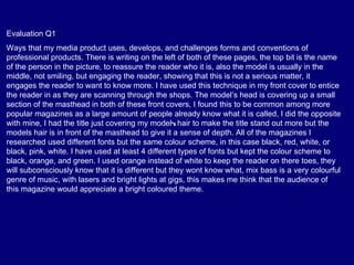
- 1. Evaluation Q1 Ways that my media product uses, develops, and challenges forms and conventions of professional products. There is writing on the left of both of these pages, the top bit is the name of the person in the picture, to reassure the reader who it is, also the model is usually in the middle, not smiling, but engaging the reader, showing that this is not a serious matter, it engages the reader to want to know more. I have used this technique in my front cover to entice the reader in as they are scanning through the shops. The model’s head is covering up a small section of the masthead in both of these front covers, I found this to be common among more popular magazines as a large amount of people already know what it is called, I did the opposite with mine, I had the title just covering my model’s hair to make the title stand out more but the models hair is in front of the masthead to give it a sense of depth. All of the magazines I researched used different fonts but the same colour scheme, in this case black, red, white, or black, pink, white. I have used at least 4 different types of fonts but kept the colour scheme to black, orange, and green. I used orange instead of white to keep the reader on there toes, they will subconsciously know that it is different but they wont know what, mix bass is a very colourful genre of music, with lasers and bright lights at gigs, this makes me think that the audience of this magazine would appreciate a bright coloured theme.
- 2. comparison. The title in my front cover is uncovered, you can see it all and my model’s head goes behind the title but on the professional one it is the back layer, adverts, articles and the model’s head are placed over it. This is because Vibe is a well known magazine name and DanStep isn’t, Some similarities are, both our the models are facing the camera and engaging there eyes to the lens to make the reader feel like QuickTimeª and a they are involved. decompressor are needed to see this picture. Also I have spread my adverts and information on what is in the magazine around the sides of the models. My model is interacting with the set around him, I think A mistake I think I could change this lightens the mood, it makes it feel more laid back is the colour of the clothing that which I think the audience of my magazine would my model is wearing, it doesn’t fit prefer this. But the other magazine shows him with a with my colour scheme. But the more sinister look, in my opinion it give a sad feel to actual items of clothing look the cover and I think I would get depressed by reading good.
- 3. Evaluation Q2. My media product might represent a particular social group, here’s the reasons why I think this. Its bright colours, loud heavy bass music, would separate out every one who would prefer darker atmospheres or calmer music genres, so ‘Goth’ or ‘geek’. Some one who has big sound systems in there car or expensive headphones might be more likely to listen to this type of music than maybe some one who plays an instrument in an orchestra and does ballet. The way my magazine looks with the popping vibrant colours, and the close up image of the model on the front might intimidate a fraction of viewers or prefer other types of music magazine.
- 4. Q3 I think the kind of media institute that would distribute my magazine would be someone who is big and has a large audience already in this field of music, this company would have TV shows or even a TV channel such as 4 music or viva, they would be able to advertise this magazine on these shows, when they have the most amount of viewers, this would encourage a large audience because the audience watching this TV channel would already be interested in this genre of music, it would share the audience from both half’s and join them together. These companies would have web sites with a large amount of people visiting them everyday; you could put up articles from the magazine on the website to give the audience a taster so it would encourage them to purchase the media product. We could offer a subscription service, letting them be up to date with every new change, article, and story. And this could lead on to them being able to have the magazine posted to there home or emailed electronically to p.c., iphone, ipad. We could make an application for apple and android to let people keep up to date on the go. The company would need to have a good reputation with its community so that the audience will accept the new magazine that they will offer. And this company would need to be quite niche, but not to a great deal as my genre if fairly niche but its still large, as it includes most heavy bass music, drum and bass, Dubstep, ect.
- 5. Q4 I think the audience for my media product would be boys, from there early teens (13 – 15) to there mid twenties, (24 – 26), and even after that I think people will still love this genre of music, and I tried to make my magazine involve as wider range of an age group as I can, I offered competitions which I think would interest the younger age bracket, and tips, and advise on how to produce your own mix bass music which appeals to the older age bracket if they plan to or are already doing this as a job or career.
- 6. Q5 I gathered a few people and asked them these questions that follow, to let me find out the answer to ‘How did you attract the audience?’ firstly, what draws your attention to the product? People said when we look at the front cover, the model on the front is staring into the lens of the camera, it grabs the reader’s attention and makes them feel as if he is looking at them, and also the bright colours of the title and the background make it stand out against all the other magazines on the shelf. When we look at the contents page the slanted angle of the writing adds interest to the page, making it fit into the picture behind, rather than most other contents pages that are just in straight coulombs, the matching colours between the sliders in the picture and the title make it look tidy and easy to read, make the reader feel calm and not rushed to read it. The DPS has a good page layout, and with the transparent background image being the same as the contents page it links the two with out making it look repetitive. The pictures make it clear to us that this was a mix genre of music, the decks on the front page are used by DJ’s which are usually solo artists such as Skrillex, mixing there own music, and the mixing desk as the main image on the contents page. The strengths we see in this product are that it keeps a consistent colour scheme throughout all of the pages and the placing of the articles, adverts and pictures make it look very professional. The majority of the people I asked said yes they would purchase my magazine because love the colours, content, the way its laid out, and they enjoy this genre of music, 3 people said they would not buy it because they don’t like this genre of music and 1 person said no because they don’t read magazines anyway. They said a couple of ways I could improve my DPS was to be more images and less writing as it looks too wordy and this can put people off the they don’t want to read large chunks of writing at a time and this can be a bit intimidating to some people. Also, there wasn’t much information on the contents page, it looked great but it needed more than just a list of what to expect in the magazine, and lastly the models clothes don’t match the colour scheme of the rest of the page on the front cover and this can be a bit distracting where as if it matched it would go unnoticed.
- 7. Q6 A list of the technologies I used include Macs, windows pc, Photoshop, PowerPoint, Word, Excel, multiple cameras, and some dj decks and mixing desk which I photographed for my media product. I knew how to use this equipment before I started this course because I have a years experience in photography A Level. But it has given me more practice at improving my skills with these products.
- 8. QuickTimeª and a decompressor are needed to see this picture. Q7 This is a comparison from my skills on Photoshop from when we did our preliminary task to now, when I have just finished my magazine, also what I have learned since then. You can see obvious differences between both the front pages, the font on my first page looks cheap and simple where as the one on the left, I use more chunky fonts so they fit the genre of the magazine better. I used the technique that the model is interacting with and object but keeping contact with the camera lens, it makes the reader feel involved in the magazine. I have improved my tool select skills, I managed to cut around the model and put in a different back ground. I have learned more of the terminologies that are relevant to media. The colour scheme in my newer front cover is more consistent than my first front cover which has almost no colour scheme, its just a mish mash.