
Recommended
More Related Content
What's hot
What's hot (20)
Similar to VCD Scope and Sequence and Design Process
Similar to VCD Scope and Sequence and Design Process (20)
More from JulietteWegdam1
More from JulietteWegdam1 (20)
Recently uploaded
Recently uploaded (20)
VCD Scope and Sequence and Design Process
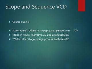
- 1. Scope and Sequence VCD Course outline “Look at me” stickers (typography and perspective) 30% “Robo in house” (narrative, 3D and aesthetics)30% “Water is life” (Logo, design process, analysis) 40%
- 2. The design process The Brief (identify client, needs, purpose..) Research (collecting ideas, information, ..) Generation of ideas (exploring design ideas, use imagination, visualisation) Development of concepts (select preferred idea and apply range of methods, materials media..) Refinement of ideas (modify visual communications in response to feedback and evaluation) Development of visual presentation (presenting final outcome)
- 4. Design Elements - (Fat Cat Splat) Form……………. Tone……………………………. Colour……………………………………….. Texture………….. Shape…………………………… Point…………………………………………… Line…………. Type…………………………. Design elements are components of visual communications.
- 5. Vocabulary Formcombining shape and value to create the illusion of three dimensions on a flat surface Tone Properties to colour hue and intensity Colour light reflected on an object. Texture tactile quality of an object Shape lines combined to create an enclosed space Point mark or short line Line a point extended in both directions Type letter form
- 6. Design Principles (PuB FaCe CHiPS) Proportion……………………. Balance…….. Figure/Ground………………………. Contrast………. Cropping………………………………… Hierarchy……… Pattern………………………………. Scale…………. Design principles are accepted conventions associated with arranging or organising Design Elements.
- 7. Why is Type so important in Visual communication? We are all Type consumers and interact with typefaces frequently in our daily life. The shapes and styles of the type communicate a huge amount of information independently of the words they spell out. A type has the power to transform the meaning of a word: to give it voice and a personality, to make it look knowledgeable, extrovert or stylish. Type guide us, interact with our senses, giving us a glimpse of what a product might taste or smell like, if it is expensive or important etc….
- 8. Type styles
- 9. Activity 1: Typography a) Discuss the hand out ”Anatomy of Type” in class. b) Students analyse the word “C r e a t i o n s” (Baskerville font) on the hand out and write down the terminology used in this font next to each letter. Stick all hand outs in your visual diary.
- 10. Activity 2: Sensitive Typefaces Typefaces can have strong personalities and can go a long way towards conveying the right mood of your message. The look of a word will be associated with certain qualities. Write down your ideas for the way the following ”senses” are made visible. What does the word taste taste like? What does the word touch feel like? Etc.
- 11. Choose 4 of the following words: Sticky, colourful, scary, mirror, dizzy, strong, elegant, fast, fog. Express the meaning of the 4 words through the typeface. Sketch the words in the four boxes and use colour/tone to enhance the meaning. Activity 3. Expressive words
- 12. Activity 4a: Find your Font (type) 1. Write down 3 adjectives which represent qualities you have eg; creative, organized ….. 2. Then research 3 fonts, each font reflecting one of your qualities. 3. Type each word on your iPad in the researched font and make it a large size, in small size you write down the name of the font. 4. Put the 3 words in a pic collage and print this out and stick this in your visual diary. 5. Annotate what made you choose each font. Discuss shape.
- 13. Activity 4b: Nametag finish for home learning 5/2. Choose your first name/nickname for this activity. Type your name in one of the researched fonts in large size Trace the letters from your iPad on A4 paper Fill each letter with a design focusing on different Design Elements: Line, point, tone, colour, texture or shape. This nametag will be laminated and stuck down on your visual diary frontcover.
- 14. Activity 5: Research Research inspiring one-point perspective nametags (location of vanishing point, use decorations (colour/pattern) etc. Present this in a pic collage, print out and stick in your visual diary.
- 15. Drawing shapes and a house (6a and b) Activity 6: One point perspective shapes
- 16. Activity 7 a+ b Drawing letters in perspective
- 17. Activity 8. ActiSelect your favorite font (from activity 4) and print out your name in a large size on A4 paper. Add the name off the font. Make some small adjustments in the shape of the letters. You might want to add wings or make your letters look drippy or you might want to simplify the letter by taking of the “serif’ or “overshoot”. Show your final design before tracing in on A4 paper using the lightbox. Create 2 different designs (quick sketches) for your nametag in perspective using 2 different fonts, colours and patterns and use different locations of your vanishing point. Annotate your thoughts and discuss design elements! Select one design, adjust the shape, to your personal preferences and draw in one point perspective and experiment with colour/pattern. (draft) Work on your final in selected medium (copic markers/ watercolour pencils/paint) Scan final design, crop the image on the computer and put the image in a sticker template.
- 18. Nametag stickers Assessment criteria: Literacy (responding to research and annotated ideas using Design elements and principles) Techniques and skills: using the Design process to develop typography and application of one-point perspective. Final presentation of nametag