
Recommended
More Related Content
What's hot
What's hot (20)
Similar to Y7 draw printmaking 2021
Similar to Y7 draw printmaking 2021 (20)
More from JulietteWegdam1
More from JulietteWegdam1 (20)
Recently uploaded
Recently uploaded (20)
Y7 draw printmaking 2021
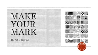
- 1. The Art of drawing
- 2. Line is used to communicate movement and journey through the experimentation of ideas, techniques & media.
- 3. a) In a group create a large mindmap/poster of the places in the world and Australia you have been. b) On the map of the world provided, draw lines on the route you have travelled overseas. Use a different colour per person. Draw a symbol of the type of transport taken for the journey. c) On the map of Australia provided, use symbolic drawings to show the type of transport and destinations you have visited. This maybe foot prints, tyre marks, train rails or a jet stream behind a plan. Again, use a different colour per person.
- 4. d) Watch the movie “The Arrival” a wordless graphic novel from Shaun Tan, published in 2006. https://youtu.be/vAay4myoEDE The arrival is a migrant story told as a series of wordless images that might seem to come from a long-forgotten time. A man leaves his wife and child in an impoverished town, seeking better prospects in an unknown country on the other side of a vast ocean. How has the artist used line and tone in this presentation? Identify the main objects and images that help convey the idea of migration, immigration and journeys in the story. Sketch these in your visual diary. e) Discuss in group: migration, journey, home and our local areas. Why is it important to us and how has this changed over recent times?
- 5. Preparing your visual diary: Number the first 20 pages in your visual diary ( as in a book). Put the numbers in the bottom outside corner. On the first double spread in your visual diary, creatively write the heading “LINE” using different types of lines. This should be across the top of the left page. What is line? “Line- element of art”. In terms of art, line can be described as a moving dot. Line is a basic element of drawing.
- 6. A. In the boxes provided, fill the first six boxes with a different pattern created with lines. Use thick and thin lines. Draw in lead pencil first then go over the lines with a fineliner. You can refer to Zentangle patterns on the internet. B.Under each pattern, write down an adjective to describe it. C.Write a description of what the Art element” LINE” can be used for. D.What do you get when you join up the two ends of a line? E.What do you call it when you see repeated lines? F. what is the word for when you can feel lines as well as see them? G. Concentric Lines are lines that follow a similar path around an initial line or shape. The are used to create the effects of movement and flow. They can be evenly spaced to create a flat effect, or the distance between them can be varied to create the effect of depth or height. In the last three boxes, draw three different arrangements of concentric lines. 1.Keep the lines an even distance apart. 2.Change the distance between the lines to create the effect of height. 3.Change the distance between the lines to create the effect of depth. H.Paste the work sheet on the right page in your visual diary or take a photograph and paste it in your OneNote as directed by your teacher. I.Find three examples of artworks made with lines. Arrange them in Pic Collage and then paste them in your visual diary below your squares.
- 7. Steve McCurry's video on Photo Composition Tips helps us to understand the different approaches to arranging images in a composition. In your visual diary, make a list of each of the composition tips shown and their definition. Draw a diagram of the lines shown in each composition tip. Find an example of a photograph for each composition tip. Paste these in your visual diary or OneNote as directed by your teacher. The first one has been done for you. 1. Rule of thirds - the image is divided evenly into thirds both horizontally and vertically. The subject of the image should be placed along one of the dividing lines or at one of the intersections.
- 8. 2. Leading Lines - draws the viewer's eye to a specific point in the composition, creating emphasis. 3. Diagonal Lines - draw the eyes across the composition, creating a sense of movement. 4. Framing - using lines to identify shapes within a composition in which the subject matter is arranged. 5. Figure to Ground - The contrast of the subject matter in the foreground against the background so each of them is clearly visible. 6. Fill the Frame - Close-up of the subject matter portrayed in the composition. 7. Centre Dominant - Place the dominant eye in the centre of the composition to make it appear that the subject matter is following the viewer. 8. Pattern and Repetition - Using lines, shapes, colours, tones and textures many times in the same composition to create organised or random effects. 9. Symmetry - can be used to create a sense of balance in the composition. The image may appear to be directly cut in half to create balance, or deliberately moved elsewhere to throw it off balance.
- 9. Step 1: Inspiration: Think about: Where do you live and like to hangout? How do you feel about these places? What do they look like? Step 2: Action: Take a series of photographs (12-20) of places that you live in or have visited. This could be your home city, the coast, country or city. Photograph landscapes and buildings rather than people. Step 3: Presentation at school: Make a contact sheet out of your photographs and glue into your visual diary. Beside your contact sheet write down the locations and the significance of them. This is called 'annotation' in the Visual Arts. Art Term: A contact sheet is a collection of photographs all arranged on one page. The images are quite small so that they can all be seen at once. This helps artists to assess the images and decide which will be the best one for the work.
- 10. Create a A5 composition of a landscape by carefully following your teacher’s instructions. The composition tips will help you to determine where objects need to be placed. Using a folded piece of A5 paper, trace a box into the middle of a page in your visual diary. Divide the A5 area into thirds, vertically and horizontally. On the left-hand side of your frame, label the fore-ground, mid-ground and background. As you draw each of the items requested by your teacher, keep a record on the side of the page in order of the item and the composition tip. NB. Do not draw items on the line at the bottom of the composition. Check instructions on OneNote.
- 11. Check specific task instructions in OneNote.
- 12. One of Australia’s most significant artists, Margaret Preston was a key figure in the development of modern art in Sydney from the 1920s to the 1950s. Renowned for her paintings and woodcuts of local landscapes and native flora, she was an outspoken public voice on Australian culture and developed a distinctly Australian style, based on the principles and motifs of modernist, Aboriginal and Asian art. paintings prints
- 13. Donwood, which is the pen name of English artist and writer Dan Rickwood, has been collaborating with the band Radiohead on album covers and posters since 1994. He explores printmaking, painting and written projects to name a few. There is a consistency in his subject matter (what you see) and his style (how he works) Donwood likes to explore and question, society, war, conformity and politics in his art. His work combines deep personal and political emotions with modesty and humor. He is obsessed nuclear apocalypse, Ebola pandemics and global cataclysm.
- 14. Teho’s printmaking journey began in 2010 on his return to his home community of Injinoo after four years of study in Sydney. Teho holds a Bachelor of Fine Arts from the University of New South Wales. His contemporary style of designs and patterning includes cultural symbols that connect Teho to the spirit of his clans. Teho’s work is recognised through his unique carving techniques, which emphasize the rhythm, composition and overall aesthetic of his works. https://onespacegallery.com.au/teho-ropeyarn-ayuva-meenha/
- 15. Glen Mackie, who is also known as Kei Kalak, has been at the forefront of the Torres Strait Islander print movement since the 1990s. He was taught to carve and paint be members of his extended family and explores both family stories, and environmental issues in his works. https://www.fireworksgallery.com.au/artist/glen-mackie https://ausaboriginalart.com/artists/glen-mackie-(kel-kalaak)
- 16. Daniel O’Shane is a relative newcomer to the art scene. He has a strong sense of design and confidence in his patterning drawn from his Torres Strait Island and Aboriginal heritage. The unique fusion of both cultures is exciting and representative of a growing movement in in Far North Qld. https://www.canopyart.com.au/portfolio-item/daniel-oshane/
- 17. Create a Visual Brainstorm of ideas for a final lino print A5 size in your visual diary. This should use line drawings of the images (animals or objects) you wish to include. You should also refer to your photographs for inspiration. Incorporate ideas and/or techniques of your inspiring artist(s). Remember your final Artwork must incorporate and communicate an idea of a journey such as migration, immigration, travel or other imaginative approaches. Your use of line must show movement and include a variety of line techniques. Then: Draw an A5 border in your visual diary to create a rough plan for your composition design. Add brief annotations to explain your ideas. Refine the drawing and go over the lines in fineliner. Using the Photocopier, create a negative/mirror image of your composition. The 'negative' photocopy will show the lines as white with a black background. The 'mirror' tool flips the composition, which is necessary for the print making process.
- 18. A. Find out who invented the printing press in 1440? B. Which book was printed first and what advantages did it have? C. What is a relief print?
- 19. Albrecht Durer made this very detailed print of a Rhino in 1515 D. What surface did the artist cut in to create the image? E. The print is very detailed. Research the names of the tools you need for cutting the image. F. Can you find the autograph of the artist in this print. Draw it in your book.
- 20. F. Find out which Japanese artist made this famous print called “the wave” in 1830? Multi coloured wood print. For each colour another wood block is used.
- 21. G. When was Linoleum invented and what is it made of? H. What advantage does lino have above wood? Both lino and woodcut belong to the relief print family, meaning the higher areas will print. Nowadays a lot of artists use vinyl as a replacement for lino as it is easier to carve. Printmaking is a technique where artists make a series of prints (=edition) I. What is the advantage for artists creating a series of prints?
- 22. Lino-cut process Donwood creates his black and white prints by using the lino cut technique.
- 23. Transfer your design using carbon paper on the lino (the carbon paper faces the lino with the blue side.) Put your design (mirror image side) facing you on top of the carbon paper and trace all the lines with a blue pen. Your pen lines will be transferred on the lino. Discuss with your teacher if you can do a one or multi coloured lino print. Determine which areas will be white/ colour 1/colour 2 (give them a different type of line) Use the lino cutting tools to cut out all the white areas in your design. Thoroughly document the process (take photos of different stages) in your visual diary.
- 24. Use a bench hook/ red protection button to put the lino against, to protect your fingers from getting cut. Always cut away from your other hand. Work concentrated, leave tools on the table, not on the chairs. Turn your lino into the most easy direction to do the cutting. If you have cut yourself, disinfect and put a band-aid on.
- 25. Always make sure your work space and your hands are clean. Put 2 ‘handles’ (masking tape) on the back of your lino. Put ink on a plastic sheet with a spatula, spread out evenly with a brayer (roller) until it sounds like Velcro. Place a piece of A3 paper on the plank Registration: Position your lino with the inked side facing the paper. When printing on other colour, line up lino from bottom side. Place a sheet of news paper on top and roll it through the press once without stopping. Take of the protective sheet of paper and then your lino. In the right hand corner of the print, write down your name and the number of the print. (First one is AP=Artist Proof, 3rd of 10 = 3/10) Put your print in the dry rack. Always have enough newspaper and printing paper on table.
- 26. Start with cutting out all white areas in your design. Then ink in the lino in the lightest colour visible in your design. Print off 4 times. Ink the lino after each print. Clean the lino with water and cut out the second light colour in the design. Ink the lino and print on top of 4 light colour prints. Do this again for the medium colour and finish with black. Every time you cut out more you print with a darker colour. The image on the lino is getting reduced.
- 27. After viewing the slides about history of printmaking and the print terminology, you are ready for the quiz. You will get the quiz from the teacher and when you have finished, check your answers. Stick down the handout in your visual diary.
- 28. Discuss the print making process and how you achieved your best print using the following questions: What story about journey is visible in your work? How have you shown movement in your work? Identify and describe how you have used the key elements and principles in your composition. Which artist inspired you the most and how can this be seen in your final print? Which part of your composition are you happy with and why? Which part doesn’t work and how could you change this? Include a quality photograph of your best print. Make sure it is framed properly. Your name and homeroom must be included on the reflection. Submit your reflection on STL Link.