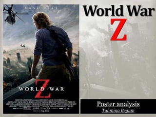
2. What can you say about the layout
design?
The colours mainly used are
blue, grey and black, which portrays
the genre of the film. We can see
destruction of buildings and
skyscrapers which shows the
audience where the action is taking
place, The title of the movie is at the
bottom of the page in bold and
stands out from any other text on the
poster. The main image is on the right
side so we get a clear view of the
destruction. At the very bottom is the
blurb which has all the casts name
etc which is a basic convention of a
movie poster.
3. What can you say about the
photography?
The camera is at a long shot of Brad
Pitt who is facing the destruction in
such a heroic pose as if he’s the one
that will save the world, also as if he
is facing the world on his own with a
gun and we can only see his back
which portrays that he is probably
the hero of the film and he’s facing
the world all by himself. Brad Pitt is
also on top of a building which makes
him look big and in power as the
buildings look small.
4. What genre of film is it and how do
you know?
By looking at the poster we can see
buildings crashing down and on fire
which makes it look like a dystopian
movie where the world is ending and
people are dying. We can also see
helicopters and guns which tells us that
it is a action/apocalyptic movie. Also the
‘War’ in ‘World War Z’ tells us clearly
that it’s a movie which will include all
sorts of world ending genres.
5. Who is the target audience and why?
At the bottom of the page is shows us
that the film will be in 3d, this appeals to
people who enjoy watching movies in 3d
also this is becoming the revolutionary
technology for films and is a good way to
draw in the audience. This mainly
appeals to boys because its an action
movie as we can see brad Pitt holding
gun, it will also appeal to people who
enjoy watching dystopian movies. This
could also attract female audience by
knowing that Brad Pitt is in the movie as
most of fans are females.
6. Where might the campaign or
individual posters be seen?
This sort of poster can be seen in train
stations, bus stops, magazines,
billboards, cinemas, newspapers.
How are the stars and director’s
used?
Brad Pitts name at the top of the poster
is used to draw the audience into the
movie this could make them decide
whether they can want to watch it or
not. If they are a Brad Pitt fan they are
more likely to watch the film. The
directors and casts names is used at the
bottom of the poster in small as its not
that important for the poster.