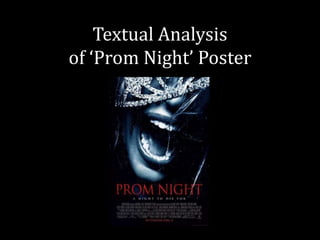
2. The main film title is in acapitalised red font which
connotes danger, blood and evil - all of which may
be inflicted onto the characters in the film. The
clear red typography stands out against the dark
background. The font has similarities to that of
which may be used on a gravestone, connoting the
genre of the film to that which surrounds death.
The poster indicates the release date of the film yet
is not specific,showing this film poster has a‘teaser’
element to it. The red font captures the audiences
focus, like the film title, there on capturing their
interest and curiosity towards the film. This also
urges the audience to keep looking out for updates
on the film and when the exact release may be.
3. The main image of the poster is focused on a
female’s mouth expression, which portrays her
emotion with terror and fear. The close-up shot
focuses on the wide-mouth positioning, taking up
almost athird of the pagewith it being placedin the
centre of the triangle of interest. The use of the
tiara links to the film title ‘PROM’ and the
ideologies that surround it – for example becoming
‘prom queen’. However alongside the female’s facial
expression there is a juxtaposition that connotes
that becoming prom queen may not be as good as
may stereotypically be represented.
The sizing of the mouth expression may connote
the breadth of her scream. The use of a female
victim is a feature used by many horror movies for
women are stereotypically seen as being the
weaker gender and would therefore be a much
easier target to the antagonist.
4. The tagline is placed effectively below the main film
title, capturing the readers attention just after they
read the main film title. It keeps to the house style
and colour scheme of the film poster,written in
whitecapitalisedtypographywhich stands out
against the black background.
The tagline ‘A NIGHT TO DIE FOR’ is a play on
words. It is a phrase which is known tobe used in a
positive way implying an evening that is ‘out of this
world amazing’. However, in this instance the word
‘die’ directly connotes what may occur in this film
therefore representing the genre to theaudience.
The tagline creates anticipation for the audience
will want to know further into the film’s plot.
5. Underneath the tagline, in the bottom third, is the
credit block whichincludes details such as the
institutions involved in the production and
distribution of the film as well as the names of the
actors. In film posters that include famous actors
often have their names in a bold eye-catching font
that would attract the target audience.
The film poster has been edited to have a worn look
to it. This may reflect the struggle that the main
character may experience through the film and
enhances the idea that ‘PROM NIGHT’ may notbe as
ajoyful night as proms arethoughtto be.
6. The target audience for this horror film would be teenagers and young
adults, with the film title itself targeting those of a similar age whom of
which may experience and relate themselves back to the movie.
Research: The budget for this movie was $20 million, produced by Origin
Film and Newmarket Films in assocation with Alliance Films. It was not
originally screened in advanced with it receiving 8% of positive reviews on
Rotten Tomato out of 59 views. The film has now made a worldwide gross
of $59,597,560 and is currently ranked as the 14th best Horror Remake and
16th Highest Grossing Slasher Film.
From my research I found that this movie is
a remake of the 1980s horror film ‘Prom Night’.
I found that the 1980’s film poster was very
effective in representing the genre of the film.