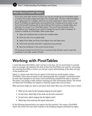
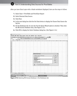
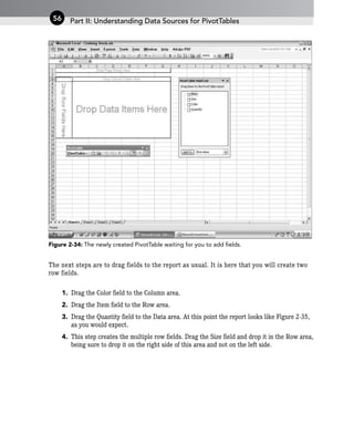
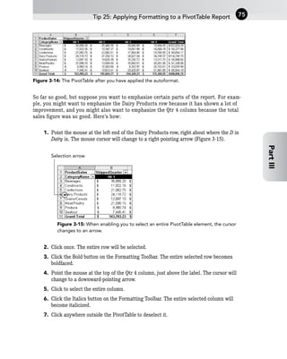
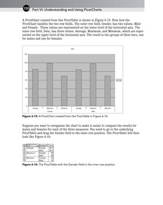
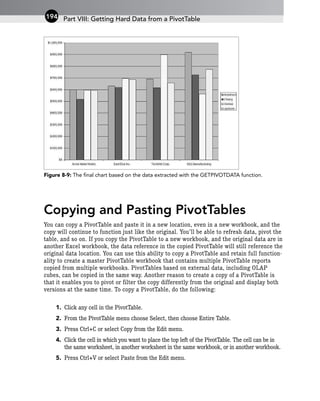
Here are some key questions you might want to ask about these sample data:
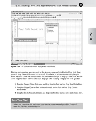
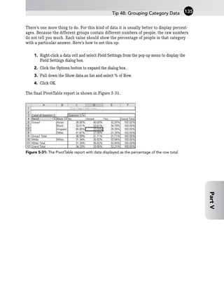
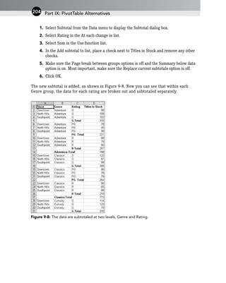
- What are the sales for the Camping category for each region?
- In each store, which days of the week see the most customers?
- In each store, which category has the highest sales?
- Which day of the week has the lowest total sales?
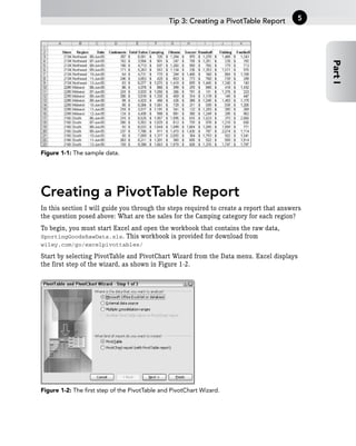
These are the kinds of questions that PivotTables are designed to help answer by enabling you to analyze and summarize your data in different ways. Let's take a look at how to create a basic PivotTable report from this sample data.


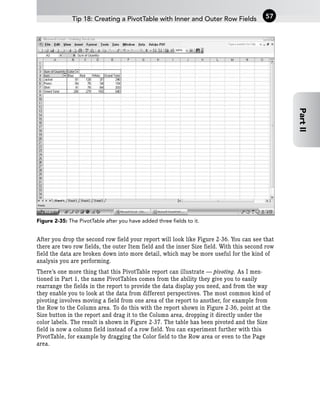
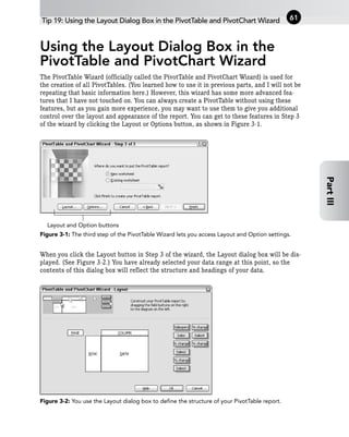


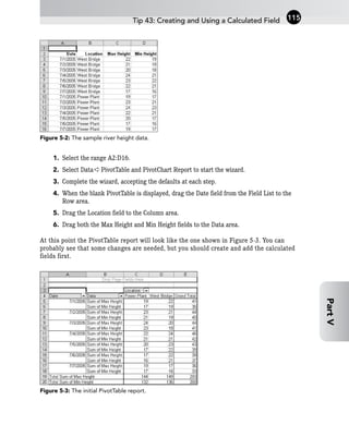
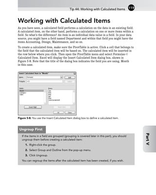
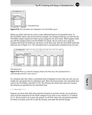
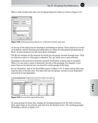


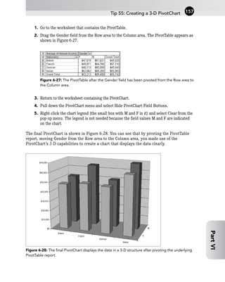


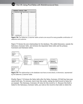

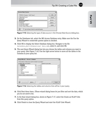
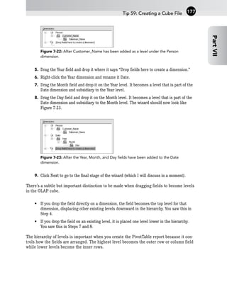
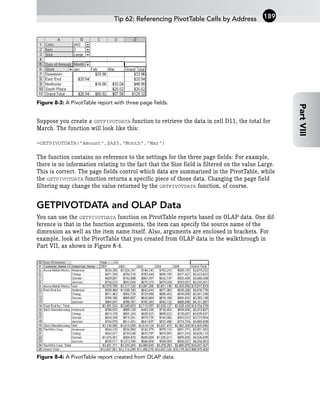
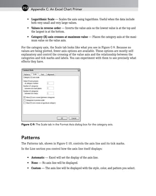
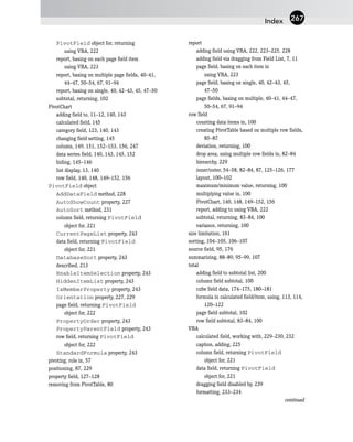
![Suppose you want to use the GETPIVOTDATA function to retrieve the total sales made by
Anderson to Acme Metal Works in the year 2003. The function will look like this:
=GETPIVOTDATA(“[Measures].[Sum Of Amount]”,
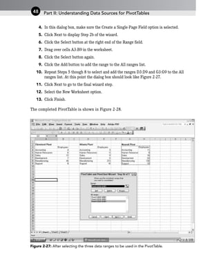
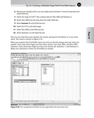
$A$3,”[Date]”,”[Date].[All].[2003]”,”[Person]”,
“[Person].[All].[Acme Metal Works].[Anderson]”)
If you refer to Part VII, you will recall that the year is actually represented in a level
named Year, and also that when you designed the cube file, you placed that level in a
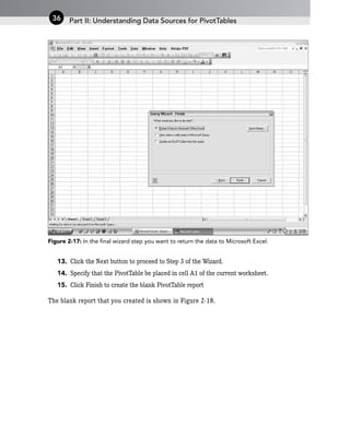
dimension named Date. The same is true for the Customer_Name and Salesman_name
fields (levels), which were placed in a dimension named Person. And you can see that the
dimension names Date and Person are used in the GETPIVOTDATA function rather than the
level names.
Because the syntax of GETPIVOTDATA can be rather complex when working with OLAP data,
I recommend that you always use the shortcut and let Excel generate the function argu-
ments for you.
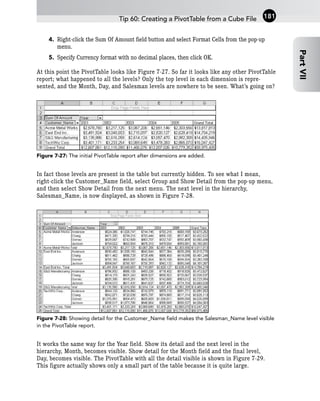
GETPIVOTDATA and Show/Hide Detail
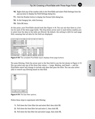
One of the nice aspects of the GETPIVOTDATA function is that the result it returns does not
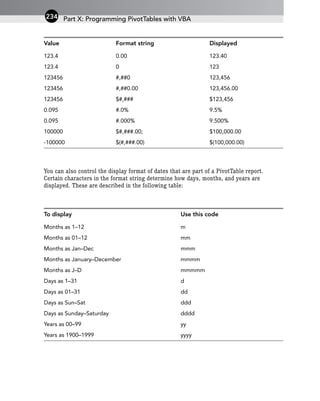
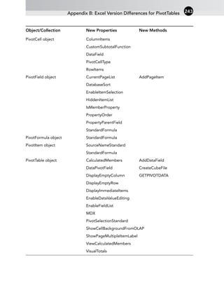
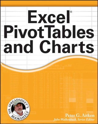
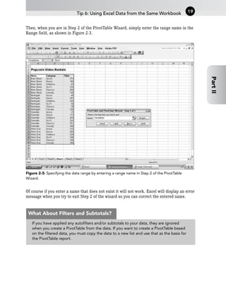
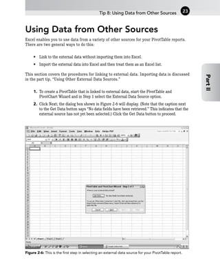
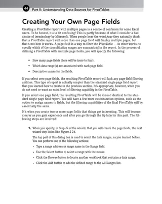
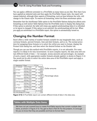
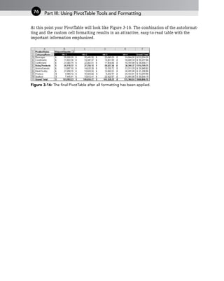
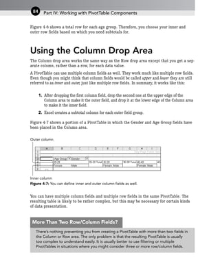
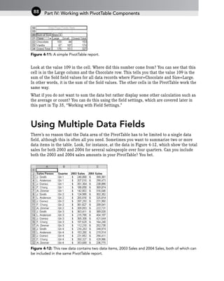
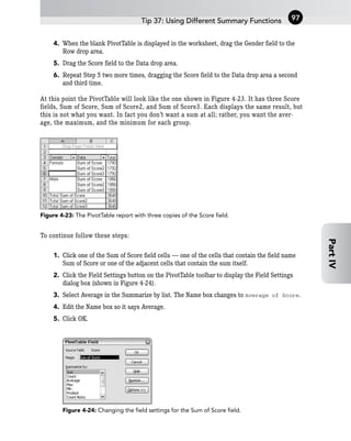
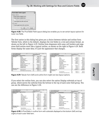
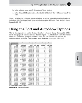
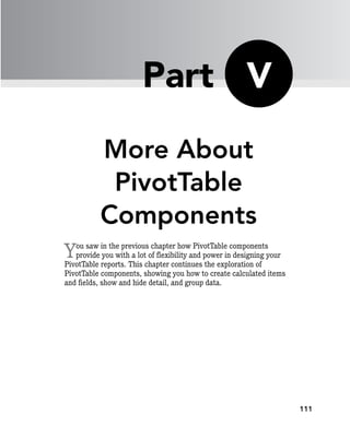
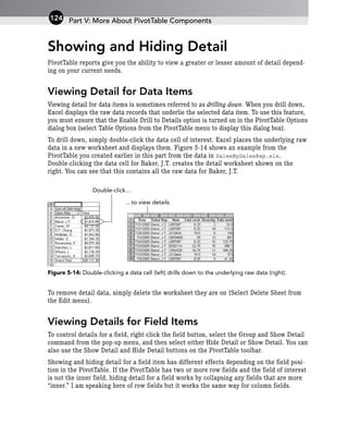
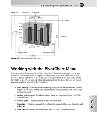
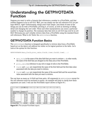
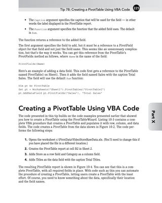
change when you show additional levels of detail. For example, look at the PivotTable
report in Figure 8-4. This is the PivotTable that you created from OLAP data in Part VII.
You can see that no detail is shown under the Year dimension; the Month and DayOfWeek
levels are hidden. This means that each result cell is the sum across all days and months.
For example, cell 5 shows the sum of all sales that Anderson made to Acme Metal Works
in 2001. If you used the GETPIVOTDATA function to reference this cell, it would return the
value in the cell — $524,386.
Suppose that now you use the Show Detail command to display additional detail for the
Year field. The result, shown in Figure 8-5, is that the Month detail is displayed in the
PivotTable report. There is no cell in the report that sums all sales that Anderson made to
Acme Metal Works in 2001 because this total is now broken down by months. Yet the GET-
PIVOTDATA function that you created still shows the same total. This is a very useful fea-
ture of this function.
Of course the opposite is not true. If you create a GETPIVOTDATA function that refers to a
cell in a PivotTable report and hide that cell with the Hide Detail command, the function
will return #REF.
Part VIII: Getting Hard Data from a PivotTable
190](https://image.slidesharecdn.com/wileyexcelpivottablesandcharts-230922094846-35df2596/85/Wiley_Excel_Pivot_Tables_and_Charts-pdf-203-320.jpg)
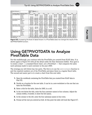

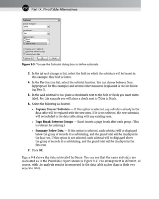

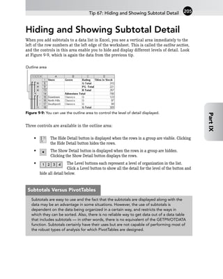
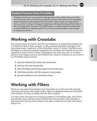
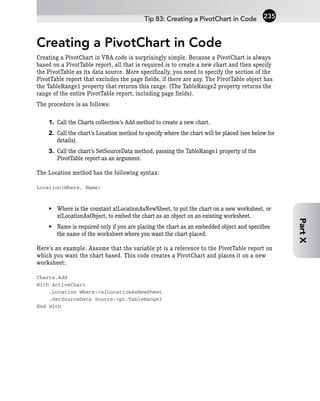
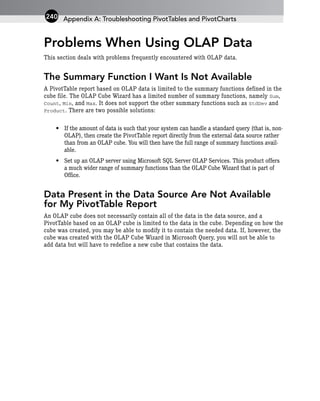
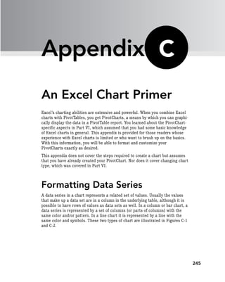
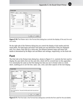
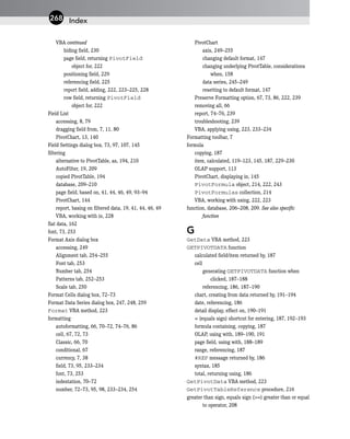
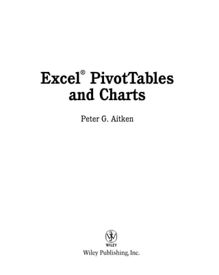
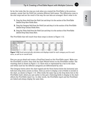
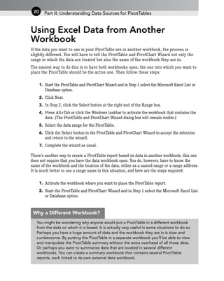
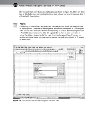
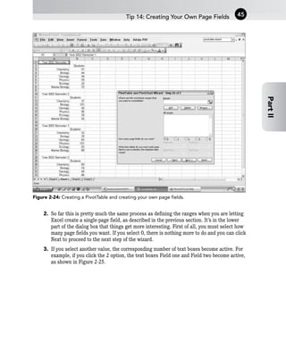
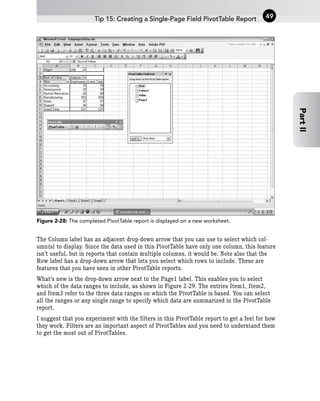
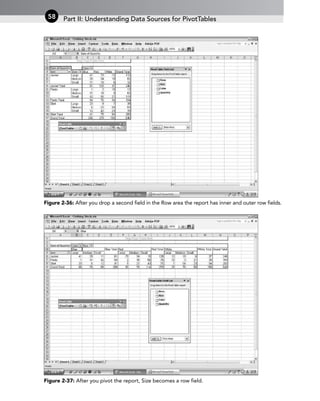
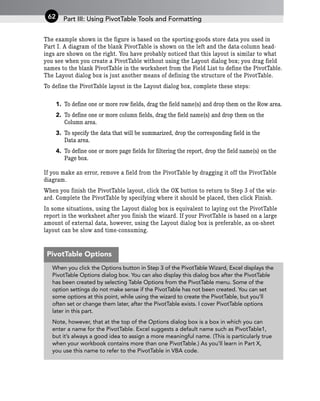
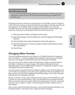
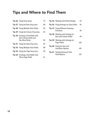
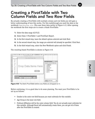
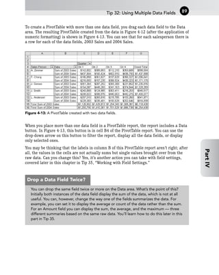
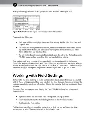
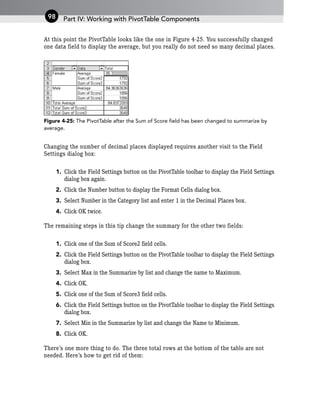
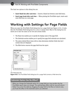
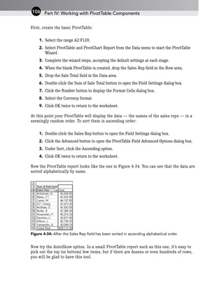
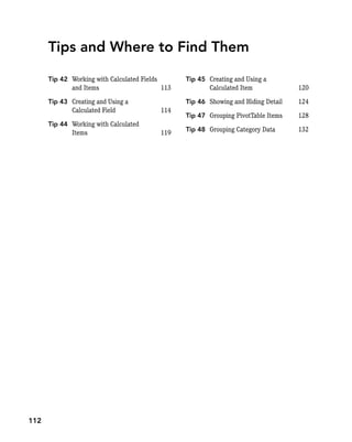
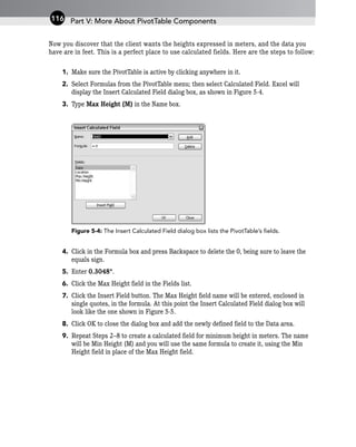
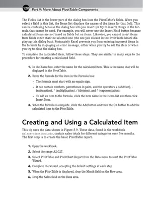
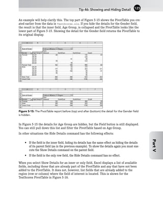
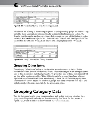
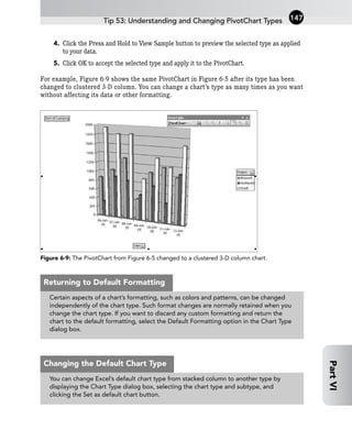
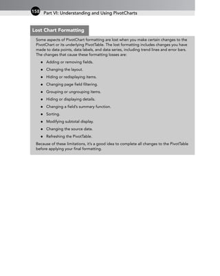
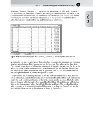
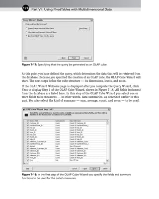
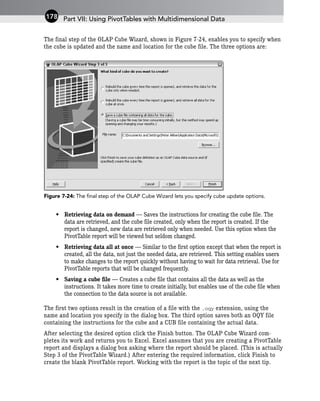
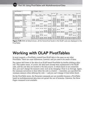
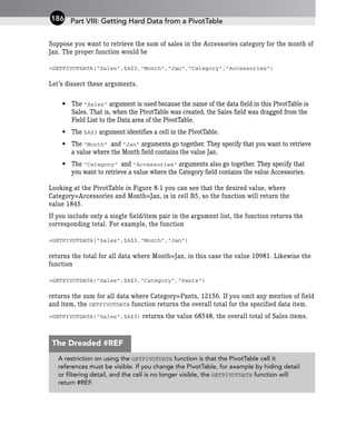
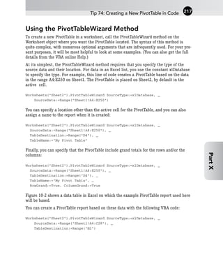
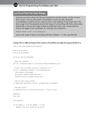
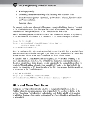
![Figure 9-14: When you add filters to a database, each column heading becomes a drop-down list.
Next, use these drop-down lists to define your filter. You can also sort the database on the
field. The drop-down list for the Genre field is shown in Figure 9-15. The choices on the
list are:
Figure 9-15: A drop-down filter list enables you to define your filter and/or sort the database.
• Sort Ascending — Sorts the database on this field in ascending order (A–Z, 1–10).
• Sort Descending — Sorts the database on this field in descending order (Z–A, 10–1).
• (All) — Remonves any filter for this field.
• (Top 10) — Displays only the top 10 records. (That is, the 10 records with the highest
values in the field. Appropriate for number fields only.)
• (Custom) — Lets you define a custom filter (which is beyond the scope of this chapter).
• [Individual data values] — Displays only those records with the selected value.
You can filter a database table on one or more fields as needed. To remove all filters from
the database, select Filter from the Data menu and then select Show All from the next
menu. To remove the filter drop-down lists, select Filter from the Data menu and then
select AutoFilter from the next menu.
Part IX: PivotTable Alternatives
210
Filters are not really an alternative to PivotTables. They can be very useful tools for
some data-presentation and -analysis tasks, but they do not provide the kind of
summary analyses that PivotTables, subtotals, and database functions do.
Filters Versus PivotTables](https://image.slidesharecdn.com/wileyexcelpivottablesandcharts-230922094846-35df2596/85/Wiley_Excel_Pivot_Tables_and_Charts-pdf-223-320.jpg)


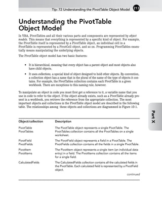

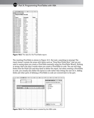
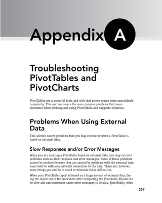
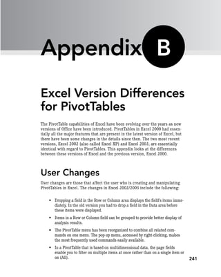
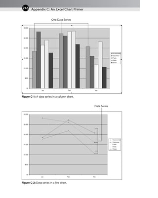
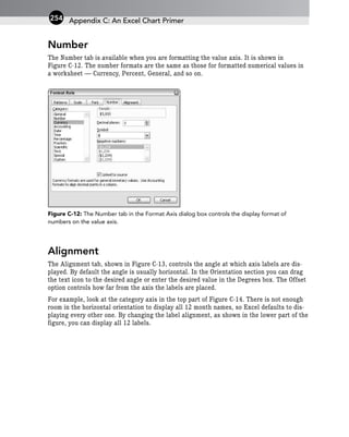
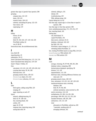
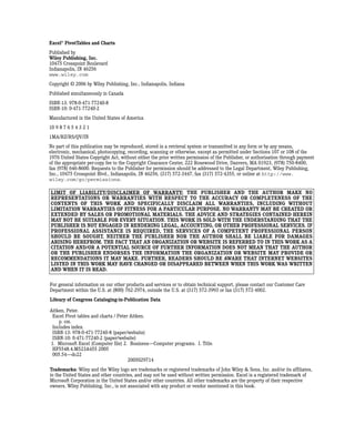
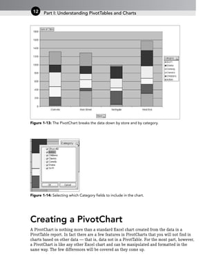
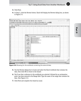
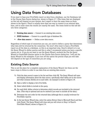
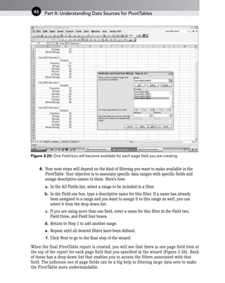
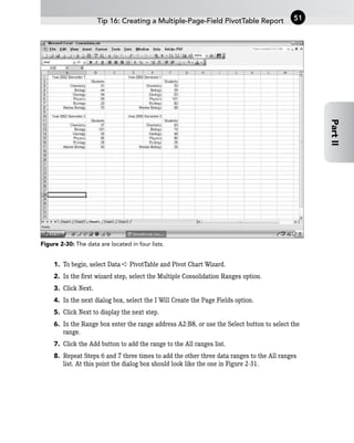
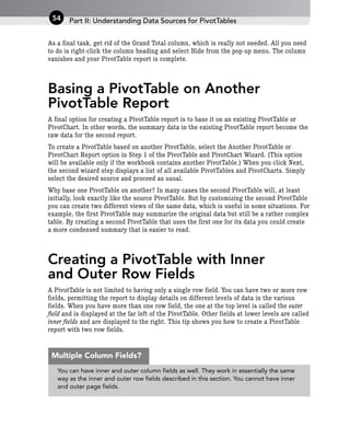
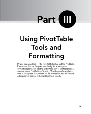
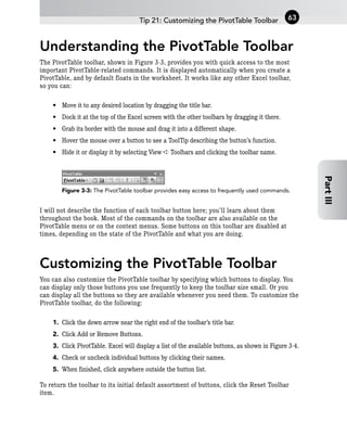
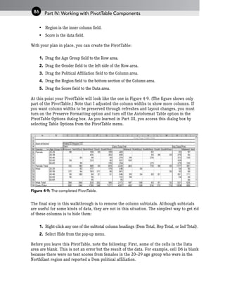
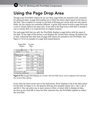
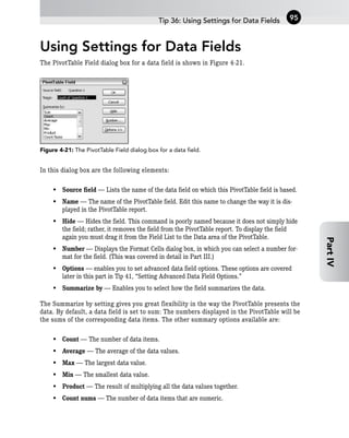
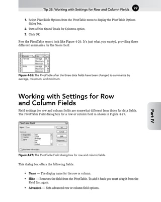
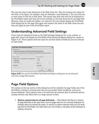
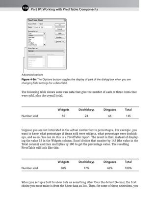
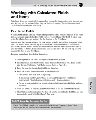
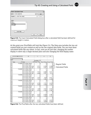
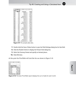
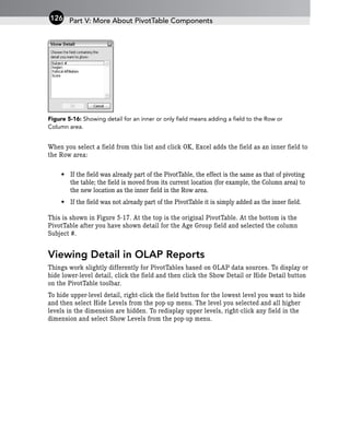
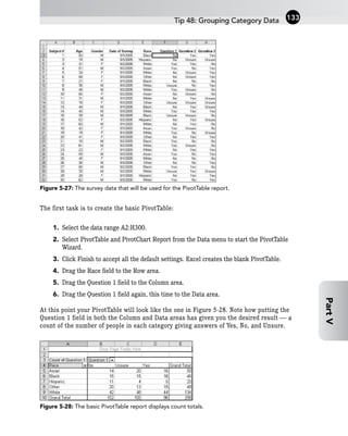
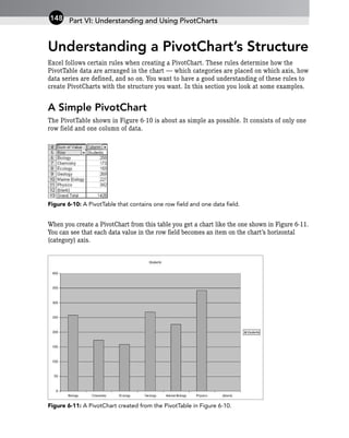
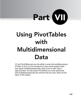
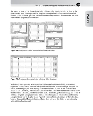
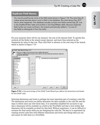
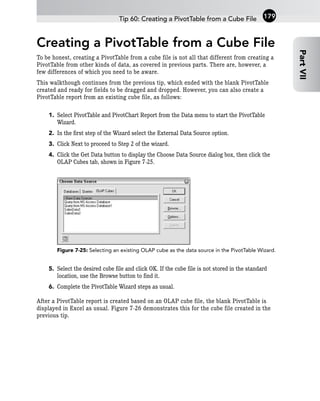
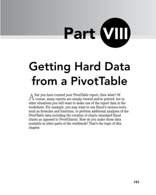
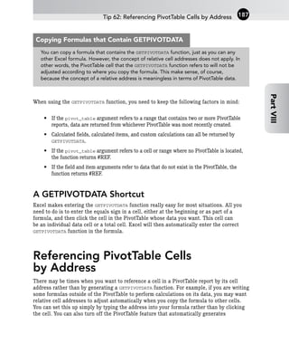
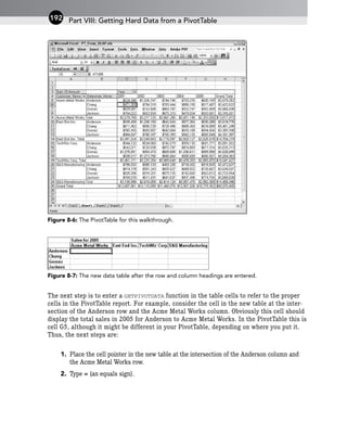
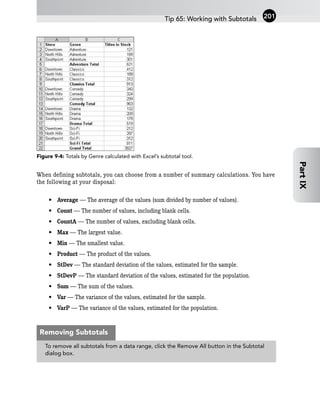
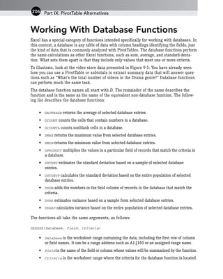
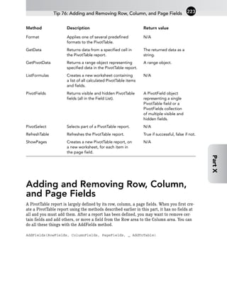
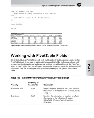
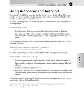
![Listing 10-2: A VBA procedure that creates a new PivotTable based on data in an Excel list.
Public Sub CreatePivotTable()
Dim wb As Workbook
Dim pt As PivotTable
Dim pc As PivotCache
On Error GoTo ErrorHandler
‘ Open the workbook.
Set wb = Workbooks.Open(“c:PivotDataVideoStoreRawData.xls”)
‘ Create the PivotCache.
Set pc = wb.PivotCaches.Add(SourceType:=xlDatabase, _
SourceData:=”[VideoStoreRawData.xls]Sheet1!A4:C28”)
‘ Create the PivotTable on Sheet 2 of the same workbook.
Set pt = pc.CreatePivotTable _
TableDestination:=”[VideoStoreRawData.xls]Sheet2! “, _
TableName:=”Video Data”
‘ At this point the variable pt refers to the new PivotTable and
‘ can be used to manipulate it.
‘ Activate the worksheet containing the PivotTable.
wb.Worksheets(“Sheet2”).Activate
EndOfSub:
Exit Sub
ErrorHandler:
If Err.Number = 5 Or Err.Number = 9 Then
MsgBox “The file could not be found”
ElseIf Err.Number = 1004 Then
MsgBox “There is already a PivotTable at that location”
Else
MsgBox “Error “ & Err & “ - “ & Err.Description
End If
Resume EndOfSub
End Sub
Part X: Programming PivotTables with VBA
220](https://image.slidesharecdn.com/wileyexcelpivottablesandcharts-230922094846-35df2596/85/Wiley_Excel_Pivot_Tables_and_Charts-pdf-233-320.jpg)
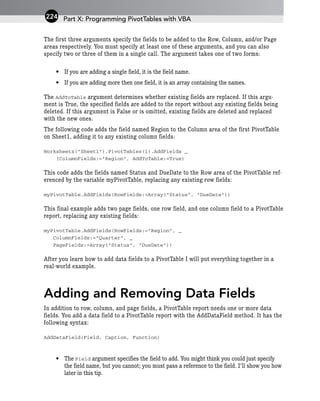
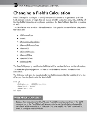
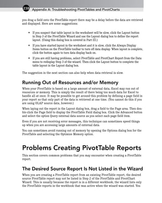
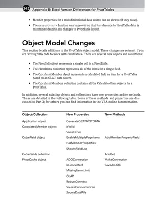
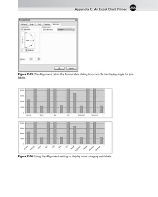
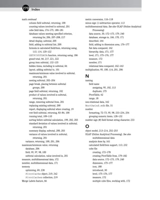
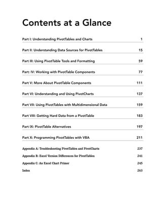
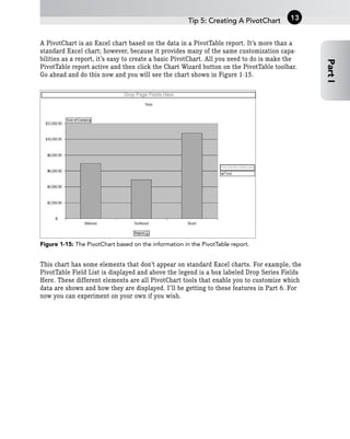
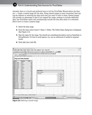
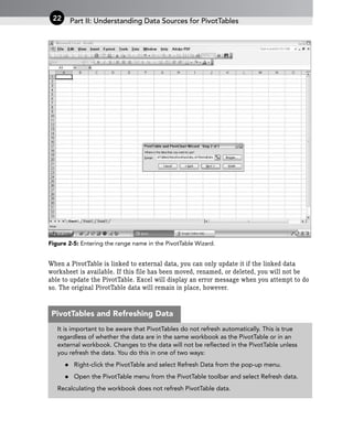
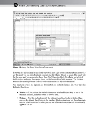
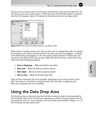
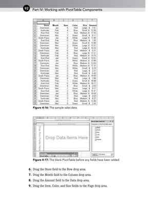
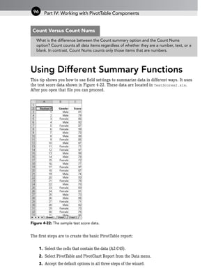
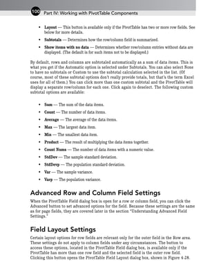
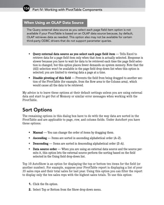
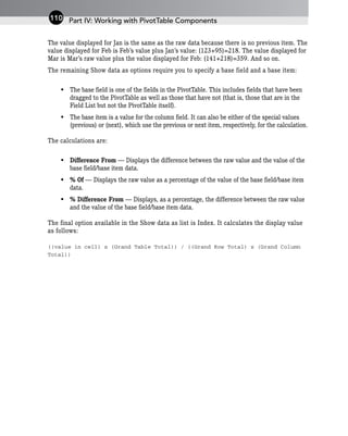
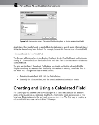
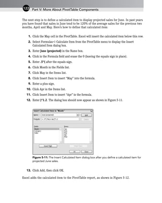
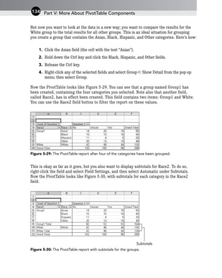
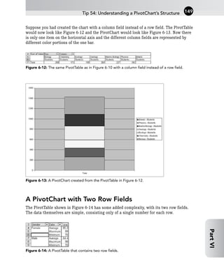
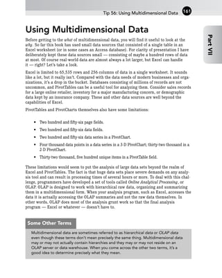
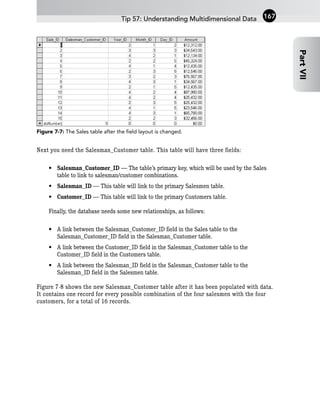
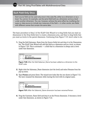
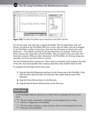
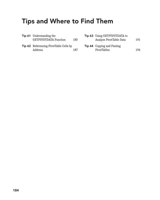
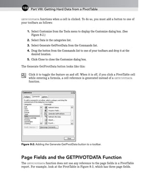
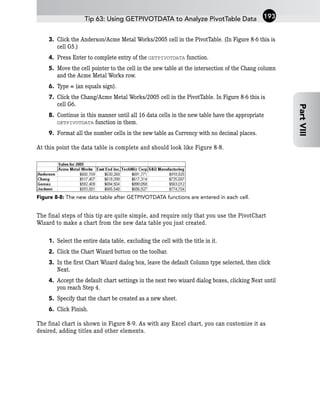
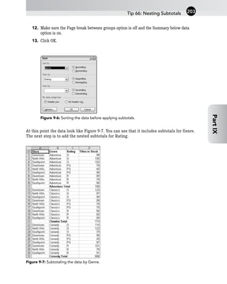
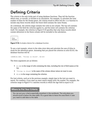
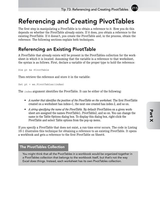
![Changing the Display Format
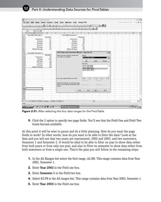
of a Field
The display format used for numbers in a field is controlled by the field’s NumberFormat
property. To change the format you must generate a format string that defines the format.
These strings use specific characters, as explained in the following table. (You can find
complete details in the Excel online Help.)
Character Function
# Defines a character-display position; insignificant zeros are
not displayed.
0 (zero) Defines a character-display position; insignificant zeros are
displayed.
. (period) Indicates the position of the decimal point.
, (comma) Indicates a thousands separator.
$ Includes a leading dollar sign.
% Displays number as a percent (for example, 0.08 as 8%).
[xxx] where xxx is Black, Specifies the text color.
Green, White, Blue, Magenta,
Yellow, Cyan, or Red
; (semicolon) Separates sections of the format string. The format
specified before the separator is used for values 0 and
greater; the format specified after the separator is used for
values less than 0.
Other characters As themselves.
such as ( and ).
Some examples of format strings and the resulting displays are given in the following
table.
Tip 82: Changing the Display Format of a Field 233
Part
X](https://image.slidesharecdn.com/wileyexcelpivottablesandcharts-230922094846-35df2596/85/Wiley_Excel_Pivot_Tables_and_Charts-pdf-246-320.jpg)