PORTFOLIO
Jerrod Thomas
CONTACT
• Magazine Cover
• Prezi
• PhotoDesign
• Montage
• Business Identity (logos, business
card, and letterhead)
• Infographic
• Coding
• Web Page Mockup
• Brochure
TABLE OF CONTENTS
Jerrod Thomas
241 W Central
Richmond, KS 66080
785.418.6530
jerrod.thomas@gmail.com
magazine cover
DESCRIPTION
Design a magazine cover that showcases a self-portrait as well as articles about yourself.
PROCESS
In the spirit of Halloween I bring you the latest issue of Tales from the Crypt. The three articles de-
scribe what it was like to grow up in the beautiful state of New Mexico, my hobby of comic collecting,
and how I enjoy 80’s pop and hair bands.
tookwp_20160928_16_29_03_pro inspiration from my love of comics. At first I did a few ideas with
different magazines, as you can see in these sketches. I tried out a few things, like in the Facebook
post, and finally decided on the final product that’s in this post.
CRITIQUE PROCESS
I contacted a friend of man, named Kevin Matthews, who helped me refine the final product. Also, an
acquaintance of mine named Dayton Ward who writes Star Trek novels, and asked his opinion about
it for advice.
I critiqued Alan Gillian’s post and as well as that of Mindaugas Kucinas.
MESSAGE
I wanted to give a sense of what brings me happiness through my magazine cover.
AUDIENCE
Those who love comics and scary stories
WHAT I LEARNED
I finally for the most part have the hang of using InDesign. It’s a tough thing to create and come up
with a design.
COLOR SCHEME
Yellow, Red, Orange and white.
FONTS
I used Chiller for the title and Arial for everything.
SOURCE OF IMAGES
A selfie I took, a drawing I made, and the logo for EC Comics i found on wikipedia.
prezi
Prezi was quite something to learn. I think I prefer PowerPoint, but willing to work with Prezi some
more to see if I get the hang of it. I’m the type that just has to mess around with something to figure it
out.
I wanted this presentation to be something like reading a comic book, so I picked out a few images
that reflected things that I learned. I do admit I threw in the eating vegetables and the milk to be
funny.
I couldn’t figure out how to get the background as big as I would have liked. One of my sisters looked
at it, and gave me a few tips on arranging the pictures and what color font to use.
This turned out a little different than my draft. Usually, when I go from draft to final product, the final
ends up being really different.
photo design
PDESCRIPTION
Capture a quality photo with good LIGHT, sharp FOCUS, and nice COMPOSITION.
PROCESS (Programs, Tools, Skills, FOCUS principles)
I took these steps to complete this assignment:
1. I decided what I wanted to take a picture and what color scheme accordingly.
2. I took pictures at different angles and picked the best picture.
3. I created a new document in Photoshop according to the directions for the assignment.
4. I put the picture and put it on the canvas.
5. I rectangles and colored them gray and teal to go with the brick.
CRITIQUE PROCESS
I met with Alie Morgan and Kevin Matthews to go over my design. Alie Morgan suggest I change the
color scheme to teal and gray, while Kevin suggested doing the rectangles with rounded corners
MESSAGE
My message is that books can make us dream and be imaginative.
AUDIENCE
Those who enjoy reading and using the library.
TOP THING LEARNED
To carefully read and understand directions.
COLOR SCHEME & COLOR NAMES
Teal // Grey
TITLE FONT NAME & CATEGORY
Old English Text MT// Script
COPY FONT NAME & CATEGORY
Goudy Old Style // Serif
montage
DESCRIPTION
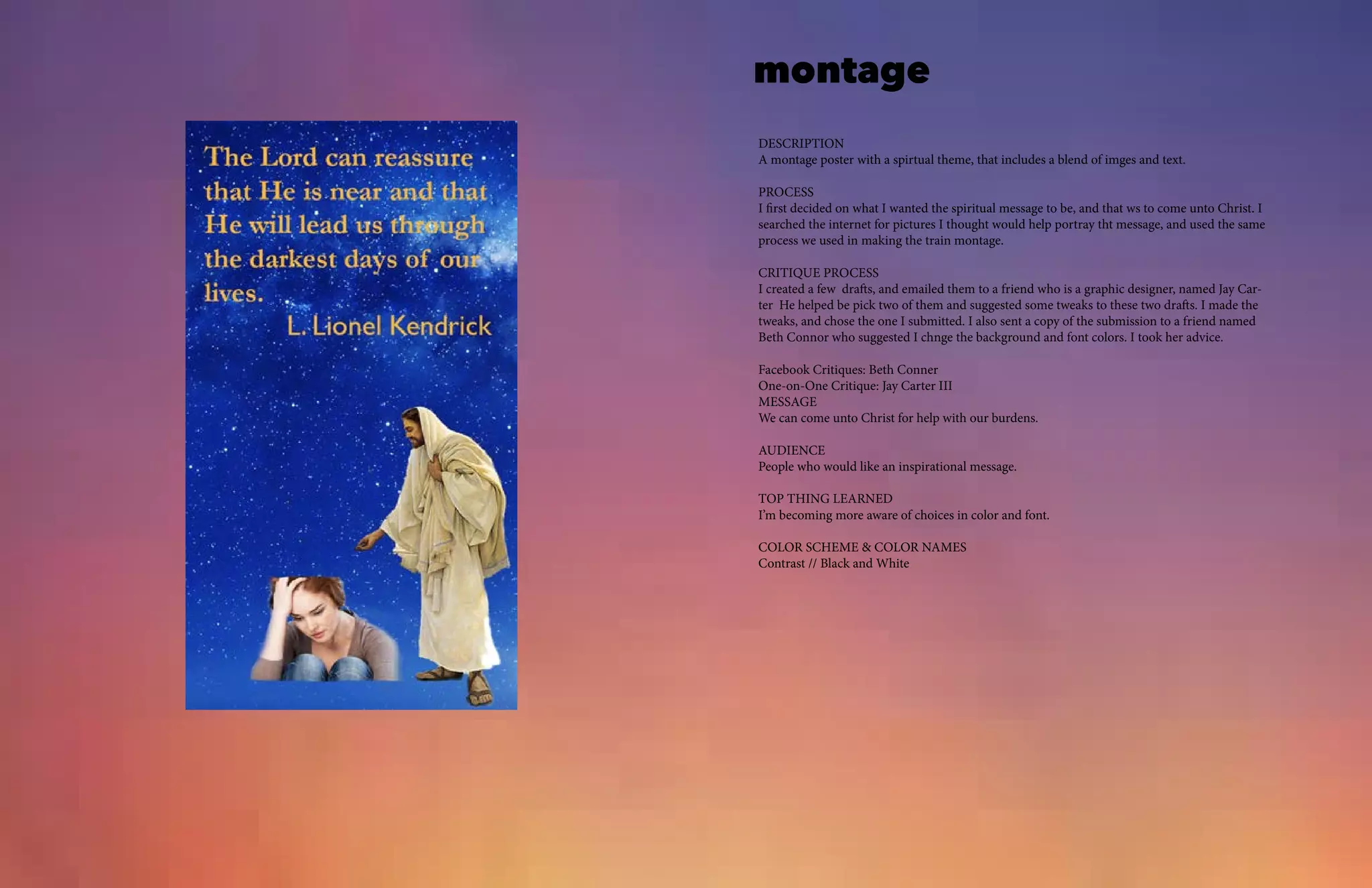
A montage poster with a spirtual theme, that includes a blend of imges and text.
PROCESS
I first decided on what I wanted the spiritual message to be, and that ws to come unto Christ. I
searched the internet for pictures I thought would help portray tht message, and used the same
process we used in making the train montage.
CRITIQUE PROCESS
I created a few drafts, and emailed them to a friend who is a graphic designer, named Jay Car-
ter He helped be pick two of them and suggested some tweaks to these two drafts. I made the
tweaks, and chose the one I submitted. I also sent a copy of the submission to a friend named
Beth Connor who suggested I chnge the background and font colors. I took her advice.
Facebook Critiques: Beth Conner
One-on-One Critique: Jay Carter III
MESSAGE
We can come unto Christ for help with our burdens.
AUDIENCE
People who would like an inspirational message.
TOP THING LEARNED
I’m becoming more aware of choices in color and font.
COLOR SCHEME & COLOR NAMES
Contrast // Black and White
business identity
DESCRIPTION
Create a logo, letterhead, and business card for a company.
PROCESS (Programs, Tools, Skills, FOCUS principles)
I sketched a few drafts of the log.
I took my favorite draft and tried to digitally create it in illustrator.
I choose my fonts and sized them according to the instructions.
I took opinions from friends of mine who collect comics to get their opinion. I
did a google search for Spider-Man.
CRITIQUE PROCESS
I met with a friend of mine named, Jay Carter who gave me some opinions, as well as meeting
with my instructor who suggested a few tweaks.
Facebook Critiques: Jay Carter
Instructor Critique: It was recommended tweak the color of the logo and layouts of my assign-
ment.
MESSAGE
How fun Marvel is.
AUDIENCE
Comic book collectors
TOP THING LEARNED
It helps to ask for help
COLOR SCHEME & COLOR NAMES
infographic
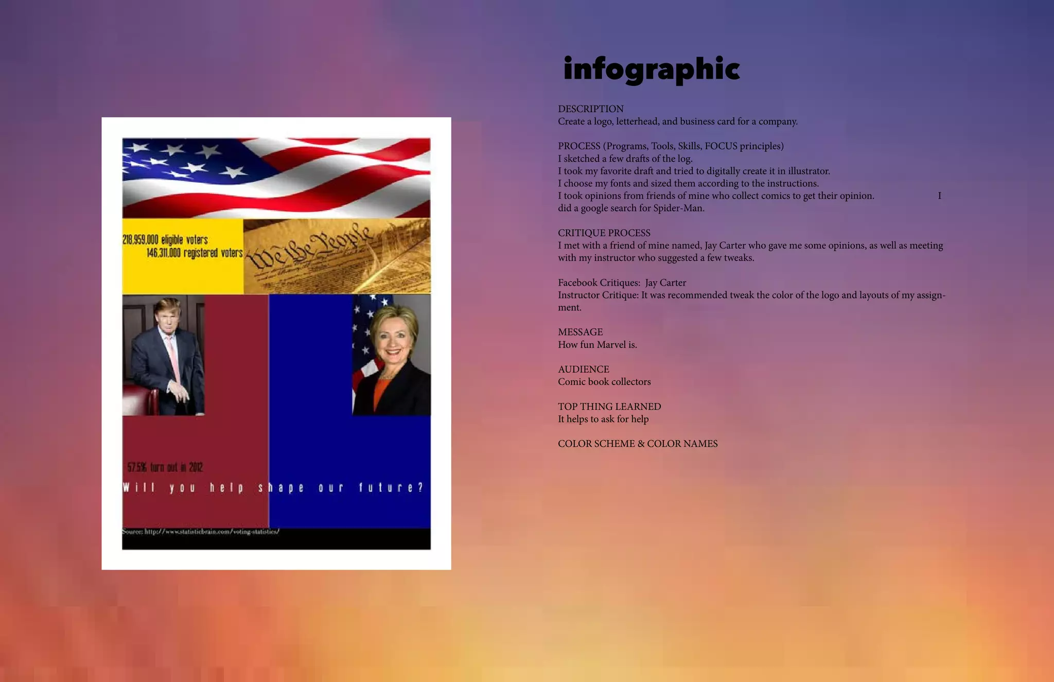
DESCRIPTION
Create a logo, letterhead, and business card for a company.
PROCESS (Programs, Tools, Skills, FOCUS principles)
I sketched a few drafts of the log.
I took my favorite draft and tried to digitally create it in illustrator.
I choose my fonts and sized them according to the instructions.
I took opinions from friends of mine who collect comics to get their opinion. I
did a google search for Spider-Man.
CRITIQUE PROCESS
I met with a friend of mine named, Jay Carter who gave me some opinions, as well as meeting
with my instructor who suggested a few tweaks.
Facebook Critiques: Jay Carter
Instructor Critique: It was recommended tweak the color of the logo and layouts of my assign-
ment.
MESSAGE
How fun Marvel is.
AUDIENCE
Comic book collectors
TOP THING LEARNED
It helps to ask for help
COLOR SCHEME & COLOR NAMES
html and css
DESCRIPTION
Code a custom webpage utilizing both HTML and CSS, describing the creation process of a
logo.
PROCESS (Programs, Tools, Skills, FOCUS principles)
1. I love comic books, and created a logo for comic books in Illustrator.
2. I resized my logo to be no wider than 300px.
3. I created an HTML file.
4. I created a CSS code and insterted it into the html file.
5. I customized the CSS using apporpriate fonts and colors.
6. I did a websearch for a background
7. I validate the HTML and CSS.
CRITIQUE PROCESS
I discussed different designs with friends of mine I work with who are also into comics.
Facebook Critiques: Coworkers.
Instructor Critique: My suggested different fonts, colors and making sure my logo wasn’t pix-
elized.
MESSAGE
The boldness of Marvel Comics
AUDIENCE
Comic book collectors.
TOP THING LEARNED
Just how fun creating webpages is.
COLOR SCHEME & COLOR NAMES
Tetradic // Red, Yellow, Orange, Blue
TITLE FONT NAME & CATEGORY
Marvel // Sans Serif
COPY FONT NAME & CATEGORY
Duru Sans // Slab Serif
webpage
DESCRIPTION
Use a grid to create a webpage.
PROCESS (Programs, Tools, Skills, FOCUS principles)
1. I broke from my usual comic book related themes and chose a funeral home.
2. I sketched out ideas for the layout. I wanted something professional and to the point.
3. After sketching, I opened a 12-column grid in Photoshop and created a wireframe.
4. I added the actual content.
5. I really liked the end result. Turned out better than I thought.
CRITIQUE PROCESS
I met with a friend of mine who works in the funeral industry for input on colors and layout,
and he gave me a few suggestions. The instructor critiqued my rough draft.
MESSAGE
To comfort those in need and help them find peace.
AUDIENCE
Those who need funeral services.
TOP THING LEARNED
To be more humble about accepting critiques.
COLOR SCHEME & COLOR NAMES
Analogous // Teal, Blue, Indigo
TITLE FONT NAME & CATEGORY
Charlamagne Standard// Decorative
COPY FONT NAME & CATEGORY
Helvetica Light // Sans Serif
brochure
DeSCRIPTION
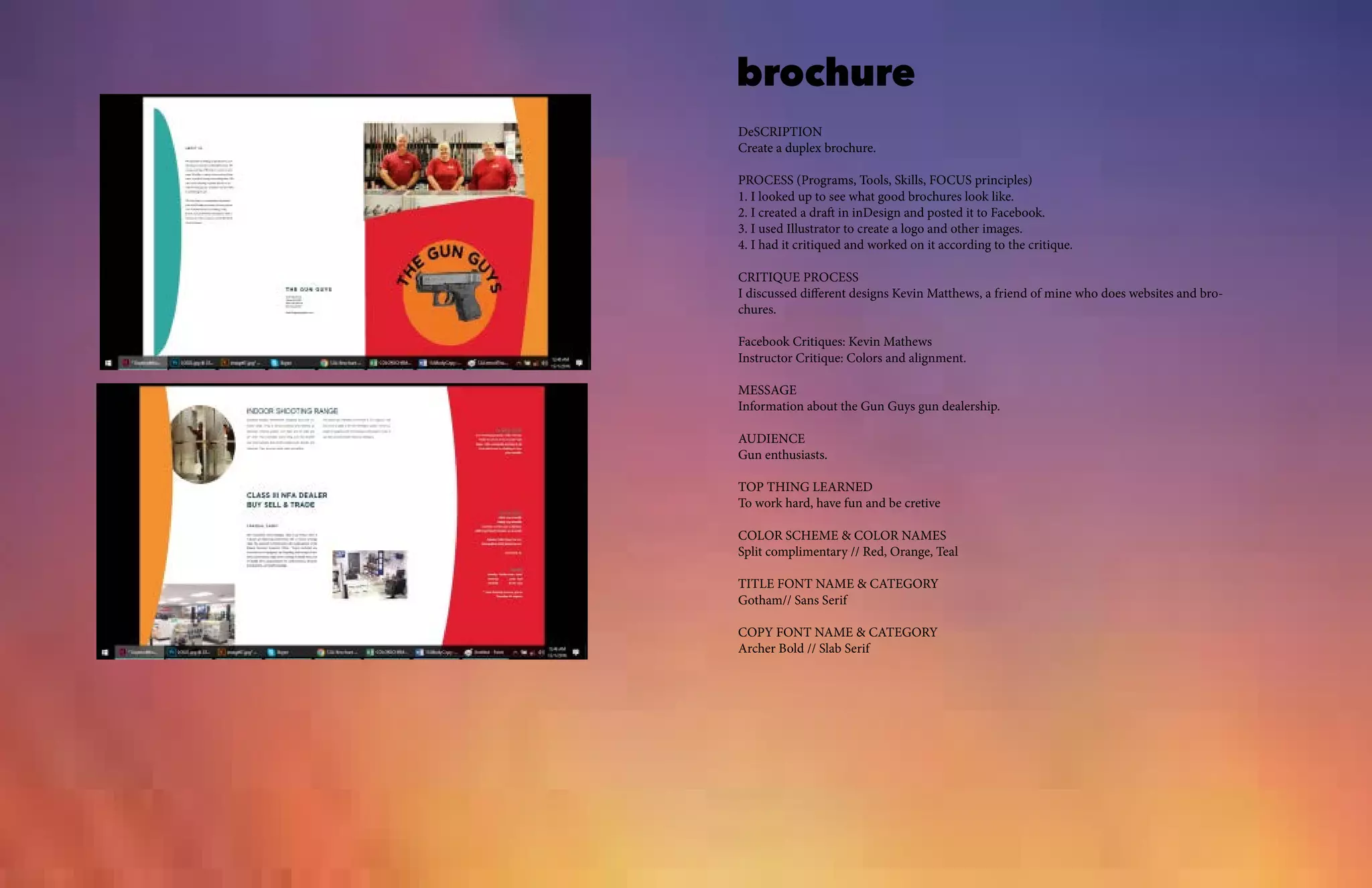
Create a duplex brochure.
PROCESS (Programs, Tools, Skills, FOCUS principles)
1. I looked up to see what good brochures look like.
2. I created a draft in inDesign and posted it to Facebook.
3. I used Illustrator to create a logo and other images.
4. I had it critiqued and worked on it according to the critique.
CRITIQUE PROCESS
I discussed different designs Kevin Matthews, a friend of mine who does websites and bro-
chures.
Facebook Critiques: Kevin Mathews
Instructor Critique: Colors and alignment.
MESSAGE
Information about the Gun Guys gun dealership.
AUDIENCE
Gun enthusiasts.
TOP THING LEARNED
To work hard, have fun and be cretive
COLOR SCHEME & COLOR NAMES
Split complimentary // Red, Orange, Teal
TITLE FONT NAME & CATEGORY
Gotham// Sans Serif
COPY FONT NAME & CATEGORY
Archer Bold // Slab Serif

13 a jerrodthomas

  • 1.
  • 2.
    CONTACT • Magazine Cover •Prezi • PhotoDesign • Montage • Business Identity (logos, business card, and letterhead) • Infographic • Coding • Web Page Mockup • Brochure TABLE OF CONTENTS Jerrod Thomas 241 W Central Richmond, KS 66080 785.418.6530 jerrod.thomas@gmail.com
  • 3.
    magazine cover DESCRIPTION Design amagazine cover that showcases a self-portrait as well as articles about yourself. PROCESS In the spirit of Halloween I bring you the latest issue of Tales from the Crypt. The three articles de- scribe what it was like to grow up in the beautiful state of New Mexico, my hobby of comic collecting, and how I enjoy 80’s pop and hair bands. tookwp_20160928_16_29_03_pro inspiration from my love of comics. At first I did a few ideas with different magazines, as you can see in these sketches. I tried out a few things, like in the Facebook post, and finally decided on the final product that’s in this post. CRITIQUE PROCESS I contacted a friend of man, named Kevin Matthews, who helped me refine the final product. Also, an acquaintance of mine named Dayton Ward who writes Star Trek novels, and asked his opinion about it for advice. I critiqued Alan Gillian’s post and as well as that of Mindaugas Kucinas. MESSAGE I wanted to give a sense of what brings me happiness through my magazine cover. AUDIENCE Those who love comics and scary stories WHAT I LEARNED I finally for the most part have the hang of using InDesign. It’s a tough thing to create and come up with a design. COLOR SCHEME Yellow, Red, Orange and white. FONTS I used Chiller for the title and Arial for everything. SOURCE OF IMAGES A selfie I took, a drawing I made, and the logo for EC Comics i found on wikipedia.
  • 4.
    prezi Prezi was quitesomething to learn. I think I prefer PowerPoint, but willing to work with Prezi some more to see if I get the hang of it. I’m the type that just has to mess around with something to figure it out. I wanted this presentation to be something like reading a comic book, so I picked out a few images that reflected things that I learned. I do admit I threw in the eating vegetables and the milk to be funny. I couldn’t figure out how to get the background as big as I would have liked. One of my sisters looked at it, and gave me a few tips on arranging the pictures and what color font to use. This turned out a little different than my draft. Usually, when I go from draft to final product, the final ends up being really different.
  • 5.
    photo design PDESCRIPTION Capture aquality photo with good LIGHT, sharp FOCUS, and nice COMPOSITION. PROCESS (Programs, Tools, Skills, FOCUS principles) I took these steps to complete this assignment: 1. I decided what I wanted to take a picture and what color scheme accordingly. 2. I took pictures at different angles and picked the best picture. 3. I created a new document in Photoshop according to the directions for the assignment. 4. I put the picture and put it on the canvas. 5. I rectangles and colored them gray and teal to go with the brick. CRITIQUE PROCESS I met with Alie Morgan and Kevin Matthews to go over my design. Alie Morgan suggest I change the color scheme to teal and gray, while Kevin suggested doing the rectangles with rounded corners MESSAGE My message is that books can make us dream and be imaginative. AUDIENCE Those who enjoy reading and using the library. TOP THING LEARNED To carefully read and understand directions. COLOR SCHEME & COLOR NAMES Teal // Grey TITLE FONT NAME & CATEGORY Old English Text MT// Script COPY FONT NAME & CATEGORY Goudy Old Style // Serif
  • 6.
    montage DESCRIPTION A montage posterwith a spirtual theme, that includes a blend of imges and text. PROCESS I first decided on what I wanted the spiritual message to be, and that ws to come unto Christ. I searched the internet for pictures I thought would help portray tht message, and used the same process we used in making the train montage. CRITIQUE PROCESS I created a few drafts, and emailed them to a friend who is a graphic designer, named Jay Car- ter He helped be pick two of them and suggested some tweaks to these two drafts. I made the tweaks, and chose the one I submitted. I also sent a copy of the submission to a friend named Beth Connor who suggested I chnge the background and font colors. I took her advice. Facebook Critiques: Beth Conner One-on-One Critique: Jay Carter III MESSAGE We can come unto Christ for help with our burdens. AUDIENCE People who would like an inspirational message. TOP THING LEARNED I’m becoming more aware of choices in color and font. COLOR SCHEME & COLOR NAMES Contrast // Black and White
  • 7.
    business identity DESCRIPTION Create alogo, letterhead, and business card for a company. PROCESS (Programs, Tools, Skills, FOCUS principles) I sketched a few drafts of the log. I took my favorite draft and tried to digitally create it in illustrator. I choose my fonts and sized them according to the instructions. I took opinions from friends of mine who collect comics to get their opinion. I did a google search for Spider-Man. CRITIQUE PROCESS I met with a friend of mine named, Jay Carter who gave me some opinions, as well as meeting with my instructor who suggested a few tweaks. Facebook Critiques: Jay Carter Instructor Critique: It was recommended tweak the color of the logo and layouts of my assign- ment. MESSAGE How fun Marvel is. AUDIENCE Comic book collectors TOP THING LEARNED It helps to ask for help COLOR SCHEME & COLOR NAMES
  • 8.
    infographic DESCRIPTION Create a logo,letterhead, and business card for a company. PROCESS (Programs, Tools, Skills, FOCUS principles) I sketched a few drafts of the log. I took my favorite draft and tried to digitally create it in illustrator. I choose my fonts and sized them according to the instructions. I took opinions from friends of mine who collect comics to get their opinion. I did a google search for Spider-Man. CRITIQUE PROCESS I met with a friend of mine named, Jay Carter who gave me some opinions, as well as meeting with my instructor who suggested a few tweaks. Facebook Critiques: Jay Carter Instructor Critique: It was recommended tweak the color of the logo and layouts of my assign- ment. MESSAGE How fun Marvel is. AUDIENCE Comic book collectors TOP THING LEARNED It helps to ask for help COLOR SCHEME & COLOR NAMES
  • 9.
    html and css DESCRIPTION Codea custom webpage utilizing both HTML and CSS, describing the creation process of a logo. PROCESS (Programs, Tools, Skills, FOCUS principles) 1. I love comic books, and created a logo for comic books in Illustrator. 2. I resized my logo to be no wider than 300px. 3. I created an HTML file. 4. I created a CSS code and insterted it into the html file. 5. I customized the CSS using apporpriate fonts and colors. 6. I did a websearch for a background 7. I validate the HTML and CSS. CRITIQUE PROCESS I discussed different designs with friends of mine I work with who are also into comics. Facebook Critiques: Coworkers. Instructor Critique: My suggested different fonts, colors and making sure my logo wasn’t pix- elized. MESSAGE The boldness of Marvel Comics AUDIENCE Comic book collectors. TOP THING LEARNED Just how fun creating webpages is. COLOR SCHEME & COLOR NAMES Tetradic // Red, Yellow, Orange, Blue TITLE FONT NAME & CATEGORY Marvel // Sans Serif COPY FONT NAME & CATEGORY Duru Sans // Slab Serif
  • 10.
    webpage DESCRIPTION Use a gridto create a webpage. PROCESS (Programs, Tools, Skills, FOCUS principles) 1. I broke from my usual comic book related themes and chose a funeral home. 2. I sketched out ideas for the layout. I wanted something professional and to the point. 3. After sketching, I opened a 12-column grid in Photoshop and created a wireframe. 4. I added the actual content. 5. I really liked the end result. Turned out better than I thought. CRITIQUE PROCESS I met with a friend of mine who works in the funeral industry for input on colors and layout, and he gave me a few suggestions. The instructor critiqued my rough draft. MESSAGE To comfort those in need and help them find peace. AUDIENCE Those who need funeral services. TOP THING LEARNED To be more humble about accepting critiques. COLOR SCHEME & COLOR NAMES Analogous // Teal, Blue, Indigo TITLE FONT NAME & CATEGORY Charlamagne Standard// Decorative COPY FONT NAME & CATEGORY Helvetica Light // Sans Serif
  • 11.
    brochure DeSCRIPTION Create a duplexbrochure. PROCESS (Programs, Tools, Skills, FOCUS principles) 1. I looked up to see what good brochures look like. 2. I created a draft in inDesign and posted it to Facebook. 3. I used Illustrator to create a logo and other images. 4. I had it critiqued and worked on it according to the critique. CRITIQUE PROCESS I discussed different designs Kevin Matthews, a friend of mine who does websites and bro- chures. Facebook Critiques: Kevin Mathews Instructor Critique: Colors and alignment. MESSAGE Information about the Gun Guys gun dealership. AUDIENCE Gun enthusiasts. TOP THING LEARNED To work hard, have fun and be cretive COLOR SCHEME & COLOR NAMES Split complimentary // Red, Orange, Teal TITLE FONT NAME & CATEGORY Gotham// Sans Serif COPY FONT NAME & CATEGORY Archer Bold // Slab Serif