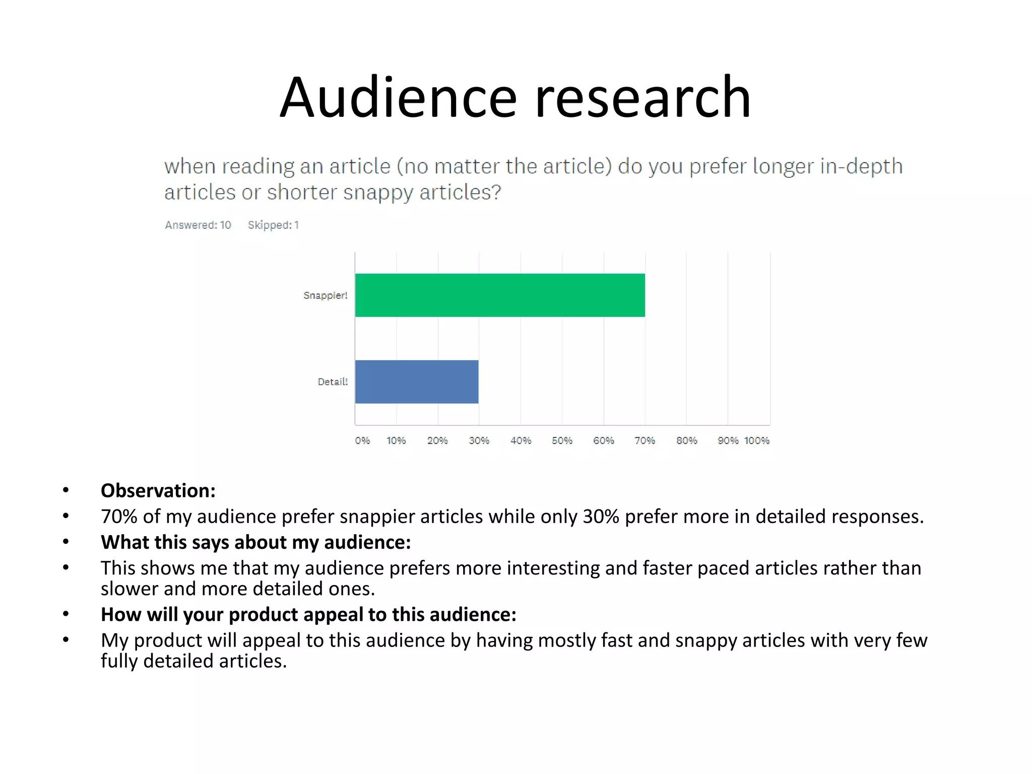
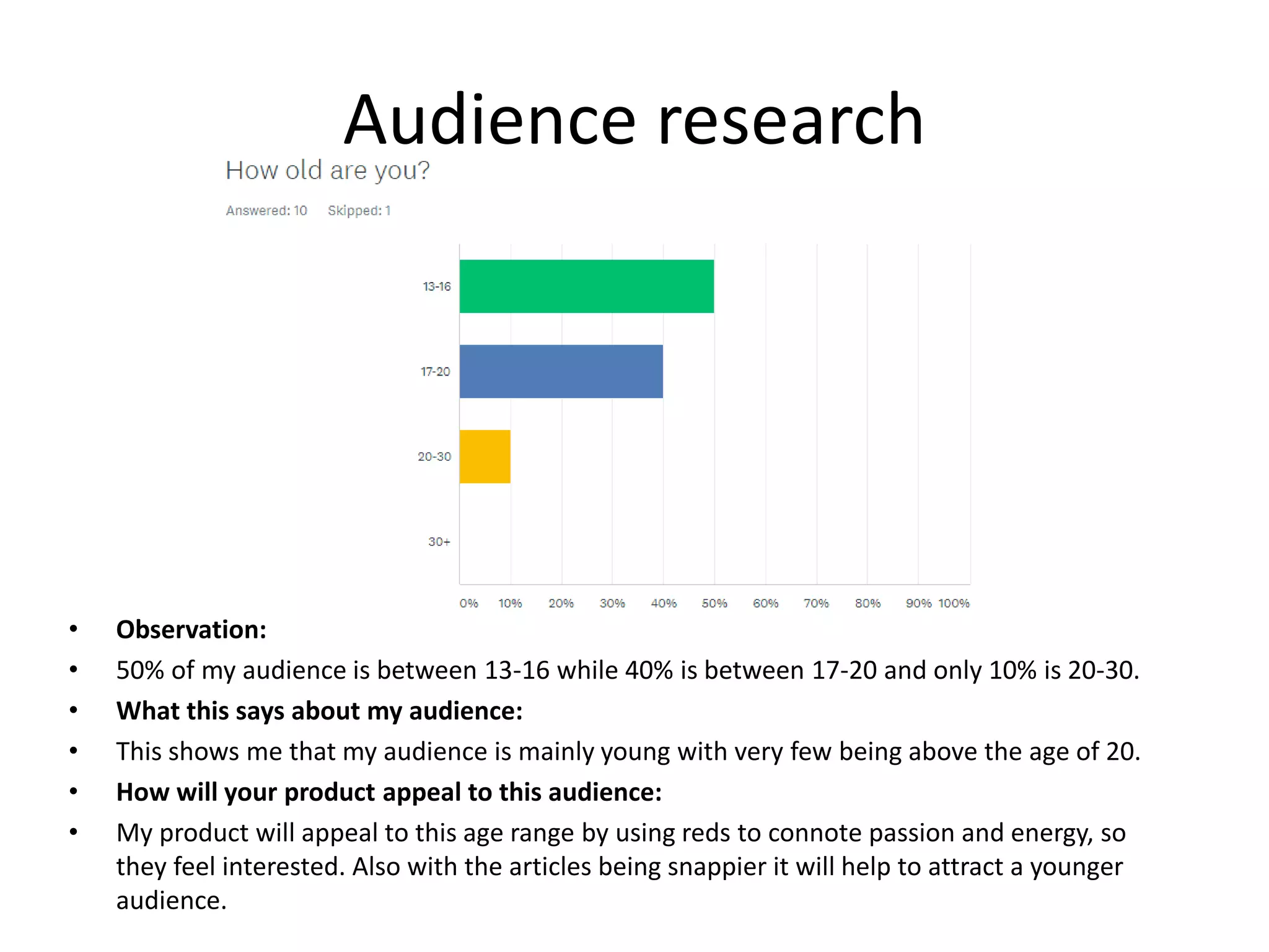
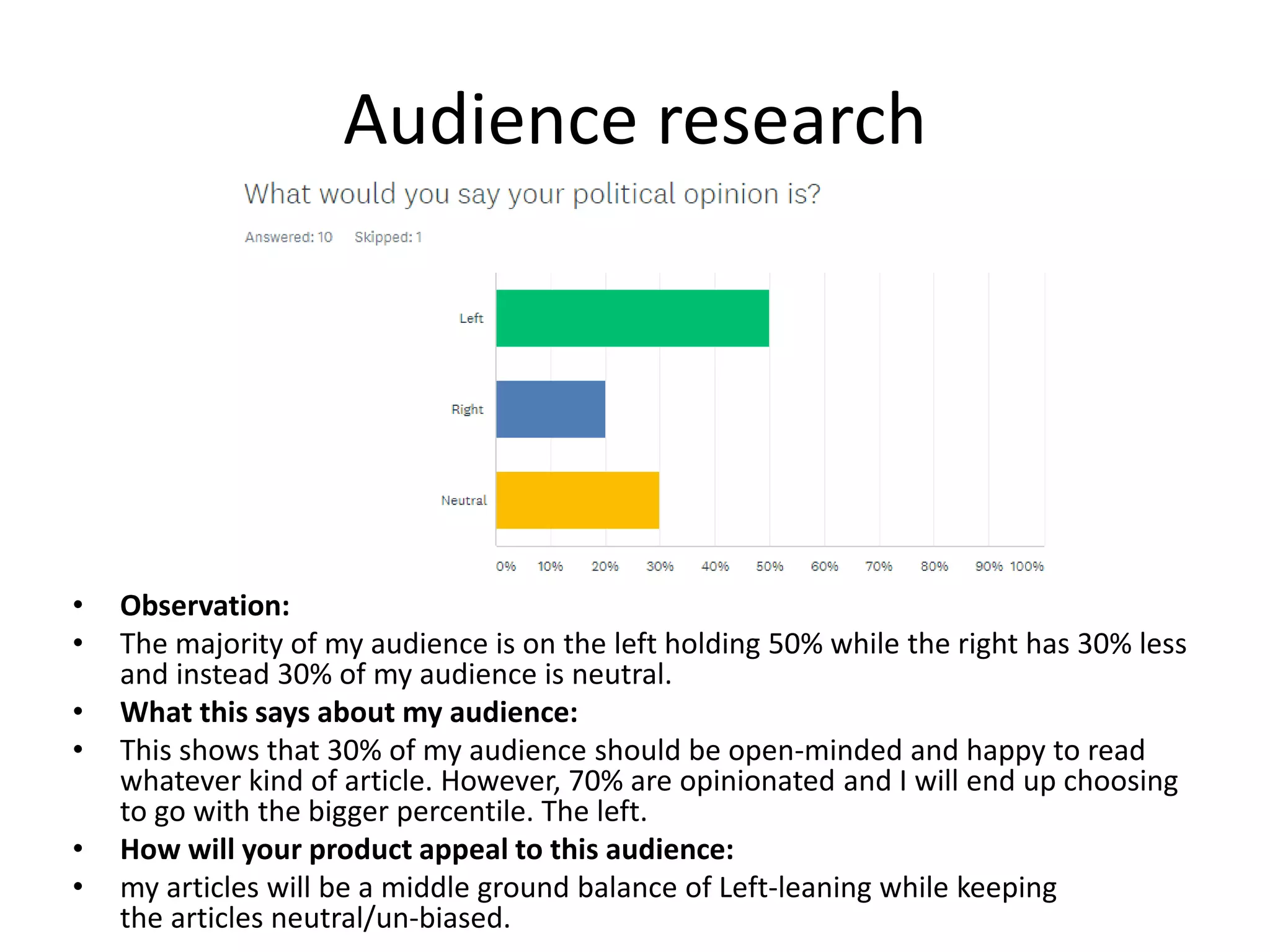
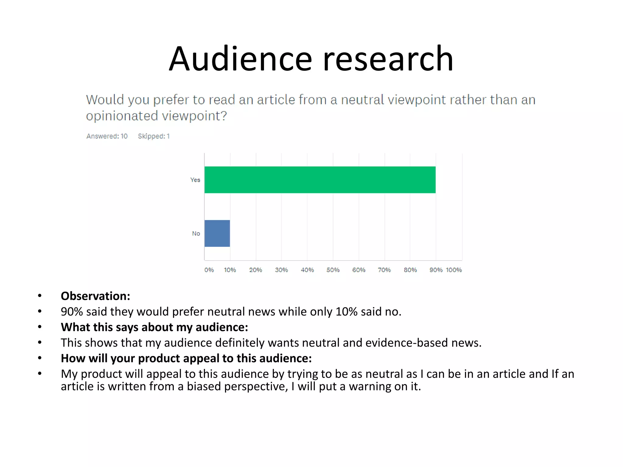
The document summarizes and analyzes several existing news websites. It finds that most websites use images to grab readers' attention, though the 1996 Guardian did not. The Press and YorkMix focus on local audiences but have different aesthetic styles - the Press is somber while YorkMix is positive. DoubleDownNews stands out with its vibrant red color scheme and lack of ads. Overall, the analysis identifies common features around use of images and topic coverage across local and national scales to engage readers.


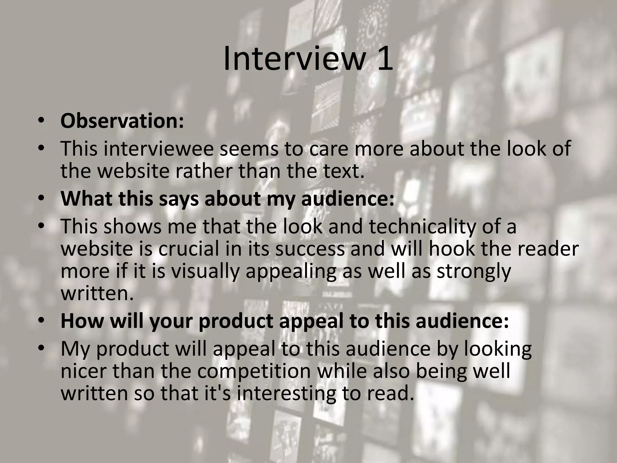


![[BROCHURE] Italy Tour Project | @SlideON](https://cdn.slidesharecdn.com/ss_thumbnails/brochure8-251215152319-2805af68-thumbnail.jpg?width=640&height=640&fit=bounds)


