Downloaded 34 times
![2
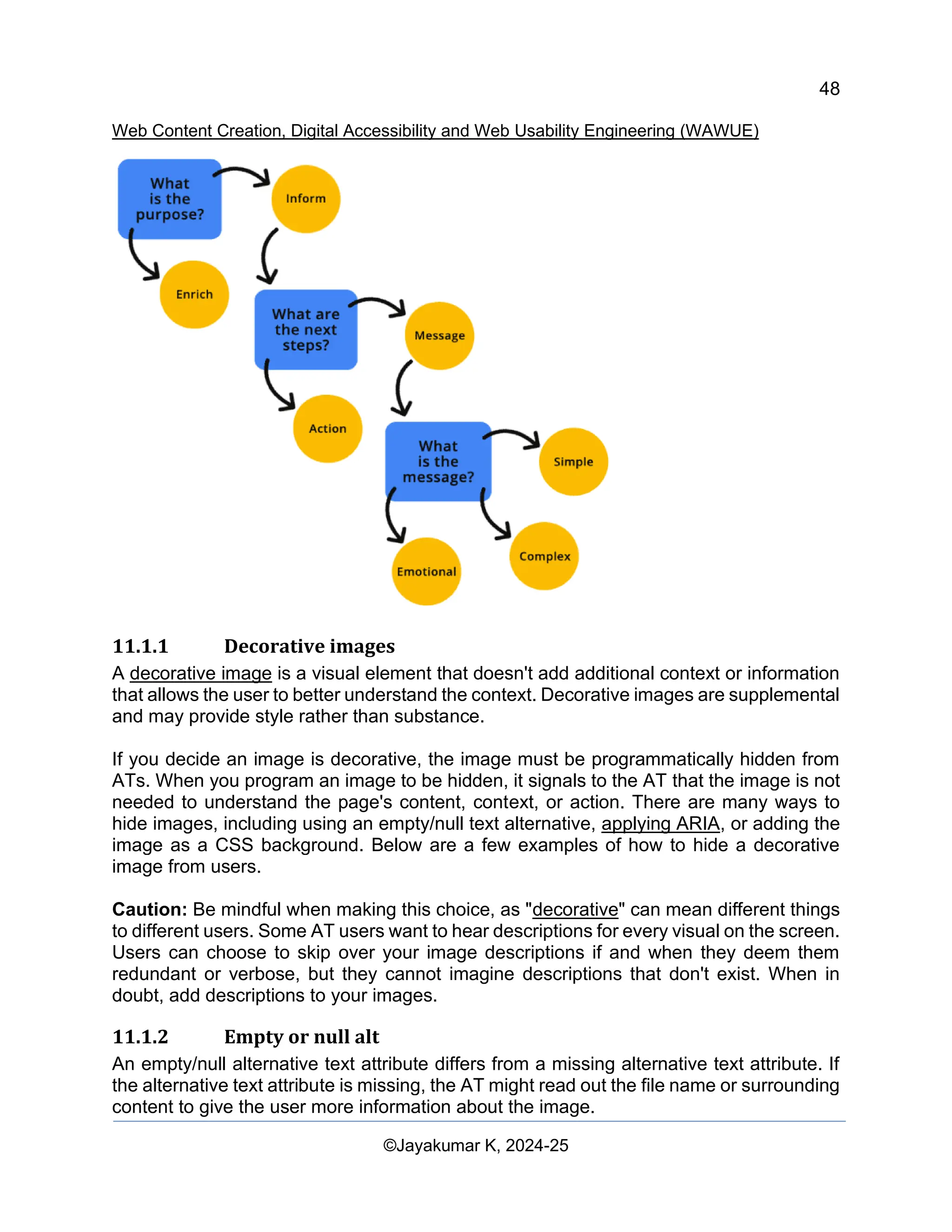
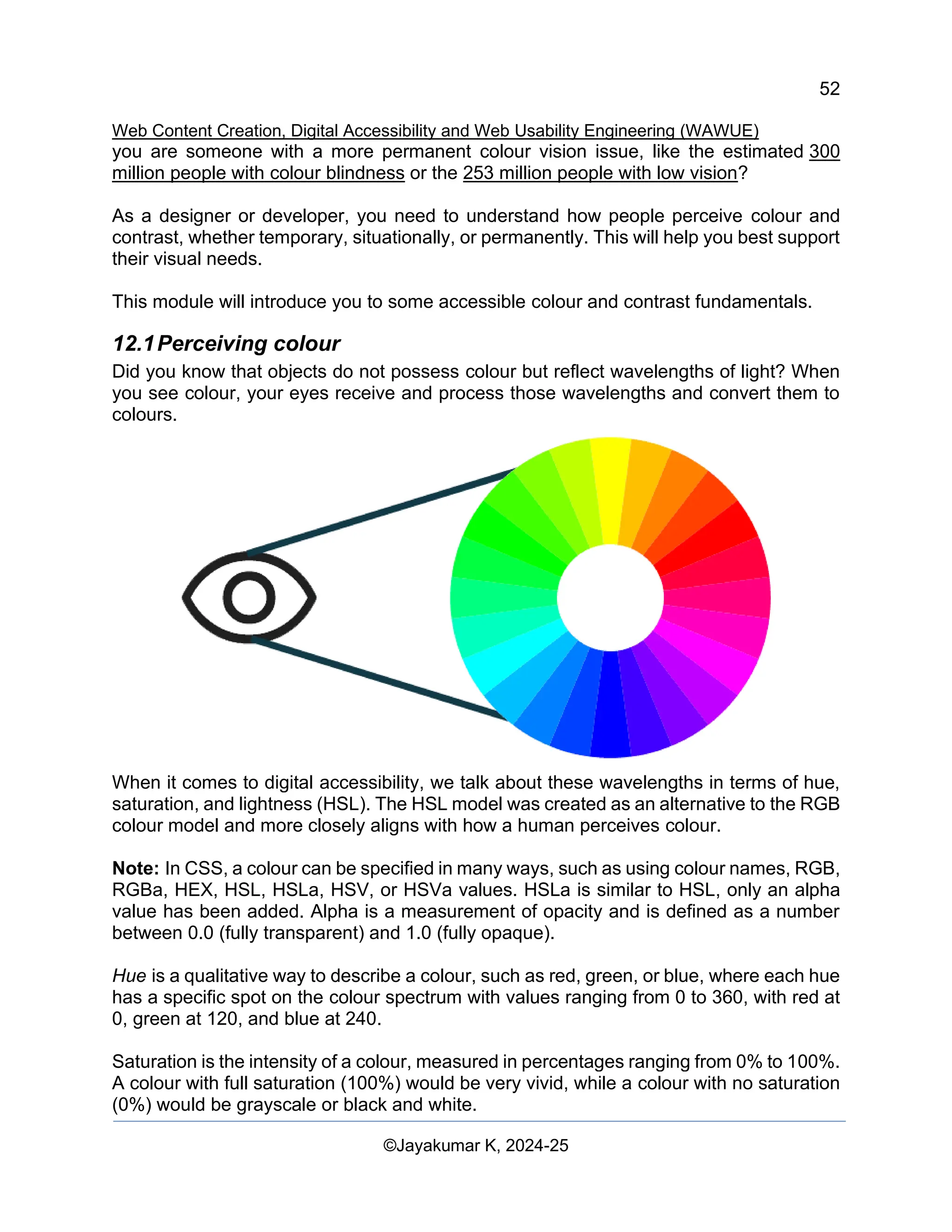
Web Content Creation, Digital Accessibility and Web Usability Engineering (WAWUE)
©Jayakumar K, 2024-25
Contents
1 Content Impact and effects in web and Social Media 6
1.1 Information Leveraging through Rich Information Mode 6
1.1.1 Lexical Analysis 6
1.1.2 Keyword Density 6
1.1.3 Unicode Format 6
1.1.4 80/20 Rule 6
1.1.5 Use of `<html lang="..">` Tag 7
1.1.6 Content Relevancy 7
1.1.7 Keyword Relevancy 7
1.1.8 Image Optimization 7
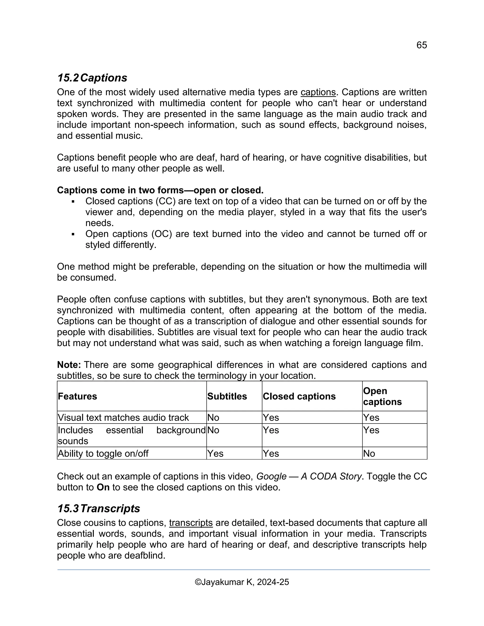
1.1.9 Importance of Alt Tag 7
1.1.10 Text Overlay Rule in Social Media 7
1.1.11 Pixel Settings 7
1.2 Readability Test 8
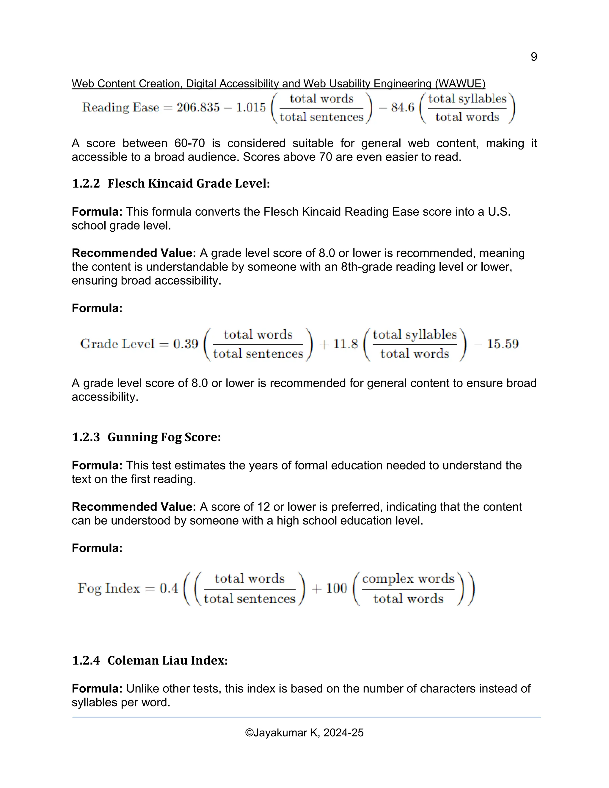
1.2.1 Flesch Kincaid Reading Ease: 8
1.2.2 Flesch Kincaid Grade Level: 9
1.2.3 Gunning Fog Score: 9
1.2.4 Coleman Liau Index: 9
1.2.5 Automated Readability Index (ARI): 10
1.3 How to Apply These in Content Optimization 10
1.3.1 Sentence Length 11
1.3.2 Word Choice 11
1.3.3 Paragraph Structure 11
1.3.4 Use of Headings and Bullet Points 11
1.3.5 Active Voice 11
1.3.6 Read Aloud 11
1.3.7 Ask for Feedback 11
1.3.8 Use Online Tools 12
1.4 Application in Business Content 12
1.5 Benefits for Humans and Bots 12
2 Digital Influence and Online Manipulation Mechanisms 12
2.1 Search Engine Manipulation Effect [SEME] 13
2.2 Canonical Issue 13
2.3 Astroturfing 13
2.4 Streisand Effect 13
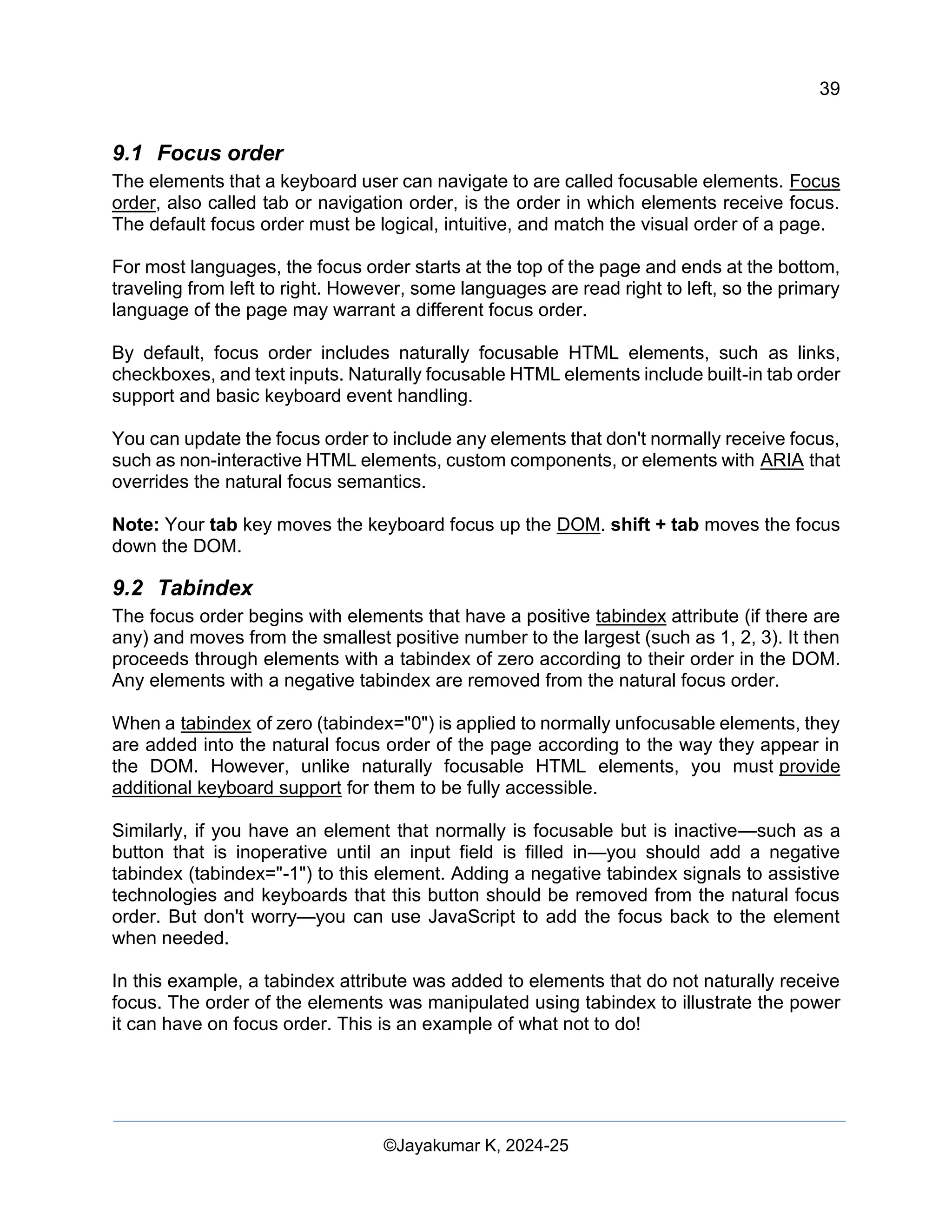
3 Digital Accessibility and Web Usability Engineering 14
3.1 Importance of Digital Accessibility and Web Usability Engineering (DAWUE) 14
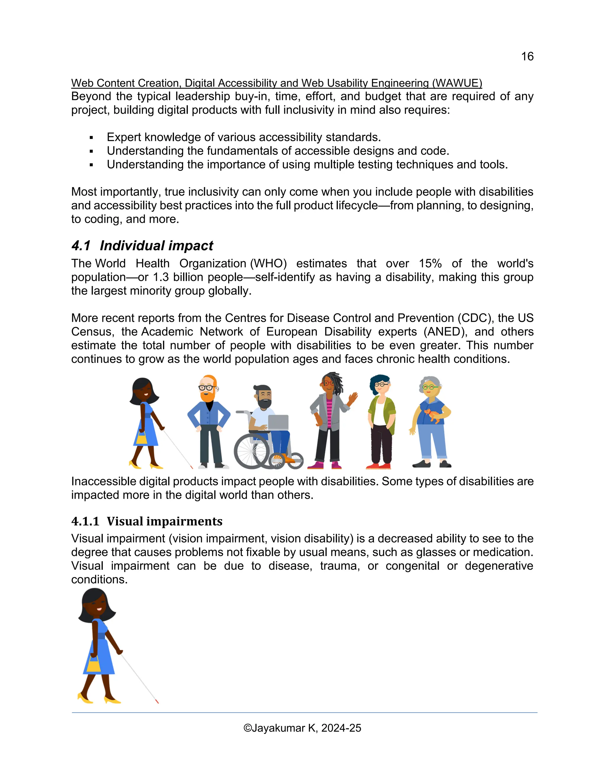
3.1.1 Individual Impact: 14
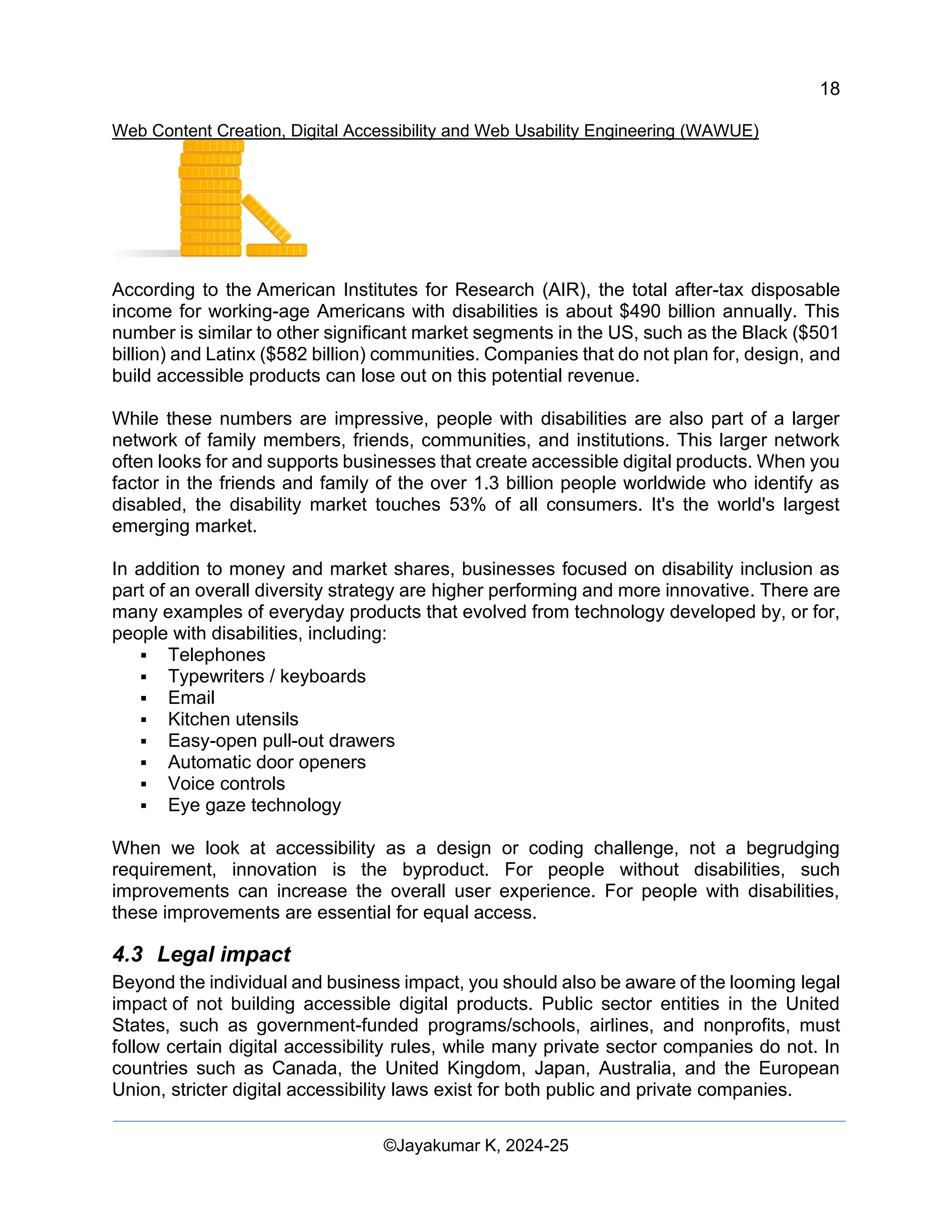
3.1.2 Business Impact: 15
3.1.3 Legal Impact: 15
4 Digital Accessibility in Web User Inerfaces 15
4.1 Individual impact 16
4.1.1 Visual impairments 16
4.2 Business impact 17
4.3 Legal impact 18
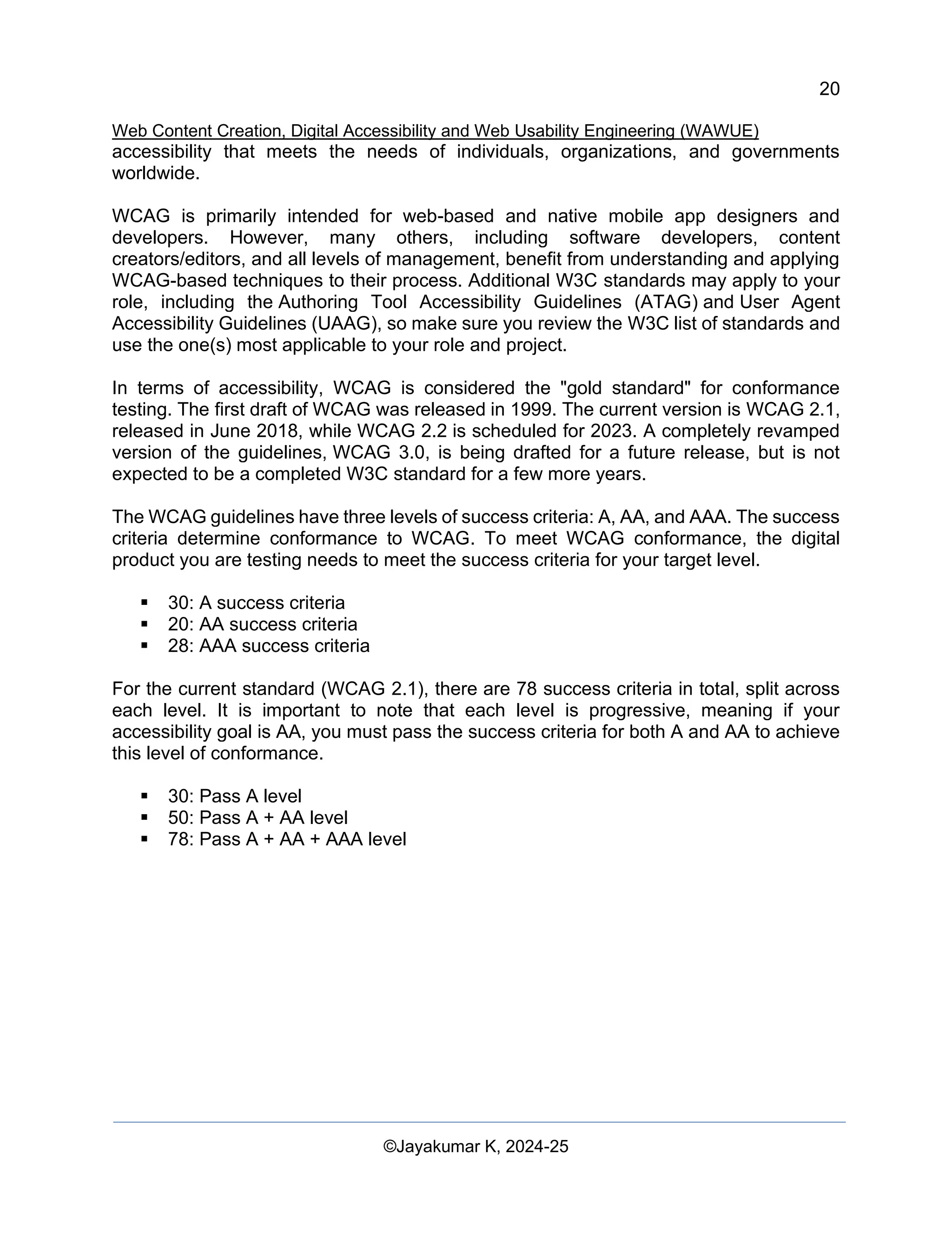
5 Digital accessibility measurement Process 19
5.1 Introduction to accessibility testing 19
5.2 Web Content Accessibility Guidelines (WCAG) 19](https://image.slidesharecdn.com/webcontentcreationdigitalaccessibilityandwebusabilityengineeringwawue-250124144442-73992279/75/Study-Material-Web-Content-Creation-Digital-Accessibility-and-Web-Usability-Engineering-WAWUE-3-2048.jpg)
![13
Web Content Creation, Digital Accessibility and Web Usability Engineering (WAWUE)
©Jayakumar K, 2024-25
perceptions and consumer behaviors. In the modern digital landscape, search engines,
social media, and other online tools play a crucial role in determining the visibility and
credibility of information.
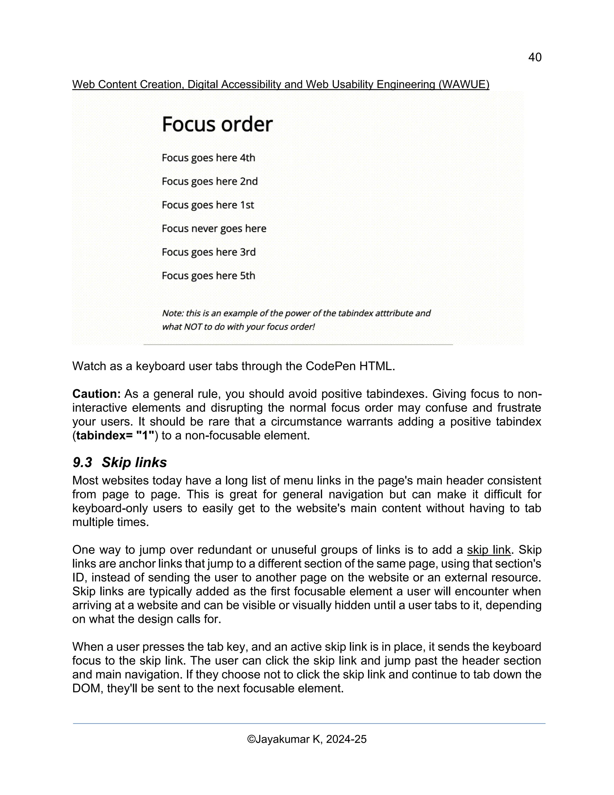
2.1 Search Engine Manipulation Effect [SEME]
The search engine manipulation effect (SEME) refers to the phenomenon where
consumer preferences are influenced by manipulations of search results. In today's digital
age, search engines play a significant role in shaping consumer perceptions and
behaviors. SEME highlights the potential impact of search engine algorithms and ranking
systems on the visibility and popularity of websites, products, and information.
Understanding SEME is crucial for businesses and marketers to navigate the
complexities of search engine optimization (SEO) and ensure ethical and transparent
practices in online visibility strategies.
2.2 Canonical Issue
A canonical issue arises when multiple URLs point to similar or identical content on a
website. This can lead to confusion for search engines, as they may treat each URL as a
separate page, diluting the website's search engine rankings. To address canonical
issues, webmasters can use canonical URLs to inform search engines that certain URLs
are equivalent and should be considered as one. This is achieved through the
implementation of rel-canonical tags, which help consolidate the authority of the preferred
URL and avoid duplicate content penalties.
2.3 Astroturfing
Astroturfing refers to the artificial creation of a grassroots movement or buzz for a product,
service, or political viewpoint. Unlike genuine grassroots movements that arise organically
from the community, astroturfing involves the manipulation of public perception through
orchestrated campaigns and fake endorsements. Astroturfing tactics often involve the use
of fake social media accounts, paid testimonials, and deceptive marketing practices to
create the illusion of widespread support. Recognizing astroturfing is essential for
consumers to make informed decisions and distinguish genuine grassroots movements
from artificially engineered ones.
2.4 Streisand Effect
The Streisand effect is a phenomenon wherein attempts to suppress or censor
information result in its widespread dissemination, often facilitated by the internet. Named
after an incident involving singer Barbara Streisand's attempt to remove photos of her
residence from the internet, the Streisand effect illustrates how efforts to hide information
can backfire, drawing more attention and publicity to the content in question.
Understanding the Streisand effect is essential for individuals and organizations when
considering strategies for managing online reputation and addressing potentially sensitive
information.](https://image.slidesharecdn.com/webcontentcreationdigitalaccessibilityandwebusabilityengineeringwawue-250124144442-73992279/75/Study-Material-Web-Content-Creation-Digital-Accessibility-and-Web-Usability-Engineering-WAWUE-14-2048.jpg)
![33
Web Content Creation, Digital Accessibility and Web Usability Engineering (WAWUE)
©Jayakumar K, 2024-25
<li>Magnifying glass</li>
<li>Stamps</li>
</ol>
</div>
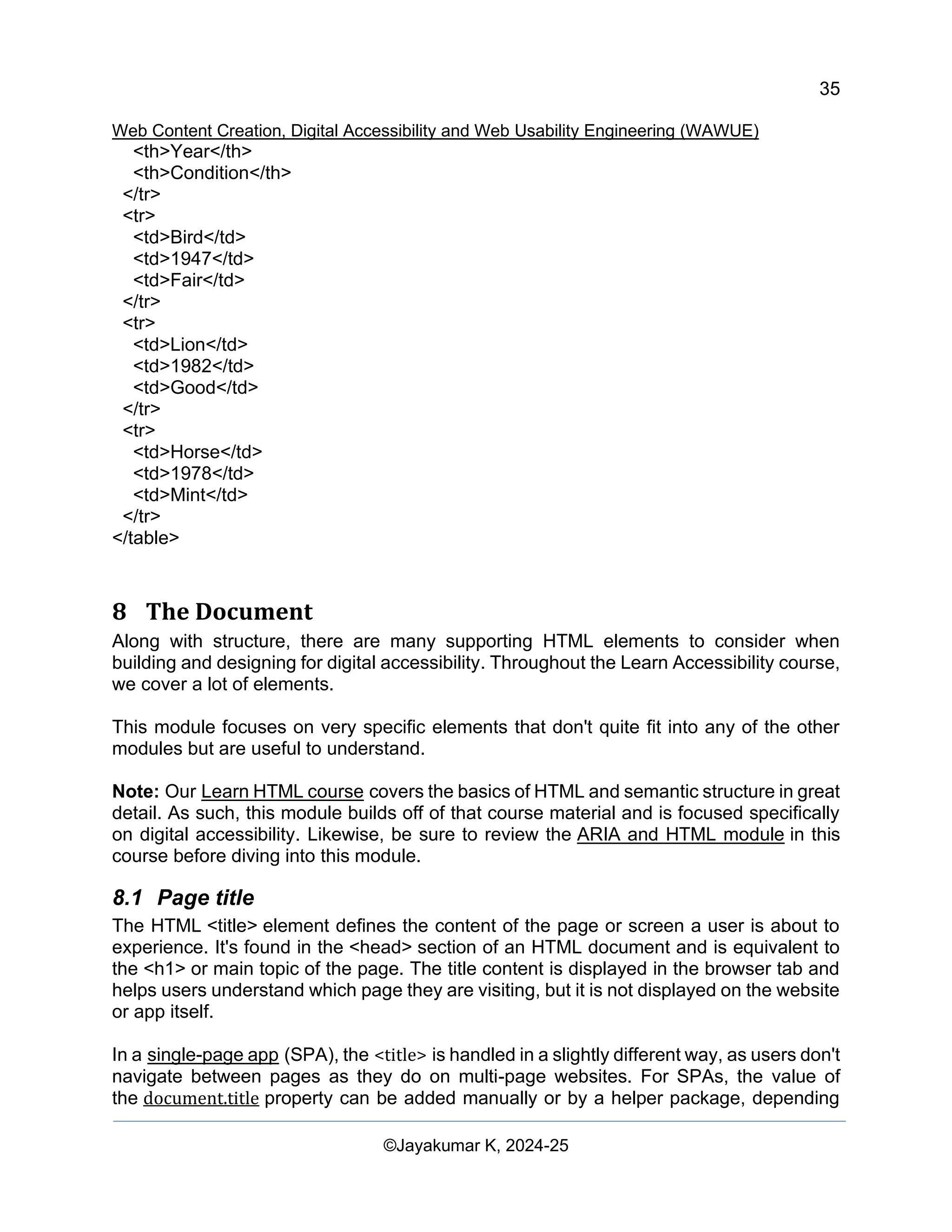
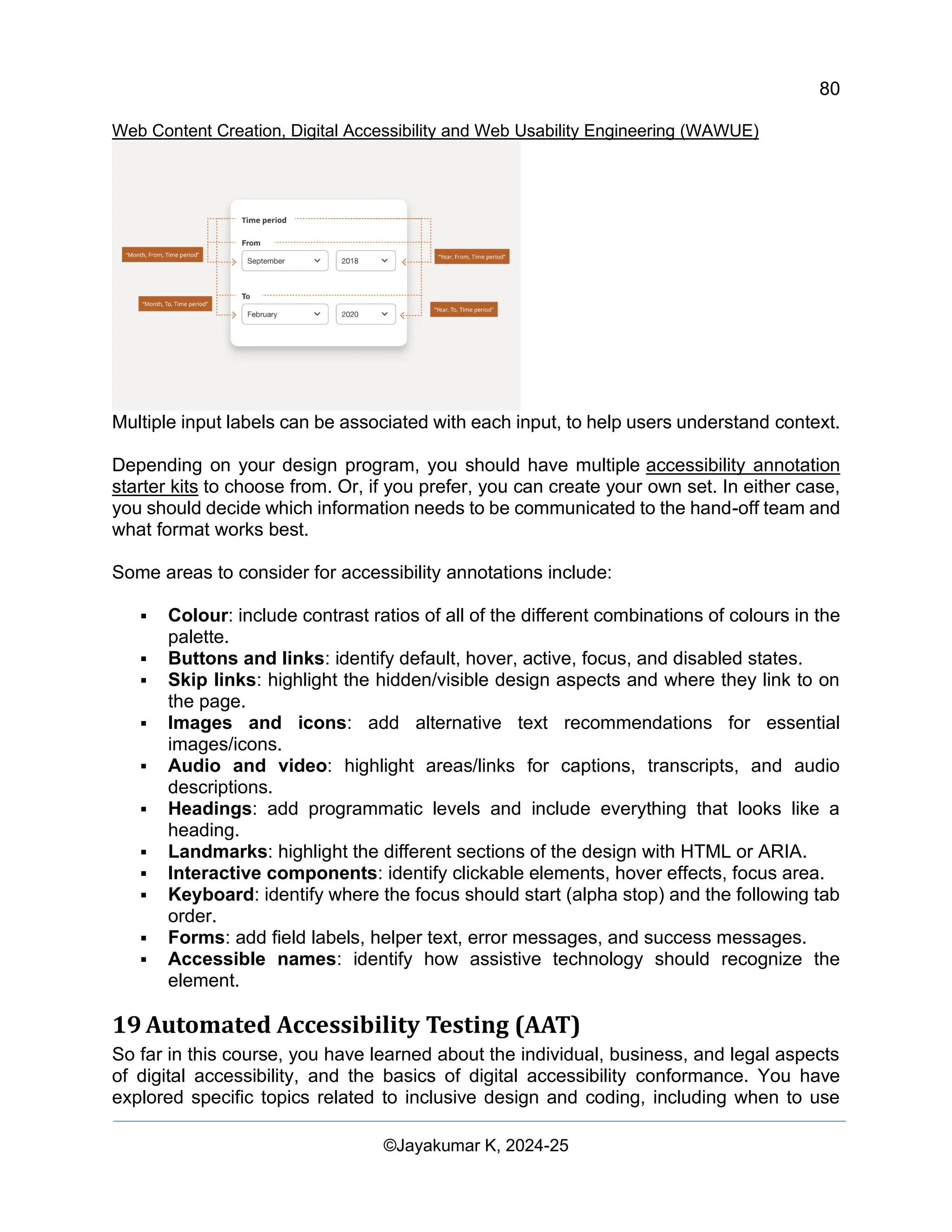
7.4 Tables
In HTML, tables are generally used for organizing data or page layout.
Depending on the table's purpose, you'll use different semantic structural elements.
Tables can be very complex in structure, but when you stick to the basic semantic rules,
they are fairly accessible without much intervention.
7.5 Layout
In the early days of the internet, layout tables were the primary HTML element used to
build visual structures. Today, we use a mix of semantic and non-semantic elements such
as <div>s and landmarks to create layouts.
While the days of creating layout tables are mostly over, there are times when layout
tables are still used, such as in visually rich emails, newsletters, and advertisements. In
these cases, tables used only for layout must not use structural elements that convey
relationships and add context, such as <th> or <caption>.
Layout tables must also be hidden from AT users with the ARIA presentation role or aria-
hidden state.
Don't
<table>
<caption>My stamp collection</caption>
<tr>
<th>[Stamp Image 1]</th>
<th>[Stamp Image 2]</th>
<th>[Stamp Image 3]</th>
</tr>
</table>
Do
<table role="presentation">
<tr>
<td>[Stamp Image 1]</td>
<td>[Stamp Image 2]</td>
<td>[Stamp Image 3]</td>
</tr>
</table>](https://image.slidesharecdn.com/webcontentcreationdigitalaccessibilityandwebusabilityengineeringwawue-250124144442-73992279/75/Study-Material-Web-Content-Creation-Digital-Accessibility-and-Web-Usability-Engineering-WAWUE-34-2048.jpg)
![55
Web Content Creation, Digital Accessibility and Web Usability Engineering (WAWUE)
©Jayakumar K, 2024-25
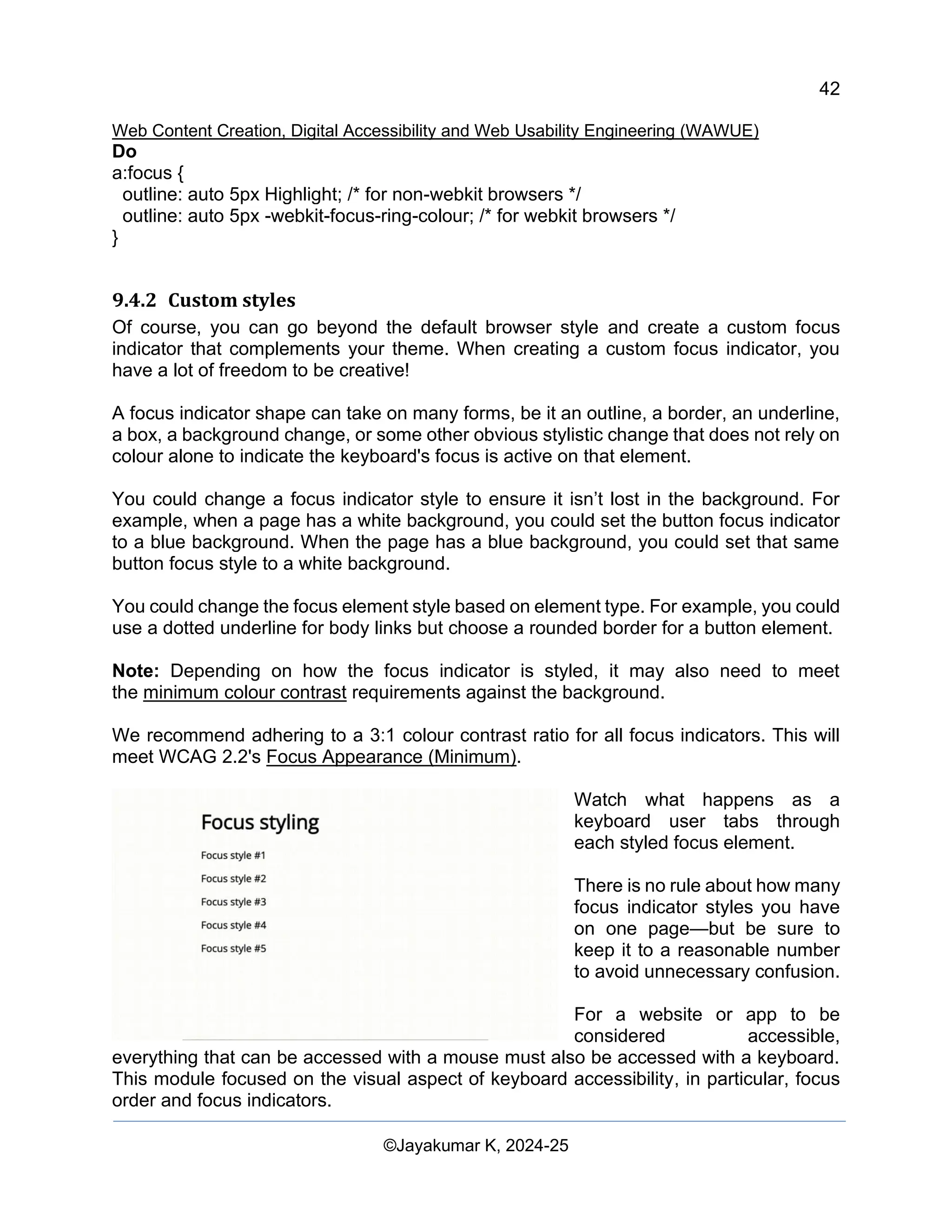
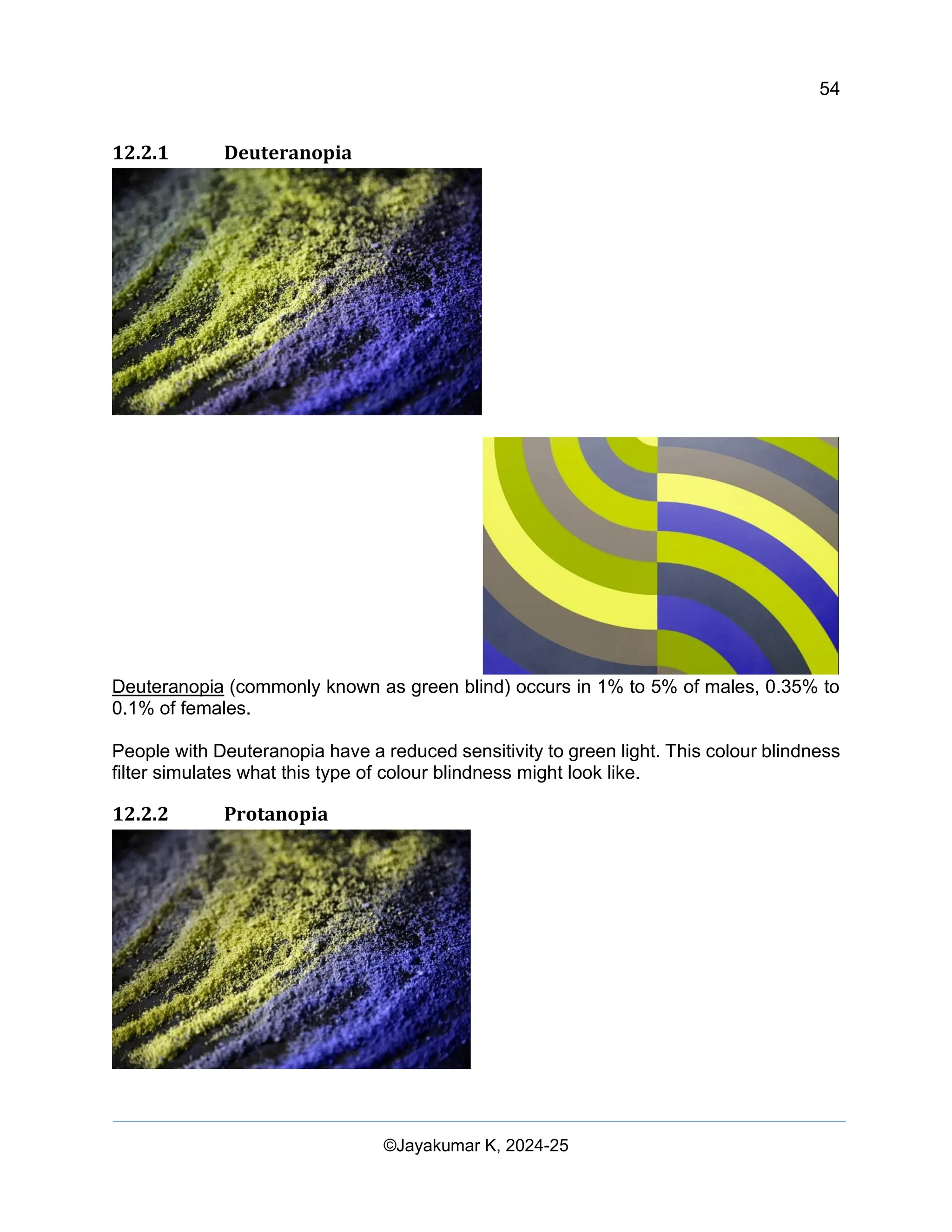
Protanopia (commonly known as red
blind) occurs in 1.01% to 1.08% of males
and 0.02% of 0.03% of females.
People with Protanopia have a reduced
sensitivity to red light. This colour
blindness filter simulates what this type of
colour blindness might look like.
12.2.3 Achromatopsia or Monochromatism
Achromatopsia or Monochromatism (or complete colour blindness) occurs very, very
rarely.
People with Achromatopsia or Monochromatism have almost no perception of red, green,
or blue light. This colour blindness filter simulates what this type of colour blindness might
look like.
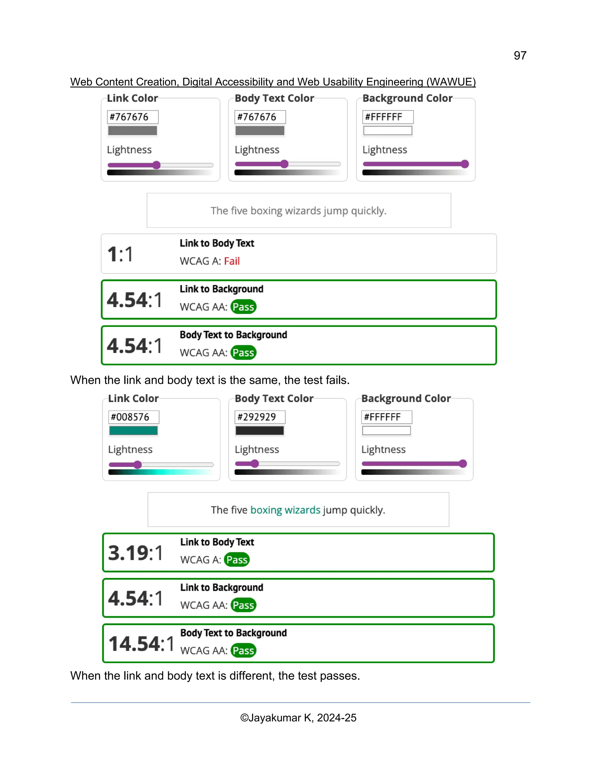
12.2.4 Calculate colour contrast
The colour contrast formula uses the relative luminance of colours to help determine
contrast, which can range from 1 to 21. This formula is often shortened to [colour value]:1.
For example, pure black against pure white has the largest colour contrast ratio at 21:1.
(L1 + 0.05) / (L2 + 0.05) L1 is the relative luminance of the lighter colour, L2 is the
relative luminance of the darker colours
Regular-sized text, including images of text, must have a colour contrast ratio of 4.5:1 to
pass the minimum WCAG requirements for colour. Large-sized text and essential icons
must have a colour contrast ratio of 3:1. Large-sized text is characterized by being at least
18pt / 24px or 14pt / 18.5px bolded. Logos and decorative elements are exempt from
these colour contrast requirements.](https://image.slidesharecdn.com/webcontentcreationdigitalaccessibilityandwebusabilityengineeringwawue-250124144442-73992279/75/Study-Material-Web-Content-Creation-Digital-Accessibility-and-Web-Usability-Engineering-WAWUE-56-2048.jpg)
![85
Web Content Creation, Digital Accessibility and Web Usability Engineering (WAWUE)
©Jayakumar K, 2024-25
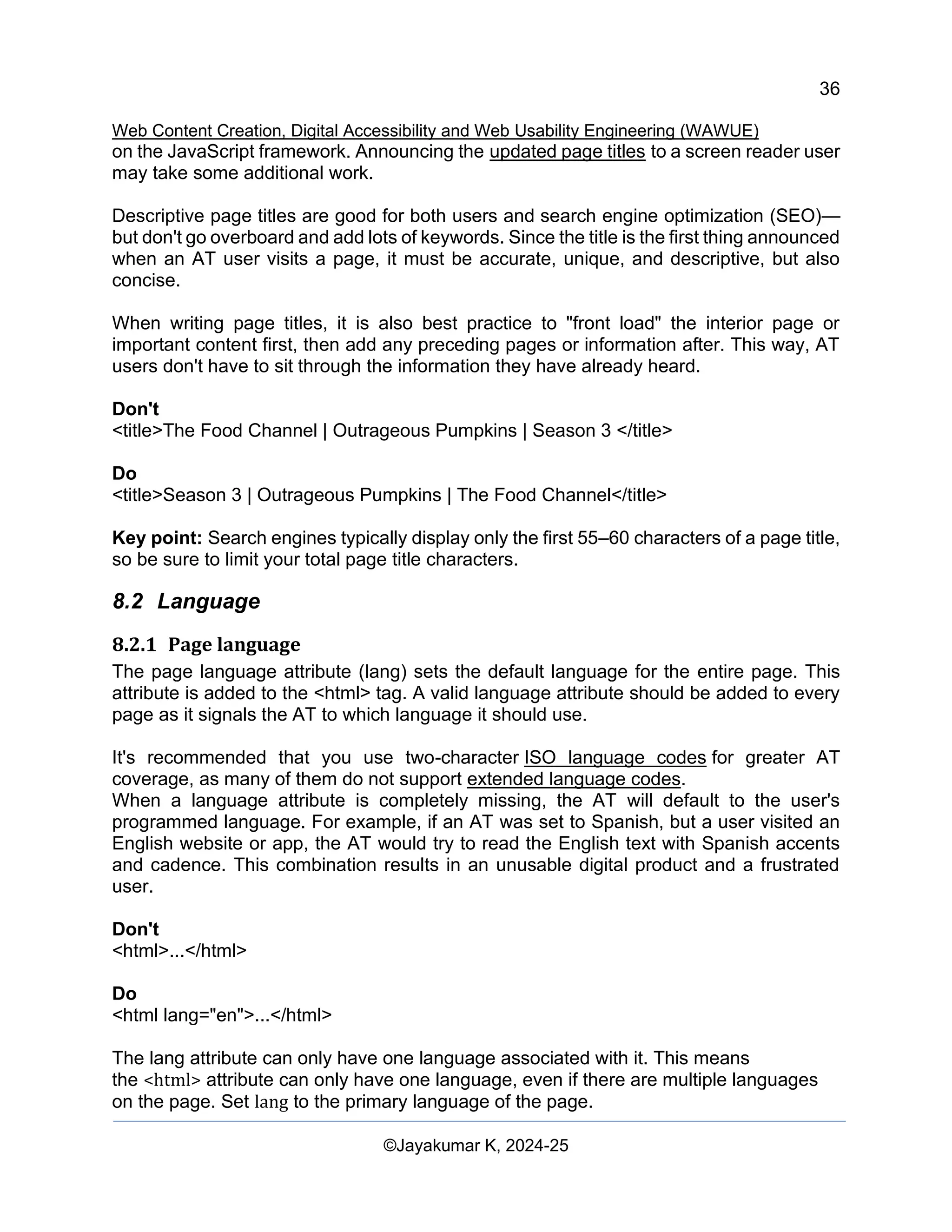
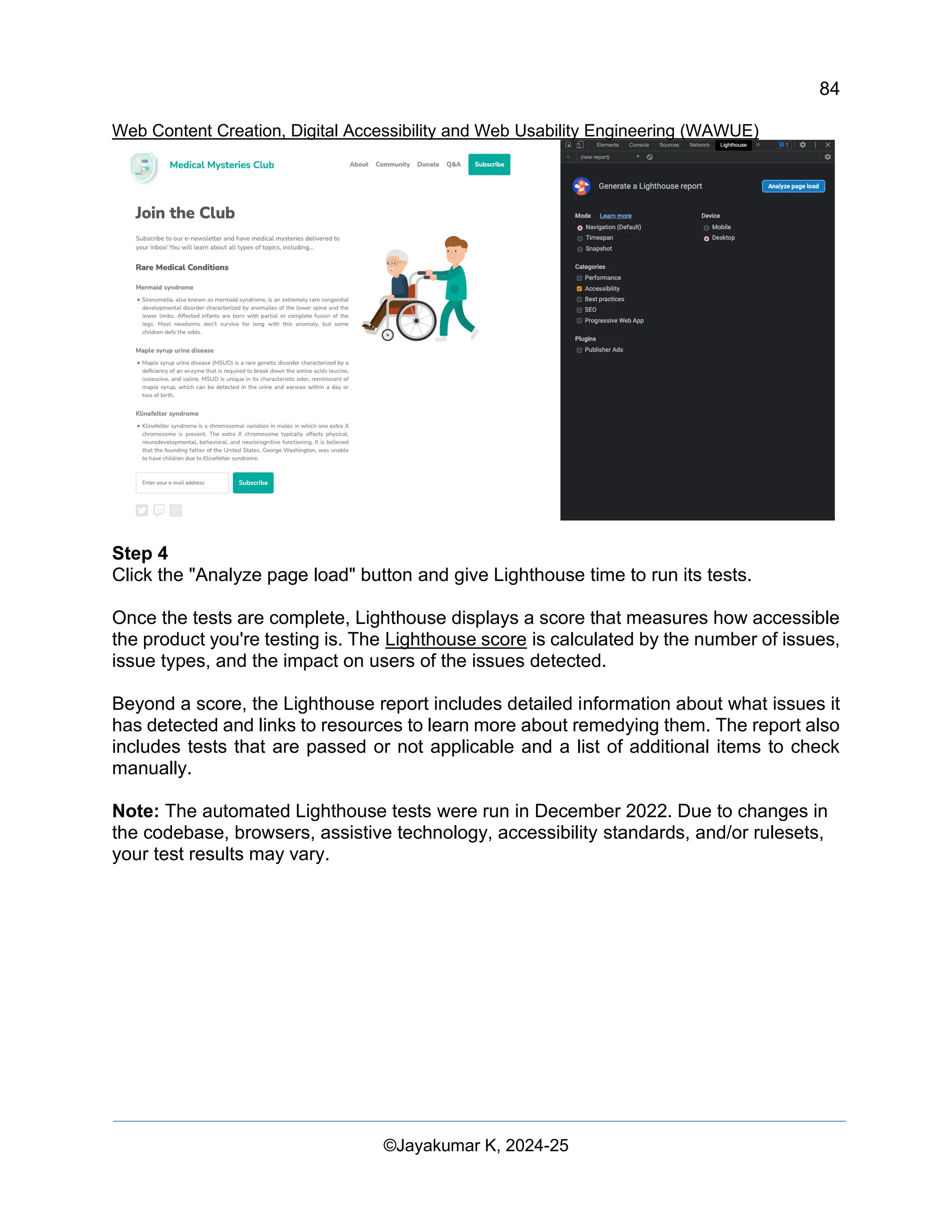
Step 5
Now, let's go through an example of each automated accessibility issue discovered and
fix the relevant styles and markup.
▪ Issue 1: ARIA roles
The first issue states: "Elements with an ARIA [role] that require children to contain a
specific [role] are missing some or all of those required children. Some ARIA parent roles
must contain specific child roles to perform their intended accessibility functions." Learn
more about ARIA role rules (https://dequeuniversity.com/rules/axe/4.4/aria-required-
children)
In our demo, the newsletter subscribe button fails:
<button role="list" type="submit" tabindex="1">Subscribe</button>
Let's fix it.
The "subscribe" button next to the input field has an incorrect ARIA role applied to it. In
this case, the role can be removed completely.
<button type="submit" tabindex="1">Subscribe</button>
Issue 2: ARIA hidden
"[aria-hidden="true"] elements contain focusable descendants. Focusable descendants
within an [aria-hidden="true"] element prevent those interactive elements from being
available to users of assistive technologies like screen readers. Learn more about aria-
hidden rules.
<input type="email" placeholder="Enter your e-mail address" aria-hidden="true"
tabindex="-1" required>](https://image.slidesharecdn.com/webcontentcreationdigitalaccessibilityandwebusabilityengineeringwawue-250124144442-73992279/75/Study-Material-Web-Content-Creation-Digital-Accessibility-and-Web-Usability-Engineering-WAWUE-86-2048.jpg)
![86
Web Content Creation, Digital Accessibility and Web Usability Engineering (WAWUE)
©Jayakumar K, 2024-25
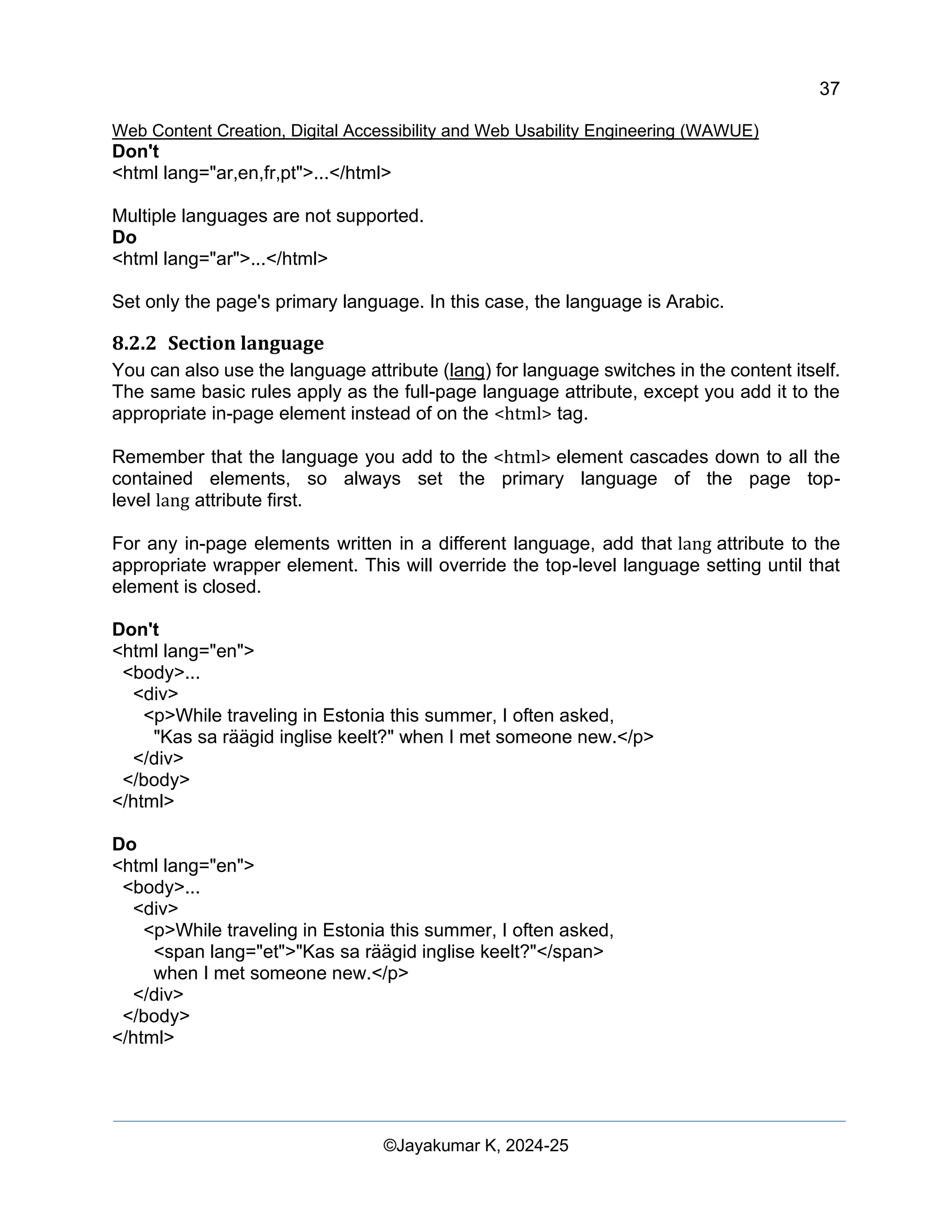
Let's fix it.
The input field had an aria-hidden="true" attribute applied to it. Adding this attribute hides
the element (and everything nested under it) from assistive tech.
<input type="email" placeholder="Enter your e-mail address" tabindex="-1" required>
In this case, you should remove this attribute from the input to allow people using assistive
technology to access and enter information into the form field.
Issue 3: Button name
Buttons do not have an accessible name. When a button doesn't have an accessible
name, screen readers announce it as "button," making it unusable for users who rely on
screen readers. Learn more about button name rules. (
https://dequeuniversity.com/rules/axe/4.4/button-name)
<button role="list" type="submit" tabindex="1">Subscribe</button>
Let's fix it.
When you remove the inaccurate ARIA role from the button element in issue 1, the word
"Subscribe" becomes the accessible button name. This functionality is built into the
semantic HTML button element. There are additional pattern options to consider for more
complex situations.
<button type="submit" tabindex="1">Subscribe</button>
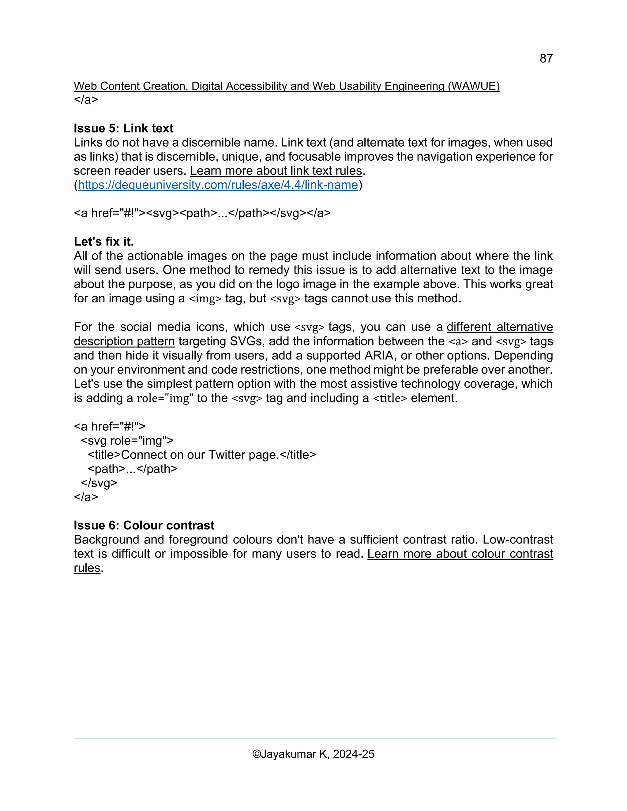
Issue 4: Image alt attributes
Image elements are missing [alt] attributes. Informative elements should aim for short,
descriptive alternate text. Decorative elements can be ignored with an empty alt
attribute. Learn more about image alternative text rules.
(https://dequeuniversity.com/rules/axe/4.4/image-alt)
<a href="index.html">
<img src="https://upload.wikimedia.org/wikipedia/commons/….png">
</a>
Let's fix it.
Since the logo image is also a link, you know from the image module that it is called an
actionable image and requires alternative text information about the purpose of the image.
Normally, the first image on the page is a logo, so you can reasonably assume your AT
users will know this, and you may decide not to add this additional contextual information
to your image description.
<a href="index.html">
<img src="https://upload.wikimedia.org/wikipedia/commons/….png"
alt="Go to the home page.">](https://image.slidesharecdn.com/webcontentcreationdigitalaccessibilityandwebusabilityengineeringwawue-250124144442-73992279/75/Study-Material-Web-Content-Creation-Digital-Accessibility-and-Web-Usability-Engineering-WAWUE-87-2048.jpg)
![90
Web Content Creation, Digital Accessibility and Web Usability Engineering (WAWUE)
©Jayakumar K, 2024-25
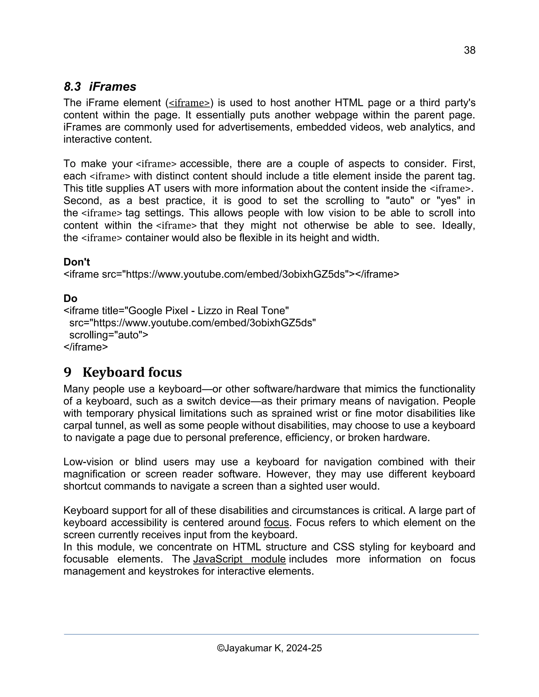
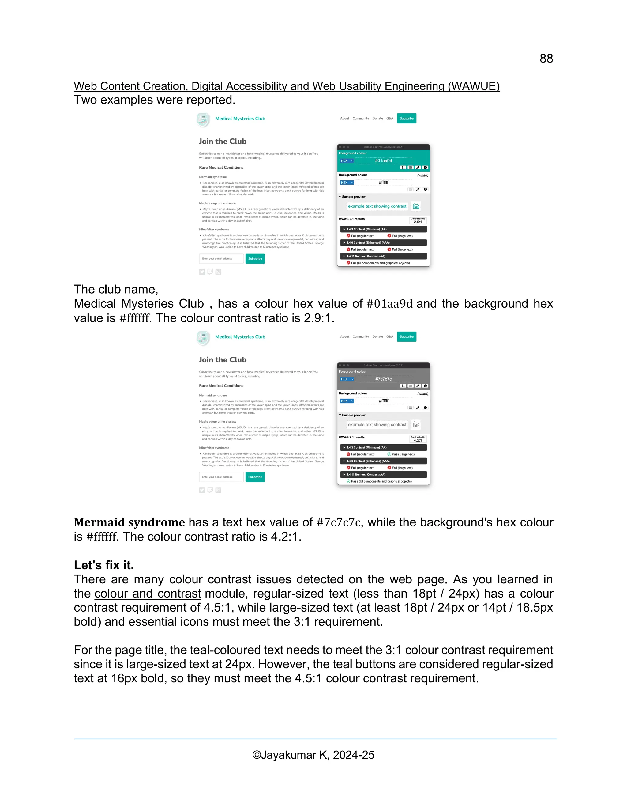
Mermaid syndrome now has a colour value of #767676 and the background
remains #ffffff. The colour contrast ratio is 4.5:1.
Issue 7: list structure
List items (<li>) are not contained within <ul> or <ol> parent elements. Screen readers
require list items (<li>) to be contained within a parent <ul> or <ol> to be announced
properly. Learn more about list rules.
<div class="ul">
<li><a href="#">About</a></li>
<li><a href="#">Community</a></li>
<li><a href="#">Donate</a></li>
<li><a href="#">Q&A</a></li>
<li><a href="#">Subscribe</a></li>
</div>
Let's fix it.
We used a CSS class in this demo to simulate the unordered list instead of using
a <ul> tag. When we wrote this code improperly, we removed the inherent semantic
HTML features built into this tag. By replacing the class with a real <ul> tag and modifying
the related CSS, we resolve this accessibility issue.
<ul>
<li><a href="#">About</a></li>
<li><a href="#">Community</a></li>
<li><a href="#">Donate</a></li>
<li><a href="#">Q&A</a></li>
<li><a href="#">Subscribe</a></li>
</ul>
Issue #8 - tabindex
Some elements have a [tabindex] value greater than 0. A value greater than 0 implies an
explicit navigation ordering. Although technically valid, this often creates frustrating
experiences for users who rely on assistive technologies. Learn more about tabindex
rules. (https://dequeuniversity.com/rules/axe/4.4/tabindex)
<button type="submit" tabindex="1">Subscribe</button>
Let's fix it.
Unless there is a specific reason to disrupt the natural tabbing order on a web page, there
is no need to have a positive integer on a tabindex attribute. To keep the natural tabbing
order, we can either change the tabindex to 0 or remove the attribute altogether.
<button type="submit">Subscribe</button>
Step 6](https://image.slidesharecdn.com/webcontentcreationdigitalaccessibilityandwebusabilityengineeringwawue-250124144442-73992279/75/Study-Material-Web-Content-Creation-Digital-Accessibility-and-Web-Usability-Engineering-WAWUE-91-2048.jpg)

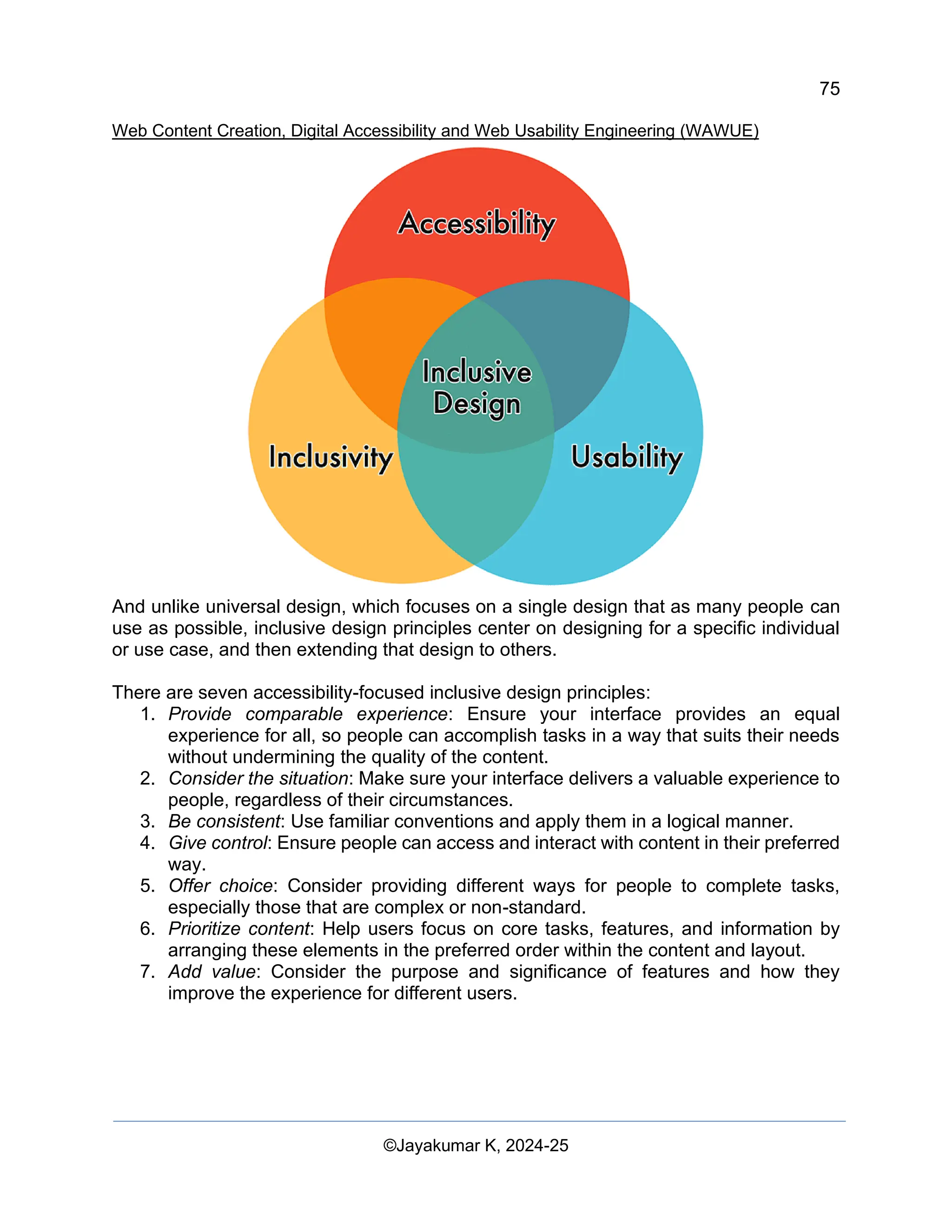
The document titled 'Web Content Creation, Digital Accessibility and Web Usability Engineering (WAWUE)' by Jayakumar K provides a comprehensive overview of content creation strategies, digital accessibility principles, and web usability practices for enhanced online engagement. It covers various topics including content optimization, readability testing, the importance of ARIA in HTML, and best practices for ensuring accessibility in web design. The material is intended for educational purposes and emphasizes the significance of digital content in influencing user behavior and improving search engine visibility.


