Download free for 30 days
Sign in
Upload
Language (EN)
Support
Business
Mobile
Social Media
Marketing
Technology
Art & Photos
Career
Design
Education
Presentations & Public Speaking
Government & Nonprofit
Healthcare
Internet
Law
Leadership & Management
Automotive
Engineering
Software
Recruiting & HR
Retail
Sales
Services
Science
Small Business & Entrepreneurship
Food
Environment
Economy & Finance
Data & Analytics
Investor Relations
Sports
Spiritual
News & Politics
Travel
Self Improvement
Real Estate
Entertainment & Humor
Health & Medicine
Devices & Hardware
Lifestyle
Change Language
Language
English
Español
Português
Français
Deutsche
Cancel
Save
EN
Uploaded by
Atsushi Tadokoro
1,999 views
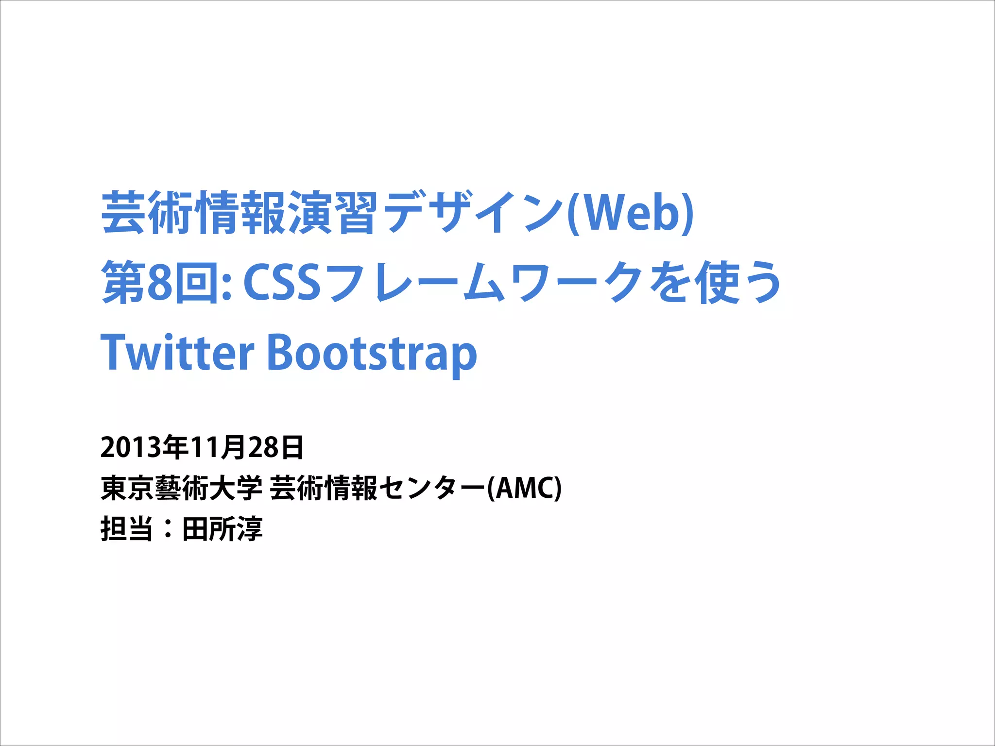
芸術情報演習デザイン(Web) 第8回: CSSフレームワークを使う
Technology
◦
Read more
4
Save
Share
Embed
Embed presentation
Download
Downloaded 13 times
1
/ 34
2
/ 34
3
/ 34
4
/ 34
5
/ 34
6
/ 34
7
/ 34
8
/ 34
9
/ 34
10
/ 34
11
/ 34
12
/ 34
13
/ 34
14
/ 34
15
/ 34
16
/ 34
17
/ 34
18
/ 34
19
/ 34
20
/ 34
21
/ 34
22
/ 34
23
/ 34
24
/ 34
25
/ 34
26
/ 34
27
/ 34
28
/ 34
29
/ 34
30
/ 34
31
/ 34
32
/ 34
33
/ 34
34
/ 34
More Related Content
PDF
情報編集(Web) 第8回: CSSフレームワークを使う Twitter Bootstrap
by
Atsushi Tadokoro
PDF
芸術情報演習デザイン(Web) 第9回: CSSフレームワークを使う - 2 Twitter Bootstrapのカスタマイズ
by
Atsushi Tadokoro
PDF
情報編集(Web) 第9回: CSSフレームワークを使う - 2 Twitter Bootstrapのカスタマイズ
by
Atsushi Tadokoro
PDF
使いやすいWordPressのためのCSSのつくりかた
by
Hiroshi Urabe
PDF
WordPress を使いこなそう
by
Wataru OKAMOTO
PDF
最近、実務に導入してみたフロントエンドの技術8つの良かった点と反省点
by
Horiguchi Seito
PDF
今日から使える! HTML/CSS/JSの シンプルテクニック15選
by
Horiguchi Seito
PDF
WordPress初心者のためのサイト運営虎の巻
by
Hidekazu Ishikawa
情報編集(Web) 第8回: CSSフレームワークを使う Twitter Bootstrap
by
Atsushi Tadokoro
芸術情報演習デザイン(Web) 第9回: CSSフレームワークを使う - 2 Twitter Bootstrapのカスタマイズ
by
Atsushi Tadokoro
情報編集(Web) 第9回: CSSフレームワークを使う - 2 Twitter Bootstrapのカスタマイズ
by
Atsushi Tadokoro
使いやすいWordPressのためのCSSのつくりかた
by
Hiroshi Urabe
WordPress を使いこなそう
by
Wataru OKAMOTO
最近、実務に導入してみたフロントエンドの技術8つの良かった点と反省点
by
Horiguchi Seito
今日から使える! HTML/CSS/JSの シンプルテクニック15選
by
Horiguchi Seito
WordPress初心者のためのサイト運営虎の巻
by
Hidekazu Ishikawa
What's hot
PDF
ブラウザにやさしいHTML/CSS
by
Takeharu Igari
PDF
今必要なCSSアーキテクチャ
by
Mayu Kimura
PPTX
Vue.js 2.0を試してみた
by
Toshiro Shimizu
PPTX
現場で使える効果的なHTML&CSS構造設計(Effective HTML&CSS)
by
Shin Takeuchi
PDF
Css Architecture for the future 未来を見据えるCSS設計
by
Horiguchi Seito
PDF
CSSフレームワークを使った 簡単なレスポンシブデザインの作成
by
Kazuki Akiyama
PDF
CSS の歩き方
by
Seiichiro Mishiba
PDF
超初心者のためのWordPressのサイトのデザインの微調整方法
by
Hidekazu Ishikawa
PDF
悩まないコーディングをしよう! OOCSS,SMACSSを用いた、読みやすくてメンテナブルなCSS設計(Sass対応)
by
Horiguchi Seito
PDF
閉じタグを超えた先に僕が見た景色とは
by
Muyuu Fujita
PDF
大規模サイトにおける本当は怖いCSSの話
by
井上 誠
PDF
シークレット・オブ・CSSシークレット改訂版
by
Japan Electronic Publishing Association
PDF
設計から実装まで、今すぐ始める高速化
by
masaaki komori
PDF
⑯jQueryをおぼえよう!その2
by
Nishida Kansuke
PDF
小規模案件で作られた秘伝のタレ
by
Muyuu Fujita
ODP
HTML5 開発環境の紹介
by
tomo_masakura
PDF
タスクランナー導入 〜とあるWordPress制作環境〜
by
Masaya Kogawa
PDF
Learning jQuery
by
taiju higashi
PPTX
Oocssとかついでにsmacssとbemの話も
by
Yumi uniq Ishizaki
PDF
WordPressでCSSプリプロセッサ入門
by
Sou Lab
ブラウザにやさしいHTML/CSS
by
Takeharu Igari
今必要なCSSアーキテクチャ
by
Mayu Kimura
Vue.js 2.0を試してみた
by
Toshiro Shimizu
現場で使える効果的なHTML&CSS構造設計(Effective HTML&CSS)
by
Shin Takeuchi
Css Architecture for the future 未来を見据えるCSS設計
by
Horiguchi Seito
CSSフレームワークを使った 簡単なレスポンシブデザインの作成
by
Kazuki Akiyama
CSS の歩き方
by
Seiichiro Mishiba
超初心者のためのWordPressのサイトのデザインの微調整方法
by
Hidekazu Ishikawa
悩まないコーディングをしよう! OOCSS,SMACSSを用いた、読みやすくてメンテナブルなCSS設計(Sass対応)
by
Horiguchi Seito
閉じタグを超えた先に僕が見た景色とは
by
Muyuu Fujita
大規模サイトにおける本当は怖いCSSの話
by
井上 誠
シークレット・オブ・CSSシークレット改訂版
by
Japan Electronic Publishing Association
設計から実装まで、今すぐ始める高速化
by
masaaki komori
⑯jQueryをおぼえよう!その2
by
Nishida Kansuke
小規模案件で作られた秘伝のタレ
by
Muyuu Fujita
HTML5 開発環境の紹介
by
tomo_masakura
タスクランナー導入 〜とあるWordPress制作環境〜
by
Masaya Kogawa
Learning jQuery
by
taiju higashi
Oocssとかついでにsmacssとbemの話も
by
Yumi uniq Ishizaki
WordPressでCSSプリプロセッサ入門
by
Sou Lab
Similar to 芸術情報演習デザイン(Web) 第8回: CSSフレームワークを使う
PDF
芸術情報演習デザイン(Web) 第8回: CSSフレームワークを使う Twitter Bootstrap
by
Atsushi Tadokoro
PPTX
20161125 尾崎 bootstrap
by
Tsuyoshi Saito
KEY
続・Twitter bootstrap入門 #html5j
by
Toshiaki Maki
PDF
第8回rest勉強会 bootstrap編
by
ksimoji
PDF
Bootstrap
by
kenji goto
PDF
メディア芸術基礎 Ⅰ 第5回:CSSレイアウト
by
Atsushi Tadokoro
PPTX
掲示板にBootstrap使ってみたよ!
by
ferretdayo
PPTX
Bootstrapを使ってみよう
by
Kawaji Masaki
PDF
Bootstrap使い始めて困ったことなど [Web的な話をシェアしてみる会]
by
Nobuko Kodera
PDF
Bootstrapを使用した画面設計 〜Bootstrapの基本(グリッドシステム・ブレークポイント)〜
by
iPride Co., Ltd.
PPTX
Boot strap3 勉強会
by
Daisuke Onoe
KEY
Twitterbootstrapでモック開発
by
Sosuke Kimura
PPTX
Bootstrap
by
Jun Chiba
PPTX
パララックスでレスポンシブでJ query mobileなサイトのつくりかた
by
Shumpei Shiraishi
PDF
Dreamweaver最新ワークフロー!PSDカンプからBootstrapページを世界最速コーディング
by
Mori Kazue
PDF
なんでCSSすぐ死んでしまうん
by
Hayato Mizuno
PDF
デザイナーのためのラクして作る神速WEBサイト〜Bootstrap編〜 先生:イシジマ ミキ
by
schoowebcampus
PDF
Bootstrap s1
by
Jun Chiba
PDF
CSSフレームワークの導入
by
Hiroyuki Horigome
PPTX
Let's make quickly mock up by bootstrap.
by
matsuohideaki
芸術情報演習デザイン(Web) 第8回: CSSフレームワークを使う Twitter Bootstrap
by
Atsushi Tadokoro
20161125 尾崎 bootstrap
by
Tsuyoshi Saito
続・Twitter bootstrap入門 #html5j
by
Toshiaki Maki
第8回rest勉強会 bootstrap編
by
ksimoji
Bootstrap
by
kenji goto
メディア芸術基礎 Ⅰ 第5回:CSSレイアウト
by
Atsushi Tadokoro
掲示板にBootstrap使ってみたよ!
by
ferretdayo
Bootstrapを使ってみよう
by
Kawaji Masaki
Bootstrap使い始めて困ったことなど [Web的な話をシェアしてみる会]
by
Nobuko Kodera
Bootstrapを使用した画面設計 〜Bootstrapの基本(グリッドシステム・ブレークポイント)〜
by
iPride Co., Ltd.
Boot strap3 勉強会
by
Daisuke Onoe
Twitterbootstrapでモック開発
by
Sosuke Kimura
Bootstrap
by
Jun Chiba
パララックスでレスポンシブでJ query mobileなサイトのつくりかた
by
Shumpei Shiraishi
Dreamweaver最新ワークフロー!PSDカンプからBootstrapページを世界最速コーディング
by
Mori Kazue
なんでCSSすぐ死んでしまうん
by
Hayato Mizuno
デザイナーのためのラクして作る神速WEBサイト〜Bootstrap編〜 先生:イシジマ ミキ
by
schoowebcampus
Bootstrap s1
by
Jun Chiba
CSSフレームワークの導入
by
Hiroyuki Horigome
Let's make quickly mock up by bootstrap.
by
matsuohideaki
More from Atsushi Tadokoro
PDF
「クリエイティブ・ミュージック・コーディング」- オーディオ・ビジュアル作品のための、オープンソースなソフトウエア・フレームワークの現状と展望
by
Atsushi Tadokoro
PDF
プログラム初級講座 - メディア芸術をはじめよう
by
Atsushi Tadokoro
PDF
Interactive Music II ProcessingとSuperColliderの連携 -2
by
Atsushi Tadokoro
PDF
coma Creators session vol.2
by
Atsushi Tadokoro
PDF
Interactive Music II ProcessingとSuperColliderの連携1
by
Atsushi Tadokoro
PDF
Interactive Music II Processingによるアニメーション
by
Atsushi Tadokoro
PDF
Interactive Music II Processing基本
by
Atsushi Tadokoro
PDF
Interactive Music II SuperCollider応用 2 - SuperColliderとPure Dataの連携
by
Atsushi Tadokoro
PDF
Media Art II openFrameworks アプリ間の通信とタンジブルなインターフェイス
by
Atsushi Tadokoro
PDF
Interactive Music II SuperCollider応用 - SuperColliderと OSC (Open Sound Control)
by
Atsushi Tadokoro
PDF
iTamabi 13 ARTSAT API 実践 5 - 衛星の軌道を描く
by
Atsushi Tadokoro
PDF
メディア芸術基礎 II 第11回:HTML5実践 表現のための様々なJavaScriptライブラリ
by
Atsushi Tadokoro
PDF
Interactive Music II SuperCollider応用 JITLib - ライブコーディング 2
by
Atsushi Tadokoro
PDF
iTamabi 13 第9回:ARTSAT API 実践 3 ジオコーディングで衛星の位置を取得
by
Atsushi Tadokoro
PDF
Tamabi media131118
by
Atsushi Tadokoro
PDF
Webデザイン 第10回:HTML5実践 Three.jsで3Dプログラミング
by
Atsushi Tadokoro
PDF
Interactive Music II SuperCollider応用 JITLib - ライブコーディング 1
by
Atsushi Tadokoro
PDF
iTamabi 13 第8回:ARTSAT API 実践 2 衛星アプリを企画する
by
Atsushi Tadokoro
PDF
Media Art II openFrameworks 複数のシーンの管理・切替え
by
Atsushi Tadokoro
PDF
Interactive Music II SuperCollider実習 オリジナルの楽器を作ろう!
by
Atsushi Tadokoro
「クリエイティブ・ミュージック・コーディング」- オーディオ・ビジュアル作品のための、オープンソースなソフトウエア・フレームワークの現状と展望
by
Atsushi Tadokoro
プログラム初級講座 - メディア芸術をはじめよう
by
Atsushi Tadokoro
Interactive Music II ProcessingとSuperColliderの連携 -2
by
Atsushi Tadokoro
coma Creators session vol.2
by
Atsushi Tadokoro
Interactive Music II ProcessingとSuperColliderの連携1
by
Atsushi Tadokoro
Interactive Music II Processingによるアニメーション
by
Atsushi Tadokoro
Interactive Music II Processing基本
by
Atsushi Tadokoro
Interactive Music II SuperCollider応用 2 - SuperColliderとPure Dataの連携
by
Atsushi Tadokoro
Media Art II openFrameworks アプリ間の通信とタンジブルなインターフェイス
by
Atsushi Tadokoro
Interactive Music II SuperCollider応用 - SuperColliderと OSC (Open Sound Control)
by
Atsushi Tadokoro
iTamabi 13 ARTSAT API 実践 5 - 衛星の軌道を描く
by
Atsushi Tadokoro
メディア芸術基礎 II 第11回:HTML5実践 表現のための様々なJavaScriptライブラリ
by
Atsushi Tadokoro
Interactive Music II SuperCollider応用 JITLib - ライブコーディング 2
by
Atsushi Tadokoro
iTamabi 13 第9回:ARTSAT API 実践 3 ジオコーディングで衛星の位置を取得
by
Atsushi Tadokoro
Tamabi media131118
by
Atsushi Tadokoro
Webデザイン 第10回:HTML5実践 Three.jsで3Dプログラミング
by
Atsushi Tadokoro
Interactive Music II SuperCollider応用 JITLib - ライブコーディング 1
by
Atsushi Tadokoro
iTamabi 13 第8回:ARTSAT API 実践 2 衛星アプリを企画する
by
Atsushi Tadokoro
Media Art II openFrameworks 複数のシーンの管理・切替え
by
Atsushi Tadokoro
Interactive Music II SuperCollider実習 オリジナルの楽器を作ろう!
by
Atsushi Tadokoro
芸術情報演習デザイン(Web) 第8回: CSSフレームワークを使う
1.
芸術情報演習デザイン(Web) 第8回: CSSフレームワークを使う Twitter Bootstrap 2013年11月28日 東京藝術大学
芸術情報センター(AMC) 担当:田所淳
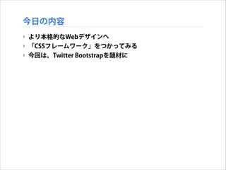
2.
今日の内容 ‣ より本格的なWebデザインヘ ‣ 「CSSフレームワーク」をつかってみる ‣
今回は、Twitter Bootstrapを題材に
3.
Twitter Bootstrapとは
4.
Twitter Bootstrapとは ‣ http://getbootstrap.com/
5.
Twitter Bootstrapとは ‣ Twitter
Bootstrap: ‣ Twitter社が開発/提供するオープンソースな「CSSフレームワー ク」 ‣ 簡単に高度なWebデザインをすることが可能 ‣ 2013年11月現在のバージョンは、Version 3.0.2
6.
Twitter Bootstrapとは ‣ Bootstrapを使用したサイト ‣
http://builtwithbootstrap.com/ で多数紹介
7.
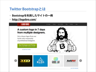
Twitter Bootstrapとは ‣ Bootstrapを利用したサイトの一例 ‣
http://logobro.com/
8.
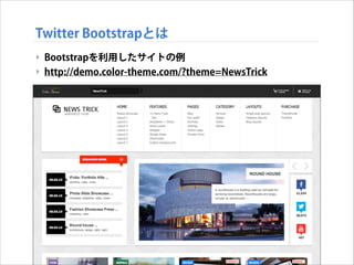
Twitter Bootstrapとは ‣ Bootstrapを利用したサイトの例 ‣
http://demo.color-theme.com/?theme=NewsTrick
9.
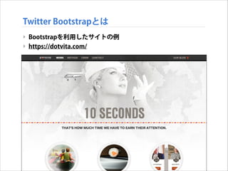
Twitter Bootstrapとは ‣ Bootstrapを利用したサイトの例 ‣
https://dotvita.com/
10.
Twitter Bootstrapを使ってみる
11.
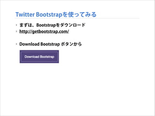
Twitter Bootstrapを使ってみる ‣ まずは、Bootstrapをダウンロード ‣
http://getbootstrap.com/ ! ‣ Download Bootstrap ボタンから
12.
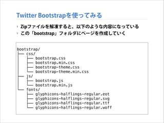
Twitter Bootstrapを使ってみる ‣ Zipファイルを解凍すると、以下のような内容になっている ‣
この「bootstrap」フォルダにページを作成していく bootstrap/ ├── css/ │ ├── bootstrap.css │ ├── bootstrap.min.css │ ├── bootstrap-theme.css │ └── bootstrap-theme.min.css ├── js/ │ ├── bootstrap.js │ └── bootstrap.min.js └── fonts/ ├── glyphicons-halflings-regular.eot ├── glyphicons-halflings-regular.svg ├── glyphicons-halflings-regular.ttf └── glyphicons-halflings-regular.woff
13.
Twitter Bootstrapを使ってみる ‣ Bootstrapのテンプレート ‣
以下のテンプレートから開始する <!DOCTYPE html> <html> <head> <title>Bootstrap 101 Template</title> <meta name="viewport" content="width=device-width, initial-scale=1.0"> <!-- Bootstrap --> <link href="css/bootstrap.min.css" rel="stylesheet"> <!--[if lt IE 9]> <script src=“https://oss.maxcdn.com/libs/html5shiv/3.7.0/html5shiv.js"> </script> <script src=“https://oss.maxcdn.com/libs/respond.js/1.3.0/respond.min.js"> </script> <![endif]--> </head> <body> <h1>Hello, world!</h1> <script src="https://code.jquery.com/jquery.js"></script> <script src="js/bootstrap.min.js"></script> </body> </html>
14.
Twitter Bootstrapを使ってみる ‣ Bootstrapのテンプレート ‣
以下のテンプレートから開始する <!DOCTYPE html> <html> <head> レスポンシブ対応 <title>Bootstrap 101 Template</title> <meta name="viewport" content="width=device-width, initial-scale=1.0"> <!-- Bootstrap --> <link href="css/bootstrap.min.css" rel="stylesheet"> <!--[if lt IE 9]> <script src=“https://oss.maxcdn.com/libs/html5shiv/3.7.0/html5shiv.js"> </script> <script src=“https://oss.maxcdn.com/libs/respond.js/1.3.0/respond.min.js"> </script> <![endif]--> </head> <body> <h1>Hello, world!</h1> <script src="https://code.jquery.com/jquery.js"></script> <script src="js/bootstrap.min.js"></script> </body> </html>
15.
Twitter Bootstrapを使ってみる ‣ Bootstrapのテンプレート ‣
以下のテンプレートから開始する <!DOCTYPE html> <html> <head> <title>Bootstrap 101 Template</title> <meta name="viewport" content="width=device-width, initial-scale=1.0"> <!-- Bootstrap --> <link href="css/bootstrap.min.css" rel="stylesheet"> BootstrapのCSS読込 <!--[if lt IE 9]> <script src=“https://oss.maxcdn.com/libs/html5shiv/3.7.0/html5shiv.js"> </script> <script src=“https://oss.maxcdn.com/libs/respond.js/1.3.0/respond.min.js"> </script> <![endif]--> </head> <body> <h1>Hello, world!</h1> <script src="https://code.jquery.com/jquery.js"></script> <script src="js/bootstrap.min.js"></script> </body> </html>
16.
Twitter Bootstrapを使ってみる ‣ Bootstrapのテンプレート ‣
以下のテンプレートから開始する <!DOCTYPE html> <html> <head> <title>Bootstrap 101 Template</title> <meta name="viewport" content="width=device-width, initial-scale=1.0"> <!-- Bootstrap --> <link href="css/bootstrap.min.css" rel="stylesheet"> <!--[if lt IE 9]> <script src=“https://oss.maxcdn.com/libs/html5shiv/3.7.0/html5shiv.js"> </script> <script src=“https://oss.maxcdn.com/libs/respond.js/1.3.0/respond.min.js"> </script> <![endif]--> </head> IE対策 <body> <h1>Hello, world!</h1> <script src="https://code.jquery.com/jquery.js"></script> <script src="js/bootstrap.min.js"></script> </body> </html>
17.
Twitter Bootstrapを使ってみる ‣ Bootstrapのテンプレート ‣
以下のテンプレートから開始する <!DOCTYPE html> <html> <head> <title>Bootstrap 101 Template</title> <meta name="viewport" content="width=device-width, initial-scale=1.0"> <!-- Bootstrap --> <link href="css/bootstrap.min.css" rel="stylesheet"> <!--[if lt IE 9]> <script src=“https://oss.maxcdn.com/libs/html5shiv/3.7.0/html5shiv.js"> </script> <script src=“https://oss.maxcdn.com/libs/respond.js/1.3.0/respond.min.js"> </script> <![endif]--> </head> <body> <h1>Hello, world!</h1> <script src="https://code.jquery.com/jquery.js"></script> JQuery必須 <script src="js/bootstrap.min.js"></script> </body> </html>
18.
Twitter Bootstrapを使ってみる ‣ Bootstrapのテンプレート ‣
以下のテンプレートから開始する <!DOCTYPE html> <html> <head> <title>Bootstrap 101 Template</title> <meta name="viewport" content="width=device-width, initial-scale=1.0"> <!-- Bootstrap --> <link href="css/bootstrap.min.css" rel="stylesheet"> <!--[if lt IE 9]> <script src=“https://oss.maxcdn.com/libs/html5shiv/3.7.0/html5shiv.js"> </script> <script src=“https://oss.maxcdn.com/libs/respond.js/1.3.0/respond.min.js"> </script> <![endif]--> </head> <body> <h1>Hello, world!</h1> <script src="https://code.jquery.com/jquery.js"></script> <script src="js/bootstrap.min.js"></script> Bootstrap読込 </body> </html>
19.
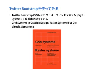
Twitter Bootstrapを使ってみる ‣ Twitter
Bootstrapでのレイアウトは「グリッドシステム (Gryd Systems)」が基本となっている ‣ Grid Systems in Graphic Design/Raster Systeme Fur Die Visuele Gestaltung
20.
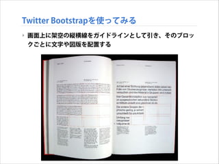
Twitter Bootstrapを使ってみる ‣ 画面上に架空の縦横線をガイドラインとして引き、そのブロッ クごとに文字や図版を配置する
21.
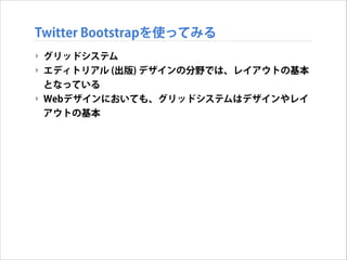
Twitter Bootstrapを使ってみる ‣ グリッドシステム ‣
エディトリアル (出版) デザインの分野では、レイアウトの基本 となっている ‣ Webデザインにおいても、グリッドシステムはデザインやレイ アウトの基本
22.
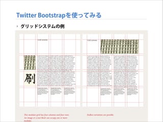
Twitter Bootstrapを使ってみる ‣ グリッドシステムの例
23.
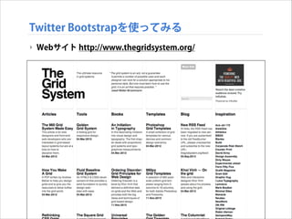
Twitter Bootstrapを使ってみる ‣ Webサイト
http://www.thegridsystem.org/
24.
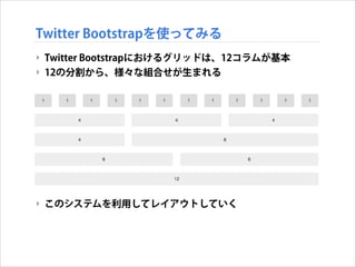
Twitter Bootstrapを使ってみる ‣ Twitter
Bootstrapにおけるグリッドは、12コラムが基本 ‣ 12の分割から、様々な組合せが生まれる ! ! ! ! ! ! ! ! ‣ このシステムを利用してレイアウトしていく
25.
Twitter Bootstrapを使ってみる ‣ グリッドの考え方 ‣
Bootstrap3からは、レスポンシブ対応で大きく変化
26.
Twitter Bootstrapを使ってみる ‣ たとえば、4
+ 4 + 4の3コラムを組んでみる ‣ まず全体を、 container クラスで囲む <!DOCTYPE html> <html> <head> <title>Bootstrap 101 Template</title> <meta name="viewport" content="width=device-width, initial-scale=1.0"> <link href="css/bootstrap.min.css" rel="stylesheet"> <![endif]--> </head> <body> <script src="https://code.jquery.com/jquery.js"></script> <script src="js/bootstrap.min.js"></script> ! ! <div class="container"> </div> </body> </html>
27.
Twitter Bootstrapを使ってみる ‣ グリッドレイアウトする1行分を
row クラスで区切る <!DOCTYPE html> <html> <head> <title>Bootstrap 101 Template</title> <meta name="viewport" content="width=device-width, initial-scale=1.0"> <link href="css/bootstrap.min.css" rel="stylesheet"> <![endif]--> </head> <body> <script src="https://code.jquery.com/jquery.js"></script> <script src="js/bootstrap.min.js"></script> <div class="container"> ! ! <div class="row"> </div> </div> </body> </html>
28.
Twitter Bootstrapを使ってみる ‣ 例えば、4
+ 8 (= 12) でコラムを区切ってみる <!DOCTYPE html> <html> <head> <title>Bootstrap 101 Template</title> <meta name="viewport" content="width=device-width, initial-scale=1.0"> <link href="css/bootstrap.min.css" rel="stylesheet"> <![endif]--> </head> <body> <script src="https://code.jquery.com/jquery.js"></script> <script src="js/bootstrap.min.js"></script> <div class="container"> <div class="row"> <div class="col-md-8">.col-md-8</div> <div class="col-md-4">.col-md-4</div> </div> </div> </body> </html>
29.
Twitter Bootstrapを使ってみる ‣ 4
+ 4 + 4 で区切った例 <!DOCTYPE html> <html> <head> <title>Bootstrap 101 Template</title> <meta name="viewport" content="width=device-width, initial-scale=1.0" /> <link href="css/bootstrap.min.css" rel="stylesheet" /> </head> <body> <script src="https://code.jquery.com/jquery.js"></script> <script src="js/bootstrap.min.js"></script> <div class="container"> <div class="row"> <div class="col-md-12"> <h1>Hello Bootstrap!!</h1> </div> </div> <div class="row"> <div class="col-md-4"> <h2>4 Column</h2> <p>…</p> </div> <div class="col-md-4"> <h2>4 Column</h2> <p>…</p> </div> <div class="col-md-4"> <h2>4 Column</h2> <p>…</p> </div> </div> </div> </body> </html>
30.
Twitter Bootstrapを使ってみる ‣ 3段組のレイアウトが簡単に実現!!
31.
Twitter Bootstrapを使ってみる ‣ いろいろなパターンの段組に挑戦してみる!
32.
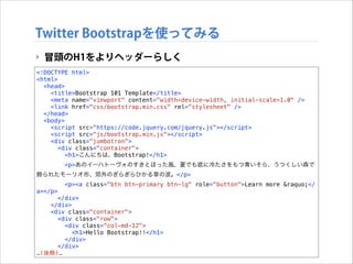
Twitter Bootstrapを使ってみる ‣ 冒頭のH1をよりヘッダーらしく <!DOCTYPE
html> <html> <head> <title>Bootstrap 101 Template</title> <meta name="viewport" content="width=device-width, initial-scale=1.0" /> <link href="css/bootstrap.min.css" rel="stylesheet" /> </head> <body> <script src="https://code.jquery.com/jquery.js"></script> <script src="js/bootstrap.min.js"></script> <div class="jumbotron"> <div class="container"> <h1>こんにちは、Bootstrap!</h1> <p>あのイーハトーヴォのすきとほった風、夏でも底に冷たさをもつ青いそら、うつくしい森で 飾られたモーリオ市、郊外のぎらぎらひかる草の波。</p> <p><a class="btn btn-primary btn-lg" role="button">Learn more »</ a></p> </div> </div> <div class="container"> <div class="row"> <div class="col-md-12"> <h1>Hello Bootstrap!!</h1> </div> </div> …(後略)…
33.
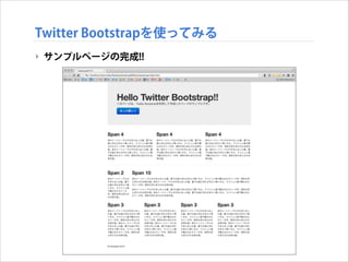
Twitter Bootstrapを使ってみる ‣ サンプルページの完成!!
34.
Twitter Bootstrapを使ってみる ‣ 今日はここまで ‣
次回はデザインをカスタマイズして、より洗練されたデザイン にしていきます
Download

![Twitter Bootstrapを使ってみる
‣ Bootstrapのテンプレート
‣ 以下のテンプレートから開始する
<!DOCTYPE html>
<html>
<head>
<title>Bootstrap 101 Template</title>
<meta name="viewport" content="width=device-width, initial-scale=1.0">
<!-- Bootstrap -->
<link href="css/bootstrap.min.css" rel="stylesheet">
<!--[if lt IE 9]>
<script src=“https://oss.maxcdn.com/libs/html5shiv/3.7.0/html5shiv.js">
</script>
<script src=“https://oss.maxcdn.com/libs/respond.js/1.3.0/respond.min.js">
</script>
<![endif]-->
</head>
<body>
<h1>Hello, world!</h1>
<script src="https://code.jquery.com/jquery.js"></script>
<script src="js/bootstrap.min.js"></script>
</body>
</html>](https://image.slidesharecdn.com/geidaiweb130530-131126232058-phpapp01/85/Web-8-CSS-13-320.jpg)
![Twitter Bootstrapを使ってみる
‣ Bootstrapのテンプレート
‣ 以下のテンプレートから開始する
<!DOCTYPE html>
<html>
<head>
レスポンシブ対応
<title>Bootstrap 101 Template</title>
<meta name="viewport" content="width=device-width, initial-scale=1.0">
<!-- Bootstrap -->
<link href="css/bootstrap.min.css" rel="stylesheet">
<!--[if lt IE 9]>
<script src=“https://oss.maxcdn.com/libs/html5shiv/3.7.0/html5shiv.js">
</script>
<script src=“https://oss.maxcdn.com/libs/respond.js/1.3.0/respond.min.js">
</script>
<![endif]-->
</head>
<body>
<h1>Hello, world!</h1>
<script src="https://code.jquery.com/jquery.js"></script>
<script src="js/bootstrap.min.js"></script>
</body>
</html>](https://image.slidesharecdn.com/geidaiweb130530-131126232058-phpapp01/85/Web-8-CSS-14-320.jpg)
![Twitter Bootstrapを使ってみる
‣ Bootstrapのテンプレート
‣ 以下のテンプレートから開始する
<!DOCTYPE html>
<html>
<head>
<title>Bootstrap 101 Template</title>
<meta name="viewport" content="width=device-width, initial-scale=1.0">
<!-- Bootstrap -->
<link href="css/bootstrap.min.css" rel="stylesheet"> BootstrapのCSS読込
<!--[if lt IE 9]>
<script src=“https://oss.maxcdn.com/libs/html5shiv/3.7.0/html5shiv.js">
</script>
<script src=“https://oss.maxcdn.com/libs/respond.js/1.3.0/respond.min.js">
</script>
<![endif]-->
</head>
<body>
<h1>Hello, world!</h1>
<script src="https://code.jquery.com/jquery.js"></script>
<script src="js/bootstrap.min.js"></script>
</body>
</html>](https://image.slidesharecdn.com/geidaiweb130530-131126232058-phpapp01/85/Web-8-CSS-15-320.jpg)
![Twitter Bootstrapを使ってみる
‣ Bootstrapのテンプレート
‣ 以下のテンプレートから開始する
<!DOCTYPE html>
<html>
<head>
<title>Bootstrap 101 Template</title>
<meta name="viewport" content="width=device-width, initial-scale=1.0">
<!-- Bootstrap -->
<link href="css/bootstrap.min.css" rel="stylesheet">
<!--[if lt IE 9]>
<script src=“https://oss.maxcdn.com/libs/html5shiv/3.7.0/html5shiv.js">
</script>
<script src=“https://oss.maxcdn.com/libs/respond.js/1.3.0/respond.min.js">
</script>
<![endif]-->
</head>
IE対策
<body>
<h1>Hello, world!</h1>
<script src="https://code.jquery.com/jquery.js"></script>
<script src="js/bootstrap.min.js"></script>
</body>
</html>](https://image.slidesharecdn.com/geidaiweb130530-131126232058-phpapp01/85/Web-8-CSS-16-320.jpg)
![Twitter Bootstrapを使ってみる
‣ Bootstrapのテンプレート
‣ 以下のテンプレートから開始する
<!DOCTYPE html>
<html>
<head>
<title>Bootstrap 101 Template</title>
<meta name="viewport" content="width=device-width, initial-scale=1.0">
<!-- Bootstrap -->
<link href="css/bootstrap.min.css" rel="stylesheet">
<!--[if lt IE 9]>
<script src=“https://oss.maxcdn.com/libs/html5shiv/3.7.0/html5shiv.js">
</script>
<script src=“https://oss.maxcdn.com/libs/respond.js/1.3.0/respond.min.js">
</script>
<![endif]-->
</head>
<body>
<h1>Hello, world!</h1>
<script src="https://code.jquery.com/jquery.js"></script> JQuery必須
<script src="js/bootstrap.min.js"></script>
</body>
</html>](https://image.slidesharecdn.com/geidaiweb130530-131126232058-phpapp01/85/Web-8-CSS-17-320.jpg)
![Twitter Bootstrapを使ってみる
‣ Bootstrapのテンプレート
‣ 以下のテンプレートから開始する
<!DOCTYPE html>
<html>
<head>
<title>Bootstrap 101 Template</title>
<meta name="viewport" content="width=device-width, initial-scale=1.0">
<!-- Bootstrap -->
<link href="css/bootstrap.min.css" rel="stylesheet">
<!--[if lt IE 9]>
<script src=“https://oss.maxcdn.com/libs/html5shiv/3.7.0/html5shiv.js">
</script>
<script src=“https://oss.maxcdn.com/libs/respond.js/1.3.0/respond.min.js">
</script>
<![endif]-->
</head>
<body>
<h1>Hello, world!</h1>
<script src="https://code.jquery.com/jquery.js"></script>
<script src="js/bootstrap.min.js"></script>
Bootstrap読込
</body>
</html>](https://image.slidesharecdn.com/geidaiweb130530-131126232058-phpapp01/85/Web-8-CSS-18-320.jpg)
![Twitter Bootstrapを使ってみる
‣ たとえば、4 + 4 + 4の3コラムを組んでみる
‣ まず全体を、 container クラスで囲む
<!DOCTYPE html>
<html>
<head>
<title>Bootstrap 101 Template</title>
<meta name="viewport" content="width=device-width, initial-scale=1.0">
<link href="css/bootstrap.min.css" rel="stylesheet">
<![endif]-->
</head>
<body>
<script src="https://code.jquery.com/jquery.js"></script>
<script src="js/bootstrap.min.js"></script>
!
!
<div class="container">
</div>
</body>
</html>](https://image.slidesharecdn.com/geidaiweb130530-131126232058-phpapp01/85/Web-8-CSS-26-320.jpg)
![Twitter Bootstrapを使ってみる
‣ グリッドレイアウトする1行分を row クラスで区切る
<!DOCTYPE html>
<html>
<head>
<title>Bootstrap 101 Template</title>
<meta name="viewport" content="width=device-width, initial-scale=1.0">
<link href="css/bootstrap.min.css" rel="stylesheet">
<![endif]-->
</head>
<body>
<script src="https://code.jquery.com/jquery.js"></script>
<script src="js/bootstrap.min.js"></script>
<div class="container">
!
!
<div class="row">
</div>
</div>
</body>
</html>](https://image.slidesharecdn.com/geidaiweb130530-131126232058-phpapp01/85/Web-8-CSS-27-320.jpg)
![Twitter Bootstrapを使ってみる
‣ 例えば、4 + 8 (= 12) でコラムを区切ってみる
<!DOCTYPE html>
<html>
<head>
<title>Bootstrap 101 Template</title>
<meta name="viewport" content="width=device-width, initial-scale=1.0">
<link href="css/bootstrap.min.css" rel="stylesheet">
<![endif]-->
</head>
<body>
<script src="https://code.jquery.com/jquery.js"></script>
<script src="js/bootstrap.min.js"></script>
<div class="container">
<div class="row">
<div class="col-md-8">.col-md-8</div>
<div class="col-md-4">.col-md-4</div>
</div>
</div>
</body>
</html>](https://image.slidesharecdn.com/geidaiweb130530-131126232058-phpapp01/85/Web-8-CSS-28-320.jpg)


![Bootstrap使い始めて困ったことなど [Web的な話をシェアしてみる会]](https://cdn.slidesharecdn.com/ss_thumbnails/20140228-140228020535-phpapp01-thumbnail.jpg?width=640&height=640&fit=bounds)