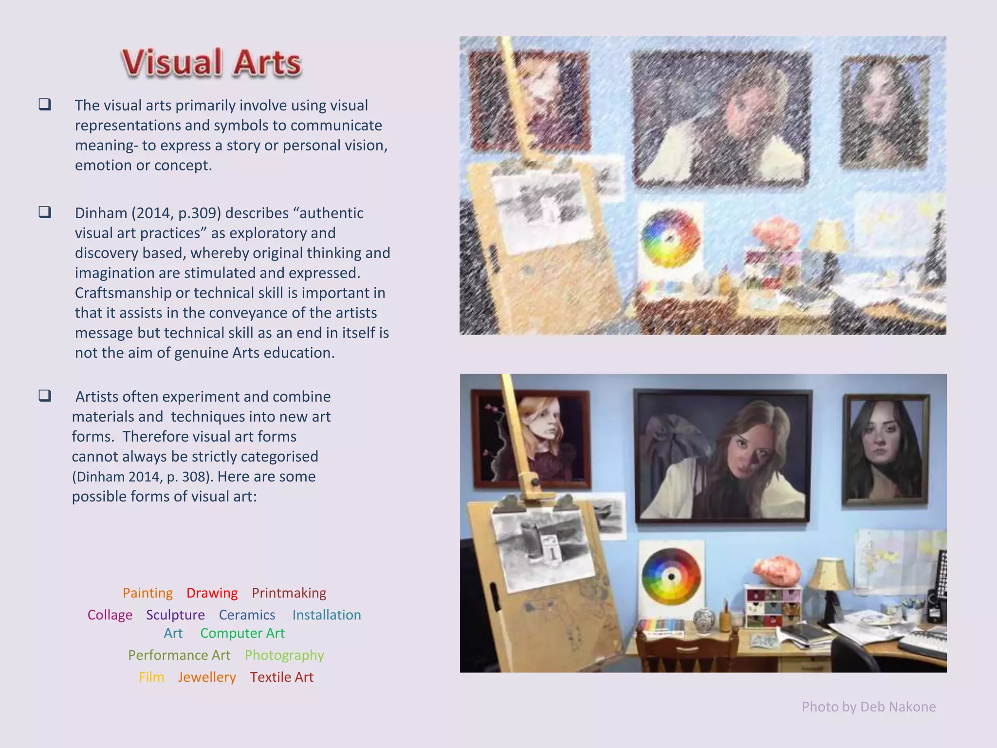
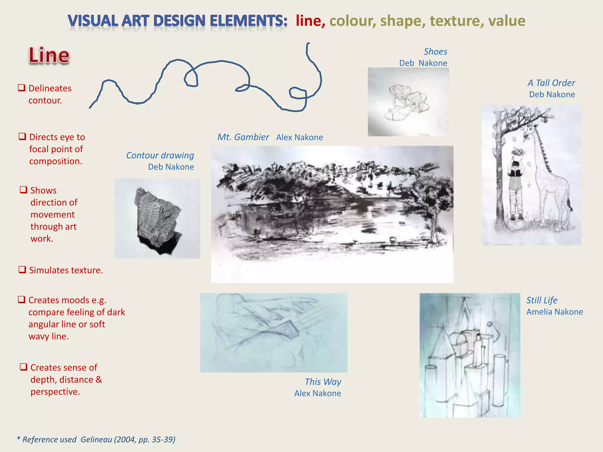
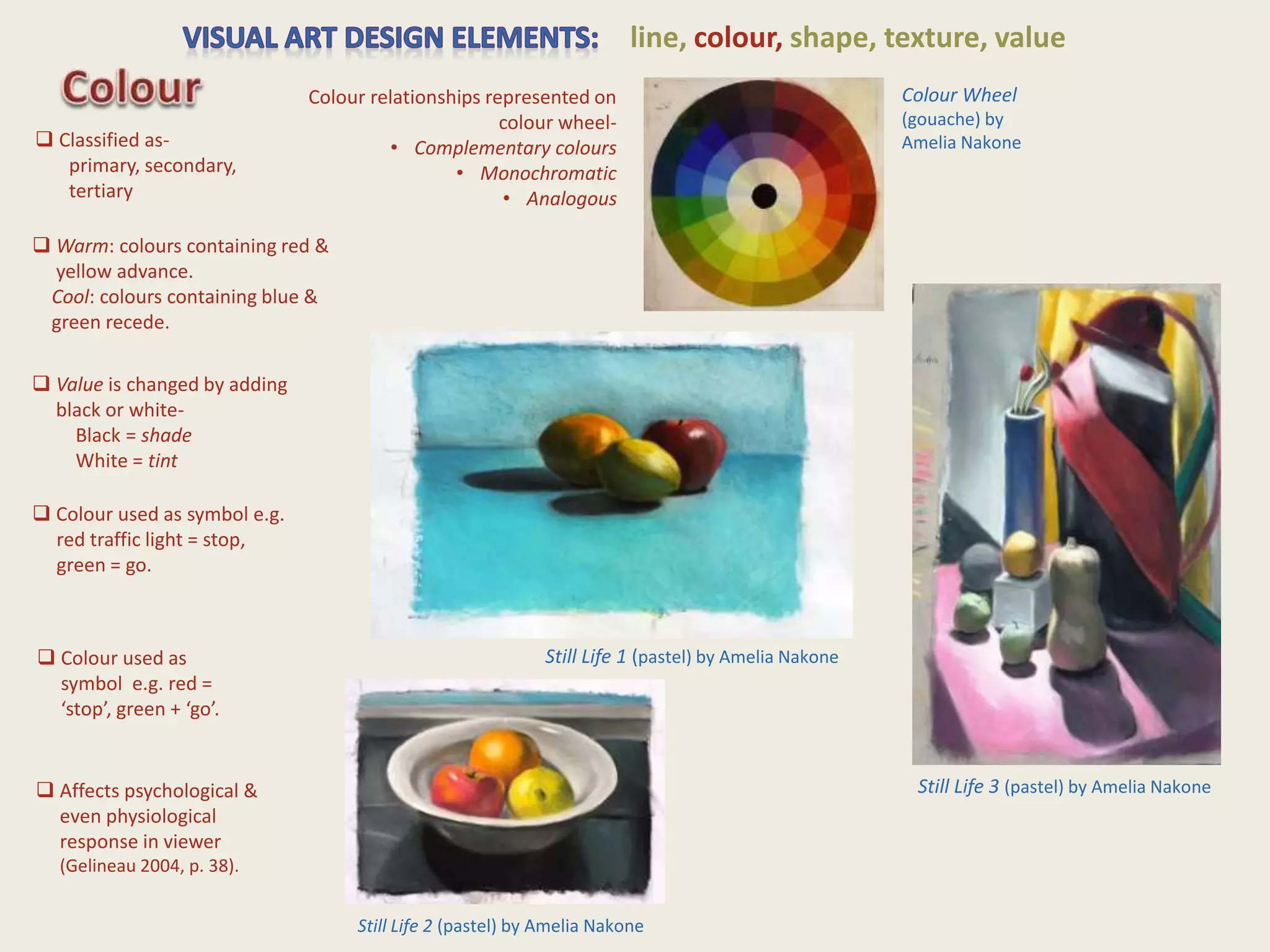
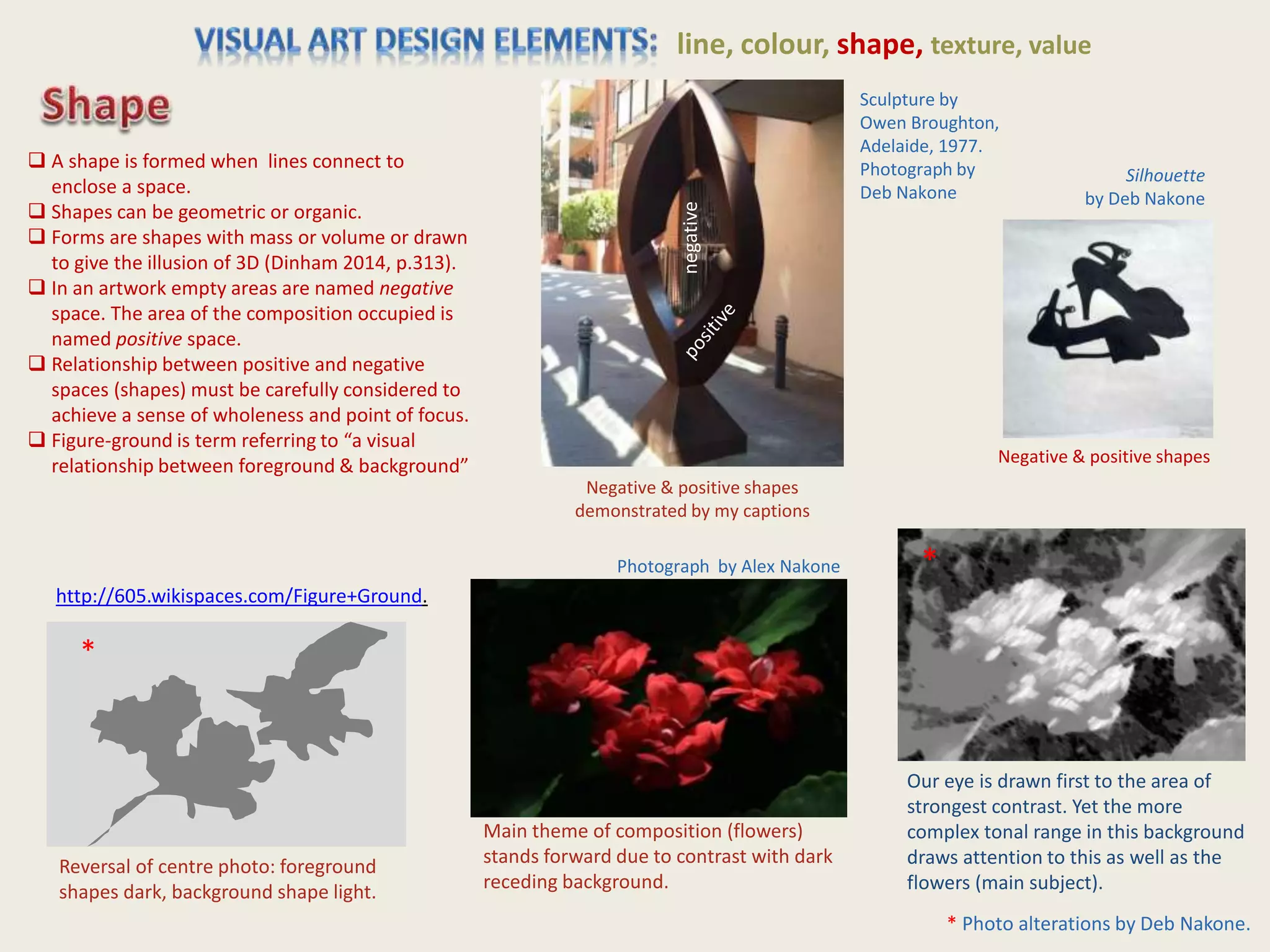
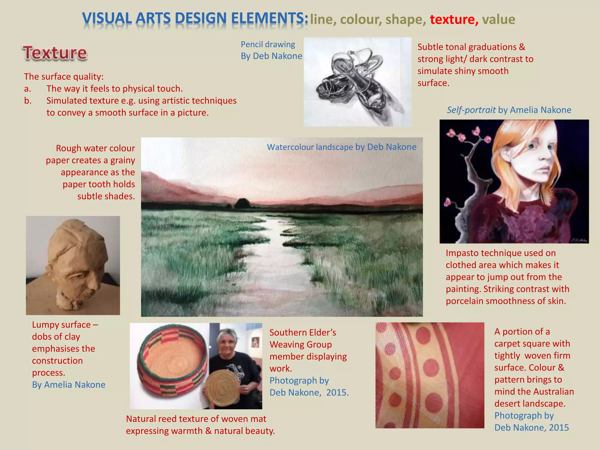
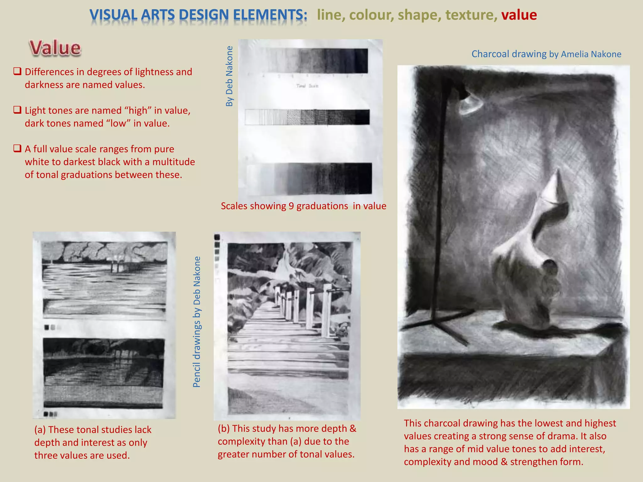
–
 The visual arts primarily involve using visual
representations and symbols to communicate
meaning- to express a story or personal vision,
emotion or concept.
 Dinham (2014, p.309) describes “authentic
visual art practices” as exploratory and
discovery based, whereby original thinking and
imagination are stimulated and expressed.
Craftsmanship or technical skill is important in
that it assists in the conveyance of the artists
message but technical skill as an end in itself is
not the aim of genuine Arts education.
 Artists often experiment and combine
materials and techniques into new art
forms. Therefore visual art forms
cannot always be strictly categorised
(Dinham 2014, p. 308). Here are some
possible forms of visual art:
Photo by Deb Nakone
Painting Drawing Printmaking
Collage Sculpture Ceramics Installation
Art Computer Art
Performance Art Photography
Film Jewellery Textile Art
line, colour, shape, texture, value
Still Life
Amelia Nakone
* Reference used Gelineau (2004, pp. 35-39)
 Delineates
contour.
 Creates moods e.g.
compare feeling of dark
angular line or soft
wavy line.
 Directs eye to
focal point of
composition.
 Simulates texture.
 Creates sense of
depth, distance &
perspective.
 Shows
direction of
movement
through art
work.
This Way
Alex Nakone
A Tall Order
Deb Nakone
Mt. Gambier Alex Nakone
Contour drawing
Deb Nakone
Shoes
Deb Nakone
line, colour, shape, texture, value
 Affects psychological &
even physiological
response in viewer
(Gelineau 2004, p. 38).
 Colour used as
symbol e.g. red =
‘stop’, green + ‘go’.
Still Life 1 (pastel) by Amelia Nakone
Still Life 3 (pastel) by Amelia Nakone
Still Life 2 (pastel) by Amelia Nakone
Colour Wheel
(gouache) by
Amelia Nakone
Colour relationships represented on
colour wheel-
• Complementary colours
• Monochromatic
• Analogous
 Classified as-
primary, secondary,
tertiary
 Warm: colours containing red &
yellow advance.
Cool: colours containing blue &
green recede.
 Value is changed by adding
black or white-
Black = shade
White = tint
 Colour used as symbol e.g.
red traffic light = stop,
green = go.
line, colour, shape, texture, value
Photograph by Alex Nakone
Silhouette
by Deb Nakone
Main theme of composition (flowers)
stands forward due to contrast with dark
receding background.
Our eye is drawn first to the area of
strongest contrast. Yet the more
complex tonal range in this background
draws attention to this as well as the
flowers (main subject).
Negative & positive shapes
Reversal of centre photo: foreground
shapes dark, background shape light.
negative
Sculpture by
Owen Broughton,
Adelaide, 1977.
Photograph by
Deb Nakone
 A shape is formed when lines connect to
enclose a space.
 Shapes can be geometric or organic.
 Forms are shapes with mass or volume or drawn
to give the illusion of 3D (Dinham 2014, p.313).
 In an artwork empty areas are named negative
space. The area of the composition occupied is
named positive space.
 Relationship between positive and negative
spaces (shapes) must be carefully considered to
achieve a sense of wholeness and point of focus.
 Figure-ground is term referring to “a visual
relationship between foreground & background”
http://605.wikispaces.com/Figure+Ground.
Negative & positive shapes
demonstrated by my captions
*
*
* Photo alterations by Deb Nakone.
VISUAL ARTS DESIGN ELEMENTS:line, colour, shape, texture, value
The surface quality:
a. The way it feels to physical touch.
b. Simulated texture e.g. using artistic techniques
to convey a smooth surface in a picture.
Subtle tonal graduations &
strong light/ dark contrast to
simulate shiny smooth
surface.
Pencil drawing
By Deb Nakone
Rough water colour
paper creates a grainy
appearance as the
paper tooth holds
subtle shades.
Lumpy surface –
dobs of clay
emphasises the
construction
process.
By Amelia Nakone
Southern Elder’s
Weaving Group
member displaying
work.
Photograph by
Deb Nakone, 2015.
Natural reed texture of woven mat
expressing warmth & natural beauty.
Impasto technique used on
clothed area which makes it
appear to jump out from the
painting. Striking contrast with
porcelain smoothness of skin.
A portion of a
carpet square with
tightly woven firm
surface. Colour &
pattern brings to
mind the Australian
desert landscape.
Photograph by
Deb Nakone, 2015
Watercolour landscape by Deb Nakone
Self-portrait by Amelia Nakone
VISUAL ARTS DESIGN ELEMENTS: line, colour, shape, texture, value
 Differences in degrees of lightness and
darkness are named values.
 Light tones are named “high” in value,
dark tones named “low” in value.
 A full value scale ranges from pure
white to darkest black with a multitude
of tonal graduations between these.
This charcoal drawing has the lowest and highest
values creating a strong sense of drama. It also
has a range of mid value tones to add interest,
complexity and mood & strengthen form.
Charcoal drawing by Amelia Nakone
(a) These tonal studies lack
depth and interest as only
three values are used.
(b) This study has more depth &
complexity than (a) due to the
greater number of tonal values.
PencildrawingsbyDebNakone
Scales showing 9 graduations in value
ByDebNakone
balance rhythm & repetition proportion & scale contrast & emphasis
PhotosbyDebNakone

Visual Arts - Design elements & Principles with original images

  • 1.
    –  The visualarts primarily involve using visual representations and symbols to communicate meaning- to express a story or personal vision, emotion or concept.  Dinham (2014, p.309) describes “authentic visual art practices” as exploratory and discovery based, whereby original thinking and imagination are stimulated and expressed. Craftsmanship or technical skill is important in that it assists in the conveyance of the artists message but technical skill as an end in itself is not the aim of genuine Arts education.  Artists often experiment and combine materials and techniques into new art forms. Therefore visual art forms cannot always be strictly categorised (Dinham 2014, p. 308). Here are some possible forms of visual art: Photo by Deb Nakone Painting Drawing Printmaking Collage Sculpture Ceramics Installation Art Computer Art Performance Art Photography Film Jewellery Textile Art
  • 2.
    line, colour, shape,texture, value Still Life Amelia Nakone * Reference used Gelineau (2004, pp. 35-39)  Delineates contour.  Creates moods e.g. compare feeling of dark angular line or soft wavy line.  Directs eye to focal point of composition.  Simulates texture.  Creates sense of depth, distance & perspective.  Shows direction of movement through art work. This Way Alex Nakone A Tall Order Deb Nakone Mt. Gambier Alex Nakone Contour drawing Deb Nakone Shoes Deb Nakone
  • 3.
    line, colour, shape,texture, value  Affects psychological & even physiological response in viewer (Gelineau 2004, p. 38).  Colour used as symbol e.g. red = ‘stop’, green + ‘go’. Still Life 1 (pastel) by Amelia Nakone Still Life 3 (pastel) by Amelia Nakone Still Life 2 (pastel) by Amelia Nakone Colour Wheel (gouache) by Amelia Nakone Colour relationships represented on colour wheel- • Complementary colours • Monochromatic • Analogous  Classified as- primary, secondary, tertiary  Warm: colours containing red & yellow advance. Cool: colours containing blue & green recede.  Value is changed by adding black or white- Black = shade White = tint  Colour used as symbol e.g. red traffic light = stop, green = go.
  • 4.
    line, colour, shape,texture, value Photograph by Alex Nakone Silhouette by Deb Nakone Main theme of composition (flowers) stands forward due to contrast with dark receding background. Our eye is drawn first to the area of strongest contrast. Yet the more complex tonal range in this background draws attention to this as well as the flowers (main subject). Negative & positive shapes Reversal of centre photo: foreground shapes dark, background shape light. negative Sculpture by Owen Broughton, Adelaide, 1977. Photograph by Deb Nakone  A shape is formed when lines connect to enclose a space.  Shapes can be geometric or organic.  Forms are shapes with mass or volume or drawn to give the illusion of 3D (Dinham 2014, p.313).  In an artwork empty areas are named negative space. The area of the composition occupied is named positive space.  Relationship between positive and negative spaces (shapes) must be carefully considered to achieve a sense of wholeness and point of focus.  Figure-ground is term referring to “a visual relationship between foreground & background” http://605.wikispaces.com/Figure+Ground. Negative & positive shapes demonstrated by my captions * * * Photo alterations by Deb Nakone.
  • 5.
    VISUAL ARTS DESIGNELEMENTS:line, colour, shape, texture, value The surface quality: a. The way it feels to physical touch. b. Simulated texture e.g. using artistic techniques to convey a smooth surface in a picture. Subtle tonal graduations & strong light/ dark contrast to simulate shiny smooth surface. Pencil drawing By Deb Nakone Rough water colour paper creates a grainy appearance as the paper tooth holds subtle shades. Lumpy surface – dobs of clay emphasises the construction process. By Amelia Nakone Southern Elder’s Weaving Group member displaying work. Photograph by Deb Nakone, 2015. Natural reed texture of woven mat expressing warmth & natural beauty. Impasto technique used on clothed area which makes it appear to jump out from the painting. Striking contrast with porcelain smoothness of skin. A portion of a carpet square with tightly woven firm surface. Colour & pattern brings to mind the Australian desert landscape. Photograph by Deb Nakone, 2015 Watercolour landscape by Deb Nakone Self-portrait by Amelia Nakone
  • 6.
    VISUAL ARTS DESIGNELEMENTS: line, colour, shape, texture, value  Differences in degrees of lightness and darkness are named values.  Light tones are named “high” in value, dark tones named “low” in value.  A full value scale ranges from pure white to darkest black with a multitude of tonal graduations between these. This charcoal drawing has the lowest and highest values creating a strong sense of drama. It also has a range of mid value tones to add interest, complexity and mood & strengthen form. Charcoal drawing by Amelia Nakone (a) These tonal studies lack depth and interest as only three values are used. (b) This study has more depth & complexity than (a) due to the greater number of tonal values. PencildrawingsbyDebNakone Scales showing 9 graduations in value ByDebNakone
  • 7.
    balance rhythm &repetition proportion & scale contrast & emphasis PhotosbyDebNakone