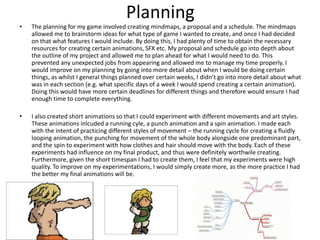
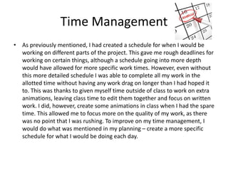
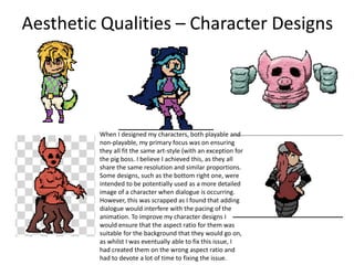
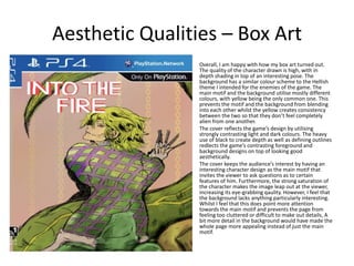
SlideShare a Scribd company logo
1 of 14
Evaluation
William Anderson
Research
For my research I investigated four games of the genre that I was interested in to
compare differences and similarities. As I was unsure as to what theme I wanted
the visuals of my game to have, I made sure that the games I researched were
varied in appearance. This helped me make a decision on what I wanted my game
to look like as well as what functions I should include in my animation to make it
appear authentic e.g. HUD. My research went into depth for each game, looking
at both the visual qualities as well as the SFX used. I also conducted research into
the target audience for my game, which is people of both genders who are
roughly 15-25 years old. By researching this, I could see what things adhered to
people in this target area and furthermore I could look at other games to see
what they do to appeal to their target audiences. I could then choose whether or
not to incorporate these techniques into my own game. To improve, I would
spend more time researching the background music for each game and what was
used to create it, as I spent the majority of the time I used to look at audio looking
at sound effects, and by looking more at what was used to create background
music I would have a wider array of software to use, thus lowering the limitations
of my audio.
Planning
ā€¢ The planning for my game involved creating mindmaps, a proposal and a schedule. The mindmaps
allowed me to brainstorm ideas for what type of game I wanted to create, and once I had decided
on that what features I would include. By doing this, I had plenty of time to obtain the necessary
resources for creating certain animations, SFX etc. My proposal and schedule go into depth about
the outline of my project and allowed me to plan ahead for what I would need to do. This
prevented any unexpected jobs from appearing and allowed me to manage my time properly. I
would improve on my planning by going into more detail about when I would be doing certain
things, as whilst I general things planned over certain weeks, I didnā€™t go into more detail about what
was in each section (e.g. what specific days of a week I would spend creating a certain animation).
Doing this would have more certain deadlines for different things and therefore would ensure I had
enough time to complete everything.
ā€¢ I also created short animations so that I could experiment with different movements and art styles.
These animations inlcuded a running cyle, a punch animation and a spin animation. I made each
with the intent of practicing different styles of movement ā€“ the running cycle for creating a fluidly
looping animation, the punching for movement of the whole body alongside one predominant part,
and the spin to experiment with how clothes and hair should move with the body. Each of these
experiments had influence on my final product, and thus were definitely worthwile creating.
Furthermore, given the short timespan I had to create them, I feel that my experiments were high
quality. To improve on my experimentations, I would simply create more, as the more practice I had
the better my final animations will be.
Time Management
ā€¢ As previously mentioned, I had created a schedule for when I would be
working on different parts of the project. This gave me rough deadlines for
working on certain things, although a schedule going into more depth
would have allowed for more specific work times. However, even without
this more detailed schedule I was able to complete all my work in the
allotted time without having any work drag on longer than I had hoped it
to. This was thanks to given myself time outside of class to work on extra
animations, leaving class time to edit them together and focus on written
work. I did, however, create some animations in class when I had the spare
time. This allowed me to focus more on the quality of my work, as there
was no point that I was rushing. To improve on my time management, I
would do what was mentioned in my planning ā€“ create a more specific
schedule for what I would be doing each day.
Technical Qualities
To ensure the quality of my charactersā€™ visuals, I created character sheets. This meant that I had
references for drawing my characters at different angles and animations so different drawings didnā€™t
look out of place. By deciding on an art style early on, I was able to make sure that different drawings
all fit the same aesthetic. As mentioned in my time management slide, I worked on animations outside
of lessons as well as in lessons, meaning I was able to focus on the quality of my animations. This, as
well as my character designs allowing for more complex animations, allowed me to be more creative
with how my characters and environments moved.
To give my game a more authentic feeling, I added extra details such as a HUD inspired by the games I
looked at in my research. This HUD also changed alongside the animation, meaning when the character
took damage the health bar depleted and more. I also created a title screen as a way of starting the
animation off whilst giving an immediate feel as to what the gameā€™s aesthetic would be like. To add
authenticity, I added a clicking sound and visual effect for the player selecting the ā€˜startā€™ option. This
then leads to a character selection screen, which I included again to improve authenticity whilst
simultaneously adhering to the target audience, as the option to select different characters of different
looks and genders means that different people feel that they have characters representing them. For
the boss fight, I made sure to research boss fights of games in the same genre to gain inspiration for
movements, attacks and different boss stages.
Technical Qualities
ā€¢ The transtitions between different parts of the game are fluid and avoid being
repetitive by some having animation created uniquely for them e.g. the title
screen to the character select screenā€™s flame. This prevents the gameplay from
feeling jarring and dull.
ā€¢ The animations all flow fluidly into each other. Furthermore, each character has
their own unique animations for different movements, including different attacks.
This not only improves the gameā€™s authenticity, but also makes the gameplay more
appealing as it doesnā€™t appear ugly or jarring.
ā€¢ I made sure to continuously include player input into the animation to make it
really feel like someone is playing the game. This is done by adding auditory and
visual cues for when the player selects certain option e.g. ā€˜Start Gameā€™.
To improve on my technical qualities, I would change the colour of the bossā€™ name
so that it stands out more as due to the lighting of the boss itself, the name blends
into the pigā€™s colour at certain points. Furthermore, adding a minimap or having the
player pause the game at some point would again increase the gameā€™s authenticity. It
also adds more depth to the gameā€™s aesthetic qualities.
Aural Qualities ā€“ Backing Tracks
My video game involved many different audio files
in order to create a variation of sound effects for
different actions. My video involves multiple
occasions where multiple movements occur,
sometimes by more than one character. By creating
these various sound effects, I was able to overlap
them so that different actions occuring at the same
time had distinct sound effects that the player can
connect to each individual action. I created two
backing tracks for my game, both of which were far
longer than the animation itself. This was done on
purpose to allow me to cut the audio up into
different parts so that I could switch it up for
different screens. The main function of the two
tracks is to ac as general level music and boss fight
music respectively. I believe that both achieve their
goals, with the general background music having a
more upbead and lively tone in contrast the the
bossfight, which utilises lots of drum sounds to
create a more grim atmosphere. Using Beepbox for
the audio, I decided to alter the softwareā€™s settings
in order to create more unique music (e.g. switching
the effect from none to virbrato light.)
Aural Qualities ā€“ Backing Tracks
ā€¢ The idea of using different music for general levels and for boss fights was inspired by games
such as Hollow Knight, which was a staple of my research. These games switch the audio up
to give the player an immediate understanding of the current atmosphere and seriousness of
the moment. Compared to the audio found in Hollow Knight, mine boasts a much more retro
feel to it, making it more similar to Sonic II, another game that I had included in my research.
To improve on my backing tracks, I would create additional songs for the title screen and
character select screen, as in my game they simply utilise different parts of the general level
backing track. A different track for each would have made them feel more unique whilst
simultaneously making the difference between them and the actual gameplay more apparent.
Aural Qualities - SFX
ā€¢ On top of SFX for character movements, I also created some
for other functions, such as character deaths as well as the
player clicking a button. The latter is used when the player
selects ā€˜Start Gameā€™ on the title screen and again when he
selects his character and clicks ā€˜confirmā€™. By adding these
small details, the game feels more authentic. Furthermore,
it gives more life to the screen that they are on, as if it were
not for these sound effects the only audio would be the
backing track which if played on its own may feel
overbearing.
ā€¢ To improve on my SFX, I would try out different audio
software to experiment with what I could create, as I was
limited to just BeepBox for this project. Whilst this does
mean all of the audio fits the same style, it also means that
the different attack SFX all sounded quite similar. I could
have very easily switched up what SFX I used for what
attack and it would have still fit for the most part.
Additionally, different software could have had a wider
array of sounds that I could have used to expand on what I
could actually give SFX to e.g. running.
Aesthetic QualitiesI am happy with how my characters turned out, as they all share the same art style and make use of
colour theory to create appealing designs. The animations I created for them donā€™t distort the look of
the character and are fluid. For my boss enemy, I added a ā€˜textureā€™ overlay to the layer to give its design
a more grotesque and other worldy appearance. Although it doesnā€™t especially fit in the textures used
elsewhere, this is intended as to make the boss appear unnatural.
I made sure that my characters were properly shaded on every frame of each animation to keep a
higher artistic quality to them. Furthermore, each character shares shading from the same direction,
meaning that with the lightsource of the moon coming from the top left, each characterā€™s shading is
done with that being taken into account, resulting in a more consistent lighting scheme.
The colours used for the level setting create the intended gothic atmosphere whilst having enough
colour and vividness to still be appealing. However, I found myself not using green very much as
opposed to blue and yellow. To create some fluidity between the two level areas I created, I made sure
they shared a similar setting and sky colour. This makes the player understand that although they look
different, the two levels are in the same general area. Furthermore, the colours used on the different
screens all utilise similar colour schemes, resulting in no screen feeling out of place in the animation.
To improve my gameā€™s aesthetic qualities, I would add more detail to the foreground of my bossā€™ level
design, as it feels like there is a slight drop in resolution between the former level and this one.
Aesthetic Qualities ā€“ Character Designs
When I designed my characters, both playable and
non-playable, my primary focus was on ensuring
they all fit the same art-style (with an exception for
the pig boss. I believe I achieved this, as they all
share the same resolution and similar proportions.
Some designs, such as the bottom right one, were
intended to be potentially used as a more detailed
image of a character when dialogue is occurring.
However, this was scrapped as I found that adding
dialogue would interfere with the pacing of the
animation. To improve my character designs I
would ensure that the aspect ratio for them was
suitable for the background that they would go on,
as whilst I was eventually able to fix this issue, I
had created them on the wrong aspect ratio and
had to devote a lot of time to fixing the issue.
Aesthetic Qualities ā€“ Box Art
ā€¢ Overall, I am happy with how my box art turned out.
The quality of the character drawn is high, with in
depth shading in top of an interesting pose. The
background has a similar colour scheme to the Hellish
theme I intended for the enemies of the game. The
main motif and the background utilise mostly different
colours, with yellow being the only common one. This
prevents the motif and the background from blending
into each other whilst the yellow creates consistency
between the two so that they donā€™t feel completely
alien from one another.
ā€¢ The cover reflects the gameā€™s design by utilising
strongly contrasting light and dark colours. The heavy
use of black to create depth as well as defining outlines
redlects the gameā€™s contrasting foreground and
background designs on top of looking good
aesthetically.
ā€¢ The cover keeps the audienceā€™s interest by having an
interesting character design as the main motif that
invites the viewer to ask questions as to certain
features of him. Furthermore, the strong saturation of
the character makes the image leap out at the viewer,
increasing its eye-grabbing qaulity. However, I feel that
the background lacks anything particularly interesting.
Whilst I feel that this does point more attention
towards the main motif and prevents the page from
feeling too cluttered or difficult to make out details, A
bit more detail in the background would have made the
whole page more appealing instead of just the main
motif.
Aesthetic Qualities ā€“ Box Art Backā€¢ To ensure the back of the box art wasnā€™t alien to the front, I made
sure that the background used similar colours to the frontā€™s.
Compared to the front cover, the back has a much more simple
design, utilising boxes to display screenshots of the game
accompanied by small paragraphs of text. Also similar to the front
cover is how the darker colours of the images within the boxes
contrast with the lighter hues of the background. Furthermore,
the use of blues in the screenshots also contrasts with the red
and yellows of the background. However, I made sure to include
a hint of blue to the backgroundā€™s colours so that similar to the
yellows on the front colour, the background didnā€™t feel alien to
the images.
ā€¢ The pageā€™s layout is simplistic in order to prevent it from feeling
cluttered. The use of boxes make the screenshots more
distinguishable and further help to organise the back. The bottom
half of the page includes legal information about the game,
including developers, a barcode and more. This not only increases
the authenticity of the game, but also shares a similar idea to the
boxes I previously mentioned, as the white box it is contained in
helps keep the pageā€™s layout uncluttered.
ā€¢ The text underneath the screenshots is short and simple, again
not cluttering the screen whilst simultaneously making the text
not bore the reader due to its extended length. The text itself
utilises terminology commonly found on actual box covers of
games.
ā€¢ To improve the back, I would make sure to fill in the gap in the
central left of the page, as the vacancy of anything there makes
the page feel a little too empty. A way to do this without adding
unnecessary text would be to make the screenshots already there
slightly smaller and fit a third in. Furthermore, some text
describing the plot of the gameā€™s story as well as some quotes
from reviewers would increase the game authenticity yet again
whilst also filling up the empty space with text that isnā€™t pointless.
Audience Appeal
To appeal to my target audience, I created characters with designs that make them appear to
be in their late teens or early twenties. Given that my target audience is around this age, it
allows them to identify with the playable characters. Furthermore, the use of darker colours in
the level design gives the gameā€™s aesthetic a more mature feel whilst not making it appear dull
. The gameā€™s UI is simple, holding function over aesthetic. This means that although the UI is
still visually appealing, it doesnā€™t have too much detail and thus doesnā€™t take away from the
actual gameplay. This adheres to the target audience who want to focus on the retro-esque
gameplay. Furthermore, by keeping the UI simple, it prevents it from adhering to any specific
gender, thus not ruling anyone out from playing the game. With enemies inspired by retro
games such as the original Doom, the game also adheres to people looking for nostalgia.

More Related Content

What's hot (20)

7. evaluation
7. evaluation7. evaluation
7. evaluation
Ā 
7. evaluation
7. evaluation7. evaluation
7. evaluation
Ā 
Video Game Production reflection
Video Game Production reflectionVideo Game Production reflection
Video Game Production reflection
Ā 
7. evaluation
7. evaluation7. evaluation
7. evaluation
Ā 
7. evaluation
7. evaluation7. evaluation
7. evaluation
Ā 
3. research
3. research3. research
3. research
Ā 
Fmp-planning and production
Fmp-planning and productionFmp-planning and production
Fmp-planning and production
Ā 
8. evaluation
8. evaluation8. evaluation
8. evaluation
Ā 
Game project- initial plans
Game project- initial plansGame project- initial plans
Game project- initial plans
Ā 
Evaluation
EvaluationEvaluation
Evaluation
Ā 
Video Game Project - 3. research
Video Game Project - 3. researchVideo Game Project - 3. research
Video Game Project - 3. research
Ā 
7. evaluation game
7. evaluation game7. evaluation game
7. evaluation game
Ā 
7. evaluation videogame
7. evaluation videogame7. evaluation videogame
7. evaluation videogame
Ā 
Tasks for Adventure Project
Tasks for Adventure ProjectTasks for Adventure Project
Tasks for Adventure Project
Ā 
1. initial plans fmp l3
1. initial plans fmp l31. initial plans fmp l3
1. initial plans fmp l3
Ā 
7. Evaluation
7. Evaluation7. Evaluation
7. Evaluation
Ā 
1. production experiments
1. production experiments1. production experiments
1. production experiments
Ā 
5. pre production
5. pre production5. pre production
5. pre production
Ā 
Game initial plans
Game initial plansGame initial plans
Game initial plans
Ā 
7. evaluation (video games)
7. evaluation (video games)7. evaluation (video games)
7. evaluation (video games)
Ā 

Similar to Video game evaluation (20)

Evaluation.3
Evaluation.3Evaluation.3
Evaluation.3
Ā 
7. evaluation interactive (1)
7. evaluation interactive (1)7. evaluation interactive (1)
7. evaluation interactive (1)
Ā 
5. evaluation(1)
5. evaluation(1)5. evaluation(1)
5. evaluation(1)
Ā 
8. evaluation 2
8. evaluation 28. evaluation 2
8. evaluation 2
Ā 
(7) evaluation
(7) evaluation(7) evaluation
(7) evaluation
Ā 
8. evaluation
8. evaluation8. evaluation
8. evaluation
Ā 
process/ evaluation lvl 3 video games
process/ evaluation lvl 3 video gamesprocess/ evaluation lvl 3 video games
process/ evaluation lvl 3 video games
Ā 
7. evaluation (interactive)
7. evaluation (interactive)7. evaluation (interactive)
7. evaluation (interactive)
Ā 
7. Evaluation (FMP).pptx
7. Evaluation (FMP).pptx7. Evaluation (FMP).pptx
7. Evaluation (FMP).pptx
Ā 
evaluation mfp Y1
evaluation mfp Y1evaluation mfp Y1
evaluation mfp Y1
Ā 
Evaluation MFP Y1
Evaluation MFP Y1Evaluation MFP Y1
Evaluation MFP Y1
Ā 
evaluation-video game
evaluation-video gameevaluation-video game
evaluation-video game
Ā 
7. evaluation (3)
7. evaluation (3)7. evaluation (3)
7. evaluation (3)
Ā 
7. evaluation(1)
7. evaluation(1)7. evaluation(1)
7. evaluation(1)
Ā 
Evaluation
EvaluationEvaluation
Evaluation
Ā 
Aaa5. evaluation(1) (1)
Aaa5. evaluation(1) (1)Aaa5. evaluation(1) (1)
Aaa5. evaluation(1) (1)
Ā 
7. Evaluation
7. Evaluation7. Evaluation
7. Evaluation
Ā 
8. evaluation final
8. evaluation final8. evaluation final
8. evaluation final
Ā 
7. evaluation (1) (1)kk
7. evaluation (1) (1)kk7. evaluation (1) (1)kk
7. evaluation (1) (1)kk
Ā 
7. Evaluation
7. Evaluation7. Evaluation
7. Evaluation
Ā 

More from WilliamAnderson165

More from WilliamAnderson165 (20)

Fmp reflective diary backup 17th may
Fmp reflective diary backup 17th mayFmp reflective diary backup 17th may
Fmp reflective diary backup 17th may
Ā 
Fmp evaluation
Fmp evaluationFmp evaluation
Fmp evaluation
Ā 
Grade response
Grade responseGrade response
Grade response
Ā 
Fmp reflective diary
Fmp reflective diary Fmp reflective diary
Fmp reflective diary
Ā 
Fmp Pre-Production Updated
Fmp Pre-Production UpdatedFmp Pre-Production Updated
Fmp Pre-Production Updated
Ā 
Fmp Pre-production
Fmp Pre-productionFmp Pre-production
Fmp Pre-production
Ā 
Fmp problem solving
Fmp problem solvingFmp problem solving
Fmp problem solving
Ā 
Fmp research
Fmp research Fmp research
Fmp research
Ā 
Fmp theory
Fmp theory Fmp theory
Fmp theory
Ā 
Year 2 fmp proposal
Year 2 fmp proposal Year 2 fmp proposal
Year 2 fmp proposal
Ā 
Grade response
Grade responseGrade response
Grade response
Ā 
Fmp pre proposal
Fmp pre proposalFmp pre proposal
Fmp pre proposal
Ā 
Art gallery project research
Art gallery project researchArt gallery project research
Art gallery project research
Ā 
Gallery project evaluation
Gallery project evaluationGallery project evaluation
Gallery project evaluation
Ā 
Gallery project production reflection
Gallery project production reflectionGallery project production reflection
Gallery project production reflection
Ā 
Gallery project pre production
Gallery project pre productionGallery project pre production
Gallery project pre production
Ā 
Client Project Reflection
Client Project ReflectionClient Project Reflection
Client Project Reflection
Ā 
Client Project Planning
Client Project PlanningClient Project Planning
Client Project Planning
Ā 
Client Project Research
Client Project ResearchClient Project Research
Client Project Research
Ā 
Client Project Evaluation
Client Project EvaluationClient Project Evaluation
Client Project Evaluation
Ā 

Recently uploaded

Russian Escort Service in Delhi 11k Hotel Foreigner Russian Call Girls in Delhi
Russian Escort Service in Delhi 11k Hotel Foreigner Russian Call Girls in DelhiRussian Escort Service in Delhi 11k Hotel Foreigner Russian Call Girls in Delhi
Russian Escort Service in Delhi 11k Hotel Foreigner Russian Call Girls in Delhi
kauryashika82
Ā 
1029 - Danh muc Sach Giao Khoa 10 . pdf
1029 -  Danh muc Sach Giao Khoa 10 . pdf1029 -  Danh muc Sach Giao Khoa 10 . pdf
1029 - Danh muc Sach Giao Khoa 10 . pdf
QucHHunhnh
Ā 
Activity 01 - Artificial Culture (1).pdf
Activity 01 - Artificial Culture (1).pdfActivity 01 - Artificial Culture (1).pdf
Activity 01 - Artificial Culture (1).pdf
ciinovamais
Ā 
Jual Obat Aborsi Hongkong ( Asli No.1 ) 085657271886 Obat Penggugur Kandungan...
Jual Obat Aborsi Hongkong ( Asli No.1 ) 085657271886 Obat Penggugur Kandungan...Jual Obat Aborsi Hongkong ( Asli No.1 ) 085657271886 Obat Penggugur Kandungan...
Jual Obat Aborsi Hongkong ( Asli No.1 ) 085657271886 Obat Penggugur Kandungan...
ZurliaSoop
Ā 
Seal of Good Local Governance (SGLG) 2024Final.pptx
Seal of Good Local Governance (SGLG) 2024Final.pptxSeal of Good Local Governance (SGLG) 2024Final.pptx
Seal of Good Local Governance (SGLG) 2024Final.pptx
negromaestrong
Ā 
Spellings Wk 3 English CAPS CARES Please Practise
Spellings Wk 3 English CAPS CARES Please PractiseSpellings Wk 3 English CAPS CARES Please Practise
Spellings Wk 3 English CAPS CARES Please Practise
AnaAcapella
Ā 

Recently uploaded (20)

Understanding Accommodations and Modifications
Understanding  Accommodations and ModificationsUnderstanding  Accommodations and Modifications
Understanding Accommodations and Modifications
Ā 
Grant Readiness 101 TechSoup and Remy Consulting
Grant Readiness 101 TechSoup and Remy ConsultingGrant Readiness 101 TechSoup and Remy Consulting
Grant Readiness 101 TechSoup and Remy Consulting
Ā 
Spatium Project Simulation student brief
Spatium Project Simulation student briefSpatium Project Simulation student brief
Spatium Project Simulation student brief
Ā 
Russian Escort Service in Delhi 11k Hotel Foreigner Russian Call Girls in Delhi
Russian Escort Service in Delhi 11k Hotel Foreigner Russian Call Girls in DelhiRussian Escort Service in Delhi 11k Hotel Foreigner Russian Call Girls in Delhi
Russian Escort Service in Delhi 11k Hotel Foreigner Russian Call Girls in Delhi
Ā 
UGC NET Paper 1 Mathematical Reasoning & Aptitude.pdf
UGC NET Paper 1 Mathematical Reasoning & Aptitude.pdfUGC NET Paper 1 Mathematical Reasoning & Aptitude.pdf
UGC NET Paper 1 Mathematical Reasoning & Aptitude.pdf
Ā 
On National Teacher Day, meet the 2024-25 Kenan Fellows
On National Teacher Day, meet the 2024-25 Kenan FellowsOn National Teacher Day, meet the 2024-25 Kenan Fellows
On National Teacher Day, meet the 2024-25 Kenan Fellows
Ā 
Asian American Pacific Islander Month DDSD 2024.pptx
Asian American Pacific Islander Month DDSD 2024.pptxAsian American Pacific Islander Month DDSD 2024.pptx
Asian American Pacific Islander Month DDSD 2024.pptx
Ā 
1029 - Danh muc Sach Giao Khoa 10 . pdf
1029 -  Danh muc Sach Giao Khoa 10 . pdf1029 -  Danh muc Sach Giao Khoa 10 . pdf
1029 - Danh muc Sach Giao Khoa 10 . pdf
Ā 
psychiatric nursing HISTORY COLLECTION .docx
psychiatric  nursing HISTORY  COLLECTION  .docxpsychiatric  nursing HISTORY  COLLECTION  .docx
psychiatric nursing HISTORY COLLECTION .docx
Ā 
PROCESS RECORDING FORMAT.docx
PROCESS      RECORDING        FORMAT.docxPROCESS      RECORDING        FORMAT.docx
PROCESS RECORDING FORMAT.docx
Ā 
Explore beautiful and ugly buildings. Mathematics helps us create beautiful d...
Explore beautiful and ugly buildings. Mathematics helps us create beautiful d...Explore beautiful and ugly buildings. Mathematics helps us create beautiful d...
Explore beautiful and ugly buildings. Mathematics helps us create beautiful d...
Ā 
SKILL OF INTRODUCING THE LESSON MICRO SKILLS.pptx
SKILL OF INTRODUCING THE LESSON MICRO SKILLS.pptxSKILL OF INTRODUCING THE LESSON MICRO SKILLS.pptx
SKILL OF INTRODUCING THE LESSON MICRO SKILLS.pptx
Ā 
How to Create and Manage Wizard in Odoo 17
How to Create and Manage Wizard in Odoo 17How to Create and Manage Wizard in Odoo 17
How to Create and Manage Wizard in Odoo 17
Ā 
Activity 01 - Artificial Culture (1).pdf
Activity 01 - Artificial Culture (1).pdfActivity 01 - Artificial Culture (1).pdf
Activity 01 - Artificial Culture (1).pdf
Ā 
Jual Obat Aborsi Hongkong ( Asli No.1 ) 085657271886 Obat Penggugur Kandungan...
Jual Obat Aborsi Hongkong ( Asli No.1 ) 085657271886 Obat Penggugur Kandungan...Jual Obat Aborsi Hongkong ( Asli No.1 ) 085657271886 Obat Penggugur Kandungan...
Jual Obat Aborsi Hongkong ( Asli No.1 ) 085657271886 Obat Penggugur Kandungan...
Ā 
Unit-IV- Pharma. Marketing Channels.pptx
Unit-IV- Pharma. Marketing Channels.pptxUnit-IV- Pharma. Marketing Channels.pptx
Unit-IV- Pharma. Marketing Channels.pptx
Ā 
Seal of Good Local Governance (SGLG) 2024Final.pptx
Seal of Good Local Governance (SGLG) 2024Final.pptxSeal of Good Local Governance (SGLG) 2024Final.pptx
Seal of Good Local Governance (SGLG) 2024Final.pptx
Ā 
Spellings Wk 3 English CAPS CARES Please Practise
Spellings Wk 3 English CAPS CARES Please PractiseSpellings Wk 3 English CAPS CARES Please Practise
Spellings Wk 3 English CAPS CARES Please Practise
Ā 
Micro-Scholarship, What it is, How can it help me.pdf
Micro-Scholarship, What it is, How can it help me.pdfMicro-Scholarship, What it is, How can it help me.pdf
Micro-Scholarship, What it is, How can it help me.pdf
Ā 
Mixin Classes in Odoo 17 How to Extend Models Using Mixin Classes
Mixin Classes in Odoo 17  How to Extend Models Using Mixin ClassesMixin Classes in Odoo 17  How to Extend Models Using Mixin Classes
Mixin Classes in Odoo 17 How to Extend Models Using Mixin Classes
Ā 

Video game evaluation

  • 2. Research For my research I investigated four games of the genre that I was interested in to compare differences and similarities. As I was unsure as to what theme I wanted the visuals of my game to have, I made sure that the games I researched were varied in appearance. This helped me make a decision on what I wanted my game to look like as well as what functions I should include in my animation to make it appear authentic e.g. HUD. My research went into depth for each game, looking at both the visual qualities as well as the SFX used. I also conducted research into the target audience for my game, which is people of both genders who are roughly 15-25 years old. By researching this, I could see what things adhered to people in this target area and furthermore I could look at other games to see what they do to appeal to their target audiences. I could then choose whether or not to incorporate these techniques into my own game. To improve, I would spend more time researching the background music for each game and what was used to create it, as I spent the majority of the time I used to look at audio looking at sound effects, and by looking more at what was used to create background music I would have a wider array of software to use, thus lowering the limitations of my audio.
  • 3. Planning ā€¢ The planning for my game involved creating mindmaps, a proposal and a schedule. The mindmaps allowed me to brainstorm ideas for what type of game I wanted to create, and once I had decided on that what features I would include. By doing this, I had plenty of time to obtain the necessary resources for creating certain animations, SFX etc. My proposal and schedule go into depth about the outline of my project and allowed me to plan ahead for what I would need to do. This prevented any unexpected jobs from appearing and allowed me to manage my time properly. I would improve on my planning by going into more detail about when I would be doing certain things, as whilst I general things planned over certain weeks, I didnā€™t go into more detail about what was in each section (e.g. what specific days of a week I would spend creating a certain animation). Doing this would have more certain deadlines for different things and therefore would ensure I had enough time to complete everything. ā€¢ I also created short animations so that I could experiment with different movements and art styles. These animations inlcuded a running cyle, a punch animation and a spin animation. I made each with the intent of practicing different styles of movement ā€“ the running cycle for creating a fluidly looping animation, the punching for movement of the whole body alongside one predominant part, and the spin to experiment with how clothes and hair should move with the body. Each of these experiments had influence on my final product, and thus were definitely worthwile creating. Furthermore, given the short timespan I had to create them, I feel that my experiments were high quality. To improve on my experimentations, I would simply create more, as the more practice I had the better my final animations will be.
  • 4. Time Management ā€¢ As previously mentioned, I had created a schedule for when I would be working on different parts of the project. This gave me rough deadlines for working on certain things, although a schedule going into more depth would have allowed for more specific work times. However, even without this more detailed schedule I was able to complete all my work in the allotted time without having any work drag on longer than I had hoped it to. This was thanks to given myself time outside of class to work on extra animations, leaving class time to edit them together and focus on written work. I did, however, create some animations in class when I had the spare time. This allowed me to focus more on the quality of my work, as there was no point that I was rushing. To improve on my time management, I would do what was mentioned in my planning ā€“ create a more specific schedule for what I would be doing each day.
  • 5. Technical Qualities To ensure the quality of my charactersā€™ visuals, I created character sheets. This meant that I had references for drawing my characters at different angles and animations so different drawings didnā€™t look out of place. By deciding on an art style early on, I was able to make sure that different drawings all fit the same aesthetic. As mentioned in my time management slide, I worked on animations outside of lessons as well as in lessons, meaning I was able to focus on the quality of my animations. This, as well as my character designs allowing for more complex animations, allowed me to be more creative with how my characters and environments moved. To give my game a more authentic feeling, I added extra details such as a HUD inspired by the games I looked at in my research. This HUD also changed alongside the animation, meaning when the character took damage the health bar depleted and more. I also created a title screen as a way of starting the animation off whilst giving an immediate feel as to what the gameā€™s aesthetic would be like. To add authenticity, I added a clicking sound and visual effect for the player selecting the ā€˜startā€™ option. This then leads to a character selection screen, which I included again to improve authenticity whilst simultaneously adhering to the target audience, as the option to select different characters of different looks and genders means that different people feel that they have characters representing them. For the boss fight, I made sure to research boss fights of games in the same genre to gain inspiration for movements, attacks and different boss stages.
  • 6. Technical Qualities ā€¢ The transtitions between different parts of the game are fluid and avoid being repetitive by some having animation created uniquely for them e.g. the title screen to the character select screenā€™s flame. This prevents the gameplay from feeling jarring and dull. ā€¢ The animations all flow fluidly into each other. Furthermore, each character has their own unique animations for different movements, including different attacks. This not only improves the gameā€™s authenticity, but also makes the gameplay more appealing as it doesnā€™t appear ugly or jarring. ā€¢ I made sure to continuously include player input into the animation to make it really feel like someone is playing the game. This is done by adding auditory and visual cues for when the player selects certain option e.g. ā€˜Start Gameā€™. To improve on my technical qualities, I would change the colour of the bossā€™ name so that it stands out more as due to the lighting of the boss itself, the name blends into the pigā€™s colour at certain points. Furthermore, adding a minimap or having the player pause the game at some point would again increase the gameā€™s authenticity. It also adds more depth to the gameā€™s aesthetic qualities.
  • 7. Aural Qualities ā€“ Backing Tracks My video game involved many different audio files in order to create a variation of sound effects for different actions. My video involves multiple occasions where multiple movements occur, sometimes by more than one character. By creating these various sound effects, I was able to overlap them so that different actions occuring at the same time had distinct sound effects that the player can connect to each individual action. I created two backing tracks for my game, both of which were far longer than the animation itself. This was done on purpose to allow me to cut the audio up into different parts so that I could switch it up for different screens. The main function of the two tracks is to ac as general level music and boss fight music respectively. I believe that both achieve their goals, with the general background music having a more upbead and lively tone in contrast the the bossfight, which utilises lots of drum sounds to create a more grim atmosphere. Using Beepbox for the audio, I decided to alter the softwareā€™s settings in order to create more unique music (e.g. switching the effect from none to virbrato light.)
  • 8. Aural Qualities ā€“ Backing Tracks ā€¢ The idea of using different music for general levels and for boss fights was inspired by games such as Hollow Knight, which was a staple of my research. These games switch the audio up to give the player an immediate understanding of the current atmosphere and seriousness of the moment. Compared to the audio found in Hollow Knight, mine boasts a much more retro feel to it, making it more similar to Sonic II, another game that I had included in my research. To improve on my backing tracks, I would create additional songs for the title screen and character select screen, as in my game they simply utilise different parts of the general level backing track. A different track for each would have made them feel more unique whilst simultaneously making the difference between them and the actual gameplay more apparent.
  • 9. Aural Qualities - SFX ā€¢ On top of SFX for character movements, I also created some for other functions, such as character deaths as well as the player clicking a button. The latter is used when the player selects ā€˜Start Gameā€™ on the title screen and again when he selects his character and clicks ā€˜confirmā€™. By adding these small details, the game feels more authentic. Furthermore, it gives more life to the screen that they are on, as if it were not for these sound effects the only audio would be the backing track which if played on its own may feel overbearing. ā€¢ To improve on my SFX, I would try out different audio software to experiment with what I could create, as I was limited to just BeepBox for this project. Whilst this does mean all of the audio fits the same style, it also means that the different attack SFX all sounded quite similar. I could have very easily switched up what SFX I used for what attack and it would have still fit for the most part. Additionally, different software could have had a wider array of sounds that I could have used to expand on what I could actually give SFX to e.g. running.
  • 10. Aesthetic QualitiesI am happy with how my characters turned out, as they all share the same art style and make use of colour theory to create appealing designs. The animations I created for them donā€™t distort the look of the character and are fluid. For my boss enemy, I added a ā€˜textureā€™ overlay to the layer to give its design a more grotesque and other worldy appearance. Although it doesnā€™t especially fit in the textures used elsewhere, this is intended as to make the boss appear unnatural. I made sure that my characters were properly shaded on every frame of each animation to keep a higher artistic quality to them. Furthermore, each character shares shading from the same direction, meaning that with the lightsource of the moon coming from the top left, each characterā€™s shading is done with that being taken into account, resulting in a more consistent lighting scheme. The colours used for the level setting create the intended gothic atmosphere whilst having enough colour and vividness to still be appealing. However, I found myself not using green very much as opposed to blue and yellow. To create some fluidity between the two level areas I created, I made sure they shared a similar setting and sky colour. This makes the player understand that although they look different, the two levels are in the same general area. Furthermore, the colours used on the different screens all utilise similar colour schemes, resulting in no screen feeling out of place in the animation. To improve my gameā€™s aesthetic qualities, I would add more detail to the foreground of my bossā€™ level design, as it feels like there is a slight drop in resolution between the former level and this one.
  • 11. Aesthetic Qualities ā€“ Character Designs When I designed my characters, both playable and non-playable, my primary focus was on ensuring they all fit the same art-style (with an exception for the pig boss. I believe I achieved this, as they all share the same resolution and similar proportions. Some designs, such as the bottom right one, were intended to be potentially used as a more detailed image of a character when dialogue is occurring. However, this was scrapped as I found that adding dialogue would interfere with the pacing of the animation. To improve my character designs I would ensure that the aspect ratio for them was suitable for the background that they would go on, as whilst I was eventually able to fix this issue, I had created them on the wrong aspect ratio and had to devote a lot of time to fixing the issue.
  • 12. Aesthetic Qualities ā€“ Box Art ā€¢ Overall, I am happy with how my box art turned out. The quality of the character drawn is high, with in depth shading in top of an interesting pose. The background has a similar colour scheme to the Hellish theme I intended for the enemies of the game. The main motif and the background utilise mostly different colours, with yellow being the only common one. This prevents the motif and the background from blending into each other whilst the yellow creates consistency between the two so that they donā€™t feel completely alien from one another. ā€¢ The cover reflects the gameā€™s design by utilising strongly contrasting light and dark colours. The heavy use of black to create depth as well as defining outlines redlects the gameā€™s contrasting foreground and background designs on top of looking good aesthetically. ā€¢ The cover keeps the audienceā€™s interest by having an interesting character design as the main motif that invites the viewer to ask questions as to certain features of him. Furthermore, the strong saturation of the character makes the image leap out at the viewer, increasing its eye-grabbing qaulity. However, I feel that the background lacks anything particularly interesting. Whilst I feel that this does point more attention towards the main motif and prevents the page from feeling too cluttered or difficult to make out details, A bit more detail in the background would have made the whole page more appealing instead of just the main motif.
  • 13. Aesthetic Qualities ā€“ Box Art Backā€¢ To ensure the back of the box art wasnā€™t alien to the front, I made sure that the background used similar colours to the frontā€™s. Compared to the front cover, the back has a much more simple design, utilising boxes to display screenshots of the game accompanied by small paragraphs of text. Also similar to the front cover is how the darker colours of the images within the boxes contrast with the lighter hues of the background. Furthermore, the use of blues in the screenshots also contrasts with the red and yellows of the background. However, I made sure to include a hint of blue to the backgroundā€™s colours so that similar to the yellows on the front colour, the background didnā€™t feel alien to the images. ā€¢ The pageā€™s layout is simplistic in order to prevent it from feeling cluttered. The use of boxes make the screenshots more distinguishable and further help to organise the back. The bottom half of the page includes legal information about the game, including developers, a barcode and more. This not only increases the authenticity of the game, but also shares a similar idea to the boxes I previously mentioned, as the white box it is contained in helps keep the pageā€™s layout uncluttered. ā€¢ The text underneath the screenshots is short and simple, again not cluttering the screen whilst simultaneously making the text not bore the reader due to its extended length. The text itself utilises terminology commonly found on actual box covers of games. ā€¢ To improve the back, I would make sure to fill in the gap in the central left of the page, as the vacancy of anything there makes the page feel a little too empty. A way to do this without adding unnecessary text would be to make the screenshots already there slightly smaller and fit a third in. Furthermore, some text describing the plot of the gameā€™s story as well as some quotes from reviewers would increase the game authenticity yet again whilst also filling up the empty space with text that isnā€™t pointless.
  • 14. Audience Appeal To appeal to my target audience, I created characters with designs that make them appear to be in their late teens or early twenties. Given that my target audience is around this age, it allows them to identify with the playable characters. Furthermore, the use of darker colours in the level design gives the gameā€™s aesthetic a more mature feel whilst not making it appear dull . The gameā€™s UI is simple, holding function over aesthetic. This means that although the UI is still visually appealing, it doesnā€™t have too much detail and thus doesnā€™t take away from the actual gameplay. This adheres to the target audience who want to focus on the retro-esque gameplay. Furthermore, by keeping the UI simple, it prevents it from adhering to any specific gender, thus not ruling anyone out from playing the game. With enemies inspired by retro games such as the original Doom, the game also adheres to people looking for nostalgia.

Editor's Notes

  1. What were the strengths of your research? How did your research help your product? Discuss product research and experiments. What were the weaknesses of your research? What could you have done better/improve? What effect would this have had on your product?
  2. What were the strengths of your planning? How did your planning help your product? What were the weaknesses of your planning? What could you have done better/improve? What effect would this have had on your product?
  3. Did you manage your time well? Did you complete your project on time or would your products have improved with additional time? What would you have done if you had more time to produce your work?
  4. Discuss the strengths and weaknesses of the technical aspects of your work; level of detail in the pixel art, smoothness of the animation, complexity of animated elements. Compare your work to similar existing products (pixel art games/similar genre games) and discuss the similarities and differences Consider putting your final piece(s) in the centre of a page alongside an existing product- Use text boxes and arrows
  5. Discuss the strengths and weaknesses of the audio elements of your work; amount of different music, music complexity, amount of sound effects, quality of sound effects, use of dialogue. Compare your work to similar existing products (pixel art games/similar genre games) and discuss the similarities and differences in the use of audio What other audio elements could you have added? What would have made it better?
  6. Does your work look good? Was it creative? What aspects of your gameā€™s visuals do you like? What would you improve? How would you improve it? Consider use of colour, if you can tell what your art is meant to represent, backgrounds, characters, pick-ups, enemies etc Discuss the strengths and weaknesses Put your final piece(s) in the centre of a page and analyse them Use text boxes and arrows
  7. How have you appealed to your target audience? What specific bits of content would appeal to your target audience. Put your final piece(s) in the centre of a page and analyse them Use text boxes and arrows Consider using you https://yougov.co.uk/profileslite#/ to develop your audience description