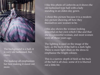
2. Her pulling her skin I feel is the
most striking about this picture.
Also the way she has white paint
on her face with no facial
expression.
The photo is a close up.
There is emphasis on the face.
Background- dark colour, and it
is a simple background to make
her stand out.
The makeup emphasizes her eyes as it
makes them stand out being big, dark
and bold.
It has a broad depth of field and is all
in focus.
White and Brown are the
overwhelming colours
Her white shirt is simple, and the
way that it is white draws the
attention to the white face.
Annie Liebovits has used direct
address in the photograph to
make the model be looking at
you wherever you are.
3. He is on the right side of the image.
He has a swan wrapped around his
neck with him. And he doesn’t seem
to have an expression on his face.
Liebovits has used direct address to
make Leonardo Dicaprio be looking
directly at the audience.
He is an environmentalist
It has a simple background of
weeds/grass and is a simple black
and white image.
It is a narrow depth of
field, focusing on the swan and
Dicaprio making those two the
only things in focus.
Lighting contrasts the colours
The rule of thirds is used in this
image to draw attention to Dicaprios
eyes.
He is wearing black which makes the
white swan stand out.
The swan wrapped around his neck
attracts the attention directly to his
face.
They both compliment each other in
the photo
4. I feel this image looks like the
drama masks of happy and sad.
It is a close up image which
emphasizes the to faces direct.
Thirds are used to emphasize the
mouth and the eyes.
The lighting is more focused on the
image on the left. Where as the image
on the right is in darker lights because
of the way she is facing.
The images are used to illustrate articles
within a magazine.
The background is simple, dark,
and black. Which emphasizes the
white faces more.
Direct address is used in the
image on the right, but the image
in the left is not as it isn't looking
straight into the camera.
It is a broad depth of field and is
a close up of the faces.
5. I like this photo of Liebovits as it shows the
old fashioned type hall with a lady
standing in an olden day gown.
I chose this picture because it is a modern
day picture showing off how they
themselves saw women to be.
I this also shows the woman looking
powerful on her own which I like and that
she is a powerful woman, and most women
were all those years ago.
The background is a hall, it
is very old fashioned, but
classy.
The makeup all emphasizes
her face making it stand out
more.
The lighting is used on the image of the
lady, as the back of the hall is a dark light.
There is more light shun on the dress to
emphasize the bright colours.
This is a narrow depth of field as the back
of the hall is all clear, some of it is blurred
out a little bit.
6. The lighting in this picture is very much
focused on lighting up the models face
and body.
The rule of thirds is used in this photo to
emphasize the eyes.
Straight away the eyes stand out in this
image as they are big, bold and brown
and full of emotion staring straight into
the camera.
Direct address is used where the model
is looking at the audience where ever
you are standing.
This image is a close up of the
head and upper
body, however is covered up
with her clothes.
The background is very simple and dark
coloured so that it doesn’t take away
from the image in the middle.
She has no facial expression
on her face
This is a broad depth of field as nothing
is blurred out, everything is clear in the
photo.