Downloaded 30 times
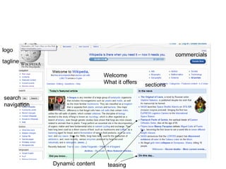
![Home page Logo + tag line Sections/classification Search Teasing Dynamic content [publicite] Shortcuts to the most visited pages [sign-up]](https://image.slidesharecdn.com/ipwc6en-110502135239-phpapp01/85/Usability-and-accessibility-on-the-web-5-320.jpg)
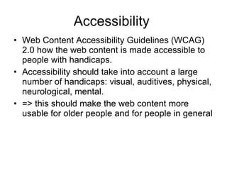

The document discusses usability and accessibility on the web. It covers topics like usability, navigation, conventions used for navigation, home page objectives, and the Web Content Accessibility Guidelines (WCAG) 2.0. WCAG 2.0 provides recommendations for making web content accessible to people with disabilities, including visual, auditory, physical, cognitive and neurological impairments. The guidelines are grouped by priority and cover objectives like ensuring information is perceivable, interface components are operable, and the interface and content are understandable. Examples are provided throughout to illustrate the guidelines.