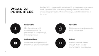
2. 2
In 1999, Bruce Lindsay Maguire (a web user who
has been blind since birth) filed a complaint
against the the Sydney Olympic Organising
Committee after being unable to successfully
book tickets to the Games.
This lawsuit enshrined digital accessibility into
Australian law, thus leading us to the requirement
that all products must reach WCAG AA
Compliance.
The Sydney Olympics Incident
3. 3
DISABILITY IN
AUSTRALIA
By the numbers
20% 1 in 5 Australians identify
as having a disability
10% of people aged 25-34 have
a disability
43% of people aged 65-74 have
a disability
As Australia’s population ages, the need
for accessible products increases.
4. 4
WCAG 2.1
PRINCIPLES
As of WCAG 2.1, there are 80 guidelines. 50 of these need to be met to
reach AA compliance. Fortunately, these guidelines follow some
simple design principles which will keep you out of trouble most of
the time.
Perceivable
All information and UI
components must be
presentable to users in ways
they can perceive
Understandable
Information and operation of
the UI must be understandable
Operable
UI Components and navigation
must be operable
Robust
Content must be robust
enough that it can be
interpreted by most devices
5. 5
WCAG 2.1
PRINCIPLES
As of WCAG 2.1, there are 80 guidelines. 50 of these need to be met to
reach AA compliance. Fortunately, these guidelines follow some
simple design principles which will keep you out of trouble most of
the time.
Perceivable
All information and UI
components must be
presentable to users in ways
they can perceive
Understandable
Information and operation of
the UI must be understandable
Operable
UI Components and navigation
must be operable
Robust
Content must be robust
enough that it can be
interpreted by most devices
6. 6
This section looks at how we can help users comprehend our
interfaces if they experience any kind of barrier which would
change how they perceive information.
This extends beyond assistive technologies (such as screen
readers) and includes cases where users might be using
different operating systems or digital wellbeing features
PERCEIVABLE
All information and UI
components must be
presentable to users in ways
they can perceive
9. 9
AUTOPLAY SOUND
WCAG 1.4.2
WCAG 1.4.5, 1.4.9
CONTENT ON HOVER
WCAG 1.4.13
LOCKING VIEWPORT
WCAG 1.3.4, 1.4.10
QUICK DON’TS Easy mistakes that we don’t really need to dive into
USE IMAGES OF TEXT
10. 10
One of the most simple but most overlooked
accessibility failures is correctly tagging
images and icons so that screen reader users
don’t miss any important content.
You can check for this using either a screen
reader (NVDA or VoiceOver are good) or a
browser plugin like WAVE or AxE
For users with screen
reading technologies, we
need to provide another
means for them to see.
TEXT
ALTERNATIVES
WCAG SUCCESS CRITERIA
1.1.1 & 1.3.1
Wouldn’t need an alt as the supporting
text provides enough context
Requires an alt attribute as there’s
insufficient context for this icon
11. 11
iOS: Settings > General > Accessibility >
Display Accommodation >
Colour Filters (toggle on) > Greyscale
Android: Settings > Accessibility > Vision >
Greyscale > Toggle On
(or it’ll be in your Quick Settings bar)
ACTIVITY
Download and play
Dots: A Game About Connecting
in greyscale
12. 12
As designers, we have a tendency to consider
colour as one of the most important aspects
of our design.
This becomes an even greater problem when
you start designing for the context of an
application that shows status -
RELIANCE
ON COLOUR
1 in 12 men & 1 in 200 women
experience some form of
colour blindness
Tools
WCAG SUCCESS CRITERIA
1.4.1, 1.4.3, 1.4.6, & 1.4.11
!
Colour Contrast Analyser (Windows & OSX)
Clunky, but covers all contrast rules.
Contrast (OSX)
Fast, but only covers text related rules
Colorblinding (Chrome Web Store)
Good for testing live sites. Allows you to see how
the site would look with different types of
colour blindnesses.
14. 14
VIDEO
ENSURE THAT AN AUDIO DESCRIPTION TRACK IS AVALIABLE
WCAG 1.2.3, 1.2.5, 1.2.7, & 1.2.9
"
ALWAYS PROVIDE CONTROLS
WCAG 1.4,2
"
ENSURE ALL VIDEO CONTENT IS CAPTIONED
WCAG 1.2.2 & 1.2.4
"
15. 15
This category covers the physicality of User Interfaces. Users
may be able to process the information presented on screen
without assistive technology, but the way they interact is
somewhat augmented.
OPERABLE
UI Components and
navigation must be operable
16. 16
Bonus challenges for people
using Outlook:
• Make the email high priority
• Change the font of the body
text to a serif typeface
ACTIVITY
Using only the
keyboard to
navigate,
send an email to:
npmtconnect@gmail.com
Next link Previous link Select
17. 17
KEYBOARD
ACCESSIBILITY
ENSURE THAT FOCUSED ELEMENTS HAVE A CLEAR FOCUS STATE
People using Gmail may have not spotted when the cursor hit the create new email button, and
instead had to determine this by using the context of the surrounding buttons to navigate. This is
creating excessive cognitive load for the users.
"
ALLOW THE USER MULTIPLE WAYS TO COMPLETE A TASK
Again, did you find it restrictive using your respective email clients? Was there only one way for you to
approach parts of this activity?
"
ENSURE THAT ALL BUTTONS CAN BE TABBED TO
You may have noticed in the previous challenge (especially if you used Gmail) that portions of the
application were completely skipped without any justification. No user should be locked off from
aspects of your website or application.
"
18. 18
Imposing a time limit in general for the user
can be quite restrictive, especially users with
mobility users.
The timing issue worsens when a user loses
their progress by failing to complete a task
within the imposed timeframe.
TIMING (2.2)
Allow the user enough time to
complete tasks
21. 21
UNDERSTANDABLE
3.1. Readable
• Is the content easy to
comprehend? (i.e. do you
need more than a lower
secondary level of education
to understand?)
• Has the page’s language
been marked up?
• Are abbreviations and
unusual words explained?
3.3. Input Assistance
• Have you provided clear
labels on inputs?
• Have you provided
meaningful error states?
• Have you tried your best to
prevent errors from
occurring?
3.2. Predictable
• Does the page act In the way
a user would anticipate it to?
• Does the context change
when the user focuses or
inputs information?
• Are similar components
tagged the same?