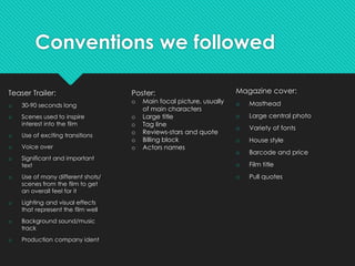
In what way does your media
product use, develop or
challenge forms and
conventions of real media
products?
By Saskia Duncan-King
Conventions we followed
Teaser Trailer:
o 30-90 seconds long
o Scenes used to inspire
interest into the film
o Use of exciting transitions
o Voice over
o Significant and important
text
o Use of many different shots/
scenes from the film to get
an overall feel for it
o Lighting and visual effects
that represent the film well
o Background sound/music
track
o Production company ident
Magazine cover:
o Masthead
o Large central photo
o Variety of fonts
o House style
o Barcode and price
o Film title
o Pull quotes
Poster:
o Main focal picture, usually
of main characters
o Large title
o Tag line
o Reviews-stars and quote
o Billing block
o Actors names
We looked at two film trailers in detail which had
a similar genre to ours: Submarine & 500 days of
Summer
Here you can see that from both
the films we looked at and our
teaser trailer, they all have a similar
over the shoulder shot of the main
character/s at the start of the trailer.
We used this as we felt it helped the
genre of our film be recognised
quickly because we've constructed
it in a way similar to other films of
the same genre.
In the next three screenshots, it shows
a still from each trailer which are also
similar. A close up of the main
characters are shown. This is another
convention we've found in many
teaser trailers that we've also used,
and also in the teaser trailer, like
others, the actors name playing the
main character is also shown.
Above you can see the screenshots for the
company idents of Submarine, 500 days of
summer and Zoe-Grace. You can see the other
films both have their ident at the beginning, this
is a convention we've challenged as we've
placed our company ident nearer the end. The
reason for this is that we felt that
It fitted in with our teaser trailer better, keeping
with the style we wanted.
Researching other teaser trailers, we found
another convention was to have the title of the
film shown at the end, and then followed by
'coming soon'. As you can see from the
screenshots below, we were able to have our title
and a coming soon board at the end of the teaser
trailer, like shown here with Submarine and 500
days of Summer.
The teaser trailer 500 days of Summer,
was our favourite teaser trailer, and
one we wanted ours to be like. We
liked the shot of the main characters
hands as we felt this added some
mystery and uncertainty to the trailer,
which is gripping for the audience so
they want to know what happens
next. To get the same reaction from
our audience, we re-created this shot
for our teaser trailer, and used it in
conjunction with cuts back to the
characters awkward faces to build
upon the quirky feel we wanted this
teaser trailer to have.
Another convention to teaser trailers are using a voice
over. In 500 days of Summer, the reason we liked the
voice over was because of the deep male voice used,
and the use of single words to describe the film as it
doesn't revealed to much about the film, but captures
the audiences attention. So we again tried to re-create
something similar using a deep male voice and single
interesting words, and we felt this was very effective
whilst also following the conventions of a teaser trailer.
We also liked the choice of
background music used in 500
days of Summer teaser trailer as it
was calm but picked up pace
still, when looking for a
background music we followed
the same conventions and found
one that suites our teaser trailer
well.
Our Poster
When looking at other films of the same genre, we found
many conventions which we found helpful and used in
ours.
As you can see in the 3 comparison film posters they all
consist of the colours red, blue and yellow, we kept to this
in our poster as it represents the genre well.
Other conventions we followed from these other posters
was something quirky, like the in the others such as, the
head half under blue, the pictures in text, we used two
'drawn' effect speech bubbles with icons inside to
represent the characters.
We also used a bold title,a star rating with quotes, a billing
block and the bottom of the poster, feature of main
characters, a strap line, and main actors names.
Our Magazine Cover
When coming to create our poster we decided on creating our own magazine company as we felt
it would be more suitable for our film, but used total film as a comparison for conventions to follow.
Here you can see both covers have a large mast head with the feature character covering
someone it, a main featured character shown about waist upwards, the title of the featured film in
a smaller bold in the central lower third of the cover, a barcode in the bottom right hand corner,use
of the word 'exclusive" to lure in the audience, a price and date, mentions of interviews with named
people, and other mentions in a smaller font around the left and right side of the lower two thirds of
the cover.
Conventions we
challenged on our
poster compared to
this total film one, are
the 'top films of the
summer' bubble and
the main character's
name in bold under
the film title. We did
this because we felt
it's something that
fitted in well with the
quirky brand identity
and gave our Nova
film magazine
company it's own
style.

Evaluation q1

  • 1.
    In what waydoes your media product use, develop or challenge forms and conventions of real media products? By Saskia Duncan-King
  • 2.
    Conventions we followed TeaserTrailer: o 30-90 seconds long o Scenes used to inspire interest into the film o Use of exciting transitions o Voice over o Significant and important text o Use of many different shots/ scenes from the film to get an overall feel for it o Lighting and visual effects that represent the film well o Background sound/music track o Production company ident Magazine cover: o Masthead o Large central photo o Variety of fonts o House style o Barcode and price o Film title o Pull quotes Poster: o Main focal picture, usually of main characters o Large title o Tag line o Reviews-stars and quote o Billing block o Actors names
  • 3.
    We looked attwo film trailers in detail which had a similar genre to ours: Submarine & 500 days of Summer Here you can see that from both the films we looked at and our teaser trailer, they all have a similar over the shoulder shot of the main character/s at the start of the trailer. We used this as we felt it helped the genre of our film be recognised quickly because we've constructed it in a way similar to other films of the same genre. In the next three screenshots, it shows a still from each trailer which are also similar. A close up of the main characters are shown. This is another convention we've found in many teaser trailers that we've also used, and also in the teaser trailer, like others, the actors name playing the main character is also shown.
  • 4.
    Above you cansee the screenshots for the company idents of Submarine, 500 days of summer and Zoe-Grace. You can see the other films both have their ident at the beginning, this is a convention we've challenged as we've placed our company ident nearer the end. The reason for this is that we felt that It fitted in with our teaser trailer better, keeping with the style we wanted. Researching other teaser trailers, we found another convention was to have the title of the film shown at the end, and then followed by 'coming soon'. As you can see from the screenshots below, we were able to have our title and a coming soon board at the end of the teaser trailer, like shown here with Submarine and 500 days of Summer.
  • 5.
    The teaser trailer500 days of Summer, was our favourite teaser trailer, and one we wanted ours to be like. We liked the shot of the main characters hands as we felt this added some mystery and uncertainty to the trailer, which is gripping for the audience so they want to know what happens next. To get the same reaction from our audience, we re-created this shot for our teaser trailer, and used it in conjunction with cuts back to the characters awkward faces to build upon the quirky feel we wanted this teaser trailer to have. Another convention to teaser trailers are using a voice over. In 500 days of Summer, the reason we liked the voice over was because of the deep male voice used, and the use of single words to describe the film as it doesn't revealed to much about the film, but captures the audiences attention. So we again tried to re-create something similar using a deep male voice and single interesting words, and we felt this was very effective whilst also following the conventions of a teaser trailer. We also liked the choice of background music used in 500 days of Summer teaser trailer as it was calm but picked up pace still, when looking for a background music we followed the same conventions and found one that suites our teaser trailer well.
  • 6.
    Our Poster When lookingat other films of the same genre, we found many conventions which we found helpful and used in ours. As you can see in the 3 comparison film posters they all consist of the colours red, blue and yellow, we kept to this in our poster as it represents the genre well. Other conventions we followed from these other posters was something quirky, like the in the others such as, the head half under blue, the pictures in text, we used two 'drawn' effect speech bubbles with icons inside to represent the characters. We also used a bold title,a star rating with quotes, a billing block and the bottom of the poster, feature of main characters, a strap line, and main actors names.
  • 7.
    Our Magazine Cover Whencoming to create our poster we decided on creating our own magazine company as we felt it would be more suitable for our film, but used total film as a comparison for conventions to follow. Here you can see both covers have a large mast head with the feature character covering someone it, a main featured character shown about waist upwards, the title of the featured film in a smaller bold in the central lower third of the cover, a barcode in the bottom right hand corner,use of the word 'exclusive" to lure in the audience, a price and date, mentions of interviews with named people, and other mentions in a smaller font around the left and right side of the lower two thirds of the cover. Conventions we challenged on our poster compared to this total film one, are the 'top films of the summer' bubble and the main character's name in bold under the film title. We did this because we felt it's something that fitted in well with the quirky brand identity and gave our Nova film magazine company it's own style.