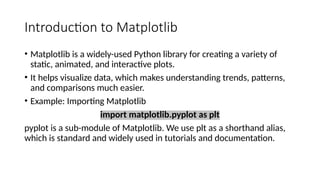
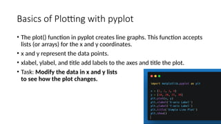
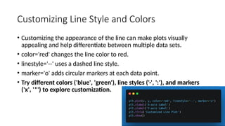
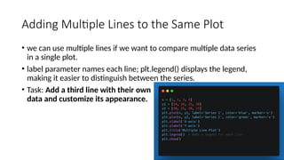
Introduction to Matplotlib
Introduction to Artificial Intelligence
Introduction to Matplotlib
• Matplotlib is a widely-used Python library for creating a variety of
static, animated, and interactive plots.
• It helps visualize data, which makes understanding trends, patterns,
and comparisons much easier.
• Example: Importing Matplotlib
import matplotlib.pyplot as plt
pyplot is a sub-module of Matplotlib. We use plt as a shorthand alias,
which is standard and widely used in tutorials and documentation.
Basics of Plotting with pyplot
• The plot() function in pyplot creates line graphs. This function accepts
lists (or arrays) for the x and y coordinates.
• x and y represent the data points.
• xlabel, ylabel, and title add labels to the axes and title the plot.
• Task: Modify the data in x and y lists
to see how the plot changes.
Customizing Line Style and Colors
• Customizing the appearance of the line can make plots visually
appealing and help differentiate between multiple data sets.
• color='red' changes the line color to red.
• linestyle='--' uses a dashed line style.
• marker='o' adds circular markers at each data point.
• Try different colors ('blue', 'green'), line styles ('-', ':'), and markers
('x', '*') to explore customization.
Adding Multiple Lines to the Same Plot
• we can use multiple lines if we want to compare multiple data series
in a single plot.
• label parameter names each line; plt.legend() displays the legend,
making it easier to distinguish between the series.
• Task: Add a third line with their own
data and customize its appearance.
Bar Plots
• Bar plots display data in rectangular bars, ideal for comparing
categories.
• plt.bar() creates a bar plot, with categories on the x-axis and values as
heights of the bars.
• Task: Change the values list to represent different data (e.g., scores
or population).
Scatter Plots
• Scatter plots are used to show relationships between two variables.
• plt.scatter() plots each point individually, useful for analyzing data
distribution.
• Task: Use different colors and markers to represent data from two
groups.
Histograms
• Histograms are useful for showing data distribution, especially with
large datasets.
• np.random.normal() generates 100 random data points.
• plt.hist() creates the histogram, where bins=10 means 10 intervals.
• Task: Change bins to see how it affects the granularity of the
histogram.
Using Subplots for Multiple Plots in One
Figure
• Subplots allow multiple plots in a single figure, useful for comparing
related data.
• fig, axs = plt.subplots(1, 2) creates a 1x2 grid.
• axs[0] and axs[1] refer to the first and second subplot.
• Task: Add a third subplot showing a bar plot.
Advanced Customization Techniques
• Advanced techniques make plots more informative and visually
engaging.
• linewidth=2 adjusts line thickness.
• grid=True adds a background grid.
• xlim and ylim set the range for x and y axes.
• Task: Experiment with different xlim
and ylim values to see how it changes
plot focus.
MINI PROJECTS
Sales Comparison Plot
• plot weekly sales data for two products, customize it with labels, title,
and legend.
Temperature Variation Plot
• Visualize temperature changes over a week using a line plot and a
scatter plot in subplots.
Monthly Expenses Bar Chart
• Visualize monthly expenses in different categories (like groceries, rent,
entertainment, and utilities) using a bar chart.
Survey Data Pie Chart
• Create a pie chart to display survey results (Visualize survey data from
a poll about favourite programming languages, showing each
language’s share.)
Sales Trend Comparison Line Plot
• Compare monthly sales trends for two products (Plot the sales of two
products over 12 months to see trends and seasonal effects.)
Population Distribution Histogram
• Display population distribution across age groups (Plot a histogram of
ages within a community to show distribution.)
Weather Data Subplots
• Create subplots to display monthly average temperature and rainfall
(Use subplots to plot monthly temperature and rainfall for a city).

a9bf73_Introduction to Matplotlib01.pptx

  • 1.
    Introduction to Matplotlib Introductionto Artificial Intelligence
  • 2.
    Introduction to Matplotlib •Matplotlib is a widely-used Python library for creating a variety of static, animated, and interactive plots. • It helps visualize data, which makes understanding trends, patterns, and comparisons much easier. • Example: Importing Matplotlib import matplotlib.pyplot as plt pyplot is a sub-module of Matplotlib. We use plt as a shorthand alias, which is standard and widely used in tutorials and documentation.
  • 3.
    Basics of Plottingwith pyplot • The plot() function in pyplot creates line graphs. This function accepts lists (or arrays) for the x and y coordinates. • x and y represent the data points. • xlabel, ylabel, and title add labels to the axes and title the plot. • Task: Modify the data in x and y lists to see how the plot changes.
  • 4.
    Customizing Line Styleand Colors • Customizing the appearance of the line can make plots visually appealing and help differentiate between multiple data sets. • color='red' changes the line color to red. • linestyle='--' uses a dashed line style. • marker='o' adds circular markers at each data point. • Try different colors ('blue', 'green'), line styles ('-', ':'), and markers ('x', '*') to explore customization.
  • 5.
    Adding Multiple Linesto the Same Plot • we can use multiple lines if we want to compare multiple data series in a single plot. • label parameter names each line; plt.legend() displays the legend, making it easier to distinguish between the series. • Task: Add a third line with their own data and customize its appearance.
  • 6.
    Bar Plots • Barplots display data in rectangular bars, ideal for comparing categories. • plt.bar() creates a bar plot, with categories on the x-axis and values as heights of the bars. • Task: Change the values list to represent different data (e.g., scores or population).
  • 7.
    Scatter Plots • Scatterplots are used to show relationships between two variables. • plt.scatter() plots each point individually, useful for analyzing data distribution. • Task: Use different colors and markers to represent data from two groups.
  • 8.
    Histograms • Histograms areuseful for showing data distribution, especially with large datasets. • np.random.normal() generates 100 random data points. • plt.hist() creates the histogram, where bins=10 means 10 intervals. • Task: Change bins to see how it affects the granularity of the histogram.
  • 9.
    Using Subplots forMultiple Plots in One Figure • Subplots allow multiple plots in a single figure, useful for comparing related data. • fig, axs = plt.subplots(1, 2) creates a 1x2 grid. • axs[0] and axs[1] refer to the first and second subplot. • Task: Add a third subplot showing a bar plot.
  • 10.
    Advanced Customization Techniques •Advanced techniques make plots more informative and visually engaging. • linewidth=2 adjusts line thickness. • grid=True adds a background grid. • xlim and ylim set the range for x and y axes. • Task: Experiment with different xlim and ylim values to see how it changes plot focus.
  • 11.
  • 12.
    Sales Comparison Plot •plot weekly sales data for two products, customize it with labels, title, and legend.
  • 13.
    Temperature Variation Plot •Visualize temperature changes over a week using a line plot and a scatter plot in subplots.
  • 14.
    Monthly Expenses BarChart • Visualize monthly expenses in different categories (like groceries, rent, entertainment, and utilities) using a bar chart.
  • 15.
    Survey Data PieChart • Create a pie chart to display survey results (Visualize survey data from a poll about favourite programming languages, showing each language’s share.)
  • 16.
    Sales Trend ComparisonLine Plot • Compare monthly sales trends for two products (Plot the sales of two products over 12 months to see trends and seasonal effects.)
  • 17.
    Population Distribution Histogram •Display population distribution across age groups (Plot a histogram of ages within a community to show distribution.)
  • 18.
    Weather Data Subplots •Create subplots to display monthly average temperature and rainfall (Use subplots to plot monthly temperature and rainfall for a city).