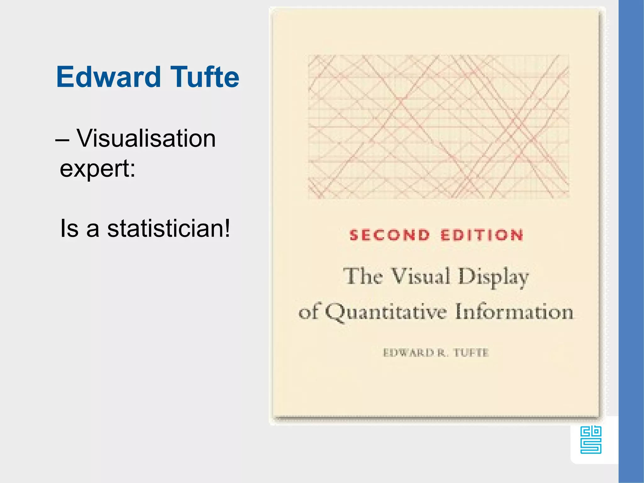
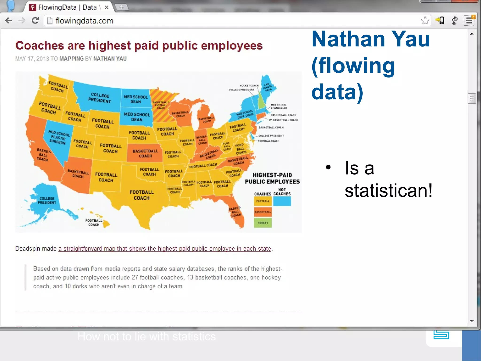
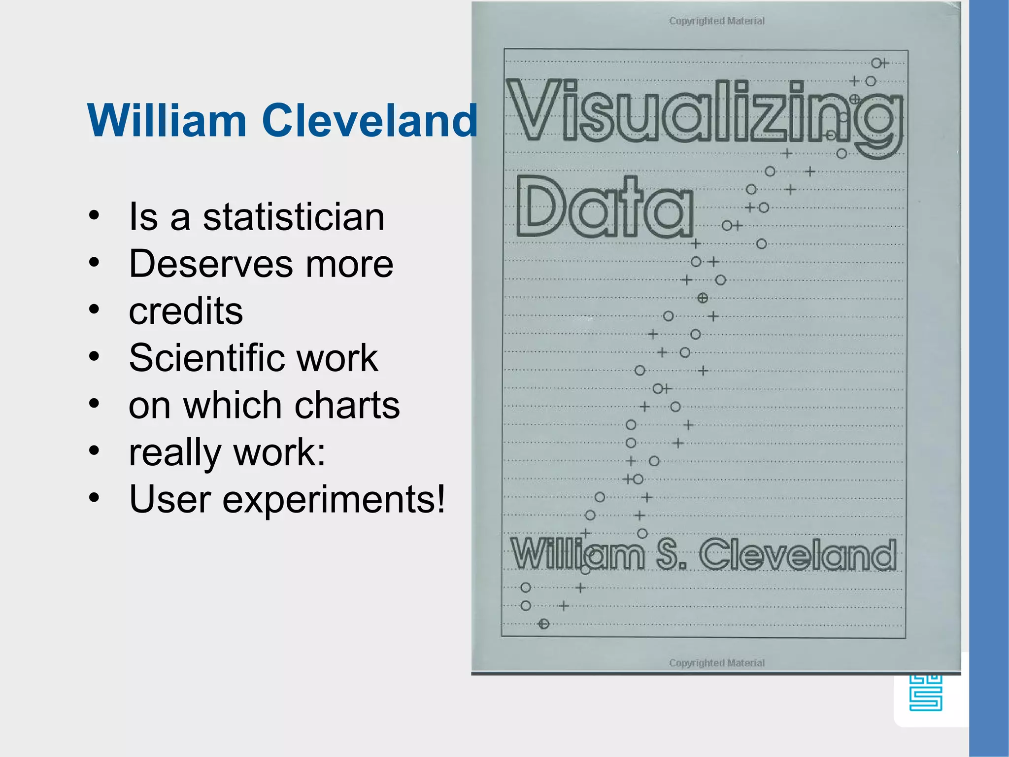
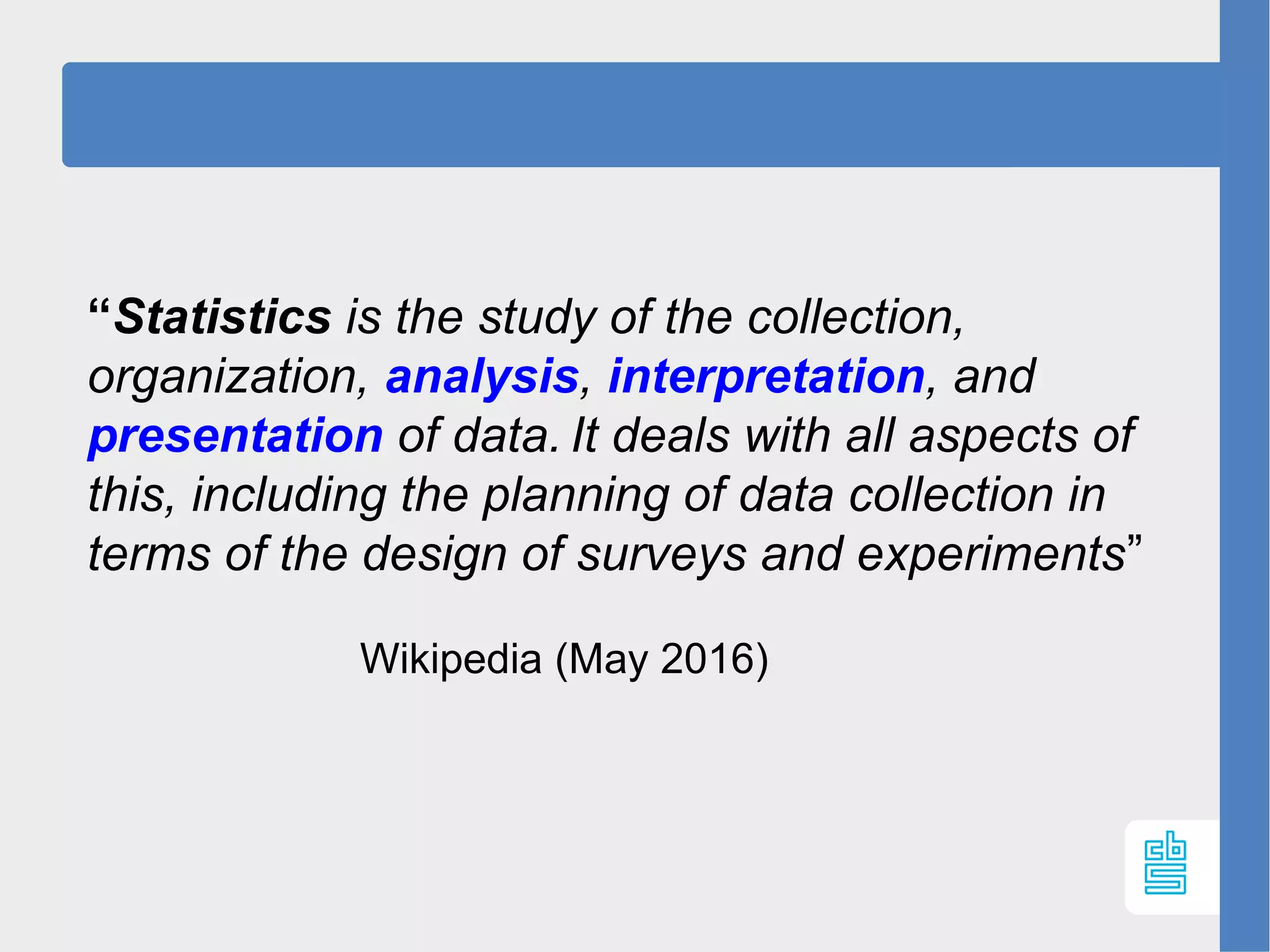
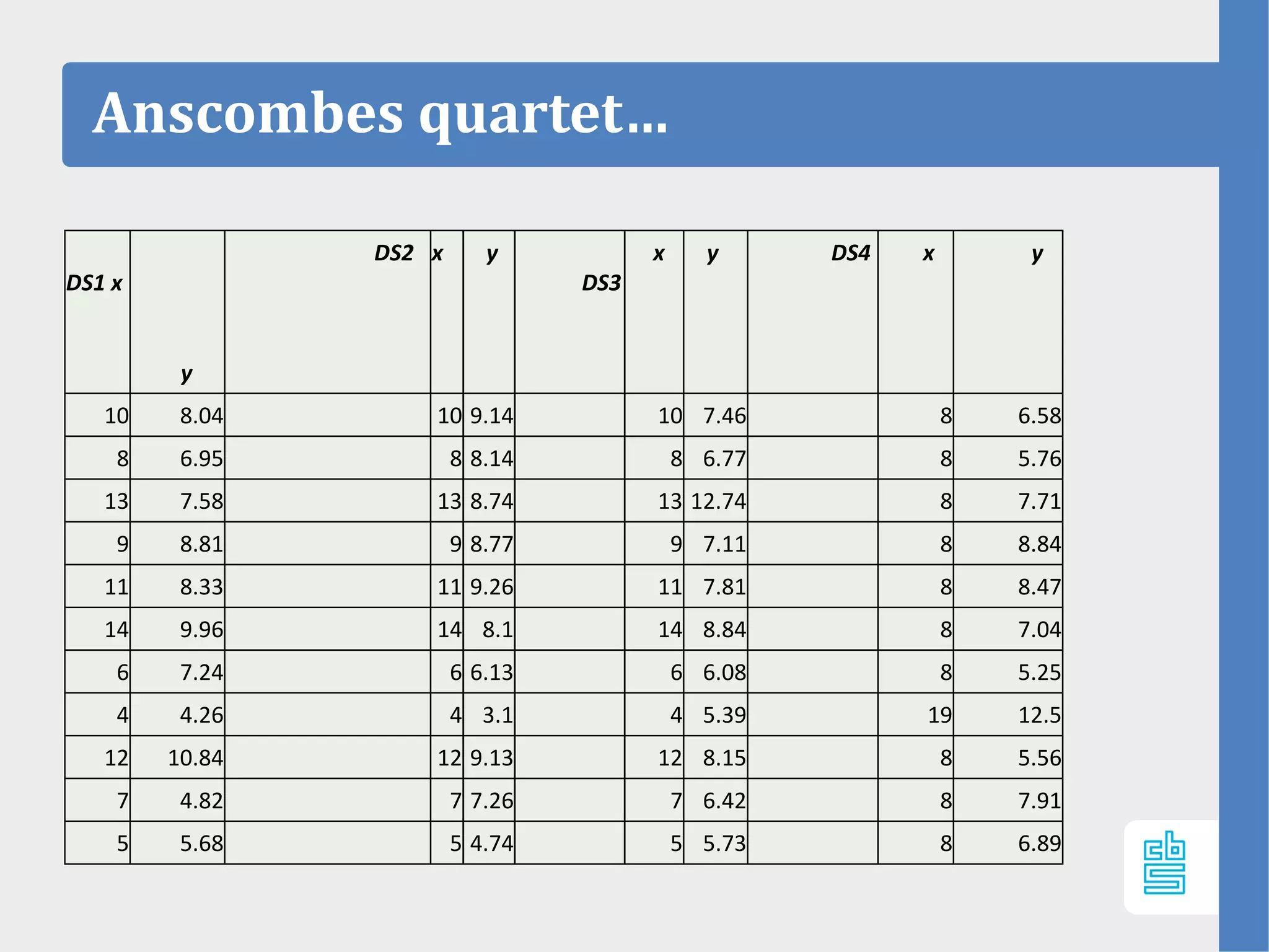
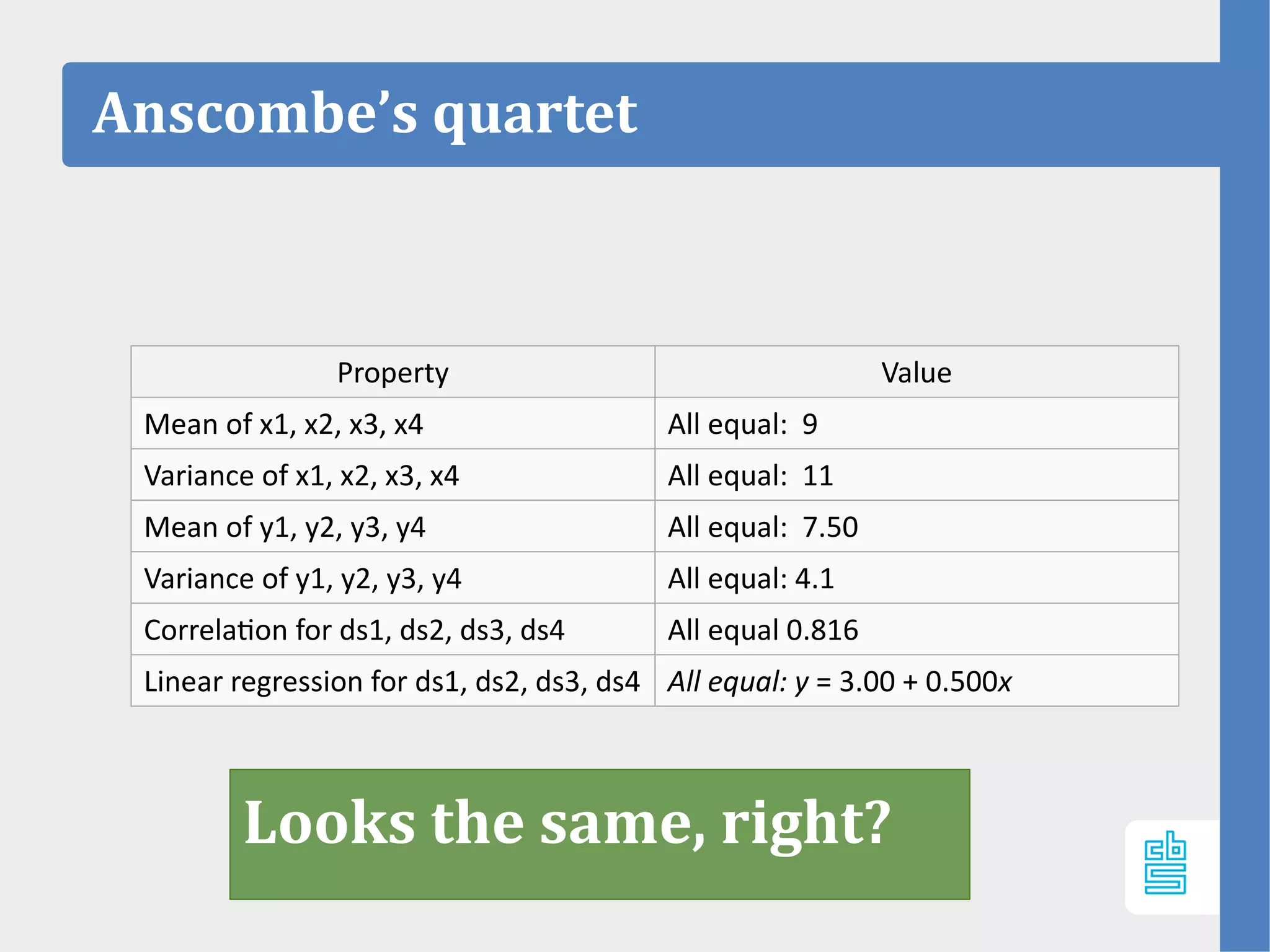
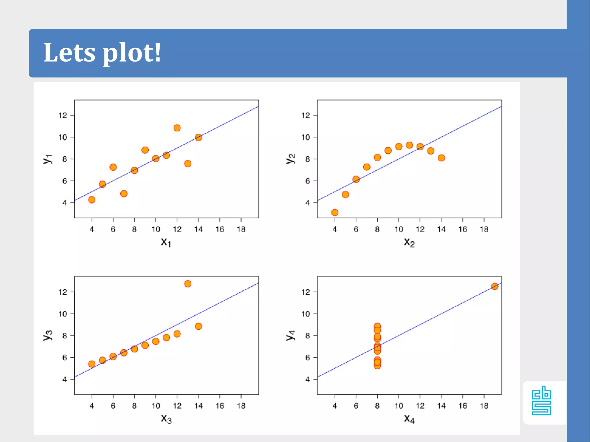
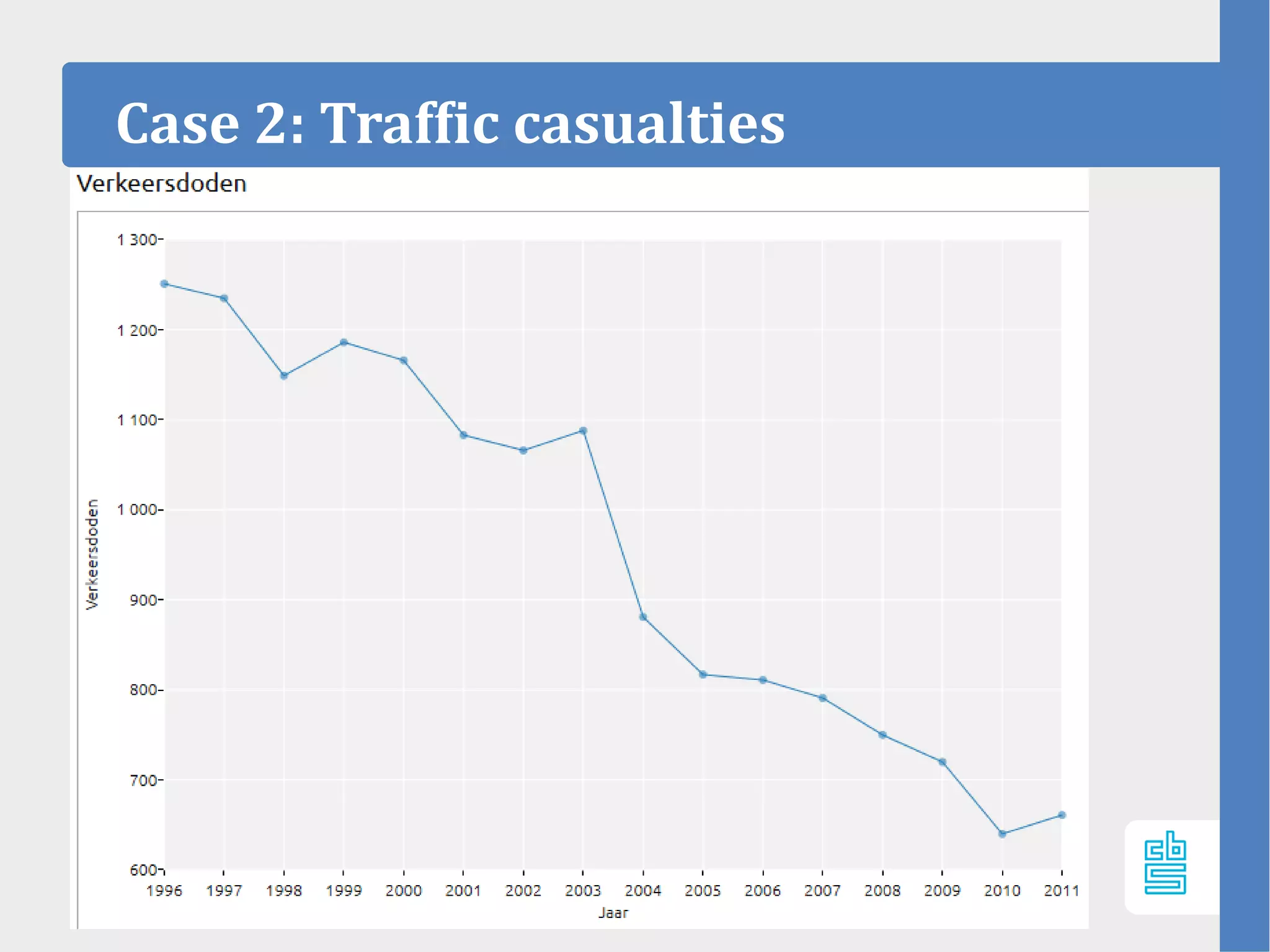
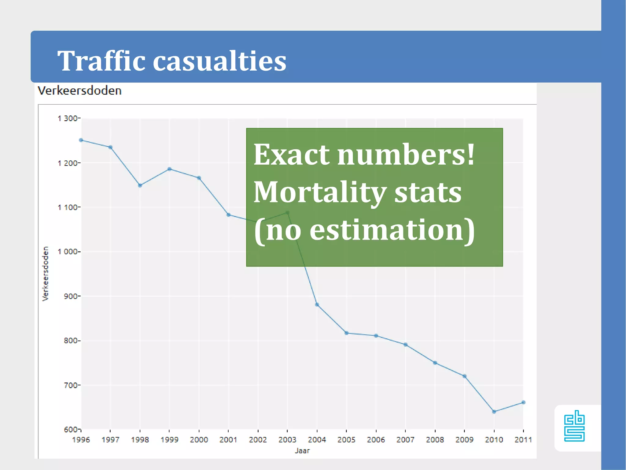
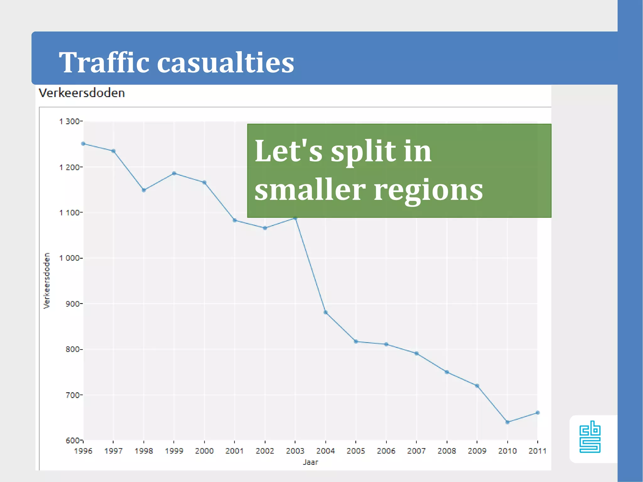
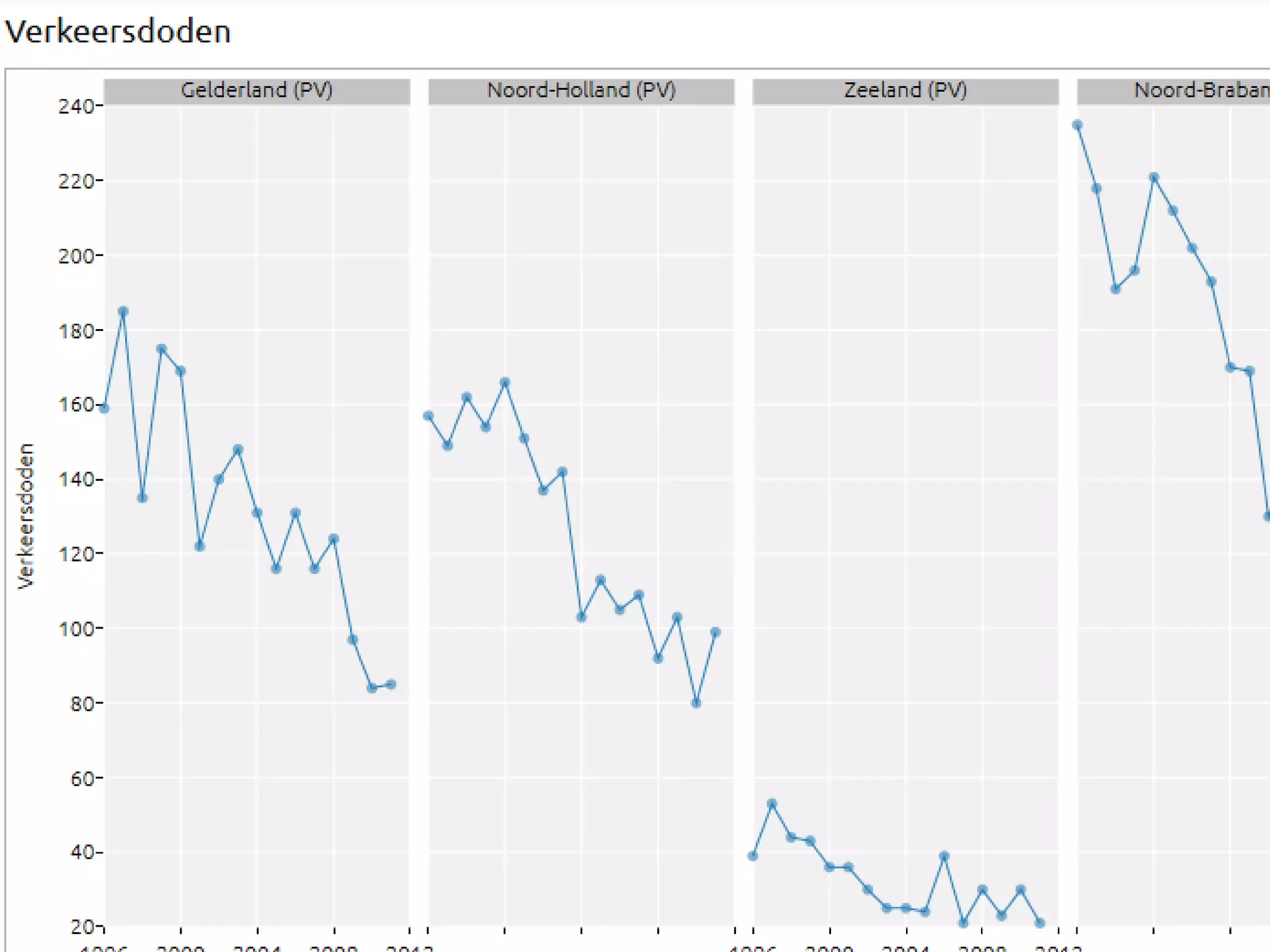
1. Edwin de Jonge (@edwindjonge)
May 17th 2016,
Visualisation Workshop, Valencia
Uncertainty visualisation
2. Who am I?
Statistical consultant / Data scientist
- working @ R&D department of Statistics
Netherlands (CBS)
- Expertise:
- Visualisation
- Computational Statistics
- Complexity
10. • Visualisation useful for every step:
•
Collection
Presentation of data
But also analysis and interpretation!
How not to lie with statistics
12. Anscombe’s quartet
Property Value
Mean of x1, x2, x3, x4 All equal: 9
Variance of x1, x2, x3, x4 All equal: 11
Mean of y1, y2, y3, y4 All equal: 7.50
Variance of y1, y2, y3, y4 All equal: 4.1
Correlation for ds1, ds2, ds3, ds4 All equal 0.816
Linear regression for ds1, ds2, ds3, ds4 All equal: y = 3.00 + 0.500x
Looks the same, right?
14. Publishing uncertainty...
Official statistics institute are:
– very careful / prudent / reluctant on publishing
uncertainty margins.
Reasons:
– “Users don't understand them”
– “Users dont need them”
– “Users may choose the number that best fits”
– “We don't have an accurate estimation of the
accuracy”.
– “It may be embarrassing large”
– ?
15. Why is uncertainty important?
For official statistics, at least two reasons:
– Communicating accuracy
– Statistical/stochastic uncertainty
Let's view two cases of stats NL (CBS)
What is not surrounded by uncertainty cannot be
the truth,
Richard Feynman
16. Case 1: Diabetes (stats nl)
– Diabetes incidence
– Based on a (large) health survey
of statistics netherlands (CBS)
30. Uncertainty Visualisation
– Active research activity!
–
– Most research papers on:
Cartography
Geology
3D (Medical imaging, astronomy
Techniques used:
Transparency
Different colorisation (“whitening”)
– Not many on plain statistical graphs…
– Error bars are known to be imperfect.
31. User Study 1:
StatMine
– The perception of visual uncertainty representation by
non-experts
Tak,Toet, van Erp,Transactions on
Visualisation and computer Graphics, 2014
– User experiment:
140 users
– Tests:
Reading of certainty.
Given a number, how certain is that value?
34. User Study 1: findings
StatMine
– Non-expert can read probability intervals.
– However: users with high numeracy are
better at it.
– No (significant) difference in response
time.
– Random lines work well for stochastic
numbers.
35. User Study 2:
– Effect of displaying uncertainty in Line and Bar charts,
Van der Laan, de Jonge, Solcer, IVAPP,
2015
User study:
110 persons
Goal:
Line: how does uncertainty effect (overall) trend?
(main purpose line chart)
Bar: how does uncertainty effect comparison?
(main purpose bar chart)
StatMine
36. User Study 2: Confidence intervals
–
– Al facts Statistics Netherlands have confidence interval
– European Statistics Code of Practice (12.2):
- “sampling and non sampling errors should be
systematically documented”
Investigate how uncertainty in numbers can be presented
understandable to users.
StatMine
37. Restricted to:
- How do users interpret CI’s?
- And what does that affect the interpretation of facts?
- Do users need CI’s?
Assumption:
- For test data set of point estimate with CI available
Study 2
StatMine 0.2
38. User test (100+) with synthetic data shows that:
- CI’s improve validity of user statements (they are
more correct)
User test CI’s
StatMine 0.2
40. Line charts:
– displaying uncertainty improve user statements
(more correct)
– “band + line” works best for point estimate
, “error bar” works best for interval estimate
– Users do not “freak out” on uncertainty
– Appreciate it and ask for its definition.
User Study 2: findings Line chart
StatMine 0.2
45. Bar charts:
– displaying uncertainty makes user less confident
in comparison tasks. (which is good)
– No significant difference between methods
– PhDs prefer error bar, but error bar does do not
perform better.
– When publishing intervals (without point):
– cigarette is better
User Study 2: findings 2
StatMine 0.2
46. Start publishing uncertainty measures
Plot them!
User appreciate it, and we are doing
statistics aren't we?
Recommadation
StatMine 0.2