The document discusses font and formatting choices for a music magazine. It examines fonts like Calibri and Copperplate Gothic, as well as the use of drop caps and justified text alignment. It also covers changing text size, color, and spacing to emphasize different elements while keeping the design simple yet interesting.
These are my final decisions on the fonts I will use for my music magazine and the colour scheme I will use. There are also my final photos I will use in my magazine.
Expert Accessory Dwelling Unit (ADU) Drafting ServicesResDraft
Whether you’re looking to create a guest house, a rental unit, or a private retreat, our experienced team will design a space that complements your existing home and maximizes your investment. We provide personalized, comprehensive expert accessory dwelling unit (ADU)drafting solutions tailored to your needs, ensuring a seamless process from concept to completion.
Unleash Your Inner Demon with the "Let's Summon Demons" T-Shirt. Calling all fans of dark humor and edgy fashion! The "Let's Summon Demons" t-shirt is a unique way to express yourself and turn heads.
https://dribbble.com/shots/24253051-Let-s-Summon-Demons-Shirt
7 Alternatives to Bullet Points in PowerPointAlvis Oh
So you tried all the ways to beautify your bullet points on your pitch deck but it just got way uglier. These points are supposed to be memorable and leave a lasting impression on your audience. With these tips, you'll no longer have to spend so much time thinking how you should present your pointers.
Transforming Brand Perception and Boosting Profitabilityaaryangarg12
In today's digital era, the dynamics of brand perception, consumer behavior, and profitability have been profoundly reshaped by the synergy of branding, social media, and website design. This research paper investigates the transformative power of these elements in influencing how individuals perceive brands and products and how this transformation can be harnessed to drive sales and profitability for businesses.
Through an exploration of brand psychology and consumer behavior, this study sheds light on the intricate ways in which effective branding strategies, strategic social media engagement, and user-centric website design contribute to altering consumers' perceptions. We delve into the principles that underlie successful brand transformations, examining how visual identity, messaging, and storytelling can captivate and resonate with target audiences.
Methodologically, this research employs a comprehensive approach, combining qualitative and quantitative analyses. Real-world case studies illustrate the impact of branding, social media campaigns, and website redesigns on consumer perception, sales figures, and profitability. We assess the various metrics, including brand awareness, customer engagement, conversion rates, and revenue growth, to measure the effectiveness of these strategies.
The results underscore the pivotal role of cohesive branding, social media influence, and website usability in shaping positive brand perceptions, influencing consumer decisions, and ultimately bolstering sales and profitability. This paper provides actionable insights and strategic recommendations for businesses seeking to leverage branding, social media, and website design as potent tools to enhance their market position and financial success.
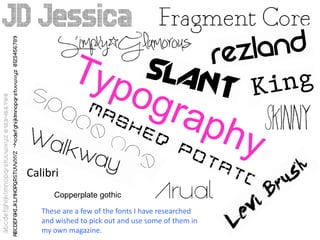
1. Calibri
Copperplate gothic
These are a few of the fonts I have researched
and wished to pick out and use some of them in
my own magazine.
2. Drop Caps
Drop caps are used in various music
magazines at the start of the article as
seen it pictures. When went to NME
they said they use drop caps in there
articles to help break up the article and
to attract the readers eye to the start of
the article.
3. Letter Spacing
Justified
Align Left
Hyphenated
I looked at the different letter spacing used in music magazine articles
and using the justified text looks neater and fits in well with my music
magazine therefore I will be using this letter spacing.
4. ChangingSi e z
& Co our l
Changing the size and colour of text on my magazine will help to
emphasise the different quotes, celebrities, news etc. NME advised us
to change the font colour and size therefore each part contrast but to
follow a colour scheme but not to over use different font, colours and
sizes otherwise it will look to over done and too clustered. They advised
us to keep it simple but to make it interesting and exciting.