
Recommended
More Related Content
What's hot
What's hot (18)
Viewers also liked
Viewers also liked (20)
Similar to Magazine Cover Design Techniques and Features
Similar to Magazine Cover Design Techniques and Features (20)
Recently uploaded
Recently uploaded (20)
Magazine Cover Design Techniques and Features
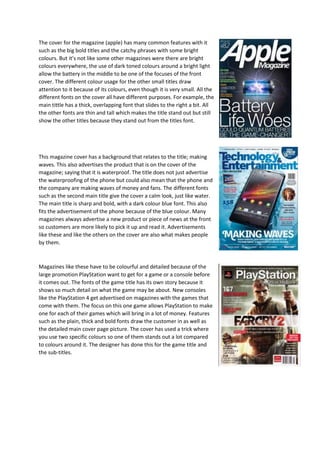
- 1. The cover for the magazine (apple) has many common features with it such as the big bold titles and the catchy phrases with some bright colours. But it’s not like some other magazines were there are bright colours everywhere, the use of dark toned colours around a bright light allow the battery in the middle to be one of the focuses of the front cover. The different colour usage for the other small titles draw attention to it because of its colours, even though it is very small. All the different fonts on the cover all have different purposes. For example, the main tittle has a thick, overlapping font that slides to the right a bit. All the other fonts are thin and tall which makes the title stand out but still show the other titles because they stand out from the titles font. This magazine cover has a background that relates to the title; making waves. This also advertises the product that is on the cover of the magazine; saying that it is waterproof. The title does not just advertise the waterproofing of the phone but could also mean that the phone and the company are making waves of money and fans. The different fonts such as the second main title give the cover a calm look, just like water. The main title is sharp and bold, with a dark colour blue font. This also fits the advertisement of the phone because of the blue colour. Many magazines always advertise a new product or piece of news at the front so customers are more likely to pick it up and read it. Advertisements like these and like the others on the cover are also what makes people by them. Magazines like these have to be colourful and detailed because of the large promotion PlayStation want to get for a game or a console before it comes out. The fonts of the game title has its own story because it shows so much detail on what the game may be about. New consoles like the PlayStation 4 get advertised on magazines with the games that come with them. The focus on this one game allows PlayStation to make one for each of their games which will bring in a lot of money. Features such as the plain, thick and bold fonts draw the customer in as well as the detailed main cover page picture. The cover has used a trick where you use two specific colours so one of them stands out a lot compared to colours around it. The designer has done this for the game title and the sub-titles.
- 2. The digit magazine uses its own custom font that makes the text look much more futuristic then the plain bold font used by every other magazine. The simple blue colour scheme allows the magazine to be printed using only one colour but many different shades of it. The catchy title that reads, (the next gadget is you) allows customers to remember this magazine for their gadgets and inspiring motives. Even though the magazine does not used a famous celebrity as their main cover picture, it still draws in much attention through the crafty detail and ideas that they have included in the cover. The font size is another feature that is used by many other magazine designers. The titles are always in a large size so you can see them from far away and know what magazine it is. The advertisements on the top and sides show what may be mentioned in the magazine regularly. The maximum tech magazine uses a famous android comical character as a eye catcher to bring in customers that know about the android character for android phones. The plain font that is used brings out the other features such as the background picture. The two colours used which hare blue and green are very calm colours depending on their tone. Having a cover with calm colours instead of sharp colours. The front cover is meant to tell you what the whole magazine is about. This magazine does this through the tower of apps with the android mascot at the top, this is showing that the contents of the magazine. The locations of all the features in the cover are always random. The gadget guide magazine uses bright orange and red colours that allow pictures to blend in a little to give it a 3D effect. The title and the other writings have a plain font but are large and sand out from the pictures. The 3D effect is a feature that captures the customer’s eyes and also shows what the magazine will be talking about. The cover is split into pictures with information and the adverts with the main title. The cover does not just use fancy pictures and deign but also used literature techniques such as a rhetorical question. This cover also descries everything that will be mentioned in the other pages of the magazine.