Transition project layout
•Download as DOCX, PDF•
0 likes•228 views
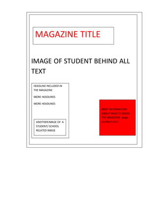
This magazine contains articles on education and student life, including headlines on page numbers about brief topics inside. It features images of students learning to represent the themes covered in the magazine.
Report
Share
Report
Share
Recommended
Transition project cover
The girl's football team's new season is starting at home and they are fundraising for their new kit. The article provides details on the new head of PE teacher, fundraising activities for both the girls and boys teams, and the release of fixtures for upcoming games.
Task 11 photography planning
The document outlines a photography planning schedule for a shoot on the 17th at a train bridge and the 18th in an alley in town. The shoot on the 17th at the train bridge will feature low angles and a mid-shot to portray a rebellious genre, while utilizing the same guitar and microphone props, rebellious clothes, photographer Beth Pimm, and camera equipment. On the 18th, the shoot in the alley will feature close-up and low angles to fit on the front cover and continue portraying a rebellious genre with the same personnel and props.
Evaluation conventions 1
This document discusses conventions used in magazine design. It notes that cover lines are conventionally placed on the left to draw more attention. Artists are typically surrounded on covers to portray their significance. Mastheads are big and easy to see. Contents pages usually repeat the title in bold and use page numbers, subheadings for navigation, and a consistent color scheme. Double page spreads commonly feature a large main image on the left page with small descriptive text, with quotes, continuous color schemes, and variations in bolding and font colors to emphasize different text types.
In depth task 10
Black Day Are is releasing a new album called "Blackest Night" which includes 9 tracks. The album appears to have a dark tone based on the album title and quotes used to promote it. Fans are encouraged to write complaints about one of the songs called "How Rude".
Preliminary task compared to my final product
The student's preliminary magazine cover task did not follow conventions in its use of images, masthead, coverlines, and layout. The photography lacked proper shot types and angles. The mise-en-scene was poor with dull costume and props. The fonts were plain and the colors were dull. Additionally, the mode of address was unclear. However, for the final magazine cover, the student's research and planning led to a more conventional design that followed industry standards. The images, fonts, colors, and overall presentation were improved to better attract the target female audience.
Transition project evaluation
The document summarizes a magazine cover created for a girls' sports team titled "SchoolSport". The magazine title is in bright red sans serif font to make it bold and noticeable. Smaller pictures on the page and writing on the bottom right provide previews of the magazine's contents, following conventional magazine cover design. The red title font and background image help all the text on the cover stand out clearly.
Draft text
Double Blood is an upcoming rock band from the UK that has seen a rapid rise to fame. They started with small local gigs but one performance that was filmed and shared online launched them into the spotlight. Since then, they have sold out larger venues across the country. The band members never expected this level of success but are working hard on their debut album while maintaining their authentic rock sound and style. They hope to one day tour internationally and become legends in the rock genre.
Magazine drafts
This document appears to be a magazine cover with images and pull quotes from stories inside. It features a main cover image and lists band names and members as well as contents from stories inside the magazine.
Transition project research
The magazine cover uses a bold sans-serif font to make the text stand out against the images. The font choice gives the impression that the content is serious, reflecting the serious nature of school. The title is displayed in the largest font at the top of the cover to draw the most attention. There is more text than images filling the page. The cover image depicts a young student in school uniform to fit the school theme. Bright colors like yellow, pink, and green are used throughout, and other text stands out in bold white font. The layout and content of the magazine are conventional, with the title at the top and articles about common school topics.
Transition project
The magazine front cover aims to attract young readers interested in sports. It uses a simple sans-serif font that is easy to read, along with ample white space and a large celebrity image of Theo Walcott to draw the eye. The title stands out in bright orange to catch attention, while other text is kept in easy-to-read white against the background. The informal tone and straightforward language make the content accessible to its target audience. Overall, the design utilizes conventional magazine elements to effectively promote the magazine's focus on sports to younger readers.
Question 7
The document describes the progress made from the student's initial school magazine project to their subsequent music magazine project. For the school magazine, they used PowerPoint and included one image below the title with spare room. For the music magazine, they used Photoshop and had learned how to overlay images on text, source additional fonts, edit images without deleting, place shapes behind images, and highlight text. The student prefers Photoshop and their skills have improved from learning to use the new software.
Evaluation question 1
The document discusses the conventions and design choices used in creating different elements of a rock music magazine, including the front cover, contents page, and double page spreads (DPS). For the front cover, banners with band names, quotes from articles, and a large central image were used. The contents page included a listing column, issue number, editor's letter, and subscription advert. Double page spreads featured a large central image on one page and columns of text on the other, with stylistic elements like drop caps and colored text to draw the reader in. Comparisons are made to established magazines to ensure the conventions of the genre are followed.
Question 7 pp progress.docx
The document compares the front covers of two magazines the author created. For the first magazine, the font was not appealing, there was too much text, and the colors were boring. For the second magazine, the author used a font site to choose a better font, improved the layout and color scheme in Photoshop, used headlines to encourage reading inside, and only included one pull quote to generate interest. The second magazine masthead also had an improved font and color that fit the genre better and was placed behind the main image.
Question 5 audience appeal
The document discusses the design choices made for a magazine appealing to teenagers. It includes justifications for design elements like the prominent cover image, use of bright colors, and inclusion of many cover lines. Feedback was gathered through a survey that showed the target audience was mostly male. Respondents liked the colors and fonts used but felt some images could be improved and requested layout changes. To make the magazine more appealing based on this feedback, the author will edit some images and adjust the bottom layout.
Question 3 – institutions
The author proposes that Bauer Media would be the best company to distribute their new rock music magazine. Bauer Media already publishes several successful music magazines similar to the author's concept, such as Kerrang, which would appeal to the target audience of 15-50 year old males. As an established publisher of popular magazines across various genres and demographics, Bauer Media has the resources and experience to help ensure the new magazine's success.
Question 4 target audience
The target audience for the magazine is males aged 16-25 because the loud, rebellious rock genre appeals most to young males attracted to bright colors and aggressive music. The rock genre is seen as masculine with few female artists. Males are more attracted to the uncontrollable aspects of rock. The magazine focuses on the music, looks, clothing, makeup, hair, tours, albums and stories within the rock genre to match the psychographics and interests of the target male audience.
Magazine drafts
This document appears to be a magazine cover with images and pull quotes from featured articles, as well as listings of band names and article topics inside. It provides a preview of stories, photos, and content contained in the magazine through brief descriptions and quotes to entice readers.
As media transition project
The document analyzes the design elements of a magazine cover for an all-boys school. It discusses the use of serif and sans serif fonts to engage students while maintaining professionalism. The masthead uses a bold, unique font and is prominently displayed at the top. The layout places the masthead, coverlines, and school logo in conventional locations. The main image depicts a focused student with teachers in the background to emphasize the student's importance. Costumes and a telescope relate the image to the cover story. Bold colors make the text easy to read. The tone uses a mixture of formal and informal language for students and parents.
Tv drama examiners report jan 2010
This document discusses different aspects of how representations of ethnicity are constructed in a scene from the TV drama Hotel Babylon, including camera work, mise-en-scène, sound, and editing. For camera work, stronger responses analyzed how shots, angles, and camera movements positioned viewers in relation to immigration officials and immigrants. For mise-en-scène, most discussed how costumes denoted power and status along ethnic lines. Sound analysis focused on the use of foreign languages and music to represent characters. Most editing discussions centered on pace and shot types like shot reverse shot to enhance tension. Weaker responses tended to make isolated points rather than coherent analyses or lacked explicit links between techniques and representations.
Transition Project
This document appears to be a contents page for a school publication. It includes the school logo and contact information at the top. The main part of the page shows a large central image surrounded by text listing the page numbers and topics for the publication on either side. The layout is designed to provide an orderly presentation of the contents in a visually appealing way using the school's brand colors.
Regional identity
The document discusses regional identity in the UK through analyzing stereotypes of different regions. It provides stereotypes for Northerners, Southerners, Essex, Scottish, Welsh, Scousers, Geordies, Yorkshire, Mancs, Brummies, and Londoners related to dialogue, costumes, makeup, class, and more. It then asks the reader to think about how television programs and films set in different locations reinforce these stereotypes through aspects like location, costumes, dialogue, and more. Examples given include EastEnders set in London, Shameless set on a housing estate, and Trainspotting set in Scotland.
As media revision session
The document provides guidance and tips for revising and preparing for a media exam, including:
1) Details about mock exam dates in different time periods and the importance of punctuality.
2) Advice for the television drama section including referring to four technical areas, using examples and terminology, explaining effects, and linking to stereotypes over 45 minutes.
3) Tips for the written analysis such as including at least three examples from each technical area and explaining effects and links between elements.
Draft media
The document discusses draft designs for a school magazine cover. It analyzes conventions from other school magazine covers, such as positioning the masthead in plain white above a full-body model shot. The draft design will feature a smaller masthead and change the top corners. Font choices are described for the masthead, subheadings, and body text that aim to grab attention but not overpower the design. A two-color subtle scheme was selected to have a relaxed, feminine feel relatable to the target audience.
Preliminary Task
This newsletter highlights the importance of continuing education after completing GCSE exams. It features a student named Smith who says choosing to study further after age 16 was the best decision. The newsletter also promotes taking a break during the upcoming holidays to avoid teenage stress.
AS Media Studies Revision Guide 2016
This document provides revision guidance for the AS Media Studies exam, outlining the two sections - TV Drama and Institutions and Audiences. For Section A on TV Drama, students will answer a question analyzing how a social group is represented in a 5-minute TV drama extract through technical elements like camerawork, editing, sound, and mise-en-scene. Section B covers topics relating to the film industry such as media ownership, cross-media convergence, technology, marketing, and consumption. Key concepts are defined to help students understand representations in TV drama and analyze the film industry accurately.
Evaluation Question 5
The document discusses how the author addressed their target audience in their magazine. They used specific colors like red, white, black, and grey that were inspired by an existing magazine their focus group liked. These colors provided contrast and attracted readers to the magazine cover. The layout was also organized with cover lines in columns left of the main image to appear neat rather than cluttered based on audience research. Both male and female images were included to appeal to all parts of the target demographic.
Audience Feedback
The document summarizes the results of a questionnaire about a magazine. It shows:
- Question 1 found that colors and images were most appealing to respondents.
- Question 2 found that 11 of 12 respondents liked the magazine's colors.
- Question 3 found that most respondents liked how both genders were featured.
- Question 4 found that all 12 respondents liked the grey gradient background.
- Question 5 found more respondents liked than disliked the logo, but getting more target audience feedback on the logo could make it more appealing.
- Question 6 had an even split on the number of images used, so adding a couple more may appeal to more of the target audience.
- Question 7 showed that colors were
Evaluation - Question One
The document discusses how the media product, a mock indie rock music magazine, uses conventions of real music magazines. It summarizes that the front cover masthead placement, cover line positioning, and color scheme mimic 'Q' magazine. The contents page and double page spread layouts also mirror 'Q' with placement of images, contents listings, and article text. Overall, the mock magazine adopts established conventions for layout, design elements, and aesthetics from real indie magazines like 'Q'.
More Related Content
Viewers also liked
Magazine drafts
This document appears to be a magazine cover with images and pull quotes from stories inside. It features a main cover image and lists band names and members as well as contents from stories inside the magazine.
Transition project research
The magazine cover uses a bold sans-serif font to make the text stand out against the images. The font choice gives the impression that the content is serious, reflecting the serious nature of school. The title is displayed in the largest font at the top of the cover to draw the most attention. There is more text than images filling the page. The cover image depicts a young student in school uniform to fit the school theme. Bright colors like yellow, pink, and green are used throughout, and other text stands out in bold white font. The layout and content of the magazine are conventional, with the title at the top and articles about common school topics.
Transition project
The magazine front cover aims to attract young readers interested in sports. It uses a simple sans-serif font that is easy to read, along with ample white space and a large celebrity image of Theo Walcott to draw the eye. The title stands out in bright orange to catch attention, while other text is kept in easy-to-read white against the background. The informal tone and straightforward language make the content accessible to its target audience. Overall, the design utilizes conventional magazine elements to effectively promote the magazine's focus on sports to younger readers.
Question 7
The document describes the progress made from the student's initial school magazine project to their subsequent music magazine project. For the school magazine, they used PowerPoint and included one image below the title with spare room. For the music magazine, they used Photoshop and had learned how to overlay images on text, source additional fonts, edit images without deleting, place shapes behind images, and highlight text. The student prefers Photoshop and their skills have improved from learning to use the new software.
Evaluation question 1
The document discusses the conventions and design choices used in creating different elements of a rock music magazine, including the front cover, contents page, and double page spreads (DPS). For the front cover, banners with band names, quotes from articles, and a large central image were used. The contents page included a listing column, issue number, editor's letter, and subscription advert. Double page spreads featured a large central image on one page and columns of text on the other, with stylistic elements like drop caps and colored text to draw the reader in. Comparisons are made to established magazines to ensure the conventions of the genre are followed.
Question 7 pp progress.docx
The document compares the front covers of two magazines the author created. For the first magazine, the font was not appealing, there was too much text, and the colors were boring. For the second magazine, the author used a font site to choose a better font, improved the layout and color scheme in Photoshop, used headlines to encourage reading inside, and only included one pull quote to generate interest. The second magazine masthead also had an improved font and color that fit the genre better and was placed behind the main image.
Question 5 audience appeal
The document discusses the design choices made for a magazine appealing to teenagers. It includes justifications for design elements like the prominent cover image, use of bright colors, and inclusion of many cover lines. Feedback was gathered through a survey that showed the target audience was mostly male. Respondents liked the colors and fonts used but felt some images could be improved and requested layout changes. To make the magazine more appealing based on this feedback, the author will edit some images and adjust the bottom layout.
Question 3 – institutions
The author proposes that Bauer Media would be the best company to distribute their new rock music magazine. Bauer Media already publishes several successful music magazines similar to the author's concept, such as Kerrang, which would appeal to the target audience of 15-50 year old males. As an established publisher of popular magazines across various genres and demographics, Bauer Media has the resources and experience to help ensure the new magazine's success.
Question 4 target audience
The target audience for the magazine is males aged 16-25 because the loud, rebellious rock genre appeals most to young males attracted to bright colors and aggressive music. The rock genre is seen as masculine with few female artists. Males are more attracted to the uncontrollable aspects of rock. The magazine focuses on the music, looks, clothing, makeup, hair, tours, albums and stories within the rock genre to match the psychographics and interests of the target male audience.
Magazine drafts
This document appears to be a magazine cover with images and pull quotes from featured articles, as well as listings of band names and article topics inside. It provides a preview of stories, photos, and content contained in the magazine through brief descriptions and quotes to entice readers.
As media transition project
The document analyzes the design elements of a magazine cover for an all-boys school. It discusses the use of serif and sans serif fonts to engage students while maintaining professionalism. The masthead uses a bold, unique font and is prominently displayed at the top. The layout places the masthead, coverlines, and school logo in conventional locations. The main image depicts a focused student with teachers in the background to emphasize the student's importance. Costumes and a telescope relate the image to the cover story. Bold colors make the text easy to read. The tone uses a mixture of formal and informal language for students and parents.
Tv drama examiners report jan 2010
This document discusses different aspects of how representations of ethnicity are constructed in a scene from the TV drama Hotel Babylon, including camera work, mise-en-scène, sound, and editing. For camera work, stronger responses analyzed how shots, angles, and camera movements positioned viewers in relation to immigration officials and immigrants. For mise-en-scène, most discussed how costumes denoted power and status along ethnic lines. Sound analysis focused on the use of foreign languages and music to represent characters. Most editing discussions centered on pace and shot types like shot reverse shot to enhance tension. Weaker responses tended to make isolated points rather than coherent analyses or lacked explicit links between techniques and representations.
Transition Project
This document appears to be a contents page for a school publication. It includes the school logo and contact information at the top. The main part of the page shows a large central image surrounded by text listing the page numbers and topics for the publication on either side. The layout is designed to provide an orderly presentation of the contents in a visually appealing way using the school's brand colors.
Regional identity
The document discusses regional identity in the UK through analyzing stereotypes of different regions. It provides stereotypes for Northerners, Southerners, Essex, Scottish, Welsh, Scousers, Geordies, Yorkshire, Mancs, Brummies, and Londoners related to dialogue, costumes, makeup, class, and more. It then asks the reader to think about how television programs and films set in different locations reinforce these stereotypes through aspects like location, costumes, dialogue, and more. Examples given include EastEnders set in London, Shameless set on a housing estate, and Trainspotting set in Scotland.
As media revision session
The document provides guidance and tips for revising and preparing for a media exam, including:
1) Details about mock exam dates in different time periods and the importance of punctuality.
2) Advice for the television drama section including referring to four technical areas, using examples and terminology, explaining effects, and linking to stereotypes over 45 minutes.
3) Tips for the written analysis such as including at least three examples from each technical area and explaining effects and links between elements.
Draft media
The document discusses draft designs for a school magazine cover. It analyzes conventions from other school magazine covers, such as positioning the masthead in plain white above a full-body model shot. The draft design will feature a smaller masthead and change the top corners. Font choices are described for the masthead, subheadings, and body text that aim to grab attention but not overpower the design. A two-color subtle scheme was selected to have a relaxed, feminine feel relatable to the target audience.
Preliminary Task
This newsletter highlights the importance of continuing education after completing GCSE exams. It features a student named Smith who says choosing to study further after age 16 was the best decision. The newsletter also promotes taking a break during the upcoming holidays to avoid teenage stress.
AS Media Studies Revision Guide 2016
This document provides revision guidance for the AS Media Studies exam, outlining the two sections - TV Drama and Institutions and Audiences. For Section A on TV Drama, students will answer a question analyzing how a social group is represented in a 5-minute TV drama extract through technical elements like camerawork, editing, sound, and mise-en-scene. Section B covers topics relating to the film industry such as media ownership, cross-media convergence, technology, marketing, and consumption. Key concepts are defined to help students understand representations in TV drama and analyze the film industry accurately.
Viewers also liked (19)
More from emilyyoungg
Evaluation Question 5
The document discusses how the author addressed their target audience in their magazine. They used specific colors like red, white, black, and grey that were inspired by an existing magazine their focus group liked. These colors provided contrast and attracted readers to the magazine cover. The layout was also organized with cover lines in columns left of the main image to appear neat rather than cluttered based on audience research. Both male and female images were included to appeal to all parts of the target demographic.
Audience Feedback
The document summarizes the results of a questionnaire about a magazine. It shows:
- Question 1 found that colors and images were most appealing to respondents.
- Question 2 found that 11 of 12 respondents liked the magazine's colors.
- Question 3 found that most respondents liked how both genders were featured.
- Question 4 found that all 12 respondents liked the grey gradient background.
- Question 5 found more respondents liked than disliked the logo, but getting more target audience feedback on the logo could make it more appealing.
- Question 6 had an even split on the number of images used, so adding a couple more may appeal to more of the target audience.
- Question 7 showed that colors were
Evaluation - Question One
The document discusses how the media product, a mock indie rock music magazine, uses conventions of real music magazines. It summarizes that the front cover masthead placement, cover line positioning, and color scheme mimic 'Q' magazine. The contents page and double page spread layouts also mirror 'Q' with placement of images, contents listings, and article text. Overall, the mock magazine adopts established conventions for layout, design elements, and aesthetics from real indie magazines like 'Q'.
Draft text
Molly Myles is featured in an interview in the UK's biggest music magazine. The magazine contains cover stories and features interviews as well as a table of contents. Molly Myles is interviewed for the feature article.
Homework 3 - Test Shots
This document contains summaries of 5 test shots for an indie rock magazine. Test Shot 1 is a mid to long shot of Curtis Oldroyd that will be used on the contents page. Test Shot 2 is a mid shot of Skye Leigh that will be used on the front cover to show her beauty. Test Shot 3 is another mid shot that will be used on the contents page to include a variety of shot types. Test Shot 4 is a long shot that will be used on the contents page to show the female's body and wardrobe choices. Test Shot 5 is a mid shot option for the front cover to show the female's wardrobe choices and appeal to both female and male target audiences.
Draft layouts
The document outlines the draft layout for a magazine cover and contents page. It includes an image of the featured artist on the front cover and contents page. The contents page also lists the articles and artists included in the magazine, such as a double page feature story on one artist highlighted in red.
Pitch
The magazine will have a formal tone and use red, white, and black colors exclusively. It will focus solely on indie rock artists. The target audience consists of indie rock fans, as determined by surveys and interviews. The magazine content will include articles on new and established indie rock artists. Female artists will be featured prominently to appeal to the majority of the target audience, but male artists will also be included to engage the entire target demographic.
Pitch
The magazine is called 'I' to represent Indie Rock, with a target audience of 16-18 year old students who are 58% female and 42% male. The images will appeal to this audience.
Photography Planning
This document outlines plans for photography of individuals for a magazine cover and contents page. It includes details on who will be photographed, descriptions of the shots, and directions on clothing, makeup, and poses to match example images. Molly Smethurst will be photographed for the front cover and double page spread, while Erin Powell, Brooke Anderson, Curtis Oldroyd, and Rachel Young will feature on the contents page. Close-up shots are planned for the front cover and Curtis, while long shots showing full or lower bodies are specified for the contents page subjects and double page spread of Molly. Consistent red lipstick is directed for Molly's shots.
Draft layouts
The document provides layout details for a magazine cover and contents. It includes an image of the featured artist on the front cover behind the magazine name in white font. The contents page also features an image of the artist who is the subject of a double page article spread within, which contains a long shot photo of a female artist, red text, and an article about the artist.
Homework One Content Analysis
This document provides a summary of the sections and content within a music magazine called 'Q'. It includes a front cover advertising the 'Ten greatest gigs', a content page with images of Lady Gaga and album covers, and articles interviewing artists like David Bowie, Jessie Ware, and Tom Odell. The magazine features and advertises a variety of popular artists such as Kendrick Lamar, Jake Bugg, Rihanna, and bands Noah and The Whale. It also includes advertisements for music products and retailers like Lady Gaga CDs, albums, Amazon, HMV, Tesco and iTunes.
Questionnaire results
There were 12 responses to a questionnaire about magazine design preferences. Most respondents were between 16-18 years old and preferred sans-serif fonts, a female on the cover, and organized layouts. Color schemes and attractive women on indie rock magazines were also popular among the majority of respondents. Based on these results, the magazine cover will feature a young female in an organized design using colors found on indie rock magazines.
Questionnire results
There were 12 responses to a questionnaire about magazine design preferences. Most respondents were between 16-18 years old and preferred sans-serif fonts, a female on the cover, and organized layouts. Color schemes and attractive women on indie rock magazines were also popular among the majority of respondents. Based on these results, the magazine cover will feature a young female in an organized design using colors found on indie rock magazines.
M layout 1
This magazine contains articles on education and student life, including headlines on page numbers about brief topics inside. It features images of students learning to represent the themes covered in the magazine.
Evaluation
The document summarizes a magazine cover created for a girls' sports team titled "SchoolSport". The magazine title is in bright red sans serif font to make it bold and noticeable. Smaller pictures on the page and writing on the bottom right provide previews of the magazine's contents, following conventional magazine cover design. The red title font and background image help all the text on the cover stand out clearly.
More from emilyyoungg (20)
Recently uploaded
How to Fix the Import Error in the Odoo 17
An import error occurs when a program fails to import a module or library, disrupting its execution. In languages like Python, this issue arises when the specified module cannot be found or accessed, hindering the program's functionality. Resolving import errors is crucial for maintaining smooth software operation and uninterrupted development processes.
A Strategic Approach: GenAI in Education
Artificial Intelligence (AI) technologies such as Generative AI, Image Generators and Large Language Models have had a dramatic impact on teaching, learning and assessment over the past 18 months. The most immediate threat AI posed was to Academic Integrity with Higher Education Institutes (HEIs) focusing their efforts on combating the use of GenAI in assessment. Guidelines were developed for staff and students, policies put in place too. Innovative educators have forged paths in the use of Generative AI for teaching, learning and assessments leading to pockets of transformation springing up across HEIs, often with little or no top-down guidance, support or direction.
This Gasta posits a strategic approach to integrating AI into HEIs to prepare staff, students and the curriculum for an evolving world and workplace. We will highlight the advantages of working with these technologies beyond the realm of teaching, learning and assessment by considering prompt engineering skills, industry impact, curriculum changes, and the need for staff upskilling. In contrast, not engaging strategically with Generative AI poses risks, including falling behind peers, missed opportunities and failing to ensure our graduates remain employable. The rapid evolution of AI technologies necessitates a proactive and strategic approach if we are to remain relevant.
PCOS corelations and management through Ayurveda.
This presentation includes basic of PCOS their pathology and treatment and also Ayurveda correlation of PCOS and Ayurvedic line of treatment mentioned in classics.
How to Build a Module in Odoo 17 Using the Scaffold Method
Odoo provides an option for creating a module by using a single line command. By using this command the user can make a whole structure of a module. It is very easy for a beginner to make a module. There is no need to make each file manually. This slide will show how to create a module using the scaffold method.
BÀI TẬP BỔ TRỢ TIẾNG ANH 8 CẢ NĂM - GLOBAL SUCCESS - NĂM HỌC 2023-2024 (CÓ FI...
BÀI TẬP BỔ TRỢ TIẾNG ANH 8 CẢ NĂM - GLOBAL SUCCESS - NĂM HỌC 2023-2024 (CÓ FI...Nguyen Thanh Tu Collection
https://app.box.com/s/y977uz6bpd3af4qsebv7r9b7s21935vdPollock and Snow "DEIA in the Scholarly Landscape, Session One: Setting Expec...
Pollock and Snow "DEIA in the Scholarly Landscape, Session One: Setting Expec...National Information Standards Organization (NISO)
This presentation was provided by Steph Pollock of The American Psychological Association’s Journals Program, and Damita Snow, of The American Society of Civil Engineers (ASCE), for the initial session of NISO's 2024 Training Series "DEIA in the Scholarly Landscape." Session One: 'Setting Expectations: a DEIA Primer,' was held June 6, 2024.CACJapan - GROUP Presentation 1- Wk 4.pdf
Macroeconomics- Movie Location
This will be used as part of your Personal Professional Portfolio once graded.
Objective:
Prepare a presentation or a paper using research, basic comparative analysis, data organization and application of economic information. You will make an informed assessment of an economic climate outside of the United States to accomplish an entertainment industry objective.
বাংলাদেশ অর্থনৈতিক সমীক্ষা (Economic Review) ২০২৪ UJS App.pdf
বাংলাদেশের অর্থনৈতিক সমীক্ষা ২০২৪ [Bangladesh Economic Review 2024 Bangla.pdf] কম্পিউটার , ট্যাব ও স্মার্ট ফোন ভার্সন সহ সম্পূর্ণ বাংলা ই-বুক বা pdf বই " সুচিপত্র ...বুকমার্ক মেনু 🔖 ও হাইপার লিংক মেনু 📝👆 যুক্ত ..
আমাদের সবার জন্য খুব খুব গুরুত্বপূর্ণ একটি বই ..বিসিএস, ব্যাংক, ইউনিভার্সিটি ভর্তি ও যে কোন প্রতিযোগিতা মূলক পরীক্ষার জন্য এর খুব ইম্পরট্যান্ট একটি বিষয় ...তাছাড়া বাংলাদেশের সাম্প্রতিক যে কোন ডাটা বা তথ্য এই বইতে পাবেন ...
তাই একজন নাগরিক হিসাবে এই তথ্য গুলো আপনার জানা প্রয়োজন ...।
বিসিএস ও ব্যাংক এর লিখিত পরীক্ষা ...+এছাড়া মাধ্যমিক ও উচ্চমাধ্যমিকের স্টুডেন্টদের জন্য অনেক কাজে আসবে ...
ISO/IEC 27001, ISO/IEC 42001, and GDPR: Best Practices for Implementation and...
Denis is a dynamic and results-driven Chief Information Officer (CIO) with a distinguished career spanning information systems analysis and technical project management. With a proven track record of spearheading the design and delivery of cutting-edge Information Management solutions, he has consistently elevated business operations, streamlined reporting functions, and maximized process efficiency.
Certified as an ISO/IEC 27001: Information Security Management Systems (ISMS) Lead Implementer, Data Protection Officer, and Cyber Risks Analyst, Denis brings a heightened focus on data security, privacy, and cyber resilience to every endeavor.
His expertise extends across a diverse spectrum of reporting, database, and web development applications, underpinned by an exceptional grasp of data storage and virtualization technologies. His proficiency in application testing, database administration, and data cleansing ensures seamless execution of complex projects.
What sets Denis apart is his comprehensive understanding of Business and Systems Analysis technologies, honed through involvement in all phases of the Software Development Lifecycle (SDLC). From meticulous requirements gathering to precise analysis, innovative design, rigorous development, thorough testing, and successful implementation, he has consistently delivered exceptional results.
Throughout his career, he has taken on multifaceted roles, from leading technical project management teams to owning solutions that drive operational excellence. His conscientious and proactive approach is unwavering, whether he is working independently or collaboratively within a team. His ability to connect with colleagues on a personal level underscores his commitment to fostering a harmonious and productive workplace environment.
Date: May 29, 2024
Tags: Information Security, ISO/IEC 27001, ISO/IEC 42001, Artificial Intelligence, GDPR
-------------------------------------------------------------------------------
Find out more about ISO training and certification services
Training: ISO/IEC 27001 Information Security Management System - EN | PECB
ISO/IEC 42001 Artificial Intelligence Management System - EN | PECB
General Data Protection Regulation (GDPR) - Training Courses - EN | PECB
Webinars: https://pecb.com/webinars
Article: https://pecb.com/article
-------------------------------------------------------------------------------
For more information about PECB:
Website: https://pecb.com/
LinkedIn: https://www.linkedin.com/company/pecb/
Facebook: https://www.facebook.com/PECBInternational/
Slideshare: http://www.slideshare.net/PECBCERTIFICATION
South African Journal of Science: Writing with integrity workshop (2024)
South African Journal of Science: Writing with integrity workshop (2024)Academy of Science of South Africa
A workshop hosted by the South African Journal of Science aimed at postgraduate students and early career researchers with little or no experience in writing and publishing journal articles.RPMS TEMPLATE FOR SCHOOL YEAR 2023-2024 FOR TEACHER 1 TO TEACHER 3
RPMS Template 2023-2024 by: Irene S. Rueco
DRUGS AND ITS classification slide share
Any substance (other than food) that is used to prevent, diagnose, treat, or relieve symptoms of a
disease or abnormal condition
Azure Interview Questions and Answers PDF By ScholarHat
Azure Interview Questions and Answers PDF By ScholarHat
A Survey of Techniques for Maximizing LLM Performance.pptx
A Survey of Techniques for Maximizing LLM Performance
clinical examination of hip joint (1).pdf
described clinical examination all orthopeadic conditions .
How to Add Chatter in the odoo 17 ERP Module
In Odoo, the chatter is like a chat tool that helps you work together on records. You can leave notes and track things, making it easier to talk with your team and partners. Inside chatter, all communication history, activity, and changes will be displayed.
Your Skill Boost Masterclass: Strategies for Effective Upskilling
Your Skill Boost Masterclass: Strategies for Effective UpskillingExcellence Foundation for South Sudan
Strategies for Effective Upskilling is a presentation by Chinwendu Peace in a Your Skill Boost Masterclass organisation by the Excellence Foundation for South Sudan on 08th and 09th June 2024 from 1 PM to 3 PM on each day.Recently uploaded (20)
How to Build a Module in Odoo 17 Using the Scaffold Method
How to Build a Module in Odoo 17 Using the Scaffold Method
BÀI TẬP BỔ TRỢ TIẾNG ANH 8 CẢ NĂM - GLOBAL SUCCESS - NĂM HỌC 2023-2024 (CÓ FI...
BÀI TẬP BỔ TRỢ TIẾNG ANH 8 CẢ NĂM - GLOBAL SUCCESS - NĂM HỌC 2023-2024 (CÓ FI...
Pollock and Snow "DEIA in the Scholarly Landscape, Session One: Setting Expec...
Pollock and Snow "DEIA in the Scholarly Landscape, Session One: Setting Expec...
বাংলাদেশ অর্থনৈতিক সমীক্ষা (Economic Review) ২০২৪ UJS App.pdf
বাংলাদেশ অর্থনৈতিক সমীক্ষা (Economic Review) ২০২৪ UJS App.pdf
ISO/IEC 27001, ISO/IEC 42001, and GDPR: Best Practices for Implementation and...
ISO/IEC 27001, ISO/IEC 42001, and GDPR: Best Practices for Implementation and...
South African Journal of Science: Writing with integrity workshop (2024)
South African Journal of Science: Writing with integrity workshop (2024)
RPMS TEMPLATE FOR SCHOOL YEAR 2023-2024 FOR TEACHER 1 TO TEACHER 3
RPMS TEMPLATE FOR SCHOOL YEAR 2023-2024 FOR TEACHER 1 TO TEACHER 3
Azure Interview Questions and Answers PDF By ScholarHat
Azure Interview Questions and Answers PDF By ScholarHat
A Survey of Techniques for Maximizing LLM Performance.pptx
A Survey of Techniques for Maximizing LLM Performance.pptx
Your Skill Boost Masterclass: Strategies for Effective Upskilling
Your Skill Boost Masterclass: Strategies for Effective Upskilling
Transition project layout
- 1. MAGAZINE TITLE IMAGE OF STUDENT BEHIND ALL TEXT BRIEF INFORMATION ABOUT WHAT IS INSIDE THE MAGAZINE (page numbersetc.) HEADLINE INCLUDED IN THE MAGAZINE MORE HEADLINES MORE HEADLINES ANOTHERIMAGE OF A STUDENT/ SCHOOL RELATED IMAGE