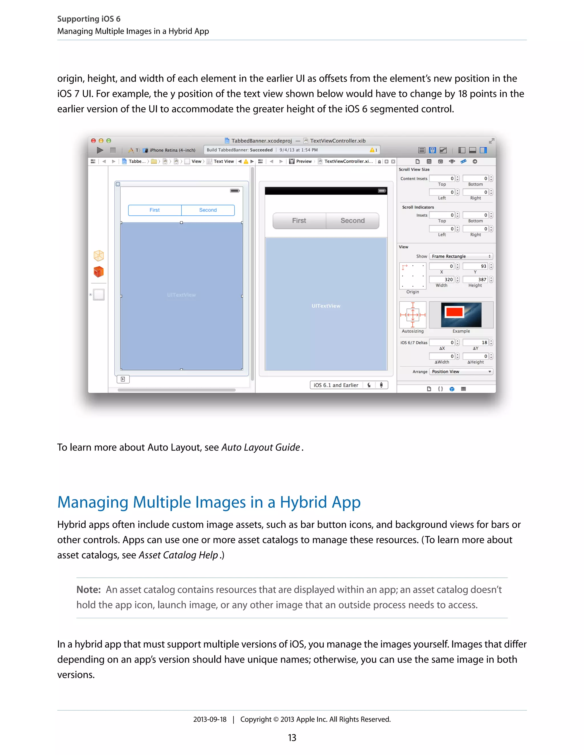
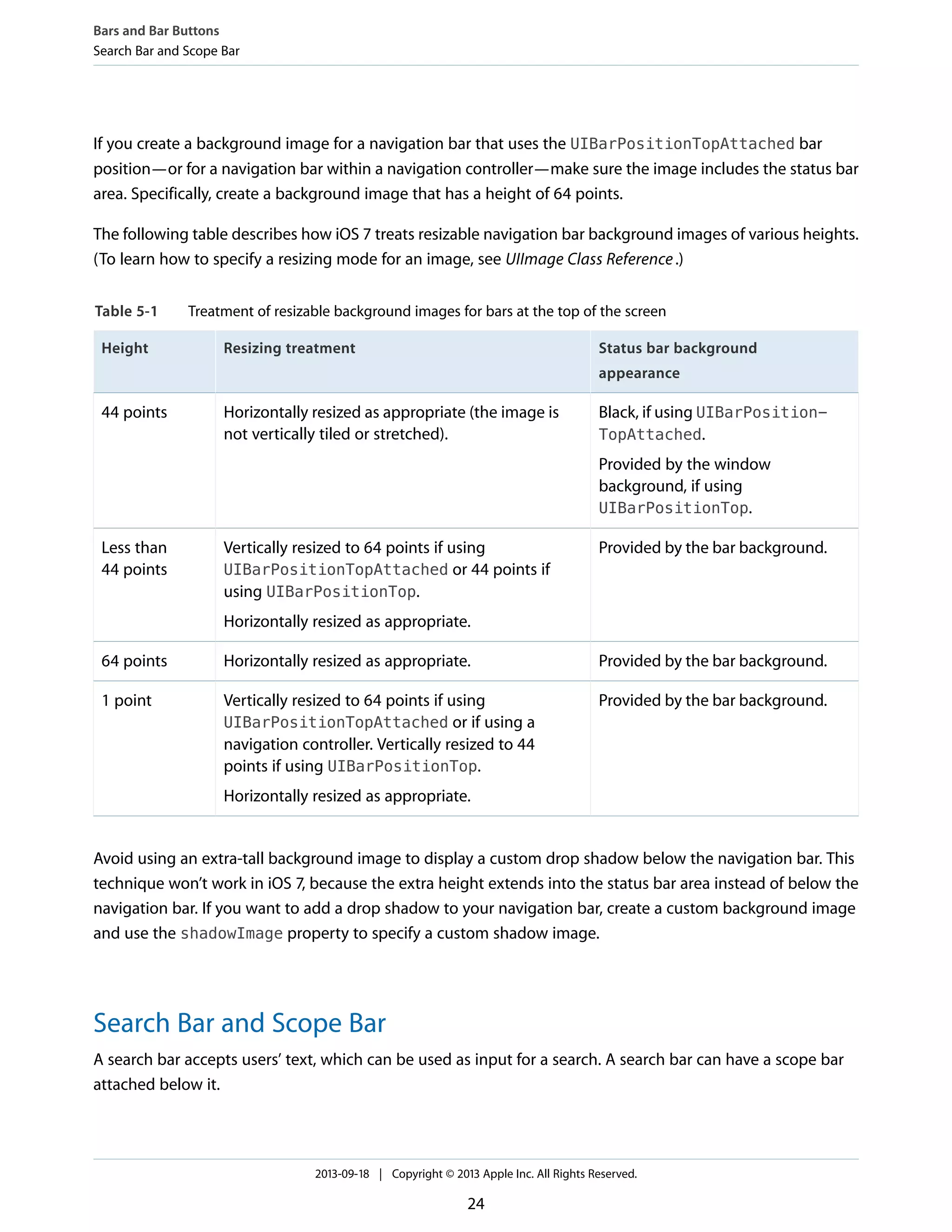
![The topLayoutGuide and bottomLayoutGuide properties indicate the location of the top or bottom
bar edges in a view controller’s view. If bars should overlap the top or bottom of a view, you can use
Interface Builder to position the view relative to the bar by creating constraints to the bottom of
topLayoutGuide or to the top of bottomLayoutGuide. (If no bars should overlap the view, the bottom
of topLayoutGuide is the same as the top of the view and the top of bottomLayoutGuide is the same
as the bottom of the view.) Both properties are lazily created when requested.
In iOS 7, view controllers can support custom animated transitions between views. In addition, you can use
iOS 7 APIs to support user interaction during an animated transition. To learn more, see
UIViewControllerAnimatedTransitioningProtocolReference andUIViewControllerInteractiveTransitioningProtocol
Reference.
iOS 7 gives view controllers the ability to adjust the style of the status bar while the app is running. A good
way to change the status bar style dynamically is to implement preferredStatusBarStyle and—within
an animation block—update the status bar appearance and call setNeedsStatusBarAppearanceUpdate.
Note: If you prefer to opt out of having view controllers adjust the status bar style—and instead
set the status bar style by using the UIApplicationstatusBarStyle method—add the
UIViewControllerBasedStatusBarAppearance key to an app’s Info.plist file and give it
the value NO.
Using Tint Color
In iOS 7, tint color is a property of UIView. iOS 7 apps often use a tint to define a key color that indicates
interactivity and selection state for UI elements throughout the app.
When you specify a tint for a view, the tint is automatically propagated to all subviews in the view’s hierarchy.
Because UIWindow inherits from UIView, you can specify a tint color for the entire app by setting the window’s
tint property using code like this:
window.tintColor = [UIColor purpleColor];
Tip: You can also set an app’s tint color in Interface Builder. The Global Tint menu in the Interface Builder
Document section of the File inspector lets you open the Colors window or choose a specific color.
If you don’t specify a tint for the window, it uses the system default color.
Appearance and Behavior
Using Tint Color
2013-09-18 | Copyright © 2013 Apple Inc. All Rights Reserved.
17](https://image.slidesharecdn.com/transitionguide-130922043246-phpapp02/75/iOS-7-Transition-guide-17-2048.jpg)
![Using Gesture Recognizers
Prior to iOS 7, if a gesture recognizer requires another gesture recognizer to fail, you use
requireGestureRecognizerToFail: to set up a permanent relationship between the two objects at
creation time. This works fine when gesture recognizers aren’t created elsewhere in the app—or in a
framework—and the set of gesture recognizers remains the same.
In iOS 7, UIGestureRecognizerDelegate introduces two methods that allow failure requirements to be
specified at runtime by a gesture recognizer delegate object:
● gestureRecognizer:gestureRecognizer
shouldRequireFailureOfGestureRecognizer:otherGestureRecognizer
● gestureRecognizer:gestureRecognizer
shouldBeRequiredToFailByGestureRecognizer:otherGestureRecognizer
Note: iOS 7 introduces similar methods in UIGestureRecognizerSubclass (described in
UIGestureRecognizer Class Reference), to give subclasses the ability to define class-wide failure
requirements.
For both methods, the gesture recognizer delegate is called once per recognition attempt, which means that
failure requirements can be determined lazily. It also means that you can set up failure requirements between
recognizers in different view hierarchies.
An example of a situation where dynamic failure requirements are useful is in an app that attaches a screen-edge
pan gesture recognizer to a view. In this case, you might want all other relevant gesture recognizers associated
with that view's subtree to require the screen-edge gesture recognizer to fail so you can prevent any graphical
glitches that might occur when the other recognizers get canceled after starting the recognition process. To
do this, you could use code similar to the following:
UIScreenEdgePanGestureRecognizer *myScreenEdgePanGestureRecognizer;
...
myScreenEdgePanGestureRecognizer = [[UIScreenEdgePanGestureRecognizer alloc]
initWithTarget:self action:@selector(handleScreenEdgePan:)];
myScreenEdgePanGestureRecognizer.delegate = self;
// Configure the gesture recognizer and attach it to the view.
...
- (BOOL)gestureRecognizer:(UIGestureRecognizer *)gestureRecognizer
shouldBeRequiredToFailByGestureRecognizer:(UIGestureRecognizer
*)otherGestureRecognizer {
Appearance and Behavior
Using Gesture Recognizers
2013-09-18 | Copyright © 2013 Apple Inc. All Rights Reserved.
20](https://image.slidesharecdn.com/transitionguide-130922043246-phpapp02/75/iOS-7-Transition-guide-20-2048.jpg)
![BOOL result = NO;
if ((gestureRecognizer == myScreenEdgePanGestureRecognizer) &&
[[otherGestureRecognizer view] isDescendantOfView:[gestureRecognizer view]]) {
result = YES;
}
return result;
}
Appearance and Behavior
Using Gesture Recognizers
2013-09-18 | Copyright © 2013 Apple Inc. All Rights Reserved.
21](https://image.slidesharecdn.com/transitionguide-130922043246-phpapp02/75/iOS-7-Transition-guide-21-2048.jpg)

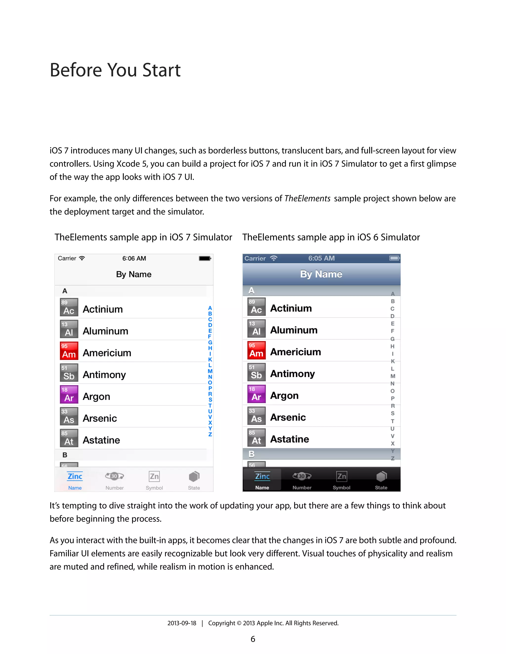
The iOS 7 UI Transition Guide outlines essential steps for adapting apps from iOS 6 to iOS 7, emphasizing the need for updated app icons, launch images, and ensuring compatibility with new UI elements. Key themes of iOS 7 include deference, clarity, and depth, encouraging developers to rethink the user experience. The document also covers strategies for supporting multiple app versions and utilizing Xcode 5's features for effective transition.


![Vibe Coding vs. Spec-Driven Development [Free Meetup]](https://cdn.slidesharecdn.com/ss_thumbnails/vibecodingvsspecdrivendevelopment-251209105622-43f455e7-thumbnail.jpg?width=640&height=640&fit=bounds)


