
Recommended
More Related Content
What's hot
What's hot (20)
Viewers also liked
Viewers also liked (15)
Similar to 'Top Of The Pops' Front Cover Analysis.
Similar to 'Top Of The Pops' Front Cover Analysis. (20)
Recently uploaded
Recently uploaded (20)
'Top Of The Pops' Front Cover Analysis.
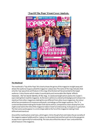
- 1. ‘Top Of The Pops’ Front Cover Analysis. The Masthead The mastheadis‘Top of the Pops’thisclearlyshowsthe genre of the magazine straightawayand allowsthe audience toguesswhatthe magazine isaboutalso The name of the mag indicatesthat onlythe ‘top’popartists will feature inthismag.Onlythe bestwill be presentedtothe target audience.Italsorhymeswhichmakesitsoundcatchyand memorable the rhyme reflects moreover, the fun brand identity of the mag. It isboldand brightwhichcatchesthe reader’s eyesmakingthemreadthe magazine.Asthe textiswhite ona vibrantpinkbackgrounditallowsitto standout fromother magazinesmakingthisone differentfromothermusicmagazines,the colour white hasconnotationsof innocence andyouth,remindingusof the target audience.The ‘S’ is curledanddecoratedmakingthe headerlookstylishandfun,comparedtoa basicdisplayfont,the slightscriptlooktothe title of the magazine makesitlook funandexciting.Italsogivesita girlyfeel. The fact some wordsappear ina circle shape addsto the funof the magazine makingitlook differentandstandout. Aroundthe mastheadare small stars,whichagain,linkto the girlyfeel andmakesthe personalityof the magazine appearbubblyandfun.Itgivesita decoratedlookandfeel andlinkstothe popgenre as pop musicisgenerallyfunandexciting.The starsalsoreflectthe ideaof ‘stars’andcelebrities whichfeature inthe magazine.
- 2. The Image Thisparticularmagazine featuresOne Directionasthe mainimage.Thisistypical of a pop music magazine astheyusuallyfeature aboybandon the front coverto attract younggirlswho are especiallybigfansof boybandsto buythe magazine.Younggirlssuchas the oneswhoreadthis magazine,wouldlove boybandsasitwouldbe a hot topictheywouldtalkaboutwiththeirfriends, as theywouldall have a favourite memberof the bandwhotheywouldhave a crushon, therefore, by featuringbandssuch asOne Direction,TopOf The Popsare able to attract theirtargetaudience. Theyappearsmilingandlaughingtogive ita happyand funfeel.Theyuse directaddressastheylook directlyatthe camera at the audience tolure themin,tomake the audience feel theyare lookingat them.Thisiseffective asyounggirlswouldfeel theyare lookingatthem, allowingamore personal and friendlyfeel. Each of the band membersare wearingacasual suit,to make the suitseemmore casual,Liam, Louis and Niall have ajerseyt-shirtundertheirblazers.Thisgivesamore funandcalmingapproach, showinghowOne Directionare lighthearted,cheekyandfashionable.Allof theminsuitswould have made themappearolderthantheyare whichwouldgoagainsttheir highenergy,youthful brand identity.All of the boysare wearingatleastone itemof blue clothing,thisistomake them appeartidyand professionalandalsohighlightstheirunityasaband andtheircompanionship. However,theyall wearothercolours toshow theirindividualityanduniquestyle.Portrayinghow each of thembringsomethingdifferenttothe band.The suitsgive thema sophisticatedlook, showingthatalthoughtheirbrandidentityisfunandfilledwithenergy,theyhave amature, understandingandhumble side tothem.Thisisalsoshownthroughtheirhairstylesinthe image. Zaynshair isfreshlycutand almostgivenablow driedlookintoa curl whichcomesoverhis forehead.Thisaddstohisquirkyand funkyfashionstyleandthe blonde streakaddstohis rocky/edgylook.The contrastincoloursalsohighlightshisfunandoutgoingpersonalityyetthe darknessrepresentshismysteriousandalluringpersonality.Thischoice of hairstyle couldbe seenas brave and controversial showinghowZaynisconfidentinhislookandisnotafraidto standout. Liam,Louisand Niall all have similarhairstyles,astheyare all freshlycutandstyledintoa quiff.This givesthema sophisticatedlookandhowtheytake time intheirappearance.Harry isshownwithhis signature curlylocks,styledperfectly.The facthishairis seenlike thisinmostimagesof One Directionhighlightshiscontinuitythroughoutthe band.Also,asHarryand Zayn have distinctivehair stylesshowshowtheyare the mainband members,itcouldalsohighlightthatthese are the most popularbandmembersthereforeitsimportantforthemtostandout. Liam,Harry, Niall andLouisall appearsmilingintothe cameraalmostas if theyare laughing.Asthey are all smilingitmakesthemappearfriendlyandbubbly,italsohighlightstheirsimilarinterestsas theyare all laughingatthe same thingat the same time,portrayinghow theyare young,funand goodfriendsall enjoyingthemselves.Yet,Zaynisshownwithamysteriousfacial expression,withhis headtiltedtothe side.Thisagainremindsusof hisquirkyand intriguingstyleandpersonalityand howhe standsoutfrom the group. Theyare all positionedinthe frame inagrouptogether,yetratherthan juststandingside by side theyare close toone another.Noone is blockingone of the memberssowe can see all of theirfaces clearly,thisshowshowthere isnokeymembertoOne Direction,theyare all a friendlyband.Also, as theyare positionedinagroup ithighlights theiryouthalot more as it wouldbe unusual tosee a youngerbandsuch as One Directionsimplystandinginline withone another.Thiswouldbe seen more witha boy bandlike Westlife,therefore thiswouldnotsuittheirbrandidentity. Theyare stoodinfront of a settingmade upof lotsof fairylights,yetthe backgroundisunfocused, makingthemappearslightlyblurred.Thisistomake sure all the focusison One Direction.The lights
- 3. alsogo withthe christmastheme of Top Of The Popsmagazine,as itgivesa festive feel.Italsoadds a touch of delicate colour,withoutoverpoweringthe band. A mediumlongshothasbeenusedsothat we can see mostof One Direction’scostume,asthe target audience of the bandwouldwanttosee as much of themas possible.Italsomeansthe image can fill the entire frontcover,asthe bottomhalf of themcan be slightlycoveredwithotherfeatures such as the mainsell line,ratherthana close upbeingusedastheirfaceswouldbe covered. FashionSection In the top rightcorneris a fashionsectionwhichisaconventionof popmagazines,showingthe audience whatisinside.Asthe targetaudience wouldbe luredintobuyingthe magazine.The captionis‘132 perfectpartybuysfor you!’.The targetaudience of Top Of The Pops wouldlove the fashionsectionastheyare younggirlswhowouldhave a love tolookgoodand enjoyshoppingwith theirfriends.Theywouldalsowanttogrow up to looklike the artistsandcelebritieswhofeature in the magazine,andby having thisfashionsectiontheyfeeltheycouldbe more like them. The number‘132’ sounds non-contrived and natural and also that there are lots of fashion items; 132 sounds more than 130. ‘Party buys for you’ gives use of direct address, the target audience feel like the magazine is helping them out like a friend, as they want them to look and feel good about themselves. The idea of a party also gives a fun feel to the magazine, sticking to its brand identity, it also highlights how the target audience of this magazine are bubbly, fun and like to party and have a good time with their friends. Finally, as the prices are shown it makes us feel like they want us to buy these exact items, as the target audience would enjoy shopping, by seeing the prices are not too expensive and that they are affordable, would make them want to buy the items. This could also be a hot topic for her and her friends to talk about together, as they could look at the pictures of 132 items of clothing and discuss which items they love and why. Alongside thisare imagesof clothes,accessoriesandshoeswhichwouldattractthe eyesof those interestedinfashion,the colourof boththe jumperandshoe are pinkwhichisa typical girlycolour and a typical colourfor a popmagazine tofeature. The Skyline The skyline isavibrant,brightblue colourwhichstraightawaygrabs attentionandintrigue.Itsays ‘FREE! 50 HUGE CHART HITS’ the word ‘free!’isinboldandcapital letters,followedbyan exclamationmark.Theyhave done thistomake thiswordstandout comparedto the rest of the sentence asthe wordfree isa buzz word,everyone will be interested.The exclamationmarkalso adds statementandloudnesstothe word.It goesonto say the ’50 HUGE CHARTHITS’ feature.The word‘huge chart hits’isalliterationmakingiteasytorememberandthe wordhuge is alsoanother buzzword makingthe sentence soundexciting.Nexttothe textisa picture of a popartist,Taylor Swift.She appearswithredlipstickandblonde hair,herfacial expressionappearssmilingwithher mouthopen,makingherlookfunand happy.Thisisimportantto come across ona popmusic magazine. Left Hand Third In the lefthandthirdthe audience are presentedwiththreebrightblue boxescontainingthree differentcelebrityboystars,includingTomDaley,AstonMerrygoldandUnionJ.All these boysare
- 4. youngand handsome whichwouldattractgirlstowant to readaboutthem.It alsoincludesastripat the bottomof the page containingsix imagesof celebrities.The titleis‘Plusall these starsand more!’all six of these celebritiesare youngandup to date. The target audience wouldappealtothe articlespromotedinthe sell linesastheyare gossipfilled and embarrassingstoriesspilledoutbytheirfavouritecelebrities.Theycouldbe able torelate to these storiesforexamplethe cringe worthy‘crimboconfessions’saidbyTomDaley.The ideaof relatingtohimlinkstoBlumlerandKatz five benefits,thisone beingidentifyingwithothers. Furthermore,the friendship‘secrets’revealedbyUnionJwouldbe interestingforthe target audience astheywouldfeel UnionJare tellingthempersonallytheirsecrets,linkingtothe ideaof the target audience feelingclosertotheirfavourite celebritieslikethey’re afriend. At the bottomof the frontcover,we are presentedwithastripof images,containinghintsasto whatcelebritiesare inside.Some of the imagesare Little Mix,Max fromThe Wanted,ArianaGrande, Demi Lavato,NickGrimshawand AustinMahone.All of these wouldappealtothe targetaudience as theyare all young,funcelebritieswhichare well knownbyateenage girl targetaudience,they wouldbe fansof these celebritiesmakingthemwanttobuythe magazine sotheycan readabout themand find outultimate gossip,makingthe targetaudience feel theyknow these celebritieslike they’re aclose friend.Above the imagesstates‘Plusall thesestarsandmore!’Thisiseffectivefor luringinthe target audience asbyshowingalistof several of theirfavouritecelebritiesitcreates excitementthattheresevenmore!Highlightinghow the fun-filledbrandidentityof the magazine is met. The word ‘plus’iswritteninboldfontcomparedtothe restof the text,the word‘plus’acts as a buzz word,drawingthe targetaudience intoreadingmore.The word‘plus’emphasisesthe amountof funwhichispresentedjustonthe frontof the magazine andhow itwantsthe target audience tosee howmuchgossipTop Of The Popshasto offer. Mode Of Address: The mode of addressthroughoutthe frontcoverof Top Of The Popsis chattyand fun,thisis shown throughthe use of language usedtoaddressitstargetaudience forexample wordslike ‘super-cute’ and ‘festivefitties’are usedtogive afriendlyandlightheartedtone tothe frontcoversothat young girlscan relate tothe frontcoverand feel like theycanunderstandthe magazinelikeafriend.The alliterationgivesacheekyandinterestingfeeltothe magazine toosothat the targetaudience are alwaysinterestedtoreadthe magazine,ratherthanjustlookat the pictures.Notice alsothatthey referto AstonMerrygoldandTom Daleybytheirfirstnamesand One Directionisshortenedto1D. Thisagain linkstothe friendlyfeel of the magazine asthe readerwouldfeel like theyknow these celebrities. Font: The mastheadappearsinbold,displayfontwithatouch of scriptas the ‘s’is curledtogive a delicate,girlyfeel linkingtothe targetaudience.Italsodecoratesthe mastheadtogive ita touchof style andexcitement,relatingtothe funbrandidentityof boththe magazine andthe popgenre. Similarfonthasbeenusedforotherareasof the magazine butlessboldandmuch smaller,thisisto create continuityandto make sure the magazine appearsprofessional.
- 5. The main sell line iswritteninabold eye catchingfontso that the targetaudience are aware thisis the mainsell line,astheywanteveryone toreadaboutit.‘1D’ iswritteninside apuff ina simple sans serif,thisisbecause the puff isenoughdecorationandiseye catchingenough,therefore there isno needfora fancyfont.The word ‘christmas’iswritteninaboldscriptfont,the textis a lotlarger than the restof the masthead,thisisto highlightthe maintheme runningthroughthe magazine.As the target audience are of a young female age theywouldbe excitedstillbythe ideaof christmas,so by the word‘christmas’beingboldercomparedtothe otherelementsof the mastheaditwould create a sense of festivefun. Layout: In thisparticularissue of ‘TopOf The Pops’magazine, layoutconventionshave beenmetsimilarly.A skyline sitsrightatthe top of the front cover,to addcolour andextrabits of information. Underneathsitsthe masthead,itiscommonfor the mastheadtoappearunderneaththe skyline,yet the skyline does notoverpowerit.Itisalsoplacedbehindthe headsof One Direction,thisisa commonconventionof popmagazinesasloyal membersof the targetaudience wouldbe familiarto the magazinesbrandidentitytherefore,wouldstillbe able tospotiton the shelf.Itisalso placed here to ensure the mainartistfeaturedhasall the attentiononthemtoattract theirtargetaudience and increase sales. The image fillsthe frame toensure itisfilledwithcolourandexcitement.The lefthandthirdis where othersell linesfeatureusuallyinpopmagazines,thisisthe case in thisissue too,highlighting howtheyhave followedlayoutconventions.The lefthandthirdiswhere the westerneye goesfirst therefore itiscrucial forsell linestofeature here.Feature article photographsalsoappearhere to grab the attentionof the target audience evenmore andagain,addscolourto the front cover. In comparisontoall the layoutconventionsbeingmetbythisissue of ‘TopOf The Pops’,one conventionwhichisexcludedisthatthe pugisfeaturedinthe middle of the frame,ratherthanthe commonplace of the bottomrightcorner.It is usuallyplacedthere asitisthe leastimportant feature andit iswhattheywant the audience tosee last,sothat theyare intriguedbyall of the exciting,exclusiveandamazinginformationbefore findingoutthe price.