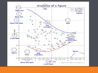
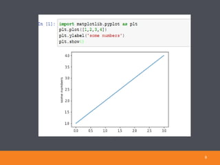
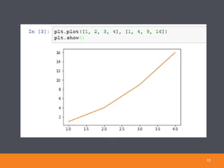
This document provides information on tools for research plotting in Python and R. It discusses matplotlib and R for creating plots in Python and R respectively. It provides examples of different plot types that can be created such as line plots, bar plots, scatter plots, and histograms. It also discusses installing and working with matplotlib and R Studio, and provides code examples to generate various plots from data.


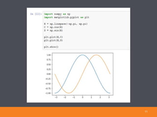
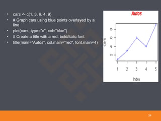
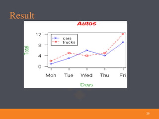
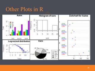
![• # Define 2 vectors
• cars <- c(1, 3, 6, 4, 9)
• trucks <- c(2, 5, 4, 5, 12)
• # Calculate range from 0 to max value of cars and trucks
• g_range <- range(0, cars, trucks)
• # Graph autos using y axis that ranges from 0 to max value in cars or trucks vector.
#Turn off axes and annotations (axis labels) so we can specify them our self
• plot(cars, type="o", col="blue", ylim=g_range, axes=FALSE, ann=FALSE)
• # Make x axis using Mon-Fri labels
• axis(1, at=1:5, lab=c("Mon","Tue","Wed","Thu","Fri"))
• # Make y axis with horizontal labels that display ticks at every 4 marks.
#4*0:g_range[2] is equivalent to c(0,4,8,12).
• axis(2, las=1, at=4*0:g_range[2])
27](https://image.slidesharecdn.com/toolsforresearchplotting-181010155413/85/Tools-for-research-plotting-27-320.jpg)
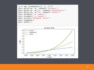
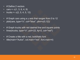
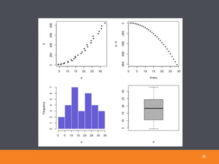
![• # Create box around plot
• box()
• # Graph trucks with red dashed line and square points
• lines(trucks, type="o", pch=22, lty=2, col="red")
• # Create a title with a red, bold/italic font
• title(main="Autos", col.main="red", font.main=4)
• # Label the x and y axes with dark green text
• title(xlab="Days", col.lab=rgb(0,0.5,0))
• title(ylab="Total", col.lab=rgb(0,0.5,0))
• # Create a legend at (1, g_range[2]) that is slightly smaller # (cex) and uses the same
#line colors and points used by the actual plots
• legend(1, g_range[2], c("cars","trucks"), cex=0.8,
• col=c("blue","red"), pch=21:22, lty=1:2);
28](https://image.slidesharecdn.com/toolsforresearchplotting-181010155413/85/Tools-for-research-plotting-28-320.jpg)
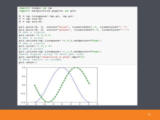
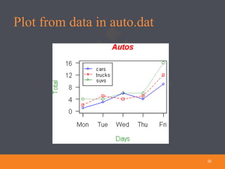
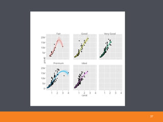
![Plotting from a file• # Read car and truck values from tab-delimited autos.dat
• autos_data <- read.table("C:/R/autos.dat", header=T, sep="t")
• # Compute the largest y value used in the data (or we could # just use range again)
• max_y <- max(autos_data)
• # Define colors to be used for cars, trucks, suvs
• plot_colors <- c("blue","red","forestgreen")
• # Start PNG device driver to save output to figure.png
• png(filename="C:/R/figure.png", height=295, width=300, bg="white")
• # Graph autos using y axis that ranges from 0 to max_y. # Turn off axes and annotations (axis labels) so we can
• # specify them ourself
• plot(autos_data$cars, type="o", col=plot_colors[1], ylim=c(0,max_y), axes=FALSE, ann=FALSE)
• # Make x axis using Mon-Fri labels
• axis(1, at=1:5, lab=c("Mon", "Tue", "Wed", "Thu", "Fri"))
• # Make y axis with horizontal labels that display ticks at every 4 marks. 4*0:max_y is equivalent to c(0,4,8,12).
• axis(2, las=1, at=4*0:max_y)
30](https://image.slidesharecdn.com/toolsforresearchplotting-181010155413/85/Tools-for-research-plotting-30-320.jpg)
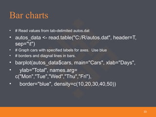
![• # Create box around plot
• box()
• # Graph trucks with red dashed line and square points
• lines(autos_data$trucks, type="o", pch=22, lty=2, col=plot_colors[2])
• # Graph suvs with green dotted line and diamond points
• lines(autos_data$suvs, type="o", pch=23, lty=3, col=plot_colors[3])
• # Create a title with a red, bold/italic font
• title(main="Autos", col.main="red", font.main=4)
• # Label the x and y axes with dark green text
• title(xlab= "Days", col.lab=rgb(0,0.5,0))
• title(ylab= "Total", col.lab=rgb(0,0.5,0))
• # Create a legend at (1, max_y) that is slightly smaller # (cex) and uses the same line colors and points used by
• # the actual plots
• legend(1, max_y, names(autos_data), cex=0.8, col=plot_colors, pch=21:23, lty=1:3);
•
• # Turn off device driver (to flush output to png)
• dev.off()
31](https://image.slidesharecdn.com/toolsforresearchplotting-181010155413/85/Tools-for-research-plotting-31-320.jpg)


![[TechPlayConf]Rekognition導入事例](https://cdn.slidesharecdn.com/ss_thumbnails/techplayconfrekognition-170820072435-thumbnail.jpg?width=640&height=640&fit=bounds)