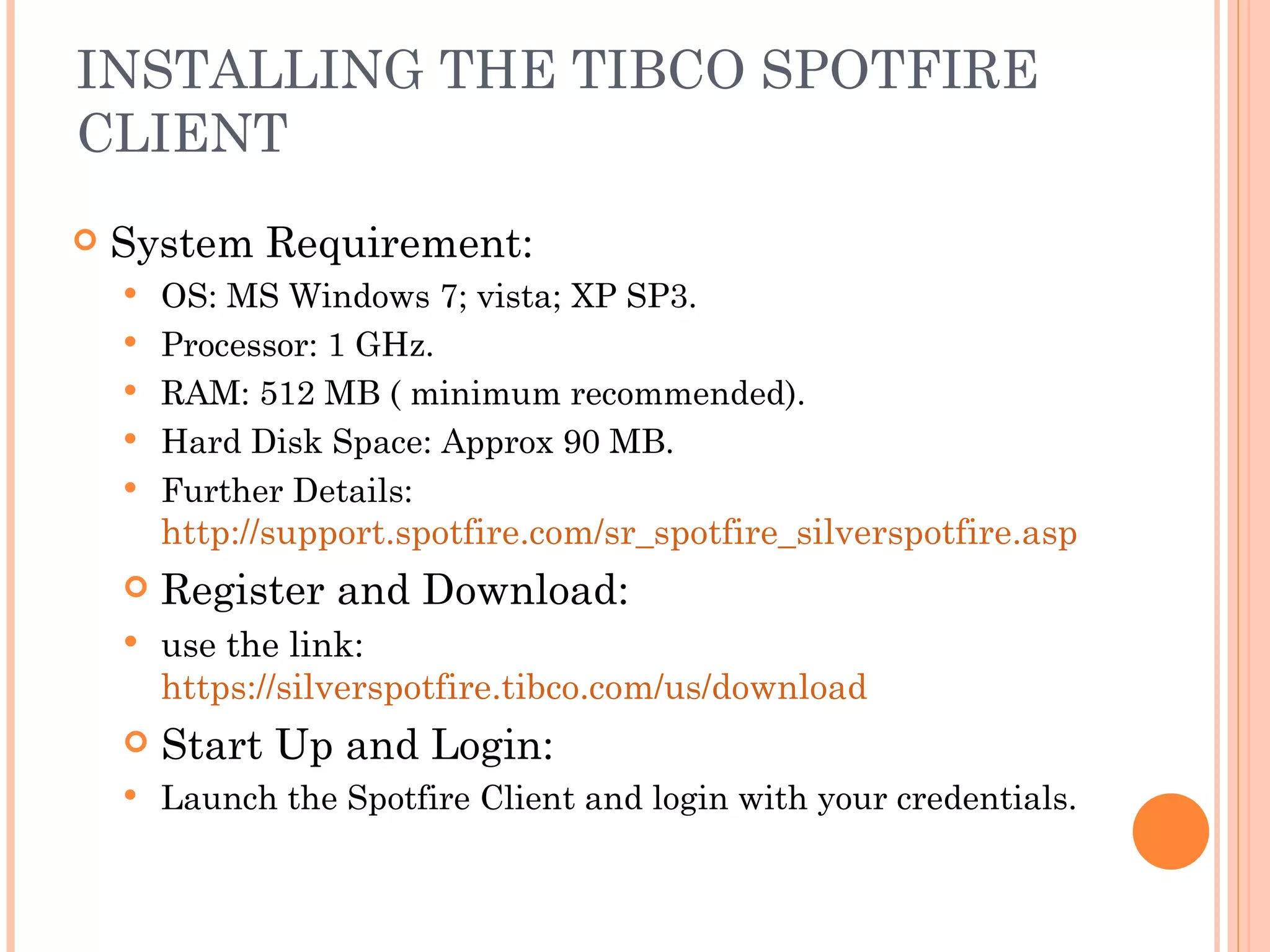
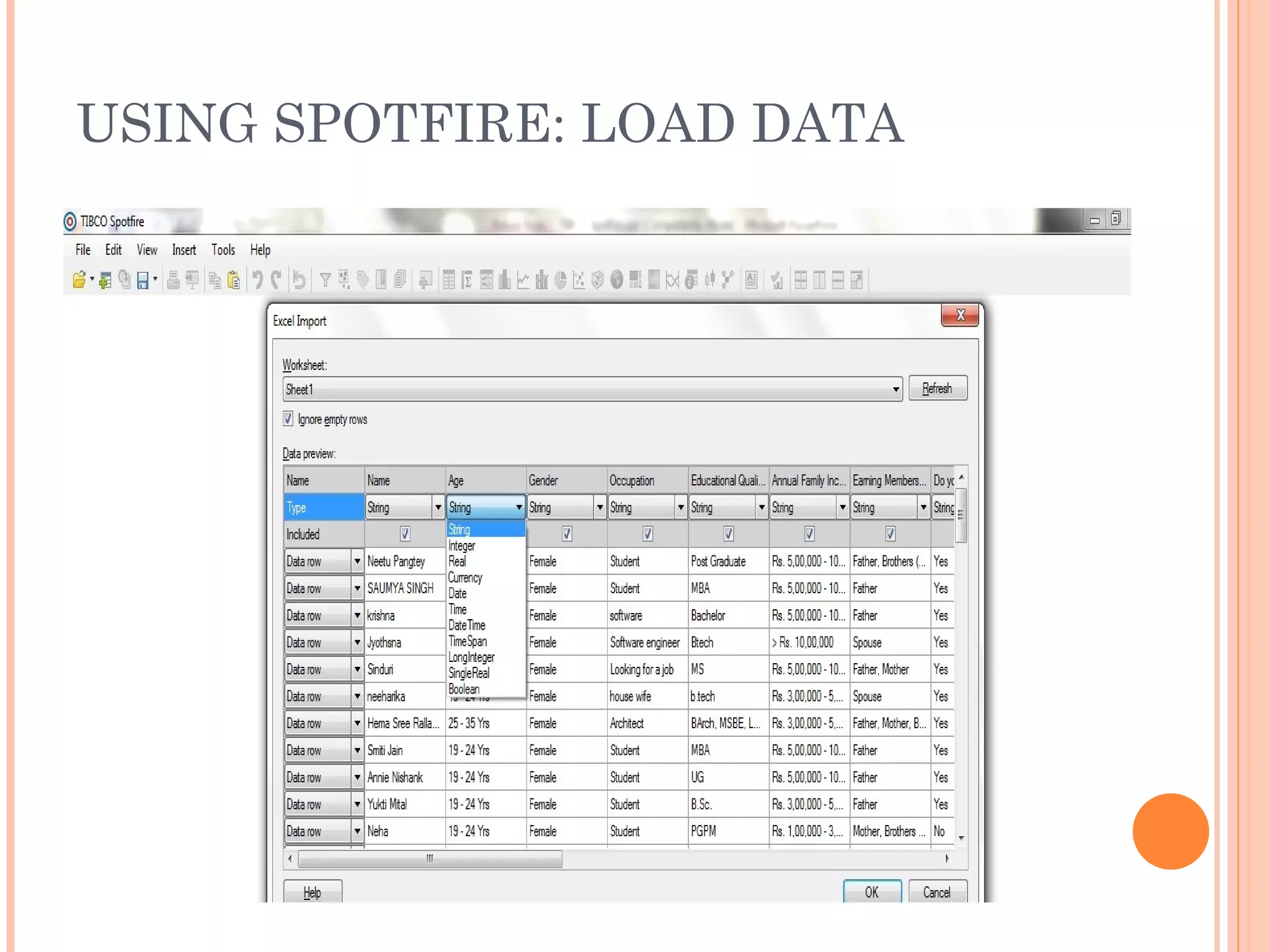
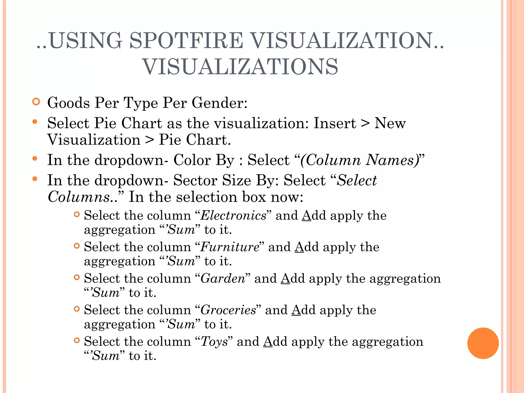
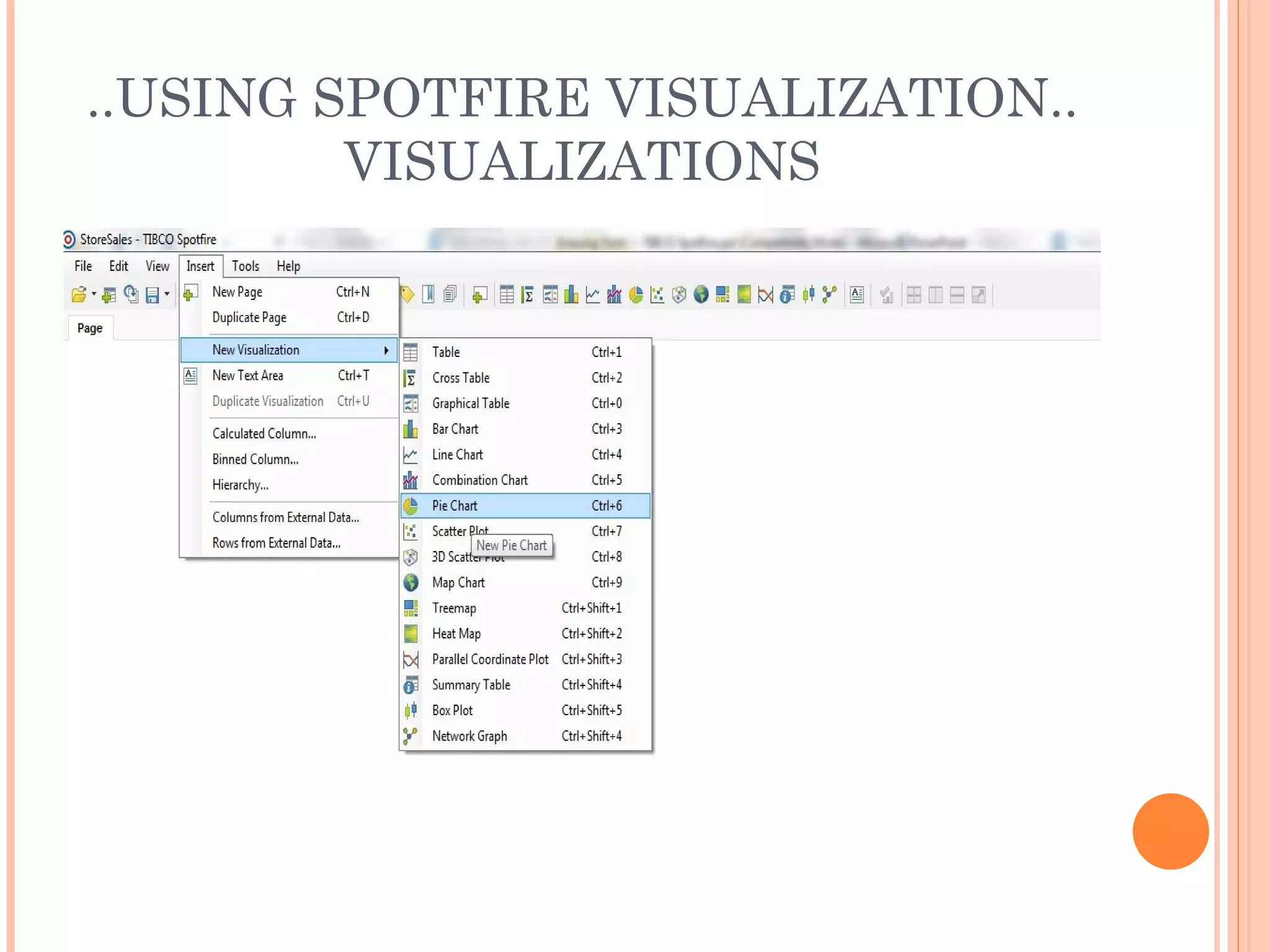
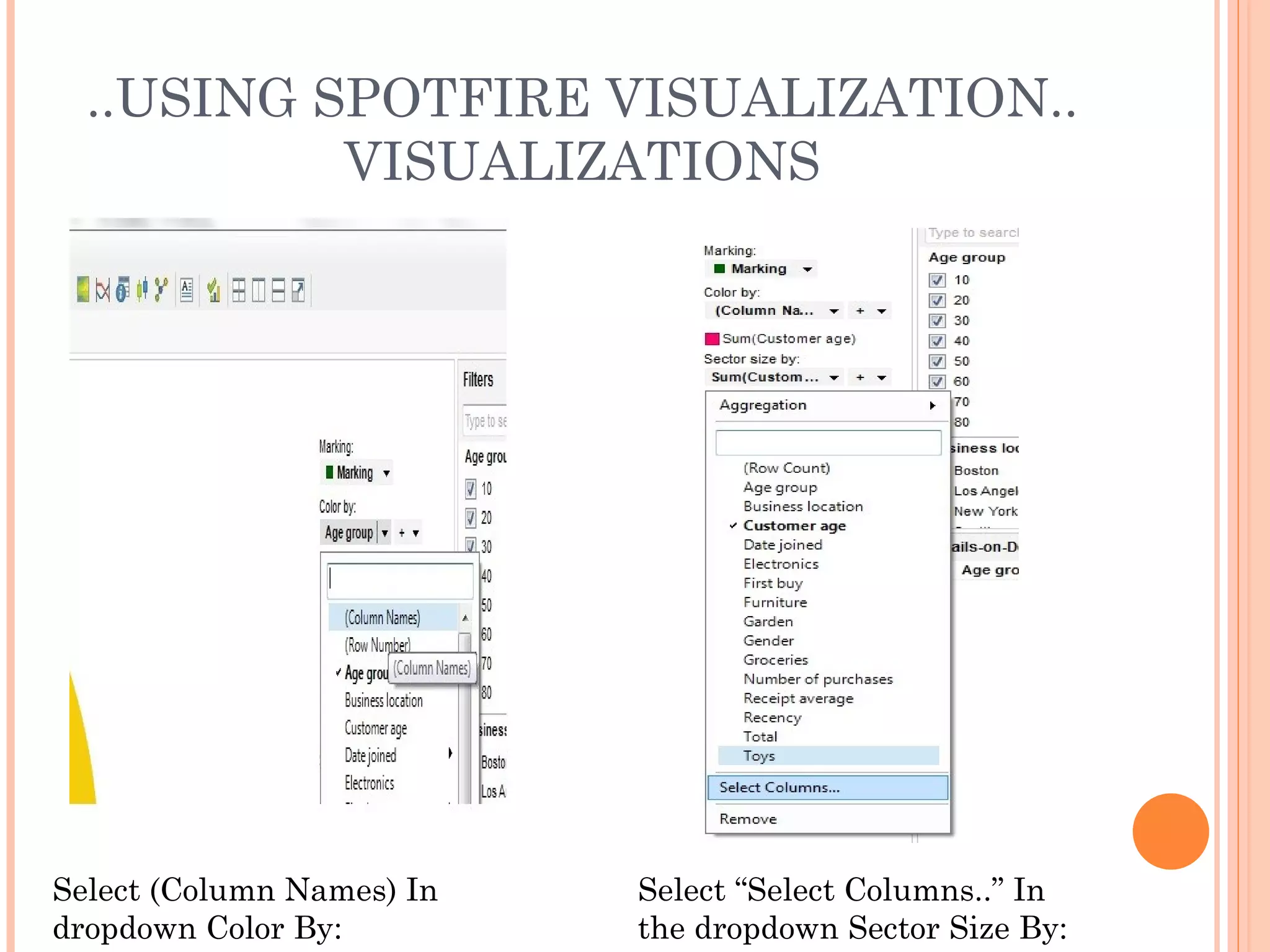
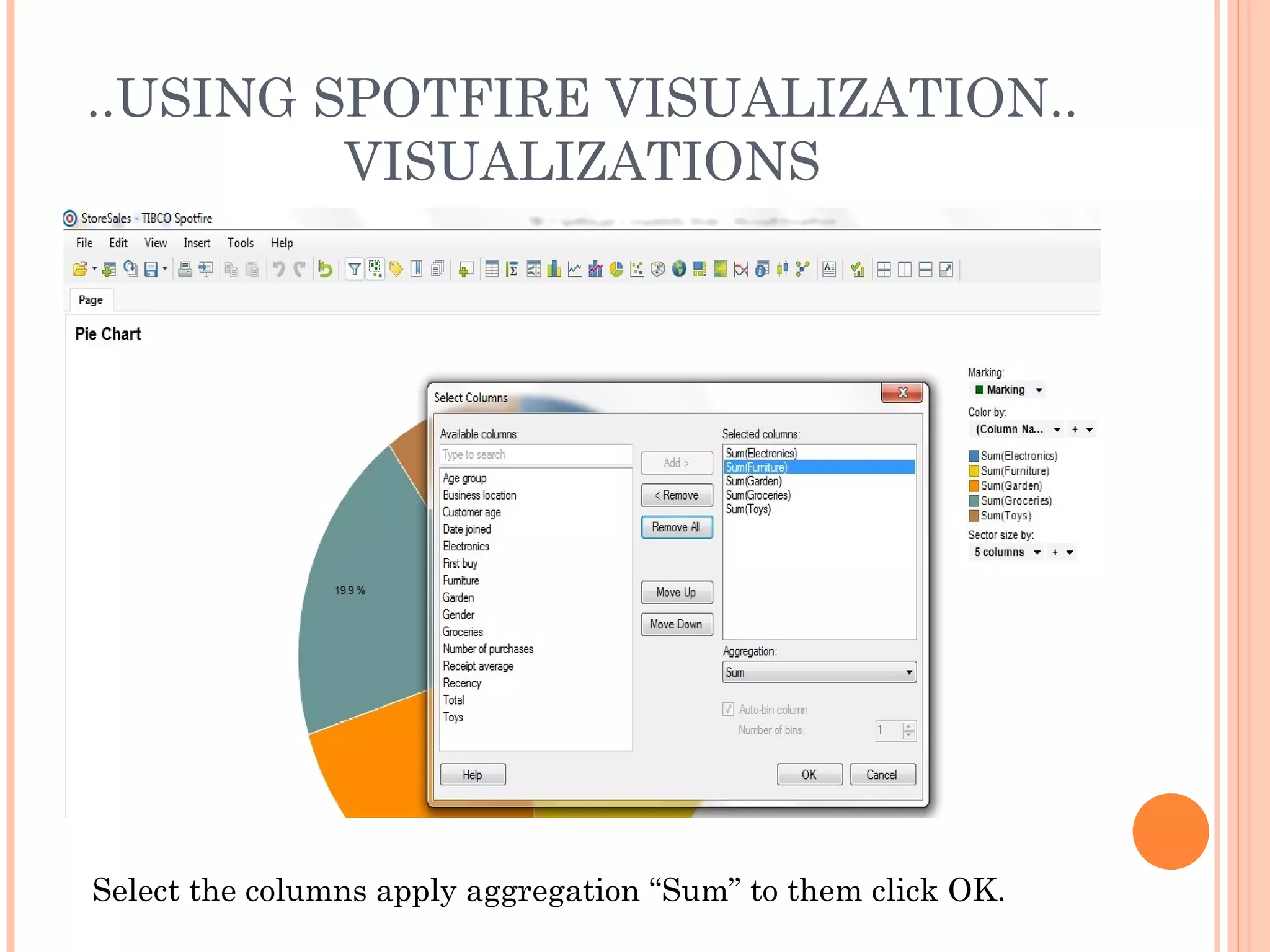
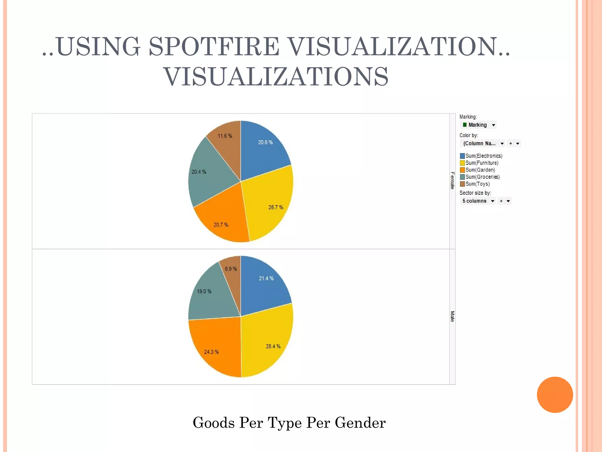
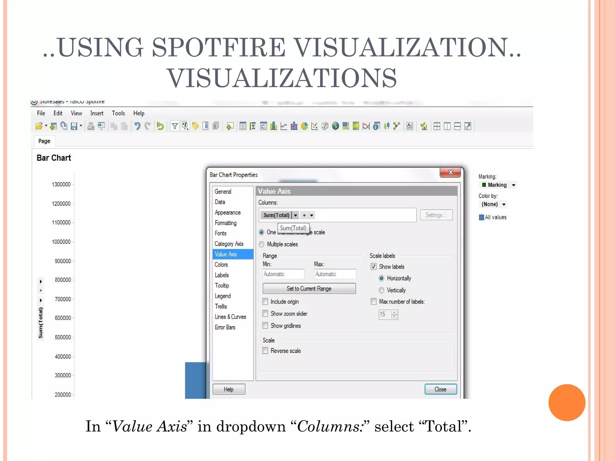
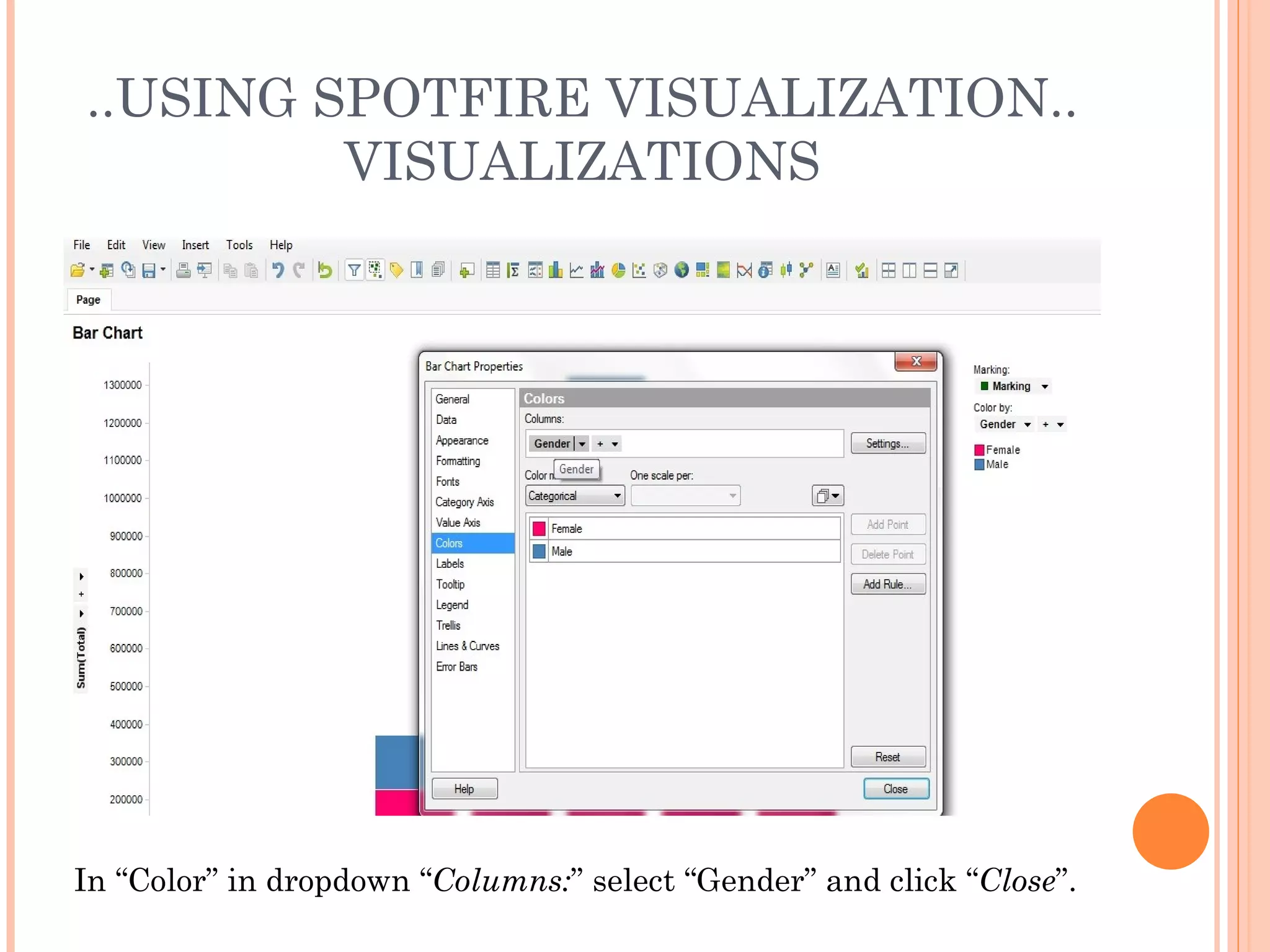
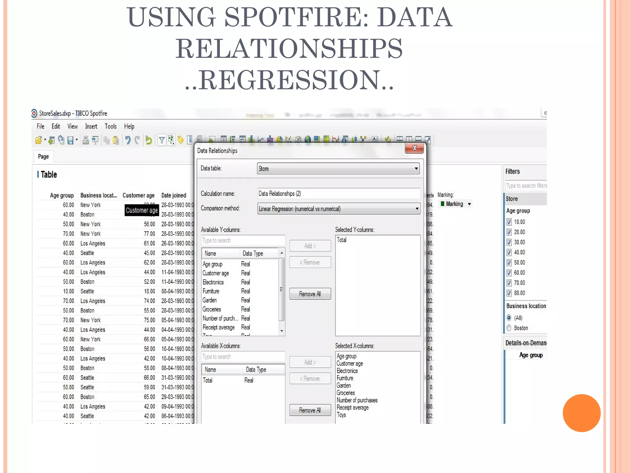
Tibco Spotfire is a business intelligence tool that allows users to quickly analyze data and visualize it in interactive charts and graphs. Data can be imported from files, databases, or other sources. Spotfire provides various visualization types like bar charts, scatter plots, and tree maps. Visualizations can be customized through properties and shared as images, PDFs, or presentations. The document then demonstrates how to install Spotfire, load sample sales data, perform linear regressions on the data, and create pie charts and stacked bar charts to visualize goods purchased by gender and total sales by age group. Results can be exported from Spotfire using various file formats.
Aligning Text in a Microsoft Word Document can be a tedious task if you try to do it
using only Tabs and Spaces.
Fortunately, Word has a Table feature which you can
use to present the same information but in a more structured and easy-to-read
format.
MS Word Table Feature helps Creating
Tabular Data, Managing their Structures and Dimensions, Formatting them, and
Displaying them in a form that you most desire.
Instruction to MAPINFO
This course is intended to give a brief introduction to MAPINFO on the following aspects:
To get a knowledge of basic functions of MAPINFO and be familiar with normal operations of MAPINFO
To carry out network planning, optimization and map maintenance with MAPINFO
Excel 2007 Training 2012 Module 1 (Self Study Materials)Amann Group
This presentation is designed for the Beginners in Excel 2007. I also published the outline of my next Two Modules. My two modules for Intermediate & Advance Learners will be coming soon. For some excel based application, I would suggest you to visit my LinkedIn Profiles\' Box Application.
Do you want to be able to integrate external systems to Salesforce without copying the data and be able to write back to that system? Join us to go through several techniques that will allow you to leverage Lightning Connect's new write capability to its fullest potential. We'll show you how to build robust two-way integrations using a variety of declarative and programmatic tools and techniques. In addition, we'll explore common pitfalls like high operation latency and transaction semantics to help you avoid potential failures.
Tableau online training and tableau desktop training by United Trainings.
http://unitedtrainings.com/tableau-online-training/
Whatsapp / call :- +91 - 9100 77 3003/2 ,
Email: info@unitedtrainings.com
Tableau training uk,
Tableau online training,
Tableau training in hyderabad,
Tableau training in bangalore,
Tableau training online,
Tableau online course,
Tableau desktop training,
Tableau interview questions,
Tableau certification,
Tableau training material,
Tableau training chennai,
Tableau training pune,
Qlikview online training,
Qlikview training videos,
Qlikview designer training,
Qlikview certification,
Qlikview interview questions,
Qlikview training in hyderabad
Tableau online training and tableau desktop training by United Trainings.
http://unitedtrainings.com/tableau-online-training/
Whatsapp / call :- +91 - 9100 77 3003/2 ,
Email: info@unitedtrainings.com
Tableau training chicago,
Tableau online training,
Tableau training in hyderabad,
Tableau training in bangalore,
Tableau training online,
Tableau online course,
Tableau developer training,
Tableau interview questions,
Tableau certification,
Tableau training material,
Tableau training chennai,
Tableau training pune,
Qlikview online training,
Qlikview training videos,
Qlikview designer training
Tableau online training and tableau desktop , tableau admin
tableau certification, tableau interview questions, tableau training institutes in hyderabad, tableau training institutes in Bangalore
**Tableau Basics Cheat Sheet**
*Introduction:*
Tableau is a powerful data visualization and business intelligence tool that allows users to easily analyze and present data in a visually compelling way. This Tableau Basics Cheat Sheet serves as a quick reference guide to help beginners get started with Tableau and perform common tasks efficiently.
*1. Data Connection:*
- Connect to data sources like Excel, CSV, databases, etc.
- Drag and drop data fields onto the "Rows" and "Columns" shelves to create a basic view.
*2. Visualizations:*
- Create various visualizations like bar charts, line graphs, scatter plots, maps, etc.
- Double-click on a field to create a basic visualization or drag fields onto the "Marks" shelf to customize.
*3. Filters:*
- Apply filters to focus on specific data subsets.
- Right-click on a field or drag it onto the "Filters" shelf to create a filter.
*4. Sorting:*
- Sort data based on specific fields.
- Right-click on a field or use the sort icon in the toolbar to sort data.
*5. Calculated Fields:*
- Create custom calculations using existing fields.
- Go to "Analysis" > "Create Calculated Field" to define formulas.
*6. Groups & Hierarchies:*
- Group data by combining individual data points.
- Create hierarchies to organize data into drill-down levels.
*7. Aggregation:*
- Aggregate data using functions like SUM, AVG, COUNT, etc.
- Drag fields to the "Measure Values" shelf to apply aggregation.
*8. Dual-Axis Charts:*
- Combine two different chart types on the same axes to compare data.
- Right-click on a axis and select "Dual-Axis" to enable this feature.
*9. Dashboard Creation:*
- Combine multiple visualizations into a single dashboard.
- Drag sheets onto the dashboard canvas and arrange as desired.
*10. Parameters:*
- Use parameters to create interactive dashboards.
- Right-click in the data pane and select "Create Parameter" to get started.
*11. Data Blending:*
- Blend data from multiple sources for comprehensive analysis.
- Go to "Data" > "Edit Relationships" to define data blending.
*12. Publishing:*
- Share your Tableau workbooks with others by publishing to Tableau Server or Tableau Public.
- Go to "Server" > "Publish Workbook" to share your insights.
*13. Formatting:*
- Customize the appearance of visualizations and dashboards.
- Use the "Format" options and "Dashboard" menu to fine-tune the design.
*14. Interactivity:*
- Add filters, actions, and tooltips to make visualizations interactive.
- Explore the "Dashboard" menu for interaction options.
*15. Exporting:*
- Export visualizations as images, PDFs, or data files.
- Use the "File" menu to access export options.
Remember, this Tableau Basics Cheat Sheet provides just a glimpse of Tableau's capabilities. As you gain more experience, you can explore advanced features and create more sophisticated data visualizations and insights to drive better decision-making. Happy data analyzing with Tableau!
This set of slides is part of the course Data Visualization GE, available on FIWARE platform, whose SpagoBI is the reference implementation. The course gradually explains how the end-user can manage the SpagoBI worksheet engine in order to build a set of analysis with charts and tables that display his own statistics.
How to Use Sparklines in Microsoft Excel 2010sopheak_heng
This presentation is very useful for Microsoft Excel learners. One of the interesting features in Microsoft Excel 2010 is Sparklines. The use of sparkline is to show a small chart among three, line, column, and win/loss, into a cell for representing your data trend. In this presentation, information of sparkline and how to use sparklines are shown very clearly. At the end of this presentation slides, there is a references slide that shows links for this presentation source. CS101 Assignment: <a> Zaman University Phnom Penh Cambodia </a>
SAS Visual Analytics is a high-performance, in-memory solution for
exploring massive amounts of data very quickly. It enables you to spot
patterns, identify opportunities for further analysis and convey visual
results via Web reports or a mobile platform such as iPad® or Androidbased
tablets.This presentation is a very brief overview of the many features and
capabilities of SAS Visual Analytics. It is meant to get you started
quickly, with a relatively modest data set example (only 1.4 million
rows).Insight Toy Company is an organization that produces and sells toys to
resellers (“vendors”). The data is made up of 34 years of Sales information,
covering 128 cities across the world.
For each row of data (transaction) we have:
Information on the items sold (product brand, line, make, style, SKU)
The sale value (“order total”) and various related costs (distribution, marketing, product)
Information on the sales representative (rating, sales target, actual to date, etc.)
Geographic information (on the vendors as well as the selling facility)
Information on the vendors (rating, satisfaction, distance to nearest facility)
Text Notes taken at the moment of the order taking, based on conversation with the vendor.
Understanding User Needs and Satisfying ThemAggregage
https://www.productmanagementtoday.com/frs/26903918/understanding-user-needs-and-satisfying-them
We know we want to create products which our customers find to be valuable. Whether we label it as customer-centric or product-led depends on how long we've been doing product management. There are three challenges we face when doing this. The obvious challenge is figuring out what our users need; the non-obvious challenges are in creating a shared understanding of those needs and in sensing if what we're doing is meeting those needs.
In this webinar, we won't focus on the research methods for discovering user-needs. We will focus on synthesis of the needs we discover, communication and alignment tools, and how we operationalize addressing those needs.
Industry expert Scott Sehlhorst will:
• Introduce a taxonomy for user goals with real world examples
• Present the Onion Diagram, a tool for contextualizing task-level goals
• Illustrate how customer journey maps capture activity-level and task-level goals
• Demonstrate the best approach to selection and prioritization of user-goals to address
• Highlight the crucial benchmarks, observable changes, in ensuring fulfillment of customer needs
Personal Brand Statement:
As an Army veteran dedicated to lifelong learning, I bring a disciplined, strategic mindset to my pursuits. I am constantly expanding my knowledge to innovate and lead effectively. My journey is driven by a commitment to excellence, and to make a meaningful impact in the world.
LA HUG - Video Testimonials with Chynna Morgan - June 2024Lital Barkan
Have you ever heard that user-generated content or video testimonials can take your brand to the next level? We will explore how you can effectively use video testimonials to leverage and boost your sales, content strategy, and increase your CRM data.🤯
We will dig deeper into:
1. How to capture video testimonials that convert from your audience 🎥
2. How to leverage your testimonials to boost your sales 💲
3. How you can capture more CRM data to understand your audience better through video testimonials. 📊
In the Adani-Hindenburg case, what is SEBI investigating.pptxAdani case
Adani SEBI investigation revealed that the latter had sought information from five foreign jurisdictions concerning the holdings of the firm’s foreign portfolio investors (FPIs) in relation to the alleged violations of the MPS Regulations. Nevertheless, the economic interest of the twelve FPIs based in tax haven jurisdictions still needs to be determined. The Adani Group firms classed these FPIs as public shareholders. According to Hindenburg, FPIs were used to get around regulatory standards.
Putting the SPARK into Virtual Training.pptxCynthia Clay
This 60-minute webinar, sponsored by Adobe, was delivered for the Training Mag Network. It explored the five elements of SPARK: Storytelling, Purpose, Action, Relationships, and Kudos. Knowing how to tell a well-structured story is key to building long-term memory. Stating a clear purpose that doesn't take away from the discovery learning process is critical. Ensuring that people move from theory to practical application is imperative. Creating strong social learning is the key to commitment and engagement. Validating and affirming participants' comments is the way to create a positive learning environment.
Top mailing list providers in the USA.pptxJeremyPeirce1
Discover the top mailing list providers in the USA, offering targeted lists, segmentation, and analytics to optimize your marketing campaigns and drive engagement.
Digital Transformation and IT Strategy Toolkit and TemplatesAurelien Domont, MBA
This Digital Transformation and IT Strategy Toolkit was created by ex-McKinsey, Deloitte and BCG Management Consultants, after more than 5,000 hours of work. It is considered the world's best & most comprehensive Digital Transformation and IT Strategy Toolkit. It includes all the Frameworks, Best Practices & Templates required to successfully undertake the Digital Transformation of your organization and define a robust IT Strategy.
Editable Toolkit to help you reuse our content: 700 Powerpoint slides | 35 Excel sheets | 84 minutes of Video training
This PowerPoint presentation is only a small preview of our Toolkits. For more details, visit www.domontconsulting.com
Discover the innovative and creative projects that highlight my journey throu...dylandmeas
Discover the innovative and creative projects that highlight my journey through Full Sail University. Below, you’ll find a collection of my work showcasing my skills and expertise in digital marketing, event planning, and media production.
[Note: This is a partial preview. To download this presentation, visit:
https://www.oeconsulting.com.sg/training-presentations]
Sustainability has become an increasingly critical topic as the world recognizes the need to protect our planet and its resources for future generations. Sustainability means meeting our current needs without compromising the ability of future generations to meet theirs. It involves long-term planning and consideration of the consequences of our actions. The goal is to create strategies that ensure the long-term viability of People, Planet, and Profit.
Leading companies such as Nike, Toyota, and Siemens are prioritizing sustainable innovation in their business models, setting an example for others to follow. In this Sustainability training presentation, you will learn key concepts, principles, and practices of sustainability applicable across industries. This training aims to create awareness and educate employees, senior executives, consultants, and other key stakeholders, including investors, policymakers, and supply chain partners, on the importance and implementation of sustainability.
LEARNING OBJECTIVES
1. Develop a comprehensive understanding of the fundamental principles and concepts that form the foundation of sustainability within corporate environments.
2. Explore the sustainability implementation model, focusing on effective measures and reporting strategies to track and communicate sustainability efforts.
3. Identify and define best practices and critical success factors essential for achieving sustainability goals within organizations.
CONTENTS
1. Introduction and Key Concepts of Sustainability
2. Principles and Practices of Sustainability
3. Measures and Reporting in Sustainability
4. Sustainability Implementation & Best Practices
To download the complete presentation, visit: https://www.oeconsulting.com.sg/training-presentations
3.0 Project 2_ Developing My Brand Identity Kit.pptxtanyjahb
A personal brand exploration presentation summarizes an individual's unique qualities and goals, covering strengths, values, passions, and target audience. It helps individuals understand what makes them stand out, their desired image, and how they aim to achieve it.
Premium MEAN Stack Development Solutions for Modern BusinessesSynapseIndia
Stay ahead of the curve with our premium MEAN Stack Development Solutions. Our expert developers utilize MongoDB, Express.js, AngularJS, and Node.js to create modern and responsive web applications. Trust us for cutting-edge solutions that drive your business growth and success.
Know more: https://www.synapseindia.com/technology/mean-stack-development-company.html
2. INTRODUCTION
Quick to analyze data and share on the web.
Data could be imported from Desktop File, Network File
System, Database.
Visualize data:
Clear concise sleek and colorful visualizations.
Bar charts, cross tables, scatter plots, tree map, combination
chart etc could be generated.
Features are easy to use through point-and-click and drag-and-
drop.
Tool Tips, Tags, Formatting , Color Patterns etc to enhance
Interactivity.
Data Relationship using Regression, Anova, Clustering,
Spearman Co-efficient etc could be studied.
Share your Results:
Data could be shared as Image, html, ppt, pdf and also printed.
3. INSTALLING THE TIBCO SPOTFIRE
CLIENT
System Requirement:
OS: MS Windows 7; vista; XP SP3.
Processor: 1 GHz.
RAM: 512 MB ( minimum recommended).
Hard Disk Space: Approx 90 MB.
Further Details:
http://support.spotfire.com/sr_spotfire_silverspotfire.asp
Register and Download:
use the link:
https://silverspotfire.tibco.com/us/download
Start Up and Login:
Launch the Spotfire Client and login with your credentials.
4. USING SPOTFIRE: LOAD DATA
Sources of Data Import:
Pasting from clipboard.
From simple text files.
Microsoft excel Files.
SAS Files.
Database.
Information Link.
Load Data from File, Text, Excel:
Click on File> Open.
StoreSales.txt
Browse to the file click Open.
Look through the preview and make settings as
desired for the data set > click OK.
6. ..USING SPOTFIRE LOAD DATA..
DATA MANIPULATIONS
The data type of the columns could be selected as
Integer, Real, Currency, date , Time etc.
The row type be selected as Data Row, Ignore,
Name Row and Type Row.
The data in a particular file could be normalized,
could be used for computation of additional
columns using relational operators, the column
names could be formatted- some of the features of
data set manipulations.
Multiple data files could be added to the existing
files.
The relationship between the columns of the files
could be defined.
8. USING SPOTFIRE VISUALIZATION
The various visualizations offered by the tool are:
Table
Cross Table
Graphical Table
Bar Chart
Line Chart
Combination Chart
Pie Chart
Scatter Plot
3D Scatter Plot
Map Chart
Tree Map
Heat Map
Parallel Coordinate Plot
Summary Table
Box Plot
9. ..USING SPOTFIRE VISUALIZATION..
VISUALIZATION PROPERTIES
The properties for the selected visualization
could be set:
Data: Data could be highlighted using markings,
also selected markings could be included, omitted.
Data: Data to be included could be limited using filter
schemes.
Data: Data to be shown could be limited using
expressions.
Appearance, Format, Fonts can be defined.
X-axis, Y-axis: Columns, Scale Order, inclusion of
slider and grid lines, Label View.
Color, Label, Tooltip properties can be added to
desired values.
10. ..USING SPOTFIRE VISUALIZATION..
PAGE VIEW
Multiple Visualizations on a page could be
viewed in the following patterns:
Arrange Evenly
Arrange Side by Side
Arrange Stacked
Maximize Active
11. ..USING SPOTFIRE VISUALIZATION..
VISUALIZATIONS
For the data file StoreSales.txt we generate the
following visualization:
Goods Per Type Per Gender.
Total Sales Per Age Group Per Gender.
12. ..USING SPOTFIRE VISUALIZATION..
VISUALIZATIONS
Goods Per Type Per Gender:
Select Pie Chart as the visualization: Insert > New
Visualization > Pie Chart.
In the dropdown- Color By : Select “(Column Names)”
In the dropdown- Sector Size By: Select “Select
Columns..” In the selection box now:
Select the column “Electronics” and Add apply the
aggregation “’Sum” to it.
Select the column “Furniture” and Add apply the
aggregation “’Sum” to it.
Select the column “Garden” and Add apply the aggregation
“’Sum” to it.
Select the column “Groceries” and Add apply the
aggregation “’Sum” to it.
Select the column “Toys” and Add apply the aggregation
“’Sum” to it.
13. ..USING SPOTFIRE VISUALIZATION..
VISUALIZATIONS
Right Click and Select “Properties”.
Select Trellis .
Check the radio button “Rows and Columns” .
In Rows dropdown select Gender.
Close.
19. ..USING SPOTFIRE VISUALIZATION..
VISUALIZATIONS
Total Sales per age group per gender:
Select Bar Chart as the visualization: Insert > New
Visualization > Bar Chart.
Right Click and Select “Properties”.
In “Appearance” check “Stacked Bars” Radio Button.
In “Category Axis” in dropdown “Columns:” select “Age
Group”.
In “Value Axis” in dropdown “Columns:” select “total”.
In “Colors” in dropdown “Columns:” select “gender”.
Goods Per Type Per Gender
27. USING SPOTFIRE: DATA
RELATIONSHIPS
REGRESSION
Go to Tools > Data Relationships.
Select “Linear Regression” in the Dropdown “Comparison
Method”.
In the “Available Y Columns” add:
Total.
In the “Available X Columns” add:
Age Group
Customer Age
Electronics
Furniture
Garden
Groceries
Number of Purchases
Receipt Average
Toys
Click OK.