Download as PDF, PPTX
![Intro to Tableau Public | DUSPViz | Spring 2017 | Page 11
Creating Calculated Fields
Tableau lets us create fields by combining or modifying the ones we have. For our project, we’ll first need to convert our Year field (currently
in text format) to a date. To do this, right-click in the Data panel, and select “Create Calculated Field...” Let’s name our new field “Year
(Date).” In the formula area, type: Date(“1/1/”+[Year]). This uses Tableau’s built-in date formula to add a month and day component to
our existing Year field. Our new field appears at the bottom of the Dimensions list of the Data Panel.](https://image.slidesharecdn.com/intrototableaupublic-170202214754/75/Intro-to-Tableau-Public-11-2048.jpg)
![Intro to Tableau Public | DUSPViz | Spring 2017 | Page 12
Creating Calculated Fields (cont.)
The other calculated field that we’ll need is the population density of each county. Repeat the steps from last time, but let’s name this field
“Population Density (persons/sq mi)” and use the following formula: [Population]/[Area (sq mi)].](https://image.slidesharecdn.com/intrototableaupublic-170202214754/75/Intro-to-Tableau-Public-12-2048.jpg)
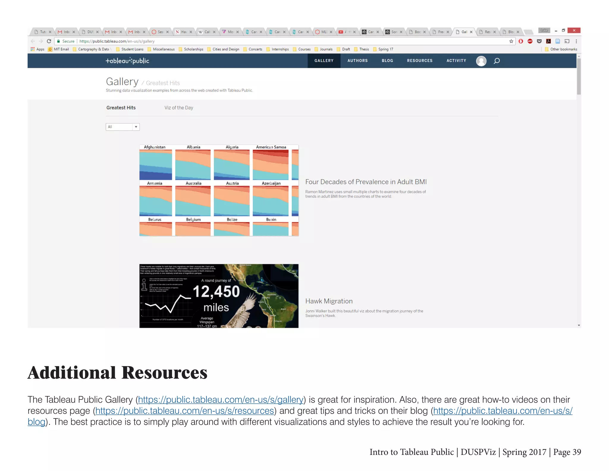

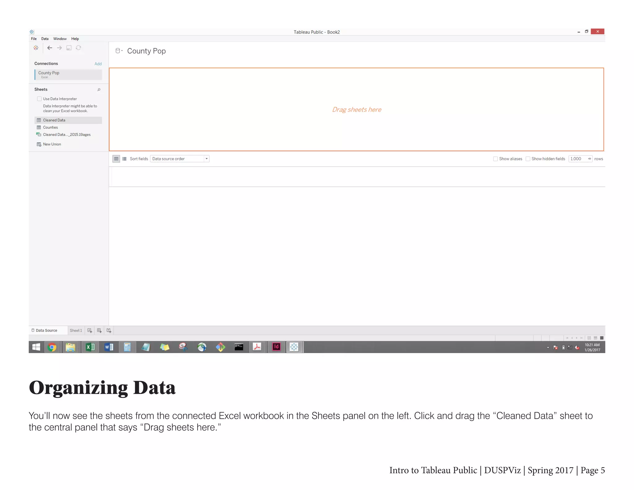
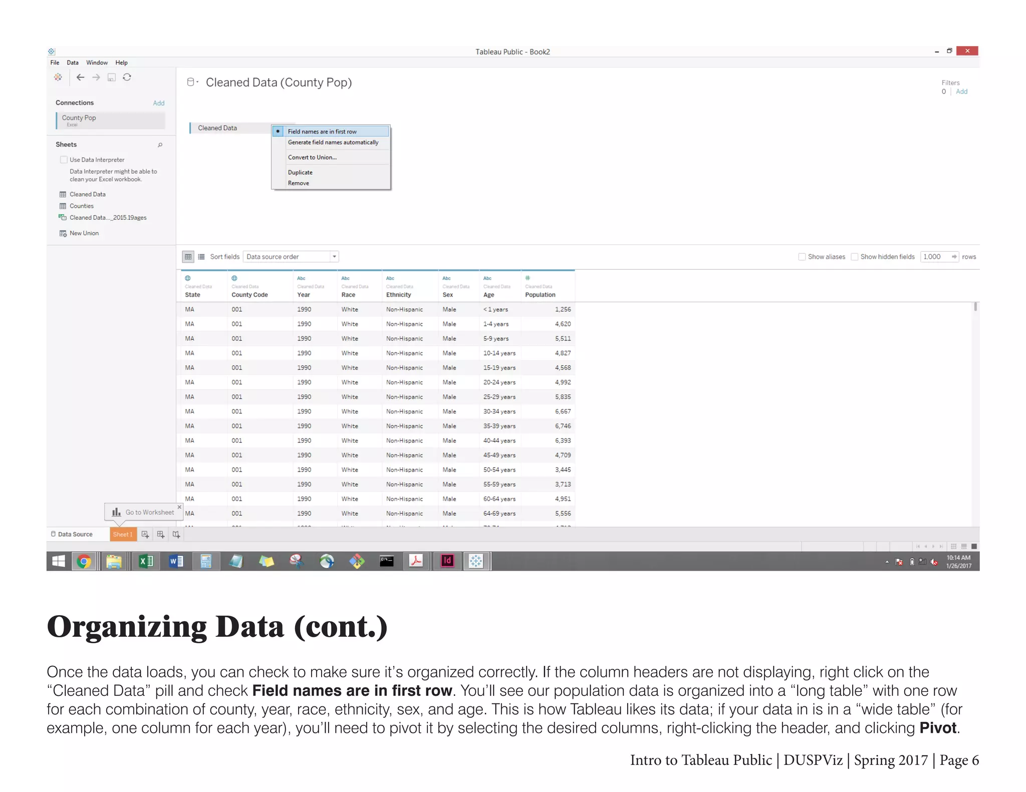
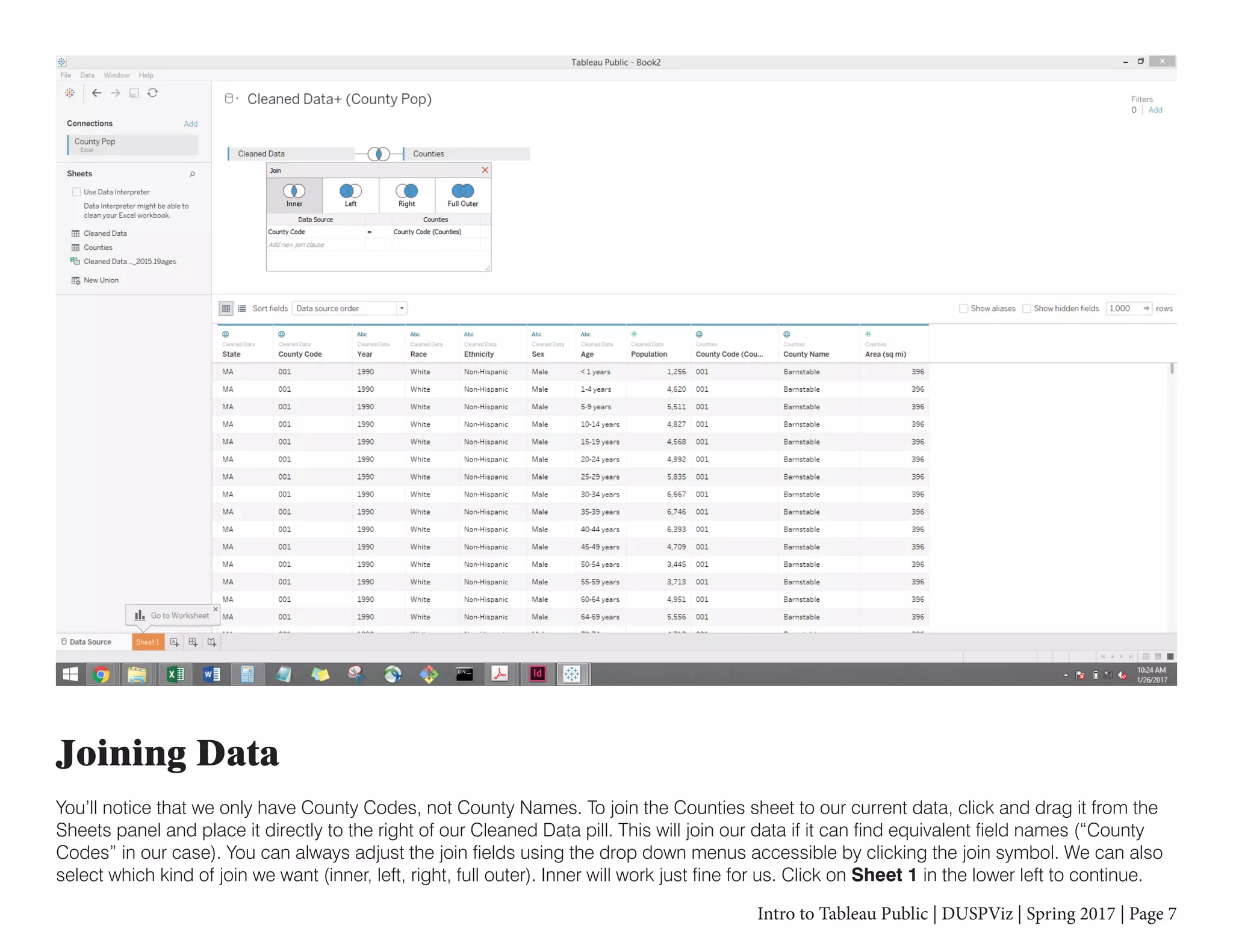
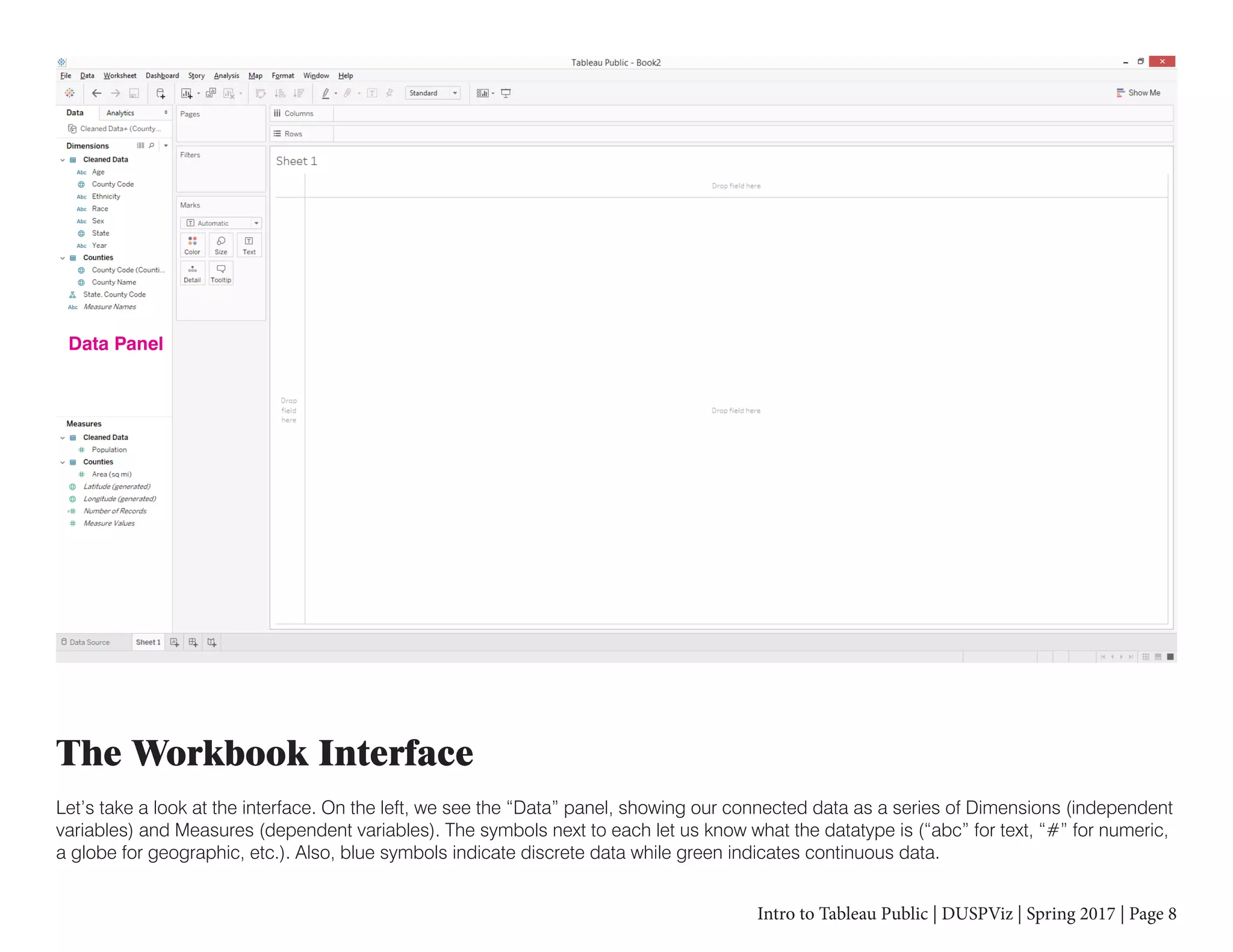
This document provides an introduction to using Tableau Public for data visualization. It explains that Tableau allows users to create web-based visualizations without programming by dragging and dropping data elements. The document then guides the reader through connecting an Excel data file, organizing and joining the data, creating calculated fields, and building basic visualizations like maps, tables, and charts. It demonstrates how to filter data, change visualization properties, and properly structure the data to create grouped charts.


![[DSC Europe 25] Petar Zivanov - AI meets documents From chatbots to AI-powere...](https://cdn.slidesharecdn.com/ss_thumbnails/xer2bb6nrdc8pdpev0pc-8-251204082258-7c2fa4a1-thumbnail.jpg?width=640&height=640&fit=bounds)


![[DSC Europe 25] Jim Sterne - Adopting Generative AI Capabilities Into the Ent...](https://cdn.slidesharecdn.com/ss_thumbnails/sxhpofuorcagxsaulkmt-3-251204082258-7e66bc48-thumbnail.jpg?width=640&height=640&fit=bounds)

![[DSC Europe 25] Bogdan Daniel Maruneac - AI - It starts with you.pptx](https://cdn.slidesharecdn.com/ss_thumbnails/odov3snhrcqs9hx5ny2n-4-251205085715-f1daacfe-thumbnail.jpg?width=640&height=640&fit=bounds)

![[DSC Europe 25] Boris Perkovic - Lost in performance.pptx](https://cdn.slidesharecdn.com/ss_thumbnails/uq5hrp7vsuahqkxzifux-1-251204082258-fd2ee09d-thumbnail.jpg?width=640&height=640&fit=bounds)


![[DSC Europe 25] Goran Obradovic - The Rise of Sovereign AI: Building the Regi...](https://cdn.slidesharecdn.com/ss_thumbnails/7nw2xxixrxqdxvrb5wca-6-251205085714-ab09a2ac-thumbnail.jpg?width=640&height=640&fit=bounds)
