Downloaded 372 times

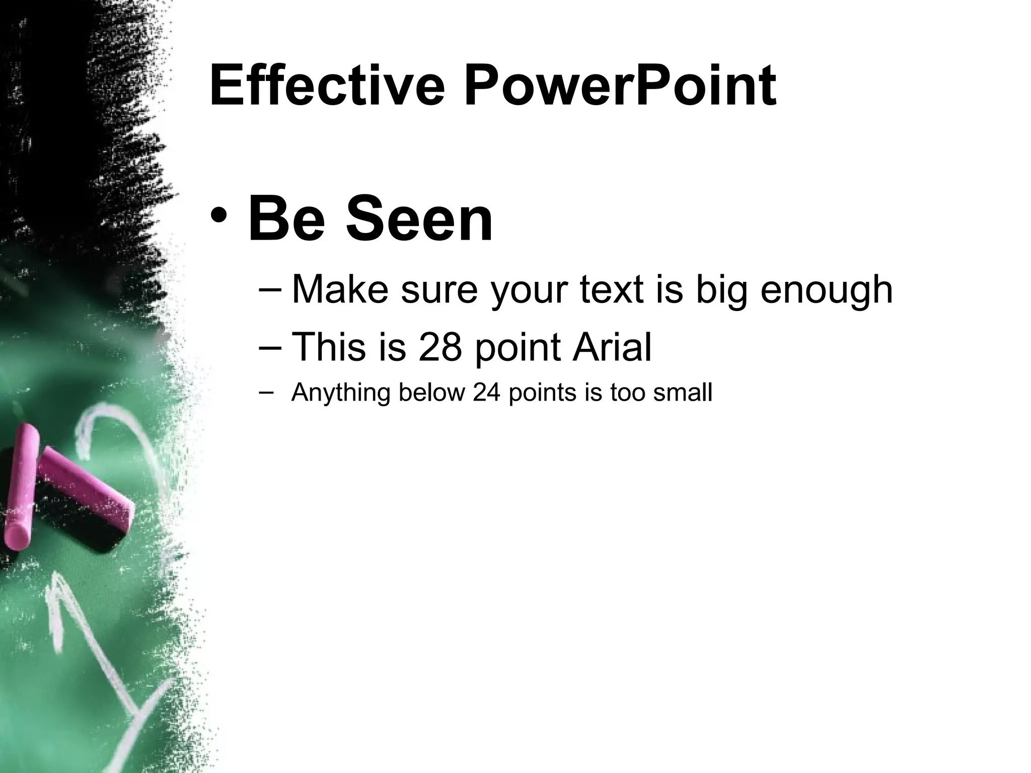
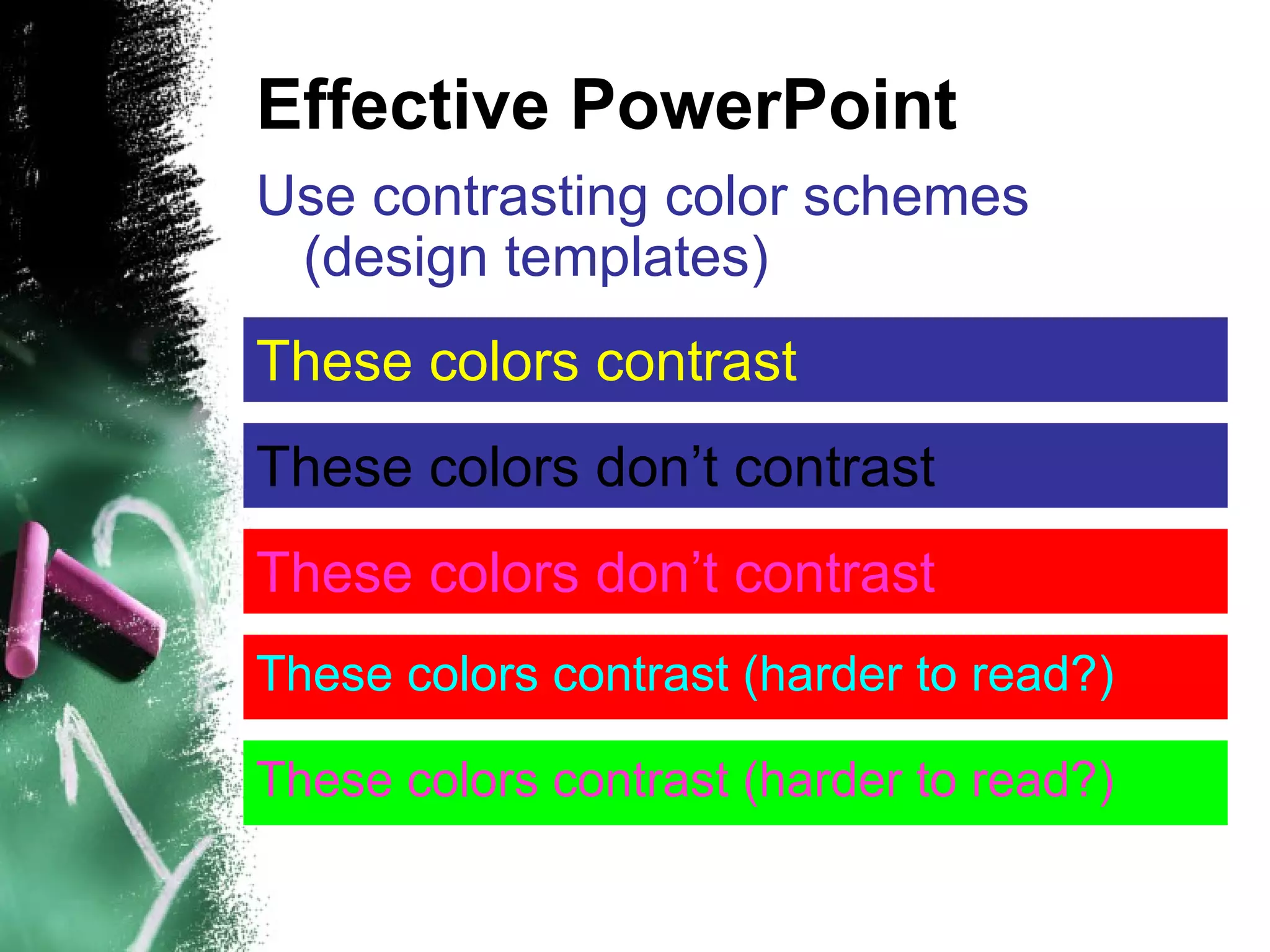
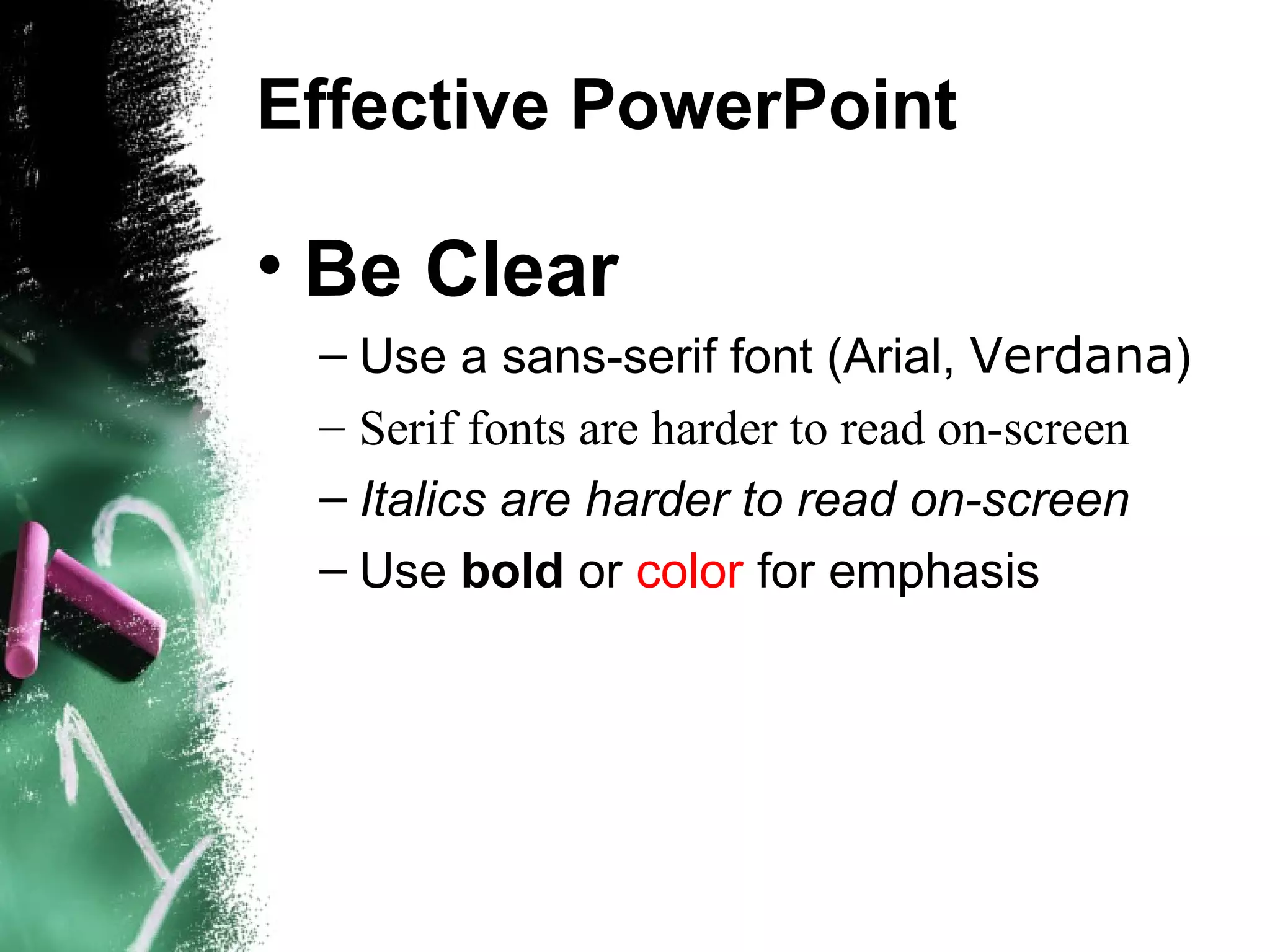
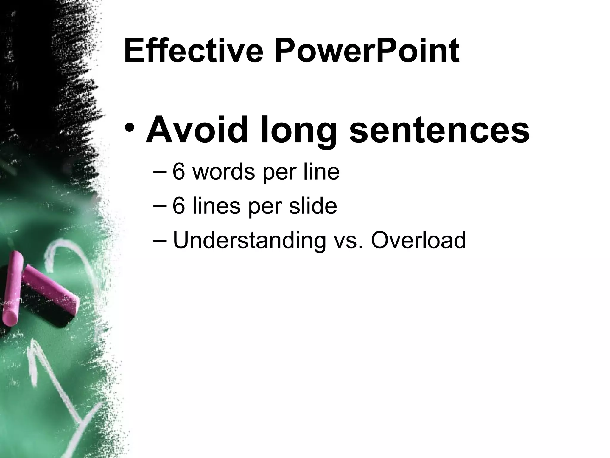
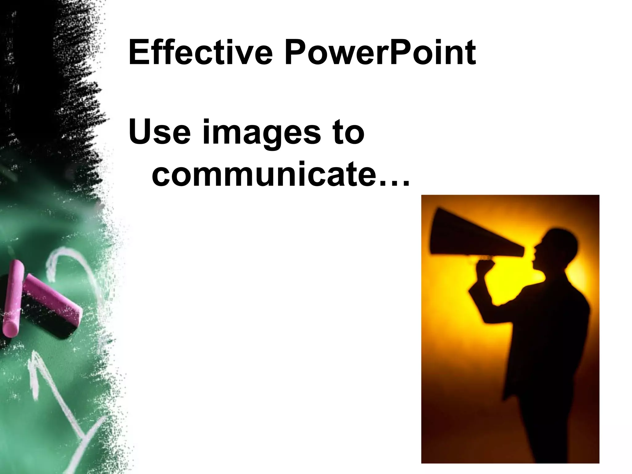


The document provides tips for creating an effective PowerPoint presentation with key points being to use a large font size of at least 24 points, choose high contrasting color schemes that are easy to read, keep the presentation simple with a light background and dark text, plan the presentation thoroughly, limit text on slides to 6 words per line and 6 lines per slide, use images to communicate ideas rather than just for decoration, and save the presentation frequently to avoid losing work.