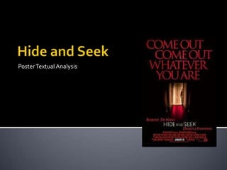
2. The main image in the poster is of a little girl hiding
behind a door, who as an audience presume is the main
protagonist within the film, immediately making the
viewer wonder why the girl is hiding and from what. The
unfocused image gives the impression that something is
looking for the girl and is looking down the dark corridor
with the main focus on the girl. This creates a void that
entices the imagination and makes the viewer wonder
what the girl is hiding from, thus creating tension and
uncertainty. The girl in the poster appears to be holding
something in her hand, possibly a knife or a sharp
object. This immediately causes anxiety in the audience
because it is not something you would see in every day
life, which would get the audience asking questions
whether she is good or bad in the film. The young girl is
standing in front of a white door which has connotations
of being ‘good’ and innocent which could sway the
audience to believe that she is good, but under the
influence of something ‘evil’. She is wearing dark clothes
though, which has connotations of being ‘bad’ and ‘evil’.
3. The colours used within the poster are
predominately red, white and black, which are the
stereotypical colours used in a poster for a horror
film, which this film is. The colour red is used in the
carpet makes the audience believe that there
could be blood involved within the film, which
could explain the reason why the young girl is
carrying a knife. On the carpet there is a faint
shadow shown creating a sense of ‘unknown’,
which could get the audience wondering what it is
heading towards the girl. The black background
creates the effect that the audience are watching
what is going to happen through a peep hole. By
engaging with the audience in this way it attracts
the audience to want to know what is going to
happen in the film, encouraging them to go and
see it when the film is released.
4. The tag line ‘come out come out whatever you
are’ immediately attracts the audience as it is very
dominant over the page, and the reader might
automatically read it as ‘come out come out
wherever you are’ as this is a phrase which is
linked to the game ‘hide and seek’, the title of the
film. With the use of the use ‘whatever’ instead of
‘wherever’ in the phrase causes the audience to
believe that there is something that is unknown
playing this game with the young girl in the
poster. This adds tension to the poster and is
almost left as a cliff hanger as the audience will
want to know ‘whatever’ is.
This play on words acts as cue that will help the
viewer to remember the film.
5. The main protagonists actors names ‘Robert De Niro’
and ‘Dakota Fanning’ are written at the bottom of the
poster. These are the only well known actors within the
film which is why they are included on the poster and
none of the others are. This is unusual as we usually see
this at the top of the page attracting the audience to see
the film. Instead they have written the names above and
below the title of the film, so the names are still seen
clearly by the audience and have also be written in a
different colour to the title so they stand out. The title
are the release date are written in white to stand out
from the rest of the page and to make it easier for the
audience to know when to go and see the film. The title
has been written in a different font, one which looks like
it has parts missing, giving it a sense of mystery. The
extra information in red is situated at the bottom of the
poster as it is the conventional position for the logo of
the company that produced the film to be situated.