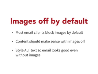
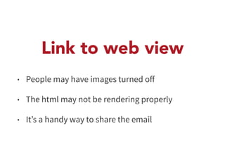
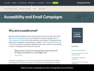
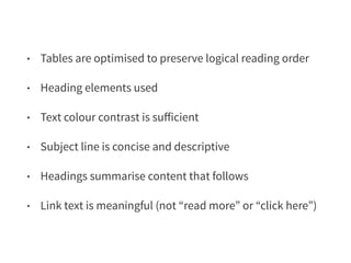
Download as PDF, PPTX


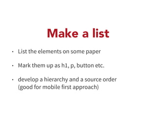

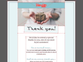
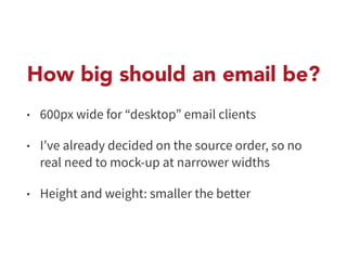
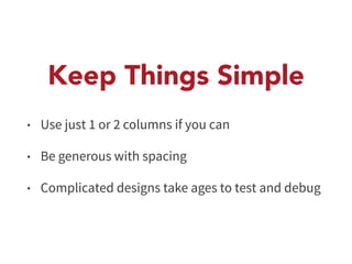


The document outlines the process for designing responsive HTML emails, emphasizing a content-first approach and accessibility. It details steps such as gathering content, wireframing, and testing across various email clients, while highlighting best practices like inline CSS and the use of tables. The importance of thorough testing and following guidelines for effective email communication is also stressed.