Download as PDF, PPTX


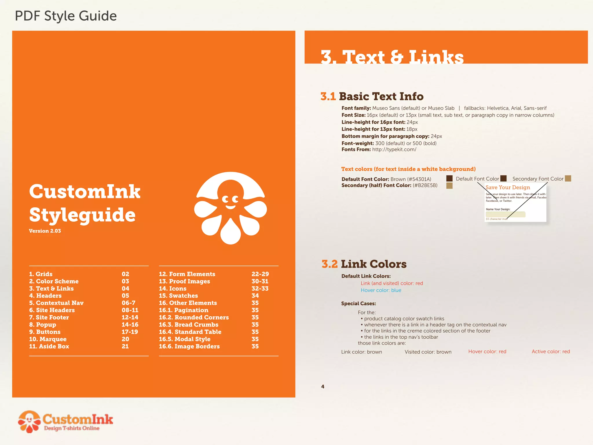
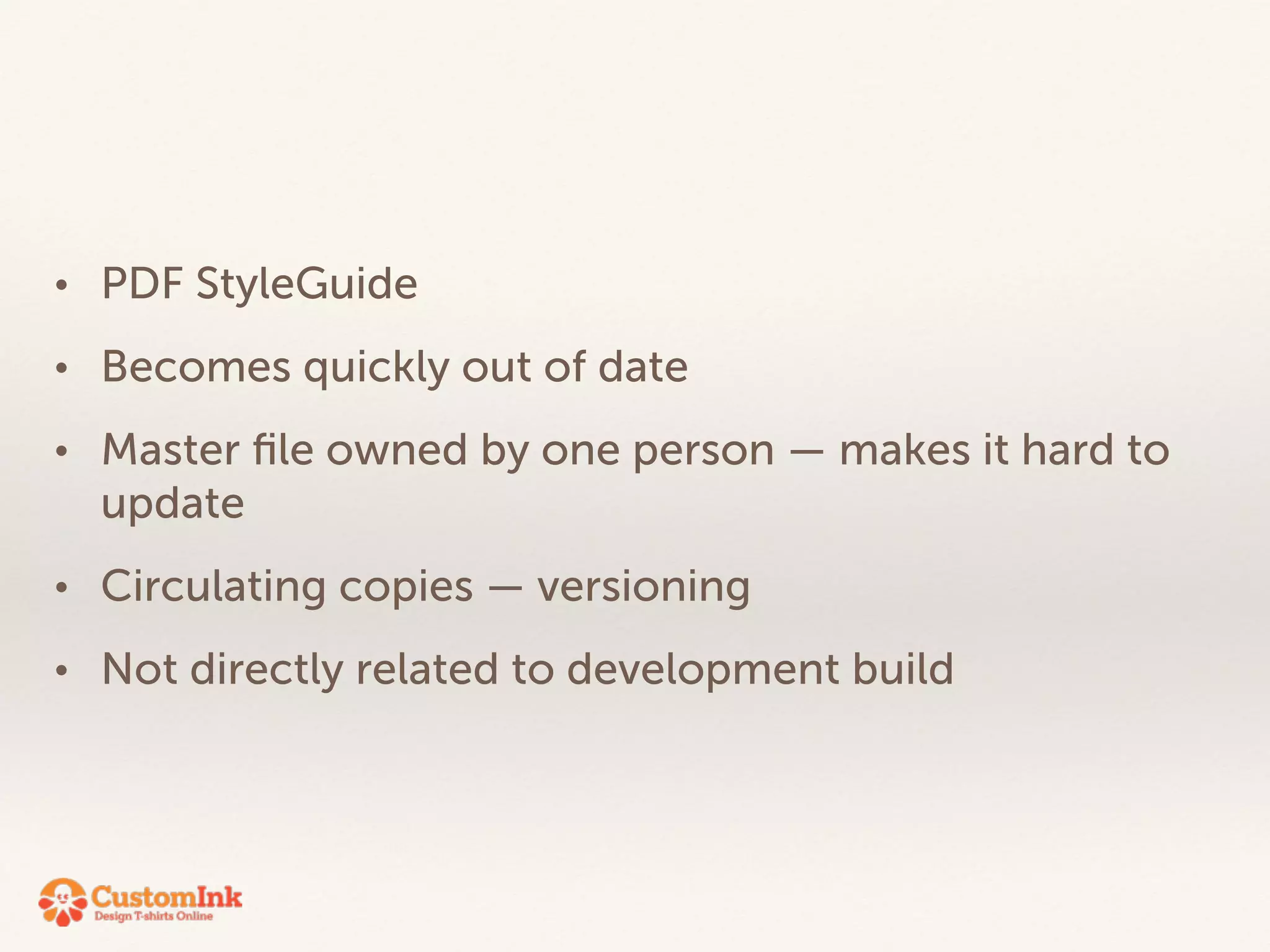
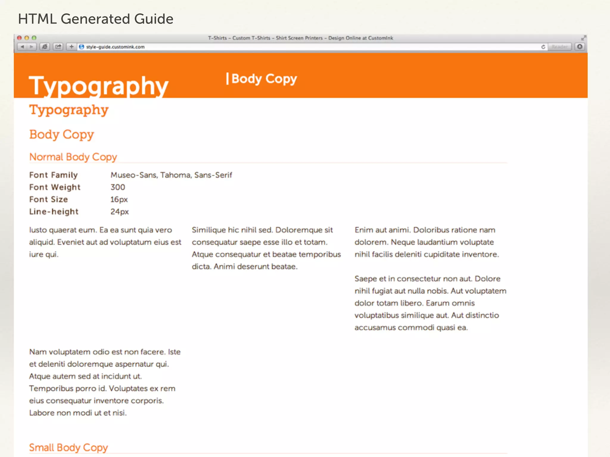
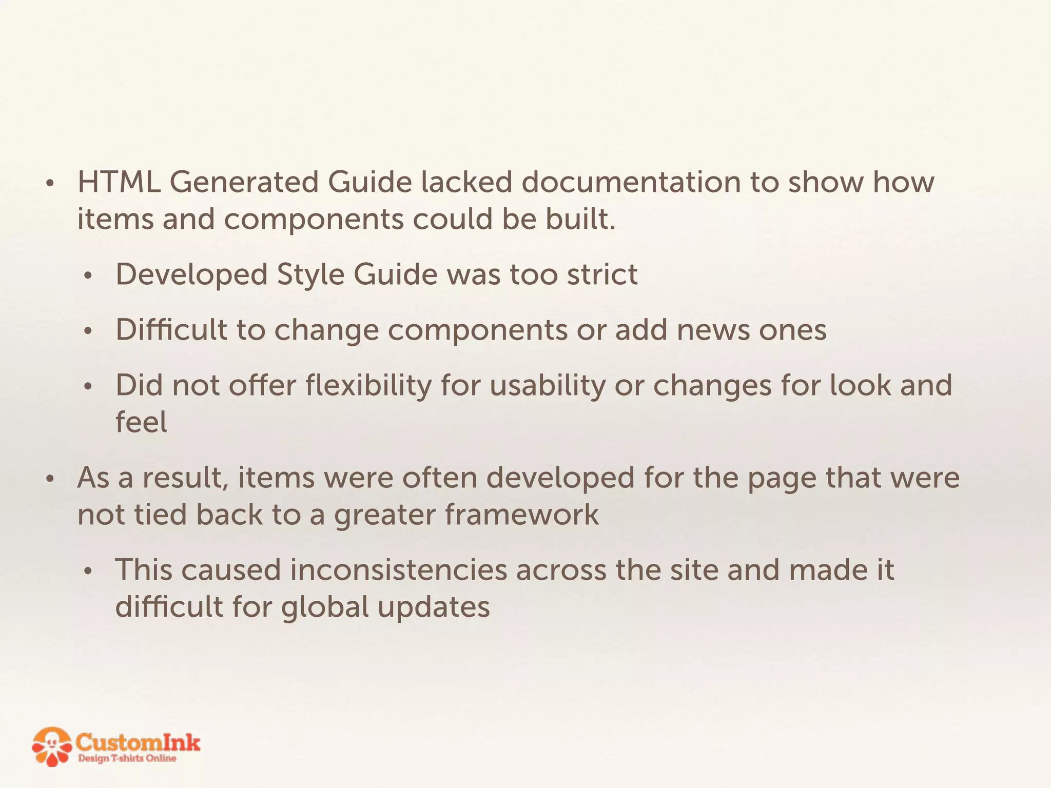


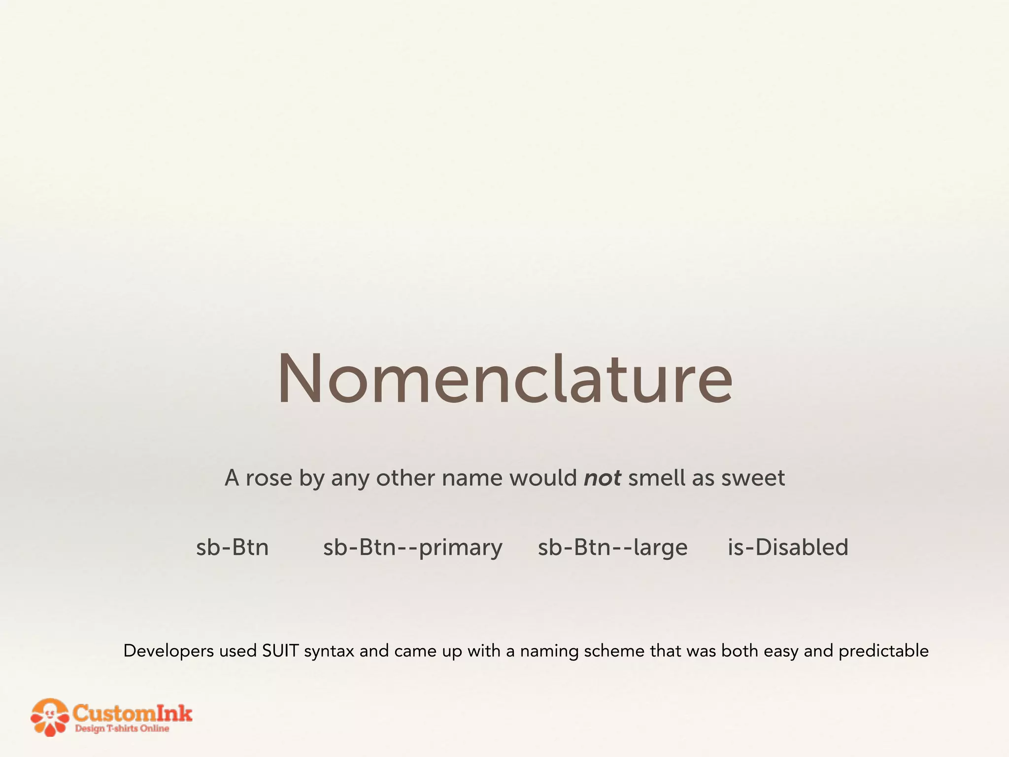
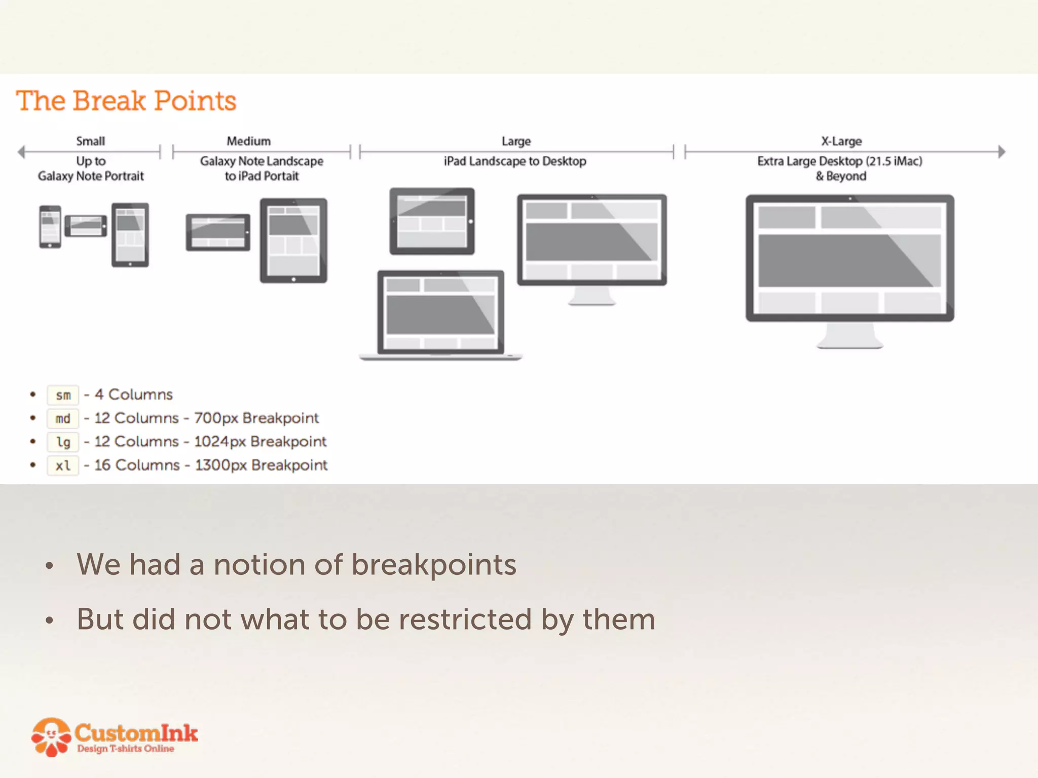

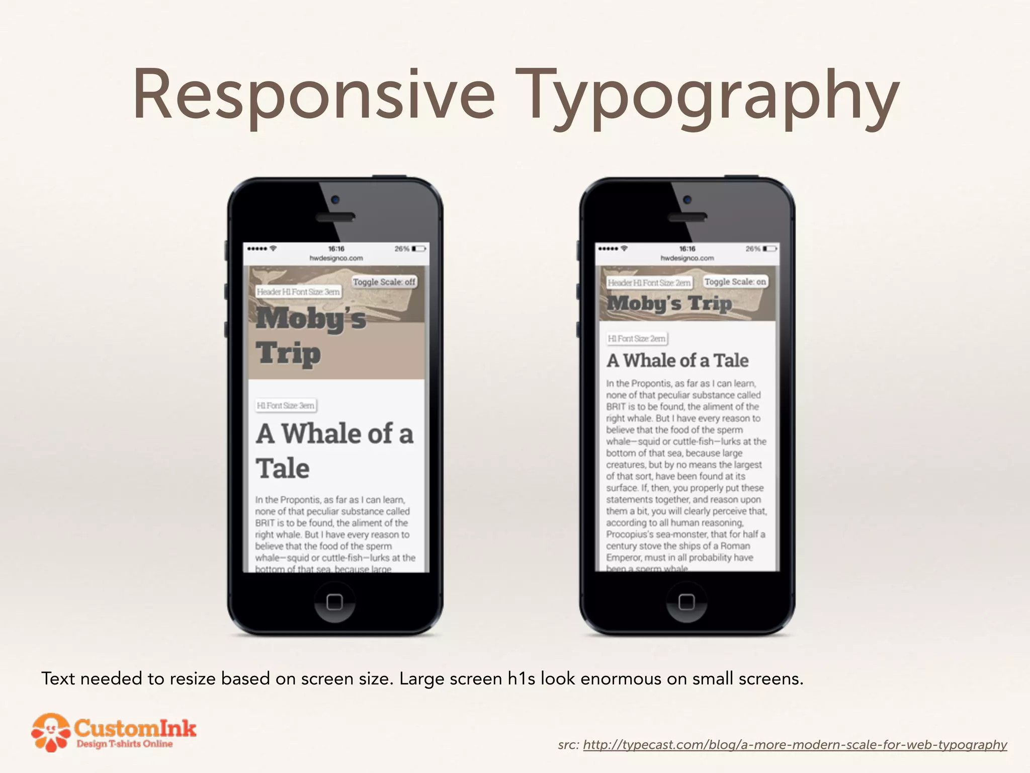
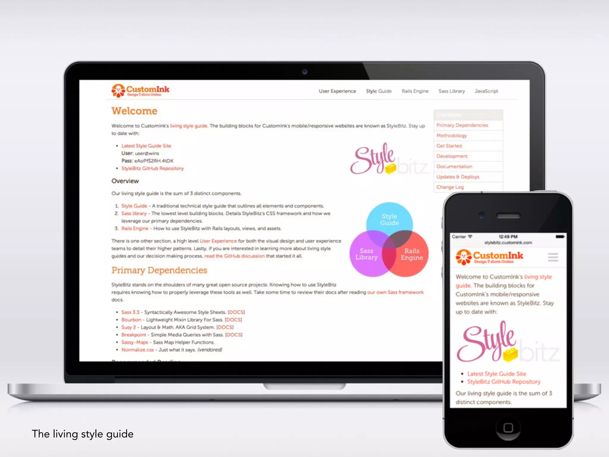

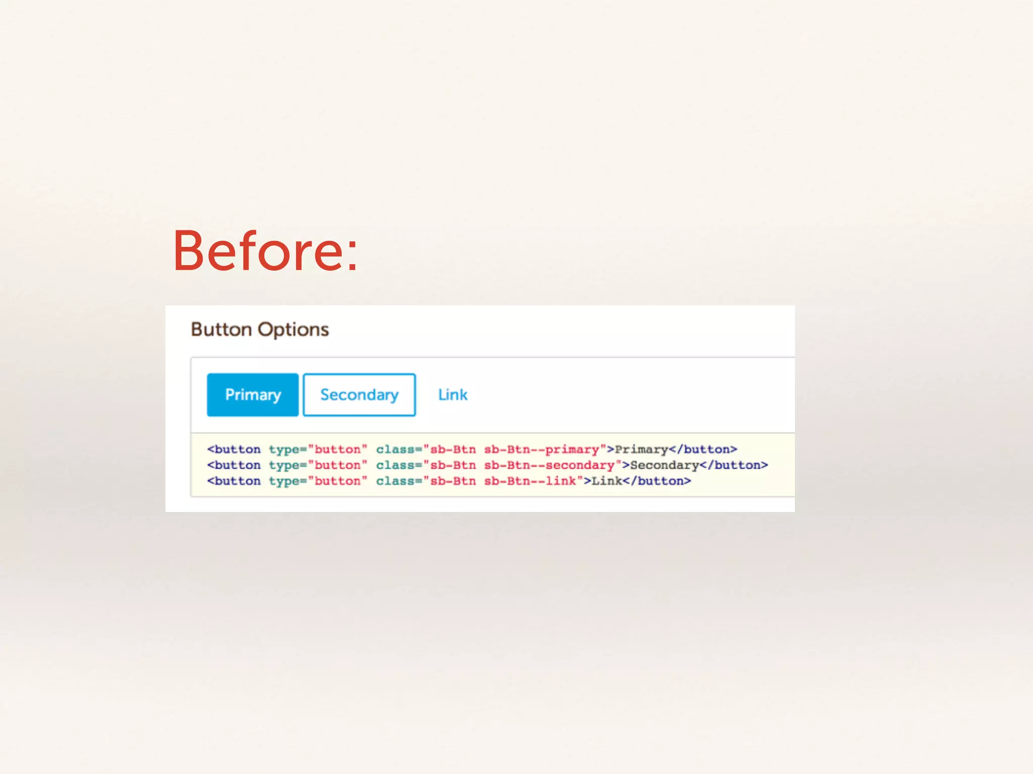
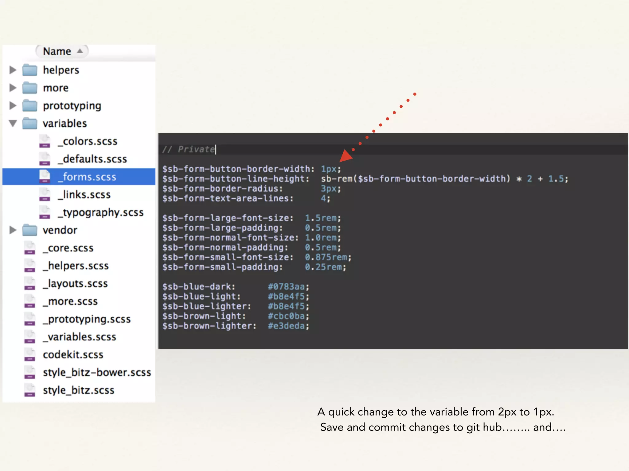
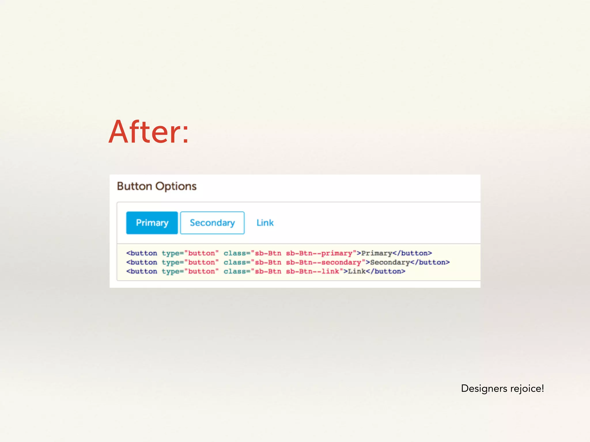


The document outlines a mobile UX style guide focusing on the design elements and components necessary for creating mobile-friendly web pages. It emphasizes the need for flexibility in the style guide to accommodate responsive design and modern user experiences while detailing specific formatting for text, links, and other interface elements. Additionally, it discusses the importance of consistent naming conventions for development and the living nature of the style guide for ongoing updates and collaboration between design and development teams.