
Recommended
More Related Content
What's hot
What's hot (16)
Viewers also liked
Similar to Textual analysis of film magazine cover
Similar to Textual analysis of film magazine cover (20)
Textual analysis of film magazine cover
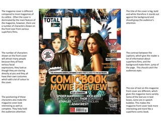
- 1. The magazine cover is different The title of the cover is big, bold compared to most magazines of and white therefore it stands out its calibre. Often the cover is against the background and dominated by the main feature of should grasp the audience’s the magazine, however, there are attention. a number of characters shown on the front over from various superhero films. The number of characters The contrast between the shown on the front cover captions, which give the reader a will attract many people lot of information about because they all have superhero films, and the serious facial background make them jump of expressions, they look as the page. This should catch the though they are staring audiences eyes. directly at you and they all have their own costumes which add a lot of colour to the cover. The size of text on this magazine front cover are different, which gives the magazine more variety. The positioning of these Some of the text are in text characters also make the boxes, some are in speech magazine cover look bubbles. This makes the interesting as well as magazine front cover look more complete. They help hold interesting and more like a the audiences attention. superhero comic book.