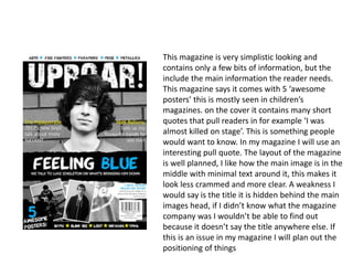
1. This magazine is very simplistic looking and
contains only a few bits of information, but the
include the main information the reader needs.
This magazine says it comes with 5 ‘awesome
posters’ this is mostly seen in children’s
magazines. on the cover it contains many short
quotes that pull readers in for example ‘I was
almost killed on stage’. This is something people
would want to know. In my magazine I will use an
interesting pull quote. The layout of the magazine
is well planned, I like how the main image is in the
middle with minimal text around it, this makes it
look less crammed and more clear. A weakness I
would say is the title it is hidden behind the main
images head, if I didn’t know what the magazine
company was I wouldn’t be able to find out
because it doesn’t say the title anywhere else. If
this is an issue in my magazine I will plan out the
positioning of things
2. The 1st page of the double
page spread is a full page
picture with text in it saying
‘the worst phone call of my
life’ this is a good use of a pull
quote and a brief overview of
what the interview is about.
The text is easy to read and
easy to understand what is an
answer and what is a question.
A positive of the page is the
running theme of white, blue
and yellow these colours all fit
in with the theme of rock and
roll.