1. Olivia Berry
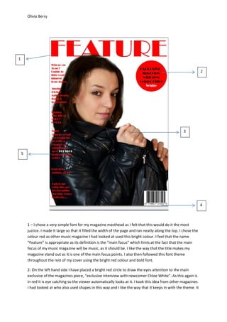
1 – I chose a very simple font for my magazine masthead as I felt that this would do it the most
justice. I made it large so that it filled the width of the page and ran neatly along the top. I chose the
colour red as other music magazine I had looked at used this bright colour. I feel that the name
“Feature” is appropriate as its definition is the “main focus” which hints at the fact that the main
focus of my music magazine will be music, as it should be. I like the way that the title makes my
magazine stand out as it is one of the main focus points. I also then followed this font theme
throughout the rest of my cover using the bright red colour and bold font.
2- On the left hand side I have placed a bright red circle to draw the eyes attention to the main
exclusive of the magazines piece, “exclusive interview with newcomer Chloe White”. As this again is
in red it is eye catching so the viewer automatically looks at it. I took this idea from other magazines
I had looked at who also used shapes in this way and I like the way that it keeps in with the theme. It
1
2
3
4
5
2. Olivia Berry
also breaks up the amount of blank white background that is on the front of my magazine, however
this was intentional as I wanted to keep it looking simple and like the example magazines I had
chosen to look at.
3 – I have placed the main image of my model, who is also my classmate, Chloe Whittle, in the
centre of my front cover. I feel that this is the best positioning as you get to see her clearly without
anything in the way. I made sure that my model looked appropriate for the style of magazine I was
creating, and for the article I was going to be writing in it. Her black clothing and dark hair looks good
against the plain white background, and the white text stands out brightly against it. I took this
photograph amongst a lot of others, in the photography room in college as I liked the white walls
and the bright lighting which made the image much more professional. I used this particular image
as I felt it was interesting and a little mysterious.
4 – I have placed the barcode and price in the bottom right hand corner of the page as when looking
at professional magazines I noticed that they all tended to do this themselves. Putting it down there
has enabled me to keep it neat and out of the way, with more room to use the page in the way I
wanted, without missing out the vital points that magazine cover has to have.
I found the image of the barcode on Google images, I then saved it and scaled it to the size I needed
myself.
5 – I placed all the main headlines down the left hand side of my magazine front cover. This is
because research has shown that all magazines do this as the eyes are naturally drawn to the left. I
placed it all in a straight line as I feel this makes it look much neater which consequently makes it
clearer and easier to read. On the fourth headline I saved a picture of the Topshop logo and then
edited it so it was exactly how I wanted and used it within one of the pieces of text. I used this brand
as it is relevant to my target audience and fits in with the theme of my magazine.