
Recommended
More Related Content
What's hot
What's hot (20)
Similar to Critical Reflection
Similar to Critical Reflection (20)
Recently uploaded
Recently uploaded (20)
Critical Reflection
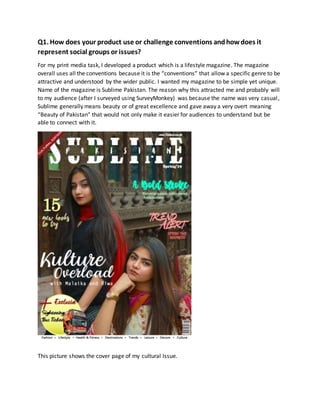
- 1. Q1. How does your product use or challenge conventions andhowdoes it represent social groups or issues? For my print media task, I developed a product which is a lifestyle magazine. The magazine overall uses all the conventions because it is the “conventions” that allow a specific genre to be attractive and understood by the wider public. I wanted my magazine to be simple yet unique. Name of the magazine is Sublime Pakistan. The reason why this attracted me and probably will to my audience (after I surveyed using SurveyMonkey) was because the name was very casual, Sublime generally means beauty or of great excellence and gave away a very overt meaning “Beauty of Pakistan” that would not only make it easier for audiences to understand but be able to connect with it. This picture shows the cover page of my cultural Issue.
- 2. As every detail count, the use of Mise-en-scene is extremely important. Usually closeups or Medium shots are used more in a lifestyle magazine’s cover, and keeping that in mind I followed the convention, using daylight photography and enhancing the vibrance as the subject “pops” beautifully in colors. I tried to follow all the basic conventions- keeping in mind that according to my research, not many lifestyle magazines have a lot of colorful cover lines; it is mostly just the plain one tone complimenting the background and image that has the spotlight. I broke this convention since it seemed to different and appealing giving a warm feeling exaggerating the culture theme to draw immediate attention towards the visuals. Moreover, talking about the masthead, I really wanted to create something unique that’s not really found in ordinary magazines, I wanted to layer Pakistan in between Sublime and that’s what I did using the masking tool. And lastly My magazine has a barcode, date, price and a puff as every other magazine concluding that I followed the conventions similarly on the contents and double spread As my magazine is a lifestyle magazine having a culture edition which means this edition focuses on our Culture in detail the Target audience ‘s primary focus would be the people living in Pakistan, I feel mostly females would be interested since with improvement in generations by generation our women are more independent. Mainly targeted personalities include Socialites, Outgoing working women/ men, mostly upper-class and middle-class people who like to read, explore and achieve certain lifestyle. Our society is refining continuously and with that feminism and other issues and stereotypes arise, which helps the community. Taking women education for example, it’s as important as men’s education. Today our women are changing the way we live, eat dress, attaining Nobel prizes, taking positions in politics therefore, the article I wrote in my double spread voices out to young working women who are famous designers raising their own clothing brand in Pakistan with the help of loved ones. The double spread page is one of the most important features in a magazine, it is important for this page to be as attractive as possible because it captures reader attention quite easily. The double spread page I made is not like usual pages- I tried to incorporate more graphic elements in order to make it look interesting. Cut out of images i.e., the polaroid effect of pictures has been used instead of placing the whole picture making it look aesthetically pleasing. Title is similar to what was on the cover page, this creates a connection between the two and allows the reader to actually be interested in what is being presented. Graphic elements have been used which give off a very pleasant look: not overly done.
- 3. 2. How does your product engage withaudiences and how would it be distributedas areal media text? My product is a Cultural Edition in a Lifestyle Magazine. The most important part of the magazine is the cover page and it is extremely essential for it to be able to attract audiences in order to have a good market. (My Audience are basically residents of Pakistan as they would like to read about their cities, but also tourists visiting Pakistan as magazine contains our culture which they might be interested to know about). The cover image is of two extremely talented young designers, Since the picture is only focusing on one subject, with a rusty old brown background it stands out to a great extent. Also, high quality, Vibrant visuals on the cover picture tends to engage with audiences and allow them to be fascinated by what are the details related to the product and what does this particular issue include. As said by many, “too much of everything is harmful”- not having a lot of overlapping coverlines made it look very simplistic. The masthead color was chosen keeping in mind the colors of the background and basic masthead color convention, the rest of the cover- lines were mostly focused with the use of cultural colors as mentioned in the House style. So we can see how a lot of color combination is kept in mind so nothing looks out of place Handwritten, thin and somewhat fancy fonts were used, to go with the genre. The language and expression used in the magazine is casual yet respectable, it is understandable by the general public and it has been made sure that the magazine is customer- friendly and whether teenagers or middle aged people, everyone can have a good look at it and be tempted with what they could do with a beautiful medium of art, culture. The color scheme of the double spread page is pretty simple, trying not to over-do it with too many colors along with gradients. More of graphic effects have been used making it a little different from usual double spreads. Distribution of the magazine has been kept in mind while developing the final product. The magazine will be published both print and online because users are digital natives and want their product available online and, on every platform, this will even reach a mass audience. The online magazine can be more engaging and interactive as two-way communication is possible between the reader and the author by giving feedback or questions related to the magazine. Moreover, Hard copies of the magazine can be sold at local stores where the target audience can easily purchase it including stalls in cafes, book stores, railway stations and airports too.
- 4. Q3. How did your productionskills developthroughout the project? For the print media task in AS level, the development of my magazine was done with extensive research, genre planning and my ability to learn and apply. Before carrying out the preliminary and final task, I needed to have a good knowledge about all the codes and conventions used in various types of magazines and then specifically about the genre I chose. Extensive research and planning were a great way to enhance creativity. At the start of AS, I prepared a cover- page, although this was a short preliminary task it allowed me to develop sufficient photoshop and photography skills to be able to develop a magazine for my AS level final task. In the post production stage, my photoshop skills such as image cropping, resizing and adjusting the image were one of the first steps to the development of my magazine. Later, when I was working on my final task, I experimented with masking tool, shapes, margin adjusting, enhancing the picture vibrance etc. which allowed me to polish my skills throughout the project. I have even used a variety of fonts on the front cover which I learnt that I could install using websites such as 1001 fonts. These skills have effectively helped me to produce the product that I wanted. For the images used, my photography skills developed to a great extent as I was able to capture exactly what I had in mind eventually using rules angles and lights- even though I know there were a few flaws when it came to selecting the picture and making the models pose. The cover page the image was a medium shot of the subject and for the double spread the images used are of a smaller size and are mostly resized whole picture dragged into the composition adding a great graphic element to a very simple page. For the content page I wanted to make sure that it didn’t have too much on it- at first I thought I should add various effects such as glow, drop shadow, bevel and emboss as I added in the double page, but it felt too heavy, instead I made it more graphic visuals which would attract a large amount of consumers. Photoshop allowed each and every skill to be polished with practice and the use of proper techniques. For the final magazine I did a lot of hard work which set objectives or rules which I applied to my magazine in order for it to be more affective in reaching the audience. Q4. How did you integrate technologies- Software, hardware andonline- inthis project? Hardware and software technologies assist in producing media. Hardware technologies used to produce the project were: A Laptop, Internet access, DSLR camera and its components and a USB How? As a DSLR camera creates high quality images and was one of the most important components of the production process as it made the shoot and images look professional, for an extensive production process to take place a laptop was necessary for Researching, the editing using Adobe Photoshop and to keep a record of all that was being done by blogging online on WordPress. The software used was Adobe photoshop which allowed me to perfect
- 5. the images I had and enhance them in whatever way possible, to Create Layouts whether its cover, content or double. Microsoft Word, PowerPoint Moreover, for publishing the process online I used WordPress, to add variety and making the blog interesting I used many other websites such as SlideShare for uploading presentations, YouTube for videos, chart makers for flowchart, Google for reference pictures and research and All my data was backed up in a USB and also in my emails in case of any emergency. All the hardware, Software and online applications were of great help for the production of my magazine. The technologies were used efficiently in order to produce the final product.