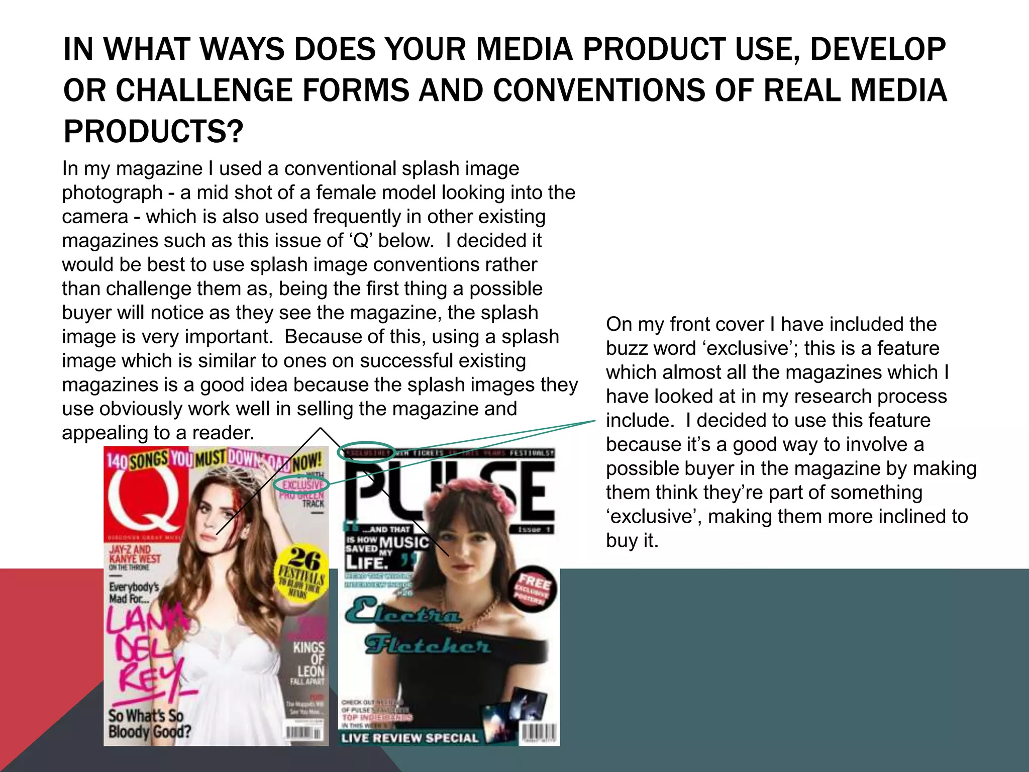
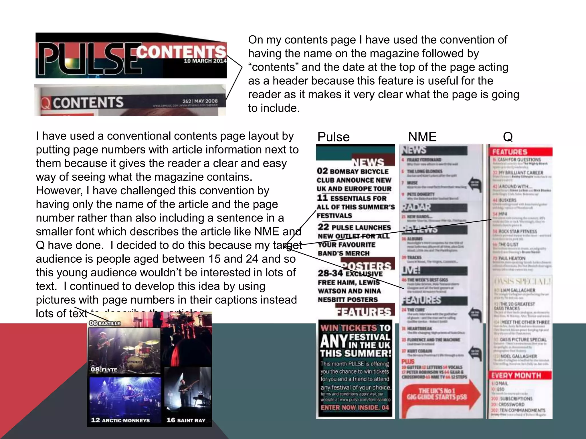
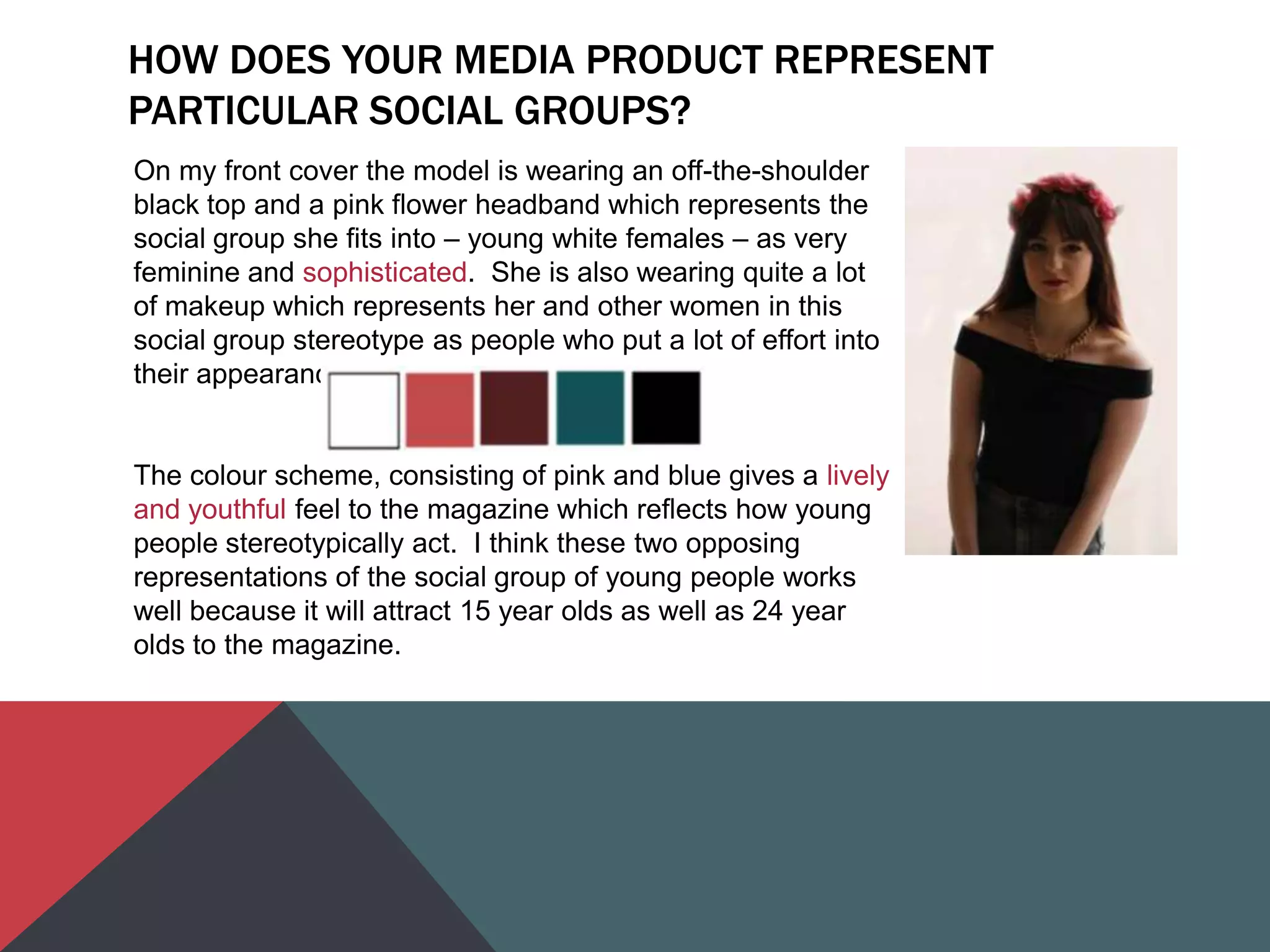
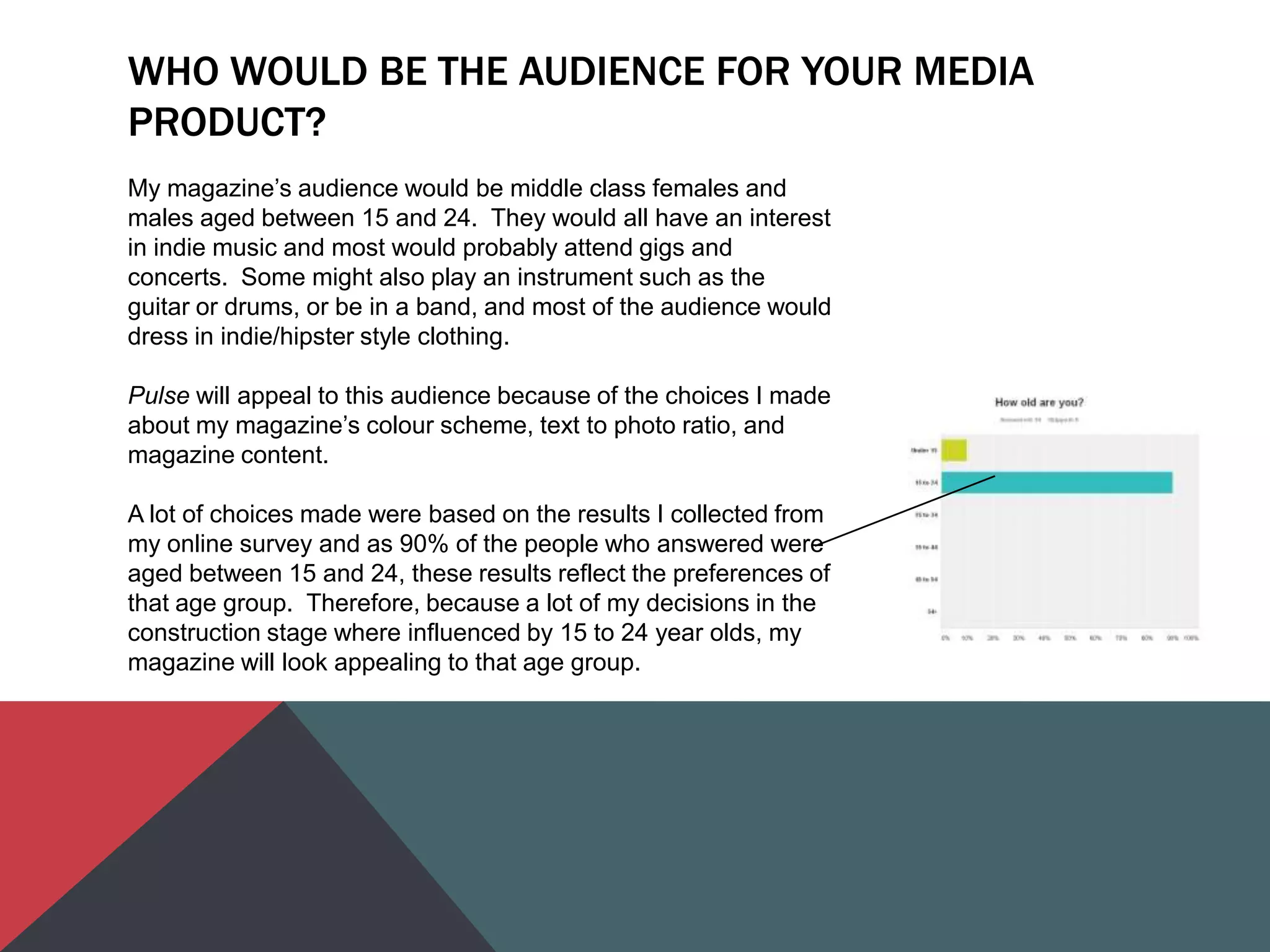
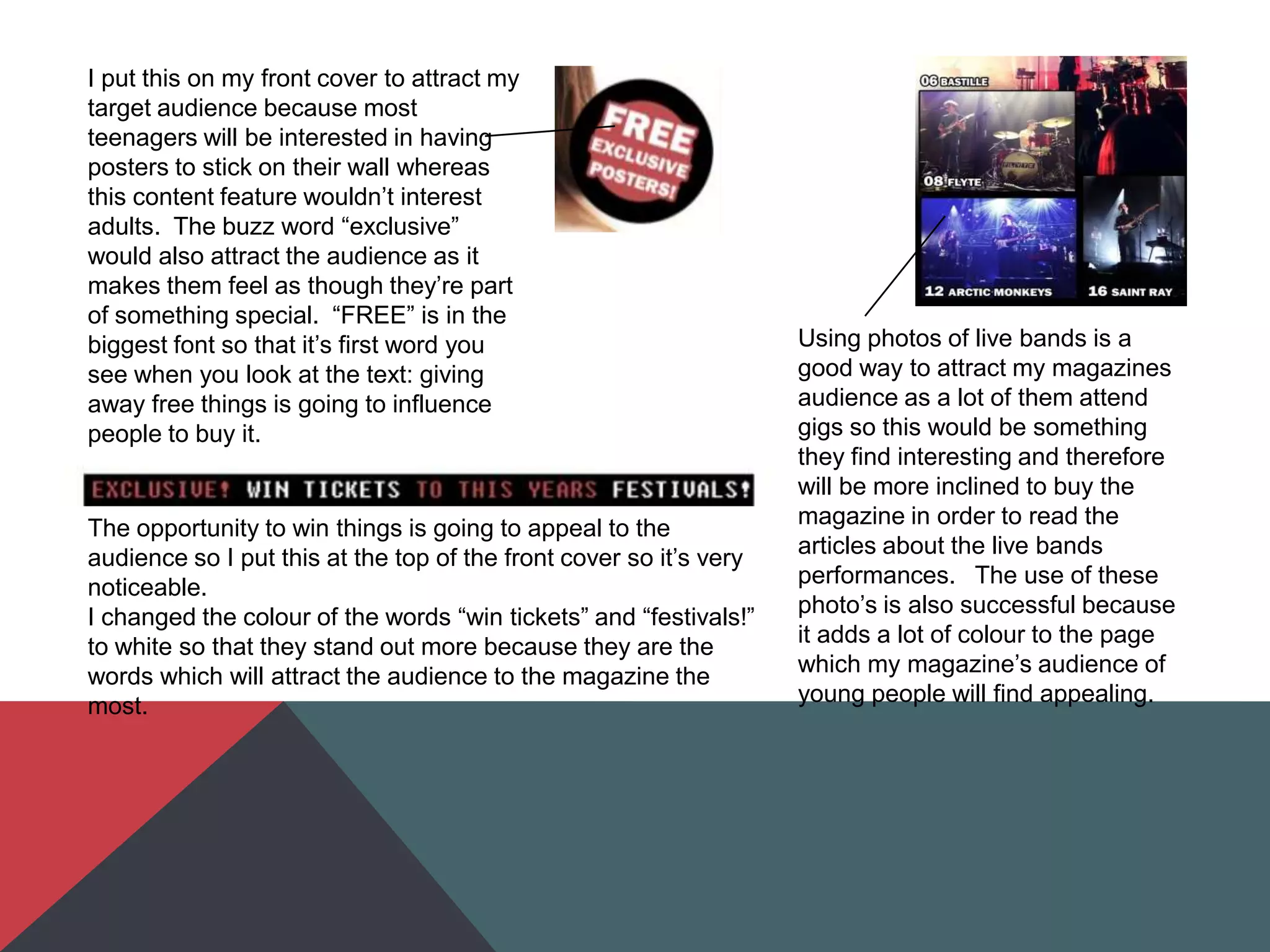
IN WHAT WAYS DOES YOUR MEDIA PRODUCT USE, DEVELOP
OR CHALLENGE FORMS AND CONVENTIONS OF REAL MEDIA
PRODUCTS?
In my magazine I used a conventional splash image
photograph - a mid shot of a female model looking into the
camera - which is also used frequently in other existing
magazines such as this issue of „Q‟ below. I decided it
would be best to use splash image conventions rather
than challenge them as, being the first thing a possible
buyer will notice as they see the magazine, the splash
image is very important. Because of this, using a splash
image which is similar to ones on successful existing
magazines is a good idea because the splash images they
use obviously work well in selling the magazine and
appealing to a reader.
On my front cover I have included the
buzz word „exclusive‟; this is a feature
which almost all the magazines which I
have looked at in my research process
include. I decided to use this feature
because it‟s a good way to involve a
possible buyer in the magazine by making
them think they‟re part of something
„exclusive‟, making them more inclined to
buy it.
On my contents page I have used the convention of
having the name on the magazine followed by
“contents” and the date at the top of the page acting
as a header because this feature is useful for the
reader as it makes it very clear what the page is going
to include.
Pulse NME QI have used a conventional contents page layout by
putting page numbers with article information next to
them because it gives the reader a clear and easy
way of seeing what the magazine contains.
However, I have challenged this convention by
having only the name of the article and the page
number rather than also including a sentence in a
smaller font which describes the article like NME and
Q have done. I decided to do this because my target
audience is people aged between 15 and 24 and so
this young audience wouldn‟t be interested in lots of
text. I continued to develop this idea by using
pictures with page numbers in their captions instead
lots of text to describe the articles.
HOW DOES YOUR MEDIA PRODUCT REPRESENT
PARTICULAR SOCIAL GROUPS?
On my front cover the model is wearing an off-the-shoulder
black top and a pink flower headband which represents the
social group she fits into – young white females – as very
feminine and sophisticated. She is also wearing quite a lot
of makeup which represents her and other women in this
social group stereotype as people who put a lot of effort into
their appearance.
The colour scheme, consisting of pink and blue gives a lively
and youthful feel to the magazine which reflects how young
people stereotypically act. I think these two opposing
representations of the social group of young people works
well because it will attract 15 year olds as well as 24 year
olds to the magazine.
WHAT KIND OF MEDIA INSTITUTION MIGHT DISTRIBUTE
YOUR MEDIA PRODUCT AND WHY?
An institution such as Bauer Media Group would
distribute my magazine, Pulse, because they are a
very large and successful company who already
connect with over nineteen million UK adults through
their 60 media brands, so it‟s obvious they have a lot
of experience and my magazine would be exposed to
a lot of people.
In their music market at the moment they distribute
Kerrang!, MOJO and Q which all currently have very
good readership and circulation figures:
• Kerrang! - Circulation - 35,127 (Jul-Dec '13)
Readership - 345,000 (July-Dec '12)
• MOJO – Circulation - 74,203 (Jul-Dec '13)
Readership - 220,000 (Jul-Dec '12)
• Q – Circulation - 52,781 (Jul-Dec '13) Readership -
377,000 (Jan-Dec '12)
My magazine would be a good addition alongside these three music
magazines as mine would fill a gap in their market because:
• Kerrang!‟s target audience is the same age as mine, as 56.1% of
people who buy Kerrang! are aged between 15 and 24 (which also
shows Bauer Media have experience in making products for this
age range), but my magazine focuses on a different music genre to
Kerrang! so they wouldn‟t be too similar and therefore would not in
competition with each other.
• Although MOJO has a similar style and focuses on the same music
genre as my magazine, it is released monthly unlike my magazine
which is fortnightly, and so is a much more substantial magazine
meaning Pulse would work well being distributed alongside it as it
would fill the gap in Bauer Media‟s music market for a throwaway
magazine which focuses on indie music.
• Q is also a magazine which is produced monthly rather than
fortnightly so it differs from Pulse due to this and also because Q
focuses on artists from many different genres unlike Pulse which
has a definite genre which it focuses on.
WHO WOULD BE THE AUDIENCE FOR YOUR MEDIA
PRODUCT?
My magazine‟s audience would be middle class females and
males aged between 15 and 24. They would all have an interest
in indie music and most would probably attend gigs and
concerts. Some might also play an instrument such as the
guitar or drums, or be in a band, and most of the audience would
dress in indie/hipster style clothing.
Pulse will appeal to this audience because of the choices I made
about my magazine‟s colour scheme, text to photo ratio, and
magazine content.
A lot of choices made were based on the results I collected from
my online survey and as 90% of the people who answered were
aged between 15 and 24, these results reflect the preferences of
that age group. Therefore, because a lot of my decisions in the
construction stage where influenced by 15 to 24 year olds, my
magazine will look appealing to that age group.
HOW DID YOU ATTRACT/ADDRESS YOUR AUDIENCE?
The predominant features I have used in my magazine to attract my audience are the colour
scheme, text to picture ratio and the magazine content.
For example, I have used shades of both blue and pink in my colour scheme to make my
magazine appealing to both females and males, and to attract people in the age range of 15
to 24 by using bright colours.
I also decided that my magazine front cover and contents page will include a lot of pictures
and not much text because this will be more interesting to a younger reader than if these
pages consisted mostly of text.
I learnt from my online survey that interviews, reviews, information about artists, and
competitions are all things that interest young people in a magazine so I will use all these
things in my magazine.
These features may exclude an older audience because stereotypically they won‟t be
interested in bright colours or lots of pictures and would prefer a magazine to look more
sophisticated and have a larger amount of text, but
I put this on my front cover to attract my
target audience because most
teenagers will be interested in having
posters to stick on their wall whereas
this content feature wouldn‟t interest
adults. The buzz word “exclusive”
would also attract the audience as it
makes them feel as though they‟re part
of something special. “FREE” is in the
biggest font so that it‟s first word you
see when you look at the text: giving
away free things is going to influence
people to buy it.
The opportunity to win things is going to appeal to the
audience so I put this at the top of the front cover so it‟s very
noticeable.
I changed the colour of the words “win tickets” and “festivals!”
to white so that they stand out more because they are the
words which will attract the audience to the magazine the
most.
Using photos of live bands is a
good way to attract my magazines
audience as a lot of them attend
gigs so this would be something
they find interesting and therefore
will be more inclined to buy the
magazine in order to read the
articles about the live bands
performances. The use of these
photo‟s is also successful because
it adds a lot of colour to the page
which my magazine‟s audience of
young people will find appealing.
When addressing my audience, I decided to use quite an
informal mode of address in terms of written language. This is
due to the age of my audience being 15 to 24 years old as this
age group tend to use informal, colloquial language towards
each other and so this language is what they‟re most
comfortable with.
For example, on my contents page
I used the words “gigs” and “check
out” which are informal phrases but
are appropriate because my
magazine‟s audience will be
familiar with the terms and
probably use them themselves.
Another way I addressed the audience is through the
photographs that I took and used. The image I used on my
double page spread continues to communicate an informal and
relaxed tone to the audience. This was achieved because the
photo was taken at the beach which has a calm atmosphere and
the natural lighting gives an authentic and therefore personal
feel to the page. The model in this photo is also wearing a
comfortable jumper which is very informal, rather than a dress or
something more formal which would give a different feel to the
page and communicate a different message to the audience.
WHAT HAVE YOU LEARNT ABOUT TECHNOLOGIES FROM
THE PROCESS OF CONSTRUCTING THIS PRODUCT?
Software
•Blogger
•Imgur
•Scribd
•Photoshop
•SlideShare
•PowerPoint
•Microsoft Word
•Internet Explorer
•SurveyMonkey
Hardware
•SLR
Camera
•Computer
Technology I have
used: Key
•Research
•Planning
•Construction
•Evaluation
•All
I have used Blogger throughout
every stage of my coursework in
order to present all my work in a
clear and tidy way. While using it I
have learnt about how to compose
a blog post, including how to use
embed codes in order to combine
different technologies with Blogger.
I used Photoshop in the
construction stages of my
coursework and have since
gained a much better
understanding of all the different
features available on this
software.
Imgur was a very useful website that I used in my
planning stages. It allowed me to easily upload and
store all the photos from the photoshoot I did for my
magazine and I then learnt how to embed the link from
that photo album onto a blog post so that the images
are accessible from my blog.
Without any technology it would not have been possible to
complete this project because my market and audience research
would be very limited without the aid of the internet, I would not
be able to take any photos to use on the magazine, and without
technology the only way to construct the magazine would be by
hand so it would be completely unprofessional.
Although a lot of the technology I used throughout this project
was vital, I could have done without some of it. For example,
Scribd wasn‟t vital in this project as instead of using it I could
have put the text that I uploaded via Scribd straight into a blog
post rather than upload it as a Word document onto Scribd and
embed it onto a blog post. I could also have completed the
project without using SurveyMonkey as I could have made a
physical questionnaire an given people it to fill out in order to
collect audience research.
Some pieces of technology were, however, vital. For example
Photoshop was vital in order to construct my magazine up to a
professional standard as Microsoft Word would not have allowed
me to do that. Blogger was also an essential piece of
technology because without it I wouldn‟t have been able to
display my work digitally.
LOOKING BACK AT YOUR PRELIMINARY TASK, WHAT DO
YOU FEEL YOU HAVE LEARNT IN THE PROGRESSION
FROM IT TO THE FULL PRODUCT?
I have learnt about the importance of research and planning in order to make the final
product look as genuine and professional as possible. For example, when I made my
magazine cover for the preliminary task, the only things I did before constructing it was some
very basic market research of College magazines and construct a mock up front cover.
However before constructing my final product, I:
•Did some in depth market research into multiple existing music magazines which helped me
gain a better understanding about the conventions of magazines
•Made an online survey to collect some audience research so that I knew what to include in
my magazine to make it appealing
•Came up with a pitch to decide what my magazine is essentially going to be
•Made flatplans to make the construction process easier
•Planned the photographs I needed to take to use in my magazine
•Wrote out an article to use in my magazine
After learning more about magazine conventions, my ability to produce a more professional-
looking magazine front cover increased a lot.
Some examples of conventions I‟ve
used in my final front cover but not
on my preliminary task include:
•Using multiple fonts for cover
lines/mastheads/main cover lines
•Putting the masthead behind the
subject of the splash image
•Using buzz words such as
“exclusive”
•Having a main coverline
•Using a pull quote from an interview
•Using shapes on photoshop to
create borders and more structured
layouts
•Using a splash image of a person
looking at the camera to create a
connection with the reader.
•Using a variety of colours.

Evaluation

  • 2.
    IN WHAT WAYSDOES YOUR MEDIA PRODUCT USE, DEVELOP OR CHALLENGE FORMS AND CONVENTIONS OF REAL MEDIA PRODUCTS? In my magazine I used a conventional splash image photograph - a mid shot of a female model looking into the camera - which is also used frequently in other existing magazines such as this issue of „Q‟ below. I decided it would be best to use splash image conventions rather than challenge them as, being the first thing a possible buyer will notice as they see the magazine, the splash image is very important. Because of this, using a splash image which is similar to ones on successful existing magazines is a good idea because the splash images they use obviously work well in selling the magazine and appealing to a reader. On my front cover I have included the buzz word „exclusive‟; this is a feature which almost all the magazines which I have looked at in my research process include. I decided to use this feature because it‟s a good way to involve a possible buyer in the magazine by making them think they‟re part of something „exclusive‟, making them more inclined to buy it.
  • 3.
    On my contentspage I have used the convention of having the name on the magazine followed by “contents” and the date at the top of the page acting as a header because this feature is useful for the reader as it makes it very clear what the page is going to include. Pulse NME QI have used a conventional contents page layout by putting page numbers with article information next to them because it gives the reader a clear and easy way of seeing what the magazine contains. However, I have challenged this convention by having only the name of the article and the page number rather than also including a sentence in a smaller font which describes the article like NME and Q have done. I decided to do this because my target audience is people aged between 15 and 24 and so this young audience wouldn‟t be interested in lots of text. I continued to develop this idea by using pictures with page numbers in their captions instead lots of text to describe the articles.
  • 4.
    HOW DOES YOURMEDIA PRODUCT REPRESENT PARTICULAR SOCIAL GROUPS? On my front cover the model is wearing an off-the-shoulder black top and a pink flower headband which represents the social group she fits into – young white females – as very feminine and sophisticated. She is also wearing quite a lot of makeup which represents her and other women in this social group stereotype as people who put a lot of effort into their appearance. The colour scheme, consisting of pink and blue gives a lively and youthful feel to the magazine which reflects how young people stereotypically act. I think these two opposing representations of the social group of young people works well because it will attract 15 year olds as well as 24 year olds to the magazine.
  • 5.
    WHAT KIND OFMEDIA INSTITUTION MIGHT DISTRIBUTE YOUR MEDIA PRODUCT AND WHY? An institution such as Bauer Media Group would distribute my magazine, Pulse, because they are a very large and successful company who already connect with over nineteen million UK adults through their 60 media brands, so it‟s obvious they have a lot of experience and my magazine would be exposed to a lot of people. In their music market at the moment they distribute Kerrang!, MOJO and Q which all currently have very good readership and circulation figures: • Kerrang! - Circulation - 35,127 (Jul-Dec '13) Readership - 345,000 (July-Dec '12) • MOJO – Circulation - 74,203 (Jul-Dec '13) Readership - 220,000 (Jul-Dec '12) • Q – Circulation - 52,781 (Jul-Dec '13) Readership - 377,000 (Jan-Dec '12)
  • 6.
    My magazine wouldbe a good addition alongside these three music magazines as mine would fill a gap in their market because: • Kerrang!‟s target audience is the same age as mine, as 56.1% of people who buy Kerrang! are aged between 15 and 24 (which also shows Bauer Media have experience in making products for this age range), but my magazine focuses on a different music genre to Kerrang! so they wouldn‟t be too similar and therefore would not in competition with each other. • Although MOJO has a similar style and focuses on the same music genre as my magazine, it is released monthly unlike my magazine which is fortnightly, and so is a much more substantial magazine meaning Pulse would work well being distributed alongside it as it would fill the gap in Bauer Media‟s music market for a throwaway magazine which focuses on indie music. • Q is also a magazine which is produced monthly rather than fortnightly so it differs from Pulse due to this and also because Q focuses on artists from many different genres unlike Pulse which has a definite genre which it focuses on.
  • 7.
    WHO WOULD BETHE AUDIENCE FOR YOUR MEDIA PRODUCT? My magazine‟s audience would be middle class females and males aged between 15 and 24. They would all have an interest in indie music and most would probably attend gigs and concerts. Some might also play an instrument such as the guitar or drums, or be in a band, and most of the audience would dress in indie/hipster style clothing. Pulse will appeal to this audience because of the choices I made about my magazine‟s colour scheme, text to photo ratio, and magazine content. A lot of choices made were based on the results I collected from my online survey and as 90% of the people who answered were aged between 15 and 24, these results reflect the preferences of that age group. Therefore, because a lot of my decisions in the construction stage where influenced by 15 to 24 year olds, my magazine will look appealing to that age group.
  • 8.
    HOW DID YOUATTRACT/ADDRESS YOUR AUDIENCE? The predominant features I have used in my magazine to attract my audience are the colour scheme, text to picture ratio and the magazine content. For example, I have used shades of both blue and pink in my colour scheme to make my magazine appealing to both females and males, and to attract people in the age range of 15 to 24 by using bright colours. I also decided that my magazine front cover and contents page will include a lot of pictures and not much text because this will be more interesting to a younger reader than if these pages consisted mostly of text. I learnt from my online survey that interviews, reviews, information about artists, and competitions are all things that interest young people in a magazine so I will use all these things in my magazine. These features may exclude an older audience because stereotypically they won‟t be interested in bright colours or lots of pictures and would prefer a magazine to look more sophisticated and have a larger amount of text, but
  • 9.
    I put thison my front cover to attract my target audience because most teenagers will be interested in having posters to stick on their wall whereas this content feature wouldn‟t interest adults. The buzz word “exclusive” would also attract the audience as it makes them feel as though they‟re part of something special. “FREE” is in the biggest font so that it‟s first word you see when you look at the text: giving away free things is going to influence people to buy it. The opportunity to win things is going to appeal to the audience so I put this at the top of the front cover so it‟s very noticeable. I changed the colour of the words “win tickets” and “festivals!” to white so that they stand out more because they are the words which will attract the audience to the magazine the most. Using photos of live bands is a good way to attract my magazines audience as a lot of them attend gigs so this would be something they find interesting and therefore will be more inclined to buy the magazine in order to read the articles about the live bands performances. The use of these photo‟s is also successful because it adds a lot of colour to the page which my magazine‟s audience of young people will find appealing.
  • 10.
    When addressing myaudience, I decided to use quite an informal mode of address in terms of written language. This is due to the age of my audience being 15 to 24 years old as this age group tend to use informal, colloquial language towards each other and so this language is what they‟re most comfortable with. For example, on my contents page I used the words “gigs” and “check out” which are informal phrases but are appropriate because my magazine‟s audience will be familiar with the terms and probably use them themselves. Another way I addressed the audience is through the photographs that I took and used. The image I used on my double page spread continues to communicate an informal and relaxed tone to the audience. This was achieved because the photo was taken at the beach which has a calm atmosphere and the natural lighting gives an authentic and therefore personal feel to the page. The model in this photo is also wearing a comfortable jumper which is very informal, rather than a dress or something more formal which would give a different feel to the page and communicate a different message to the audience.
  • 11.
    WHAT HAVE YOULEARNT ABOUT TECHNOLOGIES FROM THE PROCESS OF CONSTRUCTING THIS PRODUCT? Software •Blogger •Imgur •Scribd •Photoshop •SlideShare •PowerPoint •Microsoft Word •Internet Explorer •SurveyMonkey Hardware •SLR Camera •Computer Technology I have used: Key •Research •Planning •Construction •Evaluation •All
  • 12.
    I have usedBlogger throughout every stage of my coursework in order to present all my work in a clear and tidy way. While using it I have learnt about how to compose a blog post, including how to use embed codes in order to combine different technologies with Blogger. I used Photoshop in the construction stages of my coursework and have since gained a much better understanding of all the different features available on this software. Imgur was a very useful website that I used in my planning stages. It allowed me to easily upload and store all the photos from the photoshoot I did for my magazine and I then learnt how to embed the link from that photo album onto a blog post so that the images are accessible from my blog.
  • 13.
    Without any technologyit would not have been possible to complete this project because my market and audience research would be very limited without the aid of the internet, I would not be able to take any photos to use on the magazine, and without technology the only way to construct the magazine would be by hand so it would be completely unprofessional. Although a lot of the technology I used throughout this project was vital, I could have done without some of it. For example, Scribd wasn‟t vital in this project as instead of using it I could have put the text that I uploaded via Scribd straight into a blog post rather than upload it as a Word document onto Scribd and embed it onto a blog post. I could also have completed the project without using SurveyMonkey as I could have made a physical questionnaire an given people it to fill out in order to collect audience research. Some pieces of technology were, however, vital. For example Photoshop was vital in order to construct my magazine up to a professional standard as Microsoft Word would not have allowed me to do that. Blogger was also an essential piece of technology because without it I wouldn‟t have been able to display my work digitally.
  • 14.
    LOOKING BACK ATYOUR PRELIMINARY TASK, WHAT DO YOU FEEL YOU HAVE LEARNT IN THE PROGRESSION FROM IT TO THE FULL PRODUCT? I have learnt about the importance of research and planning in order to make the final product look as genuine and professional as possible. For example, when I made my magazine cover for the preliminary task, the only things I did before constructing it was some very basic market research of College magazines and construct a mock up front cover. However before constructing my final product, I: •Did some in depth market research into multiple existing music magazines which helped me gain a better understanding about the conventions of magazines •Made an online survey to collect some audience research so that I knew what to include in my magazine to make it appealing •Came up with a pitch to decide what my magazine is essentially going to be •Made flatplans to make the construction process easier •Planned the photographs I needed to take to use in my magazine •Wrote out an article to use in my magazine
  • 15.
    After learning moreabout magazine conventions, my ability to produce a more professional- looking magazine front cover increased a lot. Some examples of conventions I‟ve used in my final front cover but not on my preliminary task include: •Using multiple fonts for cover lines/mastheads/main cover lines •Putting the masthead behind the subject of the splash image •Using buzz words such as “exclusive” •Having a main coverline •Using a pull quote from an interview •Using shapes on photoshop to create borders and more structured layouts •Using a splash image of a person looking at the camera to create a connection with the reader. •Using a variety of colours.