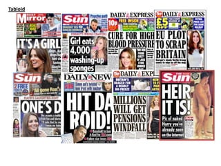
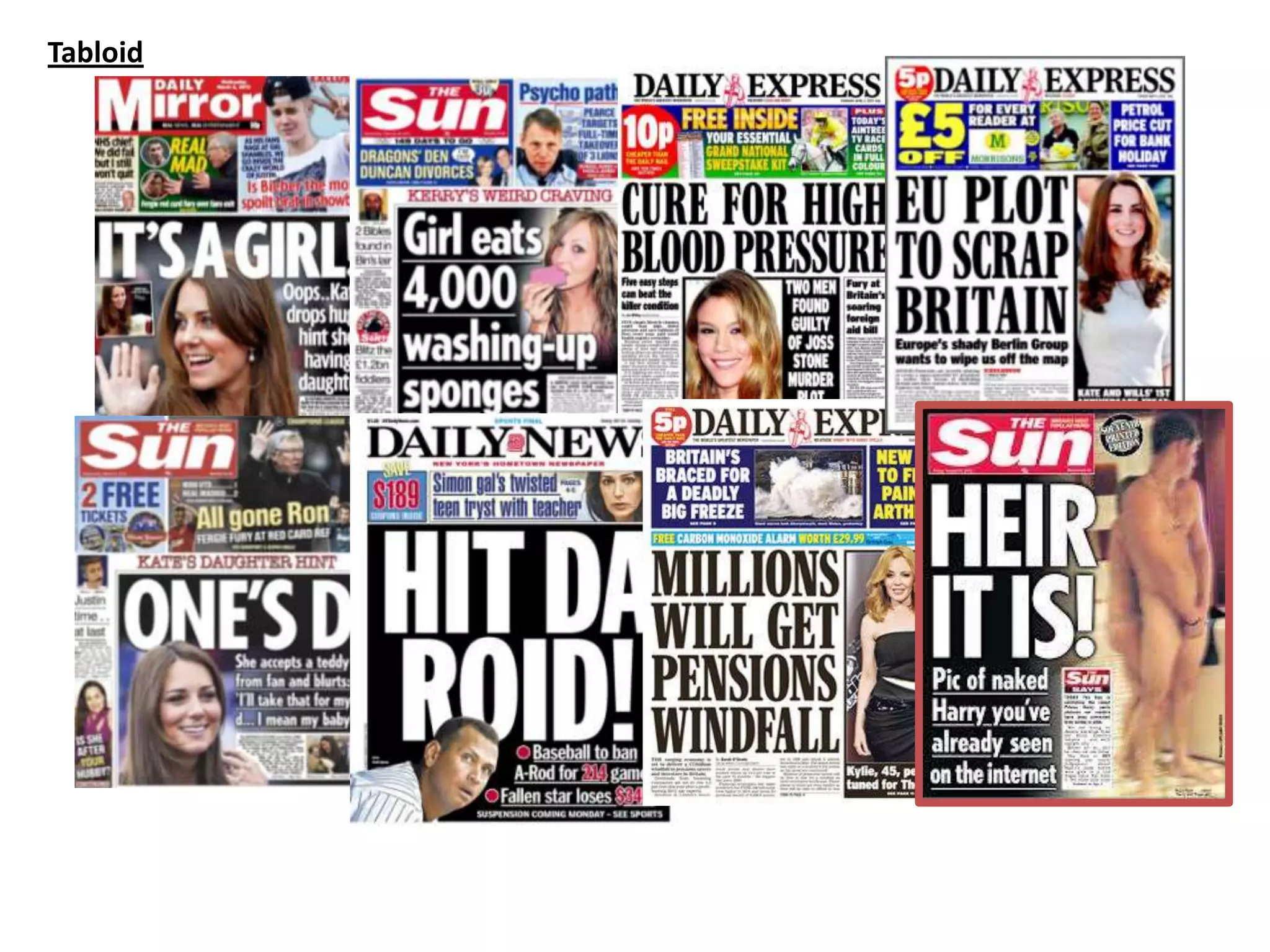
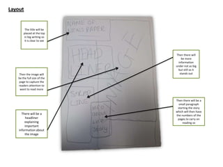
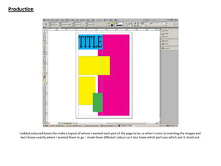
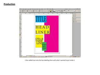
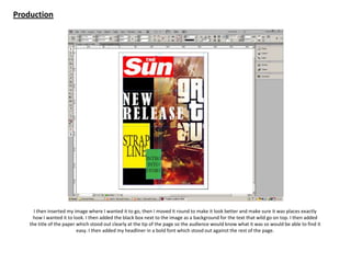
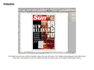
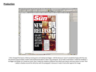
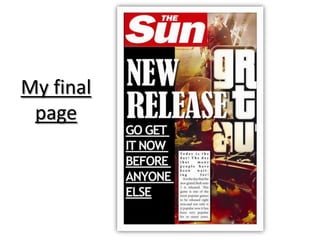
Tabloid
Fonts
Masthead
Masthead
MastheadMasthead
Masthead
Masthead
Masthead
MastheadMasthead
MastheadMasthead Masthead
Masthead Masthead
Masthead
Body Copy
Body Copy
Body CopyBody Copy
Body Copy
Body Copy
Body Copy
Body CopyBody Copy
Body CopyBody Copy Body Copy
Body Copy Body Copy
Body Copy
Body Copy
Body Copy
Body CopyBody Copy
Body Copy
Body Copy
Body Copy
Body CopyBody Copy
Body CopyBody Copy Body Copy
Body Copy Body Copy
Body Copy
Masthead
Masthead
MastheadMasthead
Masthead
Masthead
Masthead
MastheadMasthead
MastheadMasthead Masthead
Masthead Masthead
Masthead
The fonts that I outlined and the fonts I would like to use
Images
Layout
The title will be
placed at the top
in big writing so
it is clear to see
Then the image will
be the full size of the
page to capture the
readers attention to
want to read more
There will be a
headliner
explaining
important
information about
the image
Then there will
be more
information
under not as big
but still so it
stands out
Then there will be a
small paragraph
starting the story
which will then have
the numbers of the
pages to carry on
reading so
Production
I added coloured boxes the make a layout of where I wanted each part of the page to be so when I came to inserting the images and
text I knew exactly where I wanted them to go. I made them different colours so I also knew which part was which and it stood out.
Production
I then added text onto the box labelling them with what I wanted to put inside it.
Production
I then inserted my image where I wanted it to go, then I moved it round to make it look better and make sure it was places exactly
how I wanted it to look. I then added the black box next to the image as a background for the text that wild go on top. I then added
the title of the paper which stood out clearly at the tip of the page so the audience would know what it was so would be able to find it
easy. I then added my headliner in a bold font which stood out against the rest of the page.
Production
I then added a strap line just under the headliner so give a bit more information. Then I added a small paragraph of text with the start
of the story. I have placed this under the strapline this helps the audience eyes run through the whole page smoothly.
Production
I then changed the layout a little by moving parts and making text bigger. I did this because I wasn’t completely happy with the way
the previous layout looked. It didn’t look professional which is what I was aiming for. So to make it look better I made the headliner a
lot bigger and bolder so it stood out more, then I made the strapline a different font which was clearer and more easier to read. Then
I added a shadow around the white box with the paragraph in because it made it look softer against the image.
My final
page

Task 8

  • 1.
  • 2.
    Fonts Masthead Masthead MastheadMasthead Masthead Masthead Masthead MastheadMasthead MastheadMasthead Masthead Masthead Masthead Masthead BodyCopy Body Copy Body CopyBody Copy Body Copy Body Copy Body Copy Body CopyBody Copy Body CopyBody Copy Body Copy Body Copy Body Copy Body Copy Body Copy Body Copy Body CopyBody Copy Body Copy Body Copy Body Copy Body CopyBody Copy Body CopyBody Copy Body Copy Body Copy Body Copy Body Copy Masthead Masthead MastheadMasthead Masthead Masthead Masthead MastheadMasthead MastheadMasthead Masthead Masthead Masthead Masthead The fonts that I outlined and the fonts I would like to use
  • 3.
  • 4.
    Layout The title willbe placed at the top in big writing so it is clear to see Then the image will be the full size of the page to capture the readers attention to want to read more There will be a headliner explaining important information about the image Then there will be more information under not as big but still so it stands out Then there will be a small paragraph starting the story which will then have the numbers of the pages to carry on reading so
  • 5.
    Production I added colouredboxes the make a layout of where I wanted each part of the page to be so when I came to inserting the images and text I knew exactly where I wanted them to go. I made them different colours so I also knew which part was which and it stood out.
  • 6.
    Production I then addedtext onto the box labelling them with what I wanted to put inside it.
  • 7.
    Production I then insertedmy image where I wanted it to go, then I moved it round to make it look better and make sure it was places exactly how I wanted it to look. I then added the black box next to the image as a background for the text that wild go on top. I then added the title of the paper which stood out clearly at the tip of the page so the audience would know what it was so would be able to find it easy. I then added my headliner in a bold font which stood out against the rest of the page.
  • 8.
    Production I then addeda strap line just under the headliner so give a bit more information. Then I added a small paragraph of text with the start of the story. I have placed this under the strapline this helps the audience eyes run through the whole page smoothly.
  • 9.
    Production I then changedthe layout a little by moving parts and making text bigger. I did this because I wasn’t completely happy with the way the previous layout looked. It didn’t look professional which is what I was aiming for. So to make it look better I made the headliner a lot bigger and bolder so it stood out more, then I made the strapline a different font which was clearer and more easier to read. Then I added a shadow around the white box with the paragraph in because it made it look softer against the image.
  • 10.