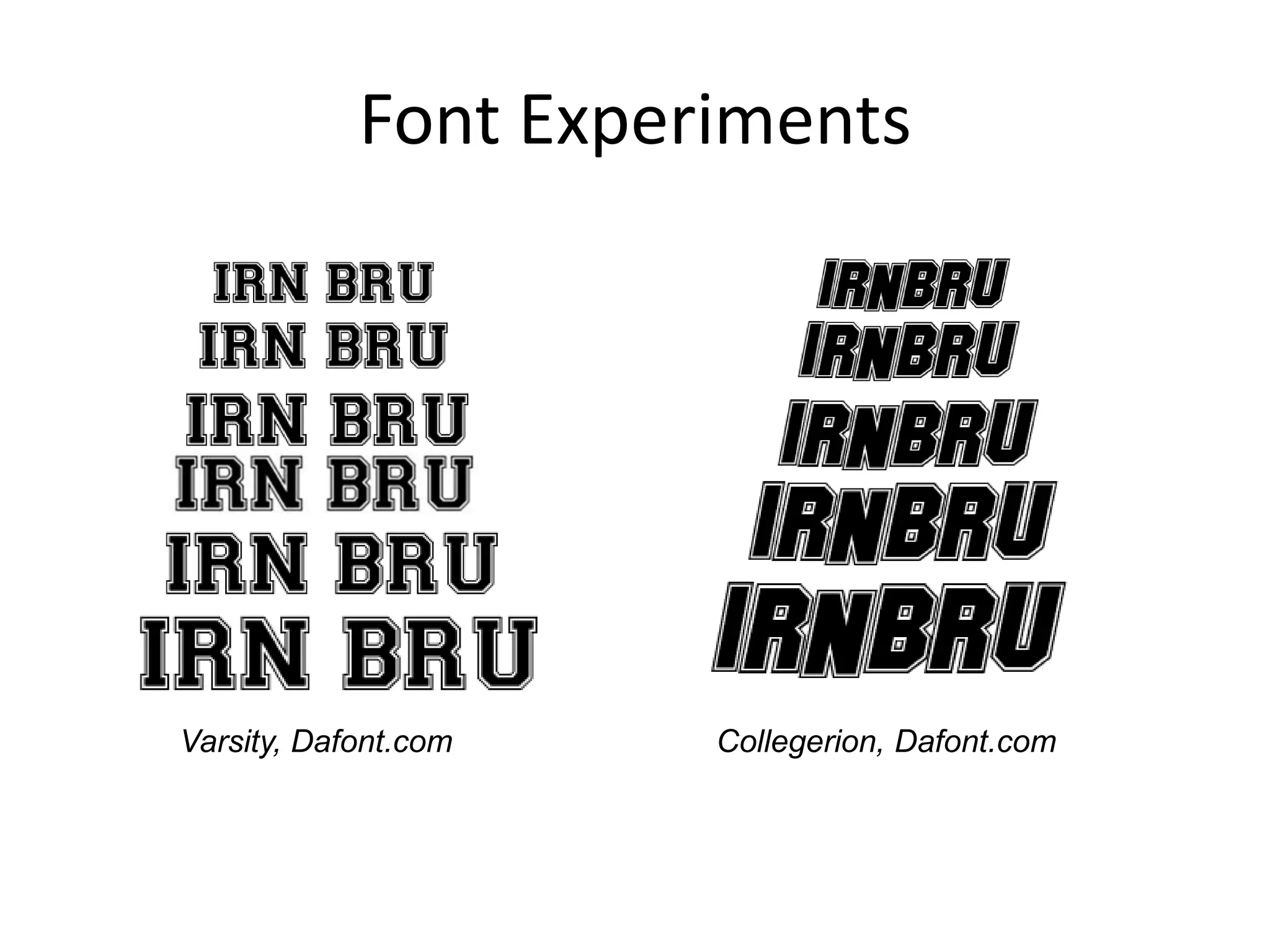
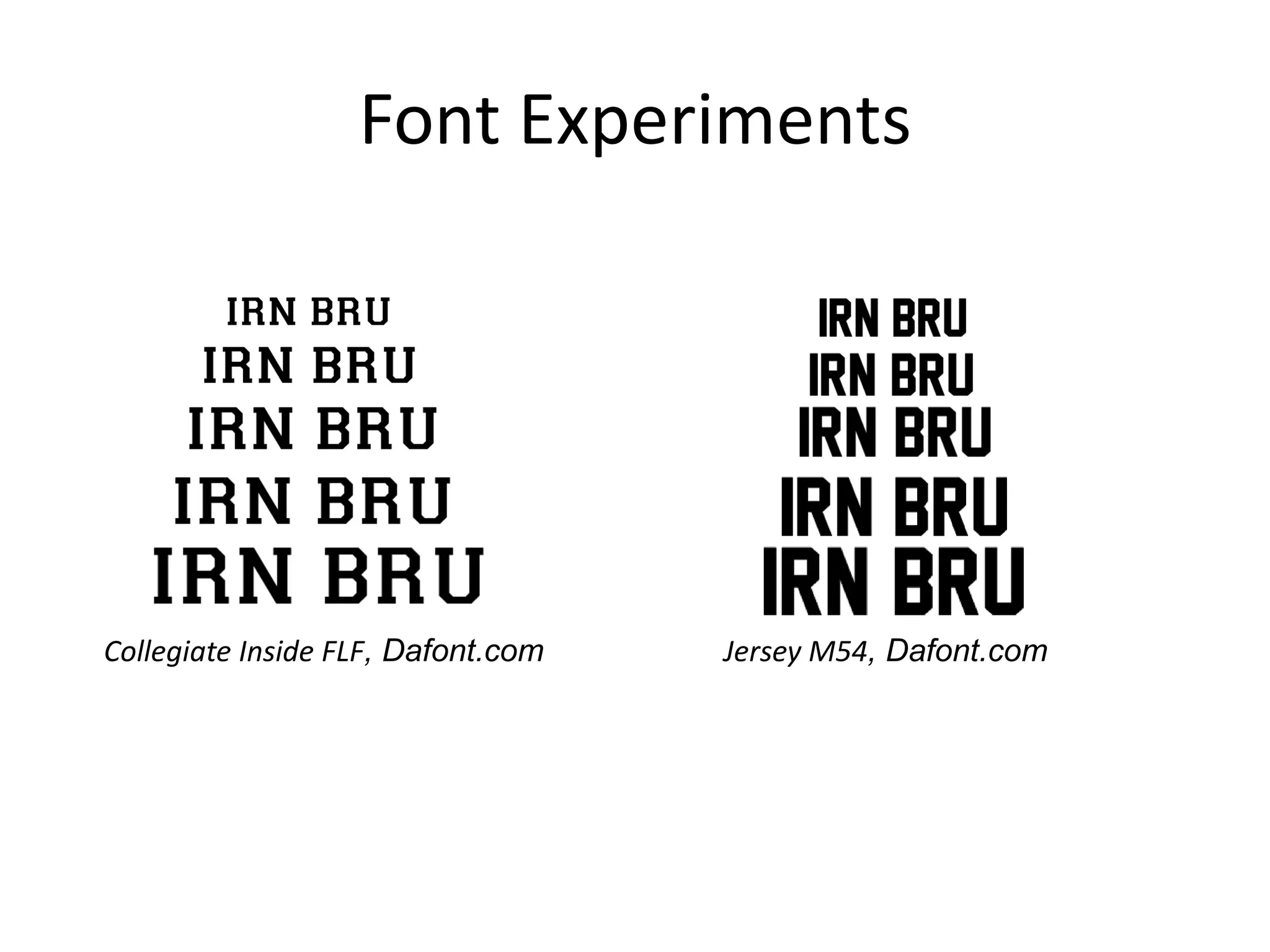
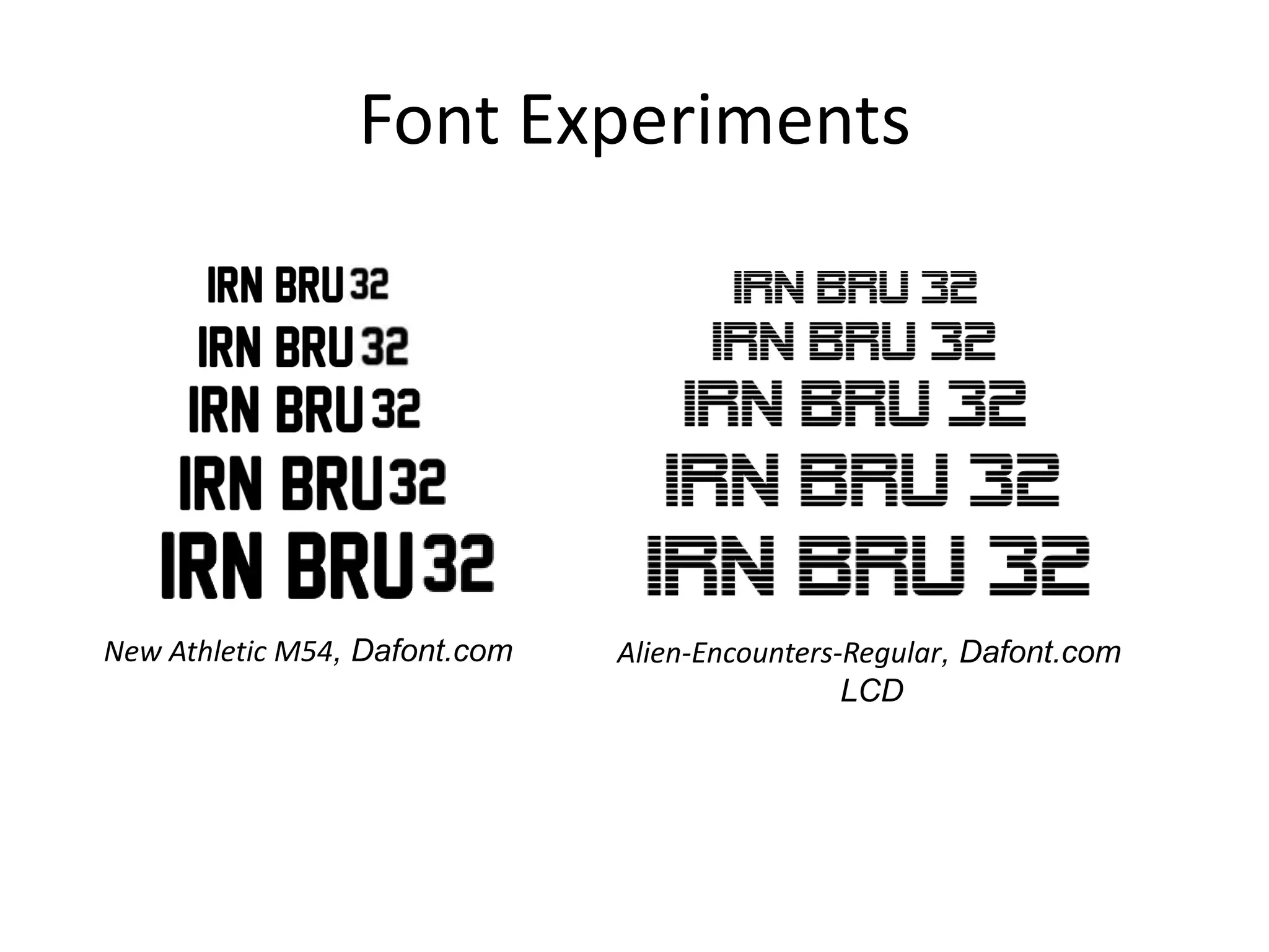
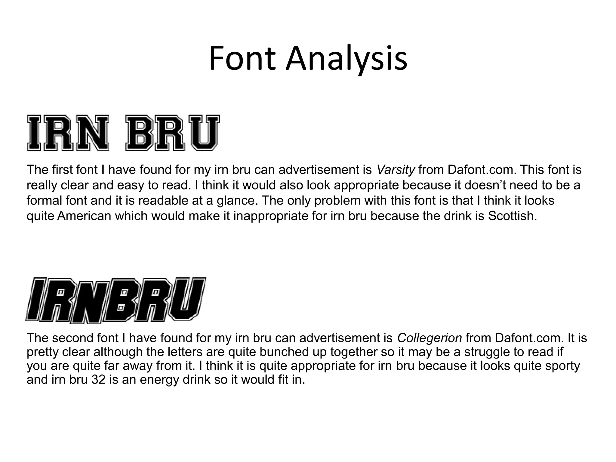
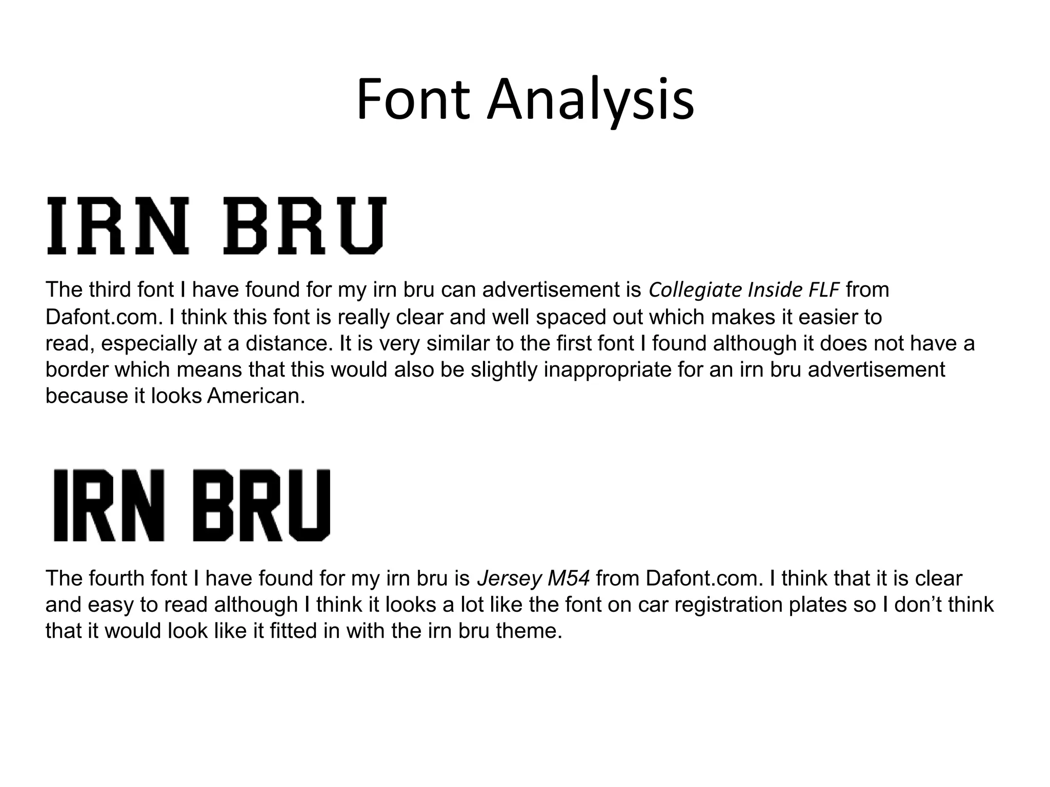
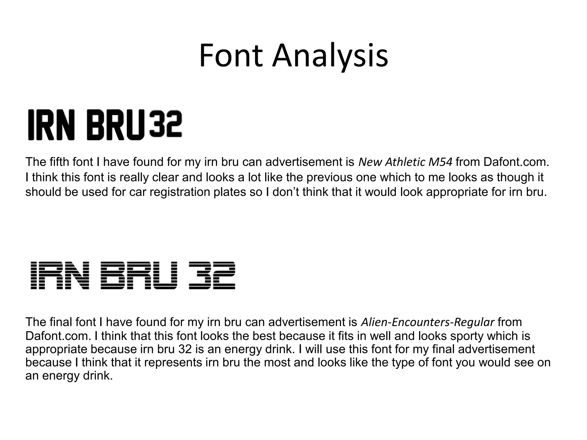
The document evaluates 6 different fonts for their suitability to advertise Irn Bru soda on a can. The first font is deemed too American-looking, while the second is difficult to read from a distance. The third and fourth fonts also have issues reading from far away or look too much like car registration plates. The fifth font has the same problem as the fourth. The author selects the sixth font "Alien-Encounters-Regular" as it looks sporty like an energy drink and best represents the Irn Bru brand for the advertisement.