7. Image 10.
Theme or focus of image & reasons for choice
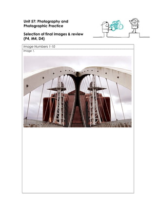
Image 1. This photo is one of my favourites that I took during this shoot at Salford
Quays. It was also one of the first. It mainly features the bronze Quay West building
and the Salford Quays Millennium Footbridge; otherwise known as the Salford Quays
Lift Bridge. These two features at Salford quays are 2 of the most symbolic. Especially
the bridge. It is the main bridge around that area and has been there since the year
2000, that’s why it’s called millennium bridge. The bridge goes over the Manchester
Ship Canal and links Media City and Salford Quays together. It is a massive part of
Salford Quays so I just had to include it in my shoot. I chose this image because I love
the overall composition of it. I love how it’s symmetrical. I centred the shot as well as I
could. And I’m proud of it. I stood on the bridge whilst taking this image so therefore
could get it right easier. And the other thing I really like about it is the colouring of the
building. Obviously I have edited it but because it is such a lovely colour naturally it
looks great when enhanced.
Image 2. Image 2 is taken in the Media City grounds. Near all of the main BBC
buildings. They have a little garden like area which is beautiful with all of the trees and
structures. As we did our shoot in Autumn, the leaves were all discolouring and falling
from the trees. Thus made the colours I the image more interesting. There are so many
different shades of colours within the image, I like it. That’s why I enhanced them in
Photoshop. I also don’t feel as though it is hard to see that it is promoting the BBC
(Media City) because I made sure you could see the BBC logo on the building. I like
with this image how it is such a busy picture with all the different colours and
8. everything within the frame. That’s why I think the colouring suits the image.
Image 3. This image is one of the more different ones compared to the rest as it is
black and white. There are a few different things within this image which you could
say are the main features. For example the ITV Coronation Street Studio takes up the
majority of the image and probably grabs your attention more than anything. As I
haven’t featured a lot of this side of Salford Quays in my shoot I thought I’d make his
image different. And I did actually capture this photo with a bird flying which made it
better. It also features one of the other bridges at the quays. This one is newer and is
the first one that you come to when pulling into the quay in a boat. This photo may
not be too inviting but I wanted to change it up a little.
Image 4. Image 4 is of the Imperial War Museum. One of the nicest and unique
buildings that I have ever seen. So I thought it would make the perfect picture! As I
personally really like and enjoy the Museum I thought it was only right to include it in
my shoot. Plus the Imperial War Museum is one of the most significant buildings at
Salford Quays because of its unique design and individuality. There isn’t anything
which symbolises this image as being around Media City / Salford Quays. But most
people would probably know about it because it’s significant in Manchester.
Image 5. This image features the same building as picture 1. It is the Bronze Quay
West building. I just think this building is really cool. The colour of it and style is just
amazing. I haven’t seen anything like it. Plus I liked the fact of having the image
perfectly central so it almost looks mirrored. And because the building is shinny it has
reflections which I thought was effective.
Image 6. This next image is taken in the same area as Picture 2. In the prime of the
Media City gardens. It features the Orange Tower building (with the diamond
pattern) and one of the BBC buildings. The one thing I really liked about this image is
the purple bullet like towers. I really love the colour of them; they’re like a metallic
purple colour. So I enhanced the colour so you could see it more. They just add that
little more colour to an image. And it makes the overall shot more unique rather than
it just featuring buildings. And once again I tried to include the BBC logo as best as I
could. You can see it within this image, this way you know more of the concept of the
images and shoot.
Image 7. This is the only image I chosen which just features one specific thing. It
doesn’t have any buildings in it. It is just the top of the swinging foot bridge which
connects Media City to Trafford Wharf. Again like every other building and structure
at Salford Quays it is a unique and has a cool design. This is the peak of the bridge all
the long rope like polls are basically holding up the structure. So it is a massive part of
the design and it makes it what it is. So I had to capture it. Also because the sky was
so angry looking behind it added to it creating a silhouette type of feel to the image.
Image 8. This image is similar to image 2 in the way it features nature and the BBC
buildings. Like I said in the description of Image 2 I wanted to capture the season and
by getting the autumn trees in the images it makes it better and more meaningful. It
was taken in the Media City gardens and has a clear focus on the BBC logo on the
building behind the branches. It also features the Bullet like tower like in image 6; I
have mentioned that I really like the look of these in pictures.
Image 9. This image is a wide shot featuring more or less the majority of the Media
9. City area. It features a few of the main buildings which make up the landscape of
Salford Quays. It was taken from the other side of media city near the Imperial War
Museum. I thought I would include this image in my final 10 because it was different
from the majority of the other images I chose to use. It captured the moment
completely and just emphasises on the buildings and surroundings.
Image 10. Image 10 is the last one I chose and similar to image 9 it is a landscape but
more featuring the water that land. It mainly features the Millennium Foot Bridge
going over the water and the back of the Lowry Theatre. You can also vaguely see
the Quay West Building. It does capture quite a distance as you can see buildings
from right across the Canal That is one of the main reasons I really like this image. And
I also think it has quite an equal balance between sky and water.
Techniques used
Image 1. There was a lot of initial thought that went in to the composition of this
image. I knew that I had to get it perfectly central because if not it wouldn’t of
looked anywhere on the scale I’d wanted it to. I didn’t use a tri pod or any other form
of stabilisation, it was all freehand. I was stood around normal height and used the
view finder to capture the image and not the screen. I knew that I wanted the main
focus to be the bridge but at the same time the building in the back ground. I knew
instantly I wanted to take an image like this because of the symmetry. The bridge on
either side is the same and so is the building so it would have almost looked reflective.
Another thing which made this picture work even more is the fact there isn’t much
going on in the sky either. If it was a sunny day with clouds then it wouldn’t have
given off the same feel as this does. In order to know that I got this picture right I did
later use the rule of thirds grid when editing. Just to make sure everything worked best
the way it was originally positioned.
Image 2. This picture is very much different compared to Picture 1 in the way that it
doesn’t really have one or two main features. There are a number of things going on
within the image which catch your eye. Definitely with this one I considered the
depth. If you notice I took the image near a tree so caught some wrinkled old leaves
extremely close up but had them out of focus so that the background was in sharp
focus. I used manual focus in order to get this correct. I really wanted to emphasise
on the season and the time of year. And by catching the trees and all the colours in
helped define when this picture was originally taken. Again no stabilisers were used; it
was free hand through the view finder. One thing I wanted to make sure you could
see within this image was the BBC logo on the front of one of the buildings. As the
shoot was ideally to promote Media City and Salford Quays in the first place. It was
important to make sure I included the logos whenever I possibly could.
Image 3. For this image I had the camera securely propped up onto the safety
barrier. Mainly so I didn’t get too much of the pathway in it and more of the water. If
I’d have stood on the pathway and pointed my camera in that same direction it
wouldn’t of looked effective because you would have seen too much of the
pathway. Also the timing of this image was important to capture the bird in the
centre frame. Again the rule of thirds grid came in handy for this image to make sure
the image didn’t include too much. There is a nice balance between water, land
and sky in this image and I think it works really well.
Image 4. This picture mainly features the Imperial War Museum. That was the whole
10. point of the image was to for it to be just the main focus. As you can see I didn’t
include the whole of the building in this image just the most eye catching and best
looking part. So even though I didn’t capture the whole of the building in the frame I
still think it looked effective. I had the exposure and ISO the same as my other photos
for this image so the sky didn’t change the way I wanted the picture to be. Originally
the sky way white but still quite bright so if I’d of messed with the exposure too much it
may have messed with the overall composition of my image.
Image 5. Similar to photo 1 I wanted to almost make this image look reflective but
without actually making it mirrored. Because the building is symmetrical it works really
well. I had to make sure I got it perfectly central also. Mise en scene wise I did try and
get it perfectly positioned in the frame. I didn’t use any form of guide in doing this I
just used my view finder on my camera the best I could to get it central. After editing
this photo it made it look quite grainy but originally my ISO wasn’t very high so it
wasn’t actually grainy before editing.
Image 6. In order to capture this photo correctly I had to point the camera up and
squat a little. I wanted the majority of the buildings in frame and some sky. I had my
shutter speed fast whilst taking this image so the sky didn’t overpower the rest of the
image. If it was any slower the light exposure would’ve been way too high and the
white balance very out of proportion. And again similar to photo 3 of the Imperial
War Museum I didn’t want the whole of the buildings to be in the shot. Even though I
could have been able to fit them in. It just looks better when there is more variety and
main focal points in an image.
Image 7. This is the image which is much different to the rest of the pictures I took that
day. It doesn’t actually feature any buildings. Another thing which makes it not similar
to the rest is the fact the sky obviously over powers this image. Originally the photo
was all white and looked really drab. The exposure shutter speed and ISO was
originally average for this image, because the sky and bridge were such similar in
colour it was hard to get the colour correct for both of them before editing.
Image 8. This picture is very similar to picture 2 composition wise. It is taken in a similar
area and features the same building. I just got a little closer when taking this picture.
And I used a similar technique where I stood with objects obviously in the way of the
frame. But the BBC logo on the building is still in clear site. So it has a varied focal
length this image because there are a couple of things you could focus on at
different distances. Also the colouring was taken very seriously into consideration as I
wanted the autumn colours to look vibrant.
Image 9. This image is a little different in the way that it is an extremely long distance
and wide shot. Taken from the opposite side of the Quays. I kind of just wanted to get
some of the main buildings into one frame. In order to do this I had to get quite far
back. I had the shutter speed a little slower than usual just to see if it would capture a
little more of the image but it let a little too much light it. This then made the sky over
power the image a little.
Image 10. The last Image is a similar overall shot to photo 9 in the way that it is quite a
distant shot. However unlike photo 9 I did take the rule of thirds grid into consideration
in this image. I wanted the balance between the water and sky to look right. As it is
an extreme wide and long distance shot I needed to get it right. I made sure when
taking the image that I had everything in the frame I wanted and tried to get it in the
11. view finder how I wanted it.
Strengths and Suggested Improvements
Image 1. In this image I would definitely say that the overall composition of the image
is a strong. However when I realised I wanted to remove the people from it I started to
dread not being able to get it to look right. Even though I fell I did an okay job at
getting rid of the people I do feel I could improve on it. If I’d of maybe had spent a
little more time on It I think I would of got it to look a little better! Another Strength is
the colouring, I absolutely love the colour of the Quay West building in the
background of the image.
Image 2. In this image I also really like the colouring. That’s the reason I made the
colours more vibrant in the first place. It shows of the season. It almost says that
Salford Quays is a beautiful place all year round. Because autumn to me seems a bit
of a messy season because everything is dying and there is just leaves and bald trees
everywhere you go. And yet Media City still looks beautiful. I wanted this image to
show that. I Maybe could have improved on getting more of the buildings in shot. As
well as having the nature in it, it would look good if I had of incorporated more of the
structural side of things as well.
Image 3. Strengths of image 3 would be the composition. I was really happy when I
captured the bird in the shot. It was a really nice simple shot. And I would say that it
definitely serves its purpose as promoting Salford quays. Also the fact there is no
people in the shot; I really prefer it in shots like this when there is no one in them. It
looks better and more professional. However there were some aspects of editing I
could probably have improved on. For example the second bird the one I edited in
could have been done better than it was. And as it is a black and white image I feel
it is quite dark. Maybe I should have enhanced it a little more.
Image 4. Composition wise I love this image. It is simple yet effective. However I
definitely feel the editing could’ve been improved. I don’t like the image I imported
to the background. It just doesn’t look right. If I had of spent more time on it I
probably could have got it better. Maybe I wouldn’t import the picture in and just
edit the original sky on the image.
Image 5. With image 5 I really like the composition and some of the way I edited it. I
love how the image is perfectly centre frame. This is what I wanted I was aiming for it
to be like this. There is some parts however where the sky has been edited which
could’ve been improved. Like on the left had side I accidently rubbed away a
section of the building and couldn’t get it back so had to try and structure it again
using different tools. I managed to do it but with more time definitely could improve.
Image 6. This image could generally have had more editing in general. It was just
such a simple edit that I didn’t spend too long on editing it. If I could improve I would
enhance the colouring and levels more. Make the buildings more appealing and
vibrant. It would generally make the image more fun to look at and better. But
strength wise I do really like the sky. As it is the original image I am proud of the editing
I did on it to make it look more inviting.
Image 7. There were a few mistakes in this image which I didn’t see until I saw the
picture bigger. Where I have edited the buildings out towards the bottom of the
image you can see where I have cloned. It has made a really faint line which is
cloned from the structure on the bridge. If I could change anything it would be that. I
would make sure everything is gone from the image which I didn’t want being there.
12. But then I do like this image because it is different from the rest of the images. For
starters it doesn’t have any colour to it it’s just mainly shades and bursts of light. And
the fact it doesn’t just include buildings. As the point of the shoot was to promote
Salford Quays I feel that the bridges are a huge significance to the landscape. Most
people would just take pictures of the buildings because they’re bigger and are more
significant to people. But to me the bridges are just as important. With such unique
designs as well I don’t feel you could go wrong when using them in your work.
Image 8. Overall this image could have had some more editing done to it to improve
it. But I mentioned above that the image was so busy it was hard to edit certain parts
of it. It would’ve looked better if the overall colour of the image was different. Like if
the sky looked a bit more inviting and nicer it would definitely add to the picture. But I
do feel that the colouring of the leaves is effective with how vibrant they are.
Image 9. When considering the final 10 images I chosen for my editing I do feel this is
my least favourite. There just could’ve been so much done to the image. Like the
composition of the image could’ve been better. And I didn’t like how over exposed
the image was originally. It killed the colour from the image. And even when edited I
am still not a massive fan of the colouring in the image. One thing I do like about the
image though is the concept of it. It is a wide angle and was meant to include a lot
of the building work. Unlike some of the other images including buildings this one
shows more of the buildings themselves. Because it is further away you can see more
landscape wise.
Image 10. I really like this image. The more I look at it the more I actually like it. I love
the fact it has a really equal balance between sky, land and water. You instantly
know it is Salford quays from its widely known millennium bridge. Parts of the image
probably could’ve been improved more. Like the buildings if I would have specifically
changed the colouring of the buildings. Especially the quay west one because the
colour is just amazing! It would’ve added more to the image. Maybe the same with
the bridge. The whole colouring on the image could’ve been improved but not all in
one. If I could I probably would select different parts of the image and do it section
by section. This would have been better.
Editing details
Image 1. With image 1 I did enhance the colouring. I wanted the bronze Quay West
building to look really vibrant but without making the rest of the image un realistic. So I
enhanced the vibrancy and ever so slightly the saturation on the building to allow the
colour to be how I wanted it. There were also people within the frame and I knew
that it would’ve looked its best if I edited them out. So I used the cloning tool on
Photoshop and got rid of them. It definitely looks more professional without people in
it.
Image 2. In image 2 I think you can obviously see some of the changes. Like for
example I enhanced the colouring in the image. I have mentioned when taking
about the concept of the image and techniques that I wanted to define this image
as being taken around the Autumn season. By enhancing the main colouring in the
image I feel as though it gives you this indication. Also I feel it works really well
because it varies out the different colours. I also slightly changed the leaves around
the BBC logo on the building. There were leaves in the way so I used the cloning tool
and went over them with the white cloned from the actual original sign on the
13. building. One thing I like about this image is when I changed the colouring it made
the sky look a little better. It gave it a blue tint rather than it just looking all white and
drab!
Image 3. I actually edited a lot of things within this image. There were a lot of things
within the frame which I didn’t want being there as it just made it look slightly messy.
For example the wall on the left hand side right by the water was really dirty. So I
cloned the clean parts and placed them over the dirty parts. There was a bright
yellow buoy in the water. It looked ridiculous so cloned the water and got rid of that.
There were a few people also, one was on the bridge and there was a couple of
people towards the right had side of the image. I wanted it to look as professional as
possible so edited them out. On the right hand side of the image there were massive
bright red containers and temporary fences. They annoyed me because they looked
messy so I edited the majority out but when I re-scaled the image it cut a little bit of it
out. Then obviously there are the birds in the middle. One of the birds was originally in
the image when I captured it. The one on the left I edited in. After touching up the
image I added the Black and white effect to it. I felt I wanted to do this because all
my other images had colour and I wanted to change it up a little.
Image 4. To help improve the overall look of this image I added a separate image of
a sky. I imported it in on a different Layer then rubbed it away from where I didn’t
want it. It looked really dull and drab when it was just white and cloudy. In order to
make it look more realistic I had to darken the higher part of the building. So I
sectioned it and just lowered the exposure and edited a couple different colouring
settings on it so It looked right. I also slightly changed the colouring of the lower part
of the building. I tried to make that part lighter than the higher part so again it looked
more realistic to fit the sky.
Image 5. On this image I added a separate image to it like on Image 4. I think this one
is more effective than Image 4 though. I sectioned this one differently by manually
drawing a line around the building then adding the image to hat one section. It looks
more realistic and tidy. To help the image look right I added some colour correction
adjustments to the building which gave it a slight blue tint. I wanted to add these
changes to the building so that the reflection on the building didn’t look too much
like it did before I added the sky image. However it did make it grainier and rough
looking but I think it works. Originally the image was really bland and didn’t have
much colour so by darkening and adding slight colour to it worked really well.
Image 6. I didn’t edit an awful lot in this image but one of the main changes I made
was the sky. However I didn’t import a separate image and add it on a different
layer. I in fact just sectioned the sky and played about until it looked how I wanted it.
First it was quite dark so to make it more inviting I lightened it. Then when I looked at
the colour balance I added a slight blue tint. So it doesn’t look fake but looks better
than it did. I feel this looks effective because it is actually the original images sky just
corrected. I also enhanced the colour on the bullet like towers. I mentioned when
describing the image that I really like the colour of them. So I selected them
individually and brightened the colour so you could catch the different shades
better. It definitely adds more variance to the image and catches your eye. I also
cropped this image ever so slightly. There was a messy looking red container in the
bottom right hand side corner. I edited the majority of it out but thought that I wasn’t
going to lose anything just by trimming the image slightly. So when doing this I used
the rule of thirds grid to get it right. Originally the image was quite dark so by adding
14. slight adjustments to the exposure and levels really helped make it that little bit more
lighter.
Image 7. Originally this image had little bits of buildings in it and it looked strange. So I
knew they needed to go. So I used the clone tool to get rid of the little bits. This then
made image 7 much different when compared to the others. It only featured the
cool and unique structure of one of the foot bridges. I love this image because I
wanted the sky to look more effective I added different effects to it to look better. As I
made the sky brighter it then silhouetted the bridge. Before editing the sky looked
really boring, but after enhancing the levels it made the sky break through almost.
The sky still looks quite angry but it looks better this way.
Image 8. This photo didn’t really require an awful lot of editing. It was hard to specify
on one section of the image as it is so busy. I obviously enhanced the colours so the
orange on the leaves looked really vibrant. This then affected the whole of the image
in a good way. Again similar to photo 2 I wanted to make sure the BBC logo could be
seen clearly so I made sure of that.
Image 9. Again similar to image 8 this one didn’t have much edited done. I had to
edit out a couple of things within the image which looked miss placed like a couple
of things on the top of one of the buildings. And I lowered the exposure as it was a
little over exposed originally. Because it’s such a long distance shot and the shutter
speed was a bit slower than on some of the other images it brought in a little too
much light. After editing though it definitely looked better. You could see a little more
in the image.
Image 10. When looking at image 10 you wouldn’t think there was much editing
done like on image 3 but I actually got rid of quite a lot in the image which didn’t
look right. Like for example a little barge type boat had gone through the Quay and
you could see it in the water in the distance. I then cloned the water to discard of it. I
also cleaned the wall next to the water like I did on image 3. It just looked untidy and
messy so I again used the cloning tool and sorted it out. This also meant I had to
slightly change the water as well. And similar to image 7 I edited the tone of the sky. I
selected it and adjusted it so it made the image something a little more. This obviously
then effected the whole image so I added colour changing effects to the rest of the
image so it all matched!
Capture Log
Setting Shutter Speed ISO Aperture
Image 1. Manual
Image 2. Manual
Image 3. Manual
Image 4. Manual
Image 5. Manual
Image 1. 1/640
Image 2. 1/320
Image 3. 1/400
Image 4. 1/640
Image 5. 1/500
Image 1. 800
Image 2. 800
Image 3. 800
Image 4. 800
Image 5. 800
Image 1. F/9
Image 2. F/9
Image 3. F/9
Image 4. F/9
Image 5. F/9