This PowerPoint helps students to consider the concept of infinity.
Task 4 final images review work sheet
1. Unit 57: Photography and
Photographic Practice
Selection of final images & review
(P4, M4, D4)
Theme or focus of images & reasons for choice
2.
3.
4.
5.
6. With my images I tried to create a coherent theme throughout, using bright and vibrant colours and
creating a fun and interesting concept to try and entice more visitors.
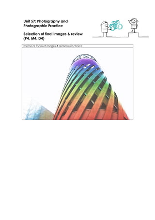
My first image is a known architectural design at The Lowry. I took the picture from a low angle shot; I
did this so I could only get this one structure in the shot to create a more dramatic image. To edit my
picture, I created a rainbow effect to enhance the design and the building even more.
My second image is of media city, I took the picture trying to include the ‘happy’ sign on top of the
building, the restaurants and Salford University sign showing off each aspect of media city and what it
holds. I edited my image just by enhancing the colours and contrast to make the image more striking
and vibrant.
My third image is a shot of the ‘ITV’ sign lit up and the big ITV buildings next to it. I think this is a good
shot because it highlights the structure and design of the building. To edit the image I actually
attempted to make it appear as if it was took in the evening, when it was actually shot in daylight. To
do this I shaded in the sky into a light purple/blue shade as if the sun was going down, around the
building I left it bright as if the sun was behind. I also enhanced the ITV sign itself by drawing over with
the same colour to make it appear as if it was light up and glowing. Before doing any of this I put the
brightness down and the contrast up to make it more realistic that it was taken in the afternoon.
Moving onto my fourth image which is very similar except it’s just a close up of the ITV sign in order to
only show if the sign, and ITV in media city. I edited the image the same as I did on my third image,
and wanted to make the audience want to go and see it.
In my 5th
image I tried to incorporate a member of the public just relaxing by the water and taking in
the views, I did this to show not only the buildings but how people enjoy it there. This may be one of
my most edited picture as I have again created a rainbow effect over the water, obviously edited and
not meant to look natural, but to enhance the view and create an illusion of a day dream like world
and so when they think of media city it makes them feel happy because of the portrayal of colours
7. and light shining through the clouds.
The 6th
image I wanted to create a very symmetrical and clean looking image. Not too much going on
all at once, but simply just to highlight the Lowry theatre. I’ve included the posters of plays showing at
the Lowry in order to show the different variety’s they create. I enhanced all of the colours to make
the key features stand out and heighten the colourful theme I have running through my images.
My 7th
image is a long distance image took in order to get most of media city in the shot. In this image
it also includes tents which were put up for the winter along with an ice rink. This shows the different
events and things the Lowry and media city create, which could make the audience looking at the
images go further to search about media city and see what other activities and events that they hold.
On this image I’ve created a very faint rainbow effect on the water, again corresponding to the other
images, but simply made the image more vibrant to intensify the buildings and then the colours on
the water to compliment the buildings.
The 8th
image is one of the rose gold business building across the bridge. I’ve simply just enhanced the
colours in the image and made it more appealing, showing off the unique style and colour of the
building.
In my 9th
image I have taken a close up of an outdoor art piece that’s also used as a slide and climbing
frame. But they’ve created it in which the artistic flair shines through. I took at close up of this
because I wanted to focus only on that one piece, ive not distracted from this by forming a colourful
effect anywhere on the image, but brought up the contrast of the image and the sharpness to make
the image look bright and crisp showing off every aspect of the ‘climbing frame’. Which the contrast
being up so high along with the sharpness, it makes the image look urban and also rustic giving depth
to my theme of images and added a different look.
My final image is of the Lowry Outlet mall, along with the VUE Cinema. The whole building is outlined
by a perfect row of trees. The design in which the surroundings was made creates a lovely look to the
building, framing it and creating a more colourful and nice environment. These images were taken in
autumn, so the leaves on the trees where multiple colours and I wanted to add to this by using
selective colour and brightening each different colour in the tress, this worked well as it enhanced the
trees but also the reflection of the trees in the water was also enhanced creating a naturally beautiful
look.
8. Techniques used
I often slowed down the shutter speed in order to let more light through to capture a
bright image, which I could then add contrast too whilst editing.
Strengths & suggested improvements
I think that my images could have been more realistic, although I like the idea of the
rainbow effect on the water and buildings, I think that I could have done it more
subtle to enhance without the audience focusing on the effect rather than the
actually place. I have also edited the sky on multiple pictures which could have been
done more refined, and less vibrant.
Editing details
In all of my images I have created a high contrast and vibrant set of photographs.
I also brought in images of sky’s on top of my image and then began to rub out the
image to where I wanted it. From that I had to put down my opacity on the rubber
and rub out the image shown on top of my photograph creating a more natural look.
Capture Log
Setting Shutter Speed ISO Aperture