7. Theme or focus of image & reasons for choice- why I took the picture, what was the
focus and why.
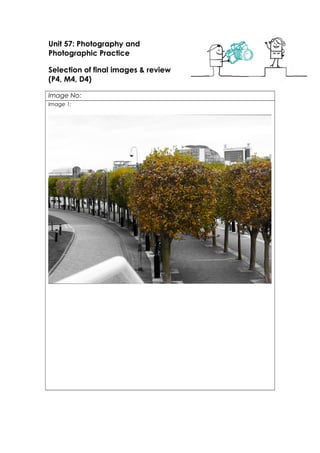
Image 1- In this image the focus is the colour and placement of the trees, against the
black and white background. I used this to show the natural beauty surrounding
Salford Quays.
Image 2- I took this image because I thought the buildings all had interesting shape to
them which I think catches the viewer’s eye along with the vibrancy of the colour of
the buildings. The focus of the image is the buildings colour and shape.
Image 3- For this image I wanted to capture an interesting and different angle of the
bridge. The focus is the bridge and where the bridge meets, but from a different point
of view along with the cool colours used in the image.
Image 4- I took this image to try and capture something similar to a typical skyline
picture, with all the different shapes of the buildings within the picture. The focus of
this image is the contrast of the shapes of the buildings against the water.
Image 5- With this image, the main focus is the boat on the water, along with the
contrast of colours of the blue buildings and the red boat. Also it shows a contrast
between the modern buildings and businesses and a typical, old fashioned canal
boat.
Image 6- For this image, I wanted to show that in the very modern area, there is still a
natural side, which is the focus of the image. The renowned Coronation Street sign,
with the greenery from the tree branch represents perfectly the contrast between the
two elements in the image. I think this definitely shows that even with the modern
8. business buildings, there is still natural beauty surrounding.
Image 7- I took this image as it is one of the first BBC buildings you see when at Salford
Quays. I wanted to highlight all the media businesses within Salford Quays, and all the
opportunities available. The main focus of this image is the big modern-style glass
buildings.
Image 8- With this image I wanted to highlight the colours that represent Media City
at Salford Quays. I thought by making the image mostly black and white, it would
ensure the blue colours would stand out and make the image itself stand out more.
The way the image is set out the words ‘Media City UK’ stands out through the wires
and makes it clear that the blue colours in the image represent Media City.
Image 9- I took this image because I think it perfectly represents Media City, the
modern buildings and the busy environment full of people, it’s both a social area and
a business place filled with creative media opportunities. The glass modern buildings
perfectly show the business side of Salford Quays, and the busy social life.
Image 10- With my last image I wanted to show more of the social side to Salford
Quays and ‘The Dock Yard’ being one of the most popular music bars around the
area. I loved the more rustic, old fashioned look against the modern glass buildings.
Showing more of the night life aspect of Salford Quays showing one of the most
popular bars around. The focus of the image is the wooden benches and barrels
against the glass building.
Techniques used
• Shutter speed
• Rule of thirds
• Depth of field
• F stop
•
Strengths & suggested improvements