Mise- En- Scene Analysis
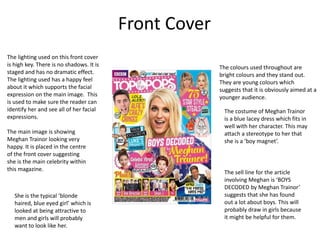
The lighting used on this front cover
is high key. There is no shadows. It is
staged and has no dramatic effect.
The lighting used has a happy feel
about it which supports the facial
expression on the main image. This
is used to make sure the reader can
identify her and see all of her facial
expressions.
The main image is showing
Meghan Trainor looking very
happy. It is placed in the centre
of the front cover suggesting
she is the main celebrity within
this magazine.
The colours used throughout are
bright colours and they stand out.
They are young colours which
suggests that it is obviously aimed at a
younger audience.
The costume of Meghan Trainor
is a blue lacey dress which fits in
well with her character. This may
attach a stereotype to her that
she is a ‘boy magnet’.
She is the typical ‘blonde
haired, blue eyed girl’ which is
looked at being attractive to
men and girls will probably
want to look like her.
The sell line for the article
involving Meghan is ‘BOYS
DECODED by Meghan Trainor’
suggests that she has found
out a lot about boys. This will
probably draw in girls because
it might be helpful for them.
Front Cover
Contents Page
The contents page is easily laid
out, the reader can point out
certain parts of the magazine
and know where abouts they
are. The title is “WE LOVE
THIS…’ and the use of the
elipsis suggests that there is
more to offer than what that
page states. But it also shows
that everything underneath the
title will be enjoyable and
interesting.
The colours used are
plain but they match,
the use of the gold
colour suggests that it is
special. The colour blue
is a neutral colour and
attracts to both sexes.
The headings are
bold and stand out
from the rest of the
font because its
bold and black. This
is to clearly separate
the text and make it
obvious which part
is which.
The majority of the
photographs look as
though they have been
taken within studios and
seem to be quite staged
where as the main image
looks as though it has been
taken when these 2
celebrities are appearing to
be going out somewhere.
The lighting used within these images
appears to be high key and this is used
because it clearly shows the facial
expressions of the characters.
Double Page Spread
The article is written in
a question and answer
format. Each sub-
heading is a different
question which makes
it clear to the reader
where the answers will
be. The questions are
in the colour red which
matches the masthead
of the article. This
colour suggests danger
and Rita’s facial
expression supports
this.
Her costume is mainly black which suggests that she is
a dark person. It looks a bit of a causal outfit but also
looks hip hoppy. This may suggest that she is a bit
different to all the other ‘pop’ artists.
The colours red and black are used mainly throughout this article which
connotes danger. Her name is spread across 2 pages which suggests that she
is important, her name is a bigger font than the rest of the text.
The setting of the
image looks as
though it is down
an alley way, this
links in with the
ideas of gangs
and ‘bad’ people
which is the
representation
this article is
creating.
The lighting used
within this
photograph is high
key which looks as
though the character
is almost in a
spotlight, this
creates a tense
feeling and questions
the character.
How my findings will influence my
work.
Analysing mise en scene within different pop magazines has helped me work out the
important things I will need in my magazine. Firstly, on my front cover I will use lots of
different images because that’s a main feature of a pop magazine. I will also use bright
colours to attract the audience. I will make sure I carefully choose the correct people
to feature in my magazine and make sure they fit in with my genre.
In my contents page I will make sure the layout is clear and easy to understand. I will
have a clear title and clear sub-headings, the colours I use within this page will be
similar or the same as the ones used on my front cover. On my contents page I will
also use pull quotes from the featuring articles.
Also, on my double page spread I will use a 3 colour pallete like the article I analysed. I
will use high key lighting and will make sure that the costume of my character is casual
but sets an impression of this person.

Mise en scene analysis 2

  • 1.
  • 2.
    The lighting usedon this front cover is high key. There is no shadows. It is staged and has no dramatic effect. The lighting used has a happy feel about it which supports the facial expression on the main image. This is used to make sure the reader can identify her and see all of her facial expressions. The main image is showing Meghan Trainor looking very happy. It is placed in the centre of the front cover suggesting she is the main celebrity within this magazine. The colours used throughout are bright colours and they stand out. They are young colours which suggests that it is obviously aimed at a younger audience. The costume of Meghan Trainor is a blue lacey dress which fits in well with her character. This may attach a stereotype to her that she is a ‘boy magnet’. She is the typical ‘blonde haired, blue eyed girl’ which is looked at being attractive to men and girls will probably want to look like her. The sell line for the article involving Meghan is ‘BOYS DECODED by Meghan Trainor’ suggests that she has found out a lot about boys. This will probably draw in girls because it might be helpful for them. Front Cover
  • 3.
    Contents Page The contentspage is easily laid out, the reader can point out certain parts of the magazine and know where abouts they are. The title is “WE LOVE THIS…’ and the use of the elipsis suggests that there is more to offer than what that page states. But it also shows that everything underneath the title will be enjoyable and interesting. The colours used are plain but they match, the use of the gold colour suggests that it is special. The colour blue is a neutral colour and attracts to both sexes. The headings are bold and stand out from the rest of the font because its bold and black. This is to clearly separate the text and make it obvious which part is which. The majority of the photographs look as though they have been taken within studios and seem to be quite staged where as the main image looks as though it has been taken when these 2 celebrities are appearing to be going out somewhere. The lighting used within these images appears to be high key and this is used because it clearly shows the facial expressions of the characters.
  • 4.
    Double Page Spread Thearticle is written in a question and answer format. Each sub- heading is a different question which makes it clear to the reader where the answers will be. The questions are in the colour red which matches the masthead of the article. This colour suggests danger and Rita’s facial expression supports this. Her costume is mainly black which suggests that she is a dark person. It looks a bit of a causal outfit but also looks hip hoppy. This may suggest that she is a bit different to all the other ‘pop’ artists. The colours red and black are used mainly throughout this article which connotes danger. Her name is spread across 2 pages which suggests that she is important, her name is a bigger font than the rest of the text. The setting of the image looks as though it is down an alley way, this links in with the ideas of gangs and ‘bad’ people which is the representation this article is creating. The lighting used within this photograph is high key which looks as though the character is almost in a spotlight, this creates a tense feeling and questions the character.
  • 5.
    How my findingswill influence my work. Analysing mise en scene within different pop magazines has helped me work out the important things I will need in my magazine. Firstly, on my front cover I will use lots of different images because that’s a main feature of a pop magazine. I will also use bright colours to attract the audience. I will make sure I carefully choose the correct people to feature in my magazine and make sure they fit in with my genre. In my contents page I will make sure the layout is clear and easy to understand. I will have a clear title and clear sub-headings, the colours I use within this page will be similar or the same as the ones used on my front cover. On my contents page I will also use pull quotes from the featuring articles. Also, on my double page spread I will use a 3 colour pallete like the article I analysed. I will use high key lighting and will make sure that the costume of my character is casual but sets an impression of this person.