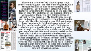
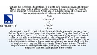
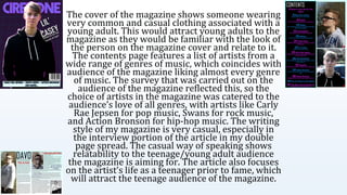
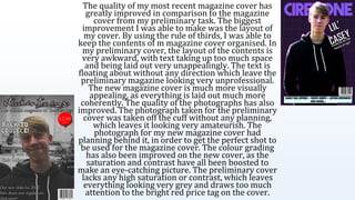
Media Magazine
EvaluationLennon Riley
In what ways does your media product
use, develop or challenge forms and
conventions of real media products?
I based the design of my magazine (Ciretone) on 3 magazines that
my survey results showed are popular amongst my target
audience; NME, Q and Mixmag. These three magazines cover
almost every genre in music, which makes them suitable to use as
inspiration. I took most of the inspiration for my magazine design
from NME as I think it looks more aesthetically pleasing than the
other magazines. NME, however, has a design that is much more
unconventional in comparison to most other music magazines,
which is why I added a [] to my magazine cover in order to make
my magazine look more professional, and because it looks better. I
originally had a sidebar on my cover too, but I decided to remove it
due to it not working with the design of my magazine cover. I also
took inspiration from NME by using slanted headlines and cover
lines. Mixmag and Q also helped inspire my magazine cover, with
the idea of having the image of the cover star overlap the masthead,
which NME doesn’t do. My magazine cover has a large masthead
which is commonplace in pretty much every magazine in
distribution and one photo that takes up the majority of the page.
The size and placement of my masthead is more similar to Mixmag
than to Q and NME, as it takes the full width of the page and is in
the centre column of the cover. The main image of my cover star is
a transparent image placed over a background, which is similar to
Q’s cover.
The colour scheme of my contents page stays
consistent throughout the rest of the magazine, with
the same shades of pink and blue being used
throughout. I used images of artists who will be
featured throughout the magazine on the contents
page in order the audience of the magazine familiar
with some of them, which is commonplace in
virtually every magazine. My double page spread
uses pull quotes to emphasize certain things said in
the article like other magazines do. Multiple images
have been used in the double page spread to
familiarize the reader with the artist being featured,
which is guaranteed in almost any article in any
music magazine. The writing style in the interview
portion of the article is much more casual than the
rest of it as it shows a conversation between two
people, which breaks the convention of magazine
articles being written formally. The rest of the article,
however, is written formally, so the article is still
conventional to an extent. The article has a lot more
writing in it in comparison to other contemporary
magazines, wo it breaks the convention with the
amount of writing shown.
How does your media product
represent particular social
groups?
In the media, a lot of the time teenagers are presented in a negative
light which causes negative stereotypes the be developed around
them being lazy or disruptive and having no future plans. The
double page spread in my magazine presents teenagers in a much
more positive light, with the person of interest in the article having
their teen years reflected upon in a much more fair and positive
way. The subject of the article is shown to be very optimistic and
ready to take on challenges ahead of them. My magazine challenges
the stereotypes of teenagers seen throughout the media by making
them much more relatable in this magazine which could make
people start to disbelieve the negative stereotypes abut teenagers.
What kind of media institution
might distribute your media
product and why?
Perhaps the biggest media institution to distribute magazines would be Bauer
Media Group, a multi-platform media company that specializes in TV, radio,
digital and print media. Bauer Media Group publishes some of the most well
known magazines in circulation today, including:
• Mojo
• Kerrang!
• Q
• Empire
• Heat
My magazine would be suitable for Bauer Media Group as the company isn’t
defined by what genre of magazines they distribute. They distribute all sort of
magazines about music, TV, movies, cars or even fishing. My magazine would
also be suitable for this company due to how high profile the other music
magazines they distribute are, which would help boost Ciretone’s popularity as
it would be associated with higher profile magazines and most likely sold the
same places that they are. My magazine is also different enough from the
magazines Bauer already distributes, so having Ciretone in with the other
magazines won’t make it get lost in the shuffle.
Who would be the audience for
your media product?
The audience for my magazine would mostly be teenagers to young
adults aged between 15-30, with the median reader age being 20.
The magazine is read by people of both genders. They like almost all
genres of music, most notably rock, pop, hip-hop and electronic
music. The audience doesn’t buy music very often, but listens to
music every day, so they instead prefer to listen to music digitally
through streaming services.
How did you attract/address
your audience?
The cover of the magazine shows someone wearing
very common and casual clothing associated with a
young adult. This would attract young adults to the
magazine as they would be familiar with the look of
the person on the magazine cover and relate to it.
The contents page features a list of artists from a
wide range of genres of music, which coincides with
audience of the magazine liking almost every genre
of music. The survey that was carried out on the
audience of the magazine reflected this, so the
choice of artists in the magazine was catered to the
audience’s love of all genres, with artists like Carly
Rae Jepsen for pop music, Swans for rock music,
and Action Bronson for hip-hop music. The writing
style of my magazine is very casual, especially in
the interview portion of the article in my double
page spread. The casual way of speaking shows
relatability to the teenage/young adult audience
the magazine is aiming for. The article also focuses
on the artist’s life as a teenager prior to fame, which
will attract the teenage audience of the magazine.
What have you learnt about
technologies from the process
of constructing this product?
I was inexperienced in using Photoshop prior to this task,
and only knew how to perform basic picture edits. Through
my magazine task, however, I became more familiar with
the software, although I still have a lot to learn about it. The
most important tool I was able to learn and use was Layer
Style, which allowed me to add border strokes, gradient
overlays and bevelling to my layers. These features were
used throughout my magazine production, especially on
the magazine cover, with strokes being used on almost
every asset of the cover, gradients being used in the
backgrounds of the contents page and double page spread,
and bevelling being used on the text on display in the
magazine cover.
SurveyMonkey is another example of unfamiliar
technology that was also used in this task. I had
previously had experience creating surveys in
Google Docs, which uses similar tools and assets in
comparison to SurveyMonkey. The only truly
unfamiliar thing about SurveyMonkey when I used
it was the 10 question limit for unpaid users, which
I used to base my survey’s questions on. This
handicap on my survey made me use the most
important questions that I could think of for my
survey. I was familiar with the tools used in
SurveyMonkey to make the actual questions, so the
website was easy to get used to.
Looking back at your preliminary task,
what do you feel you have learnt in the
progression from it to the full product?
The quality of my most recent magazine cover has
greatly improved in comparison to the magazine
cover from my preliminary task. The biggest
improvement I was able to make was the layout of
my cover. By using the rule of thirds, I was able to
keep the contents of m magazine cover organised. In
my preliminary cover, the layout of the contents is
very awkward, with text taking up too much space
and being laid out very unappealingly. The text is
floating about without any direction which leave the
preliminary magazine looking very unprofessional.
The new magazine cover is much more visually
appealing, as everything is laid out much more
coherently. The quality of the photographs has also
improved. The photograph taken for the preliminary
cover was taken off the cuff without any planning,
which leaves it looking very amateurish. The
photograph for my new magazine cover had
planning behind it, in order to get the perfect shot to
be used for the magazine cover. The colour grading
has also been improved on the new cover, as the
saturation and contrast have all been boosted to
make an eye-catching picture. The preliminary cover
lacks any high saturation or contrast, which leaves
everything looking very grey and draws too much
attention to the bright red price tag on the cover.

Media Magazine Evaluation

  • 1.
  • 2.
    In what waysdoes your media product use, develop or challenge forms and conventions of real media products?
  • 3.
    I based thedesign of my magazine (Ciretone) on 3 magazines that my survey results showed are popular amongst my target audience; NME, Q and Mixmag. These three magazines cover almost every genre in music, which makes them suitable to use as inspiration. I took most of the inspiration for my magazine design from NME as I think it looks more aesthetically pleasing than the other magazines. NME, however, has a design that is much more unconventional in comparison to most other music magazines, which is why I added a [] to my magazine cover in order to make my magazine look more professional, and because it looks better. I originally had a sidebar on my cover too, but I decided to remove it due to it not working with the design of my magazine cover. I also took inspiration from NME by using slanted headlines and cover lines. Mixmag and Q also helped inspire my magazine cover, with the idea of having the image of the cover star overlap the masthead, which NME doesn’t do. My magazine cover has a large masthead which is commonplace in pretty much every magazine in distribution and one photo that takes up the majority of the page. The size and placement of my masthead is more similar to Mixmag than to Q and NME, as it takes the full width of the page and is in the centre column of the cover. The main image of my cover star is a transparent image placed over a background, which is similar to Q’s cover.
  • 4.
    The colour schemeof my contents page stays consistent throughout the rest of the magazine, with the same shades of pink and blue being used throughout. I used images of artists who will be featured throughout the magazine on the contents page in order the audience of the magazine familiar with some of them, which is commonplace in virtually every magazine. My double page spread uses pull quotes to emphasize certain things said in the article like other magazines do. Multiple images have been used in the double page spread to familiarize the reader with the artist being featured, which is guaranteed in almost any article in any music magazine. The writing style in the interview portion of the article is much more casual than the rest of it as it shows a conversation between two people, which breaks the convention of magazine articles being written formally. The rest of the article, however, is written formally, so the article is still conventional to an extent. The article has a lot more writing in it in comparison to other contemporary magazines, wo it breaks the convention with the amount of writing shown.
  • 5.
    How does yourmedia product represent particular social groups?
  • 6.
    In the media,a lot of the time teenagers are presented in a negative light which causes negative stereotypes the be developed around them being lazy or disruptive and having no future plans. The double page spread in my magazine presents teenagers in a much more positive light, with the person of interest in the article having their teen years reflected upon in a much more fair and positive way. The subject of the article is shown to be very optimistic and ready to take on challenges ahead of them. My magazine challenges the stereotypes of teenagers seen throughout the media by making them much more relatable in this magazine which could make people start to disbelieve the negative stereotypes abut teenagers.
  • 7.
    What kind ofmedia institution might distribute your media product and why?
  • 8.
    Perhaps the biggestmedia institution to distribute magazines would be Bauer Media Group, a multi-platform media company that specializes in TV, radio, digital and print media. Bauer Media Group publishes some of the most well known magazines in circulation today, including: • Mojo • Kerrang! • Q • Empire • Heat My magazine would be suitable for Bauer Media Group as the company isn’t defined by what genre of magazines they distribute. They distribute all sort of magazines about music, TV, movies, cars or even fishing. My magazine would also be suitable for this company due to how high profile the other music magazines they distribute are, which would help boost Ciretone’s popularity as it would be associated with higher profile magazines and most likely sold the same places that they are. My magazine is also different enough from the magazines Bauer already distributes, so having Ciretone in with the other magazines won’t make it get lost in the shuffle.
  • 9.
    Who would bethe audience for your media product?
  • 10.
    The audience formy magazine would mostly be teenagers to young adults aged between 15-30, with the median reader age being 20. The magazine is read by people of both genders. They like almost all genres of music, most notably rock, pop, hip-hop and electronic music. The audience doesn’t buy music very often, but listens to music every day, so they instead prefer to listen to music digitally through streaming services.
  • 11.
    How did youattract/address your audience?
  • 12.
    The cover ofthe magazine shows someone wearing very common and casual clothing associated with a young adult. This would attract young adults to the magazine as they would be familiar with the look of the person on the magazine cover and relate to it. The contents page features a list of artists from a wide range of genres of music, which coincides with audience of the magazine liking almost every genre of music. The survey that was carried out on the audience of the magazine reflected this, so the choice of artists in the magazine was catered to the audience’s love of all genres, with artists like Carly Rae Jepsen for pop music, Swans for rock music, and Action Bronson for hip-hop music. The writing style of my magazine is very casual, especially in the interview portion of the article in my double page spread. The casual way of speaking shows relatability to the teenage/young adult audience the magazine is aiming for. The article also focuses on the artist’s life as a teenager prior to fame, which will attract the teenage audience of the magazine.
  • 13.
    What have youlearnt about technologies from the process of constructing this product?
  • 14.
    I was inexperiencedin using Photoshop prior to this task, and only knew how to perform basic picture edits. Through my magazine task, however, I became more familiar with the software, although I still have a lot to learn about it. The most important tool I was able to learn and use was Layer Style, which allowed me to add border strokes, gradient overlays and bevelling to my layers. These features were used throughout my magazine production, especially on the magazine cover, with strokes being used on almost every asset of the cover, gradients being used in the backgrounds of the contents page and double page spread, and bevelling being used on the text on display in the magazine cover.
  • 15.
    SurveyMonkey is anotherexample of unfamiliar technology that was also used in this task. I had previously had experience creating surveys in Google Docs, which uses similar tools and assets in comparison to SurveyMonkey. The only truly unfamiliar thing about SurveyMonkey when I used it was the 10 question limit for unpaid users, which I used to base my survey’s questions on. This handicap on my survey made me use the most important questions that I could think of for my survey. I was familiar with the tools used in SurveyMonkey to make the actual questions, so the website was easy to get used to.
  • 16.
    Looking back atyour preliminary task, what do you feel you have learnt in the progression from it to the full product?
  • 17.
    The quality ofmy most recent magazine cover has greatly improved in comparison to the magazine cover from my preliminary task. The biggest improvement I was able to make was the layout of my cover. By using the rule of thirds, I was able to keep the contents of m magazine cover organised. In my preliminary cover, the layout of the contents is very awkward, with text taking up too much space and being laid out very unappealingly. The text is floating about without any direction which leave the preliminary magazine looking very unprofessional. The new magazine cover is much more visually appealing, as everything is laid out much more coherently. The quality of the photographs has also improved. The photograph taken for the preliminary cover was taken off the cuff without any planning, which leaves it looking very amateurish. The photograph for my new magazine cover had planning behind it, in order to get the perfect shot to be used for the magazine cover. The colour grading has also been improved on the new cover, as the saturation and contrast have all been boosted to make an eye-catching picture. The preliminary cover lacks any high saturation or contrast, which leaves everything looking very grey and draws too much attention to the bright red price tag on the cover.