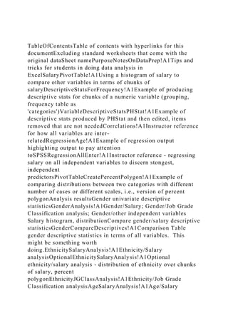
TableOfContentsTable of contents with hyperlinks for this documentExcluding standard worksheets that come with the original dataSheet namePurposeNotesOnDataPrep!A1Tips and tricks for students in doing data analysis in ExcelSalaryPivotTable!A1Using a histogram of salary to compare other variables in terms of chunks of salaryDescriptiveStatsForFrequency!A1Example of producing descriptive stats for chunks of a numeric variable (grouping, frequency table as 'categories')VariableDescriptiveStatsPHStat!A1Example of descriptive stats produced by PHStat and then edited, items removed that are not neededCorrelations!A1Instructor reference for how all variables are inter-relatedRegressionAge!A1Example of regression output highighting output to pay attention toSPSSRegressionAllEnter!A1Instructor reference - regressing salary on all independent variables to discern stongest, independent predictorsPivotTableCreatePercentPolygon!A1Example of comparing distributions between two categories with different number of cases or different scales, i.e., version of percent polygonAnalysis resultsGender univariate descriptive statisticsGenderAnalysis!A1Gender/Salary; Gender/Job Grade Classification analysis; Gender/other independent variables Salary histogram, distributionCompare gender/salary descriptive statisticsGenderCompareDescriptives!A1Comparison Table gender descriptive statistics in terms of all variables. This might be something worth doing.EthnicitySalaryAnalysis!A1Ethnicity/Salary analysisOptionalEthnicitySalaryAnalysis!A1Optional ethnicity/salary analysis - distribution of ethnicity over chunks of salary, percent polygonEthnicityJGClassAnalysis!A1Ethnicity/Job Grade Classification analysisAgeSalaryAnalysis!A1Age/Salary analysisAgeJobGradeClassAnalysis!A1Age/Job grade classification analysisYearsWorkedSalaryAnalysis!A1Years worked/Salary analysisYears worked/Job grade classification analysisRelationship between endogenous variablesJob grade classification/Salary analysisRelationship between independent variablesPercentPolygonGenderYearsWorked!A1Compare years worked distribution by gender; Example of comparing distributions between two categories with different number of cases or different scales, i.e., version of percent polygon Standard sheets that come with the dataVariable INFO'!A1Information on variablesHuman Resources DATA'!A1DataCross-Class-Table'!A1Summary Table'!A1Histogram!A1% Polygons 2 Groups'!A1Freq. & % Distribution'!A1
Variable INFOTableOfContents!A1The data are a random sample of 120 responses to a survey conducted by the VP of Human Resources at a large company.Source:INFO 501 class at Montclair State UniversityVariablesSalaryin thousands of dollars (K)Age in years YrsWorkin years JGClassjob-grade classification of 1, 3, 5, 7, 9, 11 (lowest skill job to highest skill job)Ethnicity1=Minority0=Not MinorityGender(Male, Female)Named ranges created in this worksheet - use these names to address the data more quickly then manually selecting dat.
Excel Files AssingmentsCopy of Student_Assignment_File.11.01..docxSANSKAR20
Excel Files Assingments/Copy of Student_Assignment_File.11.01.2016.xlsx
DataIDSalaryCompa-ratioMidpointAgePerformance RatingServiceGenderRaiseDegreeGender1GradeCopy Employee Data set to this page.The ongoing question that the weekly assignments will focus on is: Are males and females paid the same for equal work (under the Equal Pay Act)? Note: to simplfy the analysis, we will assume that jobs within each grade comprise equal work.The column labels in the table mean:ID – Employee sample number Salary – Salary in thousands Age – Age in yearsPerformance Rating – Appraisal rating (Employee evaluation score)SERvice – Years of serviceGender: 0 = male, 1 = female Midpoint – salary grade midpoint Raise – percent of last raiseGrade – job/pay gradeDegree (0= BS\BA 1 = MS)Gender1 (Male or Female)Compa-ratio - salary divided by midpoint
Week 2This assignment covers the material presented in weeks 1 and 2.Six QuestionsBefore starting this assignment, make sure the the assignment data from the Employee Salary Data Set file is copied over to this Assignment file.You can do this either by a copy and paste of all the columns or by opening the data file, right clicking on the Data tab, selecting Move or Copy, and copying the entire sheet to this file(Weekly Assignment Sheet or whatever you are calling your master assignment file).It is highly recommended that you copy the data columns (with labels) and paste them to the right so that whatever you do will not disrupt the original data values and relationships.To Ensure full credit for each question, you need to show how you got your results. For example, Question 1 asks for several data values. If you obtain them using descriptive statistics,then the cells should have an "=XX" formula in them, where XX is the column and row number showing the value in the descriptive statistics table. If you choose to generate each value using fxfunctions, then each function should be located in the cell and the location of the data values should be shown.So, Cell D31 - as an example - shoud contain something like "=T6" or "=average(T2:T26)". Having only a numerical value will not earn full credit.The reason for this is to allow instructors to provide feedback on Excel tools if the answers are not correct - we need to see how the results were obtained.In starting the analysis on a research question, we focus on overall descriptive statistics and seeing if differences exist. Probing into reasons and mitigating factors is a follow-up activity.1The first step in analyzing data sets is to find some summary descriptive statistics for key variables. Since the assignment problems willfocus mostly on the compa-ratios, we need to find the mean, standard deviations, and range for our groups: Males, Females, and Overall.Sorting the compa-ratios into male and females will require you copy and paste the Compa-ratio and Gender1 columns, and then sort on Gender1.The values for age, performance rating, and service are prov ...
QR Questions_Responses Apply Quantitative ReasoningNow that yo.docxsimonlbentley59018
QR Questions_Responses
Apply Quantitative Reasoning
Now that you have completed your analysis, think about the patterns you have seen in the workforce.
In this final section, you will answer five questions and write a short essay.
1. From the created histogram, it appears that a large share of employees have a salary between $61,000–$110,000 or $131,000–$170,000. This may indicate a reasonable promotion rate for new and seasoned employees. Is this distribution unimodal or bimodal? Please explain.
2. The line chart, as detailed in your "Graph Charts" Excel spreadsheet, shows sales generally increasing over the years, although sales in the first two years were notably lower. Assuming that the sales are linear, please use the Forecast tool to find projected sales for 2020 thru 2024. Hint: An easy way to do this is to highlight the sales from the data page and apply the Forecast tool to this data or use the forecast function in excel. You will generate a chart on a new sheet with projected sales; rename this sheet "Projected Sales".
3. The standard deviation provides insight into the distribution of values around the mean. If the standard deviation is small, in general, the more narrow the range between the lowest and highest value. That is, values will cluster close to the mean. From your descriptive statistics, describe your standard deviations of Salary, Hryly Rate, Yrs Worked, Education, and Age. What does this tell you about the variables?
4. The company has a keen interest in the educational, race, and gender makeup of its workforce. Its emphasis is on a diverse, dynamic workforce. From your "Graph Charts" spreadsheet, describe your pie chart findings for these characteristics of the workforce. Describe how you would determine if the company was meeting expectations on these characteristics.
5. The company is conducting an analysis on how many positions to create to keep up with demand. Specifically, it wants to know an estimate of the number of positions per job title. From your Excel chart, identify the mode of the job title distribution. Describe your findings.
FINAL ESSAY:
Now that you have done all the work with data, you will write a short three- to four-paragraph summary of your analysis. This is important. While you have done a wonderful job with your analysis, you can never assume that the end user will be able to interpret the data the way it should be understood. Supporting narrative is helpful. Never simply provide a "raw data" dump. Instead, seek to provide information!
Structure your essay like this:
a. Write a one-paragraph narrative summary of your findings, describing patterns of interest.
b. Provide an explanation of the potential relevance of such patterns.
c. Provide a description of how you would investigate further to determine if your results are "good or bad" for the company.
Prepare your response in this workbook. (Simply expand this text box to accommodate your essay and other answers, or you can copy .
1. Outline the differences between Hoarding power and Encouraging..docxpaynetawnya
1. Outline the differences between Hoarding power and Encouraging.
2. Explain about the power of Congruency in Leadership.
DataIDSalaryCompaMidpoint AgePerformance RatingServiceGenderRaiseDegreeGender1GrCopy Employee Data set to this page.822.10.962233290915.81FAThe ongoing question that the weekly assignments will focus on is: Are males and females paid the same for equal work (under the Equal Pay Act)? 1522.60.984233280814.91FANote: to simplfy the analysis, we will assume that jobs within each grade comprise equal work.3522.60.984232390415.30FA37230.999232295216.20FAThe column labels in the table mean:1023.11.003233080714.71FAID – Employee sample number Salary – Salary in thousands 2323.11.004233665613.30FAAge – Age in yearsPerformance Rating – Appraisal rating (Employee evaluation score)1123.31.01223411001914.81FASERvice – Years of serviceGender: 0 = male, 1 = female 2623.51.020232295216.20FAMidpoint – salary grade midpoint Raise – percent of last raise3123.61.028232960413.91FAGrade – job/pay gradeDegree (0= BS\BA 1 = MS)3623.61.026232775314.30FAGender1 (Male or Female)Compa-ratio - salary divided by midpoint4023.81.034232490206.30MA14241.04523329012161FA4224.21.0512332100815.71FA1924.31.055233285104.61MA25251.0872341704040MA3226.50.855312595405.60MB227.70.895315280703.90MB3428.60.923312680204.91MB3933.91.094312790615.50FB2034.11.1013144701614.80FB1834.51.1133131801115.60FB335.11.132313075513.61FB1341.11.0274030100214.70FC741.31.0324032100815.71FC1642.21.054404490405.70MC4145.81.144402580504.30MC2746.91.172403580703.91MC548.21.0044836901605.71MD3049.31.0274845901804.30MD2456.31.173483075913.80FD4556.91.185483695815.21FD4757.21.003573795505.51ME3357.51.008573590905.51ME4581.01857421001605.51ME3858.81.0325745951104.50ME5059.61.0465738801204.60ME4660.21.0575739752003.91ME2260.31.257484865613.81FD161.61.081573485805.70ME4461.81.0855745901605.21ME49631.1055741952106.60ME1763.71.1185727553131FE1264.71.1355752952204.50ME4869.51.2195734901115.31FE973.91.103674910010041MF4375.61.1286742952015.50FF2976.31.139675295505.40MF2177.21.1526743951306.31MF678.11.1656736701204.51MF2878.31.169674495914.40FF
Week 2This assignment covers the material presented in weeks 1 and 2.Six QuestionsBefore starting this assignment, make sure the the assignment data from the Employee Salary Data Set file is copied over to this Assignment file.You can do this either by a copy and paste of all the columns or by opening the data file, right clicking on the Data tab, selecting Move or Copy, and copying the entire sheet to this file(Weekly Assignment Sheet or whatever you are calling your master assignment file).It is highly recommended that you copy the data columns (with labels) and paste them to the right so that whatever you do will not disrupt the original data values and relationships.To Ensure full credit for each question, you need to show how you got your results. For example, Question 1 asks for several data values. If you obtain them using descript ...
These are MS Excel Tips and tricks you might not know, which will advance your skills in using Excel, also these tips and tricks are the main Job exams questions
Guidelines for Regression Project This project is designedJeanmarieColbert3
Guidelines for Regression Project
This project is designed to help you gain experience and build skills in the diagnosis
and prediction of employee turnover. The dataset we will use (see the Excel file
named “Regression Project”) contains a wide variety of workforce data (employee
demographics, and attitudes) on approximately 1000 employees. The primary
dependent variables are "Attrition" and “Probability of Turnover.”
Your CEO wants to better understand the factors driving employee turnover, and she
has asked you to take the lead in conducting the analyses.
You should begin with data cleaning and range checks. Expect that there are
problems here, as with most any large dataset! Please address any problems that
you find and document any changes that you have made in your memo to me.
Then, move on to the basics (e.g., are departing employees older, younger, have
higher education levels, lower job satisfaction, etc.)? You should also seek to
determine whether or not there are any differences in attrition across departments
and if so, why.
Once you have outlined the basics, develop a multivariate regression model to
determine which factors appear to be the most important predictors of Probability of
Turnover and/or Turnover (be sure to use a logistic regression model if you focus on
the latter). Note that you have a lot of discretion in how you approach this problem,
so I am intentionally not providing step-by-step details on what you should do with
these projects. I want you to show me how you would approach the problem.
Please summarize your findings in a (maximum) five-page, double spaced memo to
the CEO. Any tables, figures, etc., can be placed in an Appendix to your memo.
Appendix
Variable Descriptions
Workforce Data12345678910111213141516171819202122232425262728293031NumAttritionProbTurnoverEducationJobSatisfactionJobInvolvementPerformanceRatingRelationshipSatisfactionWorkLifeBalanceNumBusTravelNumDepartmentAgeDistanceFromHomeEmployeeNumberEnvironmentSatisfactionNumGenderJobLevelNumericJobRoleNumMaritalStatNumCompaniesWorkedNumOverTimePercentSalaryHikeStockOptionLevelTotalWorkingYearsTrainingTimesLastYearYearsAtCompanyYearsInCurrentRoleYearsSinceLastPromotionYearsWithCurrManagerDepartmentEducationFieldJobRole152433112341112128382110806405SalesLife SciencesSales Executive04122443324982322721123110310717Research & DevelopmentLife SciencesResearch Scientist152323232237244213362150730000Research & DevelopmentOtherLaboratory Technician024333333233354117212110838730Research & DevelopmentLife SciencesResearch Scientist031233432227271213291121632222Research & DevelopmentMedicalLaboratory Technician012433323232284213301130827736Research & DevelopmentLife SciencesLaboratory Technician01314419225931031132422031231000Research & DevelopmentMedicalLaboratory Technician02133423223024114213111221121000Research & DevelopmentLife SciencesLaboratory Technician043324233238231242353012101029718 ...
In Section 1 on the Data page, complete each column of the spreads.docxsleeperharwell
In Section 1 on the Data page, complete each column of the spreadsheet to arrive at the desired calculations. Use Excel formulas to demonstrate that you can perform the calculations in Excel. Remember, a cell address is the combination of a column and a row. For example, C11 refers to Column C, Row 11 in a spreadsheet.
Reminder: Occasionally in Excel, you will create an unintentional circular reference. This means that within a formula in a cell, you directly or indirectly referred to (back to) the cell. For example, while entering a formula in A3, you enter =A1+A2+A3. This is not correct and will result in an error. Excel allows you to remove or allow these references.
Hint: Another helpful feature in Excel is Paste Special. Mastering this feature allows you to copy and paste all elements of a cell, or just select elements like the formula, the value or the formatting.
"Names" are a way to define cells and ranges in your spreadsheet and can be used in formulas. For review and refresh, see the resources for Create Complex Formulas and Work with Functions.
Ready to Begin?
1. To calculate
hourly rate, you will use the annual hourly rate already computed in Excel, which is 2080. This is the number most often used in annual salary calculations based on full time, 40 hours per week, 52 weeks per year. In E11 (or the first cell in the
Hrly Rate column), create a formula that calculates the hourly rate for each employee by referencing the employee’s salary in Column D, divided by the value of annual hours, 2080. To do this, you will create a simple formula:
=D11/2080. Complete the calculations for the remainder of Column E. If you don’t want to do this cell by cell, you can create a new formula that will let you use that same formula all the way to the end of the column. It would look like this:
=$D$11:$D$382/2080.
2. In Column F, calculate the
number of years worked for each employee by creating a formula that incorporates the date in cell F9 and demonstrates your understanding of relative and absolute cells in Excel. For this, you will need a formula that can compute absolute values to determine years of service. You could do this longhand, but it would take a long time. So, try the
YEARFRAC formula, which computes the number of years (and even rounds). Once you start the formula in Excel, the element will appear to guide you. You need to know the “ending” date (F9) and the hiring date (B11). The formula looks like this:
=YEARFRAC($F$9,B11), and the $ will repeat the formula calculation down the column as before if you grab the edge of the cell and drag it to the bottom of the column.
3. To determine if an employee is
vested or not In Column I, use an
IF statement to flag with a "Yes" any employees who have been employed 10 years or more. Here is how an IF statement works:
=IF(X is greater (or less th.
Problem I - Write your first name, middle name, and last name in c.docxanitramcroberts
Problem I
- Write your first name, middle name, and last name in capital letters. The letters involved in your full name would comprise your data set. In case you do not have a middle name, or you do not want to include your real middle name, make one up. Then, do the following
Write
your data
in order from A to Z and double check.
For example
, the student whose complete name is First Middle Last would have
A
A
E
E
E
J
K
M
N
N
R
R
S
Y
Your full name
: ………………..
Letters in order with existing repetitions :
What is the type of your data? Circle, or list, all that apply:
Numerical, continuous, discrete, categorical, non-numerical, quantitative, qualitative
What is the size of your data set?
What scale of measurement is applicable to your data (nominal, ordinal, interval, ratio)?
Support your answer briefly.
Is the word “range,” with its actual definition in statistics, applicable to your data set? How can you say something about your data involving “range” in your statement, anyway?
Is your data set a sample or a population?
Support your answer briefly.
Depending on your answer to Question 6 above, and recalling what we said in class, what is the correct notation to show the size of your data set in statistics?
What is (are) the mode(s) of within data set, if any? Is your data set unimodal, bimodal, trimodal, …?
What is the frequency of the mode? In case you have more than one mode, provide the frequency of each.
Recalling the example discussed in class or provided in your eTextbooks, construct a “Frequency Distribution Table,” a complete (seven-column) frequency distribution table. You should use the following headings for your table:
Letter, Frequency (F), Relative Frequency (RF), Percent Relative Frequency (PRF), Cumulative Frequency (CF), Cumulative Relative Frequency (CRF), and Cumulative Percent Relative Frequency (CPRF).
By examining appropriate rows and columns of the frequency table that you have constructed for Step 10 above, write down (in a small table) the fractions (in percentage) of your data set that the vowels A, E, I, O, and U comprise individually and collectively.
Using the frequency table created in Step 10 above and, preferably, hand drawing on graph paper (
show at least some work, in case you use technology),
Construct a bar chart for the frequency (F) distribution. (See NOTE below)
Construct a bar chart for the percent relative frequency (PRF) distribution. (See NOTE below)
Compare your F distribution with your PRF distribution. Briefly explain your finding(s).
NOTE
: You may do Parts (a) and (b) displaying the categories from highest F (or PRF) to lowest F (or PRF) from left to right; the resulting bar chart is called a “Pareto Bar Chart.”
Please note that each bar chart must have a
descriptive title
, and the x and y axes must have
descriptive labels
.
Plot the points corresponding to the
cumulative
percent relative frequency.
Labs/Lab5/Lab5_Excel_SH.htmlLab 5: SpreadsheetsLearning Outcomes and IntroductionTask 1: Powers of 2, Powers of 10 Task 2: Importing and Sorting DataTask 3: Graphing DataTask 4: FunctionsSubmission
Learning Outcomes and Introduction
During this process, you will be able to: Demonstrate your ability to layout and format a spreadsheetDemonstrate the use of relative vs. absolute references in spreadsheetsDemonstrate the use of functions in ExcelDemonstrate the use of IF and VLOOKUP in Excel
Task 1:Powers of 2, Powers of 10 (20 marks)Instructions
There is a reasonably close relationship between the powers of two and the powers of ten: 210 is a little more than 103, that is, 1024 is close to 1000. Similarly, 220 is more than 106
and the ratio is 1.049. The approximation is pretty good for a long distance though eventually it breaks down. Your task is to make a spreadsheet that shows
how good the approximation is and find the place where the ratio first becomes greater than 2.
Start your spreadsheet program (such as Excel)
Enter Data:
Put the numbers 0, 1, 2, ...,40 into column A.Put into column B a formula that will compute 2 raised to the power 10 times the value in column A. Put into column C a formula that will compute 10 raised to the power 3 times the value in column A.Put into column D a formula that will compute the ratio of B over C, that is, the ratio of how good or bad the
approximation is.Set the cell format for column D to display exactly two digits after the decimal point.
Prepare a Chart:
Select the correct range to create a chart that shows the ratio changing for the 40 rows.Use the chart wizard ("Insert>Chart>Column" or this icon ) to create a graph that shows the ratio.Move the chart so that is beside your data as shown in the picture below.
Add an appropriate chart title and remove the " legend"
Save Worksheet:
In this lab, you will be using a new sheet for each part, each with its own name. For task1, double-click on the tab that
says Sheet1
Type the name Power2 in its place.Save the spreadsheet in a file called lab5_Firstname_Lastname under the folder COMP152\Lab5
Side Note: the spreadsheet application you are using will add the correct filename extension)
Do this with as little typing and as much use of Excel's extension feature as possible; you can probably do it by typing no more
than two or three rows and then extending them. Your table should look like this when done, except that it will have more rows, more data in the graph,
and a highlighted row towards the end:
Note: In the example below, numbers are displayed as "floating point". You do not have to
format that way, most of us prefer more common looking number formats (comma style?).
No matter what format and number of decimal places you choose to display - the spreadsheet
software is actually using floating point in the background to ensure maximum accur ...
Sheet1NAMEYOUR DATAPOPULATION VARIABLESAMPLETYPE OF VARIABLEME.docxmaoanderton
Sheet1NAME:YOUR DATAPOPULATION: VARIABLE:SAMPLE:TYPE OF VARIABLEMEAN:MEDIANMODERANGESTANDARD DEVIATION:ANSWER:REFERENCE (APA)
&"-,Bold"&14STA 3026 - ASSIGNMENT 1_x000D_ANSWER SHEET
ENTER YOUR ANSWER HERE
ENTER YOUR CITATION IN APA FORMAT HERE
a. Follow the link above to download the PowerPoint presentation file titled "PPT_Resources."
b. Save the file to your desktop using the following file name format: Your_Name_Wk5_PPT.pptx
c. Make sure to save it with your name!
d. Locate an article, video, or other resource that relates to using PowerPoint or effective slide design. Using the saved PPT slide on your desktop, provide a summary of this resource on the provided body slide (slide 2). This should be a brief summary (much like Professional Experience #2). Include a link to the resource/information on the slide. Do not alter or delete any other students' slides.
e. Save the Your_Name_Wk5_PPT.pptx file. Upload your completed PowerPoint file to OneDrive by clicking "Upload" in the menu bar at the top of the OneDrive webpage.
f. Browse to find your saved file on your computer.
g. When the upload is complete, submit a copy of the Your_Name_Wk5_PPT.pptx file to Blackboard using the “Professional Experience #3” link in Week 5.
2. In order to receive credit for completing this task you must:
h. Provide a useful article, video, or other resource on using PowerPoint and/or effective slide design.
i. Include a brief summary of the resource on the slide.
j. Limit your resource overview to one slide.
k. Submit the Your_Name_Wk5_PPT.pptx file to Blackboard in the “Professional Experience #3” link.
This is a pass/fail assignment. All elements must be completed (simulating the workplace where incomplete work is unacceptable) for credit. You cannot receive partial credit.
3. The specific course learning outcomes associated with this assignment are:
l. Plan, create, and evaluate professional documents.
m. Write clearly, coherently, and persuasively using proper grammar, mechanics, and formatting appropriate to the situation.
n. Deliver professional information to various audiences using appropriate tone, style, and format.
o. Learn communication fundamentals and execute various professional tasks in a collaborative manner.
p. Analyze professional communication examples to assist in revision.
ENG315
Using PowerPoint and effective slide design resources
Commands
for
Statistical
Procedures,
Tests,
and
Charts
in
Excel
Mean:
=AVERAGE(click and drag on cells); click “enter”
Median:
=MEDIAN(click and drag on cells); click “enter”
Mode:
=MODE(click and drag on cells); click “enter”
Range:
(highest value – lowest value)
***There is no command for mode in Excel, so this needs
to be done manually.
Standard Deviation:
=STDEV(click and drag on cells); click “enter”
Confidence Interval:
=CONFIDENCE(alpha, standard deviation, size); click
“enter”
*** Alpha is 1 – confidence le.
MANDATORY STANDARDS FOR ALL EXCEL STAT PACKS Consult Thi.docxendawalling
MANDATORY STANDARDS FOR ALL EXCEL STAT PACKS
Consult This Document for All Excel Stat Packs.
COMPLETING:
1. Follow directions given in individual Excel Stat Packs.
2. Where indicated put your name in the marked cells, copying over the words Last Name, First Name.
3. Where indicated put your Red ID# in the marked cells, copying over the words Red ID#.
4. In YELLOW HIGHLIGHTED EXCEL CELLS substitute the last four digits of your Red ID # for the letters A,
B, C, and D. A student with the Red ID # 888887654 would make the following substitutions: A = 7, B =
6, C = 5, D = 4. Thus, the Twisty Player’s Theatre problem for this student would contain the following
values: (A) Cell A9 = 117 (B) Cell A16 = 116 (C) Cell A20 = 105 (D) Cell A24 = 114
5. Pop-Up Boxes: At times Excel’s input requirements\wording is slightly different across various Excel
versions. If your pop-up box does not match the directions use the help function and good judgement.
FORMATTING:
6. Format your work so it is clean and business like.
7. Do not write anything in pen, pencil, or highlighter, except signature & date in pen if required.
8. Format all graphs and tables, including but not limited to axis titles, scales, data legends, data labels,
and titles, adjusting Excel’s default response settings where deficient.
9. No gridlines.*
10. No Excel row and column headings.*
11. No cutting off words in cells.*
12. Not cutting off tables by the right margin, leaving partial table columns “floating” on the next page.*
13. Keep the “lettered cells” (from #4, above) either highlighted yellow or grey scale when printing.
*Before printing, use Print Preview/Page Setup (if given the option or in the document itself), Portrait
Orientation and/or the NO SCALING options so your stat pack is clean and business-like.
SUBMITTING:
14. Turn it in on time.
15. Turn in a paper copy (no email submissions).
16. Organize papers in the same order as examples are presented in the Excel file.
17. Staple papers together. No loose submissions or paper clips.
18. Do not attach your own cover sheet or use a plastic presentation cover..
INTRODUCTION TO EXCEL STAT PACKS
The Stat Packs are meant to supplement and broaden your understanding of statistics.
Software can ease many of the necessary calculations, it is not, however, a replacement for
statistical knowledge.
All directions are given under the assumptions that students will be using Excel on a Microsoft
device. All analysis will involve either the DATA ANALYSIS TOOL or STATISTICAL FUNCTIONS.
ONCE IN EXCEL:
To access STATISTICAL FUNCTION click on the Function Wizard icon, fx, located on the
toolbar, to the immediate left of the input line.
To access the DATA ANYLSIS TOOL click DATA TAB on the toolbar. Data Analysis is
available under the Analysis Group (far right corner of the Tool Bar.)
If you do not see Data Analysis you .
DataIDSalaryCompa-ratioMidpoint AgePerformance RatingServiceGenderRaiseDegreeGender1GradeDo not manipuilate Data set on this page, copy to another page to make changes154.50.956573485805.70METhe ongoing question that the weekly assignments will focus on is: Are males and females paid the same for equal work (under the Equal Pay Act)? 228.30.913315280703.90MBNote: to simplfy the analysis, we will assume that jobs within each grade comprise equal work.334.11.100313075513.61FB460.91.06857421001605.51METhe column labels in the table mean:549.21.0254836901605.71MDID – Employee sample number Salary – Salary in thousands 674.11.1066736701204.51MFAge – Age in yearsPerformance Rating - Appraisal rating (employee evaluation score)741.41.0344032100815.71FCService – Years of service (rounded)Gender – 0 = male, 1 = female 822.80.992233290915.81FAMidpoint – salary grade midpoint Raise – percent of last raise9731.089674910010041MFGrade – job/pay gradeDegree (0= BS\BA 1 = MS)1023.31.014233080714.71FAGender1 (Male or Female)Compa-ratio - salary divided by midpoint1124.31.05723411001914.81FA1259.71.0475752952204.50ME1341.81.0444030100214.70FC14251.08523329012161FA1522.60.983233280814.91FA1648.51.213404490405.70MC1763.11.1075727553131FE1836.21.1673131801115.60FB1923.91.039233285104.61MA2035.51.1443144701614.80FB2178.91.1786743951306.31MF2257.61.199484865613.81FD2322.20.964233665613.30FA2453.41.112483075913.80FD2523.61.0282341704040MA2622.30.971232295216.20FA2746.21.156403580703.91MC2874.41.111674495914.40FF2975.61.129675295505.40MF3047.50.9894845901804.30MD3122.90.995232960413.91FA3228.10.906312595405.60MB3363.71.117573590905.51ME3426.90.869312680204.91MB3522.70.987232390415.30FA3624.41.059232775314.30FA3723.81.034232295216.20FA3864.61.1335745951104.50ME3937.31.202312790615.50FB4023.71.031232490206.30MA4140.31.008402580504.30MC4224.41.0592332100815.71FA4372.31.0796742952015.50FF4465.91.1565745901605.21ME4549.91.040483695815.21FD4657.41.0075739752003.91ME47560.982573795505.51ME4868.11.1955734901115.31FE4966.21.1615741952106.60ME5061.71.0835738801204.60ME
Week 1Week 1: Descriptive Statistics, including ProbabilityWhile the lectures will examine our equal pay question from the compa-ratio viewpoint, our weekly assignments will focus onexamining the issue using the salary measure.The purpose of this assignmnent is two fold:1. Demonstrate mastery with Excel tools.2. Develop descriptive statistics to help examine the question.3. Interpret descriptive outcomesThe first issue in examining salary data to determine if we - as a company - are paying males and females equally for doing equal work is to develop somedescriptive statistics to give us something to make a preliminary decision on whether we have an issue or not.1Descriptive Statistics: Develop basic descriptive statistics for SalaryThe first step in analyzing data sets is to find some summary descriptive statistics for key variables. Suggestion: Copy the gender1 and salary columns from the Data tab t.
DataIDSalaryCompa-ratioMidpoint AgePerformance RatingServiceGenderRaiseDegreeGender1GradeDo not manipuilate Data set on this page, copy to another page to make changes163.21.108573485805.70METhe ongoing question that the weekly assignments will focus on is: Are males and females paid the same for equal work (under the Equal Pay Act)? 227.10.873315280703.90MBNote: to simplfy the analysis, we will assume that jobs within each grade comprise equal work.335.31.138313075513.61FB461.41.07857421001605.51METhe column labels in the table mean:546.90.9784836901605.71MDID – Employee sample number Salary – Salary in thousands 674.61.1136736701204.51MFAge – Age in yearsPerformance Rating - Appraisal rating (employee evaluation score)740.81.0194032100815.71FCService – Years of service (rounded)Gender – 0 = male, 1 = female 823.81.035233290915.81FAMidpoint – salary grade midpoint Raise – percent of last raise974.21.108674910010041MFGrade – job/pay gradeDegree (0= BS\BA 1 = MS)1023.41.017233080714.71FAGender1 (Male or Female)Compa-ratio - salary divided by midpoint1122.30.97123411001914.81FA1264.61.1345752952204.50ME1340.61.0164030100214.70FC14230.99823329012161FA1525.21.094233280814.91FA1645.71.143404490405.70MC1770.21.2315727553131FE1834.71.1193131801115.60FB1923.91.039233285104.61MA2033.51.0813144701614.80FB21711.0606743951306.31MF2252.91.103484865613.81FD2322.10.960233665613.30FA2456.81.183483075913.80FD2524.31.0562341704040MA2624.61.071232295216.20FA2743.41.084403580703.91MC28771.149674495914.40FF2974.71.115675295505.40MF3047.80.9954845901804.30MD3120.70.898232960413.91FA3228.60.921312595405.60MB3359.21.038573590905.51ME3427.30.881312680204.91MB3522.90.996232390415.30FA3622.70.987232775314.30FA3723.91.037232295216.20FA3864.71.1355745951104.50ME39351.128312790615.50FB4023.61.024232490206.30MA4146.61.166402580504.30MC4223.31.0152332100815.71FA4376.41.1406742952015.50FF4461.21.0745745901605.21ME45511.062483695815.21FD4658.81.0315739752003.91ME4766.91.174573795505.51ME4870.71.2405734901115.31FE4963.51.1145741952106.60ME5064.51.1325738801204.60ME
Week 1Week 1: Descriptive Statistics, including ProbabilityWhile the lectures will examine our equal pay question from the compa-ratio viewpoint, our weekly assignments will focus onexamining the issue using the salary measure.The purpose of this assignmnent is two fold:1. Demonstrate mastery with Excel tools.2. Develop descriptive statistics to help examine the question.3. Interpret descriptive outcomesThe first issue in examining salary data to determine if we - as a company - are paying males and females equally for doing equal work is to develop somedescriptive statistics to give us something to make a preliminary decision on whether we have an issue or not.1Descriptive Statistics: Develop basic descriptive statistics for SalaryThe first step in analyzing data sets is to find some summary descriptive statistics for key variables. Suggestion: Copy the gender1 and salary columns from the Data tab to co.
Take a few moments to research the contextual elements surrounding P.docxperryk1
Take a few moments to research the contextual elements surrounding President Kennedy’s inauguration in 1961 and then critically examine this speech:
“Inaugural Address,” by John F. KennedyLinks to an external site.<
https://urldefense.com/v3/__https://nam01.safelinks.protection.outlook.com/?url=https*3A*2F*2Furldefense.com*2Fv3*2F__https*3A*2F*2Fwww.jfklibrary.org*2FAsset-Viewer*2FBqXIEM9F4024ntFl7SVAjA.aspx__*3B!!ACPuPu0!nRyVaN_vHAO7VokwK2jIluLRE3Rbgg_zTzlKs2LU0jy7JJDLOQzoLng5O9kq8Ar2xqOxu6ASoTCCAw*24&data=02*7C01*7Cs3521396*40students.fscj.edu*7C3dbff0e6302e40df260508d83ebef2dd*7C4258f8b94f8d44abb87f21ab35a63470*7C0*7C0*7C637328337145689500&sdata=rjSnrpQbmBtBYheBjJTh*2B57JapV8a8uLTbS*2BwaXQFps*3D&reserved=0__;JSUlJSUlJSUlJSUlJSUlJSUlJSUlJSU!!ACPuPu0!lzlmNESbzfxzfV0D2RFZGvC0P4JM5SVIIXnoztdLO3J83rBb44XpTJOZcRrT89Wp_du_$
> is made available by the John F. Kennedy Presidential Library and Museum. It is in the public domain.
In a short rhetorical analysis (minimum of four paragraphs in length), please answer all of the questions below. Your work should include an introduction, a body of supporting evidence, and a conclusion. Please take some time to edit your writing for punctuation, usage, and clarity prior to submission.
Questions for Analysis
1. Which important historical and social realities had an impact on this speech in 1961, and how do these contextual elements figure in President Kennedy’s organization of this speech?
2. What is President Kennedy saying about the nature of human progress (science and technology) and the challenges that we must navigate as a global community? Are these challenges unique to 1961, or relative throughout human history?
3. What are the goals of this speech? Isolate at least three aims of President Kennedy’s address, identify his strategy for supporting these goals, and critique their efficacy. Is this an effective speech? Where applicable, please include a quotation or two from the speech.
In a rhetorical analysis (minimum of eight paragraphs in length), please answer all of the questions below. Your work should include an introduction, a body of supporting evidence, and a conclusion. Please take some time to edit your writing for punctuation, usage, and clarity prior to submission.
Questions for Analysis
1. How does Jefferson organize this important document? How many subdivisions does it have, how do they operate, and how does his approach to organization impact the document’s efficacy?
2. Using at least one citation from the text, analyze Jefferson’s approach to style, voice, and tone. How does he create a sense of urgency in moving toward the conclusion of the work?
3. The complexities of this document’s reach are immense. How many different audiences was Jefferson writing to, and what were the needs of those different groups?
4. In terms of the approaches to formal rhetoric that we studied in the first learning module, which does The Declaration of Independence most closely resemble? .
Table of Contents Section 2 Improving Healthcare Quality from.docxperryk1
Table of Contents Section 2: Improving Healthcare Quality from Within Week 4
Week 4 - Assignment: Interpret Performance Measures
Week 4 - Assignment: Interpret
Performance Measures
Instructions
Course Home Content Dropbox Grades Bookshelf ePortfolio Library The Commons Calendar
You have just been appointed as the administrator of a large managed healthcare organization
with multiple facilities in your state, including facilities in city X and Y (table below). A task your
office is charged with is to reimburse facilities based on how they perform on a set of healthcare
quality measures.
Based on the information provided below, what considerations will you make in your decision-
making process? To complete this assignment, prepare a PowerPoint presentation that
highlights whether or not these two facilities (A and B) should be treated equally when
conducting your assessment. If any, what are the implications of treating these facilities as
equals for the purpose of comparison? Also, address the techniques you will use to ensure these
facilities are assessed fairly.
Measures Facility A Facility B
1
Population
characteristics
City X: Mostly people
with high economic
status and those with
more than high school
education
City Y: Mostly people
with low economic
status, minorities,
high school or less
education
2 Population served All ages
Mostly older adults
and people with
disabilities and
chronic conditions
3
Staff to patient
ratio
1:4 1:8
4
Physician and
nurses continuing
education
Required Required
5 Average number of
hours staff work
per week
50 hours 60 hours
Reflect in ePortfolio
Submissions
No submissions yet. Drag and drop to upload your assignment below.
Drop files here, or click below!
Upload Choose Existing
You can upload files up to a maximum of 1 GB.
Length: 8-10 slides (excluding title slide and references slide)
References: Include a minimum of 3-5 peer-reviewed, scholarly resources referenced on a
separate slide at the end of your presentation.
Your assignment should reflect scholarly academic writing, current APA standards,
Record
Week 4
Course Home Content Dropbox Grades Bookshelf More
Interpreting Performance Improvement Measures
and Benchmarking
As a healthcare administrator/manager, it is in your best
interest to help the facility you serve to move in the
direction charted in the National Quality Strategy (Joshi et
al., 2014). Organizations that fail to meet set standards are
known to face sanctions and sometimes required to close
shop. In consideration of this, you will want to ensure that
the facility you manage is adopting a culture of quality that
puts its patients at the center of healthcare delivery. You will
want to do this by making sure that your facility provides
quality patient care, while also keeping the facility’s
bottom-line healthy.
To ensure you are moving in the right direction, you must
measure and monitor key qual.
More Related Content
Similar to TableOfContentsTable of contents with hyperlinks for this document.docx
In Section 1 on the Data page, complete each column of the spreads.docxsleeperharwell
In Section 1 on the Data page, complete each column of the spreadsheet to arrive at the desired calculations. Use Excel formulas to demonstrate that you can perform the calculations in Excel. Remember, a cell address is the combination of a column and a row. For example, C11 refers to Column C, Row 11 in a spreadsheet.
Reminder: Occasionally in Excel, you will create an unintentional circular reference. This means that within a formula in a cell, you directly or indirectly referred to (back to) the cell. For example, while entering a formula in A3, you enter =A1+A2+A3. This is not correct and will result in an error. Excel allows you to remove or allow these references.
Hint: Another helpful feature in Excel is Paste Special. Mastering this feature allows you to copy and paste all elements of a cell, or just select elements like the formula, the value or the formatting.
"Names" are a way to define cells and ranges in your spreadsheet and can be used in formulas. For review and refresh, see the resources for Create Complex Formulas and Work with Functions.
Ready to Begin?
1. To calculate
hourly rate, you will use the annual hourly rate already computed in Excel, which is 2080. This is the number most often used in annual salary calculations based on full time, 40 hours per week, 52 weeks per year. In E11 (or the first cell in the
Hrly Rate column), create a formula that calculates the hourly rate for each employee by referencing the employee’s salary in Column D, divided by the value of annual hours, 2080. To do this, you will create a simple formula:
=D11/2080. Complete the calculations for the remainder of Column E. If you don’t want to do this cell by cell, you can create a new formula that will let you use that same formula all the way to the end of the column. It would look like this:
=$D$11:$D$382/2080.
2. In Column F, calculate the
number of years worked for each employee by creating a formula that incorporates the date in cell F9 and demonstrates your understanding of relative and absolute cells in Excel. For this, you will need a formula that can compute absolute values to determine years of service. You could do this longhand, but it would take a long time. So, try the
YEARFRAC formula, which computes the number of years (and even rounds). Once you start the formula in Excel, the element will appear to guide you. You need to know the “ending” date (F9) and the hiring date (B11). The formula looks like this:
=YEARFRAC($F$9,B11), and the $ will repeat the formula calculation down the column as before if you grab the edge of the cell and drag it to the bottom of the column.
3. To determine if an employee is
vested or not In Column I, use an
IF statement to flag with a "Yes" any employees who have been employed 10 years or more. Here is how an IF statement works:
=IF(X is greater (or less th.
Problem I - Write your first name, middle name, and last name in c.docxanitramcroberts
Problem I
- Write your first name, middle name, and last name in capital letters. The letters involved in your full name would comprise your data set. In case you do not have a middle name, or you do not want to include your real middle name, make one up. Then, do the following
Write
your data
in order from A to Z and double check.
For example
, the student whose complete name is First Middle Last would have
A
A
E
E
E
J
K
M
N
N
R
R
S
Y
Your full name
: ………………..
Letters in order with existing repetitions :
What is the type of your data? Circle, or list, all that apply:
Numerical, continuous, discrete, categorical, non-numerical, quantitative, qualitative
What is the size of your data set?
What scale of measurement is applicable to your data (nominal, ordinal, interval, ratio)?
Support your answer briefly.
Is the word “range,” with its actual definition in statistics, applicable to your data set? How can you say something about your data involving “range” in your statement, anyway?
Is your data set a sample or a population?
Support your answer briefly.
Depending on your answer to Question 6 above, and recalling what we said in class, what is the correct notation to show the size of your data set in statistics?
What is (are) the mode(s) of within data set, if any? Is your data set unimodal, bimodal, trimodal, …?
What is the frequency of the mode? In case you have more than one mode, provide the frequency of each.
Recalling the example discussed in class or provided in your eTextbooks, construct a “Frequency Distribution Table,” a complete (seven-column) frequency distribution table. You should use the following headings for your table:
Letter, Frequency (F), Relative Frequency (RF), Percent Relative Frequency (PRF), Cumulative Frequency (CF), Cumulative Relative Frequency (CRF), and Cumulative Percent Relative Frequency (CPRF).
By examining appropriate rows and columns of the frequency table that you have constructed for Step 10 above, write down (in a small table) the fractions (in percentage) of your data set that the vowels A, E, I, O, and U comprise individually and collectively.
Using the frequency table created in Step 10 above and, preferably, hand drawing on graph paper (
show at least some work, in case you use technology),
Construct a bar chart for the frequency (F) distribution. (See NOTE below)
Construct a bar chart for the percent relative frequency (PRF) distribution. (See NOTE below)
Compare your F distribution with your PRF distribution. Briefly explain your finding(s).
NOTE
: You may do Parts (a) and (b) displaying the categories from highest F (or PRF) to lowest F (or PRF) from left to right; the resulting bar chart is called a “Pareto Bar Chart.”
Please note that each bar chart must have a
descriptive title
, and the x and y axes must have
descriptive labels
.
Plot the points corresponding to the
cumulative
percent relative frequency.
Labs/Lab5/Lab5_Excel_SH.htmlLab 5: SpreadsheetsLearning Outcomes and IntroductionTask 1: Powers of 2, Powers of 10 Task 2: Importing and Sorting DataTask 3: Graphing DataTask 4: FunctionsSubmission
Learning Outcomes and Introduction
During this process, you will be able to: Demonstrate your ability to layout and format a spreadsheetDemonstrate the use of relative vs. absolute references in spreadsheetsDemonstrate the use of functions in ExcelDemonstrate the use of IF and VLOOKUP in Excel
Task 1:Powers of 2, Powers of 10 (20 marks)Instructions
There is a reasonably close relationship between the powers of two and the powers of ten: 210 is a little more than 103, that is, 1024 is close to 1000. Similarly, 220 is more than 106
and the ratio is 1.049. The approximation is pretty good for a long distance though eventually it breaks down. Your task is to make a spreadsheet that shows
how good the approximation is and find the place where the ratio first becomes greater than 2.
Start your spreadsheet program (such as Excel)
Enter Data:
Put the numbers 0, 1, 2, ...,40 into column A.Put into column B a formula that will compute 2 raised to the power 10 times the value in column A. Put into column C a formula that will compute 10 raised to the power 3 times the value in column A.Put into column D a formula that will compute the ratio of B over C, that is, the ratio of how good or bad the
approximation is.Set the cell format for column D to display exactly two digits after the decimal point.
Prepare a Chart:
Select the correct range to create a chart that shows the ratio changing for the 40 rows.Use the chart wizard ("Insert>Chart>Column" or this icon ) to create a graph that shows the ratio.Move the chart so that is beside your data as shown in the picture below.
Add an appropriate chart title and remove the " legend"
Save Worksheet:
In this lab, you will be using a new sheet for each part, each with its own name. For task1, double-click on the tab that
says Sheet1
Type the name Power2 in its place.Save the spreadsheet in a file called lab5_Firstname_Lastname under the folder COMP152\Lab5
Side Note: the spreadsheet application you are using will add the correct filename extension)
Do this with as little typing and as much use of Excel's extension feature as possible; you can probably do it by typing no more
than two or three rows and then extending them. Your table should look like this when done, except that it will have more rows, more data in the graph,
and a highlighted row towards the end:
Note: In the example below, numbers are displayed as "floating point". You do not have to
format that way, most of us prefer more common looking number formats (comma style?).
No matter what format and number of decimal places you choose to display - the spreadsheet
software is actually using floating point in the background to ensure maximum accur ...
Sheet1NAMEYOUR DATAPOPULATION VARIABLESAMPLETYPE OF VARIABLEME.docxmaoanderton
Sheet1NAME:YOUR DATAPOPULATION: VARIABLE:SAMPLE:TYPE OF VARIABLEMEAN:MEDIANMODERANGESTANDARD DEVIATION:ANSWER:REFERENCE (APA)
&"-,Bold"&14STA 3026 - ASSIGNMENT 1_x000D_ANSWER SHEET
ENTER YOUR ANSWER HERE
ENTER YOUR CITATION IN APA FORMAT HERE
a. Follow the link above to download the PowerPoint presentation file titled "PPT_Resources."
b. Save the file to your desktop using the following file name format: Your_Name_Wk5_PPT.pptx
c. Make sure to save it with your name!
d. Locate an article, video, or other resource that relates to using PowerPoint or effective slide design. Using the saved PPT slide on your desktop, provide a summary of this resource on the provided body slide (slide 2). This should be a brief summary (much like Professional Experience #2). Include a link to the resource/information on the slide. Do not alter or delete any other students' slides.
e. Save the Your_Name_Wk5_PPT.pptx file. Upload your completed PowerPoint file to OneDrive by clicking "Upload" in the menu bar at the top of the OneDrive webpage.
f. Browse to find your saved file on your computer.
g. When the upload is complete, submit a copy of the Your_Name_Wk5_PPT.pptx file to Blackboard using the “Professional Experience #3” link in Week 5.
2. In order to receive credit for completing this task you must:
h. Provide a useful article, video, or other resource on using PowerPoint and/or effective slide design.
i. Include a brief summary of the resource on the slide.
j. Limit your resource overview to one slide.
k. Submit the Your_Name_Wk5_PPT.pptx file to Blackboard in the “Professional Experience #3” link.
This is a pass/fail assignment. All elements must be completed (simulating the workplace where incomplete work is unacceptable) for credit. You cannot receive partial credit.
3. The specific course learning outcomes associated with this assignment are:
l. Plan, create, and evaluate professional documents.
m. Write clearly, coherently, and persuasively using proper grammar, mechanics, and formatting appropriate to the situation.
n. Deliver professional information to various audiences using appropriate tone, style, and format.
o. Learn communication fundamentals and execute various professional tasks in a collaborative manner.
p. Analyze professional communication examples to assist in revision.
ENG315
Using PowerPoint and effective slide design resources
Commands
for
Statistical
Procedures,
Tests,
and
Charts
in
Excel
Mean:
=AVERAGE(click and drag on cells); click “enter”
Median:
=MEDIAN(click and drag on cells); click “enter”
Mode:
=MODE(click and drag on cells); click “enter”
Range:
(highest value – lowest value)
***There is no command for mode in Excel, so this needs
to be done manually.
Standard Deviation:
=STDEV(click and drag on cells); click “enter”
Confidence Interval:
=CONFIDENCE(alpha, standard deviation, size); click
“enter”
*** Alpha is 1 – confidence le.
MANDATORY STANDARDS FOR ALL EXCEL STAT PACKS Consult Thi.docxendawalling
MANDATORY STANDARDS FOR ALL EXCEL STAT PACKS
Consult This Document for All Excel Stat Packs.
COMPLETING:
1. Follow directions given in individual Excel Stat Packs.
2. Where indicated put your name in the marked cells, copying over the words Last Name, First Name.
3. Where indicated put your Red ID# in the marked cells, copying over the words Red ID#.
4. In YELLOW HIGHLIGHTED EXCEL CELLS substitute the last four digits of your Red ID # for the letters A,
B, C, and D. A student with the Red ID # 888887654 would make the following substitutions: A = 7, B =
6, C = 5, D = 4. Thus, the Twisty Player’s Theatre problem for this student would contain the following
values: (A) Cell A9 = 117 (B) Cell A16 = 116 (C) Cell A20 = 105 (D) Cell A24 = 114
5. Pop-Up Boxes: At times Excel’s input requirements\wording is slightly different across various Excel
versions. If your pop-up box does not match the directions use the help function and good judgement.
FORMATTING:
6. Format your work so it is clean and business like.
7. Do not write anything in pen, pencil, or highlighter, except signature & date in pen if required.
8. Format all graphs and tables, including but not limited to axis titles, scales, data legends, data labels,
and titles, adjusting Excel’s default response settings where deficient.
9. No gridlines.*
10. No Excel row and column headings.*
11. No cutting off words in cells.*
12. Not cutting off tables by the right margin, leaving partial table columns “floating” on the next page.*
13. Keep the “lettered cells” (from #4, above) either highlighted yellow or grey scale when printing.
*Before printing, use Print Preview/Page Setup (if given the option or in the document itself), Portrait
Orientation and/or the NO SCALING options so your stat pack is clean and business-like.
SUBMITTING:
14. Turn it in on time.
15. Turn in a paper copy (no email submissions).
16. Organize papers in the same order as examples are presented in the Excel file.
17. Staple papers together. No loose submissions or paper clips.
18. Do not attach your own cover sheet or use a plastic presentation cover..
INTRODUCTION TO EXCEL STAT PACKS
The Stat Packs are meant to supplement and broaden your understanding of statistics.
Software can ease many of the necessary calculations, it is not, however, a replacement for
statistical knowledge.
All directions are given under the assumptions that students will be using Excel on a Microsoft
device. All analysis will involve either the DATA ANALYSIS TOOL or STATISTICAL FUNCTIONS.
ONCE IN EXCEL:
To access STATISTICAL FUNCTION click on the Function Wizard icon, fx, located on the
toolbar, to the immediate left of the input line.
To access the DATA ANYLSIS TOOL click DATA TAB on the toolbar. Data Analysis is
available under the Analysis Group (far right corner of the Tool Bar.)
If you do not see Data Analysis you .
DataIDSalaryCompa-ratioMidpoint AgePerformance RatingServiceGenderRaiseDegreeGender1GradeDo not manipuilate Data set on this page, copy to another page to make changes154.50.956573485805.70METhe ongoing question that the weekly assignments will focus on is: Are males and females paid the same for equal work (under the Equal Pay Act)? 228.30.913315280703.90MBNote: to simplfy the analysis, we will assume that jobs within each grade comprise equal work.334.11.100313075513.61FB460.91.06857421001605.51METhe column labels in the table mean:549.21.0254836901605.71MDID – Employee sample number Salary – Salary in thousands 674.11.1066736701204.51MFAge – Age in yearsPerformance Rating - Appraisal rating (employee evaluation score)741.41.0344032100815.71FCService – Years of service (rounded)Gender – 0 = male, 1 = female 822.80.992233290915.81FAMidpoint – salary grade midpoint Raise – percent of last raise9731.089674910010041MFGrade – job/pay gradeDegree (0= BS\BA 1 = MS)1023.31.014233080714.71FAGender1 (Male or Female)Compa-ratio - salary divided by midpoint1124.31.05723411001914.81FA1259.71.0475752952204.50ME1341.81.0444030100214.70FC14251.08523329012161FA1522.60.983233280814.91FA1648.51.213404490405.70MC1763.11.1075727553131FE1836.21.1673131801115.60FB1923.91.039233285104.61MA2035.51.1443144701614.80FB2178.91.1786743951306.31MF2257.61.199484865613.81FD2322.20.964233665613.30FA2453.41.112483075913.80FD2523.61.0282341704040MA2622.30.971232295216.20FA2746.21.156403580703.91MC2874.41.111674495914.40FF2975.61.129675295505.40MF3047.50.9894845901804.30MD3122.90.995232960413.91FA3228.10.906312595405.60MB3363.71.117573590905.51ME3426.90.869312680204.91MB3522.70.987232390415.30FA3624.41.059232775314.30FA3723.81.034232295216.20FA3864.61.1335745951104.50ME3937.31.202312790615.50FB4023.71.031232490206.30MA4140.31.008402580504.30MC4224.41.0592332100815.71FA4372.31.0796742952015.50FF4465.91.1565745901605.21ME4549.91.040483695815.21FD4657.41.0075739752003.91ME47560.982573795505.51ME4868.11.1955734901115.31FE4966.21.1615741952106.60ME5061.71.0835738801204.60ME
Week 1Week 1: Descriptive Statistics, including ProbabilityWhile the lectures will examine our equal pay question from the compa-ratio viewpoint, our weekly assignments will focus onexamining the issue using the salary measure.The purpose of this assignmnent is two fold:1. Demonstrate mastery with Excel tools.2. Develop descriptive statistics to help examine the question.3. Interpret descriptive outcomesThe first issue in examining salary data to determine if we - as a company - are paying males and females equally for doing equal work is to develop somedescriptive statistics to give us something to make a preliminary decision on whether we have an issue or not.1Descriptive Statistics: Develop basic descriptive statistics for SalaryThe first step in analyzing data sets is to find some summary descriptive statistics for key variables. Suggestion: Copy the gender1 and salary columns from the Data tab t.
DataIDSalaryCompa-ratioMidpoint AgePerformance RatingServiceGenderRaiseDegreeGender1GradeDo not manipuilate Data set on this page, copy to another page to make changes163.21.108573485805.70METhe ongoing question that the weekly assignments will focus on is: Are males and females paid the same for equal work (under the Equal Pay Act)? 227.10.873315280703.90MBNote: to simplfy the analysis, we will assume that jobs within each grade comprise equal work.335.31.138313075513.61FB461.41.07857421001605.51METhe column labels in the table mean:546.90.9784836901605.71MDID – Employee sample number Salary – Salary in thousands 674.61.1136736701204.51MFAge – Age in yearsPerformance Rating - Appraisal rating (employee evaluation score)740.81.0194032100815.71FCService – Years of service (rounded)Gender – 0 = male, 1 = female 823.81.035233290915.81FAMidpoint – salary grade midpoint Raise – percent of last raise974.21.108674910010041MFGrade – job/pay gradeDegree (0= BS\BA 1 = MS)1023.41.017233080714.71FAGender1 (Male or Female)Compa-ratio - salary divided by midpoint1122.30.97123411001914.81FA1264.61.1345752952204.50ME1340.61.0164030100214.70FC14230.99823329012161FA1525.21.094233280814.91FA1645.71.143404490405.70MC1770.21.2315727553131FE1834.71.1193131801115.60FB1923.91.039233285104.61MA2033.51.0813144701614.80FB21711.0606743951306.31MF2252.91.103484865613.81FD2322.10.960233665613.30FA2456.81.183483075913.80FD2524.31.0562341704040MA2624.61.071232295216.20FA2743.41.084403580703.91MC28771.149674495914.40FF2974.71.115675295505.40MF3047.80.9954845901804.30MD3120.70.898232960413.91FA3228.60.921312595405.60MB3359.21.038573590905.51ME3427.30.881312680204.91MB3522.90.996232390415.30FA3622.70.987232775314.30FA3723.91.037232295216.20FA3864.71.1355745951104.50ME39351.128312790615.50FB4023.61.024232490206.30MA4146.61.166402580504.30MC4223.31.0152332100815.71FA4376.41.1406742952015.50FF4461.21.0745745901605.21ME45511.062483695815.21FD4658.81.0315739752003.91ME4766.91.174573795505.51ME4870.71.2405734901115.31FE4963.51.1145741952106.60ME5064.51.1325738801204.60ME
Week 1Week 1: Descriptive Statistics, including ProbabilityWhile the lectures will examine our equal pay question from the compa-ratio viewpoint, our weekly assignments will focus onexamining the issue using the salary measure.The purpose of this assignmnent is two fold:1. Demonstrate mastery with Excel tools.2. Develop descriptive statistics to help examine the question.3. Interpret descriptive outcomesThe first issue in examining salary data to determine if we - as a company - are paying males and females equally for doing equal work is to develop somedescriptive statistics to give us something to make a preliminary decision on whether we have an issue or not.1Descriptive Statistics: Develop basic descriptive statistics for SalaryThe first step in analyzing data sets is to find some summary descriptive statistics for key variables. Suggestion: Copy the gender1 and salary columns from the Data tab to co.
Similar to TableOfContentsTable of contents with hyperlinks for this document.docx (20)
Take a few moments to research the contextual elements surrounding P.docxperryk1
Take a few moments to research the contextual elements surrounding President Kennedy’s inauguration in 1961 and then critically examine this speech:
“Inaugural Address,” by John F. KennedyLinks to an external site.<
https://urldefense.com/v3/__https://nam01.safelinks.protection.outlook.com/?url=https*3A*2F*2Furldefense.com*2Fv3*2F__https*3A*2F*2Fwww.jfklibrary.org*2FAsset-Viewer*2FBqXIEM9F4024ntFl7SVAjA.aspx__*3B!!ACPuPu0!nRyVaN_vHAO7VokwK2jIluLRE3Rbgg_zTzlKs2LU0jy7JJDLOQzoLng5O9kq8Ar2xqOxu6ASoTCCAw*24&data=02*7C01*7Cs3521396*40students.fscj.edu*7C3dbff0e6302e40df260508d83ebef2dd*7C4258f8b94f8d44abb87f21ab35a63470*7C0*7C0*7C637328337145689500&sdata=rjSnrpQbmBtBYheBjJTh*2B57JapV8a8uLTbS*2BwaXQFps*3D&reserved=0__;JSUlJSUlJSUlJSUlJSUlJSUlJSUlJSU!!ACPuPu0!lzlmNESbzfxzfV0D2RFZGvC0P4JM5SVIIXnoztdLO3J83rBb44XpTJOZcRrT89Wp_du_$
> is made available by the John F. Kennedy Presidential Library and Museum. It is in the public domain.
In a short rhetorical analysis (minimum of four paragraphs in length), please answer all of the questions below. Your work should include an introduction, a body of supporting evidence, and a conclusion. Please take some time to edit your writing for punctuation, usage, and clarity prior to submission.
Questions for Analysis
1. Which important historical and social realities had an impact on this speech in 1961, and how do these contextual elements figure in President Kennedy’s organization of this speech?
2. What is President Kennedy saying about the nature of human progress (science and technology) and the challenges that we must navigate as a global community? Are these challenges unique to 1961, or relative throughout human history?
3. What are the goals of this speech? Isolate at least three aims of President Kennedy’s address, identify his strategy for supporting these goals, and critique their efficacy. Is this an effective speech? Where applicable, please include a quotation or two from the speech.
In a rhetorical analysis (minimum of eight paragraphs in length), please answer all of the questions below. Your work should include an introduction, a body of supporting evidence, and a conclusion. Please take some time to edit your writing for punctuation, usage, and clarity prior to submission.
Questions for Analysis
1. How does Jefferson organize this important document? How many subdivisions does it have, how do they operate, and how does his approach to organization impact the document’s efficacy?
2. Using at least one citation from the text, analyze Jefferson’s approach to style, voice, and tone. How does he create a sense of urgency in moving toward the conclusion of the work?
3. The complexities of this document’s reach are immense. How many different audiences was Jefferson writing to, and what were the needs of those different groups?
4. In terms of the approaches to formal rhetoric that we studied in the first learning module, which does The Declaration of Independence most closely resemble? .
Table of Contents Section 2 Improving Healthcare Quality from.docxperryk1
Table of Contents Section 2: Improving Healthcare Quality from Within Week 4
Week 4 - Assignment: Interpret Performance Measures
Week 4 - Assignment: Interpret
Performance Measures
Instructions
Course Home Content Dropbox Grades Bookshelf ePortfolio Library The Commons Calendar
You have just been appointed as the administrator of a large managed healthcare organization
with multiple facilities in your state, including facilities in city X and Y (table below). A task your
office is charged with is to reimburse facilities based on how they perform on a set of healthcare
quality measures.
Based on the information provided below, what considerations will you make in your decision-
making process? To complete this assignment, prepare a PowerPoint presentation that
highlights whether or not these two facilities (A and B) should be treated equally when
conducting your assessment. If any, what are the implications of treating these facilities as
equals for the purpose of comparison? Also, address the techniques you will use to ensure these
facilities are assessed fairly.
Measures Facility A Facility B
1
Population
characteristics
City X: Mostly people
with high economic
status and those with
more than high school
education
City Y: Mostly people
with low economic
status, minorities,
high school or less
education
2 Population served All ages
Mostly older adults
and people with
disabilities and
chronic conditions
3
Staff to patient
ratio
1:4 1:8
4
Physician and
nurses continuing
education
Required Required
5 Average number of
hours staff work
per week
50 hours 60 hours
Reflect in ePortfolio
Submissions
No submissions yet. Drag and drop to upload your assignment below.
Drop files here, or click below!
Upload Choose Existing
You can upload files up to a maximum of 1 GB.
Length: 8-10 slides (excluding title slide and references slide)
References: Include a minimum of 3-5 peer-reviewed, scholarly resources referenced on a
separate slide at the end of your presentation.
Your assignment should reflect scholarly academic writing, current APA standards,
Record
Week 4
Course Home Content Dropbox Grades Bookshelf More
Interpreting Performance Improvement Measures
and Benchmarking
As a healthcare administrator/manager, it is in your best
interest to help the facility you serve to move in the
direction charted in the National Quality Strategy (Joshi et
al., 2014). Organizations that fail to meet set standards are
known to face sanctions and sometimes required to close
shop. In consideration of this, you will want to ensure that
the facility you manage is adopting a culture of quality that
puts its patients at the center of healthcare delivery. You will
want to do this by making sure that your facility provides
quality patient care, while also keeping the facility’s
bottom-line healthy.
To ensure you are moving in the right direction, you must
measure and monitor key qual.
Take a company and build a unique solution not currently offered. Bu.docxperryk1
Take a company and build a unique solution not currently offered. Build a
Lean Business Model Canvas.jpg
and present your idea using all 5 frameworks below:
1.Start with Why (by Simon Sinek)
2.Blue Ocean Strategy(by Chan Kim & Renee Mauborgne)
3.Being re"Markable"
4.The Tipping Point (by Malcolm Gladwell)
5.Story Brand (by Donald Miller)
.
Tackling a Crisis Head-onThis week, we will be starting our .docxperryk1
Tackling a Crisis Head-on
This week, we will be starting our work on Assignment 2. Go to
The Wall Street Journal
menu item and find an article about a crisis that occurred at a specific organization in the last year.
Considering the course materials for this week, answer the following:
Describe the crisis faced by the organization.
What communication tactics did the organization use to address its crisis? Refer to Jack and Warren's guidance for dealing with crises.
To what extent, if any, was the organization's crisis communication plan effective?
If you were a senior leader in the organization, would you have responded differently? Why or why not?
This week and next, continue to research this specific crisis so that you can better prepare for Assignment 2.
Post your initial response by Wednesday, midnight of your time zone, and reply to at least 2 of your classmates' initial posts by Sunday, midnight of your time zone.
1st response
The Bank of America Earnings Crisis
In 2020, many businesses experienced notable challenges due to the outbreak of the coronavirus. The Bank of America was no exception based on its reports of firm earnings in 2020. According to Eisen (2021), many large financial organizations in the United States withstood the recession due to COVID-19. However, the author explains that the banks have not been fully protected against the minimal rates brought about by the pandemic. For Bank of America, the outcomes of the COVID-19 outbreak have been felt in many ways, particularly the reduction of earnings by 22%. Additionally, lenders have also experienced significant challenges based on low-interest rates, and Bank of America is among them. Since the financial institution gains earnings on the difference between their lending payments and what they pay to depositors, the bank's interest rates downfall. The earnings crisis also affected the firm's operations in the last quarter of 2020 even though it made considerable profits.
Communication Tactics and Addressing the Crisis
Handling a crisis in organizations presents notable problems for managers and leaders that do not understand the proper ways of solving a crisis. Warren Buffet explains that there are four significant steps a leader can take to address a crisis. First, getting the crisis right and understanding why it happens and what can stop it will help address the crisis. The Bank of America leaders understood that the company needs to introduce measures that will increase the earnings. Secondly, according to Buffet, responding to the crisis fast is also a core step in managing a crisis. The Bank of America did not wait until the last quarter of 2020 to react to the earnings crisis. Rather, they resorted to ensuring the loan demands are stabilized by business consumers and focused more on investment activities (Eisen, 2021). The third and fourth steps based on Warren's advice involve getting the crisis out by dealing with it and getting over with. Th.
take a look at the latest Presidential Order that relates to str.docxperryk1
take a look at the latest Presidential Order that relates to strengthening cybersecurity that relates to critical infrastructure:
https://www.whitehouse.gov/presidential-actions/presidential-executive-order-strengthening-cybersecurity-federal-networks-critical-infrastructure/
Let’s look at a real-world scenario and how the Department of Homeland Security (DHS) plays into it. In the scenario, the United States will be hit by a large-scale, coordinated cyber attack organized by China. These attacks debilitate the functioning of government agencies, parts of the critical infrastructure, and commercial ventures. The IT infrastructure of several agencies are paralyzed, the electric grid in most of the country is shut down, telephone traffic is seriously limited and satellite communications are down (limiting the Department of Defense’s [DOD’s] ability to communicate with commands overseas). International commerce and financial institutions are also severely hit. Please explain how DHS should handle this situation.
please explain how DHS should handle the situation described in the preceding paragraph.
.
Take a look at the sculptures by Giacometti and Moore in your te.docxperryk1
Take a look at the sculptures by Giacometti and Moore in your text. Both pieces are good examples of the relationship between form, content, and subject matter. How do you feel the form of each sculpture expresses the content? What specific characteristics give us clues and communicate meaning?
Select a third work of art from the text and discuss how the form and content relate. Identify at least five visual elements and/or principles of design in your analysis of the third piece.
.
Table of ContentsLOCAL PEOPLE PERCEPTION TOWARDS SUSTAINABLE TOU.docxperryk1
Table of Contents
LOCAL PEOPLE PERCEPTION TOWARDS SUSTAINABLE TOURISM IN DENMARK1
Declaration:2
ACKNOWLEDGEMENT2
CHAPTER:15
Introduction5
1.1 Background of the study6
1.2 Problem Statement:7
1.3 Research Questions:8
1.4 Research Objectives:8
1.5 Thesis Structure8
CHAPTER:29
Literature review9
2.1 Attitudes of local people towards Sustainable tourism9
2.2 Practices of Sustainable tourism10
2.3 Sustainable tourism development.12
2.4 Involvement of people in Sustainability.14
2.5 Theoretical Framework.15
3.1 Introduction17
3.2 Research Design17
3.3 Sampling method18
3.4 Data collection18
3.5 Measurements and Variables18
3.6 Data analysis19
CHAPTER:1Introduction
Sustainable tourism is a form of tourism, which requires a tourist to respect the local culture, environment, preserving cultural heritage, and supporting local economies by purchasing local products which also benefits the people of that country. Sustainable tourism is a form of development, which is Social development, Economic development and Nature protection. According to the World Tourism Organization, Sustainable tourism is “Tourism that takes full account of its current and future economic, social and environmental impacts, addressing the needs of visitors, the industry, the environment, and host communities” UNWTO (2013). Denmark is more concerned about sustainable environment, for instance the Government is aiming at Copenhagen becoming the world’s first carbon-neutral capital by 2025. Government have put high taxation on vehicles, cars so Danes have to think twice before buying or using them. This could be the strategy of the nation. As they are on the way to gain something remarkable, they also have some challenges. The tourism industry has a million of turnover in Danish economy and Danish government puts a high effort in order to make it more sustainable. The big topic could be how the tourist react on it? All the government efforts could be result less if the customer and the business does not act smart. To the Danes, sustainability is a holistic approach that includes renewable energy, water management, waste recycling and green transportation including bicycle culture. Most of the local restaurants use re-usable things during their service also, practices waste deposable for take away.
Tourism is the best way to experience the culture however, damage and waste can occur due to inappropriate behavior of tourists. According to the Denmark statics (2019), every year tourist spends around 128 billion DKK in Denmark. Denmark is very responsible towards environment and most of the hotels are practicing Corporate Social Responsibility (CSR). For example, Scandic Kødbyen is one of the hotels practicing sustainability, first to implement CSR. It plays a significant support in sustainable tourism business, which includes hotel, restaurant and the service provided sectors. Visit Copenhagen states that 70% of hotels hold an official eco-certification and also known as the hap.
Table of Contents Title PageWELCOMETHE VAJRA.docxperryk1
Table of Contents
Title Page
WELCOME
THE VAJRACCHEDIKA PRAJÑAPARAMITA SUTRA
COMMENTARIES
PART ONE - THE DIALECTICS OF
PRAJÑAPARAMITA
Chapter 1 - THE SETTING
Chapter 2 - SUBHUTI’S QUESTION
Chapter 3 - THE FIRST FLASH OF LIGHTNING
Chapter 4 - THE GREATEST GIFT
Chapter 5 - SIGNLESSNESS
PART TWO - THE LANGUAGE OF
NONATTACHMENT
Chapter 6 - A ROSE IS NOT A ROSE
Chapter 7 - ENTERING THE OCEAN OF REALITY
Chapter 8 - NONATTACHMENT
PART THREE - THE ANSWER IS IN
THE QUESTION
Chapter 9 - DWELLING IN PEACE
Chapter 10 - CREATING A FORMLESS PURE
LAND
Chapter 11 - THE SAND IN THE GANGES
Chapter 12 - EVERY LAND IS A HOLY LAND
Chapter 13 - THE DIAMOND THAT CUTS
THROUGH ILLUSION
Chapter 14 - ABIDING IN NON-ABIDING
Chapter 15 - GREAT DETERMINATION
Chapter 16 - THE LAST EPOCH
Chapter 17 - THE ANSWER IS IN THE QUESTION
PART FOUR - MOUNTAINS AND
RIVERS ARE OUR OWN BODY
Chapter 18 - REALITY IS A STEADILY FLOWING
STREAM
Chapter 19 - GREAT HAPPINESS
Chapter 20 - THIRTY-TWO MARKS
Chapter 21 - INSIGHT-LIFE
Chapter 22 - THE SUNFLOWER
Chapter 23 - THE MOON IS JUST THE MOON
Chapter 24 - THE MOST VIRTUOUS ACT
Chapter 25 - ORGANIC LOVE
Chapter 26 - A BASKET FILLED WITH WORDS
Chapter 27 - NOT CUT OFF FROM LIFE
Chapter 28 - VIRTUE AND HAPPINESS
Chapter 29 - NEITHER COMING NOR GOING
Chapter 30 - THE INDESCRIBABLE NATURE OF
ALL THINGS
Chapter 31 - TORTOISE HAIR AND RABBIT
HORNS
Chapter 32 - TEACHING THE DHARMA
CONCLUSION
Copyright Page
WELCOME
WELCOME
BROTHERS AND SISTERS, please read The Diamond
That Cuts through Illusion with a serene mind, a mind
free from views. It’s the basic sutra for the practice of
meditation. Late at night, it’s a pleasure to recite the
Diamond Sutra alone, in complete silence. The sutra is
so deep and wonderful. It has its own language. The
first Western scholars who obtained the text thought it
was talking nonsense. Its language seems mysterious,
but when you look deeply, you can understand.
Don’t rush into the commentaries or you may be
unduly influenced by them. Please read the sutra first.
You may see things that no commentator has seen. You
can read as if you were chanting, using your clear body
and mind to be in touch with the words. Try to
understand the sutra from your own experiences and
your own suffering. It is helpful to ask, “Do these
teachings of the Buddha have anything to do with my
daily life?” Abstract ideas can be beautiful, but if they
have nothing to do with our life, of what use are they?
So please ask, “Do the words have anything to do with
eating a meal, drinking tea, cutting wood, or carrying
water?”
The sutra’s full name is The Diamond That Cuts
through Illusion, Vajracchedika Prajñaparamita in
Sanskrit. Vajracchedika means “the diamond that cuts
through afflictions, ignorance, delusion, or illusion.” In
China and Vietnam, people generally call it the Diamond
Sutra, emphasizing the word “diamond,” but, in fact,
the phrase “cutting through” is the most important.
Prajñaparamita means “per.
Take a few minutes to reflect on this course. How has your think.docxperryk1
Take a few minutes to reflect on this course. How has your thinking (e.g., worldview, knowledge, etc.) been challenged from what you thought prior to taking this course? What are your thoughts now on the significance of correctly diagnosing mental health disorders? What are your thoughts on the treatment of psychopathology? In general, what thoughts do you have about psychopathology and its impact on an individual and the family?
.
Taiwan The Tail That Wags DogsMichael McDevittAsia Po.docxperryk1
Taiwan: The Tail That Wags Dogs
Michael McDevitt
Asia Policy, Number 1, January 2006, pp. 69-93 (Article)
Published by National Bureau of Asian Research
DOI: 10.1353/asp.2006.0011
For additional information about this article
Access provided by Florida International University (9 Sep 2013 16:14 GMT)
http://muse.jhu.edu/journals/asp/summary/v001/1.mcdevitt.html
http://muse.jhu.edu/journals/asp/summary/v001/1.mcdevitt.html
asia p olicy, number 1 (january 2006 ), 69–93
Michael McDevitt (Rear Admiral, retired) is Vice President and Director
of the Center for Naval Analyses at the CNA Corporation. These views are his
own and do not represent the views of the CNA Corporation. He can be reached
at <[email protected]>.
keywords: taiwan; china; united states; japan; foreign relations
Taiwan: The Tail That Wags Dogs
Michael McDevitt
[ 70 ]
execu tive summary
asia p olicy
This essay explores how Taiwan has been able to seize the political initiative
from China, Japan, and the United States.
main argument
Taiwan has attained this leverage due to the interrelationship of four factors:
• Strategic considerations stemming from Taiwan’s geographic position lead
Tokyo and Washington to prefer the status quo, while leading China to
strive for reunification. China’s increasing military power, however, may
suggest a Chinese intention to change the status quo.
• Shared democratic values and the fact that the “democracy issue” has great-
ly prolonged the timetable for reunification give Taipei political influence
in both Washington and Tokyo.
• China’s constant threats of force actually empower Taipei in its relationship
with Washington, and cause the United States to plan for the worst.
• Taiwan is a litmus test of U.S. credibility as an ally, a condition that in turn
creates a perception on the island that U.S. military backing is uncondi-
tional.
policy implications
• Taipei’s high-risk diplomatic approach carries with it the very real possibil-
ity of miscalculation, which could easily lead to great power conflict.
• The United States would benefit from exploring with Beijing ways in which
to demilitarize the issue of Taiwan independence so that the threat of great
power conflict over Taiwan is greatly moderated.
• Tensions may eventually lessen substantially if Beijing can be encouraged to
substitute political deterrence for military deterrence.
• In order to ensure that the U.S. position in the region would survive a
Taipei-provoked conflict should the United States choose not to become
directly involved, Washington can undertake extensive talks with Japan de-
signed to ensure that Japan does not lose confidence in Washington.
organization of the essay
The first four sections of the essay respectively explore the four factors of the
complex U.S.-Taiwan-Japan-China relationship outlined above:
Geostrategic Issues and Considerations . . . . . . . . . . . . . . . . . ..
TABLE 1-1 Milestones of Medicine and Medical Education 1700–2015 ■.docxperryk1
TABLE 1-1 Milestones of Medicine and Medical Education 1700–2015 ■ 1700s: Training and apprenticeship under one physician was common until hospitals were founded in the mid-1700s. In 1765, the first medical school was established at the University of Pennsylvania. ■ 1800s: Medical training was provided through internships with existing physicians who often were poorly trained themselves. In the United States, there were only four medical schools, which graduated only a handful of students. There was no formal tuition with no mandatory testing. ■ 1847: The AMA was established as a membership organization for physicians to protect the interests of its members. It did not become powerful until the 1900s when it organized its physician members by county and state medical societies. The AMA wanted to ensure these local societies were protecting physicians’ financial well-being. It also began to focus on standardizing medical education. ■ 1900s–1930s: The medical profession was represented by general or family practitioners who operated in solo practices. A small percentage of physicians were women. Total expenditures for medical care were less than 4% of the gross domestic product. ■ 1904: The AMA created the Council on Medical Education to establish standards for medical education. ■ 1910: Formal medical education was attributed to Abraham Flexner, who wrote an evaluation of medical schools in the United States and Canada indicating many schools were substandard. The Flexner Report led to standardized admissions testing for students called the Medical College Admission Test (MCAT), which is still used as part of the admissions process today. ■ 1930s: The healthcare industry was dominated by male physicians and hospitals. Relationships between patients and physicians were sacred. Payments for physician care were personal. ■ 1940s–1960s: When group health insurance was offered, the relationship between patient and physician changed because of third-party payers (insurance). In the 1950s, federal grants supported medical school operations and teaching hospitals. In the 1960s, the Regional Medical Programs provided research grants and emphasized service innovation and provider networking. As a result of the Medicare and Medicaid enactment in 1965, the responsibilities of teaching faculty also included clinical responsibilities. ■ 1970s–1990s: Patient care dollars surpassed research dollars as the largest source of medical school funding. During the 1980s, third-party payers reimbursed academic medical centers with no restrictions. In the 1990s with the advent of managed care, reimbursement was restricted. ■ 2014: According to the 2014 Association of American Medical Colleges (AAMAC) annual survey, over 70% of medical schools have or will be implementing policies and programs to encourage primary care specialties for medical school students. TABLE 1-2 Milestones of the Hospital and Healthcare Systems 1820–2015 ■ 1820s: Almshouses or poorhouses, the pr.
Tackling wicked problems A public policy perspective Ple.docxperryk1
Tackling wicked problems : A
public policy perspective
Please note - this is an archived publication.
Commissioner’s foreword
The Australian Public Service (APS) is increasingly being tasked with solving very
complex policy problems. Some of these policy issues are so complex they have
been called ‘wicked’ problems. The term ‘wicked’ in this context is used, not in the
sense of evil, but rather as an issue highly resistant to resolution.
Successfully solving or at least managing these wicked policy problems requires
a reassessment of some of the traditional ways of working and solving problems
in the APS. They challenge our governance structures, our skills base and our
organisational capacity.
It is important, as a first step, that wicked problems be recognised as such.
Successfully tackling wicked problems requires a broad recognition and
understanding, including from governments and Ministers, that there are no quick
fixes and simple solutions.
Tackling wicked problems is an evolving art. They require thinking that is capable
of grasping the big picture, including the interrelationships among the full range of
causal factors underlying them. They often require broader, more collaborative
and innovative approaches. This may result in the occasional failure or need for
policy change or adjustment.
Wicked problems highlight the fundamental importance of the APS building on the
progress that has been made with working across organisational boundaries both
within and outside the APS. The APS needs to continue to focus on effectively
engaging stakeholders and citizens in understanding the relevant issues and in
involving them in identifying possible solutions.
The purpose of this publication is more to stimulate debate around what is
needed for the successful tackling of wicked problems than to provide all the
answers. Such a debate is a necessary precursor to reassessing our current
systems, frameworks and ways of working to ensure they are capable of
responding to the complex issues facing the APS.
I hope that this publication will encourage public service managers to reflect on
these issues, and to look for ways to improve the capacity of the APS to deal
effectively with the complex policy problems confronting us.
Lynelle Briggs
Australian Public Service Commissioner
1. Introduction
Many of the most pressing policy challenges for the APS involve dealing with very
complex problems. These problems share a range of characteristics—they go
beyond the capacity of any one organisation to understand and respond to, and
there is often disagreement about the causes of the problems and the best way to
tackle them. These complex policy problems are sometimes called ‘wicked’
problems.
Usually, part of the solution to wicked problems involves changing the behaviour
of groups of citizens or all citizens. Other key ingredients in solving or at least
managing complex policy problems include successfu.
Tahira Longus Week 2 Discussion PostThe Public Administration.docxperryk1
Tahira Longus Week 2 Discussion Post:
The Public Administrations may entrust the development of collective bargaining activities to bodies created by them, of a strictly technical nature, which will hold their representation in collective bargaining before the corresponding political instructions and without prejudice to the ratification of the agreements reached by the bodies. Government or administrative with competence for it. In addition, public bargaining involves the process of resolving labor-management conflicts. It alsoensuresboth the employee and the employer fair treatment during the negotiation process. The Tables will be validly constituted when, in addition to the representation of the corresponding Administration, and without prejudice to the right of all legitimate trade union organizations to participate in them in proportion to their representatives, such union organizations represent, at least, the absolute majority of the members of the unitary representative bodies in the area in question.
www.ilo.org ›
The Public Administrations may entrust the development of collective bargaining activities to bodies created by them, of a strictly technical nature, which will hold their representation in collective bargaining before the corresponding political instructions and without prejudice to the ratification of the agreements reached by the bodies. Government or administrative with competence for it. In addition, public bargaining involves the process of resolving labor-management conflicts. It also assures both the employee and the employer fair treatment during the negotiation process. The Tables will be validly constituted when, in addition to the representation of the corresponding Administration, and without prejudice to the right of all legitimate trade union organizations to participate in them in proportion to their representatives, such union organizations represent, at least, the absolute majority of the members of the unitary representative bodies in the area in question.
Tara St Laurent Post
.
Tabular and Graphical PresentationsStatistics (exercises).docxperryk1
Tabular and Graphical Presentations
Statistics (exercises)
Aleksandra Pawłowska
April 7, 2020
Glossary (part 1)
Categorical data Labels or names used to identify categories of like items.
Quantitative data Numerical values that indicate how much or how many.
Frequency distribution A tabular summary of data showing the number (fre-
quency) of data values in each of several nonoverlapping classes.
Relative frequency distribution A tabular summary of data showing the fraction
or proportion of data values in each of several nonoverlapping classes.
Percent frequency distribution A tabular summary of data showing the percent-
age of data values in each of several nonoverlapping classes.
Bar chart A graphical device for depicting qualitative data that have been sum-
marized in a frequency, relative frequency, or percent frequency distribution.
Pie chart A graphical device for presenting data summaries based on subdivision
of a circle into sectors that correspond to the relative frequency for each class.
Dot plot A graphical device that summarizes data by the number of dots above
each data value on the horizontal axis.
Aleksandra Pawłowska Tabular and Graphical Presentations
Glossary (part 2)
Histogram A graphical presentation of a frequency distribution, relative frequency
distribution, or percent frequency distribution of quantitative data constructed
by placing the class intervals on the horizontal axis and the frequencies, relative
frequencies, or percent frequencies on the vertical axis.
Cumulative frequency distribution A tabular summary of quantitative data show-
ing the number of data values that are less than or equal to the upper class limit
of each class.
Cumulative relative frequency distribution A tabular summary of quantitative
data showing the fraction or proportion of data values that are less than or equal
to the upper class limit of each class.
Cumulative percent frequency distribution A tabular summary of quantitative
data showing the percentage of data values that are less than or equal to the
upper class limit of each class.
Ogive A graph of a cumulative distribution.
Scatter diagram A graphical presentation of the relationship between two quan-
titative variables. One variable is shown on the horizontal axis and the other
variable is shown on the vertical axis.
Trendline A line that provides an approximation of the relationship between two
variables.
Aleksandra Pawłowska Tabular and Graphical Presentations
Useful tips (part 1)
1 Often the number of classes in a frequency distribution is the same as the
number of categories found in the data. Most statisticians recommend
that classes with smaller frequencies be grouped into an aggregate class
called „other”. Classes with frequencies of 5% or less would most often be
treated in this fashion.
2 The sum of the frequencies in any frequency distribution always equals
the number of observations. The sum of the relative frequencies in any
relative frequency distribution.
Table 4-5 CSFs for ERP ImplementationCritical Success Fact.docxperryk1
Table 4-5 CSFs for ERP Implementation
Critical Success Factors
Description
Management Support
Top management advocacy, provision of adequate resources, and commitment to project
Release of Full-Time Subject Matter Experts (SME)
Release full time on to the project of relevant business experts who provide assistance to the project
Empowered Decision Makers
The members of the project team(s) must be empowered to make quick decisions
Deliverable Dates
At planning stage, set realistic milestones and end date
Champion
Advocate for system who is unswerving in promoting the benefits of the new system
Vanilla ERP
Minimal customization and uncomplicated option selection
Smaller Scope
Fewer modules and less functionality implemented, smaller user group, and fewer site(s)
Definition of Scope and Goals
The steering committee determines the scope and objectives of the project in advance and then adheres to it
Balanced Team
Right mix of business analysts, technical experts, and users from within the implementation company and consultants from external companies
Commitment to Change
Perseverance and determination in the face of inevitable problems with implementation
Question 11 pts
The melody of a piece of music is
the harmony
the rhythm
the tune
the chords
Flag this Question
Question 21 pts
Chords are an element of
melody
rhythm
all of the above
harmony
Flag this Question
Question 31 pts
The distance between pitches is called
a space
an interval
a beat
all of the above
Flag this Question
Question 41 pts
Rhythmic organization in pre-Conquest Native American music was
divisive
in duple meter
in triple meter
additive
Flag this Question
Question 51 pts
Pan-Indian music often uses:
all of the above
the Navajo language
vocables
English
Flag this Question
Question 61 pts
Pre-conquest Native American musicians were primarily valued for their expertise in spiritual matters.
True
False
Flag this Question
Question 71 pts
Traditional Native American melodies have a wide melodic range
True
False
Flag this Question
Question 81 pts
Early Native American music features intervals that are:
rhythmically longer
rhythmically shorter
farther apart than what we have in the western system
closer together than what we have in the western system
Flag this Question
Question 91 pts
In the early New England colonies folk songs were:
derived from Irish melodies
derived from English melodies
all of the above
usually sung without accompaniment
Flag this Question
Question 101 pts
Early Anglo - American folks songs were:
often in polymeters
often in triple meter
often in duple meter
often in free meter
Flag this Question
Question 111 pts
Of the following, which is not a form of early Anglo-American folk songs?
ballads
lyric songs
work songs
jubilees
Flag this Question
Question 121 pts
Of the following which instrument was not brought to the Americas by European colonists?
clavichord
recorder
viol
banjo
Flag this Question
Quest.
Tajfel and Turner (in chapter two of our reader) give us the followi.docxperryk1
Tajfel and Turner (in chapter two of our reader) give us the following definition of Social Identity Theory: "SIT proposes that individuals make sense of their social environment by categorizing themselves and others into groups that can be contrasted with others" (Oksanen et al., 2014). SIT brings order to chaos, you might say, in that individuals define themselves as being different from everyone else.
Considering what we have read about the perpetrators of group violence, how do you suppose that it is that people make the leap from their own social identity to group violence? What social and psychological mechanisms are at work that would go from simple categorization to overt violence?
.
Tableau Homework 3 – Exploring Chart Types with QVC Data .docxperryk1
Tableau Homework 3 – Exploring Chart Types with QVC Data
Getting familiar with the data
You will focus on five dimensions as you start to explore the QVC data:
• order date (Order Dt)
• merchandise department (Merchandise Dept)
• region of the country (Region)
• customer state (Ship To State)
• location of the originating warehouse (Warehouse Zip).
You will use five measures:
• price (Total Line Amt)
• number of orders (Number of Records)
• average order value (AOV to be calculated)
• delivery time ([Days Shipped] to be calculated)
Create two calculated fields:
AOV = SUM([Total Line Amt])/SUM([Number of Records]). On the Data Pane, change the number
format to Currency with 2 decimal places.
Days Shipped = CEILING( [Delivery Confirmation Dt]-[Shipped Dt])
In the next homework, we will explore additional measures to address the QVC analytics challenge more
explicitly. In this homework, the primary goal is to continue to build basic Tableau skills for creating
tables, maps, and charts.
Change the label in the Region dimension for Alaska and Hawaii:
Alaska and Hawaii were not assigned a region in the input data, but we are going to change the Null
label to AK/HI. Depending on the context, we may filter out these states.
To change the label, go to the blue pill for Region and right-click (or click on the down arrow) to get the
menu of actions. Select Aliases…. In the pop-up box, change the alias for Null to AK/HI.
For the rest of the course, you are expected to have complete titles on every worksheet you complete. I
will guide you through this process for the first few worksheets.
Chapter 19 – Highlight Tables
1. Create a text table with merchandise departments for rows and the sum of sales (Total Line Amt) in
the table. Sort in descending order by sales.
Add Region to the Columns Shelf. You should have a crosstab table with 5 columns and 11 rows of data.
Drag the Total Line Amt to the Color marks card. Change the mark type to Square. Note that the East
region has highest sales overall and the ordering within region is similar. Name the sheet Highlight
Table.
Edit the title (double-click on the Highlight Table text and type over <Sheet Name>) to be something like
‘Total sales by region and merchandise department’.
Chapter 22 – Scatter Plot
2. Open a new worksheet. Create a scatter plot of average Days Shipped (Columns Shelf) and average
order value AOV (Row Shelf). Make sure you change the default SUM aggregate function to AVG for
Days Shipped. Drag Merchandise Dept to the Detail marks card. Drag Total Line Amt to the Size marks
card.
At this point, you will want to change the axis settings so they do not include 0. Right-click on each axis,
select Edit Axis, and uncheck the Include zero box.
Add an average line for each measure. This plot highlights that the jewelry department has high average
ship times, though is a small revenue department. .
The Roman Empire A Historical Colossus.pdfkaushalkr1407
The Roman Empire, a vast and enduring power, stands as one of history's most remarkable civilizations, leaving an indelible imprint on the world. It emerged from the Roman Republic, transitioning into an imperial powerhouse under the leadership of Augustus Caesar in 27 BCE. This transformation marked the beginning of an era defined by unprecedented territorial expansion, architectural marvels, and profound cultural influence.
The empire's roots lie in the city of Rome, founded, according to legend, by Romulus in 753 BCE. Over centuries, Rome evolved from a small settlement to a formidable republic, characterized by a complex political system with elected officials and checks on power. However, internal strife, class conflicts, and military ambitions paved the way for the end of the Republic. Julius Caesar’s dictatorship and subsequent assassination in 44 BCE created a power vacuum, leading to a civil war. Octavian, later Augustus, emerged victorious, heralding the Roman Empire’s birth.
Under Augustus, the empire experienced the Pax Romana, a 200-year period of relative peace and stability. Augustus reformed the military, established efficient administrative systems, and initiated grand construction projects. The empire's borders expanded, encompassing territories from Britain to Egypt and from Spain to the Euphrates. Roman legions, renowned for their discipline and engineering prowess, secured and maintained these vast territories, building roads, fortifications, and cities that facilitated control and integration.
The Roman Empire’s society was hierarchical, with a rigid class system. At the top were the patricians, wealthy elites who held significant political power. Below them were the plebeians, free citizens with limited political influence, and the vast numbers of slaves who formed the backbone of the economy. The family unit was central, governed by the paterfamilias, the male head who held absolute authority.
Culturally, the Romans were eclectic, absorbing and adapting elements from the civilizations they encountered, particularly the Greeks. Roman art, literature, and philosophy reflected this synthesis, creating a rich cultural tapestry. Latin, the Roman language, became the lingua franca of the Western world, influencing numerous modern languages.
Roman architecture and engineering achievements were monumental. They perfected the arch, vault, and dome, constructing enduring structures like the Colosseum, Pantheon, and aqueducts. These engineering marvels not only showcased Roman ingenuity but also served practical purposes, from public entertainment to water supply.
Palestine last event orientationfvgnh .pptxRaedMohamed3
An EFL lesson about the current events in Palestine. It is intended to be for intermediate students who wish to increase their listening skills through a short lesson in power point.
How to Split Bills in the Odoo 17 POS ModuleCeline George
Bills have a main role in point of sale procedure. It will help to track sales, handling payments and giving receipts to customers. Bill splitting also has an important role in POS. For example, If some friends come together for dinner and if they want to divide the bill then it is possible by POS bill splitting. This slide will show how to split bills in odoo 17 POS.
Operation “Blue Star” is the only event in the history of Independent India where the state went into war with its own people. Even after about 40 years it is not clear if it was culmination of states anger over people of the region, a political game of power or start of dictatorial chapter in the democratic setup.
The people of Punjab felt alienated from main stream due to denial of their just demands during a long democratic struggle since independence. As it happen all over the word, it led to militant struggle with great loss of lives of military, police and civilian personnel. Killing of Indira Gandhi and massacre of innocent Sikhs in Delhi and other India cities was also associated with this movement.
Welcome to TechSoup New Member Orientation and Q&A (May 2024).pdfTechSoup
In this webinar you will learn how your organization can access TechSoup's wide variety of product discount and donation programs. From hardware to software, we'll give you a tour of the tools available to help your nonprofit with productivity, collaboration, financial management, donor tracking, security, and more.
Unit 8 - Information and Communication Technology (Paper I).pdfThiyagu K
This slides describes the basic concepts of ICT, basics of Email, Emerging Technology and Digital Initiatives in Education. This presentations aligns with the UGC Paper I syllabus.
This is a presentation by Dada Robert in a Your Skill Boost masterclass organised by the Excellence Foundation for South Sudan (EFSS) on Saturday, the 25th and Sunday, the 26th of May 2024.
He discussed the concept of quality improvement, emphasizing its applicability to various aspects of life, including personal, project, and program improvements. He defined quality as doing the right thing at the right time in the right way to achieve the best possible results and discussed the concept of the "gap" between what we know and what we do, and how this gap represents the areas we need to improve. He explained the scientific approach to quality improvement, which involves systematic performance analysis, testing and learning, and implementing change ideas. He also highlighted the importance of client focus and a team approach to quality improvement.
Model Attribute Check Company Auto PropertyCeline George
In Odoo, the multi-company feature allows you to manage multiple companies within a single Odoo database instance. Each company can have its own configurations while still sharing common resources such as products, customers, and suppliers.
We all have good and bad thoughts from time to time and situation to situation. We are bombarded daily with spiraling thoughts(both negative and positive) creating all-consuming feel , making us difficult to manage with associated suffering. Good thoughts are like our Mob Signal (Positive thought) amidst noise(negative thought) in the atmosphere. Negative thoughts like noise outweigh positive thoughts. These thoughts often create unwanted confusion, trouble, stress and frustration in our mind as well as chaos in our physical world. Negative thoughts are also known as “distorted thinking”.
TableOfContentsTable of contents with hyperlinks for this document.docx
1. TableOfContentsTable of contents with hyperlinks for this
documentExcluding standard worksheets that come with the
original dataSheet namePurposeNotesOnDataPrep!A1Tips and
tricks for students in doing data analysis in
ExcelSalaryPivotTable!A1Using a histogram of salary to
compare other variables in terms of chunks of
salaryDescriptiveStatsForFrequency!A1Example of producing
descriptive stats for chunks of a numeric variable (grouping,
frequency table as
'categories')VariableDescriptiveStatsPHStat!A1Example of
descriptive stats produced by PHStat and then edited, items
removed that are not neededCorrelations!A1Instructor reference
for how all variables are inter-
relatedRegressionAge!A1Example of regression output
highighting output to pay attention
toSPSSRegressionAllEnter!A1Instructor reference - regressing
salary on all independent variables to discern stongest,
independent
predictorsPivotTableCreatePercentPolygon!A1Example of
comparing distributions between two categories with different
number of cases or different scales, i.e., version of percent
polygonAnalysis resultsGender univariate descriptive
statisticsGenderAnalysis!A1Gender/Salary; Gender/Job Grade
Classification analysis; Gender/other independent variables
Salary histogram, distributionCompare gender/salary descriptive
statisticsGenderCompareDescriptives!A1Comparison Table
gender descriptive statistics in terms of all variables. This
might be something worth
doing.EthnicitySalaryAnalysis!A1Ethnicity/Salary
analysisOptionalEthnicitySalaryAnalysis!A1Optional
ethnicity/salary analysis - distribution of ethnicity over chunks
of salary, percent
polygonEthnicityJGClassAnalysis!A1Ethnicity/Job Grade
Classification analysisAgeSalaryAnalysis!A1Age/Salary
2. analysisAgeJobGradeClassAnalysis!A1Age/Job grade
classification analysisYearsWorkedSalaryAnalysis!A1Years
worked/Salary analysisYears worked/Job grade classification
analysisRelationship between endogenous variablesJob grade
classification/Salary analysisRelationship between independent
variablesPercentPolygonGenderYearsWorked!A1Compare years
worked distribution by gender; Example of comparing
distributions between two categories with different number of
cases or different scales, i.e., version of percent polygon
Standard sheets that come with the dataVariable
INFO'!A1Information on variablesHuman Resources
DATA'!A1DataCross-Class-Table'!A1Summary
Table'!A1Histogram!A1% Polygons 2 Groups'!A1Freq. & %
Distribution'!A1
Variable INFOTableOfContents!A1The data are a random
sample of 120 responses to a survey conducted by the VP of
Human Resources at a large company.Source:INFO 501 class at
Montclair State UniversityVariablesSalaryin thousands of
dollars (K)Age in years YrsWorkin years JGClassjob-grade
classification of 1, 3, 5, 7, 9, 11 (lowest skill job to highest
skill job)Ethnicity1=Minority0=Not MinorityGender(Male,
Female)Named ranges created in this worksheet - use these
names to address the data more quickly then manually selecting
dataUse the name of the range in dialog boxes rather than
clicking and dragging ranges.Example of using names instead of
manual ranges:50681.1320754717Female
salary56465.671641791male salary-10%Percent difference
Human Resources
DATATableOfContents!A1SalaryAgeYrsWorkJGClassEthnicity
CODEGender
codeEthnicityGender$31,200191310MinorityFemale$40,400283
300Not
MinorityFemale$42,600293510MinorityFemale$39,800262500N
ot
MinorityFemale$33,300222310MinorityFemale$35,600284300N
ot
6. work with data, it is frequently easier to copy pivot table data
and paste as - paste as values.e. Word of warning: If you divide
data into subcategories - chunks of salary for women, men - if
there are no values for a category, Excel won't list it - you have
to manually put a zero in for the value.4. Getting Excel stuff
into Word for a report: It might be easier to paste as a picture
object - easier to manipulate.
PercentDifferenceCount of GenderColumn LabelsRow
LabelsFemaleMaleGrand
Total316.98%5.97%10.83%533.96%25.37%29.17%733.96%35.8
2%35.00%913.21%22.39%18.33%111.89%10.45%6.67%Grand
Total100.00%100.00%100.00%Count of GenderColumn
LabelsRow
LabelsFemaleMale317%6%96%534%25%29%734%36%5%913
%22%52%112%10%139%
Percent difference in Male to female
Proportions
3 5 7 9 11 0.95950920245398763
0.28951115329852861 5.3268765133171914E-2
0.51582278481012667 1.3881278538812787 3 5
7 9 11 3 5 7 9 11
3 5 7 9 11 1
Job Levels
LevelGenderRow LabelsAverage of
Salary338484.6153846154Female37555.5555555556Male40575
546345.7142857143Female45250Male47505.882352941275480
9.5238095238Female57194.4444444444Male53020.8333333333
965740.9090909091Female62371.4285714286Male67313.33333
333331174825Female67500Male75871.4285714286Grand
7. Total53910.8333333333
Average salary of gender on each level
Total
Female Male Female Male Female Male Female Male
Female Male 3 5 7 9 11
37555.555555555555 40575 45250
47505.882352941175 57194.444444444445
53020.833333333336 62371.428571428572
67313.333333333328 67500 75871.428571428565
BiVariateDistributionChartAverage of SalaryColumn
LabelsRow LabelsFemaleMaleGrand Total30000-
3999936938.46153846153780037177.777777777840000-
4999945878.57142857144568045761.764705882350000-
5999955533.333333333354321.428571428654948.27586206960
000-6999964812.564578.947368421164648.148148148170000-
799997070075671.42857142867418080000-
900008170081700Grand
Total50681.132075471756465.67164179153910.8333333333
Gender average salary comparison by salary level
Female 30000-39999 40000-49999 50000-59999 60000-
69999 70000-79999 80000-90000 36938.461538461539
4587 8.571428571428 55533.333333333336
64812.5 70700 Male 30000-39999 40000-49999
50000-59999 60000-69999 70000-79999 80000-90000
37800 45680 54321.428571428572
64578.947368421053 75671.428571428565 81700
8. Salary ranges
Average salary
GenderDescriptiveStatsTableOfContents!A1Gender/salary
comparison - descriptive statisticsRun descriptive statistics
twice - once with named range "malesalary" and again with
"femalesalary", then copy and paste them next to each
otherColumn1Column1Comparing male and female salary<==
table title centered across columnsStatisticMaleFemale<==row
headers differentiated from
dataMean56465.671641791Mean50681.1320754717Mean$
56,466$ 50,681<==number formattingStandard
Error1474.68546001Standard Error1515.0288634913Standard
Error$ 1,475$ 1,515<==all statistics that are NOT being used
are REMOVEDMedian56000Median49000Median$ 56,000$
49,000Mode45600Mode39800Standard Deviation$ 12,071$
11,030Standard Deviation12070.8207177324Standard
Deviation11029.5766116484Range$ 48,900$ 40,800Sample
Variance145704712.799638Sample
Variance121651560.232221Minimum$ 33,400$
31,200Kurtosis-0.8044449928Kurtosis-
0.9313514963Maximum$ 82,300$
72,000Skewness0.3244762148Skewness0.1887693789Count675
3Range48900Range40800Minimum33400Minimum31200Maxim
um82300Maximum72000Sum3783200Sum2686100Count67Coun
t53
GenderDescriptiveStats (2)TableOfContents!A1Gender/salary
comparison - descriptive statisticsRun descriptive statistics
twice - once with named range "malesalary" and again with
"femalesalary", then copy and paste them next to each
9. otherTable 1<== Start with labeleling each table by number,
sequentially (charts too - call them "Figure
x")Column1Column1Comparing male and female salary<==
table title centered across columns or left justified, meaningful,
not abstractStatisticMaleaFemale<==row headers differentiated
from data (bold); lines above and below column
headersMean56465.671641791Mean50681.1320754717Count67
53<==If you want to show subsets of statistics, use an italicized
header, indent followingStandard Error1474.68546001Standard
Error1515.0288634913Measures of central
tendency<==indented to show part of type of
statisticMedian56000Median49000Mean$ 56,466$
50,681<==number formattingMode45600Mode39800Median$
56,000$ 49,000Standard Deviation12070.8207177324Standard
Deviation11029.5766116484Measures of central
variance90%Sample Variance145704712.799638Sample
Variance121651560.232221Standard Deviation$ 12,071$
11,030Kurtosis-0.8044449928Kurtosis-0.9313514963Minimum$
33,400$
31,2000.9375Skewness0.3244762148Skewness0.1887693789Ma
ximum$ 82,300$
72,0000.7162162162Range48900Range40800Range$ 48,900$
40,8000.9137387481Minimum33400Minimum31200Test for
outliersMaximum82300Maximum72000Zscore of Minimum-1.9-
1.8Sum3783200Sum2686100Zscore of
Maximum2.11.9Count67Count53Source: Random sample of
120 RJCorp employees, June 2015<==Note: All statistics that
are NOT being used are REMOVEDa Notation if needed
(superscript used after header "Male" above as an example
SalaryDistributionHistogramTable of contentsSalary
histogram/distributionRow LabelsCount of Salary30000-
399991840000-499993450000-599992960000-699992770000-
799991080000-900002Grand Total120Row LabelsCount of
Salary30-39K1840-49K3450-59K2960-69K2770-79K1080-89K2
Histogram of salary
10. Total 30000-39999 40000-49999 50000-59999 60000-
69999 70000-79999 80000-90000 18 34 29 27 10
2
Salary levels (in dollars)
Number of employees
Figure 1: Distribution of salaries in RJ Corp
Count of Salary 30-39K 40-49K 50-59K 60-69K
70-79K 80-89K 18 34 29 27 10 2
Salary
Number of employees
GenderDescriptiveStatistics (2Categorical variable descriptive
statistics produced through a pivot tablePivot table outputRow
LabelsCount of GenderCount of
Gender2Female5344.17%12%Male6755.83%Grand
Total120100.00%Copy, paste special, paste as a value:Row
LabelsCount of GenderCount of
Gender2Female530.4416666667Male670.5583333333Grand
Total1201Format in an attractive manner by standards of good
table formatting (see Chapter 9, or PowerPoint)Note: I've used
format as a table from the Home ribbon, the selected "Convert
to Range" button to get rid of special drop downs.Table
1Gender descriptive statistics<==Title centered across columns
or left justified, bold; meaningfulGenderCountPercent of
total<==Column/row headers formatted to distinguish from
11. data, centeredFemale5344%<==Number formatting used -
percentage formatting in this caseMale6756%Grand
Total120100%0.2641509434
SalaryDescriptiveStatistics (2Table of contentsSalary
descriptive statisticsColumn1Table 2Salary descriptive
statistics<== table title centered across columns or left
justified;
meaningfulMean53910.8333333333StatisticFigures<==row /
column headers differentiated from dataStandard
Error1088.9229612112Mean$ 53,911<==number
formattingMedian53100Median$ 53,100<==all statistics that
are NOT being used are REMOVEDMode48100Standard
Deviation$ 11,929Standard
Deviation11928.5533848133Range$ 51,100Sample
Variance142290385.854342Minimum$ 31,200Kurtosis-
0.6661524346Maximum$
82,300Skewness0.3069257671Count120Range51100Minimum31
200Maximum82300Sum6469300Count120
Formatted output from Data Analysis Toolpack, Descriptive
Statistics function
GenderAgeSalaryAverage of SalaryColumn LabelsAverage of
SalaryColumn LabelsRow LabelsFemaleMaleRow
LabelsFemaleMale<20$31,20030000-
3999936938.46153846153780020-29$39,000$41,06040000-
4999945878.57142857144568030-39$48,564$49,44750000-
5999955533.333333333354321.428571428640-
49$54,873$54,84060000-6999964812.564578.947368421150-
59$56,638$63,91470000-799997070075671.428571428660-
69$52,089$62,55080000-900008170070-80$59,220
Comparing gender average salary by age group
Female < 20 20-29 30-39 40-49 50-59
60-69 70-80 31200 39000
48563.63636363636 54872.727272727272
12. 56638.461538461539 52088.888888888891 Male <
20 20-29 30-39 40-49 50-59 60-69
70-80 41060 49446.666666666664 54840
63914.285714285717 62550 59220
Age groups
Average salary
GenderSalaryAvgRow LabelsAverage of SalaryCount of
SalaryPercent differenceFemale$50,68153-
10.24%Male$56,46667Grand Total$53,911120GenderAverage
of SalaryCount of SalaryPercent differenceFemale$ 50,68153-
10%Male$ 56,46667
Average of Salary Female Male 50681.132075471702
56465.671641791043
AgeAnalysisPivot table producing descriptive statistics for
chunks of age (age histogram)TableOfContents!A1Row
LabelsCount of AgeAverage of SalaryStdDev of SalaryMin of
SalaryMax of
Salary<201$31,200ERROR:#DIV/0!$31,200$31,20020-
2913$39,792$4,773$33,300$48,10030-
3926$49,073$7,724$34,200$70,00040-
4926$54,854$8,235$38,600$75,50050-
5934$61,132$11,434$38,700$82,30060-
6915$56,273$13,295$39,200$77,50070-
805$59,220$15,388$39,900$76,000Grand
Total120$53,911$11,929$31,200$82,300Row LabelsCount of
AgeAverage of SalaryStdDev of SalaryMin of SalaryMax of
13. Salaryrangecoefficient of variationnegative Zscorepositive
Zscore15-245$ 35,920$ 4,670$ 31,200$ 42,100$
10,90013%-1.011.3225-3417$ 44,888$ 6,832$ 34,600$
57,700$ 23,10015%-1.511.8835-4426$ 51,165$ 9,192$
34,200$ 75,500$ 41,30018%-1.852.6545-5435$ 56,926$
9,876$ 38,600$ 79,000$ 40,40017%-1.862.2455-6428$
59,293$ 12,956$ 39,200$ 82,300$ 43,10022%-1.551.7865-
759$ 60,411$ 13,371$ 39,900$ 76,000$ 36,10022%-
1.531.17Instructions:1. Create a pivot table using the numeric
variable (age) as the row label2. Group the row label - Group
button on ribbon. Choose chunks in dialog box.3. Add anything
you want to the Values box. Add items multiple times to get
multiple stats about the same item.4. To work with data, it is
frequently easier to copy pivot table data and paste as - paste as
values.
copy this, paste as values below
Age Line Fit Plot
Salary 19 28 29 26 22 28 38 35 28 27 36
28 36 33 49 38 45 47 30 39 60 47 62
39 53 57 43 61 33 44 51 49 47 53 39
48 49 54 48 50 50 50 51 53 62 57 56
58 60 61 64 66 67 24 20 24 31 27 39
37 35 30 39 37 40 28 42 31 33 59 49
58 54 41 32 50 45 40 56 40 59 56 48
42 38 36 49 49 36 54 36 38 48 47 51
49 51 52 52 49 54 55 56 56 57 57 58
59 59 60 62 63 63 68 69 70 71 72 73
74 31200 40400 42600 39800 33300
35600 34200 43600 37600 34600 37700
48100 38900 46700 58000 52200 46500
52300 50000 54200 47000 57500 47700
49000 70100 60000 48600 57000 57700
47800 47600 59000 72000 43500 70000
54100 55500 60000 52300 67000 58000
38700 62100 65500 43200 67500 56700
39600 39200 58500 39800 67500 68900
15. 0.72830.0532-0.5082-1.3862-
1.9766Count120120120120120120Standard
Error1088.92301.18240.36460.19560.04260.0455Descriptive
statistics
summarySalaryGenderMean$53,9110.56Median$53,1001Mode$
48,1001Minimum$31,2000Maximum$82,3001Range$51,1001Sta
ndard Deviation$11,9290.4987Coeff. of
Variation22.13%89.31%Count120120
Students should get rid of anything that is not covered in the
course and they don't understand in the output.
Tables should have headers differentiated, number formatting
done, centered data.
GenderAnalysisTableOfContents!A1Analysis of varibles in
terms of gender via pivot tableRow LabelsCount of
GenderPercentAverage of SalaryStdDev of SalaryAverage of
AgeAverage of YrsWorkAverage of JGClassAverage of
EthnicityCODEFemale5344.17%$50,681$11,03045.35.36.00.2M
ale6755.83%$56,466$12,07148.37.47.10.4Grand
Total120100.00%$53,911$11,92947.06.56.60.3Instructions:1.
Create a pivot table using the categorical variable (gender) as
the row label2. Add anything you want to the Values box. Add
items multiple times to get multiple stats about the same item.3.
To work with data, it is frequently easier to copy pivot table
data and paste as - paste as values.Descriptive
StatisticsEndogenous variablesOther independent
variablesSalaryJGClassAgeYrsWorkEthnicityCODEFemaleMale
FemaleMaleFemaleMaleFemaleMaleFemaleMaleMean$
50,681$ 56,4665.987.1245.3448.315.307.390.210.40Standard
Error$ 1,515$
1,4750.270.261.721.610.450.530.060.06Median$ 49,000$
56,0005748495700Mode$ 39,800$
45,6005728493900Standard Deviation$ 11,030$
12,0711.992.1412.5513.213.244.300.410.49Range$ 40,800$
48,900884854141711Minimum$ 31,200$
33,4003319201100Maximum$ 72,000$
82,30011116774151811Count53675367536753675367Coefficien
16. t of
variance22%21%33%30%28%27%61%58%197%123%Zscore
negative$ (1.77)$ (1.91)-1.50-1.92-2.10-2.14-1.33-1.48-0.51-
0.82Zscore positive$ 1.93$
2.142.531.811.731.942.992.471.941.21Quartile 1$ 40,400$
46,25055363834nanaQuartile 3$ 58,000$
65,25079545479nanaInter Quartile Range$ 17,600$
19,00024181645nanaNote: I created special named ranges in the
data to make it easier - e.g., SalaryFemale, SalaryMale
SalaryPivotTableTableOfContents!A1Analysis of variables in
terms of chunks of salaryRow LabelsCount of SalaryAverage of
AgeAverage of EthnicityCODEAverage of Gender codeAverage
of YrsWorkAverage of JGClass30000-
399991838.170.440.284.224.0040000-
499993443.650.380.595.595.7150000-
599992944.930.240.485.556.4560000-
699992756.190.330.708.008.3370000-
799991053.300.100.7010.309.4080000-
89999258.000.001.0015.0011.00Grand
Total120470.31666666670.55833333336.46666666676.6166666
667Instructions:1. Create a pivot table using the numeric
variable (age) as the row label2. Group the row label - Group
button on ribbon. Choose chunks in dialog box.3. Add anything
you want to the Values box. Add items multiple times to get
multiple stats about the same item.4. To work with data, it is
frequently easier to copy pivot table data and paste as - paste as
values.
GenderCompareDescriptivesTableOfContents!A1Table
comparing descriptve statistics for all variables in terms of
genderSalaryAgeYrsWorkJGClassEthnicityCODEFemaleMaleFe
maleMaleFemaleMaleFemaleMaleFemaleMaleMean$ 50,681$
56,46645.348.35.37.46.07.10.20.4Standard Error$ 1,515$
1,4751.71.60.40.50.30.30.10.1Median$ 49,000$
56,0004849575700Mode$ 39,800$
45,6002849395700Standard Deviation$ 11,030$
12,07112.513.23.24.32.02.10.40.5Sample
18. PivotTableCreatePercentPolygonTableOfContents!A1Pivot table
used to create percent polygon - comparing percents of males
vs. females in terms of chunks of ageRow LabelsCount of
AgeCount of Age2Female5344.17%FemaleMale<2011.89%15-
243.77%4.48%20-29815.09%25-3418.87%10.45%30-
391120.75%35-4418.87%23.88%40-491120.75%45-
5433.96%25.37%50-591324.53%55-6420.75%25.37%60-
69916.98%65-753.77%10.45%Male6755.83%20-2957.46%30-
391522.39%40-491522.39%50-592131.34%60-6968.96%70-
8057.46%Grand Total120100.00%Instructions1. Pivot table
created using gender and then age as row labels2. Group age
row labels3. Create a count column (not necessary)4. Drag age
again to the values box. 5. Chage values - click Show Values
As, choose Percent Of Parent Row Total6. Copy data, paste as
values, then create a line chart with that- you will have to check
the row labels - if there are no values in a chunk, Excel will not
…
TableOfContentsTable of contents with hyperlinks for this
documentExcluding standard worksheets that come with the
original dataSheet namePurposeNotesOnDataPrep!A1Tips and
tricks for students in doing data analysis in
ExcelSalaryPivotTable!A1Using a histogram of salary to
compare other variables in terms of chunks of
salaryDescriptiveStatsForFrequency!A1Example of producing
descriptive stats for chunks of a numeric variable (grouping,
frequency table as
'categories')VariableDescriptiveStatsPHStat!A1Example of
descriptive stats produced by PHStat and then edited, items
removed that are not neededCorrelations!A1Instructor reference
for how all variables are inter-
relatedRegressionAge!A1Example of regression output
highighting output to pay attention
toSPSSRegressionAllEnter!A1Instructor reference - regressing
salary on all independent variables to discern stongest,
independent
19. predictorsPivotTableCreatePercentPolygon!A1Example of
comparing distributions between two categories with different
number of cases or different scales, i.e., version of percent
polygonAnalysis resultsGender univariate descriptive
statisticsGenderAnalysis!A1Gender/Salary; Gender/Job Grade
Classification analysis; Gender/other independent variables
Salary histogram, distributionCompare gender/salary descriptive
statisticsGenderCompareDescriptives!A1Comparison Table
gender descriptive statistics in terms of all variables. This
might be something worth
doing.EthnicitySalaryAnalysis!A1Ethnicity/Salary
analysisOptionalEthnicitySalaryAnalysis!A1Optional
ethnicity/salary analysis - distribution of ethnicity over chunks
of salary, percent
polygonEthnicityJGClassAnalysis!A1Ethnicity/Job Grade
Classification analysisAgeSalaryAnalysis!A1Age/Salary
analysisAgeJobGradeClassAnalysis!A1Age/Job grade
classification analysisYearsWorkedSalaryAnalysis!A1Years
worked/Salary analysisYears worked/Job grade classification
analysisRelationship between endogenous variablesJob grade
classification/Salary analysisRelationship between independent
variablesPercentPolygonGenderYearsWorked!A1Compare years
worked distribution by gender; Example of comparing
distributions between two categories with different number of
cases or different scales, i.e., version of percent polygon
Standard sheets that come with the dataVariable
INFO'!A1Information on variablesHuman Resources
DATA'!A1DataCross-Class-Table'!A1Summary
Table'!A1Histogram!A1% Polygons 2 Groups'!A1Freq. & %
Distribution'!A1
Variable INFOTableOfContents!A1The data are a random
sample of 120 responses to a survey conducted by the VP of
Human Resources at a large company.Source:INFO 501 class at
Montclair State UniversityVariablesSalaryin thousands of
dollars (K)Age in years YrsWorkin years JGClassjob-grade
classification of 1, 3, 5, 7, 9, 11 (lowest skill job to highest
20. skill job)Ethnicity1=Minority0=Not MinorityGender(Male,
Female)Named ranges created in this worksheet - use these
names to address the data more quickly then manually selecting
dataUse the name of the range in dialog boxes rather than
clicking and dragging ranges.Example of using names instead of
manual ranges:50681.1320754717Female
salary56465.671641791male salary-10%Percent difference
Human Resources
DATATableOfContents!A1SalaryAgeYrsWorkJGClassEthnicity
CODEGender
codeEthnicityGender$31,200191310MinorityFemale$40,400283
300Not
MinorityFemale$42,600293510MinorityFemale$39,800262500N
ot
MinorityFemale$33,300222310MinorityFemale$35,600284300N
ot
MinorityFemale$34,200386310MinorityFemale$43,600353500N
ot
MinorityFemale$37,600285510MinorityFemale$34,600276310M
inorityFemale$37,700361300Not
MinorityFemale$48,100283500Not
MinorityFemale$38,900362500Not
MinorityFemale$46,7003310510MinorityFemale$58,000493900
Not MinorityFemale$52,200386500Not
MinorityFemale$46,500453700Not
MinorityFemale$52,300472700Not
MinorityFemale$50,000308500Not
MinorityFemale$54,200396710MinorityFemale$47,0006010500
Not MinorityFemale$57,500473700Not
MinorityFemale$47,700624900Not
MinorityFemale$49,000399500Not
MinorityFemale$70,100535700Not
MinorityFemale$60,000577700Not
MinorityFemale$48,600432700Not
MinorityFemale$57,000615700Not
MinorityFemale$57,700337700Not
23. in PHStat and Data Analysis Toolpack)2. Note that Pivot tables
can provide all descriptive statistics except median, quartiles,
IQR. If Zscores indicate that there is an outlier on one side,
students should not be using the mean, but as a work around,
you can ask them to note that, discuss what it means and then
use the mean/SD anyway; OR you can require them to manually
create those separately from the pivot table (or don't use a pivot
table, use the data analysis toolpack or PHSTat).3. Instructions
for producing a histogram/frequency table with a Pivot Table:a.
Create a pivot table using the numeric variable (age) as the row
labelb. Group the row label - Group button on ribbon. Choose
chunks in dialog box.make sure you click in the data, not the
header, or the button will be greyed outPlay with the beginning,
end value and chunks to make bins common sense, i.e., 1-10,
not 1-11c. Add anything you want to the Values box. Add items
multiple times to get multiple stats about the same item.d. To
work with data, it is frequently easier to copy pivot table data
and paste as - paste as values.e. Word of warning: If you divide
data into subcategories - chunks of salary for women, men - if
there are no values for a category, Excel won't list it - you have
to manually put a zero in for the value.4. Getting Excel stuff
into Word for a report: It might be easier to paste as a picture
object - easier to manipulate.
PercentDifferenceCount of GenderColumn LabelsRow
LabelsFemaleMaleGrand
Total316.98%5.97%10.83%533.96%25.37%29.17%733.96%35.8
2%35.00%913.21%22.39%18.33%111.89%10.45%6.67%Grand
Total100.00%100.00%100.00%Count of GenderColumn
LabelsRow
LabelsFemaleMale317%6%96%534%25%29%734%36%5%913
%22%52%112%10%139%
Percent difference in Male to female
Proportions
3 5 7 9 11 0.95950920245398763
24. 0.28951115329852861 5.3268765133171914E-2
0.51582278481012667 1.3881278538812787 3 5
7 9 11 3 5 7 9 11
3 5 7 9 11 1
Job Levels
LevelGenderRow LabelsAverage of
Salary338484.6153846154Female37555.5555555556Male40575
546345.7142857143Female45250Male47505.882352941275480
9.5238095238Female57194.4444444444Male53020.8333333333
965740.9090909091Female62371.4285714286Male67313.33333
333331174825Female67500Male75871.4285714286Grand
Total53910.8333333333
Average salary of gender on each level
Total
Female Male Female Male Female Male Female Male
Female Male 3 5 7 9 11
37555.555555555555 40575 45250
47505.882352941175 57194.444444444445
53020.833333333336 62371.428571428572
67313.333333333328 67500 75871.428571428565
BiVariateDistributionChartAverage of SalaryColumn
LabelsRow LabelsFemaleMaleGrand Total30000-
3999936938.46153846153780037177.777777777840000-
4999945878.57142857144568045761.764705882350000-
25. 5999955533.333333333354321.428571428654948.27586206960
000-6999964812.564578.947368421164648.148148148170000-
799997070075671.42857142867418080000-
900008170081700Grand
Total50681.132075471756465.67164179153910.8333333333
Gender average salary comparison by salary level
Female 30000-39999 40000-49999 50000-59999 60000-
69999 70000-79999 80000-90000 36938.461538461539
4587 8.571428571428 55533.333333333336
64812.5 70700 Male 30000-39999 40000-49999
50000-59999 60000-69999 70000-79999 80000-90000
37800 45680 54321.428571428572
64578.947368421053 75671.428571428565 81700
Salary ranges
Average salary
GenderDescriptiveStatsTableOfContents!A1Gender/salary
comparison - descriptive statisticsRun descriptive statistics
twice - once with named range "malesalary" and again with
"femalesalary", then copy and paste them next to each
otherColumn1Column1Comparing male and female salary<==
table title centered across columnsStatisticMaleFemale<==row
headers differentiated from
dataMean56465.671641791Mean50681.1320754717Mean$
56,466$ 50,681<==number formattingStandard
Error1474.68546001Standard Error1515.0288634913Standard
Error$ 1,475$ 1,515<==all statistics that are NOT being used
26. are REMOVEDMedian56000Median49000Median$ 56,000$
49,000Mode45600Mode39800Standard Deviation$ 12,071$
11,030Standard Deviation12070.8207177324Standard
Deviation11029.5766116484Range$ 48,900$ 40,800Sample
Variance145704712.799638Sample
Variance121651560.232221Minimum$ 33,400$
31,200Kurtosis-0.8044449928Kurtosis-
0.9313514963Maximum$ 82,300$
72,000Skewness0.3244762148Skewness0.1887693789Count675
3Range48900Range40800Minimum33400Minimum31200Maxim
um82300Maximum72000Sum3783200Sum2686100Count67Coun
t53
GenderDescriptiveStats (2)TableOfContents!A1Gender/salary
comparison - descriptive statisticsRun descriptive statistics
twice - once with named range "malesalary" and again with
"femalesalary", then copy and paste them next to each
otherTable 1<== Start with labeleling each table by number,
sequentially (charts too - call them "Figure
x")Column1Column1Comparing male and female salary<==
table title centered across columns or left justified, meaningful,
not abstractStatisticMaleaFemale<==row headers differentiated
from data (bold); lines above and below column
headersMean56465.671641791Mean50681.1320754717Count67
53<==If you want to show subsets of statistics, use an italicized
header, indent followingStandard Error1474.68546001Standard
Error1515.0288634913Measures of central
tendency<==indented to show part of type of
statisticMedian56000Median49000Mean$ 56,466$
50,681<==number formattingMode45600Mode39800Median$
56,000$ 49,000Standard Deviation12070.8207177324Standard
Deviation11029.5766116484Measures of central
variance90%Sample Variance145704712.799638Sample
Variance121651560.232221Standard Deviation$ 12,071$
11,030Kurtosis-0.8044449928Kurtosis-0.9313514963Minimum$
33,400$
31,2000.9375Skewness0.3244762148Skewness0.1887693789Ma
27. ximum$ 82,300$
72,0000.7162162162Range48900Range40800Range$ 48,900$
40,8000.9137387481Minimum33400Minimum31200Test for
outliersMaximum82300Maximum72000Zscore of Minimum-1.9-
1.8Sum3783200Sum2686100Zscore of
Maximum2.11.9Count67Count53Source: Random sample of
120 RJCorp employees, June 2015<==Note: All statistics that
are NOT being used are REMOVEDa Notation if needed
(superscript used after header "Male" above as an example
SalaryDistributionHistogramTable of contentsSalary
histogram/distributionRow LabelsCount of Salary30000-
399991840000-499993450000-599992960000-699992770000-
799991080000-900002Grand Total120Row LabelsCount of
Salary30-39K1840-49K3450-59K2960-69K2770-79K1080-89K2
Histogram of salary
Total 30000-39999 40000-49999 50000-59999 60000-
69999 70000-79999 80000-90000 18 34 29 27 10
2
Salary levels (in dollars)
Number of employees
Figure 1: Distribution of salaries in RJ Corp
Count of Salary 30-39K 40-49K 50-59K 60-69K
70-79K 80-89K 18 34 29 27 10 2
Salary
Number of employees
28. GenderDescriptiveStatistics (2Categorical variable descriptive
statistics produced through a pivot tablePivot table outputRow
LabelsCount of GenderCount of
Gender2Female5344.17%12%Male6755.83%Grand
Total120100.00%Copy, paste special, paste as a value:Row
LabelsCount of GenderCount of
Gender2Female530.4416666667Male670.5583333333Grand
Total1201Format in an attractive manner by standards of good
table formatting (see Chapter 9, or PowerPoint)Note: I've used
format as a table from the Home ribbon, the selected "Convert
to Range" button to get rid of special drop downs.Table
1Gender descriptive statistics<==Title centered across columns
or left justified, bold; meaningfulGenderCountPercent of
total<==Column/row headers formatted to distinguish from
data, centeredFemale5344%<==Number formatting used -
percentage formatting in this caseMale6756%Grand
Total120100%0.2641509434
SalaryDescriptiveStatistics (2Table of contentsSalary
descriptive statisticsColumn1Table 2Salary descriptive
statistics<== table title centered across columns or left
justified;
meaningfulMean53910.8333333333StatisticFigures<==row /
column headers differentiated from dataStandard
Error1088.9229612112Mean$ 53,911<==number
formattingMedian53100Median$ 53,100<==all statistics that
are NOT being used are REMOVEDMode48100Standard
Deviation$ 11,929Standard
Deviation11928.5533848133Range$ 51,100Sample
Variance142290385.854342Minimum$ 31,200Kurtosis-
0.6661524346Maximum$
82,300Skewness0.3069257671Count120Range51100Minimum31
200Maximum82300Sum6469300Count120
Formatted output from Data Analysis Toolpack, Descriptive
Statistics function
29. GenderAgeSalaryAverage of SalaryColumn LabelsAverage of
SalaryColumn LabelsRow LabelsFemaleMaleRow
LabelsFemaleMale<20$31,20030000-
3999936938.46153846153780020-29$39,000$41,06040000-
4999945878.57142857144568030-39$48,564$49,44750000-
5999955533.333333333354321.428571428640-
49$54,873$54,84060000-6999964812.564578.947368421150-
59$56,638$63,91470000-799997070075671.428571428660-
69$52,089$62,55080000-900008170070-80$59,220
Comparing gender average salary by age group
Female < 20 20-29 30-39 40-49 50-59
60-69 70-80 31200 39000
48563.63636363636 54872.727272727272
56638.461538461539 52088.888888888891 Male <
20 20-29 30-39 40-49 50-59 60-69
70-80 41060 49446.666666666664 54840
63914.285714285717 62550 59220
Age groups
Average salary
GenderSalaryAvgRow LabelsAverage of SalaryCount of
SalaryPercent differenceFemale$50,68153-
10.24%Male$56,46667Grand Total$53,911120GenderAverage
of SalaryCount of SalaryPercent differenceFemale$ 50,68153-
10%Male$ 56,46667
Average of Salary Female Male 50681.132075471702
56465.671641791043
30. AgeAnalysisPivot table producing descriptive statistics for
chunks of age (age histogram)TableOfContents!A1Row
LabelsCount of AgeAverage of SalaryStdDev of SalaryMin of
SalaryMax of
Salary<201$31,200ERROR:#DIV/0!$31,200$31,20020-
2913$39,792$4,773$33,300$48,10030-
3926$49,073$7,724$34,200$70,00040-
4926$54,854$8,235$38,600$75,50050-
5934$61,132$11,434$38,700$82,30060-
6915$56,273$13,295$39,200$77,50070-
805$59,220$15,388$39,900$76,000Grand
Total120$53,911$11,929$31,200$82,300Row LabelsCount of
AgeAverage of SalaryStdDev of SalaryMin of SalaryMax of
Salaryrangecoefficient of variationnegative Zscorepositive
Zscore15-245$ 35,920$ 4,670$ 31,200$ 42,100$
10,90013%-1.011.3225-3417$ 44,888$ 6,832$ 34,600$
57,700$ 23,10015%-1.511.8835-4426$ 51,165$ 9,192$
34,200$ 75,500$ 41,30018%-1.852.6545-5435$ 56,926$
9,876$ 38,600$ 79,000$ 40,40017%-1.862.2455-6428$
59,293$ 12,956$ 39,200$ 82,300$ 43,10022%-1.551.7865-
759$ 60,411$ 13,371$ 39,900$ 76,000$ 36,10022%-
1.531.17Instructions:1. Create a pivot table using the numeric
variable (age) as the row label2. Group the row label - Group
button on ribbon. Choose chunks in dialog box.3. Add anything
you want to the Values box. Add items multiple times to get
multiple stats about the same item.4. To work with data, it is
frequently easier to copy pivot table data and paste as - paste as
values.
copy this, paste as values below
Age Line Fit Plot
Salary 19 28 29 26 22 28 38 35 28 27 36
28 36 33 49 38 45 47 30 39 60 47 62
39 53 57 43 61 33 44 51 49 47 53 39
32. 56 56 57 57 58 59 59 60 62 63 63 68
69 70 71 72 73 74 1
Age
Salary
Simply create formulas here referencing values to the left
VariableDescriptiveStatsPHStatTableOfContents!A1PHStat
ouput - Descriptive Statistics for
HumanResources.xlsxDescriptive
SummarySalaryAgeYrsWorkJGClassEthnicityGenderMean$53,9
11476.476.620.320.56Median$53,100496701Mode$48,10049370
1Minimum$31,200191300Maximum$82,30074181111Range$51,
1005517811Variance142290385.8543167.781515.94854.59130.
21820.2487Standard
Deviation$11,92912.95313.99362.14270.46710.4987Coeff. of
Variation22.13%27.56%61.76%32.38%147.51%89.31%Skewnes
s0.3069-0.09860.85450.18340.7982-0.2379Kurtosis-0.6662-
0.72830.0532-0.5082-1.3862-
1.9766Count120120120120120120Standard
Error1088.92301.18240.36460.19560.04260.0455Descriptive
statistics
summarySalaryGenderMean$53,9110.56Median$53,1001Mode$
48,1001Minimum$31,2000Maximum$82,3001Range$51,1001Sta
ndard Deviation$11,9290.4987Coeff. of
Variation22.13%89.31%Count120120
Students should get rid of anything that is not covered in the
course and they don't understand in the output.
Tables should have headers differentiated, number formatting
done, centered data.
GenderAnalysisTableOfContents!A1Analysis of varibles in
terms of gender via pivot tableRow LabelsCount of
GenderPercentAverage of SalaryStdDev of SalaryAverage of
AgeAverage of YrsWorkAverage of JGClassAverage of
EthnicityCODEFemale5344.17%$50,681$11,03045.35.36.00.2M
ale6755.83%$56,466$12,07148.37.47.10.4Grand
Total120100.00%$53,911$11,92947.06.56.60.3Instructions:1.
Create a pivot table using the categorical variable (gender) as
33. the row label2. Add anything you want to the Values box. Add
items multiple times to get multiple stats about the same item.3.
To work with data, it is frequently easier to copy pivot table
data and paste as - paste as values.Descriptive
StatisticsEndogenous variablesOther independent
variablesSalaryJGClassAgeYrsWorkEthnicityCODEFemaleMale
FemaleMaleFemaleMaleFemaleMaleFemaleMaleMean$
50,681$ 56,4665.987.1245.3448.315.307.390.210.40Standard
Error$ 1,515$
1,4750.270.261.721.610.450.530.060.06Median$ 49,000$
56,0005748495700Mode$ 39,800$
45,6005728493900Standard Deviation$ 11,030$
12,0711.992.1412.5513.213.244.300.410.49Range$ 40,800$
48,900884854141711Minimum$ 31,200$
33,4003319201100Maximum$ 72,000$
82,30011116774151811Count53675367536753675367Coefficien
t of
variance22%21%33%30%28%27%61%58%197%123%Zscore
negative$ (1.77)$ (1.91)-1.50-1.92-2.10-2.14-1.33-1.48-0.51-
0.82Zscore positive$ 1.93$
2.142.531.811.731.942.992.471.941.21Quartile 1$ 40,400$
46,25055363834nanaQuartile 3$ 58,000$
65,25079545479nanaInter Quartile Range$ 17,600$
19,00024181645nanaNote: I created special named ranges in the
data to make it easier - e.g., SalaryFemale, SalaryMale
SalaryPivotTableTableOfContents!A1Analysis of variables in
terms of chunks of salaryRow LabelsCount of SalaryAverage of
AgeAverage of EthnicityCODEAverage of Gender codeAverage
of YrsWorkAverage of JGClass30000-
399991838.170.440.284.224.0040000-
499993443.650.380.595.595.7150000-
599992944.930.240.485.556.4560000-
699992756.190.330.708.008.3370000-
799991053.300.100.7010.309.4080000-
89999258.000.001.0015.0011.00Grand
Total120470.31666666670.55833333336.46666666676.6166666
34. 667Instructions:1. Create a pivot table using the numeric
variable (age) as the row label2. Group the row label - Group
button on ribbon. Choose chunks in dialog box.3. Add anything
you want to the Values box. Add items multiple times to get
multiple stats about the same item.4. To work with data, it is
frequently easier to copy pivot table data and paste as - paste as
values.
GenderCompareDescriptivesTableOfContents!A1Table
comparing descriptve statistics for all variables in terms of
genderSalaryAgeYrsWorkJGClassEthnicityCODEFemaleMaleFe
maleMaleFemaleMaleFemaleMaleFemaleMaleMean$ 50,681$
56,46645.348.35.37.46.07.10.20.4Standard Error$ 1,515$
1,4751.71.60.40.50.30.30.10.1Median$ 49,000$
56,0004849575700Mode$ 39,800$
45,6002849395700Standard Deviation$ 11,030$
12,07112.513.23.24.32.02.10.40.5Sample
Variance121651560.232221145704712.799638157.38243831641
74.551786521910.522496371618.5137946633.94194484764.591
5875170.16763425250.2442333786Kurtosis-0.9313514963-
0.8044449928-0.92511818-0.68184286471.0936677151-
0.4368448489-0.4548349394-0.56765894360.2105423988-
1.8936805556Skewness0.18876937890.3244762148-
0.2357663046-
0.04283899741.17274434330.57474266330.21092724420.10688
051461.48460232580.4046946723Range$ 40,800$
48,900485414178811Minimum$ 31,200$
33,4001920113300Maximum$ 72,000$
82,30067741518111111Sum26861003783200240332372814953
174771127Count53675367536753675367MaleSalaryAgeYrsWor
kJGClassEthnicityCODEMean56465.671641791Mean48.313432
8358Mean7.3880597015Mean7.1194029851Mean0.4029850746
Standard Error1474.68546001Standard
Error1.6140788534Standard Error0.5256665231Standard
Error0.2617845621Standard
Error0.0603761071Median56000Median49Median7Median7Med
ian0Mode45600Mode49Mode9Mode7Mode0Standard
35. Deviation12070.8207177324Standard
Deviation13.211804817Standard
Deviation4.3027659317Standard
Deviation2.1427989913Standard Deviation0.4941997355Sample
Variance145704712.799638Sample
Variance174.5517865219Sample Variance18.513794663Sample
Variance4.591587517Sample Variance0.2442333786Kurtosis-
0.8044449928Kurtosis-0.6818428647Kurtosis-
0.4368448489Kurtosis-0.5676589436Kurtosis-
1.8936805556Skewness0.3244762148Skewness-
0.0428389974Skewness0.5747426633Skewness0.1068805146Sk
ewness0.4046946723Range48900Range54Range17Range8Range
1Minimum33400Minimum20Minimum1Minimum3Minimum0Ma
ximum82300Maximum74Maximum18Maximum11Maximum1Su
m3783200Sum3237Sum495Sum477Sum27Count67Count67Coun
t67Count67Count67
PivotTableCreatePercentPolygonTableOfContents!A1Pivot table
used to create percent polygon - comparing percents of males
vs. females in terms of chunks of ageRow LabelsCount of
AgeCount of Age2Female5344.17%FemaleMale<2011.89%15-
243.77%4.48%20-29815.09%25-3418.87%10.45%30-
391120.75%35-4418.87%23.88%40-491120.75%45-
5433.96%25.37%50-591324.53%55-6420.75%25.37%60-
69916.98%65-753.77%10.45%Male6755.83%20-2957.46%30-
391522.39%40-491522.39%50-592131.34%60-6968.96%70-
8057.46%Grand Total120100.00%Instructions1. Pivot table
created using gender and then age as row labels2. Group age
row labels3. Create a count column (not necessary)4. Drag age
again to the values box. 5. Chage values - click Show Values
As, choose Percent Of Parent Row Total6. Copy data, paste as
values, then create a line chart with that- you will have to check
the row labels - if there are no values in a chunk, Excel will not
…
StudentSurveyVariableListVariables and measures Count=192
casesSurveys from semesters Fall 16 through Spring 17, from
36. Prof. William Colucci and Daphne Hanrahan's BUGN280
coursesVariable labelVariable full referenceScale (if any)type
of variabledateWhen the survey was taken
nanominalClassLevelWhat is your class designation?nanominal
or ordinalGenderWhat is your gender?nanominalTransferIs
Montclair the only college you have attended,or are you a
transfer student?nanominalFullPartTimeAre you a full-time or
part-time student at MSU?nanominalClassesTakingHow many 3-
credit classes are you taking this
semester?naordinalHoursWorkHow many hours/week do you
work? Answer with an average. Please use only numbers, e.g. 5,
11, etc.naordinalWhat is your majorWhat is your
major?nanominalChoiceOfMajorHow strongly do you feel about
your choice of major? On a scale of 1 to 7, 1 is uncertain and 7
is very enthousiatic/passionate.On a scale of 1 to 7, 1 is
uncertain and 7 is very
enthousiatic/passionate.nominalHSAverageGradeWhat is your
overall average high school
grade?nanumericMontclairGPAWhat is your Montclair
GPA?nanumericAgeWhat is your age? Use numbers
only.nanumericComputerTypeIs your primary school computer a
PC or Mac?nanumericConfidentStatsHow confident are you of
your mastery of business statistics now that you have taken
INFO 240 (or equivelent for transfer students)?1 is not at all
confident and 7 is extremely
confident.numericConfidentWritingHow confident are you of
your mastery of business writing now that you have taken the
prerequisite writing course?1 is not at all confident and 7 is
extremely confident.numericConfidentSpeakingHow confident
are you of your mastery of public speaking? 1 is not at all
confident and 7 is extremely
confident.numericInterestInCampaignHow interested are/were
you in the 2016 Presidential campaign? 1 is not at all interested
and 7 is extremely passionate.nominalPartyWhat political party
do you identify with?nanominalHaveVotedHave you ever
voted?nanominalWillVoteWill you vote in the presidential
37. election?nanominalHoursStudyPerWeekHow many hours do you
study for all courses per week on
average?nanumericCommuteDormDo you commute or live in a
dorm?nacategoricalMediaWhich media do you use the
most?nanominal
StudentSurveyDatasectionsection_idsubmitted4719453: What is
your class designation?4719454: What is your gender?4719455:
Is Montclair the only college you have attended, or are you a
transfer student?4719469: Do you commute or live in a
dorm?4719456: Are you a full-time or part-time student at
MSU?4719458: How many hours/week do you work for pay?
 Answer with an average.  4719457: How many 3-credit
classes are you taking this semester?4719459: What is your
major?4719460: How strongly do you feel about your choice of
major? Â On a scale of 1 to 7, 1 is uncertain and 7 is very
enthousiatic/passionate.4719462: What is your Montclair
GPA?4719461: What is your overall average high school
grade?4719463: What is your age? Use numbers only.4719464:
Is your primary school computer a PC or Mac?4719465: How
confident are you of your mastery of business statistics now that
you have taken INFO 240 (or equivelent for transfer students)?
 1 is not at all confident and 7 is extremely
confident.4719466: How confident are you of your mastery of
business writing now that you have taken the prerequisite
writing course? Â 1 is not at all confident and 7 is extremely
confident.
4719467: How confident are you of your mastery of public
speaking? Â 1 is not at all confident and 7 is extremely
confident.
4719468: How many hours a week do you study on average?Â
Please use numbers only.4719470:
Which media do you use the most?
Check the box next to each media you use at least a couple of
times a week.
4719471: Did you vote in the last presidential
election?4719472: Have you ever
38. voted?ElectionInterestNOTICE THERE IS AN EMPTY ROW
BELOW THIS ROW - AN EMPTY ROW/COLUMN AROUND
A CONTINUOUS BODY OF DATA IS AUTOMATICALLY
RECOGNIZED BY EXCEL AS THE DATA YOU ARE GOING
TO ADDRESS WITH A PIVOT TABLE (UNLESS YOU HAVE
HIGHLIGHTED A FEW CELLS - SO JUST CLICK ON ONE
CELL IN THE BODY OF THE DATA TO START A PIVOT
TABLE.sectionsection_idsubmittedClassClassNumGenderGende
rNumTransferTransferNumCommuteDormCommuteDormNumF
TPTHoursPayClassesNumMajorMajorFeelMSUGPAHSAverage
AgePCMacConfStatsConfWritingConfSPeakingHoursStudyWee
kSocialMediaTopVoteLastElectionEverVotedElectionInterestBU
GN280_22SP16Junior3Male1Transfer0Full
Time20463.7521Mac353Yes6BUGN280_22SP16Junior3Female0
Montclair only1Full
Time30412.121Mac341No4BUGN280_22SP16Junior3Male1Tra
nsfer0Full
Time40463.222Mac561Yes3BUGN280_22SP16Junior3Male1Tra
nsfer0Full
Time40462.931PC422No4BUGN280_22SP16Junior3Female0Tra
nsfer0Full
Time50452.821Mac453No5BUGN280_22SP16Junior3Male1Tra
nsfer0Full
Time50473.224PC177Yes4BUGN280_22SP16Sophmore2Male1
Transfer0Full
Time30463.319PC464No5BUGN280_22SP16Senior4Male1Tran
sfer0Full
Time45372.833Mac455Yes1BUGN280_22SP16Junior3Male1Tra
nsfer0Full
Time0372.922Mac777Yes7BUGN280_22SP16Junior3Male1Tran
sfer0Part
Time45363.4529Mac666Yes5BUGN280_22SP16Junior3Female0
Transfer0Part
Time6037324PC467Yes7BUGN280_22SU162016-06-13
22:26:45 UTCSenior4Female0Transfer0Commute0Full
Time06Marketing63.279034Mac5476Facebook7BUGN280_13S
57. DataCopy4OriginAsia or EuropeAsia or EuropeAsia or
EuropeAsia or EuropeAsia or EuropeAsia or EuropeAsia or
EuropeAsia or EuropeAsia or EuropeAsia or EuropeAsia or
EuropeAsia or EuropeAsia or EuropeAsia or EuropeAsia or
EuropeAsia or
EuropeUSUSUSUSUSUSUSUSUSUSUSUSUSUSUSUSUSUSU
SUSUSUSUSUSUSUSUSUSUSUSUSUSUSUSUSUSUSAsia or
EuropeAsia or EuropeAsia or EuropeAsia or EuropeAsia or
EuropeAsia or EuropeAsia or EuropeUSAsia or EuropeAsia or
EuropeAsia or EuropeAsia or EuropeAsia or EuropeAsia or
EuropeAsia or EuropeAsia or EuropeAsia or EuropeAsia or
EuropeAsia or EuropeAsia or EuropeUSUSUSUSUSAsia or
EuropeAsia or EuropeAsia or EuropeAsia or EuropeAsia or
EuropeAsia or EuropeAsia or EuropeAsia or EuropeUSAsia or
EuropeAsia or EuropeAsia or EuropeAsia or EuropeAsia or
EuropeAsia or EuropeAsia or EuropeUSUSUSUSAsia or
EuropeAsia or EuropeAsia or EuropeAsia or EuropeAsia or
EuropeAsia or EuropeAsia or EuropeAsia or EuropeAsia or
EuropeAsia or EuropeAsia or EuropeAsia or EuropeAsia or
EuropeAsia or EuropeAsia or EuropeUSUSAsia or EuropeAsia
or EuropeAsia or EuropeAsia or EuropeAsia or EuropeAsia or
EuropeAsia or EuropeAsia or EuropeAsia or EuropeAsia or
EuropeAsia or EuropeAsia or EuropeAsia or EuropeAsia or
EuropeAsia or EuropeUSUSUSUSAsia or EuropeAsia or
EuropeUSUSUSUSUSUSAsia or EuropeAsia or EuropeAsia or
EuropeAsia or EuropeAsia or EuropeAsia or EuropeAsia or
EuropeAsia or EuropeAsia or EuropeAsia or EuropeAsia or
EuropeAsia or EuropeAsia or EuropeAsia or EuropeAsia or
EuropeAsia or EuropeAsia or EuropeAsia or EuropeAsia or
EuropeAsia or EuropeAsia or EuropeAsia or EuropeAsia or
EuropeAsia or EuropeUSUSUSUSUS
Bar Chart
Origin of Vehicle
Total Asia or Europe US 106 65
Origin
58. OneWayTableOrigin of VehicleCount of OriginOriginTotalAsia
or Europe106US65Grand Total171
SideBySide
Auto Type by Origin of Vehicle
4 Door Hatchback Asia or Europe US 6 1 4 Door SUV
Asia or Europe US 33 27 Coupe Asia or Europe
US 17 6 Minivan Asia or Europe US 4 3
Sedan Asia or Europe US 40 25 Wagon Asia or
Europe US 6 3
TwoWayTableOrigin and Auto TypeCount of OriginType
AutoOrigin4 Door Hatchback4 Door
SUVCoupeMinivanSedanWagonGrand TotalAsia or
Europe633174406106US1276325365Grand Total760237659171
Variable INFOAutomobile features taken from a sample of 171
car modelsSourceBerenson, Levine, Krehbiel Basic Business
Statistics: Concepts and Applications (12 ed.),
PearsonVariablesMake/ModelMPGMiles Per
GallonLengthCargoWidthCargo storage width in
inchesHeightWheelBaseWheel base distance in
inchesWeightMaxLoadMaximum car load in
poundsCargoVolVolume of trunk space in cubic inches
feetHPHorsepowerAccto60Time in seconds to accelerate to 60
miles per hourBreakfr60Distance in feet to stop vehicle when
applying the breaks at 60 miles per hourTrngCircDistance in
feet to turn the vehicle 360 degreesOriginUS, Asia or
EuropeTypeAutoType of automobileTransmissionType of
transmission
DATAAutomobile comparison studey
dataMake/ModelMPGLength (in)CargoWidth (in)Height
(in)WheelBase (in)Weight (lb)MaxLoad
(lb)CargoVol(cuft)HPAccto60(sec)Breakfr60(ft)TrngCirc(ft)Ori
ginType AutoTransmissionAcura
59. MDX1719179661084595116036300813940Asia or Europe4
Door SUVAuto 5Acura
RDX1818174651044015870302407.414541Asia or Europe4
Door SUVAuto 5Acura
RL1819473571104085850133006.914843Asia or
EuropeSedanAuto 5Acura
TL2319574571093705850132706.713842Asia or
EuropeSedanAuto 5Audi
A32516977561023305990202007.314935Asia or Europe4 Door
HatchbackSeq 6Audi
A621194715711241151100162557.714440Asia or
EuropeSedanAuto 6Audi
A817204755712145051210183307.614041Asia or
EuropeSedanAuto 6Audi
Q715200786811854651325373508.214640Asia or Europe4 Door
SUVAuto 6Audi S420181725610439201145133405.314038Asia
or EuropeSedanMan 6BMW 3 Series sedan 328i 6-
cyl24178725610934851060112157.414237Asia or
EuropeWagonAuto 6BMW 5
Series22191735811437851100143005.814939Asia or
EuropeSedanAuto 6BMW 6
Series1919073541093885840133605.613340Asia or
EuropeCoupeAuto 6BMW 7
Series18204755912345051060183256.915442Asia or
EuropeSedanAuto 6BMW
X319180736611040651005332607.914039Asia or Europe4 Door
SUVAuto 6BMW
X517191767011650251350362608.614242Asia or Europe4 Door
SUVAuto 6BMW Z42616170509831705502225612633Asia or
EuropeCoupeMan 6Buick
Enclave15201787011951001335442758.915343US4 Door
SUVAuto 6Buick
LaCrosse181987357111356591516200916040USSedanAuto
4Buick
Lucerne1920374581164095925171979.217544USSedanAuto
4Cadillac
60. DTS17208755811640851095192757.618046USSedanAuto
4Cadillac Escalade13203797511658101330474037.518142US4
Door SUVAuto 6Cadillac
SRX16195736811647301285372558.315242US4 Door SUVAuto
5Cadillac
STS1819673581164000890142557.114640USSedanAuto
5Cadillac
XLR171787250106368040043206.414541USCoupeAuto
5Chevrolet Aveo hatchback 1LT 4-
cyl271546659982560860710311.214635USSedanMan
5Chevrolet Cobalt sedan LT 4-
cyl2318068571032920890141458.815237USSedanAuto
4Chevrolet Corvette convertible Base V8
MT211757349106328039011400514542USCoupeMan
6Chevrolet Equinox18189716911338801115371859.115343US4
Door SUVAuto 5Chevrolet
HHR2317669651043265820301729.215941US4 Door SUVAuto
4Chevrolet
Impala2020073591113710945192427.815541USSedanAuto
4Chevrolet
Suburban14222797713059351460613209.116545US4 Door
SUVAuto 4Chevrolet Tahoe LT
V81420279771165715158051320916842US4 Door SUVAuto
4Chevrolet
TrailBlazer15192757511348301020392919.115939US4 Door
SUVAuto 4Chevrolet
Uplander18205727212144201410512408.815343USMinivanAut
o 4Chrysler 300 C
V81619774581204105865163406.413941USSedanAuto
5Chrysler Pacifica16199796711647201000362538.614642US4
Door SUVAuto 6Chrysler PT
Cruiser2016967611033350865321808.116541USSedanAuto
4Chrysler Sebring sedan Touring 4-
cyl23191735910933358251317310.215640USSedanAuto
4Chrysler Town &
Country17203776912147551150622518.817242USMinivanAuto
61. 6Dodge Caliber SXT 4-cyl
CVT22174696010431858652017210.315739US4 Door
HatchbackCVTDodge Charger SXT
V6172007558120389586516340613441USSedanAuto 5Dodge
Durango12201767411951501455453357.616743US4 Door
SUVAuto 5Dodge Grand
Caravan162037769121460011506219710.318242USMinivanAut
o 6Dodge
Magnum1919874581203950865302508.816641USWagonAuto
4Dodge Nitro16179736910943401150402109.116739US4 Door
SUVAuto 4Dodge
Viper15176754899348046565104.213043USCoupeMan 6Ford
Edge1618676671114540910362658.315939US4 Door SUVAuto
6Ford Escape191757070103360510003820010.521540US4 Door
SUVAuto 4Ford
Expedition13221797713163251570733009.116645US4 Door
SUVAuto 6Ford Explorer XLT
V615193747311449051275482109.716338US4 Door SUVAuto
5Ford Fusion SEL
V6201907256107348085016221814342USSedanAuto 6Ford
Mustang coupe GT Premium V8
MT2018874551073585720133005.514439USCoupeMan 5Ford
Taurus X16200756711344201150382638.515242USSedanAuto
6Honda Civic sedan EX 4-
cyl3117769571062810850131408.613639Asia or
EuropeSedanMan 5Honda CR-
V21178726610335058502616610.613939Asia or Europe4 Door
SUVAuto 5Honda
Element21170727010136506754716610.416236Asia or Europe4
Door SUVAuto 5Honda Fit Sport 4-cyl
MT341626760982370850241099.914436Asia or Europe4 Door
HatchbackMan 5Honda
Odyssey19201776911846151320672558.614440Asia or
EuropeMinivanAuto 5Honda
Pilot17191797310945101320482558.215740Asia or Europe4
Door SUVAuto 5Honda
62. S200025162695195285540052405.813436Asia or
EuropeCoupeMan 6Hummer
H314187757411249409403822011.517037US4 Door SUVAuto
4Hyundai Accent GLS 4-
cyl2816967589825908501211012.515336Asia or
EuropeSedanAuto 4Hyundai
Azera1919373591093835860172637.114441Asia or
EuropeSedanAuto 5Hyundai Elantra GLS 4-
cyl27177705810429458501413810.415237Asia or
EuropeSedanAuto 4Hyundai Santa
Fe18184746810643451120382428.513939Asia or Europe4 Door
SUVAuto 5Hyundai Sonata GLS 4-
cyl23189725810733458601616210.513339Asia or
EuropeSedanAuto 4Hyundai
Tucson18170716610438008603117310.114339Asia or Europe4
Door SUVAuto 4Hyundai
Veracruz17191776911046101160422608.615441Asia or
Europe4 Door SUVAuto 6Infiniti G sedan Journey
V61918770571123635900143062.213238Asia or
EuropeSedanAuto 5Infiniti M M35
V61919371591143890860132756.914139Asia or
EuropeSedanAuto 5Jaguar S-
Type1919272561153880905142946.314240Asia or
EuropeSedanAuto 6Jaguar
XJ1920073571193860880172947.114341Asia or
EuropeSedanAuto 6Jaguar
XK191898252108389070510300713838Asia or
EuropeCoupeAuto 6Jeep
Commander13189757211052451100393307.316041US4 Door
SUVAuto 5Jeep
Compass22173696510433809252717210.116338US4 Door
SUVCVTJeep Grand
Cherokee14186736710946901050332358.815940US4 Door
SUVAuto 5Jeep
Patriot20174696410435759253017210.816838US4 Door
SUVCVTJeep
63. Wrangler15173747111645508503520510.717243US4 Door
SUVAuto 4Kia
Amanti1819773591103870860162009.116041Asia or
EuropeSedanAuto 5Kia Optima EX
V62318671581073430825151629.214239Asia or
EuropeSedanAuto 5Kia Rio sedan LX 4-
cyl281676758982615850911012.815035Asia or
EuropeSedanAuto 4Kia
Rondo2117972651063660825331829.616339Asia or
EuropeWagonAuto 5Kia
Sedona1720278691194725115565244915243Asia or
EuropeMinivanAuto 5Kia
Sorento1518173681074310880321929.515539Asia or Europe4
Door SUVAuto 4Kia Spectra EX 4-
cyl2817668581032875850121389.515337Asia or
EuropeSedanMan 5Kia
Sportage18170716610437508603117311.317238Asia or
Europe4 Door SUVAuto 4Land Rover
LR313191757411457051475523009.114539US4 Door SUVAuto
6Lexus ES2319172571093670900152726.414039Asia or
EuropeSedanAuto 6Lexus GS 300
V62019072571123915815132457.414738Asia or
EuropeSedanAuto 6Lexus
GX1518874731104825122540235813641Asia or Europe4 Door
SUVAuto 5Lexus IS2418071561083510825132047.713435Asia
or EuropeSedanAuto 6Lexus
LS2120374581224515825183806.215340Asia or
EuropeSedanAuto 8Lexus RX 350
V61918673661074235925332707.314140Asia or Europe4 Door
SUVAuto 5Lexus SC211797253103387064582886.514438Asia
or EuropeCoupeAuto 6Lincoln
MKX1618776671114620910372658.216241US4 Door SUVAuto
6Lincoln
MKZ2019172571073625875162636.913542USSedanAuto
6Lincoln Navigator13208797811962451525573008.816742US4
Door SUVAuto 6Lincoln Town
64. Car17215785911844151100212398.715442USSedanAuto 4Lotus
Elise29149684491200055041904.613237Asia or
EuropeCoupeMan 6Mazda CX-
71818474651084025850282449.114041Asia or Europe4 Door
SUVAuto 6Mazda CX-
916200766811345851190382633.216140Asia or Europe4 Door
SUVAuto 6Mazda MX-5
Miata27157684992251034051706.713833Asia or
EuropeCoupeMan 6Mazda RX-
8181747053106308568082386.713038Asia or EuropeCoupeMan
6Mazda Mazda3 sedan i 4-cyl
MT3017869581042830850111488.614036Asia or
EuropeSedanMan 5Mazda
Mazda5231826964108348010203915710.315437Asia or
EuropeWagonAuto 4Mazda
Mazda62318770571053355850151609.614541Asia or
EuropeSedanAuto 4Mercedes-Benz
CLS1819474551124060915163026.113338Asia or
EuropeSedanAuto 7Mercedes-Benz E-Class sedan E350
V621190725811238451010162686.515238Asia or
EuropeSedanAuto 7Mercedes-Benz GL-
Class15200767212155751210463357.415442Asia or Europe4
Door SUVAuto 7Mercedes-Benz M-
Class16189757011548451165412687.814338Asia or Europe4
Door SUVAuto 7Mercedes-Benz S-
Class1720573581254490113516382615440Asia or
EuropeSedanAuto 7Mercedes-Benz
SL1717972511014235570103825.313236Asia or
EuropeCoupeAuto 7Mercedes-Benz
SLK211617051963315525102686.213034Asia or
EuropeCoupeMan 6Mercury Grand
Marquis1621278571154180110021239815142USSedanAuto
4Mercury Milan Base 4-
cyl2319172561073320850161609.514440USSedanAuto 5Mini
Cooper 30146665597269081561727.215437Asia or
EuropeCoupeMan 6Mitsubishi Eclipse hatchback GS 4-cyl
65. MT2318072541013345660161629.314942Asia or
EuropeCoupeMan 5Mitsubishi
Endeavor1719074701084195970402158.214741Asia or Europe4
Door SUVAuto 4Mitsubishi Galant ES 4-
cyl2319072581083430825131609.114843Asia or
EuropeSedanAuto 4Mitsubishi Outlander XLS
V619183716610539251155342208.314238Asia or Europe4 Door
SUVAuto 6Nissan
350Z201697252104364045042876.213037Asia or
EuropeCoupeMan 6Nissan Altima sedan 2.5 S 4-cyl
CVT2519071581093215900161758.114239Asia or
EuropeSedanCVTNissan
Armada13208797612357151375593177.214044Asia or Europe4
Door SUVAuto 5Nissan
Maxima2119173581093555900142556.815044Asia or
EuropeSedanCVTNissan
Murano191897467111419090031245814640Asia or Europe4
Door SUVCVTNissan
Pathfinder1518873701124875112548270817243Asia or Europe4
Door SUVAuto 5Nissan
Quest18204787012445501205602358.415345Asia or
EuropeMinivanAuto 5Nissan Sentra 2.0 S 4-cyl
CVT2618071601063010850131409.616438Asia or
EuropeSedanCVTNissan Versa hatchback 1.8 S 4-cyl
MT2916967601022780860181229.518737Asia or
EuropeSedanMan 6Nissan
Xterra1717973751064480920462617.715840Asia or Europe4
Door SUVAuto 5Pontiac G6 sedan GT
V62218971571123540890141699.415642USSedanAuto 4Pontiac
Grand Prix2019872561113630915162008.316941USSedanAuto
4Pontiac
Solstice23157715095292535541777.214836USCoupeMan
5Pontiac
Vibe27173706110230008502412610.715038USWagonAuto
4Porsche 91120176715293330566053554.412737Asia or
EuropeCoupeMan 6Porsche
66. Boxster22172705195301542092406.512337Asia or
EuropeCoupeMan 5Saab 9-3 sedan 2.0T 4-
cyl231826857105337093015210813637USSedanAuto 5Saab 9-
52119071571063545930162607.213940USSedanAuto 5Saturn
Aura XE 4-
cyl2019070581123335915162248.116042USSedanAuto 4Saturn
Outlook16201787011950151320492758.816242US4 Door
SUVAuto 6Saturn
Sky24161715095306542542606.215637USCoupeMan 5Saturn
Vue1718073671073915915282578.216242US4 Door SUVAuto
6Scion tC2617469561062890865131608.814737Asia or
EuropeCoupeMan 5Scion
xB2316769641023120850341589.414837Asia or
EuropeWagonAuto 4Subaru Forester 2.5X 4-
cyl221776865993260900321731014238Asia or Europe4 Door
SUVAuto 4Subaru
Legacy1818668561053540850112503.115138Asia or
EuropeSedanAuto 5Subaru Outback wagon 2.5i 4-
cyl21189706310535459003116811.815838Asia or
EuropeWagonAuto 4Subaru
Tribeca16192746610842801155362568.616240Asia or Europe4
Door SUVAuto 5Suzuki
Forenza2717768571022840875121269.515736Asia or Europe4
Door HatchbackMan 5Suzuki Grand
Vitara1817771671043650905251859.514738Asia or Europe4
Door SUVAuto 5Suzuki SX4 Sport 4-
cyl2216369639829958151614312.215037Asia or Europe4 Door
HatchbackAuto 4Suzuki XL-
717197726911241901190372527.714744Asia or Europe4 Door
SUVAuto 5Toyota
4Runner16189747211043451035452398.214640Asia or Europe4
Door SUVAuto 4Toyota
Avalon2219773591113600875142806.715541Asia or
EuropeSedanAuto 5Toyota Camry LE 4-
cyl2418972581093280900151589.615138Asia or
EuropeSedanAuto 5Toyota Camry