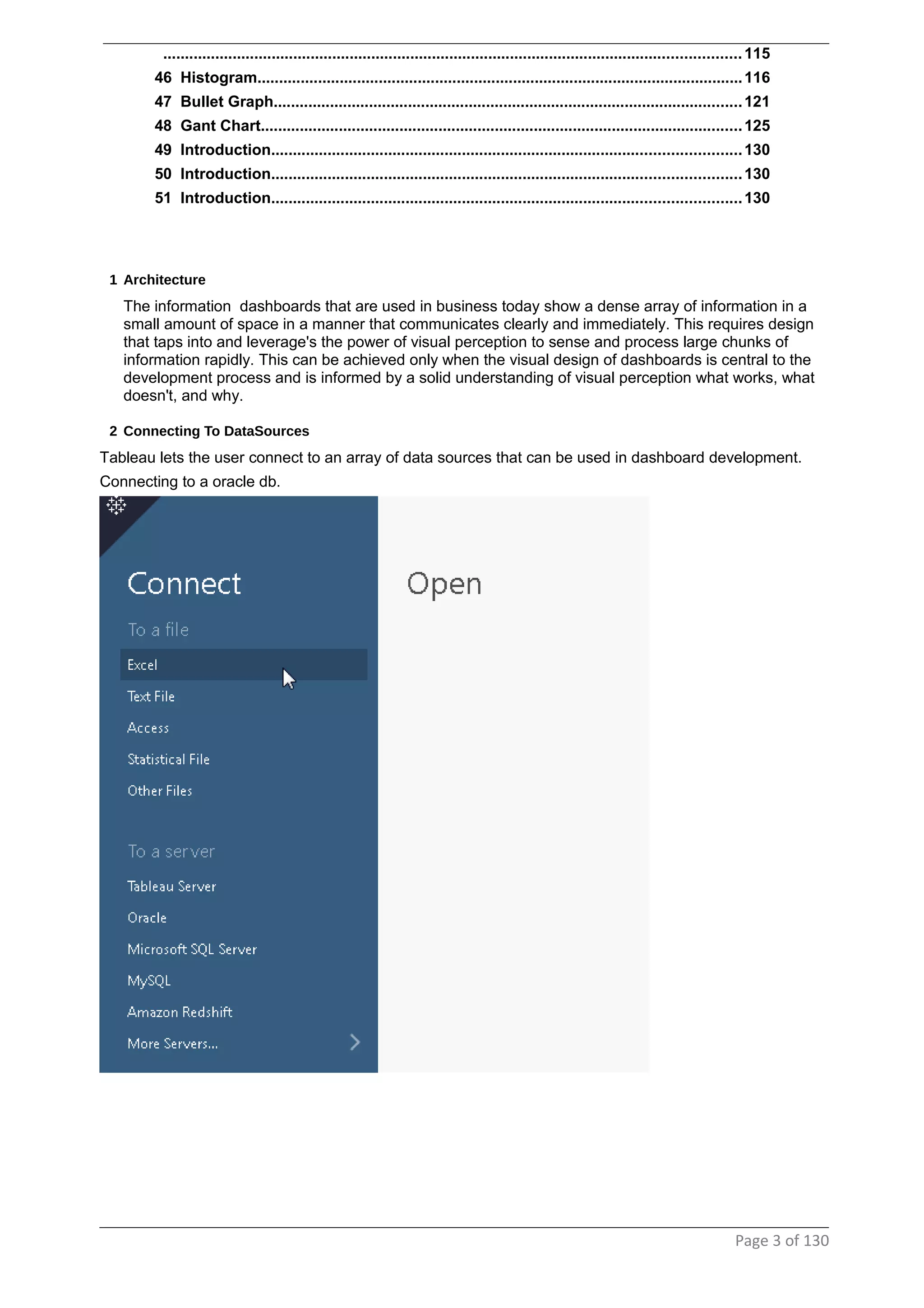
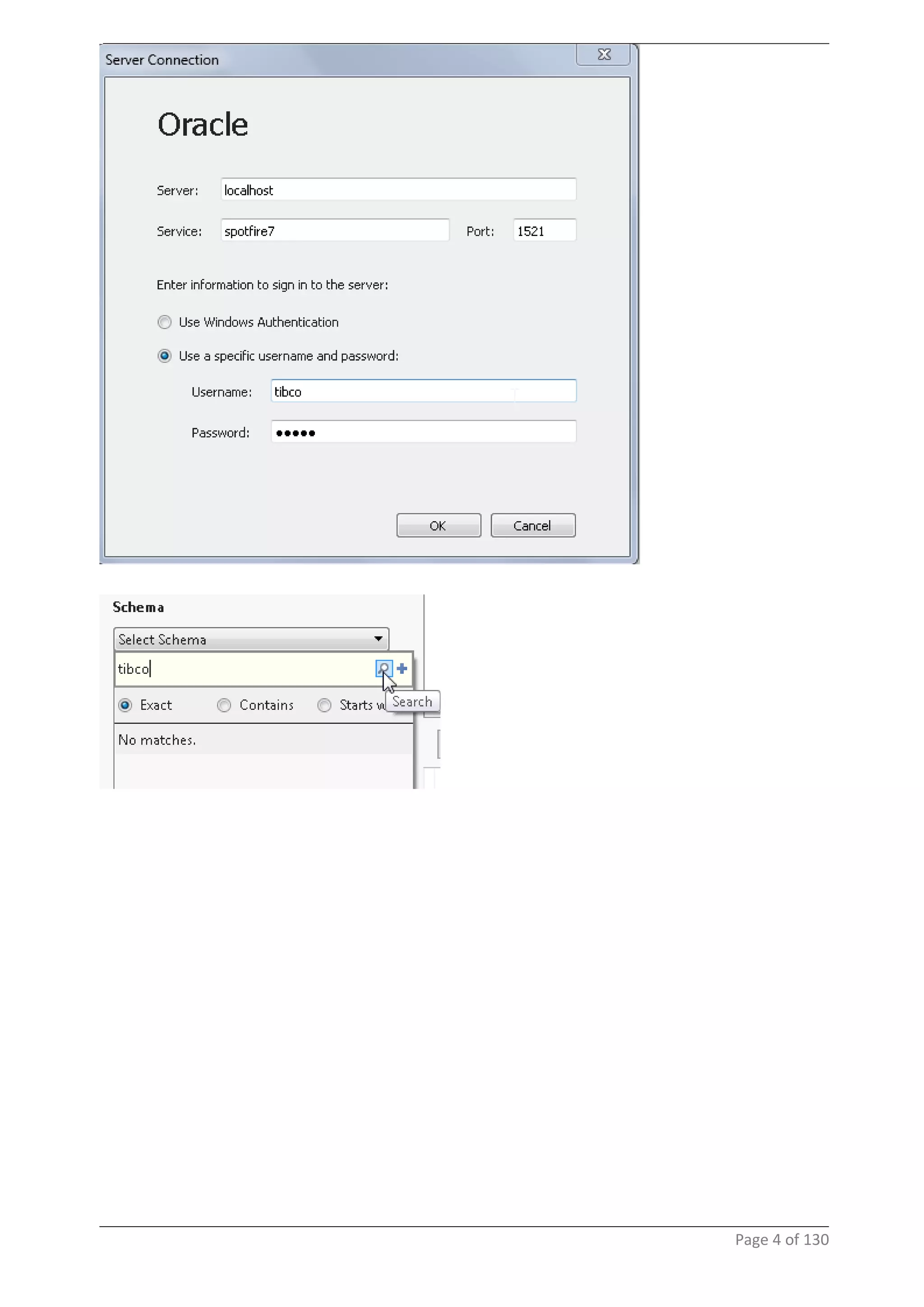
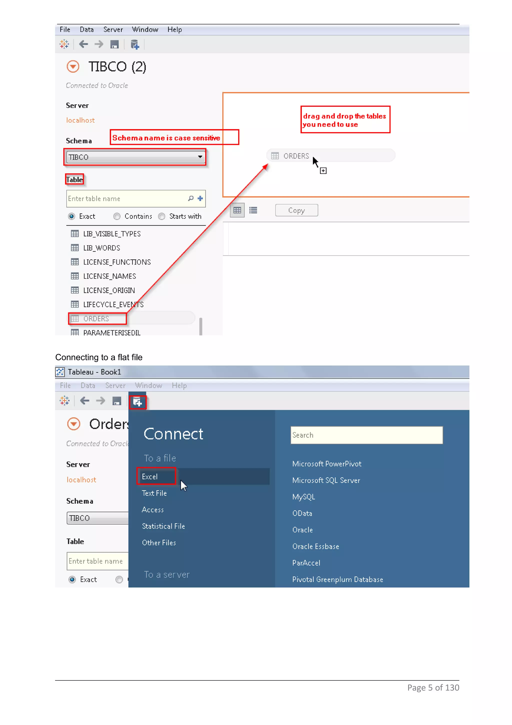
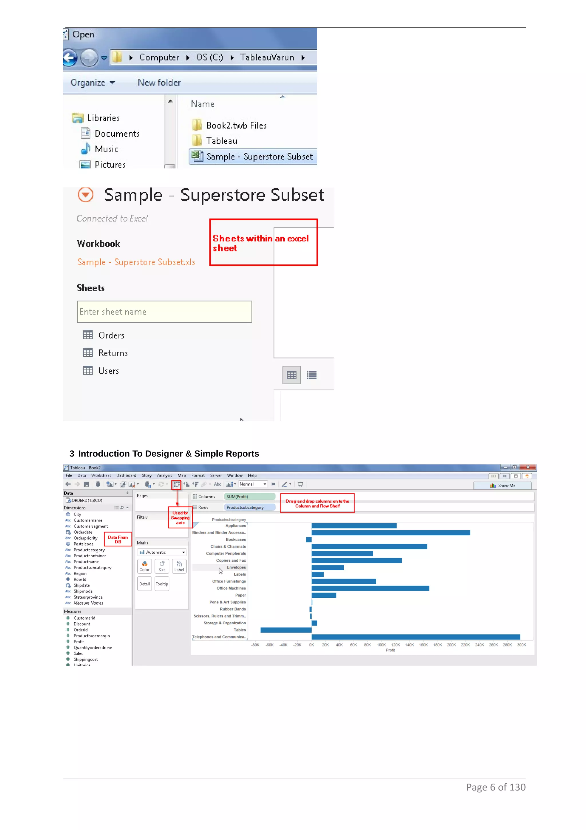
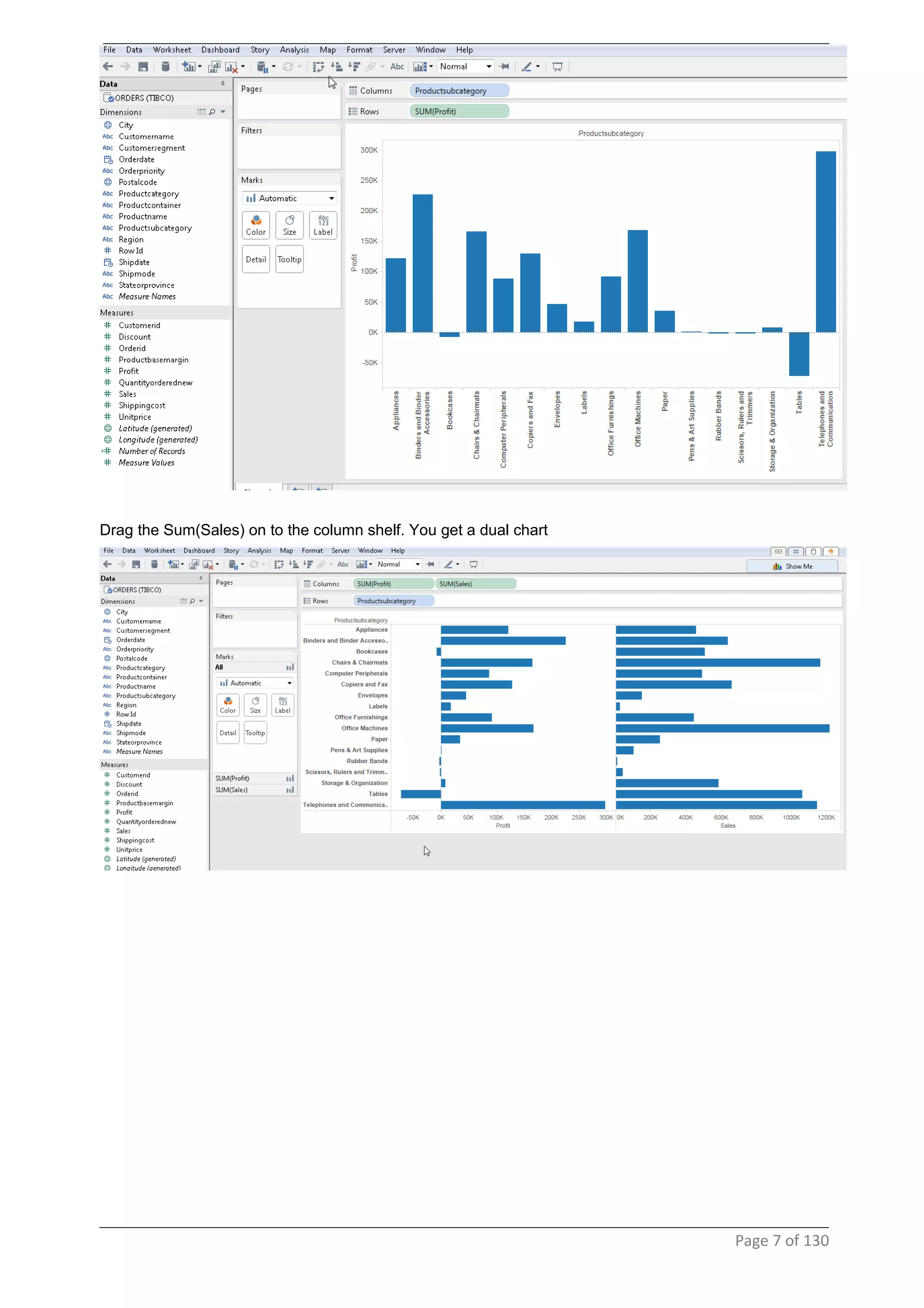
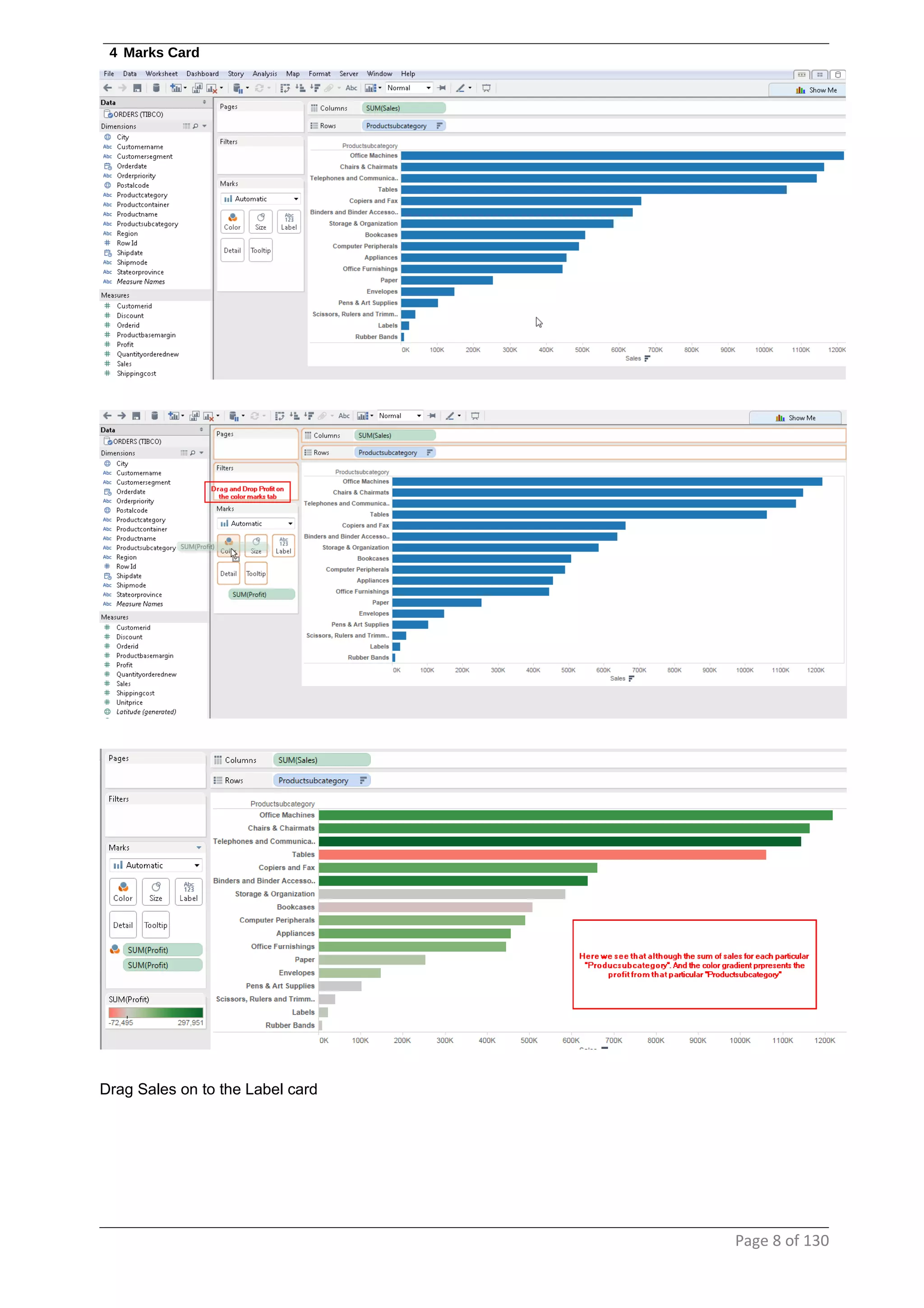
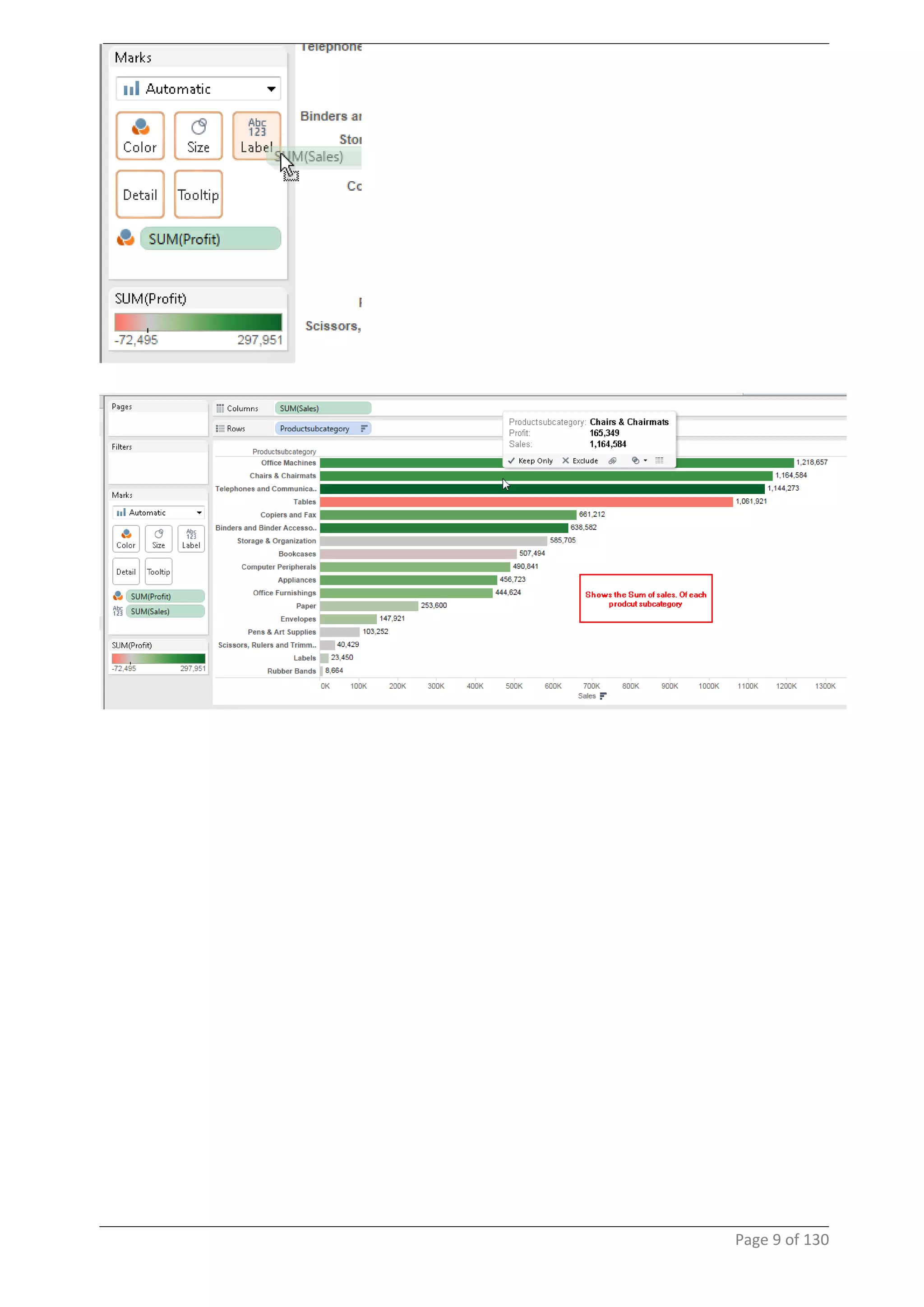
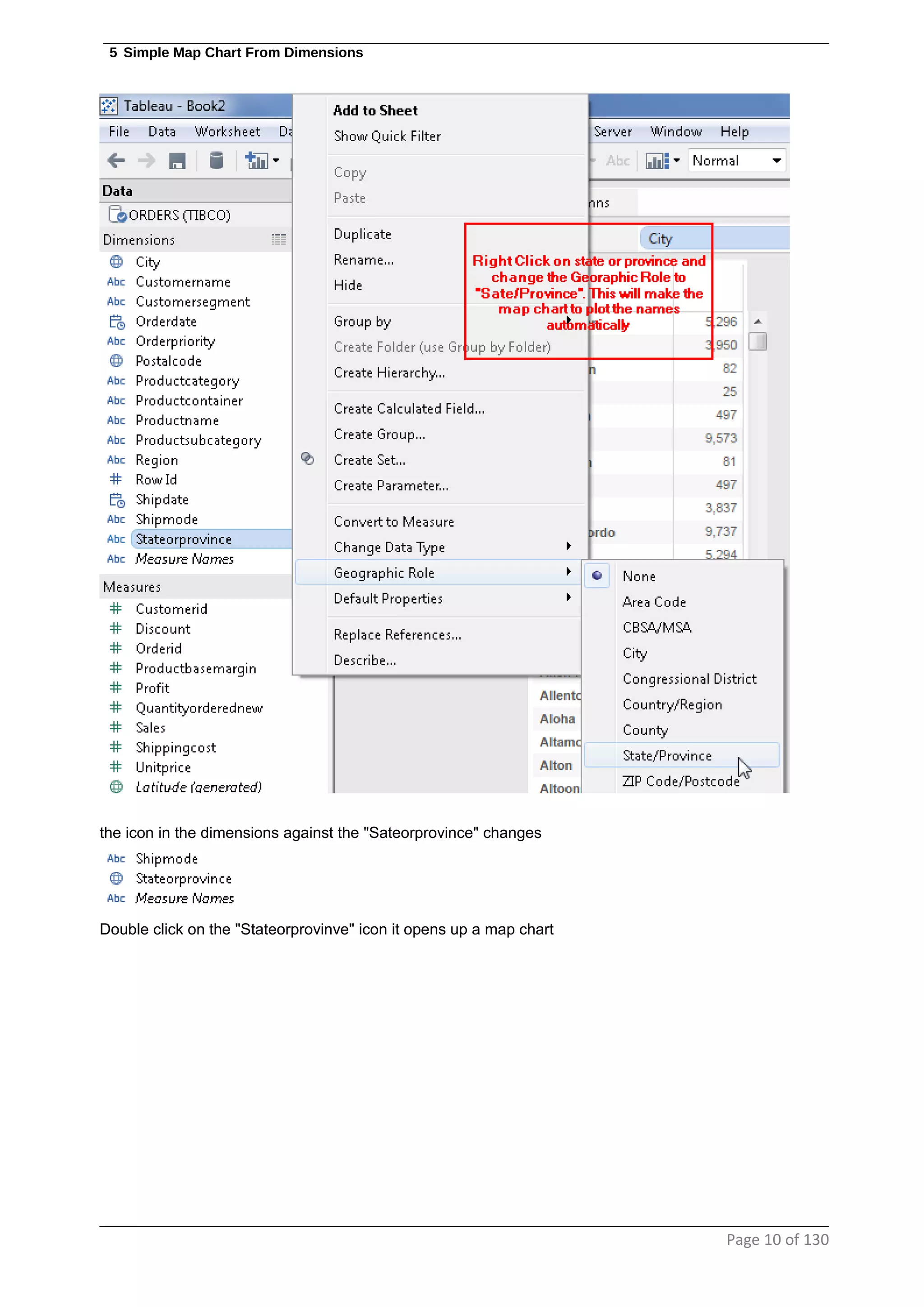
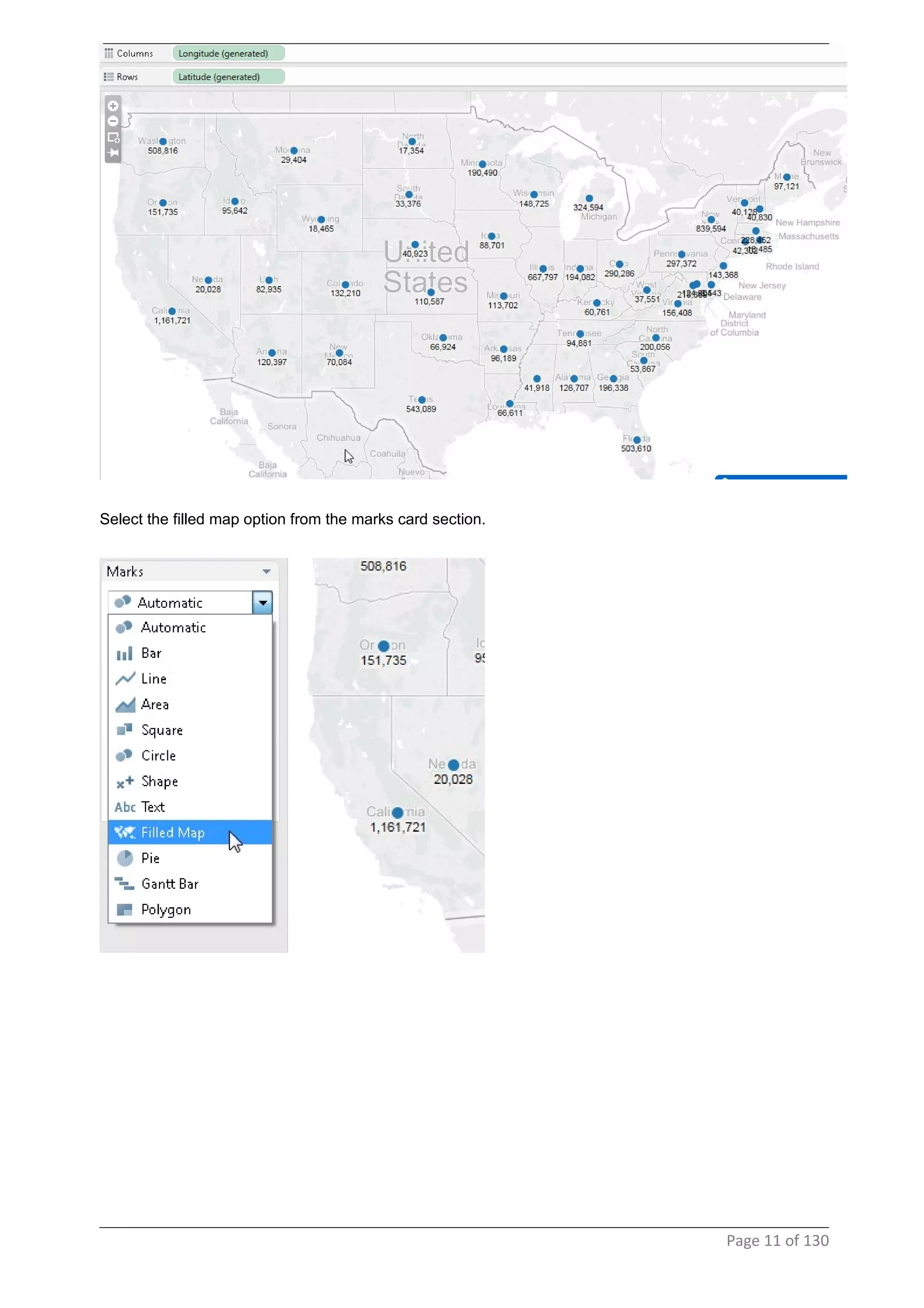
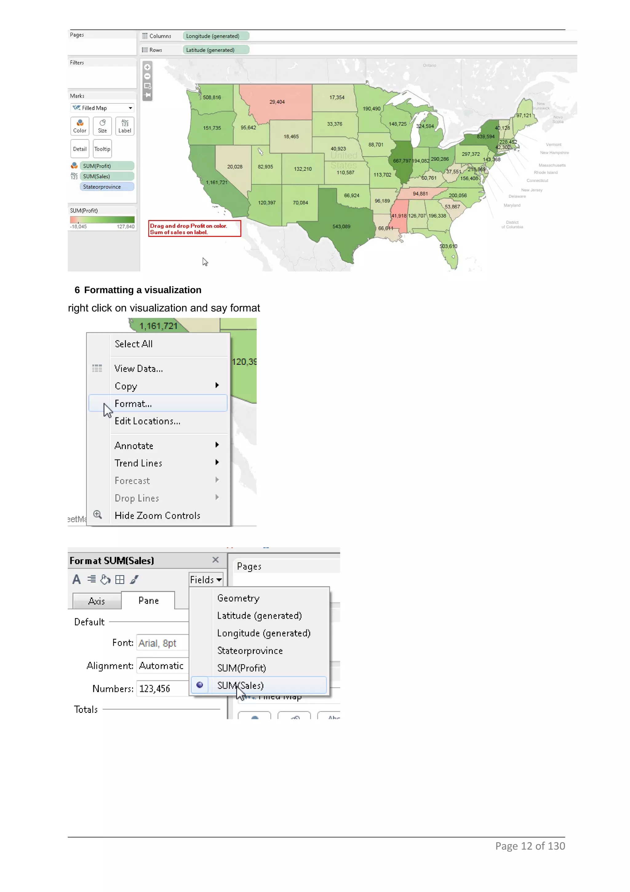
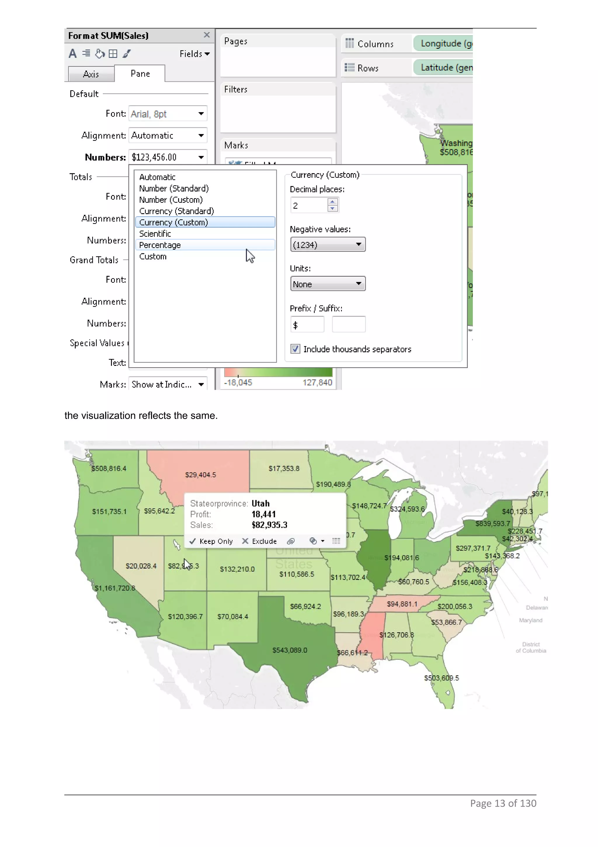
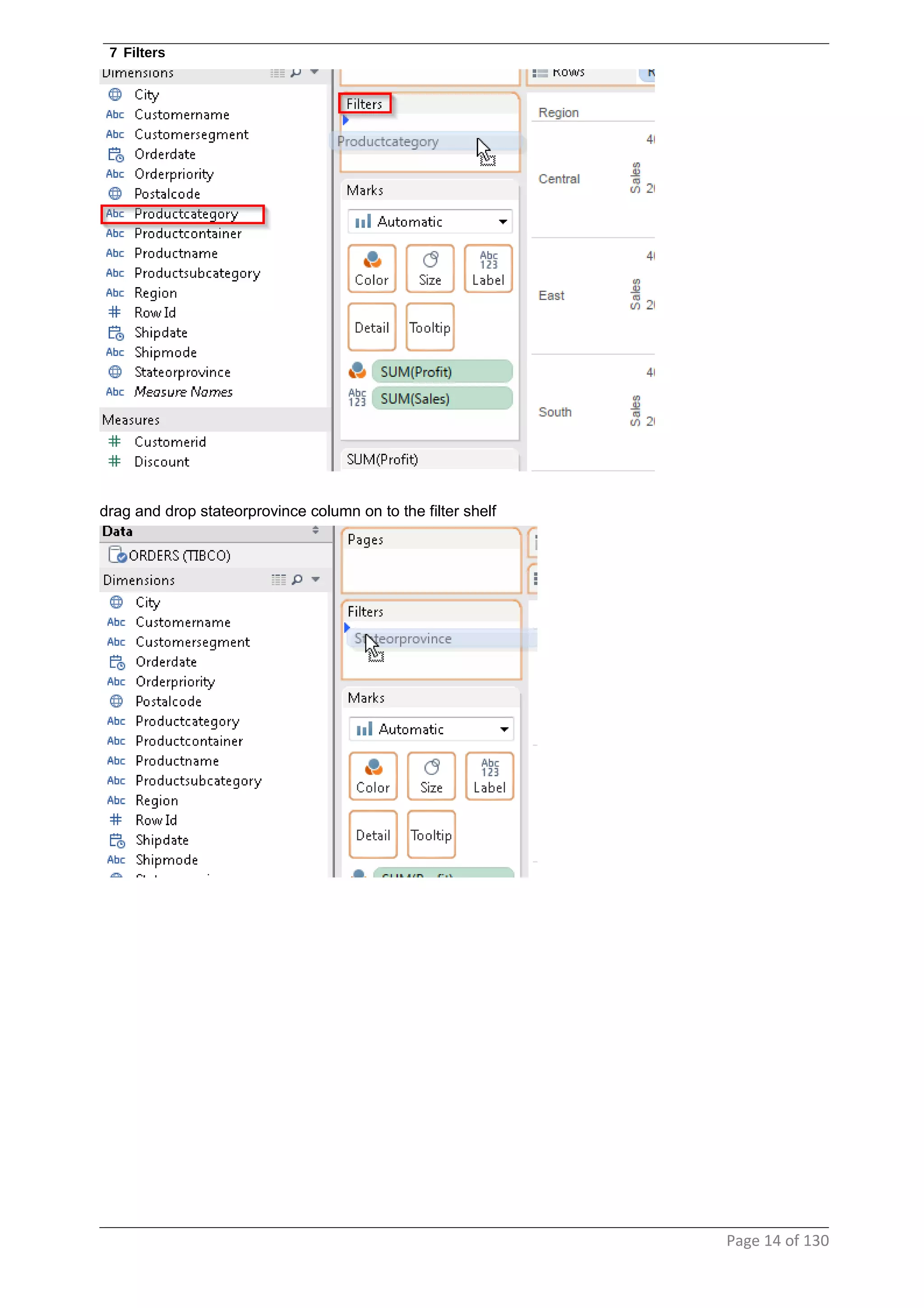
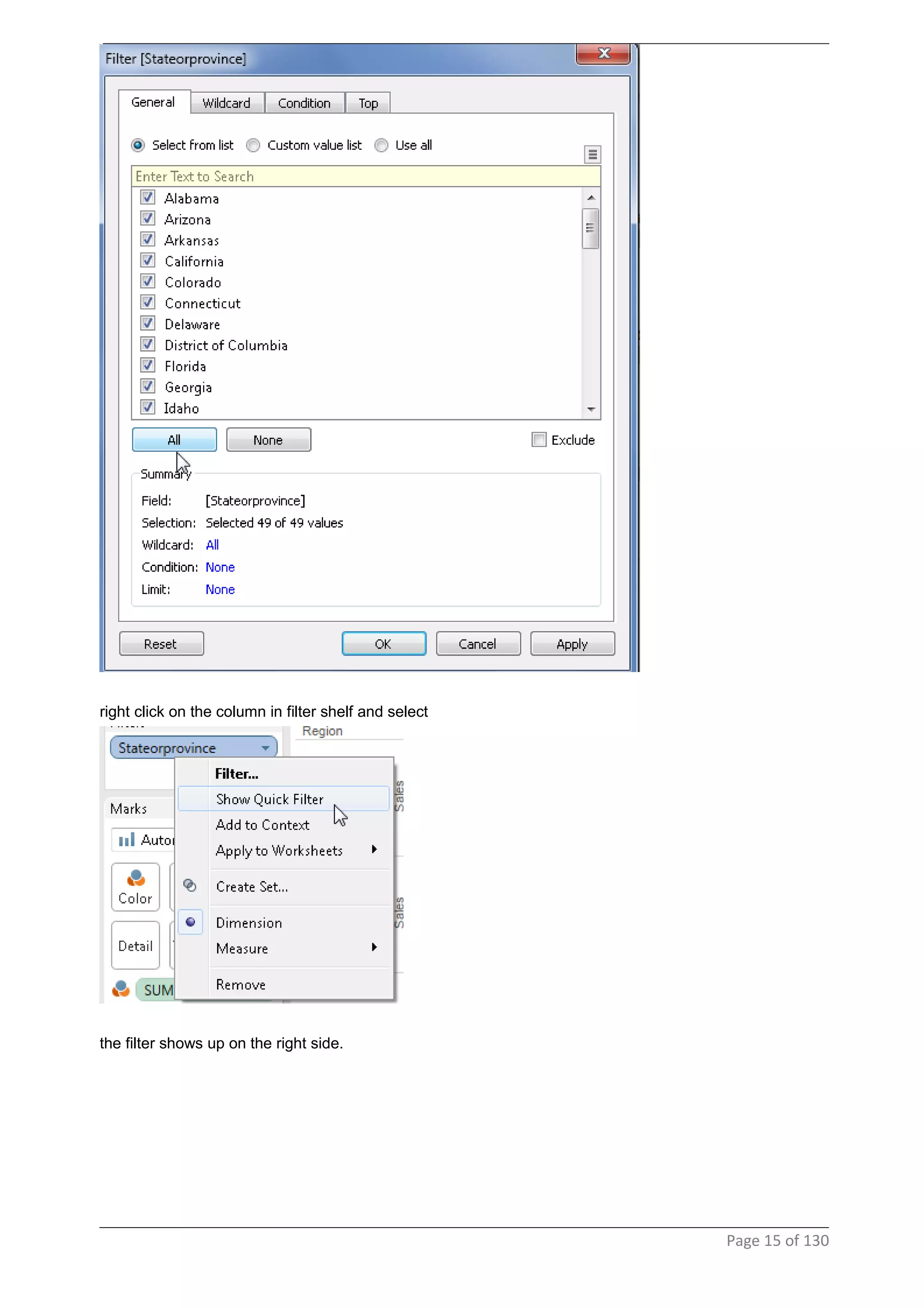
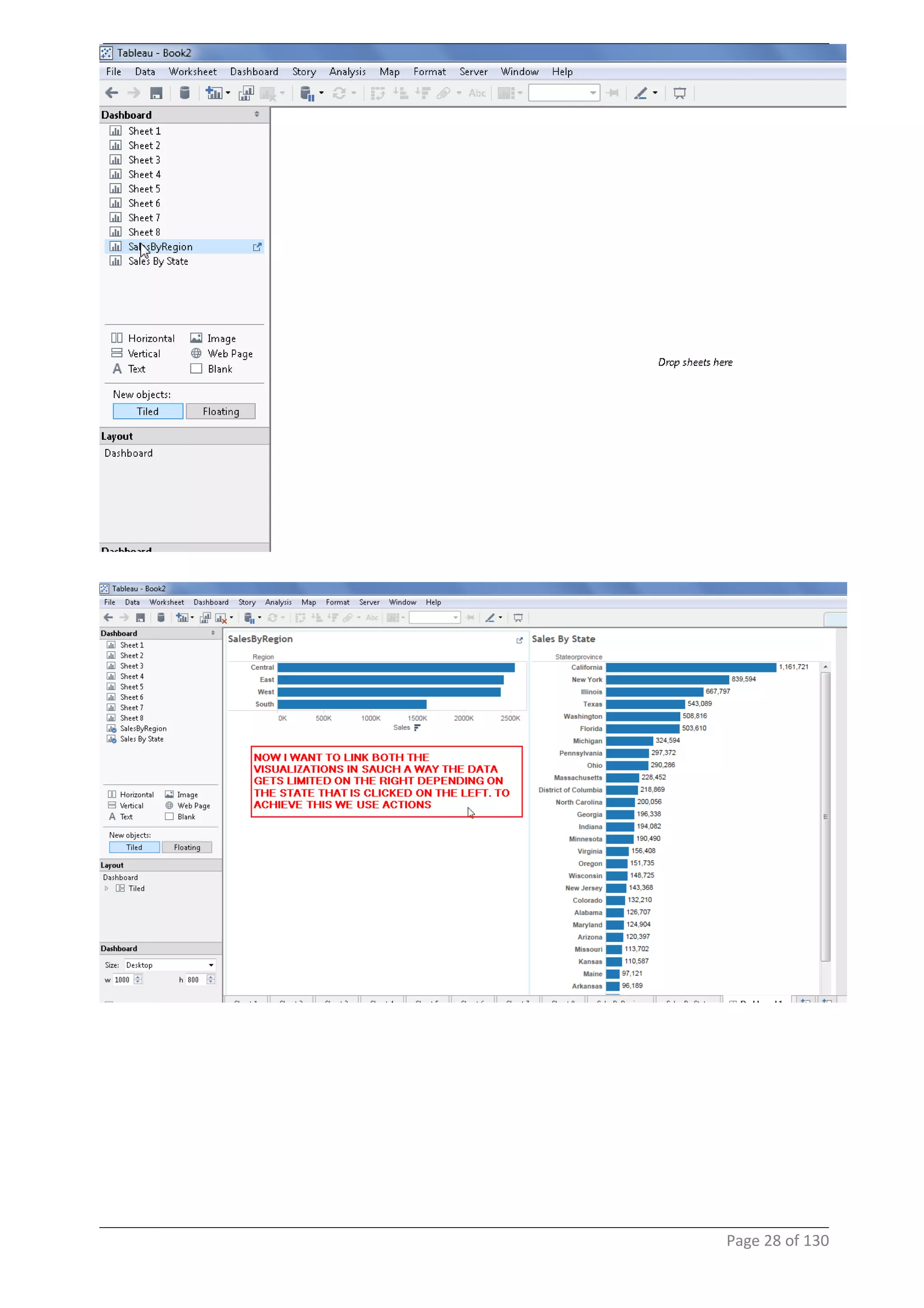
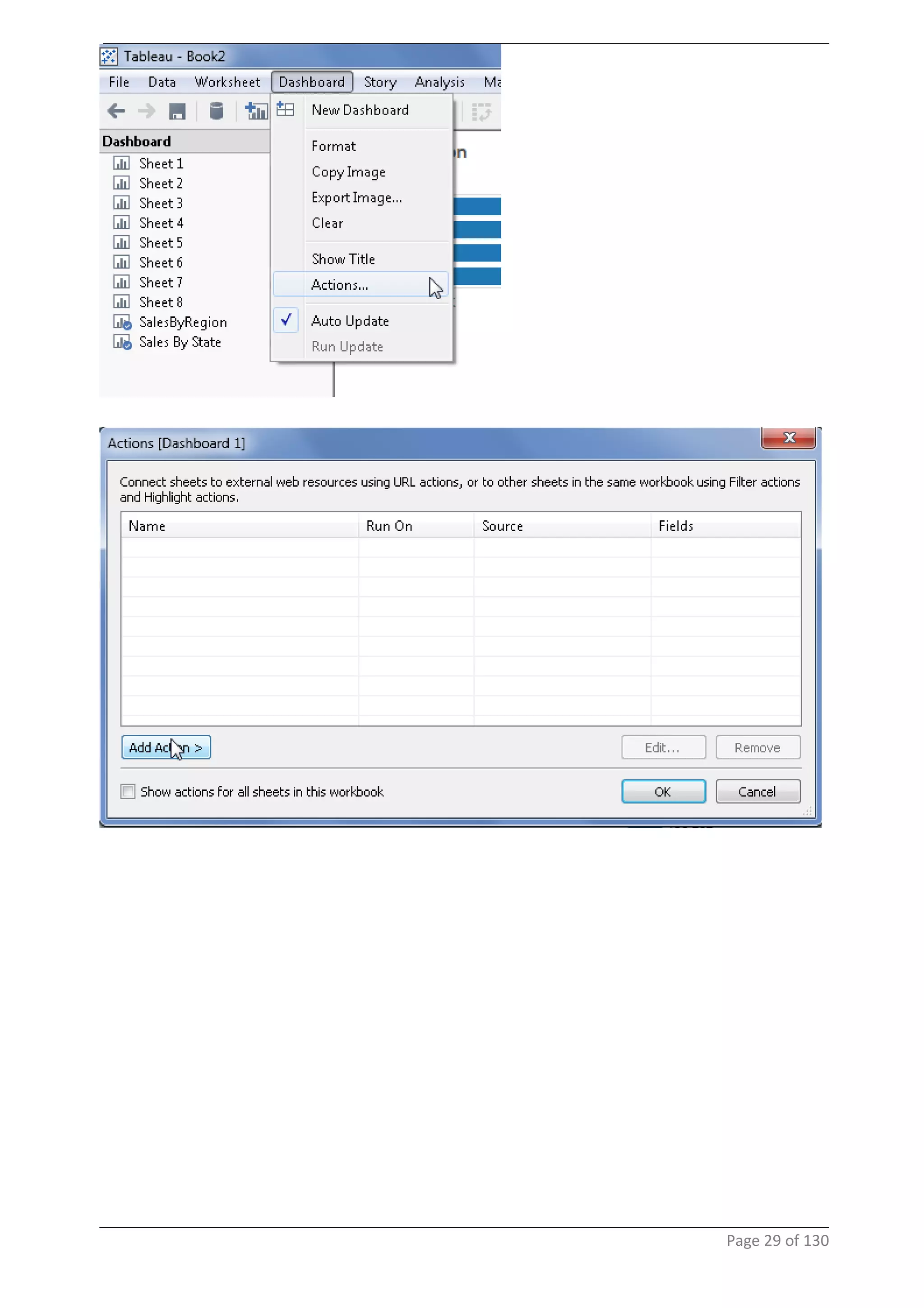
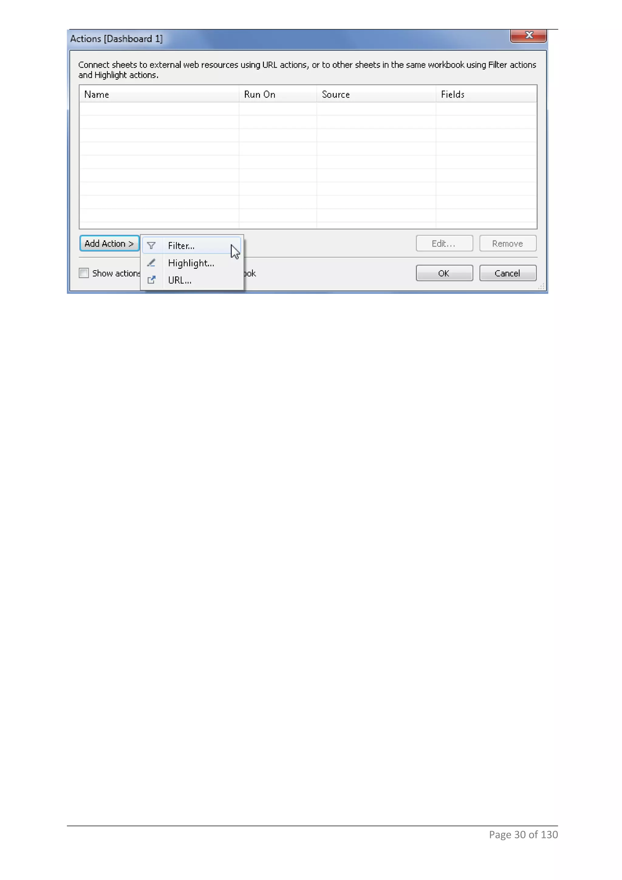
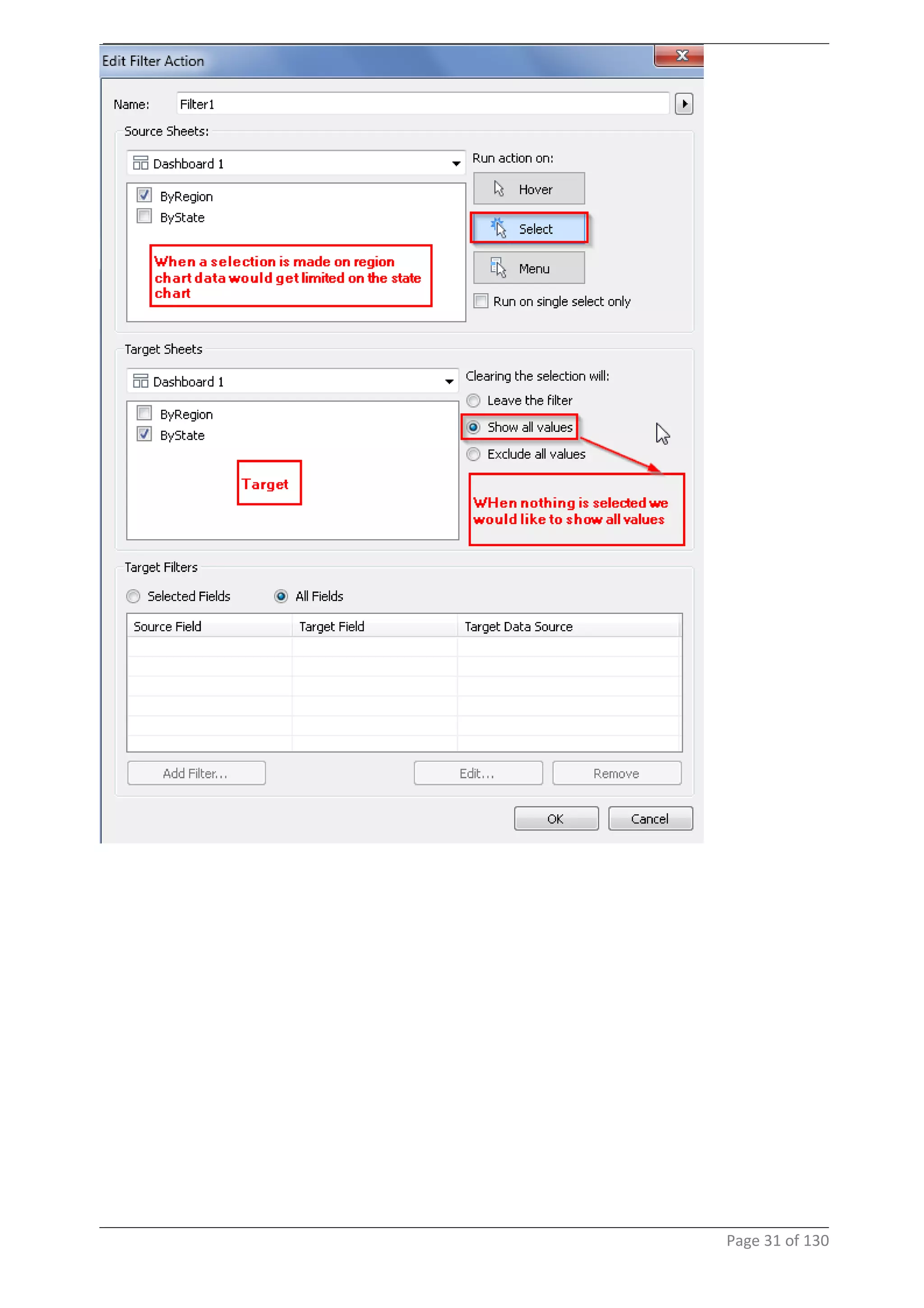
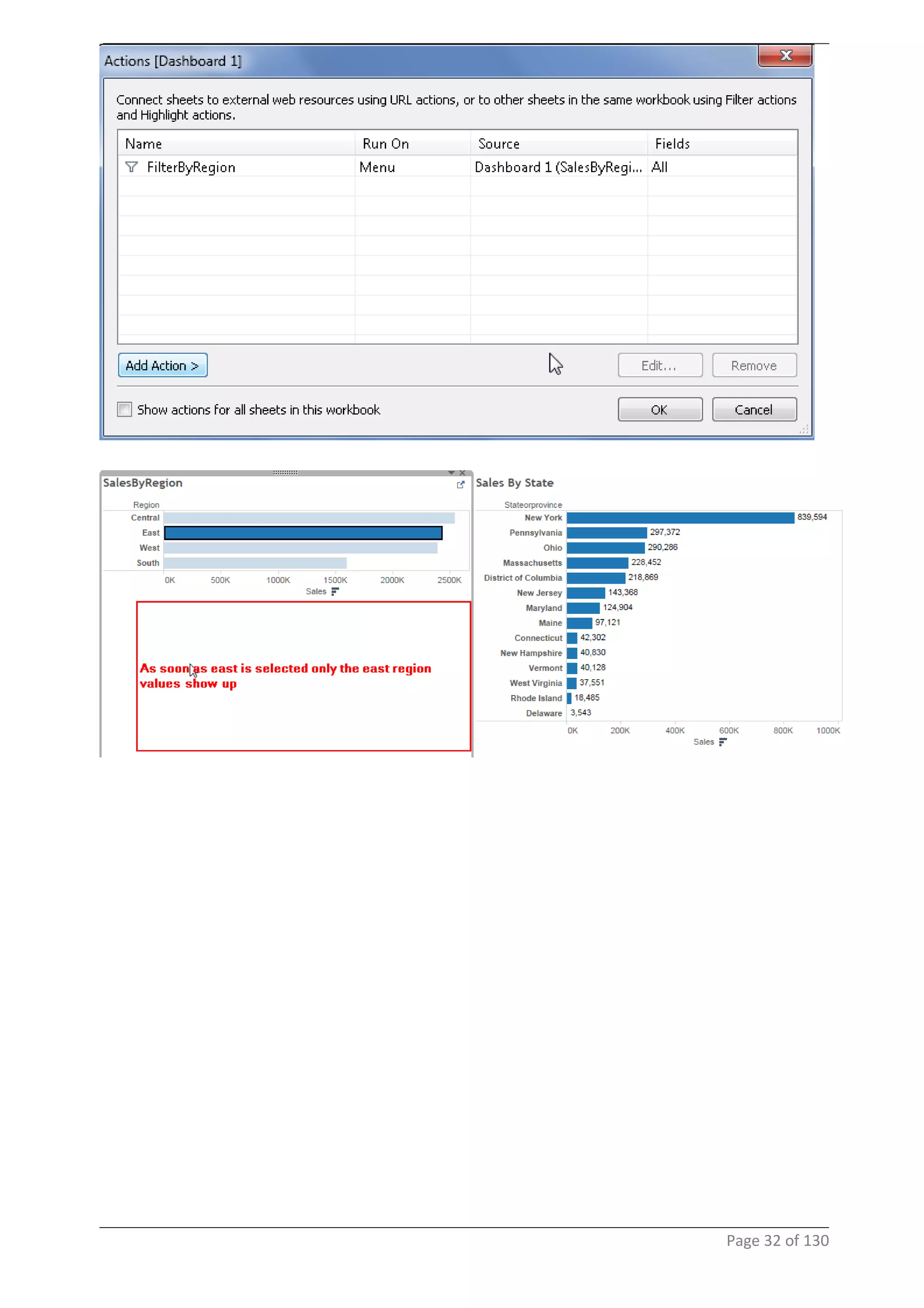
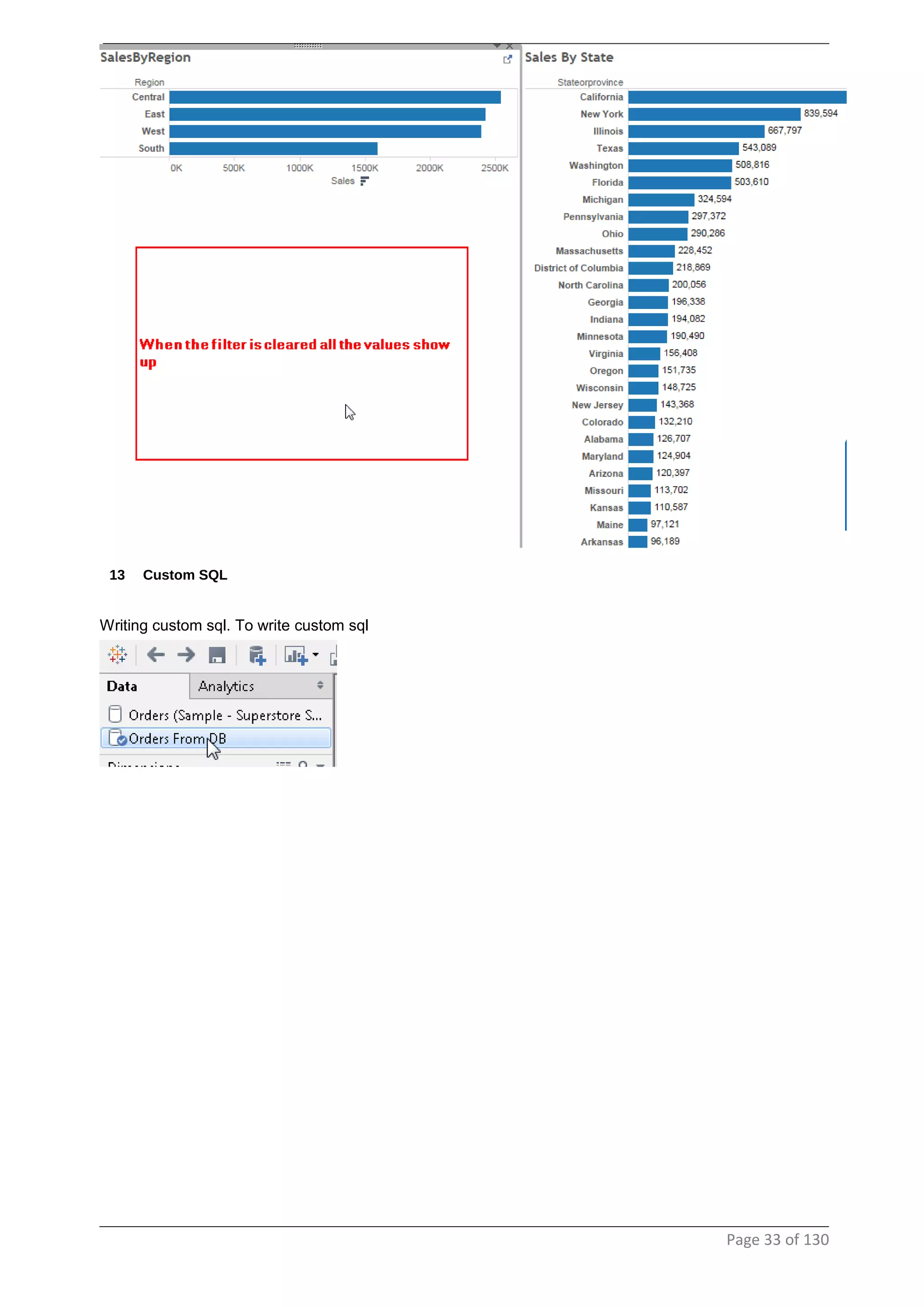
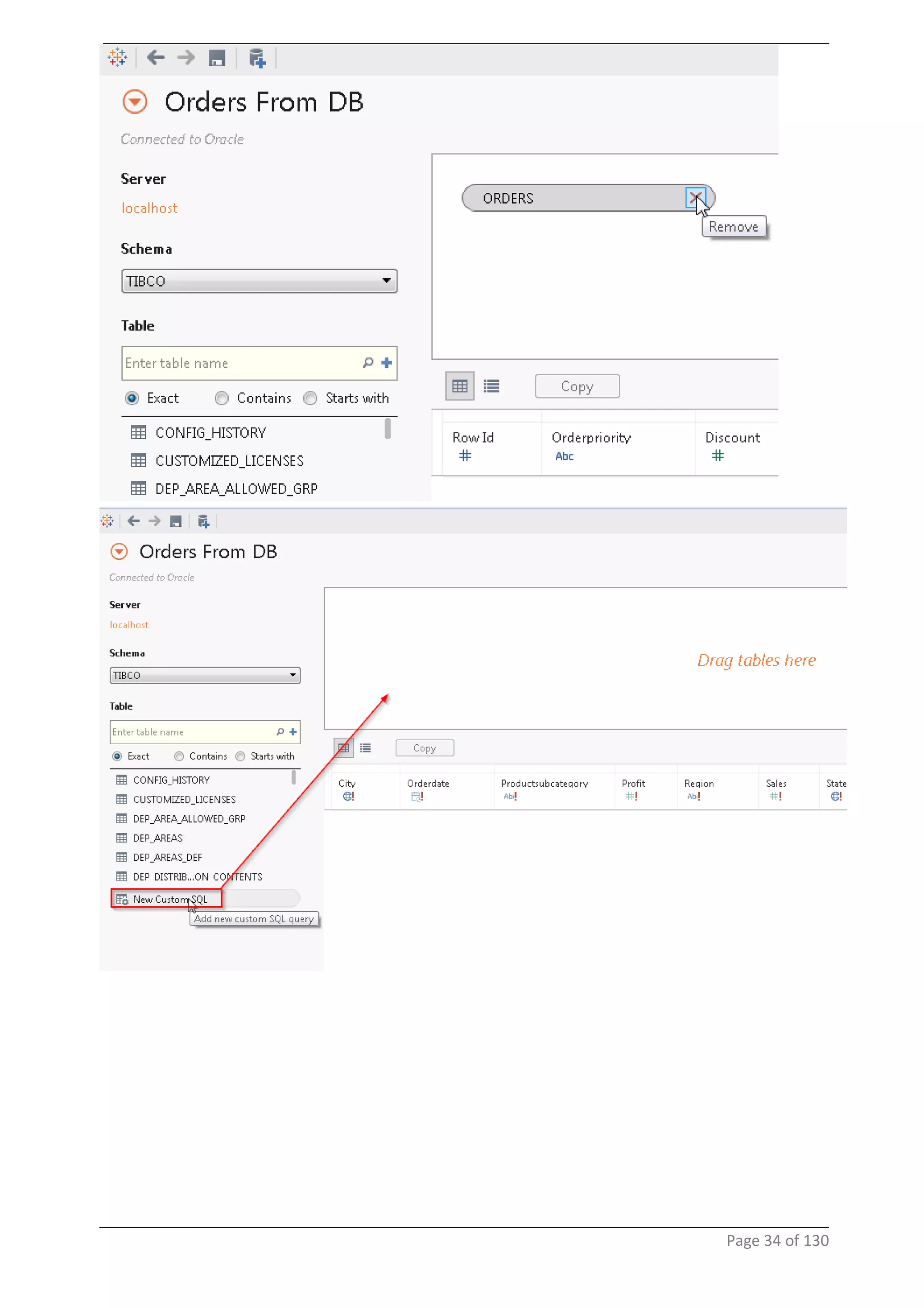
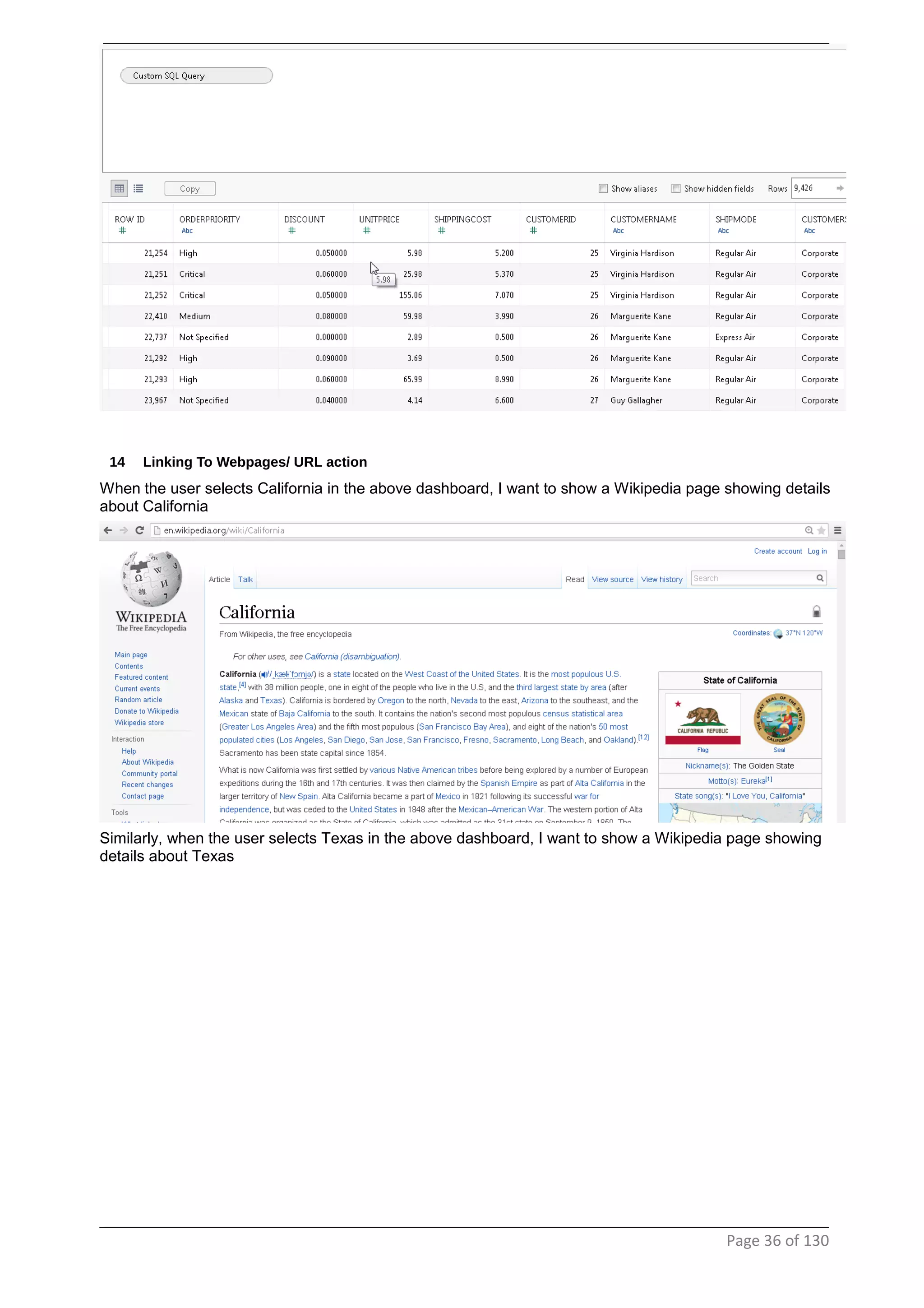
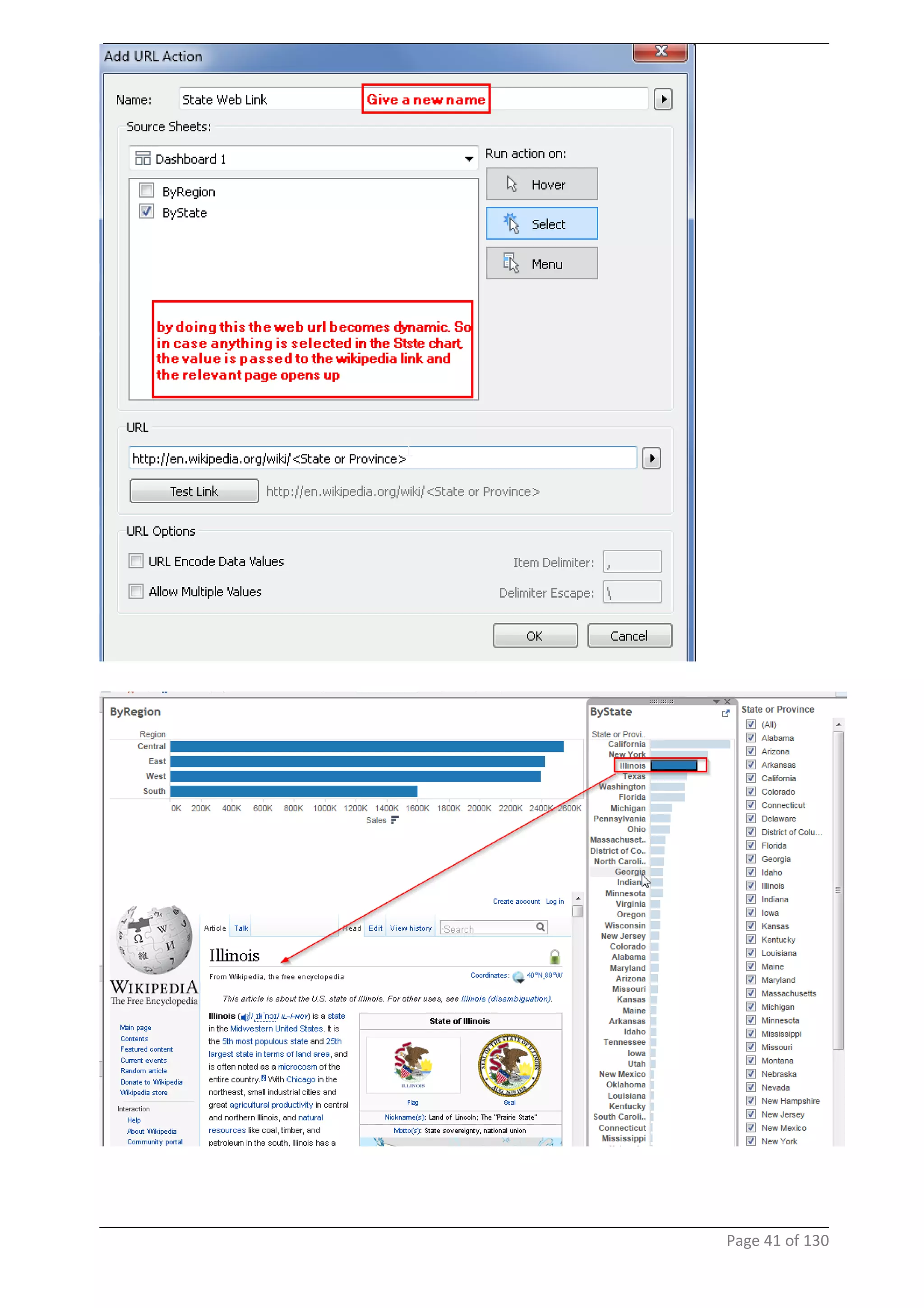
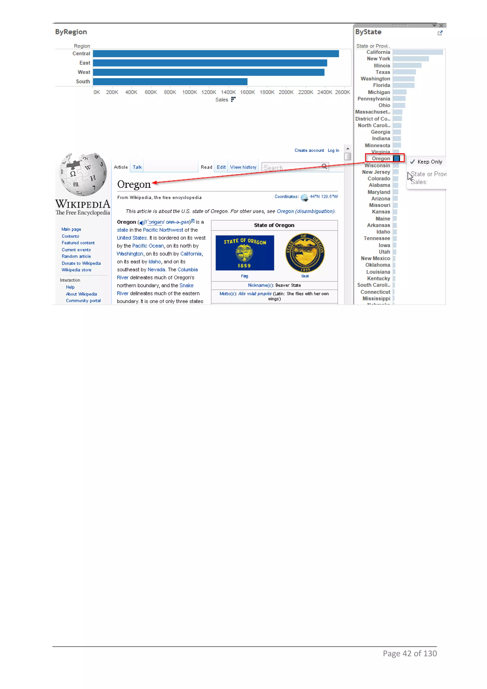
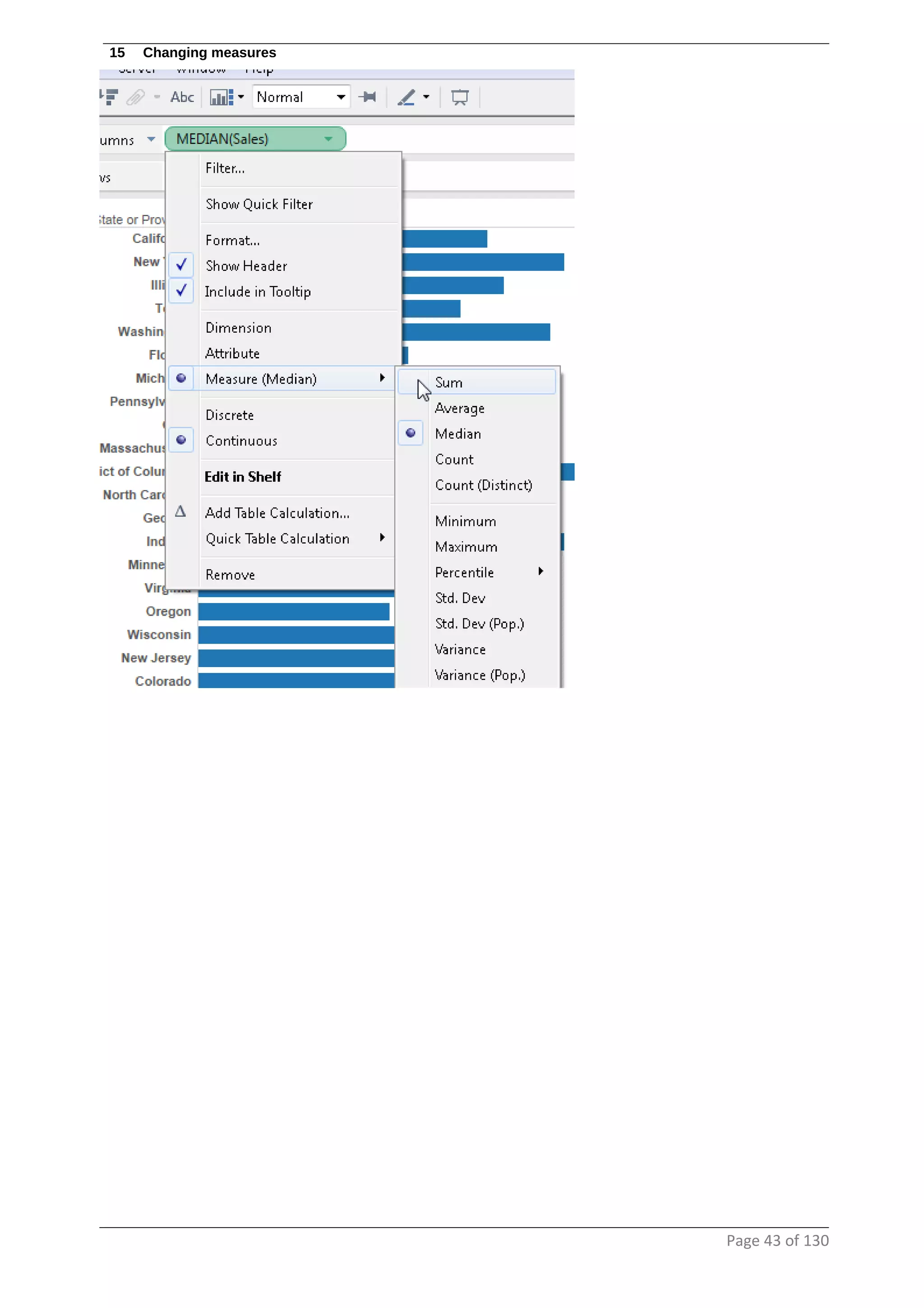
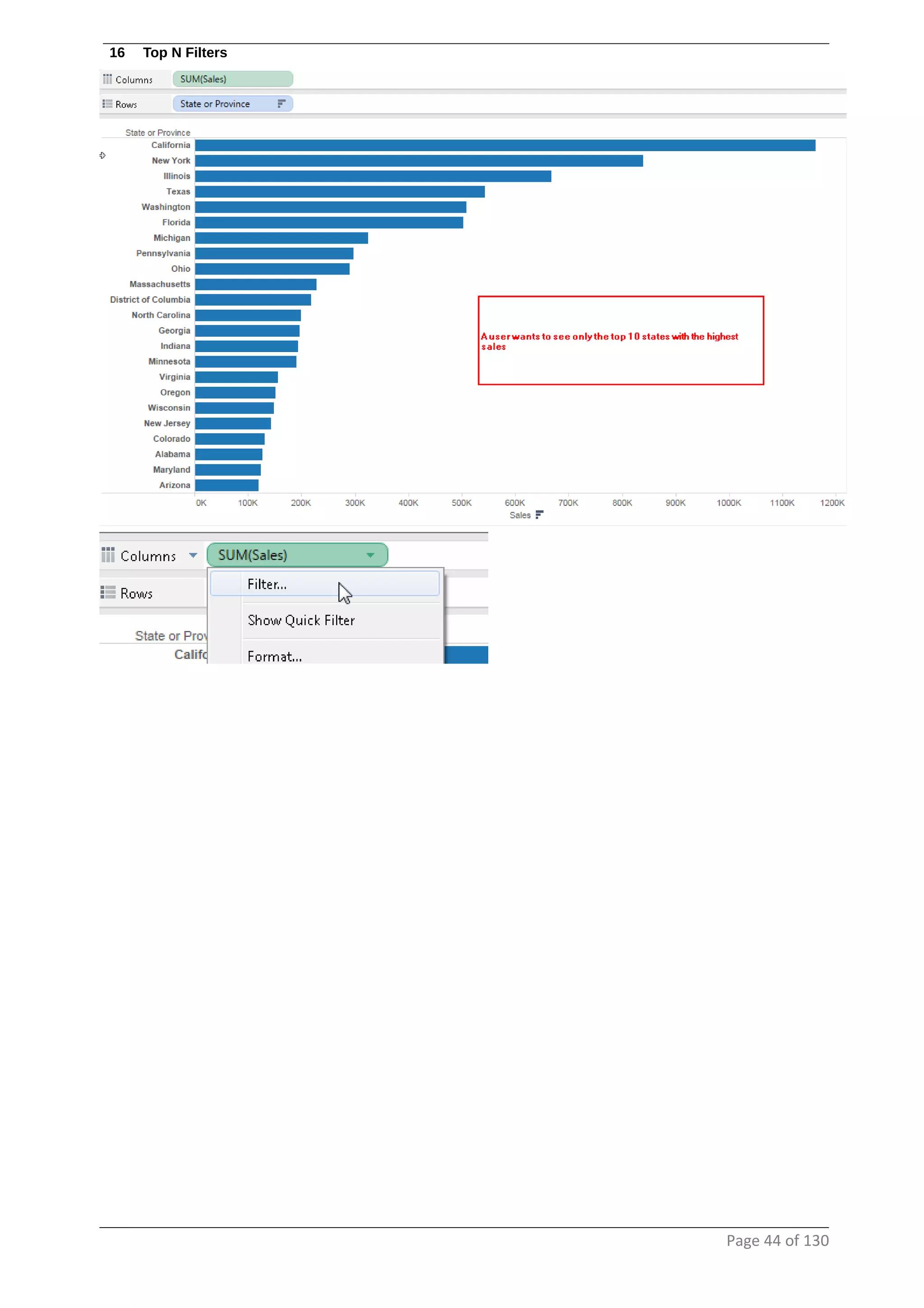
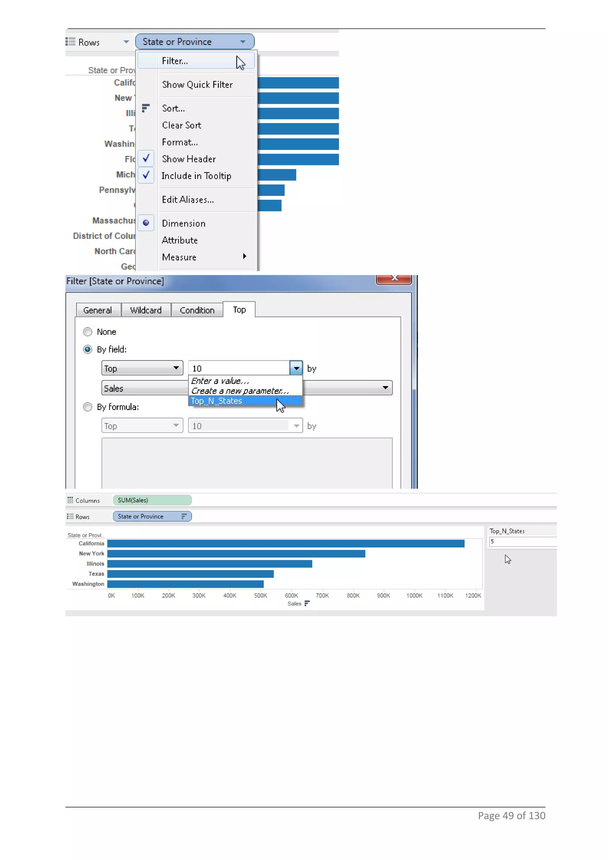
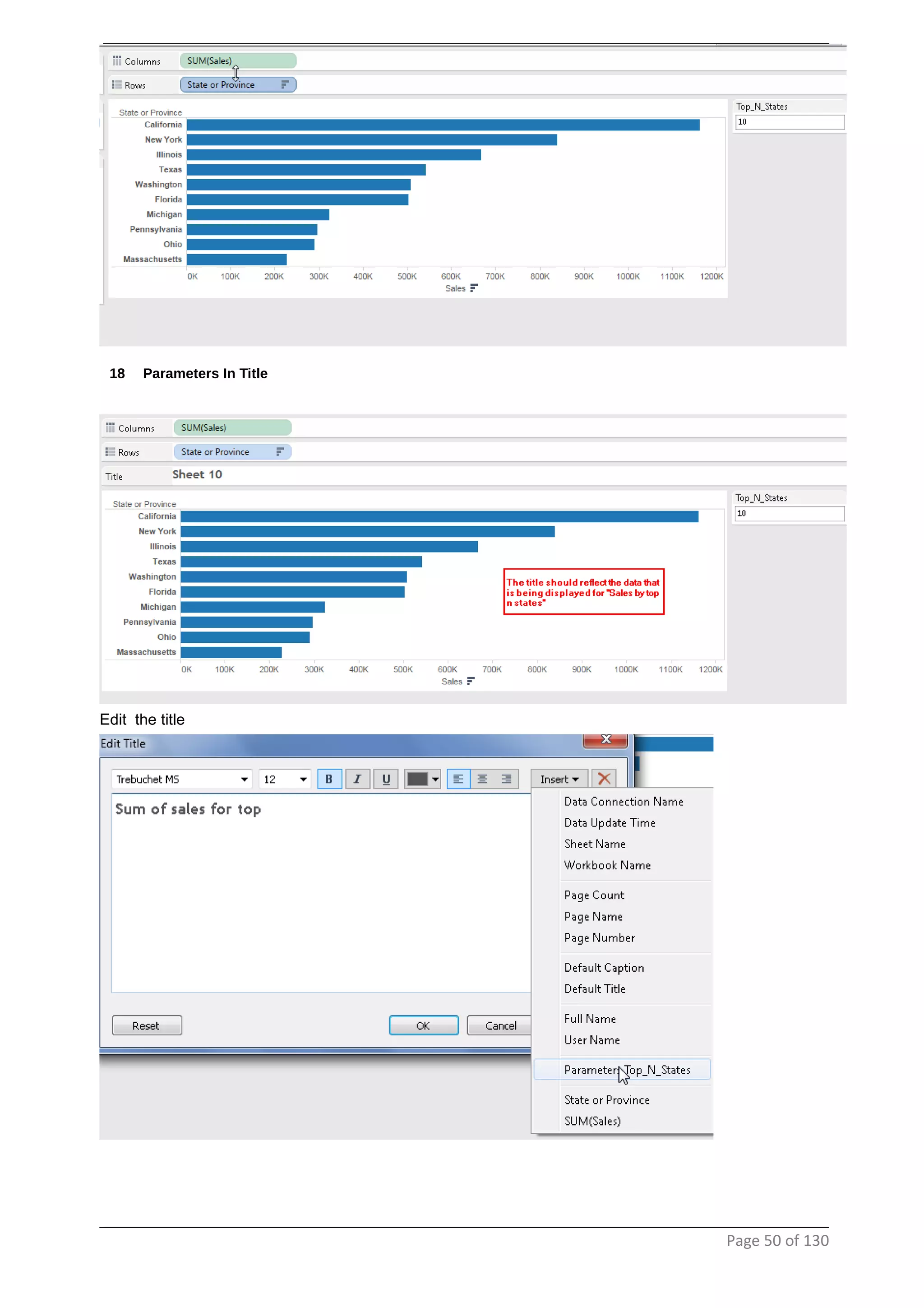
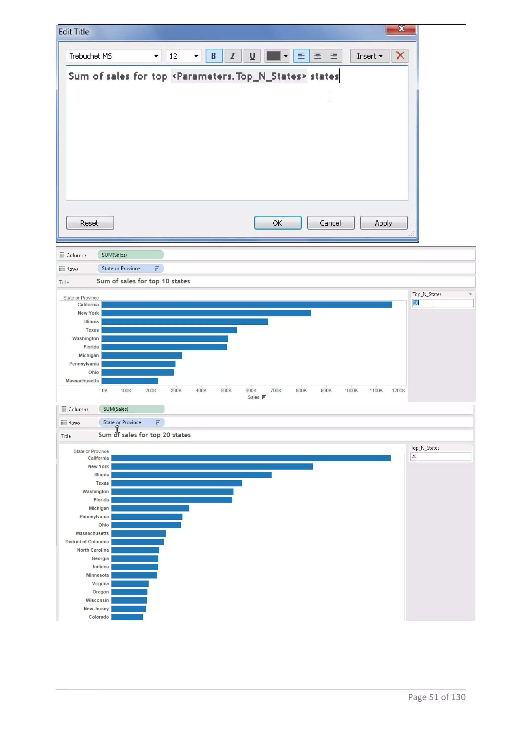
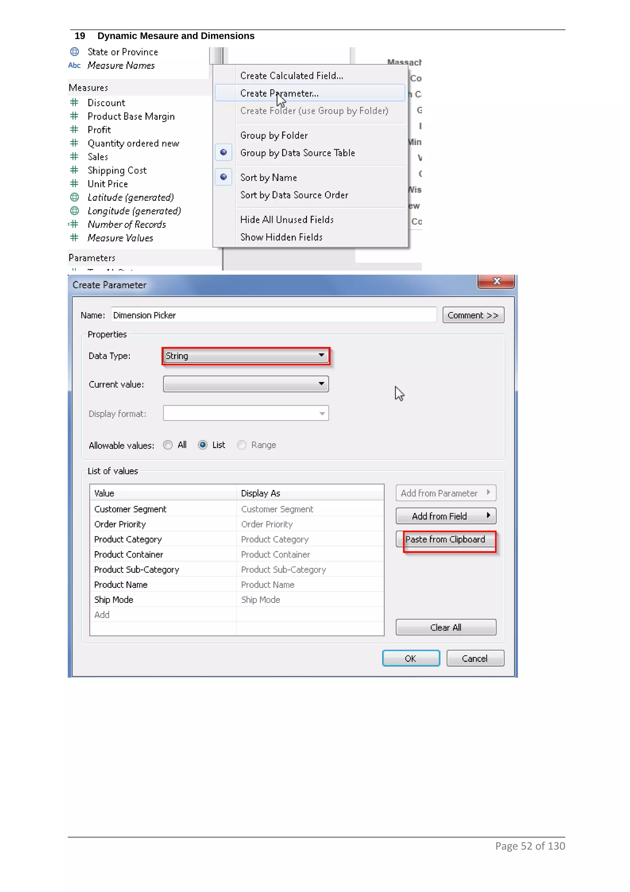
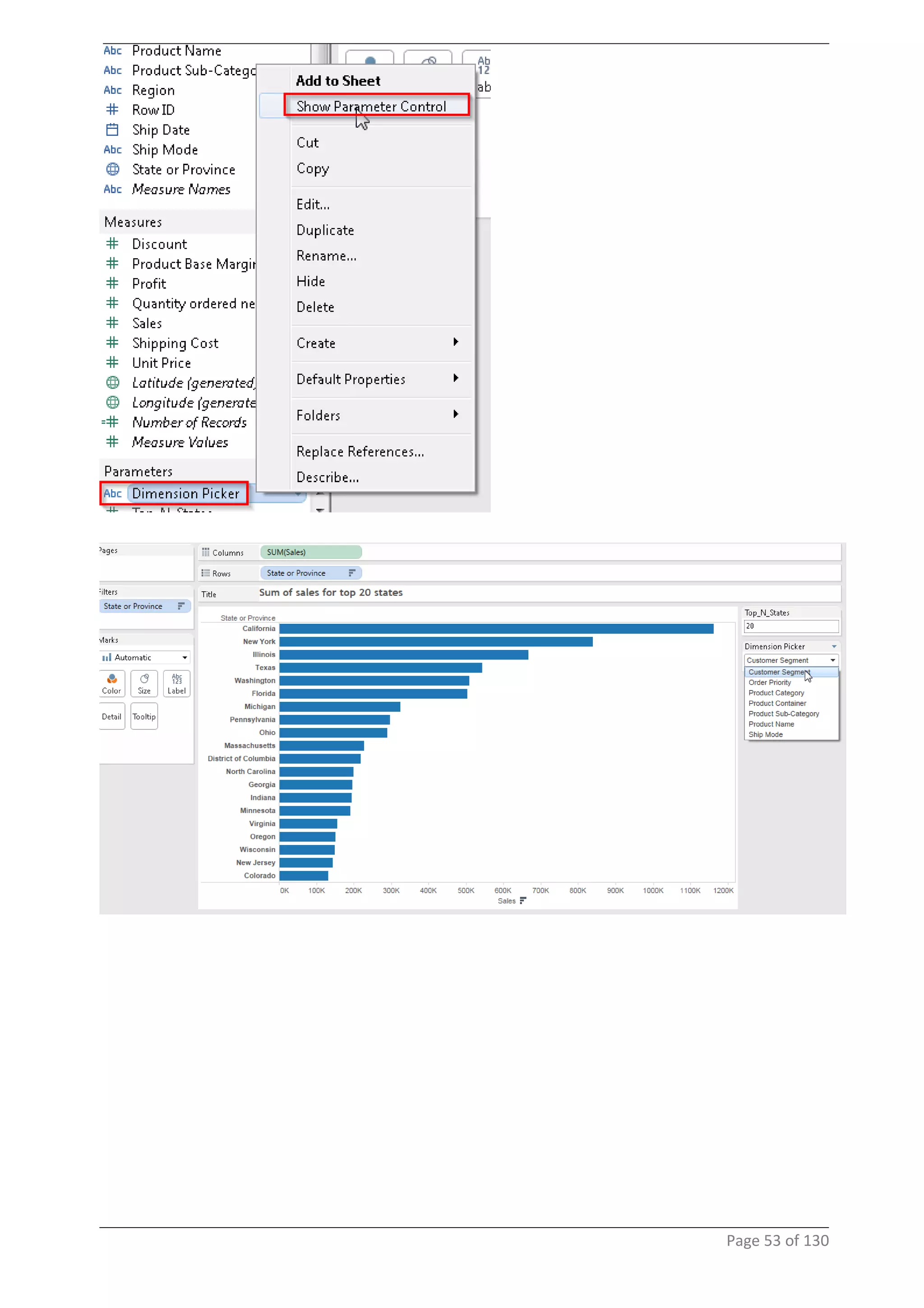
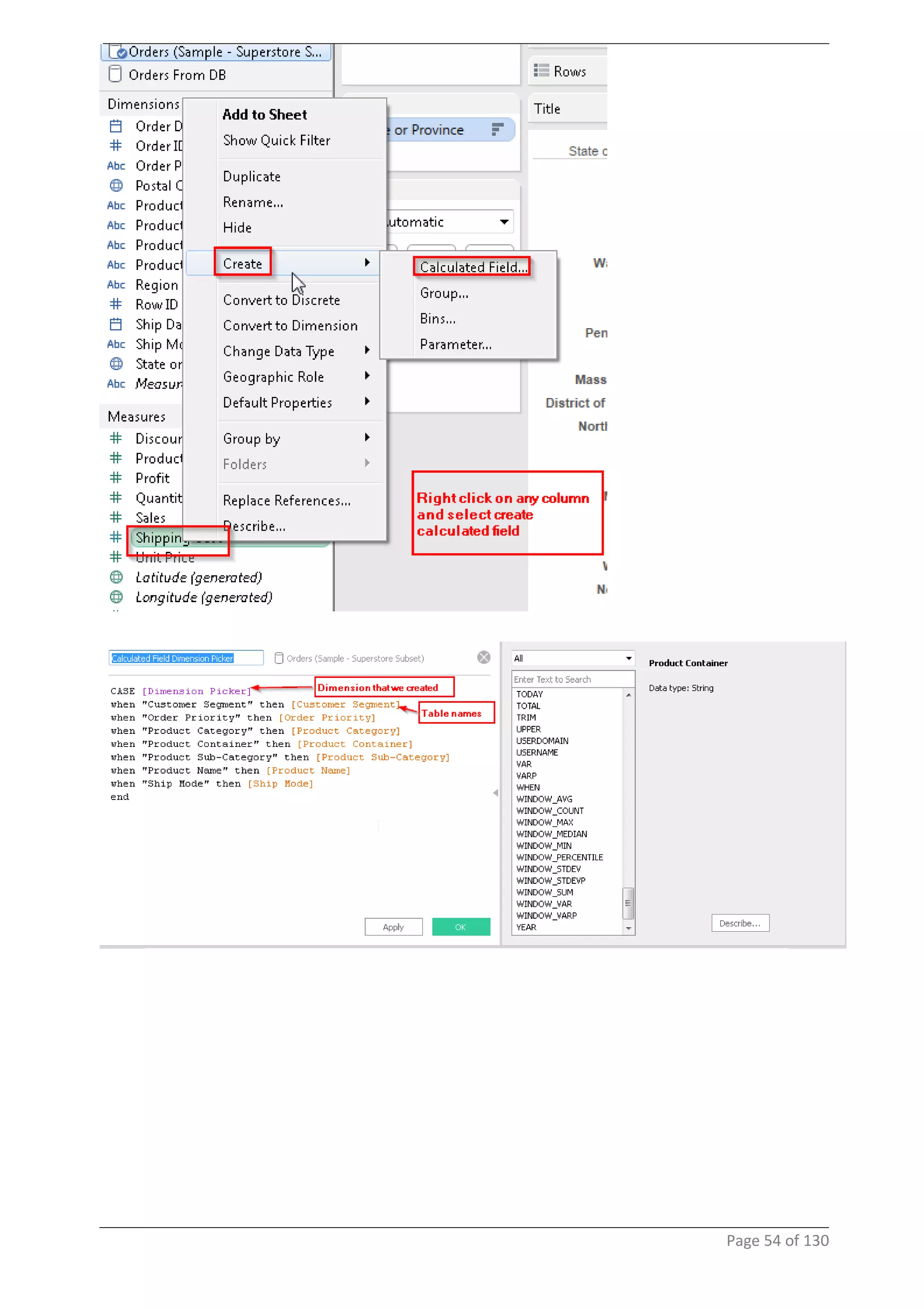
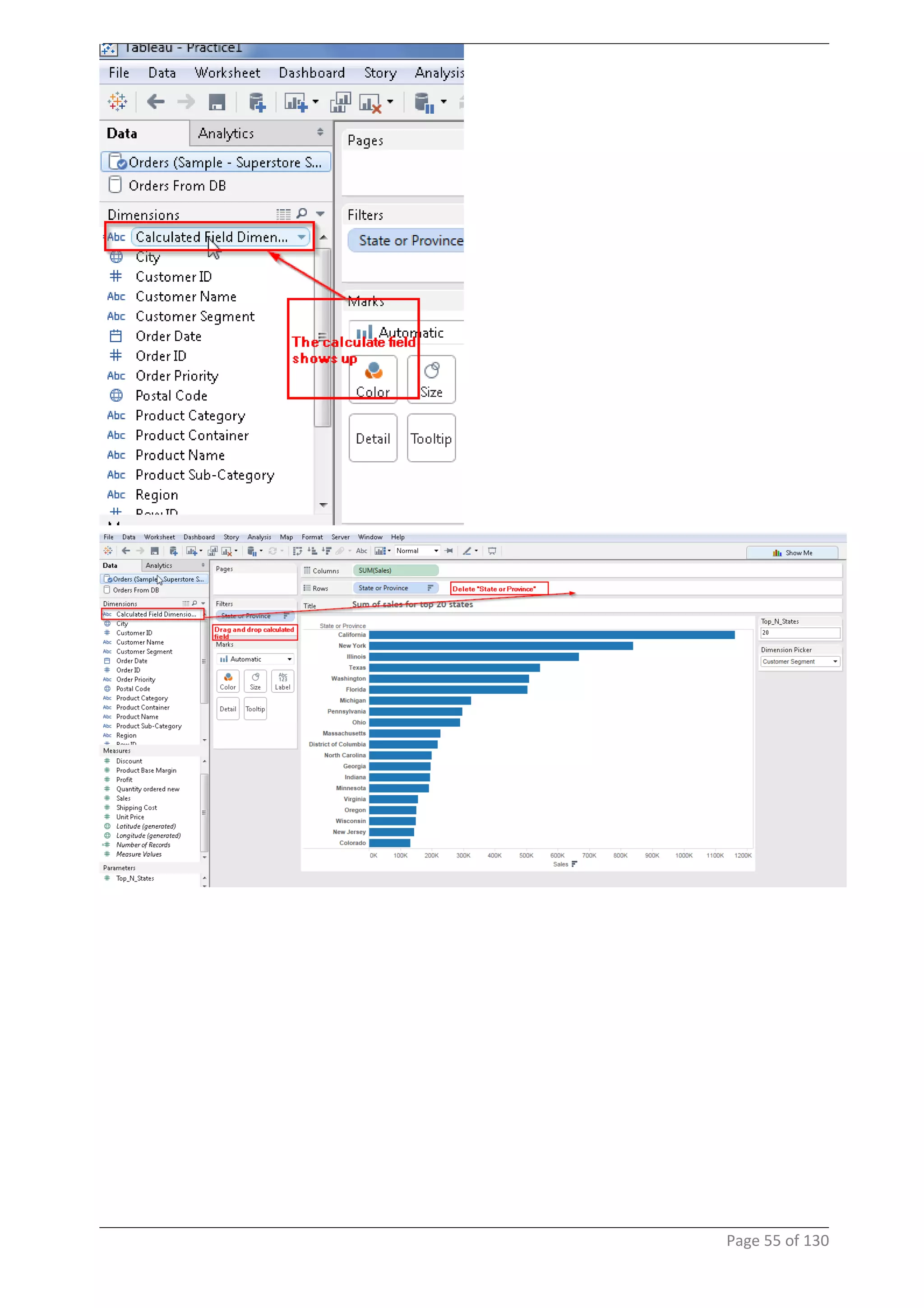
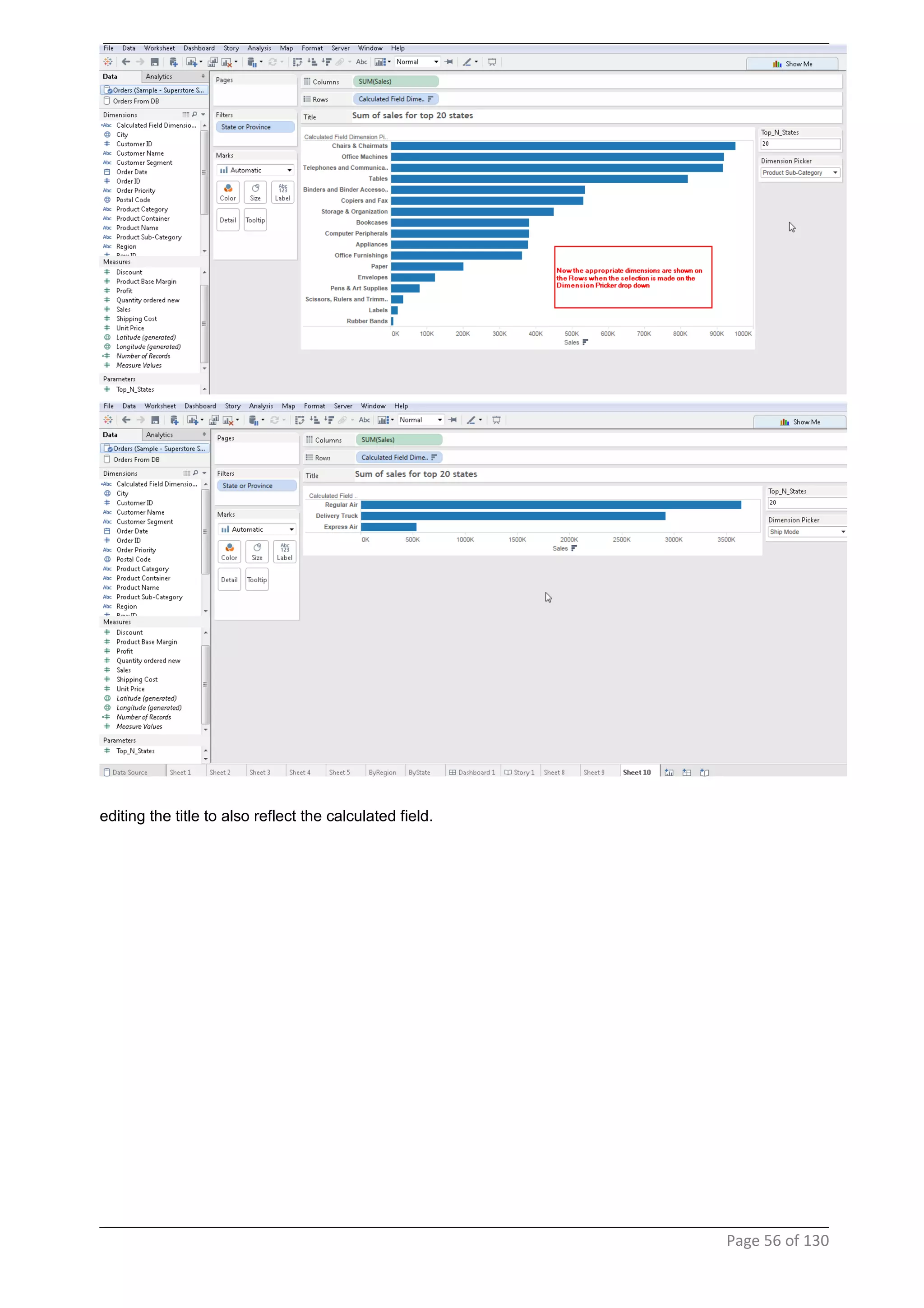
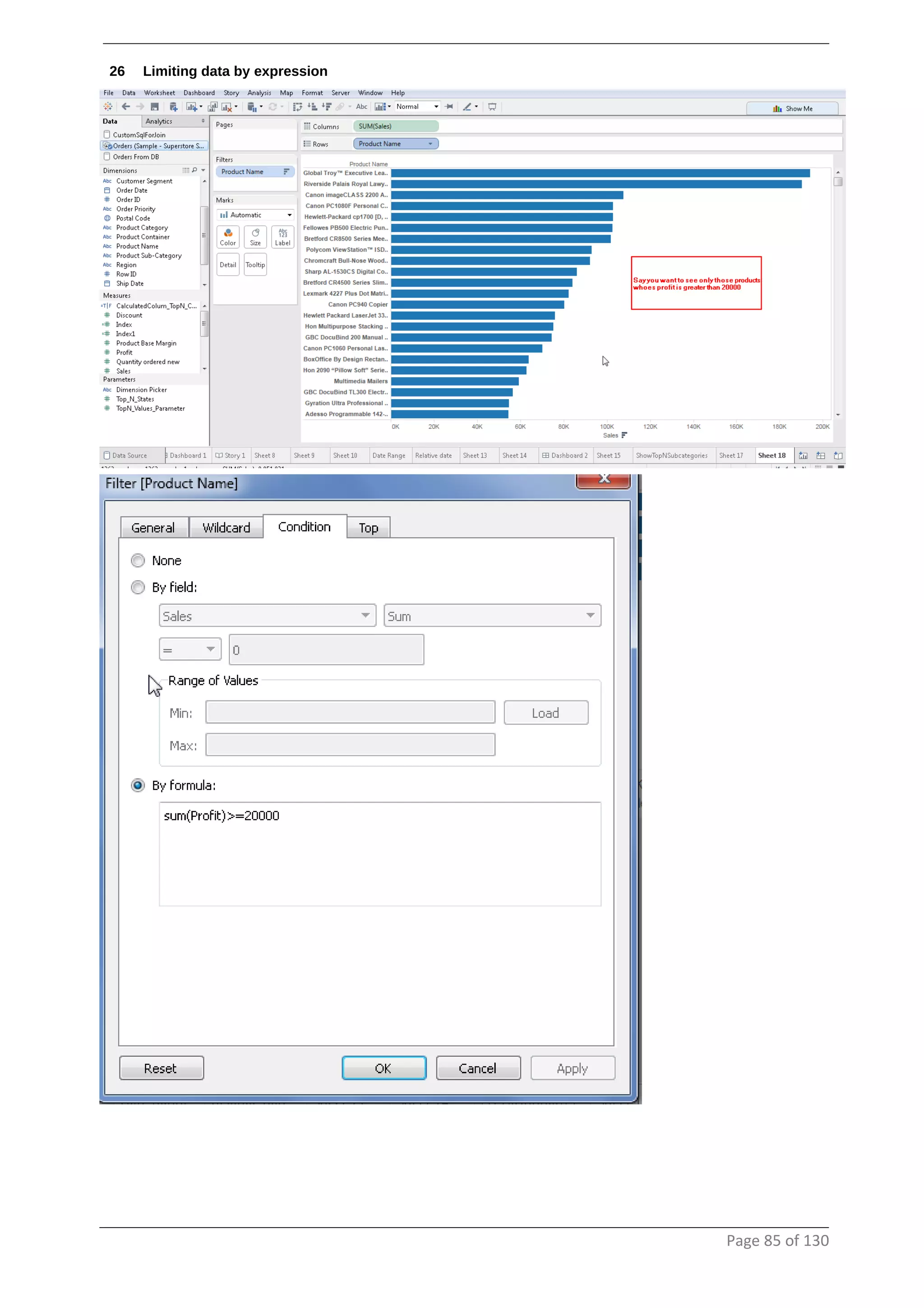
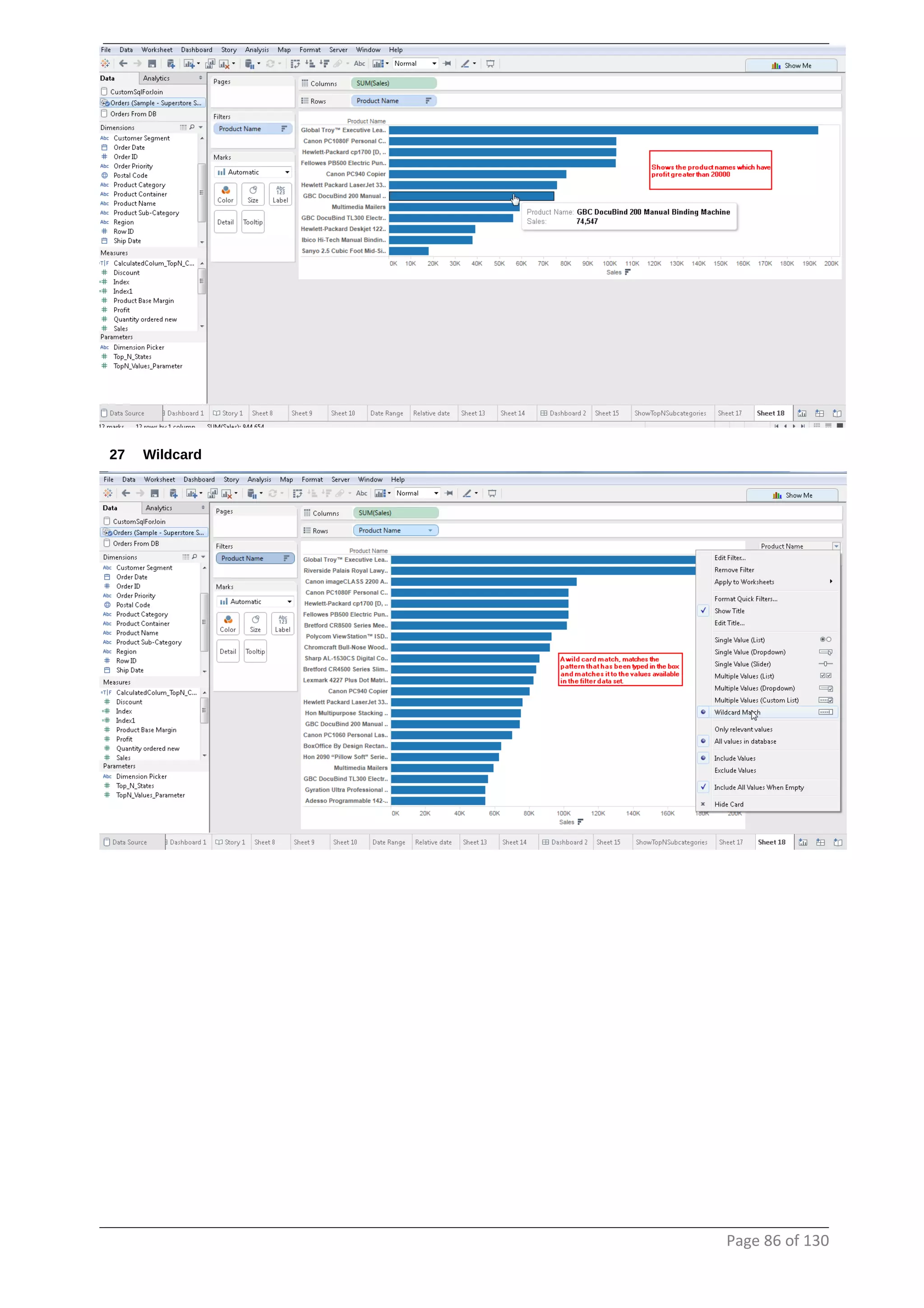
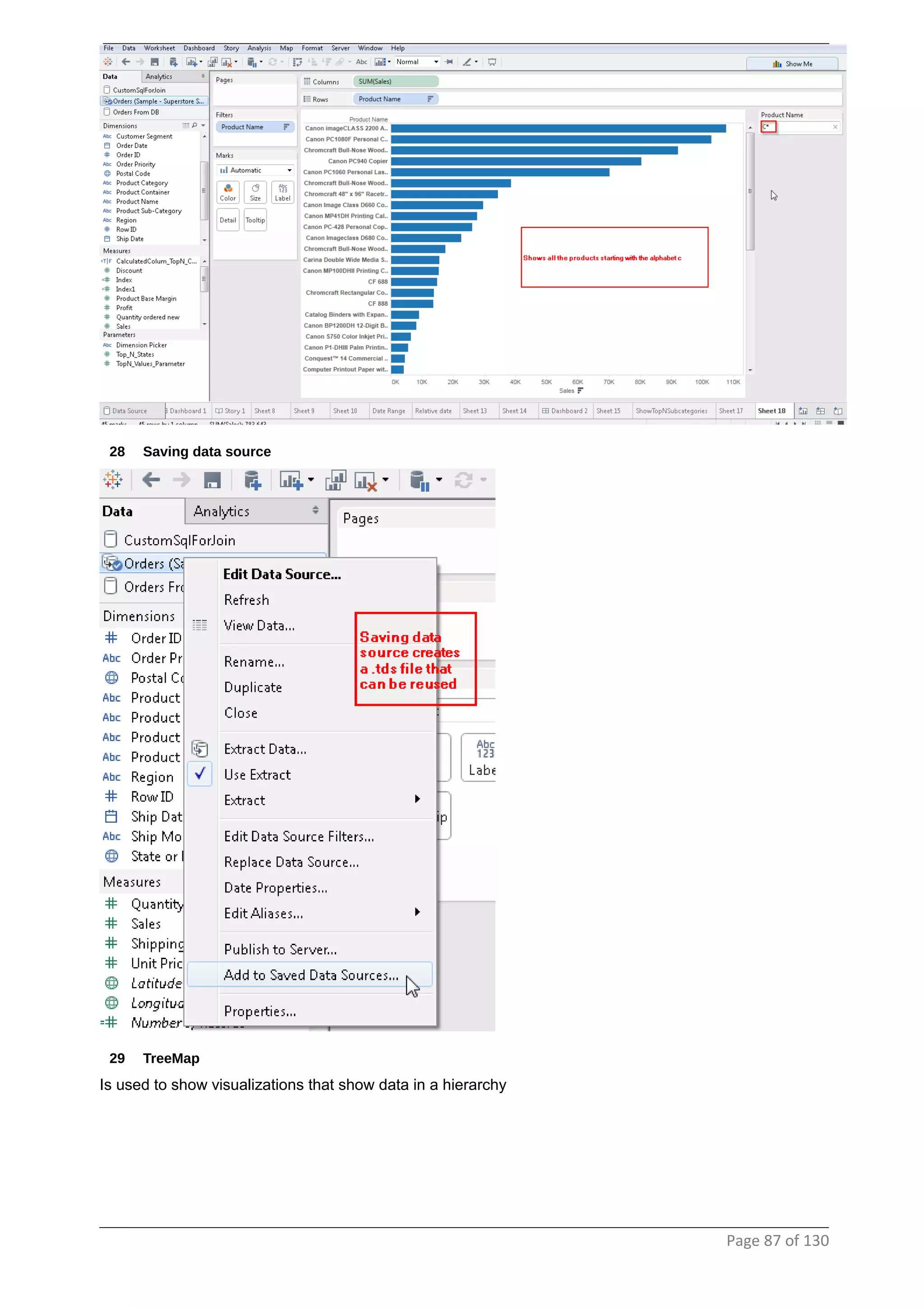
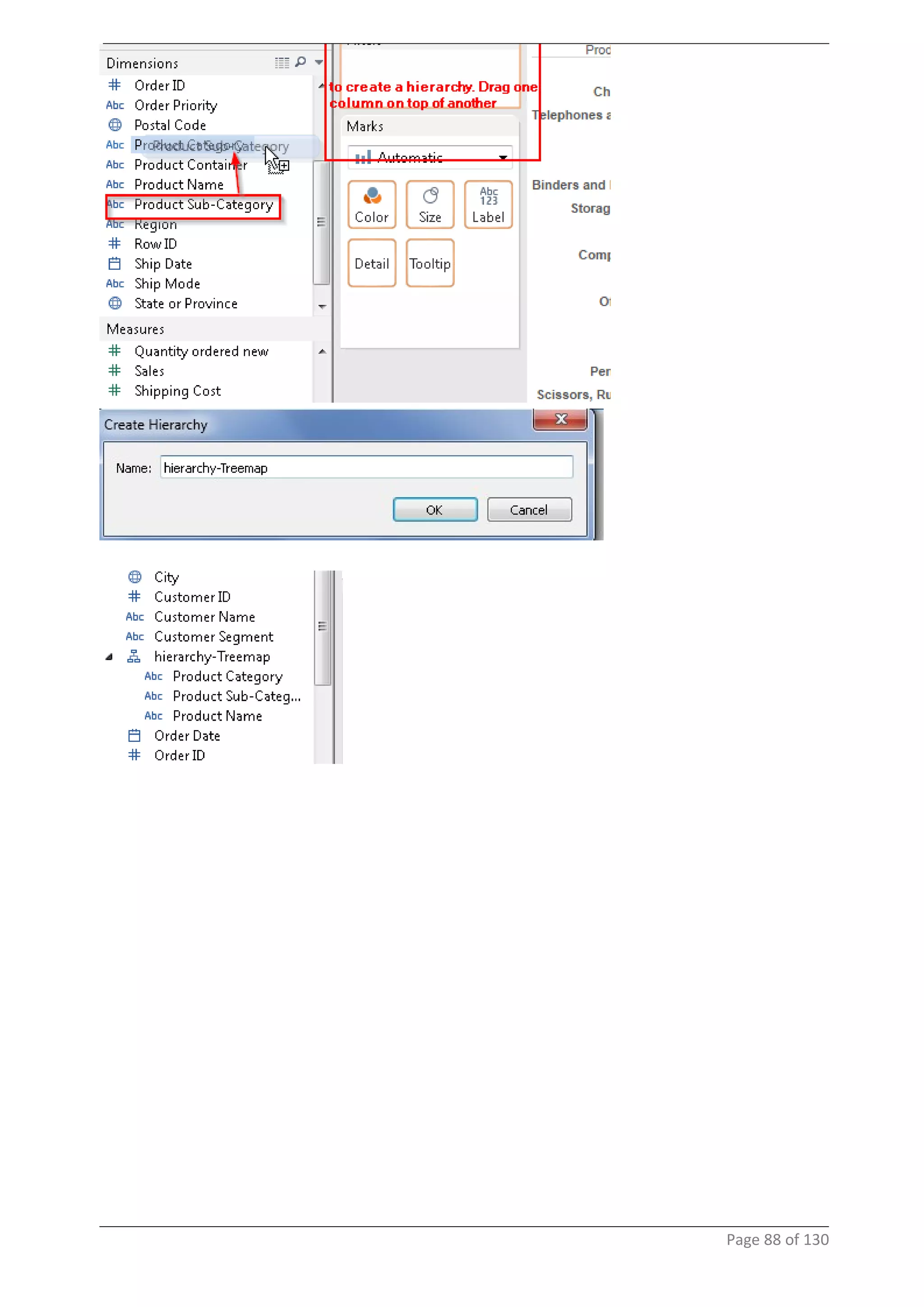
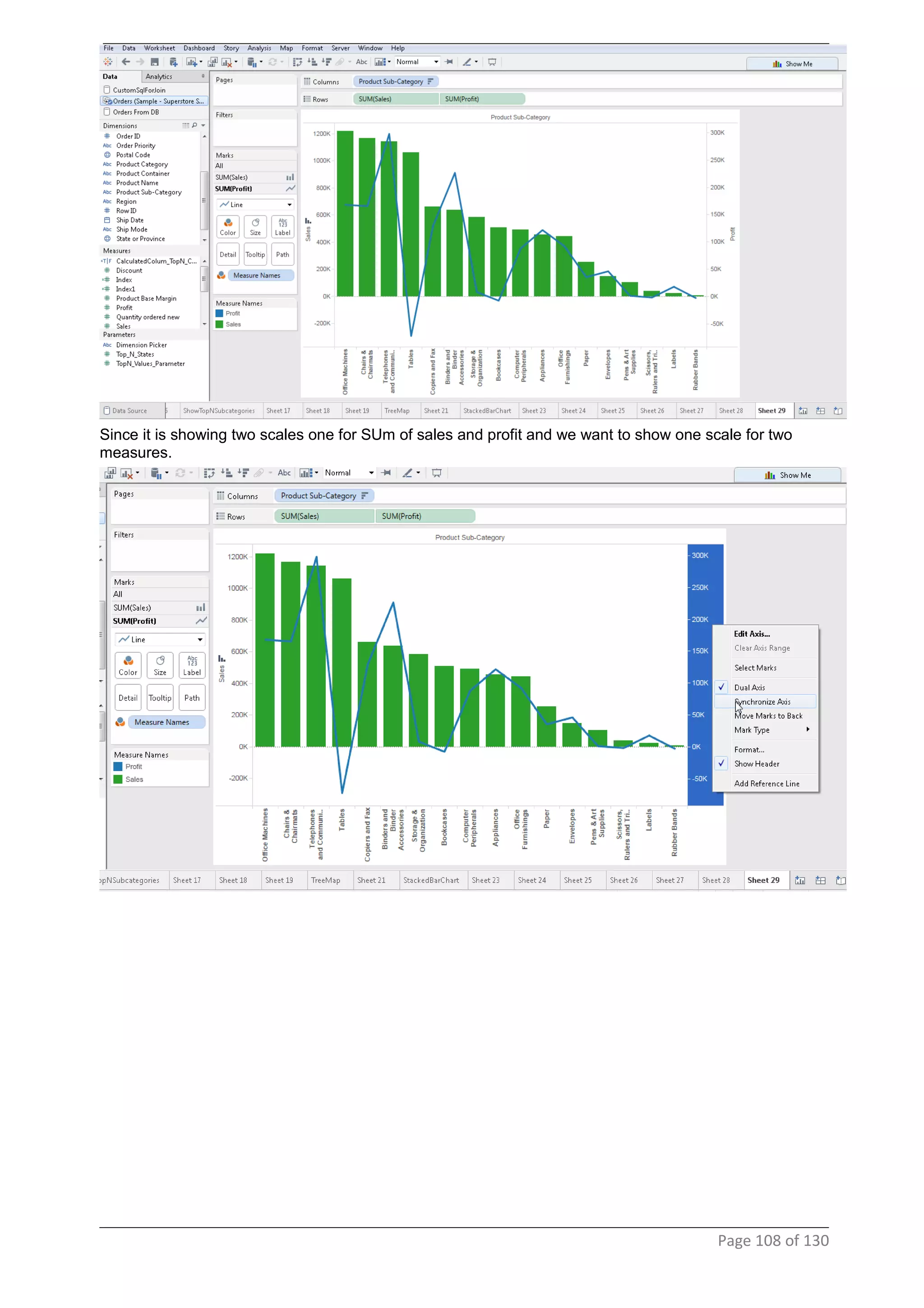
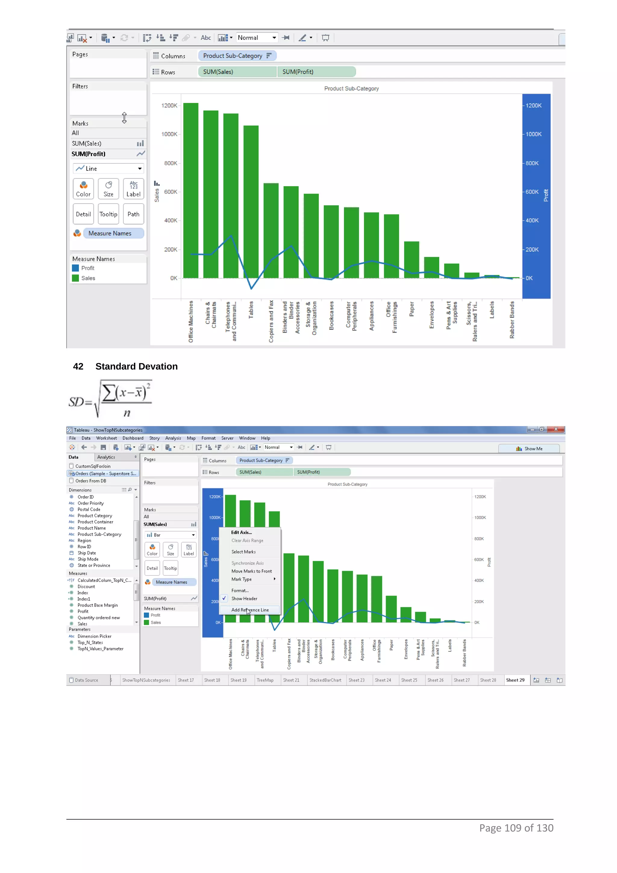
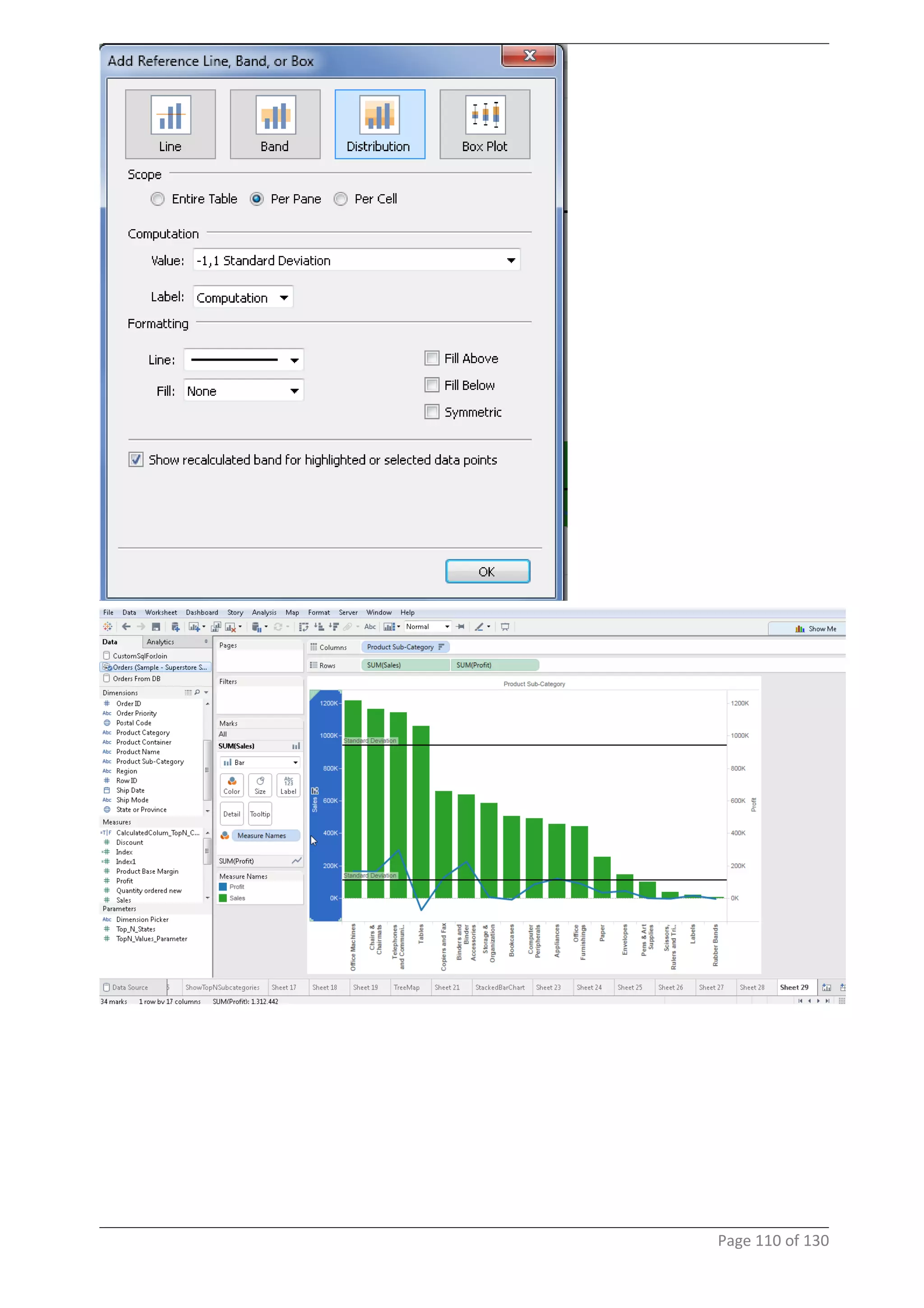
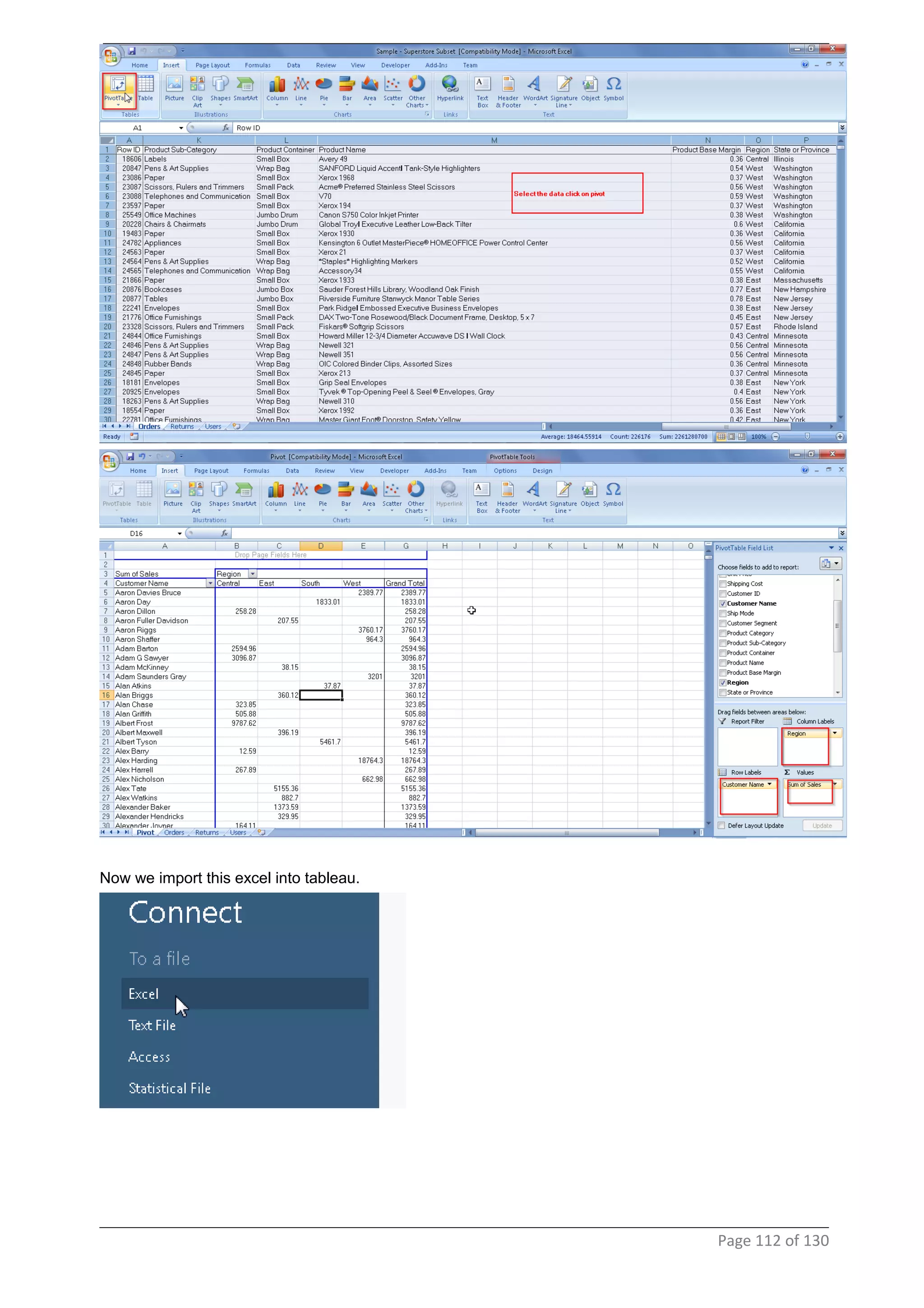
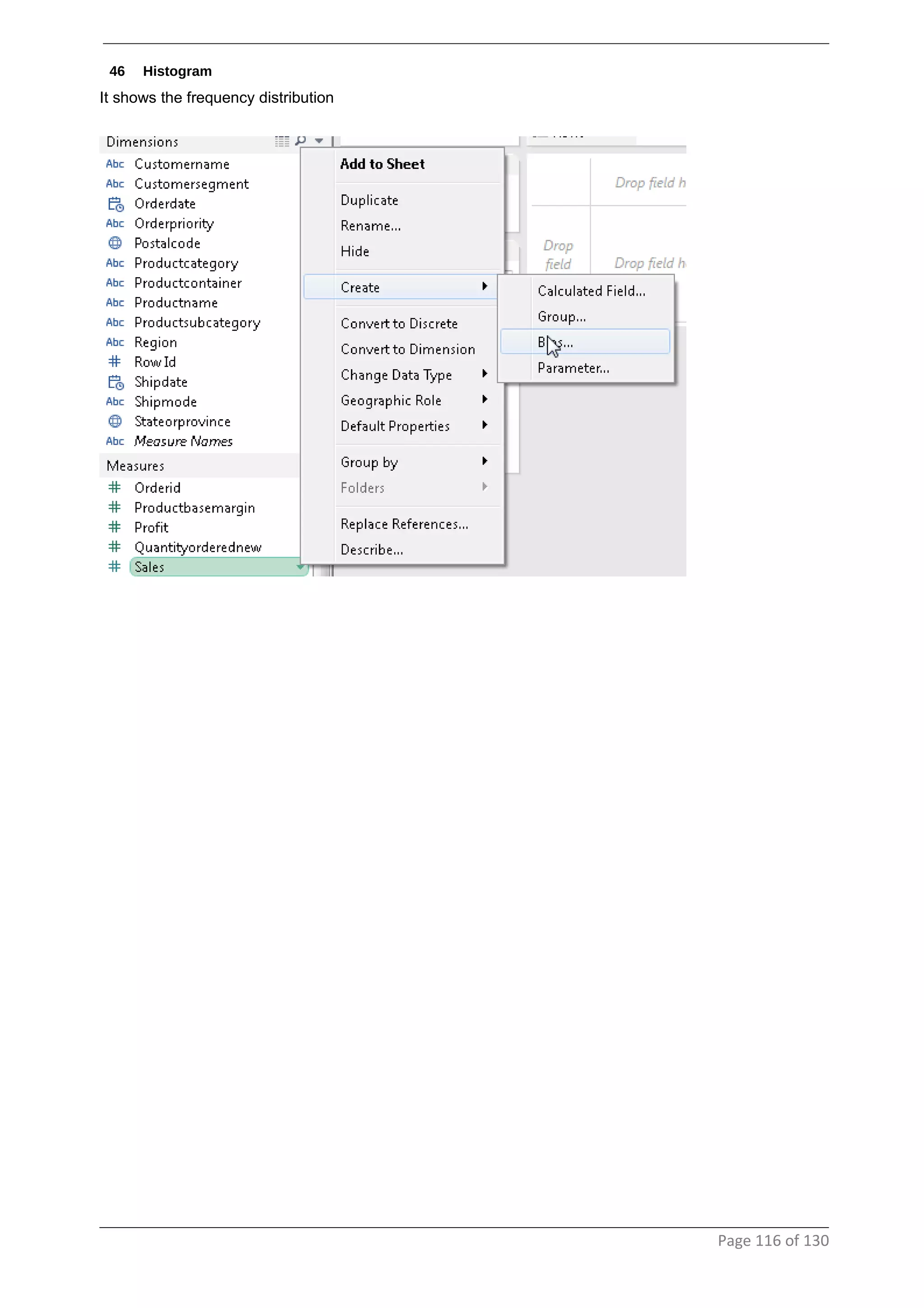
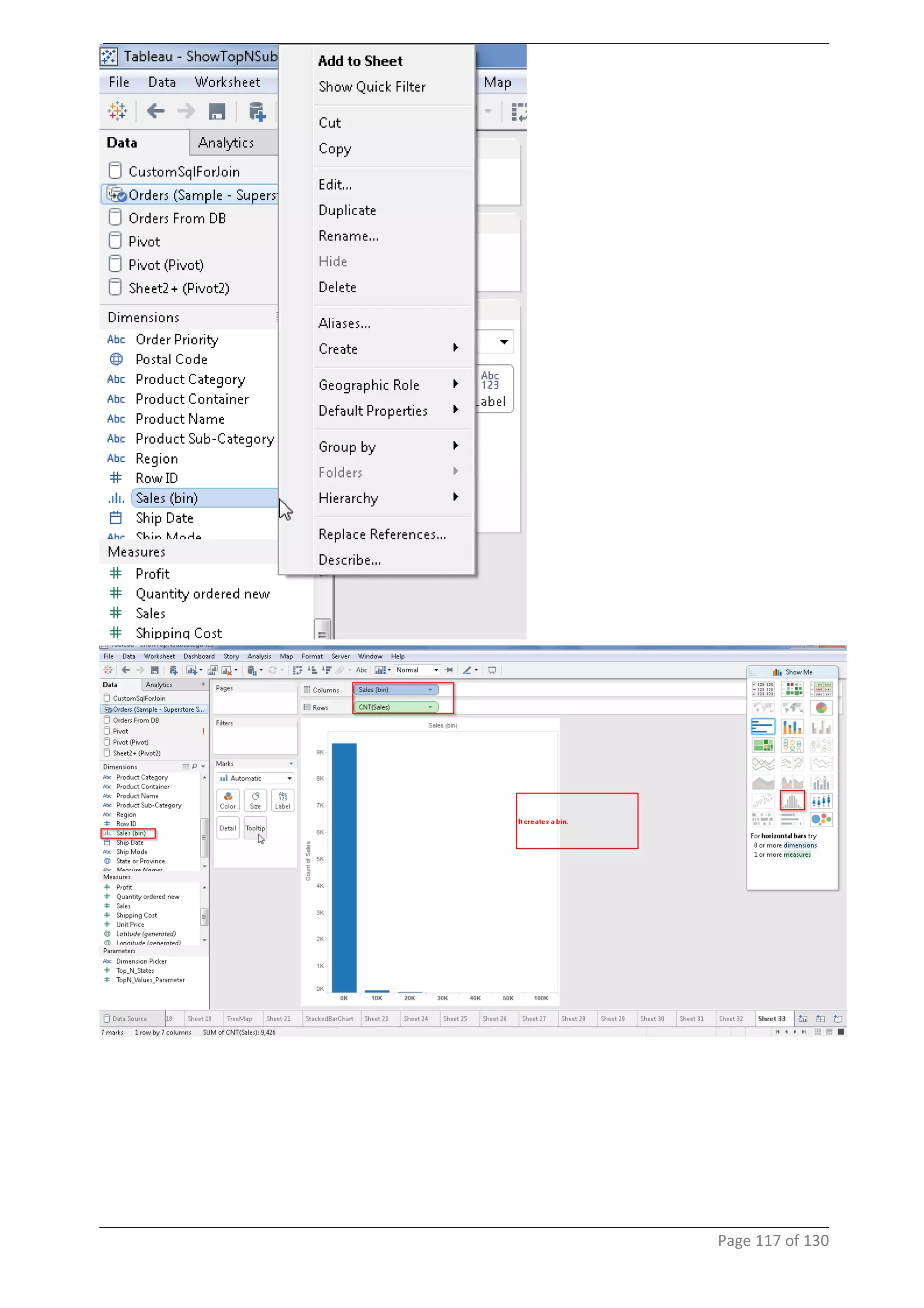
TABLEAU DEVELOPMENT
Table of Content
1 Architecture..................................................................................................................3
2 Connecting To DataSources ......................................................................................3
3 Introduction To Designer & Simple Reports..............................................................6
4 Marks Card....................................................................................................................8
5 Simple Map Chart From Dimensions........................................................................10
6 Formatting a visualization.........................................................................................12
7 Filters..........................................................................................................................14
8 PageShelf....................................................................................................................17
9 Simple filters...............................................................................................................19
10 Drop field type..........................................................................................................24
11 Dimesions/Measure..................................................................................................26
12 Dashboard/Actions..................................................................................................27
13 Custom SQL..............................................................................................................33
14 Linking To Webpages/ URL action.........................................................................36
15 Changing measures.................................................................................................43
16 Top N Filters.............................................................................................................44
17 Limiting data using parameters..............................................................................46
18 Parameters In Title...................................................................................................50
19 Dynamic Mesaure and Dimensions........................................................................52
20 Date Range................................................................................................................60
21 Relative dates...........................................................................................................62
22 Custom SQL Join.....................................................................................................63
23 Nested sorting..........................................................................................................64
24 Embeding Data Into Report Extracts......................................................................80
25 Include/Exclude Values...........................................................................................82
26 Limiting data by expression....................................................................................85
27 Wildcard....................................................................................................................86
28 Saving data source..................................................................................................87
29 TreeMap....................................................................................................................87
30 Using Hierarchy in a horizontal bar chart..............................................................90
31 Stacked Bar chart.....................................................................................................92
32 Side By Side Bar Chart............................................................................................92
33 Stacked circle view..................................................................................................92
34 Area Chart.................................................................................................................93
35 Rolling Up Data For Continious Values..................................................................96
36 Rolling Up Data For Discrete Values......................................................................98
.......................................................................................................................................98
37 Packed Bubble Chart...............................................................................................99
38 Calculating frequency..............................................................................................99
39 Scatter Plot.............................................................................................................100
40 Pie Chart.................................................................................................................106
41 Combination Chart.................................................................................................106
42 Standard Devation..................................................................................................109
43 Piviot Table.............................................................................................................111
44 Unpivot....................................................................................................................111
45 Heat Map.................................................................................................................115
Page 2 of 130
.....................................................................................................................................115
46 Histogram................................................................................................................116
47 Bullet Graph............................................................................................................121
48 Gant Chart...............................................................................................................125
49 Introduction............................................................................................................130
50 Introduction............................................................................................................130
51 Introduction............................................................................................................130
1 Architecture
The information dashboards that are used in business today show a dense array of information in a
small amount of space in a manner that communicates clearly and immediately. This requires design
that taps into and leverage's the power of visual perception to sense and process large chunks of
information rapidly. This can be achieved only when the visual design of dashboards is central to the
development process and is informed by a solid understanding of visual perception what works, what
doesn't, and why.
2 Connecting To DataSources
Tableau lets the user connect to an array of data sources that can be used in dashboard development.
Connecting to a oracle db.
Page 3 of 130
Page 4 of 130
Connecting to a flat file
Page 5 of 130
3 Introduction To Designer & Simple Reports
Page 6 of 130
Drag the Sum(Sales) on to the column shelf. You get a dual chart
Page 7 of 130
4 Marks Card
Drag Sales on to the Label card
Page 8 of 130
Page 9 of 130
5 Simple Map Chart From Dimensions
the icon in the dimensions against the "Sateorprovince" changes
Double click on the "Stateorprovinve" icon it opens up a map chart
Page 10 of 130
Select the filled map option from the marks card section.
Page 11 of 130
6 Formatting a visualization
right click on visualization and say format
Page 12 of 130
the visualization reflects the same.
Page 13 of 130
7 Filters
drag and drop stateorprovince column on to the filter shelf
Page 14 of 130
right click on the column in filter shelf and select
the filter shows up on the right side.
Page 15 of 130
now the values get filtered as seen
Page 16 of 130
8 PageShelf
Using pages we view a subset of a list at a time from a given column.
we see a drop down list of values also navigation arrows.
Page 17 of 130
Also using Pages we can see the history of sales. In this case I want to see the history of a selected
product subcategory for the last 3 motnhs.
Page 18 of 130
9 Simple filters
to resolve the error click on the errors in the right bottom corner
Page 19 of 130
drag size on to the size marks card
We see that bubbles are created around cities depending upon the size of sales
Page 20 of 130
now to edit the border around the bubble
create filters on the right hand side
Page 21 of 130
make a selection on the region and only the map belonging to that region will show up and the relevant
states will show up in the "Stateorprovince" quick filter
Page 22 of 130
When hovering over the area it shows the following details
Page 23 of 130
10 Drop field type
Page 24 of 130
Page 25 of 130
11 Dimesions/Measure
Dimensions are discreet values. Blue (Dimensions are those which cannot be aggregated, for ex:- order id)
Measures is continuous values. Green (Measures are those values which make sense when aggregated.
For ex sum of sales over a period of time)
Page 26 of 130
12 Dashboard/Actions
create two sheets showing "sales by region" and "sales by state"
to create a dashboard we click on
Drag and drop the sheets
Page 27 of 130
Page 28 of 130
Page 29 of 130
Page 30 of 130
Page 31 of 130
Page 32 of 130
13 Custom SQL
Writing custom sql. To write custom sql
Page 33 of 130
Page 34 of 130
Page 35 of 130
14 Linking To Webpages/ URL action
When the user selects California in the above dashboard, I want to show a Wikipedia page showing details
about California
Similarly, when the user selects Texas in the above dashboard, I want to show a Wikipedia page showing
details about Texas
Page 36 of 130
If we observer there is a similarity in the url's of the different wikipedia pages.
http://en.wikipedia.org/wiki/Texas
http://en.wikipedia.org/wiki/California
So the state names will be passed as a parameter from the dashboard
Page 37 of 130
To achieve the statement stated above click on actions and select the url
Page 38 of 130
Page 39 of 130
Page 40 of 130
Page 41 of 130
Page 42 of 130
15 Changing measures
Page 43 of 130
16 Top N Filters
Page 44 of 130
Page 45 of 130
shows the top ten states
17 Limiting data using parameters
Page 46 of 130
Right click on the measures and create a parameter
Page 47 of 130
Page 48 of 130
Page 49 of 130
18 Parameters In Title
Edit the title
Page 50 of 130
Page 51 of 130
19 Dynamic Mesaure and Dimensions
Page 52 of 130
Page 53 of 130
Page 54 of 130
Page 55 of 130
editing the title to also reflect the calculated field.
Page 56 of 130
Page 57 of 130
Above if you see the Y-axis has the name of "Calculated Field Dimensions" showing up. To correct it the
below steps need to be done.
Page 58 of 130
Page 59 of 130
20 Date Range
Page 60 of 130
Page 61 of 130
21 Relative dates
Page 62 of 130
22 Custom SQL Join
Page 63 of 130
23 Nested sorting
Page 64 of 130
create a calculated field
Page 65 of 130
Page 66 of 130
Page 67 of 130
Page 68 of 130
Page 69 of 130
as a result the sorting works in descending order for ever region
Page 70 of 130
Page 71 of 130
Page 72 of 130
To let the user pick the Top N Values in clustered filtering.
first create a parameter
Page 73 of 130
Page 74 of 130
now create a calculated field
Page 75 of 130
say you want to see only true values
Page 76 of 130
Page 77 of 130
Page 78 of 130
Page 79 of 130
24 Embeding Data Into Report Extracts
In tableau extracts are created to fetch all the data from the datasource to the machine where tableau
server is installed by using the concept of "Columnar" architecture. The extracts are stored in .ted
extension. As a result the data is loaded in a fraction of the time on to the visualization.
Page 80 of 130
now the report is using data from extract and not directly from the DB
Page 81 of 130
25 Include/Exclude Values
Page 82 of 130
Page 83 of 130
Page 84 of 130
26 Limiting data by expression
Page 85 of 130
27 Wildcard
Page 86 of 130
28 Saving data source
29 TreeMap
Is used to show visualizations that show data in a hierarchy
Page 87 of 130
Page 88 of 130
Page 89 of 130
30 Using Hierarchy in a horizontal bar chart
Page 90 of 130
Page 91 of 130
31 Stacked Bar chart
32 Side By Side Bar Chart
33 Stacked circle view
This is not recommended to be used at all
Page 92 of 130
34 Area Chart
Page 93 of 130
Page 94 of 130
Page 95 of 130
35 Rolling Up Data For Continious Values
If you are showing sales for a year. The Feb month should contain data for Jan+Feb, Mar should contain
Jan+Feb+Mar
Page 96 of 130
Page 97 of 130
36 Rolling Up Data For Discrete Values
Page 98 of 130
37 Packed Bubble Chart
38 Calculating frequency
Calculating frequency is done by using number of records. Frequency is calculated by number of
occurrences for a particular type of record in a data set. For ex:- how many times the word bad that
occurred in a data set.
Page 99 of 130
39 Scatter Plot
Scatter plot is used to identify the co-relationship between two measures and identify the outliers.
The measure that comes on the X-axis is called the explanatory variable and the measure that comes on
the y-axis is called the response variable.
We will be tracking the movement of the response variable with respect to the explanatory variable. Also
there will be no aggregation in scatter plot.
Page 100 of 130
uncheck
Page 101 of 130
right click on visualization and select
Page 102 of 130
Page 103 of 130
the trend lines need to contain the following setting
Page 104 of 130
drop region on to color shelf
Page 105 of 130
40 Pie Chart
Not a best practice to use pie chart to display a large distinct data set.
41 Combination Chart
It has two measure and one dimensions.
Page 106 of 130
Page 107 of 130
Since it is showing two scales one for SUm of sales and profit and we want to show one scale for two
measures.
Page 108 of 130
42 Standard Devation
Page 109 of 130
Page 110 of 130
43 Piviot Table
44 Unpivot
To see this feature in tableau we will first create a worksheet in excel with Pivoted data, then bring it into
Tableau and unpivot it.
Page 111 of 130
Now we import this excel into tableau.
Page 112 of 130
Page 113 of 130
Page 114 of 130
45 Heat Map
Page 115 of 130
46 Histogram
It shows the frequency distribution
Page 116 of 130
Page 117 of 130
the same can be done through expression
Page 118 of 130
Page 119 of 130
Page 120 of 130
47 Bullet Graph
Page 121 of 130
Page 122 of 130
doing the same using a bar chart.
Page 123 of 130
Page 124 of 130
48 Gant Chart
Page 125 of 130
Page 126 of 130
create a negative profit column
Page 127 of 130
Page 128 of 130
Page 129 of 130
I don't want to see colour gradient. I only want to see if it is a loss or profit.
49 Introduction
50 Introduction
51 Introduction
postgre sql
tableu
Page 130 of 130

TableauDevelopment

  • 1.
  • 2.
    Table of Content 1Architecture..................................................................................................................3 2 Connecting To DataSources ......................................................................................3 3 Introduction To Designer & Simple Reports..............................................................6 4 Marks Card....................................................................................................................8 5 Simple Map Chart From Dimensions........................................................................10 6 Formatting a visualization.........................................................................................12 7 Filters..........................................................................................................................14 8 PageShelf....................................................................................................................17 9 Simple filters...............................................................................................................19 10 Drop field type..........................................................................................................24 11 Dimesions/Measure..................................................................................................26 12 Dashboard/Actions..................................................................................................27 13 Custom SQL..............................................................................................................33 14 Linking To Webpages/ URL action.........................................................................36 15 Changing measures.................................................................................................43 16 Top N Filters.............................................................................................................44 17 Limiting data using parameters..............................................................................46 18 Parameters In Title...................................................................................................50 19 Dynamic Mesaure and Dimensions........................................................................52 20 Date Range................................................................................................................60 21 Relative dates...........................................................................................................62 22 Custom SQL Join.....................................................................................................63 23 Nested sorting..........................................................................................................64 24 Embeding Data Into Report Extracts......................................................................80 25 Include/Exclude Values...........................................................................................82 26 Limiting data by expression....................................................................................85 27 Wildcard....................................................................................................................86 28 Saving data source..................................................................................................87 29 TreeMap....................................................................................................................87 30 Using Hierarchy in a horizontal bar chart..............................................................90 31 Stacked Bar chart.....................................................................................................92 32 Side By Side Bar Chart............................................................................................92 33 Stacked circle view..................................................................................................92 34 Area Chart.................................................................................................................93 35 Rolling Up Data For Continious Values..................................................................96 36 Rolling Up Data For Discrete Values......................................................................98 .......................................................................................................................................98 37 Packed Bubble Chart...............................................................................................99 38 Calculating frequency..............................................................................................99 39 Scatter Plot.............................................................................................................100 40 Pie Chart.................................................................................................................106 41 Combination Chart.................................................................................................106 42 Standard Devation..................................................................................................109 43 Piviot Table.............................................................................................................111 44 Unpivot....................................................................................................................111 45 Heat Map.................................................................................................................115 Page 2 of 130
  • 3.
    .....................................................................................................................................115 46 Histogram................................................................................................................116 47 BulletGraph............................................................................................................121 48 Gant Chart...............................................................................................................125 49 Introduction............................................................................................................130 50 Introduction............................................................................................................130 51 Introduction............................................................................................................130 1 Architecture The information dashboards that are used in business today show a dense array of information in a small amount of space in a manner that communicates clearly and immediately. This requires design that taps into and leverage's the power of visual perception to sense and process large chunks of information rapidly. This can be achieved only when the visual design of dashboards is central to the development process and is informed by a solid understanding of visual perception what works, what doesn't, and why. 2 Connecting To DataSources Tableau lets the user connect to an array of data sources that can be used in dashboard development. Connecting to a oracle db. Page 3 of 130
  • 4.
  • 5.
    Connecting to aflat file Page 5 of 130
  • 6.
    3 Introduction ToDesigner & Simple Reports Page 6 of 130
  • 7.
    Drag the Sum(Sales)on to the column shelf. You get a dual chart Page 7 of 130
  • 8.
    4 Marks Card DragSales on to the Label card Page 8 of 130
  • 9.
  • 10.
    5 Simple MapChart From Dimensions the icon in the dimensions against the "Sateorprovince" changes Double click on the "Stateorprovinve" icon it opens up a map chart Page 10 of 130
  • 11.
    Select the filledmap option from the marks card section. Page 11 of 130
  • 12.
    6 Formatting avisualization right click on visualization and say format Page 12 of 130
  • 13.
    the visualization reflectsthe same. Page 13 of 130
  • 14.
    7 Filters drag anddrop stateorprovince column on to the filter shelf Page 14 of 130
  • 15.
    right click onthe column in filter shelf and select the filter shows up on the right side. Page 15 of 130
  • 16.
    now the valuesget filtered as seen Page 16 of 130
  • 17.
    8 PageShelf Using pageswe view a subset of a list at a time from a given column. we see a drop down list of values also navigation arrows. Page 17 of 130
  • 18.
    Also using Pageswe can see the history of sales. In this case I want to see the history of a selected product subcategory for the last 3 motnhs. Page 18 of 130
  • 19.
    9 Simple filters toresolve the error click on the errors in the right bottom corner Page 19 of 130
  • 20.
    drag size onto the size marks card We see that bubbles are created around cities depending upon the size of sales Page 20 of 130
  • 21.
    now to editthe border around the bubble create filters on the right hand side Page 21 of 130
  • 22.
    make a selectionon the region and only the map belonging to that region will show up and the relevant states will show up in the "Stateorprovince" quick filter Page 22 of 130
  • 23.
    When hovering overthe area it shows the following details Page 23 of 130
  • 24.
    10 Drop fieldtype Page 24 of 130
  • 25.
  • 26.
    11 Dimesions/Measure Dimensions arediscreet values. Blue (Dimensions are those which cannot be aggregated, for ex:- order id) Measures is continuous values. Green (Measures are those values which make sense when aggregated. For ex sum of sales over a period of time) Page 26 of 130
  • 27.
    12 Dashboard/Actions create twosheets showing "sales by region" and "sales by state" to create a dashboard we click on Drag and drop the sheets Page 27 of 130
  • 28.
  • 29.
  • 30.
  • 31.
  • 32.
  • 33.
    13 Custom SQL Writingcustom sql. To write custom sql Page 33 of 130
  • 34.
  • 35.
  • 36.
    14 Linking ToWebpages/ URL action When the user selects California in the above dashboard, I want to show a Wikipedia page showing details about California Similarly, when the user selects Texas in the above dashboard, I want to show a Wikipedia page showing details about Texas Page 36 of 130
  • 37.
    If we observerthere is a similarity in the url's of the different wikipedia pages. http://en.wikipedia.org/wiki/Texas http://en.wikipedia.org/wiki/California So the state names will be passed as a parameter from the dashboard Page 37 of 130
  • 38.
    To achieve thestatement stated above click on actions and select the url Page 38 of 130
  • 39.
  • 40.
  • 41.
  • 42.
  • 43.
  • 44.
    16 Top NFilters Page 44 of 130
  • 45.
  • 46.
    shows the topten states 17 Limiting data using parameters Page 46 of 130
  • 47.
    Right click onthe measures and create a parameter Page 47 of 130
  • 48.
  • 49.
  • 50.
    18 Parameters InTitle Edit the title Page 50 of 130
  • 51.
  • 52.
    19 Dynamic Mesaureand Dimensions Page 52 of 130
  • 53.
  • 54.
  • 55.
  • 56.
    editing the titleto also reflect the calculated field. Page 56 of 130
  • 57.
  • 58.
    Above if yousee the Y-axis has the name of "Calculated Field Dimensions" showing up. To correct it the below steps need to be done. Page 58 of 130
  • 59.
  • 60.
  • 61.
  • 62.
  • 63.
    22 Custom SQLJoin Page 63 of 130
  • 64.
  • 65.
    create a calculatedfield Page 65 of 130
  • 66.
  • 67.
  • 68.
  • 69.
  • 70.
    as a resultthe sorting works in descending order for ever region Page 70 of 130
  • 71.
  • 72.
  • 73.
    To let theuser pick the Top N Values in clustered filtering. first create a parameter Page 73 of 130
  • 74.
  • 75.
    now create acalculated field Page 75 of 130
  • 76.
    say you wantto see only true values Page 76 of 130
  • 77.
  • 78.
  • 79.
  • 80.
    24 Embeding DataInto Report Extracts In tableau extracts are created to fetch all the data from the datasource to the machine where tableau server is installed by using the concept of "Columnar" architecture. The extracts are stored in .ted extension. As a result the data is loaded in a fraction of the time on to the visualization. Page 80 of 130
  • 81.
    now the reportis using data from extract and not directly from the DB Page 81 of 130
  • 82.
  • 83.
  • 84.
  • 85.
    26 Limiting databy expression Page 85 of 130
  • 86.
  • 87.
    28 Saving datasource 29 TreeMap Is used to show visualizations that show data in a hierarchy Page 87 of 130
  • 88.
  • 89.
  • 90.
    30 Using Hierarchyin a horizontal bar chart Page 90 of 130
  • 91.
  • 92.
    31 Stacked Barchart 32 Side By Side Bar Chart 33 Stacked circle view This is not recommended to be used at all Page 92 of 130
  • 93.
  • 94.
  • 95.
  • 96.
    35 Rolling UpData For Continious Values If you are showing sales for a year. The Feb month should contain data for Jan+Feb, Mar should contain Jan+Feb+Mar Page 96 of 130
  • 97.
  • 98.
    36 Rolling UpData For Discrete Values Page 98 of 130
  • 99.
    37 Packed BubbleChart 38 Calculating frequency Calculating frequency is done by using number of records. Frequency is calculated by number of occurrences for a particular type of record in a data set. For ex:- how many times the word bad that occurred in a data set. Page 99 of 130
  • 100.
    39 Scatter Plot Scatterplot is used to identify the co-relationship between two measures and identify the outliers. The measure that comes on the X-axis is called the explanatory variable and the measure that comes on the y-axis is called the response variable. We will be tracking the movement of the response variable with respect to the explanatory variable. Also there will be no aggregation in scatter plot. Page 100 of 130
  • 101.
  • 102.
    right click onvisualization and select Page 102 of 130
  • 103.
  • 104.
    the trend linesneed to contain the following setting Page 104 of 130
  • 105.
    drop region onto color shelf Page 105 of 130
  • 106.
    40 Pie Chart Nota best practice to use pie chart to display a large distinct data set. 41 Combination Chart It has two measure and one dimensions. Page 106 of 130
  • 107.
  • 108.
    Since it isshowing two scales one for SUm of sales and profit and we want to show one scale for two measures. Page 108 of 130
  • 109.
  • 110.
  • 111.
    43 Piviot Table 44Unpivot To see this feature in tableau we will first create a worksheet in excel with Pivoted data, then bring it into Tableau and unpivot it. Page 111 of 130
  • 112.
    Now we importthis excel into tableau. Page 112 of 130
  • 113.
  • 114.
  • 115.
    45 Heat Map Page115 of 130
  • 116.
    46 Histogram It showsthe frequency distribution Page 116 of 130
  • 117.
  • 118.
    the same canbe done through expression Page 118 of 130
  • 119.
  • 120.
  • 121.
  • 122.
  • 123.
    doing the sameusing a bar chart. Page 123 of 130
  • 124.
  • 125.
  • 126.
  • 127.
    create a negativeprofit column Page 127 of 130
  • 128.
  • 129.
  • 130.
    I don't wantto see colour gradient. I only want to see if it is a loss or profit. 49 Introduction 50 Introduction 51 Introduction postgre sql tableu Page 130 of 130