Download to read offline


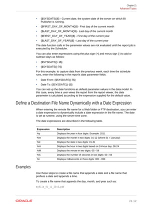
![1. On the Home page, click Console.
2. Click Maps.
3. Use the Include option to make a map layer available to end users or hide it from
end users.
You can hide or display custom map and system map layers.
Make Map Backgrounds Available to Users
Oracle provides two preconfigured map backgrounds with Data Visualization. As an
administrator, you can add map backgrounds for use in map visualizations.
1. On the Home page, click Console, select Maps, and then click Backgrounds.
• To set a background as the default map background, click the Default column.
• To include or exclude a map background as an available option to users, click
the Include column.
2. To add a map background, click Add Background and select a map background
from the list.
Oracle Maps are preconfigured and shipped with the product. Other background
maps that you can add are Google Maps and Baidu Maps. For a map provider
other than Oracle (for example, Google or Baidu), you must obtain an Map API
access key for which you may be charged based on your usage.
3. Copy and paste in the appropriate Maps API access key.
You must sign up with the provider to be able to add and use any of these map
types.
• To use the Google Maps tiles, you must obtain a Google Maps API access key
from Google. Google prompts you to enter your Maps API access key and,
when applicable, your Google “Client ID”. Usage of the tiles must meet the
terms of service specified by Google in the Google Developers Site Terms of
Service.
• To use the Baidu Maps tiles, you must obtain a Baidu Maps API access key
from Baidu. Baidu prompts you to enter your Maps API access key. Usage of
the tiles must meet the terms of service specified by Baidu in the Baidu User
Agreement.
4. Select a default map type if applicable and enter a helpful description if needed.
5. Click Add to include the map in the list of available map backgrounds.
Data Visualization displays a message when the map background is successfully
added.
For Baidu Maps in Oracle Analytics Cloud, you must add the following three URLs
to be white-listed as safe domains. You do this in the Data Visualization Console,
from the Safe Domains page.
• *.map.baidu.com [Image, Script]
• *.map.bdimg.com [Image, Script]
• *.bdstatic.com [Image, Script]
You must select both the Image and Script options. This indicates these domains
can be trusted to provide image tiles and the necessary scripts to run, ensuring
that Baidu map content renders successfully.
Chapter 3
Apply Map Backgrounds and Map Layers to Enhance Visualizations
3-31](https://image.slidesharecdn.com/visualizing-data-and-building-reports-oracle-analytics-cloud-220928042530-be311462/85/visualizing-data-and-building-reports-oracle-analytics-cloud-pdf-67-320.jpg)
![Sort and Select Data in Visualization Canvases
While adding filters to visualizations helps you narrow your focus on certain aspects of
your data, you can take a variety of other analytic actions to explore your data (for
example, drilling, sorting, and selecting). When you take any of these analytic actions,
the filters are automatically applied for you.
Select a visualization and click Menu or right-click, then select one of the following
analytics actions:
• Use Sort to sort attributes in a visualization, such as product names from A to Z. If
you’re working with a table view, then the system always sorts the left column first.
In some cases where specific values display in the left column, you can’t sort the
center column. For example, if the left column is Product and the center column is
Product Type, then you can’t sort the Product Type column. To work around this
issue, swap the positions of the columns and try to sort again.
• Use Drill to drill to a data element and drill through hierarchies in data elements,
such as drilling to weeks within a quarter. You can also drill asymmetrically using
multiple data elements. For example, you can select two separate year members
that are columns in a pivot table, and drill into those members to see the details.
• Use Drill to [Attribute Name] to directly drill to a specific attribute within a
visualization.
• Use Keep Selected to keep only the selected members and remove all others
from the visualization and its linked visualizations. For example, you can keep only
the sales that are generated by a specific sales associate.
• Use Remove Selected to remove selected members from the visualization and its
linked visualizations. For example, you can remove the Eastern and Western
regions from the selection.
• Use Add Reference Line to add a reference line to highlight an important fact
depicted in the visualization, such as a minimum or maximum value. For example,
you can add a reference line across the visualization at the height of the maximum
revenue amount.
Explore Data on Mobile Devices
Explore your data at your desk and on the move. You can use mobile devices using
Android, Windows, or Apple operating systems.
Topics:
• What You See on a Tablet
• What You See on a Mobile Phone
What You See on a Tablet
This topic covers the differences you see in projects when you explore data on a
tablet.
• You can search for and use existing data sources in projects. See Create a Project
and Add Data Sets.
Chapter 3
Sort and Select Data in Visualization Canvases
3-32](https://image.slidesharecdn.com/visualizing-data-and-building-reports-oracle-analytics-cloud-220928042530-be311462/85/visualizing-data-and-building-reports-oracle-analytics-cloud-pdf-68-320.jpg)


![called “oracle.bitech.dataaction” with the context payload information. You can
subscribe to this event and receive the payload in the event callback, and you can
make further use of the payload as required.
The following project is embedded inside a HTML page. The project shows the
revenue (in Dollars) for lines of business (for example Communication, Digital,
Electronics) across organizations (For example fFranchises Org, Inbound Org,
International Org) —
Event and Payload Format and Context
The following examples enable an event to be published when the embedded data
action is invoked by one or more data cells that have been right-clicked and the data
action selected from the menu that’s displayed in the embedded project.
The examples below are from a JSON file (for example, obitech-cca/cca/
component.json).
Event Format
"events": {
"oracle.bitech.dataaction": {
"description": "Generic DV Event published from an embedded data
visualization.",
"bubbles": true,
"cancelable": false,
"detail": {
"eventName": {
"description": "The name of the published BI Event",
"type": "string"
},
"payload": {
"description": "The payload contains context and related
information to the event published",
"type": "object"
}
}
}
Payload Format
{"context":[
"or": [
"and":[
{"contextParamValues":[...],
"contextParamValuesKeys":[...],
Chapter 5
Use Data Actions to Connect to Canvases and External URLs and Use in External Containers
5-13](https://image.slidesharecdn.com/visualizing-data-and-building-reports-oracle-analytics-cloud-220928042530-be311462/85/visualizing-data-and-building-reports-oracle-analytics-cloud-pdf-98-320.jpg)
!["colFormula":"...",
"displayName":"...",
"isDoubleColumn":true/false,
"dataType":"..."
}
]
]
]
}
Passing a single value for a single column in the Pass By Context
In this example, when you click a column cell, what gets passed is an object with
context information about the column. In this case, the organization name is passed.
{
"context": [
{
"contextParamValues": [
"Inbound Org."
],
"contextParamValuesKeys": [
"Inbound Org."
],
"colFormula": ""A - Sample Sales"."Offices"."D3 Organization
"",
"displayName": "D3 Organization",
"isDoubleColumn": false,
"dataType": "varchar"
}
]
}
Passing a single value for each column in the Pass By Context
In this example, when you click a column cell (for example Inbound Org, and Digital
products), what gets passed when you click the Embedded DA1 menu option to select
the embedded action is the revenue value in Dollars for the selected line of business
and organization. For example, the revenue for Digital products from the Inbound Org
is passed, which is $1, 458,738.42 in this example.
Chapter 5
Use Data Actions to Connect to Canvases and External URLs and Use in External Containers
5-14](https://image.slidesharecdn.com/visualizing-data-and-building-reports-oracle-analytics-cloud-220928042530-be311462/85/visualizing-data-and-building-reports-oracle-analytics-cloud-pdf-99-320.jpg)
![{
"context": [
{
"contextParamValues": [
"Digital"
],
"contextParamValuesKeys": [
"Digital"
],
"colFormula": ""A - Sample Sales"."Products"."P3 LOB"",
"displayName": "P3 LOB",
"isDoubleColumn": false,
"dataType": "varchar"
},
{
"contextParamValues": [
"Inbound Org."
],
"contextParamValuesKeys": [
"Inbound Org."
],
"colFormula": ""A - Sample Sales"."Offices"."D3 Organization
"",
"displayName": "D3 Organization",
"isDoubleColumn": false,
"dataType": "varchar"
}
]
}
Passing multiple values in the Pass By Context
In this example, when you click two row cells (for example Inbound Org and
International Org for Digital products) and click the Embedded DA1 menu option to
select the embedded action, what gets passed is the revenue value in dollars for the
two selected cells for organization and lines of business. For example, clicking the
revenue for Digital products from the two selected organizations (Inbound Org and
International Org) passes the values $1, 458,738.42, and $915,528.97.
Chapter 5
Use Data Actions to Connect to Canvases and External URLs and Use in External Containers
5-15](https://image.slidesharecdn.com/visualizing-data-and-building-reports-oracle-analytics-cloud-220928042530-be311462/85/visualizing-data-and-building-reports-oracle-analytics-cloud-pdf-100-320.jpg)
![{
"context": [
{
"or": [
{
"and": [
{
"contextParamValues": [
"Digital"
],
"contextParamValuesKeys": [
"Digital"
],
"colFormula": ""A - Sample Sales"."Products".
"P3 LOB"",
"displayName": "P3 LOB",
"isDoubleColumn": false,
"dataType": "varchar"
},
{
"contextParamValues": [
"Inbound Org."
],
"contextParamValuesKeys": [
"Inbound Org."
],
"colFormula": ""A - Sample Sales"."Offices"."D3
Organization"",
"displayName": "D3 Organization",
"isDoubleColumn": false,
"dataType": "varchar"
}
]
},
{
"and": [
{
"contextParamValues": [
"Digital"
],
Chapter 5
Use Data Actions to Connect to Canvases and External URLs and Use in External Containers
5-16](https://image.slidesharecdn.com/visualizing-data-and-building-reports-oracle-analytics-cloud-220928042530-be311462/85/visualizing-data-and-building-reports-oracle-analytics-cloud-pdf-101-320.jpg)
!["contextParamValuesKeys": [
"Digital"
],
"colFormula": ""A - Sample Sales"."Products".
"P3 LOB"",
"displayName": "P3 LOB",
"isDoubleColumn": false,
"dataType": "varchar"
},
{
"contextParamValues": [
"International Org."
],
"contextParamValuesKeys": [
"International Org."
],
"colFormula": ""A - Sample Sales"."Offices"."D3
Organization"",
"displayName": "D3 Organization",
"isDoubleColumn": false,
"dataType": "varchar"
}
]
}
]
}
]
}
Use these steps to configure the sample HTML page shown below.
1. Add or modify the path location of the Data Visualization project.
See <======== 1 below.
2. Subscribe to the Data Visualization published event called
‘oracle.bitech.dataaction’.
See <======== 2 below.
3. Define an event listener and an event callback.
See <======== 3 below.
Example of an HTML Page with Data Visualization that Receives Events
The following HTML page has a data visualization embedded and can receive events.
The HTML page is configured to listen for the event “oracle.bitech.dataaction.”
<!DOCTYPE HTML PUBLIC "-//IETF//DTD HTML//EN"><html>
<head>
<meta http-equiv="X-UA-Compatible" content="IE=edge"/>
<title>Standalone DV CCA Demo</title>
<script src="http://hostname:port/bali/ui/api/v1/plugins/embedding/
standalone/embedding.js" type="text/javascript"></script>
</head>
<body>
Chapter 5
Use Data Actions to Connect to Canvases and External URLs and Use in External Containers
5-17](https://image.slidesharecdn.com/visualizing-data-and-building-reports-oracle-analytics-cloud-220928042530-be311462/85/visualizing-data-and-building-reports-oracle-analytics-cloud-pdf-102-320.jpg)
![<h1>Standalone DV CCA Embedded Data Action Demo</h1>
<div id="mydiv" style="position: absolute; width: calc(100% - 40px);
height: calc(100% - 120px)" >
<oracle-dv project-path="/shared/RR/sample"></oracle-dv>
<=============== 1
</div>
<script>
requirejs(['knockout', 'ojs/ojcore', 'ojs/ojknockout', 'ojs/
ojcomposite', 'jet-composites/oracle-dv/loader'], function(ko) {
ko.applyBindings();
});
</script>
<script>
var eventName = 'oracle.bitech.dataaction'; <========== 2
var element = document.getElementById("mydiv");
if (element) {
var oEventListener = element.addEventListener(eventName, function
(e) { <================= 3
console.log("***** Payload from DV ***** ");
console.log("eventName = " + e.detail.eventName);
console.log("payload = " + JSON.stringify(e.detail.payload));
console.log("***** Payload from DV end ***** ");
}, true);
}
</script>
</body>
</html>
Search Data, Projects, and Visualizations
This topic describes how you can search for objects, projects, and columns. This topic
also describes how you can use BI Ask to create spontaneous visualizations.
Topics:
• Index Data for Search and BI Ask
• Enable Search Using BI Ask
• Visualize Data with BI Ask
• Search for Saved Projects and Visualizations
• Search Tips
Index Data for Search and BI Ask
When you search or use BI Ask, the search results are determined by what
information has been indexed.
Every two minutes, the system runs a process to index your saved objects, project
content, and data set column information. The indexing process also updates the
index file to reflect any objects, projects, or data sets that you deleted from your
system so that these items are no longer displayed in your search results.
Chapter 5
Search Data, Projects, and Visualizations
5-18](https://image.slidesharecdn.com/visualizing-data-and-building-reports-oracle-analytics-cloud-220928042530-be311462/85/visualizing-data-and-building-reports-oracle-analytics-cloud-pdf-103-320.jpg)


![You must add the following snippet with appropriate attribute values in your web page
where you want to embed the visualization:
<oracle-dv project-path="" project-json="" active-page="" active-tab-id=""
filters=""></oracle—dv>
Supported attributes — These attributes support static strings and properties defined
within a Knockout model (Knockout is a technology used in Oracle JET).
• project-path: If you’ve saved the project, then you can specify the path in the
repository to the project that you want to render.
• project-json: If you’ve a project in the JSON format in Oracle Data Visualization,
you can enter it here. You must specify either project-path or project-json.
• active-page: This is optional. You use this attribute if a canvas or insight other
than the default is rendered. When you specify active-page, you also use
active-tab-id to specify the exact canvas or story page that you’re showing.
Valid values are canvas and insight.
• active-tab-id: This is optional. You use this attribute to specify the id of the
canvas or the story page that you’re showing.
• filters: This is optional.
See Embed Visualizations in Web Pages When the Embedding Application Doesn’t
Use Oracle JET Technology for an example of binding these attributes to a Knockout
model.
Pass Filters to Embed in Your HTML Page
Embedding supports Numeric filters and List filters. Using any one of these, any type
of data can be filtered.
The filters payload is a Javascript array containing one filter Javascript object per array
item.
Rendering a project while applying filters looks like this:
<oracle-dv project-path="{{projectPath}}" filters="{{filters}}">
</oracle-dv>
<script>
requirejs(['knockout', 'ojs/ojcore', 'ojs/ojknockout', 'ojs/ojcomposite',
'jet-composites/oracle-dv/loader'], function(ko) {
function MyProject() {
var self = this;
self.projectPath = ko.observable("/users/weblogic/EmbeddingStory");
self.filters = ko.observableArray([{
"sColFormula": ""A - Sample Sales"."Products"."P2 Product
Type"",
"sColName": "P2 Product Type",
"sOperator": "in", /* One of in, notIn, between, less,
lessOrEqual, greater, greaterOrequal */
"isNumericCol": false,
"bIsDoubleColumn": false,
"aCodeValues": [],
"aDisplayValues": ['Audio', 'Camera', 'LCD']
Chapter 6
Embed Visualizations in Other Web Pages
6-24](https://image.slidesharecdn.com/visualizing-data-and-building-reports-oracle-analytics-cloud-220928042530-be311462/85/visualizing-data-and-building-reports-oracle-analytics-cloud-pdf-132-320.jpg)
![},{
"sColFormula": ""A - Sample Sales"."Base Facts"."1- Revenue
"",
"sColName": "Rev",
"sOperator": "between", /* One of in, notIn, between, less,
lessOrEqual, greater, greaterOrequal */
"isNumericCol": true,
"bIsDoubleColumn": false,
"aCodeValues": [],
"aDisplayValues": [0, 2400000] /* Because the operator is
"between", this results in values between 0 and 2400000 *
/
}]);
}
ko.applyBindings(MyProject);
});
</script>
Filter supported attributes — Each filter object within the filters payload must contain
the following attributes:
• sColFormula: The three part column formula of the column you want to filter. This
must be three parts. If you don't know what this is, create a project within Data
Visualization using the column, then go to the Debug menu item and look up the
column formula there.
• sColName: A unique name for this column. This must not be empty.
• sOperator: One of in, notIn, between, less, lessOrEqual, greater,
greaterOrequal. in and notIn apply to list filters. between, less, lessOrEqual,
greater, andgreaterOrEqual apply to numeric filters
• isNumericCol: Whether or not this is a numeric filter or a list filter. Values should
betrue or false.
• bIsDoubleColumn: Whether or not this column has double column values behind
the display values. Values should be true or false.
• aCodeValues: When bIsDoubleColumn is true, this array is used.
• aDisplayValues: When bIsDoubleColumn is false, this array is used to filter and
to display values within the user interface. When bIsDoubleColumn is true, the
values in this array are used for display in the user interface while the values in
aCodeValues are used for filtering. When bIsDoubleColumn is true, there must be
the same number of entries in this array as there are in the aCodeValues array,
and the values must line up. That is, if aCodeValues has two values, '1', and '2',
then aDisplayValues must have two values 'a', and 'b', where '1' is the code value
for 'a', and '2' is the code value for 'b'.
Refresh Data in Embedded HTML Pages
When you embed content in a project, that project likely accesses an underlying data
set whose data may change so the project needs refreshing. You can configure the
refresh of data embedded in an HTML page in a Data Visualization project.
Every Data Visualization embedded project (defined with the <oracle-dv> element)
provides a refreshData method that you can invoke when the data shown in the
embedded project should be refreshed.
Chapter 6
Embed Visualizations in Other Web Pages
6-25](https://image.slidesharecdn.com/visualizing-data-and-building-reports-oracle-analytics-cloud-220928042530-be311462/85/visualizing-data-and-building-reports-oracle-analytics-cloud-pdf-133-320.jpg)
![The code to refresh data for a single project embedded in an HTML page looks like
this:
<oracle-dv id="project1" project-path="{{projectPath}}">
</oracle-dv>
<script>
function refreshProject() {
$('#project1')
[0].refreshData();
}
</script>
The code to refresh data for multiple projects embedded in an HTML page looks like
this:
<script>
function refreshProject()
{
$('oracle-dv').each(function() {
this.refreshData();
});
}
</script>
Any data changes that you refresh in a Data Visualization project are reflected in the
embedded HTML page when you invoke the method to refresh the data.
Find the Javascript and HTML to Embed a Specific Data Visualization Project
The Javascript and canvas HTML that embeds a Data Visualization project in an
external web page is automatically generated and exposed through the Embed tab
when editing the Data Visualization project. You can copy and paste this code to your
external web page to embed the Data Visualization content.
1. Display a project.
2. Click Developer in the project Menu.
3. Display the Embed page.
4. Click Copy to copy the code for each Embedding Script, Project HTML, or Canvas
HTML that you want to embed.
The following sections are displayed on the Embed page:
• Embedding Script To Include — Script to embed for this instance.
• Default — HTML to embed for the current project.
• Canvas "<Name_of_Canvas>" — HTML to embed one or more specific canvases
of the current project - For example, Canvas "C1 Polygon", Canvas "C2 Cluster",
and so on for each canvas that you want to embed from the current project.
Chapter 6
Embed Visualizations in Other Web Pages
6-26](https://image.slidesharecdn.com/visualizing-data-and-building-reports-oracle-analytics-cloud-220928042530-be311462/85/visualizing-data-and-building-reports-oracle-analytics-cloud-pdf-134-320.jpg)
![Embed Visualizations in Web Pages When the Embedding Application
Doesn’t Use Oracle JET Technology
You can embed a visualization in an external web page that isn’t based on JET
technology.
If the embedding application uses a regular, hosted (not local) web page, Data
Visualization brings in the relevant Javascript libraries used to embed the JET-based
Data Visualization content. This is also known as the standalone method.
1. Include the standalone version of embedding.js.
<script src="http://<host_name>:<port>/dv/ui/api/v1/plugins/embedding/
standalone/embedding.js" type="text/javascript"> </script>
2. Include <oracle-dv> under an appropriately sized <div> .
<div style="position: absolute; width: calc(100% - 40px); height:
calc(100% - 120px)">
<oracle-dv project-path="your_project_path">
</oracle-dv>
</div>
3. Apply Knockout bindings after the visualization is fully loaded. This should be
placed inside of a <script> tag after the <oracle-dv> tag, or executed in an
onload body handler.
requirejs(['knockout', 'ojs/ojcore', 'ojs/ojknockout', 'ojs/
ojcomposite', 'jet-composites/oracle-dv/loader'], function(ko) {
ko.applyBindings();
});
Complete Example
<!DOCTYPE HTML PUBLIC "-//IETF//DTD HTML//EN">
<html>
<head>
<title>AJAX Standalone Demo</title>
<script src="
http://example.com/dv/ui/api/v1/plugins/embedding/standalone/embedding.js"
type="text/javascript">
</script>
</head>
<body>
<h1>AJAX Standalone Demo</h1>
<div style="position: absolute; width: calc(100% - 40px); height:
calc(100% -
120px)" >
<oracle-dv project-path="/shared/embed/test-embed">
</oracle-dv>
</div>
<script>
Chapter 6
Embed Visualizations in Other Web Pages
6-27](https://image.slidesharecdn.com/visualizing-data-and-building-reports-oracle-analytics-cloud-220928042530-be311462/85/visualizing-data-and-building-reports-oracle-analytics-cloud-pdf-135-320.jpg)
![requirejs(['knockout', 'ojs/ojcore', 'ojs/ojknockout', 'ojs/ojcomposite',
'jet-composites/oracle-dv/loader'], function(ko) { ko.applyBindings();
});
</script
</body
</html
Embed Visualizations in Web Pages When the Embedding Application
Is Using Oracle JET
You can embed a visualization in another web page when the embedding application
is using Oracle JET.
If the embedding application is using Oracle JET, Data Visualization embedding
extends the application with components that it needs. For information about installing
and using Oracle JET, see http://www.oracle.com/technetwork/developer-tools/jet/
overview/index.html.
1. Include the Oracle JET embedding script.
a. Include the Oracle JET version of embedding.js.
<script src="http://example.com/dv/api/ui/v1/plugins/embedding/jet/
embedding.js" type="text/javascript"> </script>
b. Include <oracle-dv> under an appropriately sized <div>.
<div style="position: absolute; width: calc(100% - 40px); height:
calc(100% - 120px)" >
<oracle-dv project-path="/shared/embed/test-embed">
</oracle-dv>
</div>
c. Alternatively, replace the <oracle-dv> attributes with a parameter and add the
relevant values to the model.
<div style="position: absolute; width: calc(100% - 40px); height:
calc(100% - 120px)">
<oracle-dv project-path="{{projectPath}}">
</oracle-dv>
</div>
The following should be placed inside a <script> tag after the <oracle-dv>
tag, or executed in an onload body handler.
function MyViewModel() {
var self = this;
self.projectPath = ko.observable("/shared/embed/test-embed");
//...
}
2. Embed a visualization in Oracle JET QuickStart Application.
Chapter 6
Embed Visualizations in Other Web Pages
6-28](https://image.slidesharecdn.com/visualizing-data-and-building-reports-oracle-analytics-cloud-220928042530-be311462/85/visualizing-data-and-building-reports-oracle-analytics-cloud-pdf-136-320.jpg)

![b. Import ojs/ojselectcombobox in view model (DVCCAAPP/src/js/
viewModels/incidents.js ).
define(['ojs/ojcore', 'knockout', 'jquery', 'ojs/ojselectcombobox'],
c. Add projectPath to view model ( DVCCAAPP/src/js/viewModels/
incidents.js )
function IncidentsViewModel() {
var self = this;
self.projectPath = ko.observable("/shared/embed/test-embed");
};
d. Add optionChangeHandler to view model (DVCCAAPP/src/js/
viewModels/incidents.js).
function IncidentsViewModel() {
//...
self.optionChangedHandler = function (event, data) {
if (data.option == "value") {
self.projectPath(data.value[0]);
}
};
Chapter 6
Embed Visualizations in Other Web Pages
6-30](https://image.slidesharecdn.com/visualizing-data-and-building-reports-oracle-analytics-cloud-220928042530-be311462/85/visualizing-data-and-building-reports-oracle-analytics-cloud-pdf-138-320.jpg)


![2017-11-01). You might want to change the level of granularity (for example year,
month, week, or day).
1. Open the project or the data set that includes the date and time column that you
want to update. If you’re working in a project, then confirm that you’re working in
the project's Prepare canvas.
2. Click the date or time column you want to edit.
For example, click a date in the data elements area of the Data Panel, or click or
hover over a date element on the main editing canvas.
3. If you’re working in the main editing canvas, adjust the format by doing one of the
following:
• Click Options, then Extract to display a portion of the date or time (for
example, the year or quarter only).
• Click Options, then Edit to display a Expression Editor that enables you to
create complex functions (for example, with operators, aggregates, or
conversions).
• In the properties pane, click the Date/Time Format tab, and use the options to
adjust your dates or times (for example, click Format) to select from short,
medium, or long date formats, or specify your own format by selecting
Custom and editing the calendar string displayed.
4. If you’re working in the data elements area of the Data Panel, adjust the format by
doing one of the following:
• If you want to display just a portion of a calendar column (for example, the
year or quarter only), then select and expand a calendar column and select
the part of the date that you want to display in your visualization. For example,
to only visualize the year in which orders were taken, you might click Order
Date and select Year.
• In the properties pane, click the Date/Time Format tab, and use the options to
adjust your dates or times.
5. If you’re working in table view, select the column header and click Options, then in
the properties pane click Date/Time Format to display or update the format for that
column.
General Custom Format Strings
You can use these strings to create custom time or date formats.
The table shows the general custom format strings and the results that they display.
These allow the display of date and time fields in the user's locale.
General Format
String
Result
[FMT:dateShort] Formats the date in the locale's short date format. You can also type
[FMT:date].
[FMT:dateLong] Formats the date in the locale's long date format.
[FMT:dateInput] Formats the date in a format acceptable for input back into the system.
[FMT:time] Formats the time in the locale's time format.
Chapter 8
General Custom Format Strings
8-8](https://image.slidesharecdn.com/visualizing-data-and-building-reports-oracle-analytics-cloud-220928042530-be311462/85/visualizing-data-and-building-reports-oracle-analytics-cloud-pdf-157-320.jpg)
![General Format
String
Result
[FMT:timeHourMi
n]
Formats the time in the locale's time format but omits the seconds.
[FMT:timeInput] Formats the time in a format acceptable for input back into the system.
[FMT:timeInputH
ourMin]
Formats the time in a format acceptable for input back into the system, but
omits the seconds.
[FMT:timeStamp
Short]
Equivalent to typing [FMT:dateShort] [FMT:time]. Formats the
date in the locale's short date format and the time in the locale's time
format. You can also type [FMT:timeStamp].
[FMT:timeStampL
ong]
Equivalent to typing [FMT:dateLong] [FMT:time]. Formats the
date in the locale's long date format and the time in the locale's time format.
[FMT:timeStampI
nput]
Equivalent to [FMT:dateInput] [FMT:timeInput]. Formats the
date and the time in a format acceptable for input back into the system.
[FMT:timeHour] Formats the hour field only in the locale's format, such as 8 PM.
YY or yy Displays the last two digits of the year, for example 11 for 2011.
YYY or yyy Displays the last three digits of the year, for example, 011 for 2011.
YYYY or yyyy Displays the four-digit year, for example, 2011.
M Displays the numeric month, for example, 2 for February.
MM Displays the numeric month, padded to the left with zero for single-digit
months, for example, 02 for February.
MMM Displays the abbreviated name of the month in the user's locale, for
example, Feb.
MMMM Displays the full name of the month in the user's locale, for example,
February.
D or d Displays the day of the month, for example, 1.
DD or dd Displays the day of the month, padded to the left with zero for single-digit
days, for example, 01.
DDD or ddd Displays the abbreviated name of the day of the week in the user's locale,
for example, Thu for Thursday.
DDDD or dddd Displays the full name of the day of the week in the user's locale, for
example, Thursday.
DDDDD or ddddd Displays the first letter of the name of the day of the week in the user's
locale, for example, T for Thursday.
r Displays the day of year, for example, 1.
rr Displays the day of year, padded to the left with zero for single-digit day of
year, for example, 01.
rrr Displays the day of year, padded to the left with zero for single-digit day of
year, for example, 001.
w Displays the week of year, for example, 1.
ww Displays the week of year, padded to the left with zero for single-digit
weeks, for example, 01.
q Displays the quarter of year, for example, 4.
h Displays the hour in 12-hour time, for example 2.
Chapter 8
General Custom Format Strings
8-9](https://image.slidesharecdn.com/visualizing-data-and-building-reports-oracle-analytics-cloud-220928042530-be311462/85/visualizing-data-and-building-reports-oracle-analytics-cloud-pdf-158-320.jpg)


![About Applying Formatting from Views
When you import the format of one type of view, that format gets applied to all the
views of the same type in the target analysis.
For example, suppose you import the custom formatting of a table to a target analysis
containing three tables. The custom format gets applied to all three.
About Applying Formatting from Containers
In the Compound Layout, you can specify formatting properties for view containers,
including background color, borders, and padding.
When you import container formatting, the views in the target analysis inherit the exact
container formatting properties as the views in the saved analysis.
However, the layout of the views in the two analyses don’t have to be exactly the
same. If the target analysis contains more views than the source analysis, the extra
views also inherit the imported formatting.
For example, suppose that a saved analysis contains two tables that are stacked on
top of each other in one layout column and that the target analysis contains four tables
divided between two layout columns. When you import the formatting, the two tables in
each of the first and second layout columns of the target analysis inherit the
formatting.
Import Formatting from a Saved Analysis to a Target Analysis
You can import formatting from one analysis to another.
For example, suppose you have an analysis that contains one column to which you
have applied formatting, such as font family, horizontal alignment, and background
color. You can save the analysis and apply the same formatting to all the columns in
another analysis.
1. Open the analysis for editing.
2. Display the target analysis in the Results tab, or edit the view.
3. Click Import formatting from another analysis on the toolbar.
4. In the Select Analysis dialog, navigate to the saved analysis.
5. Click OK.
Advanced Techniques: Format with HTML Tags
If you have administrator privileges, then you’ll see the option Contains HTML
Markup on some dialogs.
This option allows you to format content with valid HTML markup, including JavaScript.
If you include additional formatting, prefix the HTML markup with “@”. Devices that
don’t support custom formatting just ignore markup after “@” and display the content
without formatting .
For example, this HTML markup sets the width and height of a column in tables and
pivot tables. The prefix @[html] means to apply HTML.
Chapter 12
Advanced Techniques: Format with HTML Tags
12-14](https://image.slidesharecdn.com/visualizing-data-and-building-reports-oracle-analytics-cloud-220928042530-be311462/85/visualizing-data-and-building-reports-oracle-analytics-cloud-pdf-212-320.jpg)
![@[html]<span style="width:200px; height:50px>@</span>
The Contains HTML Markup option is available wherever you can apply formatting:
• For analyses:
– In the analysis editor.
– In the Analysis Properties dialog.
– In the Column Properties dialog.
– In the New Calculated Measure dialog.
• For dashboards:
– In the Dashboard Properties dialog.
Here are some examples. If you find an example that is similar to what you want to do,
copy and paste the example and tailor it to your needs.
HTML Element Usage Notes and Examples
Text Any HTML tags can be used to control the
format of the text. For example:
• To center the text in the section:
<CENTER>Centered Text</CENTER>
• To make the text bold:
<B>Bold Text</B>
• To set font size and color:
<FONT SIZE="4" COLOR="red">Red
Text</FONT>
You can also combine tags for additional
effects:
<CENTER><B><FONT COLOR="red">Bold
Centered Red Text</FONT></B></
CENTER>
JavaScript Use self-contained scripts supported by the
browser. Paste or type the script into the
HTML text window, including the begin and
end tags <script> and </script>.
Specify JavaScript in the opening <SCRIPT>
tag: <SCRIPT LANGUAGE="javascript"> .
Advanced Techniques: Combine Columns to Display Data
Differently
You can combine columns based on set operations such as Union or Intersect. By
combining columns, you create a column for displaying the data in a different way.
For example, you can combine a Region column with a City column and create a
column named Regions and Cities.
The analysis must meet certain criteria if you want to use set operations:
• The number and data types of the columns must be the same.
Chapter 12
Advanced Techniques: Combine Columns to Display Data Differently
12-15](https://image.slidesharecdn.com/visualizing-data-and-building-reports-oracle-analytics-cloud-220928042530-be311462/85/visualizing-data-and-building-reports-oracle-analytics-cloud-pdf-213-320.jpg)


![global variable set to calculate revenue is displayed in the Column Formula dialog
as follows:
"Base Facts"."1- Revenue"*@{global.variables.gv_qualified}
7. Enter values for the Type and Value.
• If you’re selecting "Date and Time" as the data type, then enter the value as in
the following example: 03/25/2004 12:00:00 AM
• If you’re entering an expression or a calculation as a value, then you must use
the Text data type, as in the following example: "Base Facts"."1-
Revenue"*3.1415
8. Click OK. The new global variable is added to the Insert Global Variable dialog.
9. Select the new global variable that you just created, and click OK. The Edit
Column Formula dialog is displayed with the global variable inserted in the Column
Formula pane. The Custom Headings check box is automatically selected.
10. Enter a new name for the column to which you have assigned a global variable to
reflect the variable more accurately.
11. Click OK.
Syntax for Referencing Variables
You can reference variables in analyses and dashboards.
How you reference a variable depends on the task that you’re performing. For tasks
where you’re presented with fields in a dialog, you must specify only the type and
name of the variable (not the full syntax), for example, referencing a variable in a filter
definition.
For other tasks, such as referencing a variable in a title view, you specify the variable
syntax. The syntax that you use depends on the type of variable as described in the
following table.
Type Syntax Example
Session @{biServer.variables['NQ_SESSION.va
riablename']}
where variablename is the name of the
session variable, for example
DISPLAYNAME.
@{biServer.variables['NQ_SE
SSION.SalesRegion]}
Repository @{biServer.variables.variablename}
or
@{biServer.variables['variablename']}
where variablename is the name of the
repository variable, for example,
prime_begin
@{biServer.variables.prime_b
egin}
or
@{biServer.variables['prime_b
egin']}
Chapter 12
Advanced Techniques: Reference Stored Values in Variables
12-22](https://image.slidesharecdn.com/visualizing-data-and-building-reports-oracle-analytics-cloud-220928042530-be311462/85/visualizing-data-and-building-reports-oracle-analytics-cloud-pdf-220-320.jpg)
![Type Syntax Example
Presentation or
request
@{variables.variablename}[format]
{defaultvalue}
or
@{scope.variables['variablename']}
where:
variablename is the name of the
presentation or request variable, for
example, MyFavoriteRegion.
(optional) format is a format mask
dependent on the data type of the
variable, for example #,##0, MM/DD/YY
hh:mm:ss. (Note that the format isn’t
applied to the default value.)
(optional) defaultvalue is a constant or
variable reference indicating a value to
be used if the variable referenced by
variablename isn’t populated.
scope identifies the qualifiers for the
variable. You must specify the scope
when a variable is used at multiple
levels (analyses, dashboard pages, and
dashboards) and you want to access a
specific value. (If you don’t specify the
scope, then the order of precedence is
analyses, dashboard pages, and
dashboards.)
When using a dashboard prompt with a
presentation variable that can have
multiple values, the syntax differs
depending on the column type. Multiple
values are formatted into comma-
separated values and therefore, any
format clause is applied to each value
before being joined by commas.
@{variables.MyFavoriteRegio
n}{EASTERN REGION}
or
@{MyFavoriteRegion}
or
@{dashboard.variables['MyFa
voriteRegion']}
or
(@{myNumVar}[#,##0]{1000})
or
(@{variables.MyOwnTimesta
mp}[YY-MM-DD hh:mm:ss]{)
or
(@{myTextVar}{A, B, C})
Global @{global.variables.variablename}
where variablename is the name of the
global variable, for example, gv_region.
When referencing a global variable, you
must use the fully qualified name as
indicated in the example.
The naming convention for global
variables must conform to EMCA
Scripting language specifications for
JavaScript. The name must not exceed
200 characters, nor contain embedded
spaces, reserved words, and special
characters. If you’re unfamiliar with
JavaScripting language requirements,
consult a third party reference
@{global.variables.gv_date_n
_time}
You can also reference variables in expressions. The guidelines for referencing
variables in expressions are described in the following topics:
• Session Variables
Chapter 12
Advanced Techniques: Reference Stored Values in Variables
12-23](https://image.slidesharecdn.com/visualizing-data-and-building-reports-oracle-analytics-cloud-220928042530-be311462/85/visualizing-data-and-building-reports-oracle-analytics-cloud-pdf-221-320.jpg)
![• Presentation Variables
• Repository Variables
Session Variables
You can use the following guidelines for referencing session variables in expressions.
• Include the session variable as an argument of the VALUEOF function.
• Enclose the variable name in double quotes.
• Precede the session variable by NQ_SESSION and a period.
• Enclose both the NQ_SESSION portion and the session variable name in
parentheses.
For example:
"Market"."Region"=VALUEOF(NQ_SESSION."SalesRegion")
Presentation Variables
You can use the following guidelines for referencing presentation variable in
expressions.
When referencing a presentation variable, use this syntax:
@{variablename}{defaultvalue}
where variablename is the name of the presentation variable and defaultvalue
(optional) is a constant or variable reference indicating a value to be used if the
variable referenced by variablename isn’t populated.
To type-cast (that is, convert) the variable to a string, enclose the entire syntax in
single quotes, for example:
'@{user.displayName}'
If the @ sign isn’t followed by a {, then it’s treated as an @ sign. When using a
presentation variable that can have multiple values, the syntax differs depending on
the column type.
Use the following syntax in SQL for the specified column type in order to generate
valid SQL statements:
• Text — (@{variablename}['@']{'defaultvalue'})
• Numeric — (@{variablename}{defaultvalue})
• Date-time — (@{variablename}{timestamp 'defaultvalue'})
• Date (only the date) — (@{variablename}{date 'defaultvalue'})
• Time (only the time) — (@{variablename}{time 'defaultvalue'})
For example:
"Market"."Region"=VALUEOF(NQ_SESSION."SalesRegion")
Chapter 12
Advanced Techniques: Reference Stored Values in Variables
12-24](https://image.slidesharecdn.com/visualizing-data-and-building-reports-oracle-analytics-cloud-220928042530-be311462/85/visualizing-data-and-building-reports-oracle-analytics-cloud-pdf-222-320.jpg)


![• Zoom Controls - These controls adjust the detail of the geographic data that is
shown in the map view. For example, zooming in from a country might show state
and city details.
The administrator specifies which zoom levels each layer is visible for. You can
have multiple zoom levels for one layer, and you can have a single zoom level
associated with multiple layers. When you zoom, you change the map information
at that zoom level, but you do not affect the display of BI data at that level. You
affect the display of data by drilling.
The zoom controls include a zoom slider that is displayed in the upper left-hand
corner of the map view with a thumb for large scale zooming and buttons for
zooming a single level. When the zoom control is zoomed-out all the way, the
zoom level is set to 0 and the entire map view is displayed.
You determine the visibility of the zoom control. When you create a map view, by
default the map is initially zoomed into the highest zoom level that fits the entire
contents of the top-most layer. For example, if the highest ordered layer contains
data only in the state of California, then the map zooms to the highest zoom level
that still shows all of California.
• Scale Tool - Also known as the Distance Indicator, this tool provides a key to
distance interpretation of the map and consists of two horizontal bars that display
in the lower left-hand corner of the map view below the information panel and
above the copyright. The top bar represents miles (mi) and the bottom bar
represents kilometers (km). Labels are displayed above the miles bar and below
the kilometers bar in the format: [distance] [unit of measure]. The length and
distance values of the bars change as the zoom level changes and as the map is
panned.
• Legend - The legend is a semi-transparent area in the upper right-hand corner of
the map view that you can display and hide. The legend shows the information
that relates to the current zoom level. The legend provides a read-only visual key
for symbols, layers, and formatting on the map and displays all visible formats that
are applied to the map. If a format is turned off, then the corresponding legend
item is hidden also. If a format is turned on but zoomed out of view, then it is not
displayed in the legend. The legend displays text such as "No formats defined for
current zoom level" if you have no formats defined at the current zoom level.
When you select a format on the map, the corresponding legend item is
highlighted. Highlights have varying granularity, depending on the selected formats
(for example, a pie graph does not have the level of granularity that color fill has).
Use the Expand Map Legend and Collapse Map Legend buttons in the upper
right-hand corner to control the display of the legend.
• Overview Map - The overview map consists of a miniature view of the main map
that is shown in the lower right-hand corner of the main map. This overview map
provides regional context.
The reticule displays as a small window that you can move across a miniature
view of the main map. The position of the reticule in the miniature map determines
the viewable area of the main map. As you move the reticule, the main map is
updated automatically. You can also pan in the overview map without using the
reticule.
The overview map is automatically hidden if the reticule cannot be shown. This
hiding generally happens when the scale difference between successive zoom
levels is too small to show the miniature view in the overview map.
• Interactive Panel - The top section of the interactive panel enables you to create
and edit BI data formats in the analysis editor. If a format has editable thresholds,
Chapter 13
Edit Various Types of Views
13-20](https://image.slidesharecdn.com/visualizing-data-and-building-reports-oracle-analytics-cloud-220928042530-be311462/85/visualizing-data-and-building-reports-oracle-analytics-cloud-pdf-244-320.jpg)


![[u] Static Text View [/u][br/]
Region: @{variables.myFavoriteRegion} - Year:
@{variables.myFavoriteYear}[br/]
System Time: @{system.currentTime}[dddd,MMMM dd,yyyy][br/]
Product Version: @{system.productVersion}[br/]
[br/]
About Title Views
A title view displays a title, a subtitle, a logo, and timestamps to the results.
If you don’t specify a title, then the name of the saved analysis is used as the title. For
unsaved analyses, the Title text box is blank. You can reference variables in the text
fields of the Title editor.
Graph Data in Analyses
This topic identifies additional information for graphing data in analyses.
Topics:
• Edit Graph Views
• Zoom and Scroll in Graphs
• Format the Visual Appearance of Graphs
• Limit Data Displayed in Graphs and Gauges
Edit Graph Views
You can use graphs of various types for analyzing and displaying data.
For example, in the Brand Revenue analysis, you can edit a bar graph to compare the
product revenue for three different regions, as shown below.
1. Open the analysis for editing.
2. Click the Results tab.
3. Click View Properties on the graph view you want to edit.
4. In the Graph Properties dialog, edit properties as needed.
Chapter 13
Graph Data in Analyses
13-30](https://image.slidesharecdn.com/visualizing-data-and-building-reports-oracle-analytics-cloud-220928042530-be311462/85/visualizing-data-and-building-reports-oracle-analytics-cloud-pdf-254-320.jpg)


![Text Description
"" Displays the double quote.
The double quote syntax isn’t limited to a single character. In general, you
can use a backslash escaped string inside double quotes. For example:
"1234567890abcd"x"yz!@#$%ˆ&*()-+=_{}[];:'|?/><,.` ~"
Is displayed as:
1234567890abcd"x"yz!@#$%ˆ&*()-+=_{}[];:'|?/><,.` ~
"" Displays the symbol.
Displays the symbol.
Display Running Sums and Relative Values in Pivot Tables
You can use the Layout pane to display running sums or the relative value of measure
columns in pivot tables.
Topics
• Display Running Sums for Measure Columns in Pivot Tables
• Display Relative Values for Measure Columns in Pivot Tables
Display Running Sums for Measure Columns in Pivot Tables
In a pivot table, you can display numeric measures as running sums, where each
consecutive cell for the measure displays the total of all previous cells for that
measure. This option is a display feature only that has no effect on actual pivot table
results.
Typically, running sums are displayed for duplicated attribute columns or for measure
columns for which the option to show data as a percentage of the column has been
selected, with the last value being 100 percent. For example, you can display a
running sum and percentage, to view progress toward next year's revenue target of $2
million. Running sums apply to all totals. The running sum for each level of detail is
computed separately.
Column headings aren’t affected when the running sum option is selected. You can
format the column heading if you want it to indicate that the running sum option is in
effect.
The following usage rules are in effect for running sums:
• A running sum is incompatible with the SQL RSUM function (the effect would be a
running sum of the running sum).
• All running sums are reset with each new section. A running sum doesn’t reset at
a break within a section or continued across sections.
• If a measure doesn’t display in a single column or in a single row, then the
measure is summed left to right and then top to bottom. (The lower right cell
contains the grand total.) A running sum doesn’t reset with each row or column.
1. Open the pivot table view in the view editor.
2. In the Layout pane, in the Measures area, click More Options for the row or
column to be summed.
Chapter 13
Modify the Layout of Data in Views
13-53](https://image.slidesharecdn.com/visualizing-data-and-building-reports-oracle-analytics-cloud-220928042530-be311462/85/visualizing-data-and-building-reports-oracle-analytics-cloud-pdf-277-320.jpg)


![report that shows the SQL statement that is sent to Oracle Analytics Cloud for each
object.
When you create a report, a blank or empty field is exported as a tab character. If you
create a report with the default of a tab as the field separator, then two tab characters
in the report file indicate a blank field.
1. In Catalog Manager, select the top folder for the catalog.
2. From the Tools menu, select Create Report.
3. Select the catalog object type for which you want to create a report.
4. To eliminate any rows that are the same from the report, select the Distinct box.
5. Specify the columns to be displayed in the report in the Columns in Report list.
Use the left and right-arrow buttons (< and >) to move the columns between the
Available Columns list and the Columns in Report list, and the plus and minus
buttons (+ and -) to set the order in which columns are displayed in the report.
6. Click OK.
7. Repeat Steps 4 through 7 until the report contains the appropriate columns.
8. To save the report to a file, in the Save report to field, specify the path name of
the file. Click the Browse button to display the Save As dialog for selecting the
path name (if the file does not exist, then it is created).
9. Select Excel Format to create a file with a .tab extension that can be imported into
Microsoft Excel.
10. Click OK.
When you create a report and export it, blank or empty fields are exported as a tab
character. If you also use a tab character as the field separator, blank fields display as
two tab characters.
Sample Uses for Reports
You can use reports from Catalog Manager to maintain data within the instance and to
identify issues before they become problematic.
For example, you can:
• Find out which dashboards are using an analysis. Create a Dashboard report
including analyses, and search that report for the analysis.
• Find out which analyses are affected by a changed column in a repository table.
Create an Analysis report that includes all columns and formulas, and then search
the report for the items that must then be replaced in Catalog Manager.
• Find out which dashboard prompts and related fields (such as column, formula,
and subject area) are used in dashboards. Create a report of analyses and extract
the filters that are used within those analyses. The following is an example of
extracting filters in which the formula is derived using a saved filter that is
prompted:
Example: "Markets"."Region" [Filter, prompted]
• Find out the ACLs for objects. By reviewing the ACLs in the report, you can verify
that access to objects is granted to the proper roles with the proper permissions,
such as Read/Write. For example, to show ACLs, specify:
^biconsumer=RX:steve=F, where the caret (^) indicates an application role.
Chapter 18
Perform Advanced Catalog Management
18-20](https://image.slidesharecdn.com/visualizing-data-and-building-reports-oracle-analytics-cloud-220928042530-be311462/85/visualizing-data-and-building-reports-oracle-analytics-cloud-pdf-356-320.jpg)


![28
Expression Editor Reference
This topic describes the expression elements that you can use in the Expression
Editor.
Topics:
• Data Model Objects
• SQL Operators
• Conditional Expressions
• Functions
• Constants
• Types
• Variables
Data Model Objects
You can use data model objects in expressions, like time levels, dimension columns,
and fact columns.
To reference a data model object, use the syntax:
"Fact/Dimension Table Name"."Column Name"
For example: "Order Metrics"."Booked Amount"-"Order Metrics"."Fulfilled
Amount"
The Expression Elements section includes only items that are relevant for your task,
so not all fact tables and dimension tables might be listed. Similarly, time hierarchies
are included only if the Time fact table is joined to the current table.
SQL Operators
SQL operators are used to specify comparisons between expressions.
You can use various types of SQL operators.
Operator Example Description Syntax
BETWEEN "COSTS"."UNIT
_COST"
BETWEEN 100.0
AND 5000.0
Determines if a value is between two
non-inclusive bounds.
BETWEEN can be preceded with NOT
to negate the condition.
BETWEEN
[LowerBound] AND
[UpperBound]
28-1](https://image.slidesharecdn.com/visualizing-data-and-building-reports-oracle-analytics-cloud-220928042530-be311462/85/visualizing-data-and-building-reports-oracle-analytics-cloud-pdf-406-320.jpg)
![Operator Example Description Syntax
IN "COSTS"."UNIT
_COST"
IN(200, 600,
'A')
Determines if a value is present in a
set of values.
IN ([Comma
Separated List])
IS NULL "PRODUCTS"."P
ROD_NAME" IS
NULL
Determines if a value is null. IS NULL
LIKE "PRODUCTS"."P
ROD_NAME"
LIKE 'prod%'
Determines if a value matches all or
part of a string. Often used with
wildcard characters to indicate any
character string match of zero or
more characters (%) or any single
character match (_).
LIKE
+ (FEDERAL_REVE
NUE +
LOCAL_REVENUE
) -
TOTAL_EXPENDI
TURE
Plus sign for addition. +
- (FEDERAL_REVE
NUE +
LOCAL_REVENUE
) -
TOTAL_EXPENDI
TURE
Minus sign for subtraction. -
* or X SUPPORT_SERVI
CES_EXPENDITU
RE * 1.5
Multiply sign for multiplication. *
X
/ CAPITAL_OUTLA
Y_EXPENDITURE
/1.05
Divide by sign for division. /
% Percentage %
|| STATE||
CAST(YEAR AS
CHAR(4))
Character string concatenation. ||
( (FEDERAL_REVE
NUE +
LOCAL_REVENUE
) -
TOTAL_EXPENDI
TURE
Open parenthesis. (
) (FEDERAL_REVE
NUE +
LOCAL_REVENUE
) -
TOTAL_EXPENDI
TURE
Closed parenthesis. )
Chapter 28
SQL Operators
28-2](https://image.slidesharecdn.com/visualizing-data-and-building-reports-oracle-analytics-cloud-220928042530-be311462/85/visualizing-data-and-building-reports-oracle-analytics-cloud-pdf-407-320.jpg)

![Expression Example Description Syntax
CASE (If) CASE
WHEN score-par < 0 THEN
'Under Par'
WHEN score-par = 0 THEN
'Par'
WHEN score-par = 1 THEN
'Bogey'
WHEN score-par = 2 THEN
'Double Bogey'
ELSE 'Triple Bogey or
Worse'
END
Evaluates each WHEN condition
and if satisfied, assigns the value
in the corresponding THEN
expression.
If none of the WHEN conditions
are satisfied, it assigns the
default value specified in the
ELSE expression. If no ELSE
expression is specified, the
system automatically adds an
ELSE NULL.
CASE WHEN
request_condition1
THEN expr1 ELSE expr2
END
CASE (Switch) CASE Score-par
WHEN -5 THEN 'Birdie on
Par 6'
WHEN -4 THEN 'Must be
Tiger'
WHEN -3 THEN 'Three under
par'
WHEN -2 THEN 'Two under
par'
WHEN -1 THEN 'Birdie'
WHEN 0 THEN 'Par'
WHEN 1 THEN 'Bogey'
WHEN 2 THEN 'Double
Bogey'
ELSE 'Triple Bogey or
Worse'
END
Also referred to as CASE
(Lookup). The value of the first
expression is examined, then the
WHEN expressions. If the first
expression matches any WHEN
expression, it assigns the value
in the corresponding THEN
expression.
If none of the WHEN expressions
match, it assigns the default
value specified in the ELSE
expression. If no ELSE
expression is specified, the
system automatically adds an
ELSE NULL.
If the first expression matches an
expression in multiple WHEN
clauses, only the expression
following the first match is
assigned.
CASE expr1 WHEN expr2
THEN expr3 ELSE expr4
END
IfCase > Else ELSE [expr]
IfCase > IfNull IfNull([expr],
[value])
IfCase > NullIf NullIf([expr],
[expr])
IfCase > When WHEN [Condition] THEN
[expr]
IfCase > Case CASE WHEN [Condition]
THEN [expr] END
SwitchCase >
Else
ELSE [expr]
SwitchCase >
IfNull
IfNull([expr],
[value])
Chapter 28
Conditional Expressions
28-4](https://image.slidesharecdn.com/visualizing-data-and-building-reports-oracle-analytics-cloud-220928042530-be311462/85/visualizing-data-and-building-reports-oracle-analytics-cloud-pdf-409-320.jpg)
![Expression Example Description Syntax
SwitchCase >
NullIf
NullIf([expr],
[expr])
SwitchCase >
When
WHEN [Condition] THEN
[expr]
Functions
There are various types of functions that you can use in expressions.
Topics:
• Aggregate Functions
• Analytics Functions
• Calendar Functions
• Conversion Functions
• Display Functions
• Evaluate Functions
• Mathematical Functions
• Running Aggregate Functions
• String Functions
• System Functions
• Time Series Functions
Aggregate Functions
Aggregate functions perform operations on multiple values to create summary results.
Function Example Description Syntax
Aggregate At AGGREGATE(sales
AT month,
region)
This function aggregates columns based on
the level or levels you specify.
measure is the name of a measure column.
level is the level at which you want to
aggregate. You can optionally specify more
than one level. You cannot specify a level
from a dimension that contains levels that
are being used as the measure level for the
measure you specified in the first argument.
For example, you cannot write the function
as AGGREGATE(yearly_sales AT month)
because "month" is from the same time
dimension that is being used as the measure
level for "yearly_sales".
AGGREGATE(measure AT
level [, level1,
levelN])
Avg Avg(Sales) Calculates the average (mean) of a numeric
set of values.
Avg(expr)
Chapter 28
Functions
28-5](https://image.slidesharecdn.com/visualizing-data-and-building-reports-oracle-analytics-cloud-220928042530-be311462/85/visualizing-data-and-building-reports-oracle-analytics-cloud-pdf-410-320.jpg)
![Function Example Description Syntax
AvgDistinct Calculates the average (mean) of all distinct
values of an expression.
Avg(DISTINCT expr)
Bin BIN(revenue BY
productid, year
WHERE productid
> 2 INTO 4 BINS
RETURNING
RANGE_LOW)
The BIN function classifies a given numeric
expression into a specified number of equal
width buckets. The function can return either
the bin number or one of the two end points
of the bin interval. numeric_expr is the
measure or numeric attribute to bin BY
grain_expr1,…, grain_exprN is a list of
expressions that define the grain at which
the numeric_expr will be calculated. BY is
required for measure expressions and is
optional for attribute expressions. WHERE a
filter to apply to the numeric_expr before the
numeric values are assigned to bins INTO
number_of_bins BINS is the number of bins
to return BETWEEN min_value AND
max_value is the min and max values used
for the end points of the outermost bins
RETURNING NUMBER indicates that the
return value should be the bin number (1, 2,
3, 4, etc.). This is the default. RETURNING
RANGE_LOW indicates the lower value of
the bin interval RETURNING RANGE_HIGH
indicates the higher value of the bin interval
BIN(numeric_expr [BY
grain_expr1, ...,
grain_exprN] [WHERE
condition] INTO
number_of_bins BINS
[BETWEEN min_value
AND max_value]
[RETURNING {NUMBER |
RANGE_LOW |
RANGE_HIGH}])
BottomN Ranks the lowest n values of the expression
argument from 1 to n, 1 corresponding to the
lowest numerical value.
expr is any expression that evaluates to a
numerical value. integer is any positive
integer. Represents the bottom number of
rankings displayed in the result set, 1 being
the lowest rank.
BottomN(expr,
integer)
Count Count(Products) Determines the number of items with a non-
null value.
COUNT(expr)
CountDistinct Adds distinct processing to the Count
function.
expr is any expression.
COUNT(DISTINCT expr)
Count* SELECT COUNT(*)
FROM Facts
Counts the number of rows. COUNT(*)
First First(Sales) Selects the first non-null returned value of
the expression argument. The First
function operates at the most detailed level
specified in your explicitly defined dimension.
First([NumericExpress
ion)]
Last Last(Sales) Selects the last non-null returned value of
the expression.
Last([NumericExpressi
on)]
Chapter 28
Functions
28-6](https://image.slidesharecdn.com/visualizing-data-and-building-reports-oracle-analytics-cloud-220928042530-be311462/85/visualizing-data-and-building-reports-oracle-analytics-cloud-pdf-411-320.jpg)

![Function Example Description Syntax
StdDev_Pop StdDev_Pop(Sales
)
StdDev_Pop(DISTI
NCT Sales)
Returns the standard deviation for a set of
values using the computational formula for
population variance and standard deviation.
StdDev_Pop([NumericEx
pression])
Sum Sum(Revenue) Calculates the sum obtained by adding up all
values satisfying the numeric expression
argument.
SUM(expr)
SumDistinct Calculates the sum obtained by adding all of
the distinct values satisfying the numeric
expression argument.
expr is any expression that evaluates to a
numerical value.
SUM(DISTINCT expr)
TopN Ranks the highest n values of the expression
argument from 1 to n, 1 corresponding to the
highest numerical value.
expr is any expression that evaluates to a
numerical value. integer is any positive
integer. Represents the top number of
rankings displayed in the result set, 1 being
the highest rank.
TOPN(expr, integer)
Analytics Functions
Analytics functions allow you to explore data using models such as trendline and
cluster.
Function Example Description Syntax
Trendline TRENDLINE(revenue,
(calendar_year,
calendar_quarter,
calendar_month) BY
(product), 'LINEAR',
'VALUE')
Fits a linear or exponential
model and returns the fitted
values or model. The
numeric_expr represents
the Y value for the trend
and the series (time
columns) represent the X
value.
TRENDLINE(numeric_expr,
([series]) BY
([partitionBy]),
model_type, result_type)
Cluster CLUSTER((product,
company),
(billed_quantity,
revenue), 'clusterName',
'algorithm=k-
means;numClusters=
%1;maxIter=
%2;useRandomSeed=FALSE;en
ablePartitioning=TRUE',
5, 10)
Collects a set of records
into groups based on one
or more input expressions
using K-Means or
Hierarchical Clustering.
CLUSTER((dimension_expr1
, ... dimension_exprN),
(expr1, ... exprN),
output_column_name,
options,
[runtime_binded_options])
Chapter 28
Functions
28-8](https://image.slidesharecdn.com/visualizing-data-and-building-reports-oracle-analytics-cloud-220928042530-be311462/85/visualizing-data-and-building-reports-oracle-analytics-cloud-pdf-413-320.jpg)
![Function Example Description Syntax
Outlier OUTLIER((product,
company),
(billed_quantity,
revenue), 'isOutlier',
'algorithm=kmeans')
This function classifies a
record as Outlier based on
one or more input
expressions using K-
Means or Hierarchical
Clustering or Multi-Variate
Outlier detection
Algorithms.
OUTLIER((dimension_expr1
, ... dimension_exprN),
(expr1, ... exprN),
output_column_name,
options,
[runtime_binded_options])
Regr REGR(revenue,
(discount_amount),
(product_type, brand),
'fitted', '')
Fits a linear model and
returns the fitted values or
model. This function can be
used to fit a linear curve on
two measures.
REGR(y_axis_measure_expr,
(x_axis_expr),
(category_expr1, ...,
category_exprN),
output_column_name,
options,
[runtime_binded_options])
Evaluate_Script EVALUATE_SCRIPT('filerepo
://obiee.Outliers.xml',
'isOutlier',
'algorithm=kmeans;id=
%1;arg1=%2;arg2=
%3;useRandomSeed=False;',
customer_number,
expected_revenue,
customer_age)
Executes a Python script
as specified in the
script_file_path, passing in
one or more columns or
literal expressions as input.
The output of the function
is determined by the
output_column_name.
EVALUATE_SCRIPT(script_fi
le_path,
output_column_name,
options,
[runtime_binded_options])
Calendar Functions
Calendar functions manipulate data of the data types DATE and DATETIME based on a
calendar year.
Function Example Description Syntax
CURRENT_Dat
e
CURRENT_DATE Returns the current date.
The date is determined by the system in
which the Oracle BI is running.
CURRENT_DATE
CURRENT_TI
ME
CURRENT_TIME(3) Returns the current time to the specified
number of digits of precision, for example:
HH:MM:SS.SSS
If no argument is specified, the function
returns the default precision.
CURRENT_TIME(expr)
CURRENT_TI
MESTAMP
CURRENT_TIMESTAM
P(3)
Returns the current date/timestamp to the
specified number of digits of precision.
CURRENT_TIMESTAMP(exp
r)
DAYNAME DAYNAME(Order_Da
te)
Returns the name of the day of the week for
a specified date expression.
DAYNAME(expr)
DAYOFMONTH DAYOFMONTH(Order
_Date)
Returns the number corresponding to the
day of the month for a specified date
expression.
DAYOFMONTH(expr)
Chapter 28
Functions
28-9](https://image.slidesharecdn.com/visualizing-data-and-building-reports-oracle-analytics-cloud-220928042530-be311462/85/visualizing-data-and-building-reports-oracle-analytics-cloud-pdf-414-320.jpg)

![Function Example Description Syntax
WEEK_OF_QU
ARTER
WEEK_OF_QUARTER(
Order_Date)
Returns a number (between 1 and 13)
corresponding to the week of the quarter for
the specified date expression.
WEEK_OF_QUARTER(expr)
WEEK_OF_YE
AR
WEEK_OF_YEAR(Ord
er_Date)
Returns a number (between 1 and 53)
corresponding to the week of the year for the
specified date expression.
WEEK_OF_YEAR(expr)
YEAR YEAR(Order_Date) Returns the year for the specified date
expression.
YEAR(expr)
Conversion Functions
Conversion functions convert a value from one form to another.
Function Example Description Syntax
CAST CAST(hiredate AS
CHAR(40)) FROM
employee
Changes the data type of an
expression or a null literal to another
data type. For example, you can cast a
customer_name (a data type of Char
or Varchar) or birthdate (a datetime
literal).
Use CAST to change to a Date data
type.
Don’t use ToDate.
CAST(expr AS type)
IfNull IfNull(Sales, 0) Tests if an expression evaluates to a
null value, and if it does, assigns the
specified value to the expression.
IFNULL(expr, value)
INDEXCOL SELECT
IndexCol(VALUEOF
(NQ_SESSION.GEOGRAPHY
_LEVEL), Country,
State, City), Revenue
FROM Sales
Uses external information to return the
appropriate column for the signed-in
user to see.
IndexCol([integer
literal], [expr1] [,
[expr2], ?-])
NullIf SELECT e.last_name,
NullIf(e.job_id,
j.job_id) "Old Job
ID" FROM employees e,
job_history j WHERE
e.employee_id =
j.employee_id ORDER
BY last_name, "Old
Job ID";
Compares two expressions. If they’re
equal, then the function returns NULL.
If they’re not equal, then the function
returns the first expression. You can’t
specify the literal NULL for the first
expression.
NullIf([expression],
[expression])
To_DateTime SELECT To_DateTime
('2009-03-0301:01:00'
, 'yyyy-mm-dd
hh:mi:ss') FROM sales
Converts string literals of DateTime
format to a DateTime data type.
To_DateTime([expressi
on], [literal])
Chapter 28
Functions
28-11](https://image.slidesharecdn.com/visualizing-data-and-building-reports-oracle-analytics-cloud-220928042530-be311462/85/visualizing-data-and-building-reports-oracle-analytics-cloud-pdf-416-320.jpg)
![Function Example Description Syntax
VALUEOF SalesSubjectArea.Cust
omer.Region =
VALUEOF("Region
Security"."REGION")
References the value of an Oracle BI
repository variable in a filter.
Use expr variables as arguments of
the VALUEOF function. Refer to static
repository variables by name.
ValueOf(expr)
Display Functions
Display functions operate on the result set of a query.
Function Example Description Syntax
BottomN BottomN(Sales,
10)
Returns the n lowest values of expression,
ranked from lowest to highest.
BottomN([NumericExpre
ssion], [integer])
Filter Filter(Sales
USING Product =
'widget')
Computes the expression using the given
preaggregate filter.
FILTER(measure USING
filter_expr)
Mavg Mavg(Sales, 10) Calculates a moving average (mean) for the
last n rows of data in the result set, inclusive
of the current row.
Mavg([NumericExpressi
on], [integer])
Msum SELECT Month,
Revenue,
Msum(Revenue, 3)
as 3_MO_SUM FROM
Sales
Calculates a moving sum for the last n rows
of data, inclusive of the current row.
The sum for the first row is equal to the
numeric expression for the first row. The
sum for the second row is calculated by
taking the sum of the first two rows of data,
and so on. When the nth row is reached, the
sum is calculated based on the last n rows of
data.
Msum([NumericExpressi
on], [integer])
NTile Ntile(Sales,
100)
Determines the rank of a value in terms of a
user-specified range. It returns integers to
represent any range of ranks. The example
shows a range from 1 to 100, with the lowest
sale = 1 and the highest sale = 100.
NTile([NumericExpress
sion], [integer])
Percentile Percentile(Sales
)
Calculates a percent rank for each value
satisfying the numeric expression argument.
The percentile rank ranges are from 0 (1st
percentile) to 1 (100th percentile), inclusive.
Percentile([NumericEx
pression])
Rank Rank(Sales) Calculates the rank for each value satisfying
the numeric expression argument. The
highest number is assigned a rank of 1, and
each successive rank is assigned the next
consecutive integer (2, 3, 4,...). If certain
values are equal, they are assigned the
same rank (for example, 1, 1, 1, 4, 5, 5, 7...).
Rank([NumericExpressi
on])
Rcount SELECT month,
profit,
Rcount(profit)
FROM sales WHERE
profit > 200
Takes a set of records as input and counts
the number of records encountered so far.
Rcount([NumericExpres
sion])
Chapter 28
Functions
28-12](https://image.slidesharecdn.com/visualizing-data-and-building-reports-oracle-analytics-cloud-220928042530-be311462/85/visualizing-data-and-building-reports-oracle-analytics-cloud-pdf-417-320.jpg)
![Function Example Description Syntax
Rmax SELECT month,
profit,
Rmax(profit)
FROM sales
Takes a set of records as input and shows
the maximum value based on records
encountered so far. The specified data type
must be one that can be ordered.
Rmax([NumericExpressi
on])
Rmin SELECT month,
profit,
Rmin(profit)
FROM sales
Takes a set of records as input and shows
the minimum value based on records
encountered so far. The specified data type
must be one that can be ordered.
Rmin([NumericExpressi
on])
Rsum SELECT month,
revenue,
Rsum(revenue) as
RUNNING_SUM FROM
sales
Calculates a running sum based on records
encountered so far.
The sum for the first row is equal to the
numeric expression for the first row. The
sum for the second row is calculated by
taking the sum of the first two rows of data,
and so on.
Rsum([NumericExpressi
on])
TopN TopN(Sales, 10) Returns the n highest values of expression,
ranked from highest to lowest.
TopN([NumericExpressi
on], [integer])
Evaluate Functions
Evaluate functions are database functions that can be used to pass through
expressions to get advanced calculations.
Embedded database functions can require one or more columns. These columns are
referenced by %1 ... %N within the function. The actual columns must be listed after
the function.
Function Example Description Syntax
Evaluate SELECT
EVALUATE('instr(
%1, %2)',
address, 'Foster
City') FROM
employees
Passes the specified database function with
optional referenced columns as parameters
to the database for evaluation.
Evaluate([string
expression], [comma
separated
expressions])
Evaluate_Aggr EVALUATE_AGGR('R
EGR_SLOPE(%1,
%2)',
sales.quantity,
market.marketkey
)
Passes the specified database function with
optional referenced columns as parameters
to the database for evaluation. This function
is intended for aggregate functions with a
GROUP BY clause.
EVALUATE_AGGR('db_agg
_function(%1...%N)'
[AS datatype] [,
column1, columnN])
Mathematical Functions
The mathematical functions described in this section perform mathematical operations.
Chapter 28
Functions
28-13](https://image.slidesharecdn.com/visualizing-data-and-building-reports-oracle-analytics-cloud-220928042530-be311462/85/visualizing-data-and-building-reports-oracle-analytics-cloud-pdf-418-320.jpg)
![Function Example Description Syntax
Abs Abs(Profit) Calculates the absolute value of a numeric
expression.
expr is any expression that evaluates to a
numerical value.
ABS(expr)
Acos Acos(1) Calculates the arc cosine of a numeric
expression.
expr is any expression that evaluates to a
numerical value.
ACOS(expr)
Asin Asin(1) Calculates the arc sine of a numeric
expression.
expr is any expression that evaluates to a
numerical value.
ASIN(expr)
Atan Atan(1) Calculates the arc tangent of a numeric
expression.
expr is any expression that evaluates to a
numerical value.
ATAN(expr)
Atan2 Atan2(1, 2) Calculates the arc tangent of y/x, where y is
the first numeric expression and x is the
second numeric expression.
ATAN2(expr1, expr2)
Ceiling Ceiling(Profit) Rounds a non-integer numeric expression to
the next highest integer. If the numeric
expression evaluates to an integer, the
CEILING function returns that integer.
CEILING(expr)
Cos Cos(1) Calculates the cosine of a numeric
expression.
expr is any expression that evaluates to a
numerical value.
COS(expr)
Cot Cot(1) Calculates the cotangent of a numeric
expression.
expr is any expression that evaluates to a
numerical value.
COT(expr)
Degrees Degrees(1) Converts an expression from radians to
degrees.
expr is any expression that evaluates to a
numerical value.
DEGREES(expr)
Exp Exp(4) Sends the value to the power specified.
Calculates e raised to the n-th power, where
e is the base of the natural logarithm.
EXP(expr)
ExtractBit Int
ExtractBit(1, 5)
Retrieves a bit at a particular position in an
integer. It returns an integer of either 0 or 1
corresponding to the position of the bit.
ExtractBit([Source
Number], [Digits])
Floor Floor(Profit) Rounds a non-integer numeric expression to
the next lowest integer. If the numeric
expression evaluates to an integer, the
FLOOR function returns that integer.
FLOOR(expr)
Chapter 28
Functions
28-14](https://image.slidesharecdn.com/visualizing-data-and-building-reports-oracle-analytics-cloud-220928042530-be311462/85/visualizing-data-and-building-reports-oracle-analytics-cloud-pdf-419-320.jpg)


![Function Example Description Syntax
Substring Substring('abcde
f' FROM 2)
Creates a new string starting from a fixed
number of characters into the original string.
expr is any expression that evaluates to a
character string.
startPos is any positive integer that
represents the number of characters from
the start of the left side of the string where
the result is to begin.
Substring([SourceStri
ng] FROM
[StartPostition])
SubstringN Substring('abcde
f' FROM 2 FOR 3)
Like Substring, creates a new string starting
from a fixed number of characters into the
original string.
SubstringN includes an integer argument
that enables you to specify the length of the
new string, in number of characters.
xpr is any expression that evaluates to a
character string.
startPos is any positive integer that
represents the number of characters from
the start of the left side of the string where
the result is to begin.
SUBSTRING(expr FROM
startPos FOR length)
TrimBoth Trim(BOTH '_'
FROM '_abcdef_')
Strips specified leading and trailing
characters from a character string.
char is any single character. If you omit this
specification (and the required single
quotes), a blank character is used as the
default.
expr is any expression that evaluates to a
character string.
TRIM(BOTH char FROM
expr)
TrimLeading Trim(LEADING '_'
FROM '_abcdef')
Strips specified leading characters from a
character string.
char is any single character. If you omit this
specification (and the required single
quotes), a blank character is used as the
default.
expr is any expression that evaluates to a
character string.
TRIM(LEADING char
FROM expr)
TrimTrailing Trim(TRAILING
'_' FROM
'abcdef_')
Strips specified trailing characters from a
character string.
char is any single character. If you omit this
specification (and the required single
quotes), a blank character is used as the
default.
expr is any expression that evaluates to a
character string.
TRIM(TRAILING char
FROM expr)
Upper Upper(Customer_N
ame)
Converts a character string to uppercase.
Expr is any expression that evaluates to a
character string.
UPPER(expr)
Chapter 28
Functions
28-20](https://image.slidesharecdn.com/visualizing-data-and-building-reports-oracle-analytics-cloud-220928042530-be311462/85/visualizing-data-and-building-reports-oracle-analytics-cloud-pdf-425-320.jpg)
![System Functions
The USER system function returns values relating to the session.
It returns the user name you signed in with.
Function Example Description Syntax
Database Returns the name of the Oracle BI subject
area to which you are logged on.
DATABASE()
User Returns the user name for the Oracle BI
Repository to which you are logged on.
USER()
Time Series Functions
Time series functions are aggregate functions that operate on time dimensions.
The time dimension members must be at or below the level of the function. Because of
this, one or more columns that uniquely identify members at or below the given level
must be projected in the query.
Function Example Description Syntax
Ago SELECT Year_ID,
Ago(sales, year,
1)
Calculates the aggregated value of a
measure from the current time to a specified
time period in the past. For example, AGO
can produce sales for every month of the
current quarter and the corresponding
quarter-ago sales.
AGO(expr, time_level,
offset)
Periodrolling SELECT Month_ID,
Periodrolling
(monthly_sales,
-1, 1)
Computes the aggregate of a measure over
the period starting x units of time and ending
y units of time from the current time. For
example, PERIODROLLING can compute
sales for a period that starts at a quarter
before and ends at a quarter after the current
quarter.
measure is the name of a measure column.
x is an integer that specifies the
offset from the current time.
y specifies the number of time units over
which the function will compute.
hierarchy is an optional argument that
specifies the name of a hierarchy in a time
dimension, such as yr, mon, day, that you
want to use to compute the time window.
PERIODROLLING(measure
, x [,y])
ToDate SELECT Year_ID,
Month_ID, ToDate
(sales, year)
Aggregates a measure from the beginning of
a specified time period to the currently
displayed time. For example, this function
can calculate Year to Date sales.
expr is an expression that references at least
one measure column.
time_level is the type of time period, such as
quarter, month, or year.
TODATE(expr,
time_level)
Chapter 28
Functions
28-21](https://image.slidesharecdn.com/visualizing-data-and-building-reports-oracle-analytics-cloud-220928042530-be311462/85/visualizing-data-and-building-reports-oracle-analytics-cloud-pdf-426-320.jpg)
![Function Example Description Syntax
Forecast FORECAST(numeric
_expr,
([series]),
output_column_na
me, options,
[runtime_binded_
options])
Creates a time-series model of the specified
measure over the series using Exponential
Smoothing (ETS) or Seasonal ARIMA or
ARIMA, and outputs a forecast for a set of
periods as specified by numPeriods.
numeric _expr represents the measure to
forecast.
series is the time grain at which the forecast
model is built. It is a list of one or more time
dimension columns. If series is omitted, the
time grain is determined from the query.
output_column_name is the output column.
The valid values are 'forecast', 'low', 'high',
'predictionInterval' .
options is a string list of name=value pairs
separated by ';'. The value can include %1 ...
%N, which can be specified using
runtime_binded_options.
runtime_binded_options is an optional
comma separated list of runtime binded
columns or literal expressions.
FORECAST(revenue,
(time_year,
time_quarter),
'forecast',
'modelType=arima;numP
eriods=
%1;predictionInterval
=70;', 3)
Constants
You can use constants in expressions.
Available constants include Date, Time, and Timestamp. See Current_Date, Current
_Time, and Current_TimeStamp.
Constant Example Description Syntax
Date DATE
[2014-04-09]
Inserts a specific date. DATE [yyyy-mm-dd]
Time TIME [12:00:00] Inserts a specific time. TIME [hh:mi:ss]
TimeStamp TIMESTAMP
[2014-04-09
12:00:00]
Inserts a specific timestamp. TIMESTAMP [yyyy-mm-
dd hh:mi:ss]
Types
You can use data types, such as CHAR, INT, and NUMERIC in expressions.
For example, you use types when creating CAST expressions that change the data type
of an expression or a null literal to another data type.
Variables
Variables are used in expressions.
You can use a variable in an expression. See Defining Variables.
Chapter 28
Constants
28-22](https://image.slidesharecdn.com/visualizing-data-and-building-reports-oracle-analytics-cloud-220928042530-be311462/85/visualizing-data-and-building-reports-oracle-analytics-cloud-pdf-427-320.jpg)


The document provides instructions for visualizing data and building reports in Oracle Analytics Cloud. It discusses exploring data through visualization and analysis, preparing data, applying filters, using machine learning and data flows to analyze data, and sharing insights. The document is a user guide that describes typical workflows for common tasks in data visualization and reporting.


