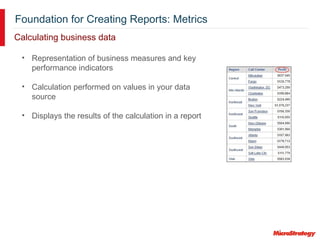
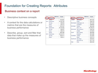
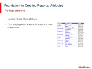
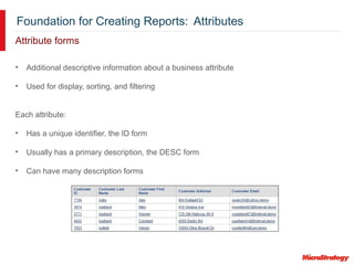
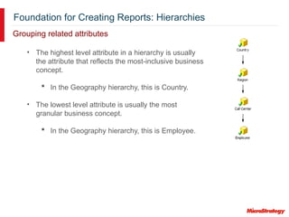
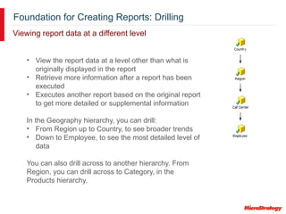
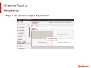
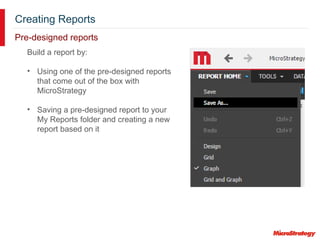
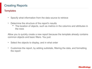
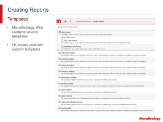
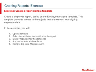
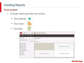
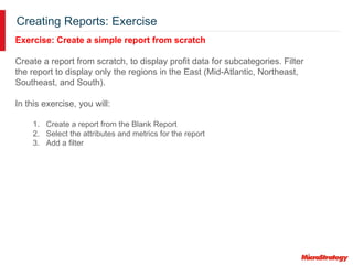
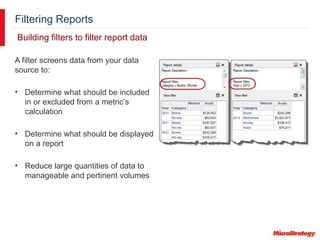
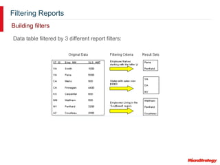
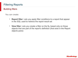
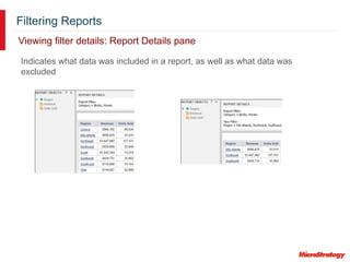
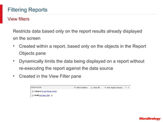
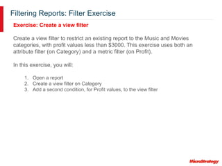
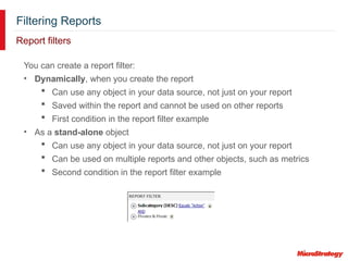
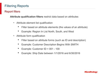
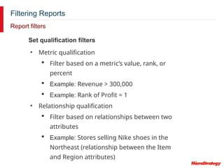
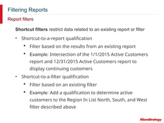
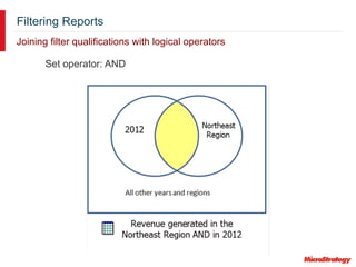
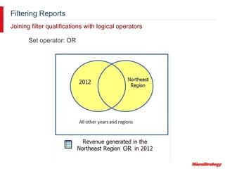
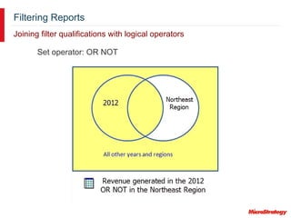
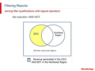
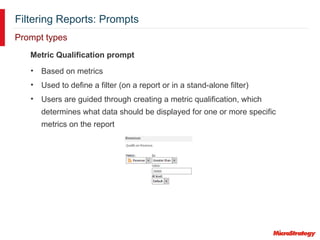
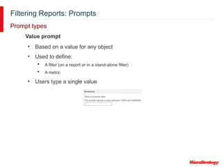
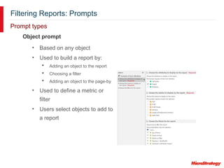
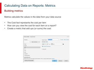
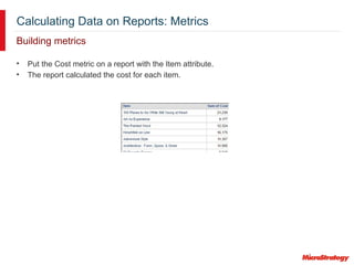
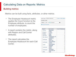
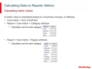
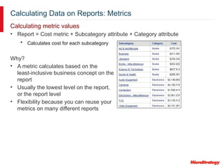
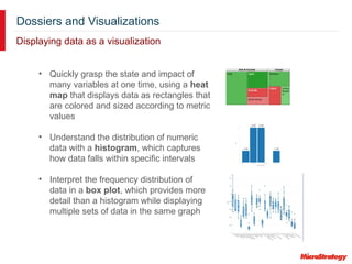
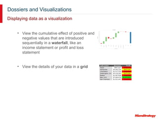
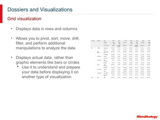
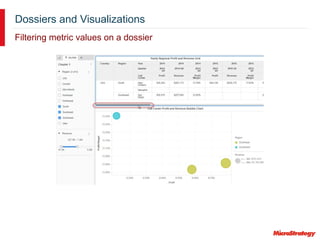
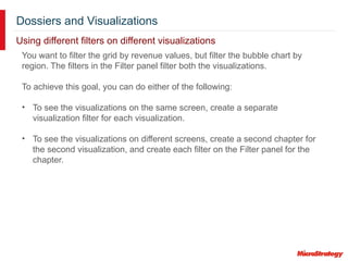
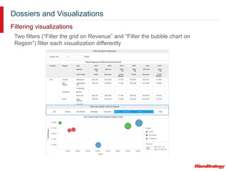
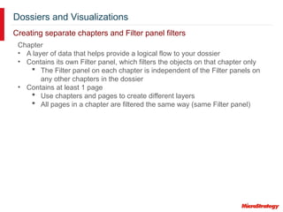
Introduction to Analytics Reporting
MicroStrategy Education
Foundation for Creating Reports
Chapter 1
Foundation for Creating Reports: Reports
What is a report?
• The focus of business intelligence analysis
• Gather business insight through data analysis
• Contain any of these objects:
 Metrics
 Attributes
 Filters
These objects determine:
• The data that is gathered from your data source
• How that data is calculated
• How the results are displayed
Foundation for Creating Reports: Metrics
• Representation of business measures and key
performance indicators
• Calculation performed on values in your data
source
• Displays the results of the calculation in a report
Calculating business data
Foundation for Creating Reports: Attributes
Business context on a report
• Descriptive business concepts
• A context for the data calculations or
metrics that are the measures of
business performance
• Describe, group, sort and filter that
data that make up the measures of
business performance
Foundation for Creating Reports: Attributes
Attribute elements
• Unique values of an attribute
• Data displayed on a report in a report’s rows
or columns
Foundation for Creating Reports: Attributes
Attribute forms
• Additional descriptive information about a business attribute
• Used for display, sorting, and filtering
Each attribute:
• Has a unique identifier, the ID form
• Usually has a primary description, the DESC form
• Can have many description forms
Foundation for Creating Reports: Hierarchies
• The highest level attribute in a hierarchy is usually
the attribute that reflects the most-inclusive business
concept.
 In the Geography hierarchy, this is Country.
• The lowest level attribute is usually the most
granular business concept.
 In the Geography hierarchy, this is Employee.
Grouping related attributes
Foundation for Creating Reports: Drilling
• View the report data at a level other than what is
originally displayed in the report
• Retrieve more information after a report has been
executed
• Executes another report based on the original report
to get more detailed or supplemental information
In the Geography hierarchy, you can drill:
• From Region up to Country, to see broader trends
• Down to Employee, to see the most detailed level of
data
You can also drill across to another hierarchy. From
Region, you can drill across to Category, in the
Products hierarchy.
Viewing report data at a different level
Foundation for Creating Reports: Exercise
Exercise: Report Basics
Gain familiarity with MicroStrategy Web’s development environment, screen
navigation, basic use of Web’s report development functions, along with
executing and then modifying a basic pre-designed report using attributes
and metrics.
In this exercise, you will:
1. Open a pre-designed report
2. Modify the report adding additional attributes and metrics
3. View the report in Grid, Graph, and Grid/Graph modes
4. Drill into the report to view a different level of data
Foundation for Creating Reports: Exercise
Exercise: Report Data Manipulation
Manipulate a report to display data in different ways for analysis.
In this exercise, you will:
1. Open a pre-designed report
2. Pivot the report data
3. Page the report
4. Drill into the report to view a different level of data
5. Change the background fill of the Revenue metric
6. Save the report with a different name
Creating Reports
Chapter 2
Creating Reports
Options for creating reports
Create a report in MicroStrategy Web using:
• Pre-designed reports
• Templates
• Blank report
Creating Reports
Report Editor
Reports are created using the Report Editor
Creating Reports
Pre-designed reports
Build a report by:
• Using one of the pre-designed reports
that come out of the box with
MicroStrategy
• Saving a pre-designed report to your
My Reports folder and creating a new
report based on it
Creating Reports
Templates
• Specify what information from the data source to retrieve
• Determine the structure of the report’s results
 The location of objects, such as metrics in the columns and attributes in
the rows
Allow you to quickly create a new report because the template already contains
common objects and basic filters. You just:
• Select the objects to display, and in what order
• Customize the report, by adding subtotals, filtering the data, and formatting
the report
Creating Reports
Templates
• MicroStrategy Web
contains several
templates
• Or, create your own
custom templates
Creating Reports: Exercise
Exercise: Create a report using a template
Create a employee report, based on the Employee Analysis template. This
template provides access to the objects that are relevant to analyzing
employee data.
In this exercise, you will:
1. Open a template
2. Select the attributes and metrics for the report
3. Display repeated row headers once
4. Add and remove attribute forms
5. Remove the extra Metrics column
Creating Reports
From scratch
• A simple report generally has at least:
 One attribute
 One metric
 One filter
Creating Reports: Exercise
Exercise: Create a simple report from scratch
Create a report from scratch, to display profit data for subcategories. Filter
the report to display only the regions in the East (Mid-Atlantic, Northeast,
Southeast, and South).
In this exercise, you will:
1. Create a report from the Blank Report
2. Select the attributes and metrics for the report
3. Add a filter
Filtering Reports
Chapter 3
Creating Filters and Prompts
Filtering Reports
Building filters to filter report data
A filter screens data from your data
source to:
• Determine what should be included
in or excluded from a metric’s
calculation
• Determine what should be displayed
on a report
• Reduce large quantities of data to
manageable and pertinent volumes
Filtering Reports
Data table filtered by 3 different report filters:
Building filters
Filtering Reports
Building filters
You can create:
• Report filter: Lets you apply filter conditions to a report that appear
in the SQL used to retrieve the report result set
• View filter: Lets you create a filter on the fly, based only on those
objects that are part of the report’s definition (that exist in the Report
objects pane)
Filtering Reports
Indicates what data was included in a report, as well as what data was
excluded
Viewing filter details: Report Details pane
Filtering Reports
View filters
Restricts data based only on the report results already displayed
on the screen
• Created within a report, based only on the objects in the Report
Objects pane
• Dynamically limits the data being displayed on a report without
re-executing the report against the data source
• Created in the View Filter pane
Filtering Reports: Filter Exercise
Exercise: Create a view filter
Create a view filter to restrict an existing report to the Music and Movies
categories, with profit values less than $3000. This exercise uses both an
attribute filter (on Category) and a metric filter (on Profit).
In this exercise, you will:
1. Open a report
2. Create a view filter on Category
3. Add a second condition, for Profit values, to the view filter
Filtering Reports
Report filters
You can create a report filter:
• Dynamically, when you create the report
 Can use any object in your data source, not just on your report
 Saved within the report and cannot be used on other reports
 First condition in the report filter example
• As a stand-alone object
 Can use any object in your data source, not just on your report
 Can be used on multiple reports and other objects, such as metrics
 Second condition in the report filter example
Filtering Reports
Report filters
Attribute qualification filters restrict data based on attributes
• Attribute element list qualification
 Filter based on attribute elements (the values of an attribute)
 Example: Region In List North, South, and West
• Attribute form qualification
 Filter based on attribute forms (such as ID and description)
 Example: Customer Description Begins With SMITH
 Example: Customer ID = 001 - 100
 Example: Ship Date between 1/1/2016 and 6/30/2016
Filtering Reports
Report filters
Set qualification filters
• Metric qualification
 Filter based on a metric’s value, rank, or
percent
 Example: Revenue > 300,000
 Example: Rank of Profit = 1
• Relationship qualification
 Filter based on relationships between two
attributes
 Example: Stores selling Nike shoes in the
Northeast (relationship between the Item
and Region attributes)
Filtering Reports
Report filters
Shortcut filters restrict data related to an existing report or filter
• Shortcut-to-a-report qualification
 Filter based on the results from an existing report
 Example: Intersection of the 1/1/2015 Active Customers
report and 12/31/2015 Active Customers report to
display continuing customers
• Shortcut-to-a-filter qualification
 Filter based on an existing filter
 Example: Add a qualification to determine active
customers to the Region In List North, South, and West
filter described above
Filtering Reports
Joining filter qualifications with logical operators
Set operator: AND
Filtering Reports
Joining filter qualifications with logical operators
Set operator: OR
Filtering Reports
Joining filter qualifications with logical operators
Set operator: OR NOT
Filtering Reports
Joining filter qualifications with logical operators
Set operator: AND NOT
Filtering Reports: Filter Exercise
Exercise: Create a report filter in a report
Create a report filter in the report that we applied a view filter to. The filter
uses the Subcategory attribute, which is not included on the report. Only
data from the Action, Comedy, Alternative, and Country subcategories will
be included in the report’s data.
In this exercise, you will:
1. Open a report
2. Create a report filter in the report, to filter on Subcategory (attribute form
qualification)
Filtering Reports: Filter Exercise
Exercise: Create stand-alone filters
In this exercise, you will create a:
• Filter for Revenue values over $5,000,000 (a metric qualification)
• Filter for specific items (an attribute list qualification)
• Filter using a shortcut to a report
• Report with Region and Revenue, filtered by the revenue filter
Finally, replace the revenue filter in the report with the item and shortcut
filters
Filtering Reports: Prompts
Allowing user input
A prompt:
• Is a question presenting to a user during report execution
 The user’s answer determines what data the report displays
 The user effectively creates his own filter
• Dynamically modifies the contents of a report
• Provides flexibility for report design
 One prompted report can satisfy multiple reporting requirements
Filtering Reports: Prompts
Allowing user input
On a report, you can place a prompt in:
Report filter Report template
Page-by
Filtering Reports: Prompts
Prompt types
Filtering Reports: Prompts
Prompt types
Attribute Element List prompt
• Based on attribute elements
• Used to define a filter (on a report or in a stand-alone filter)
• Users select prompt answers from a limited list of specific attribute
elements
Filtering Reports: Prompts
Prompt types
Attribute Qualification prompt
• Based on an attribute form
• Used to define a filter (on a report or in a stand-alone filter)
• Users select from a list of all the attribute elements from specific
attributes or are guided through creating a qualification to filter on an
attribute form
Filtering Reports: Prompts
Prompt types
Hierarchy Qualification prompt
• Based on attribute elements from one or more attributes in a hierarchy
• Used to define a filter (on a report or in a stand-alone filter)
• Users select attribute elements from a list of attributes
Filtering Reports: Prompts
Prompt types
Metric Qualification prompt
• Based on metrics
• Used to define a filter (on a report or in a stand-alone filter)
• Users are guided through creating a metric qualification, which
determines what data should be displayed for one or more specific
metrics on the report
Filtering Reports: Prompts
Prompt types
• Based on a value for any object
• Used to define:
 A filter (on a report or in a stand-alone filter)
 A metric
• Users type a single value
Value prompt
Filtering Reports: Prompts
Prompt types
Object prompt
• Based on any object
• Used to build a report by:
 Adding an object to the report
 Choosing a filter
 Adding an object to the page-by
• Used to define a metric or
filter
• Users select objects to add to
a report
Filtering Reports: Prompts
Prompt creation
• Prompt type: Select which type of prompt to create.
• Definition: Set limits on the amount of content that can be
selected in the prompt.
• General: Provide title, prompt instructions, required answer,
min/max limits, and personal answers.
• Style: Define how the prompt will be displayed (style, font,
size, and so on).
• Qualification: Choose whether to allow users to select
prompt answers, create a qualification, or select which to
use. Define the expression that qualifies the prompt answer.
Filtering Reports: Prompt Exercise
Exercise: Create prompts to use in a filter
In this exercise, you will:
1. Create these prompts:
• Prompt on the Product hierarchy: Users see all the attributes and
attribute elements in the Product hierarchy.
• Prompt on the Region attribute element list: Users see the entire list of
attribute elements (regions). Answering the prompt is required.
• Metric Qualification prompt on Revenue: Users are guided through
creating a metric qualification (filter) on the Revenue metric.
2. Create a report with Item and Revenue, and add the prompts to its report
filter.
3. Run and save the report with a prompted filter.
Filtering Reports: Prompts
Saving a prompted report
• Reports with prompts can be saved in various ways:
 Static
 Prompted
• You can reuse prompt answers when you run the same report
again
 When you create the prompt, select whether the prompt allows for
reusable answers (none, single, or multiple)
Filtering Reports: Prompt Exercise
Exercise: Create object prompts to select the objects displayed on a
report
In this exercise, you will:
1. Create a prompt to select metrics.
2. Create a prompt to select attributes.
3. Create a report using the object prompts.
4. Save the report as a prompted report, and use the prompt answers as the
default answers.
5. Run the report, using the default answers.
6. Save the report as a static, non-prompted report.
7. Run the report, which no longer displays the prompts.
Filtering Reports
Prompts on reports
Reprompting a report:
• Refreshing a report does not reprompt it.
• To reprompt a report, click the Reprompt button in the Data
toolbar.
Calculating Data on Reports
Chapter 4
Creating Metrics
Calculating Data on Reports: Metrics
Building metrics
Metrics calculate the values in the data from your data source
• The Cost fact represents the cost per item
• How can you view the cost for each item on a report?
• Create a metric that add ups (or sums) the cost:
Calculating Data on Reports: Metrics
Building metrics
• Put the Cost metric on a report with the Item attribute.
• The report calculated the cost for each item.
Calculating Data on Reports: Metrics
Building metrics
• The Employee Headcount metric
applies the Count function to the
Employee attribute, to count the
number of employees.
• A report contains the metric, along
with Region and Call Center
attributes.
• The report calculates the
Employee Headcount for each Call
Center.
Metrics can be built using facts, attributes, or other metrics
Calculating Data on Reports: Metrics
Calculating metric values
A metric value is calculated based on a business concept, or attribute.
• Cost metric = Sum (CostFact)
• Report = Cost metric + Category attribute
 Calculates cost for each category
• Report = Cost metric + Region attribute
 Calculates cost for each category
Calculating Data on Reports: Metrics
Calculating metric values
• Report = Cost metric + Subcategory attribute + Category attribute
 Calculates cost for each subcategory
Why?
• A metric calculates based on the
least-inclusive business concept on the
report
• Usually the lowest level on the report,
or the report level
• Flexibility because you can reuse your
metrics on many different reports
Calculating Data on Reports: Metric Exercise
Exercise: Create simple metrics
In this exercise, you will create:
• A Cost metric and save it in a new folder called My Metrics Exercises.
• Cost metric = Sum of Cost fact
• Format the values as currency with two decimal points. Format the
values so that negative numbers display in red with no negative sign
or parentheses.
• A Revenue metric and save it in your My Metrics Exercises folder.
• Revenue metric = Sum of Revenue fact
• Format the values as currency with two decimal points. Format the
values so that negative numbers display in red with no negative sign
or parentheses.
• A report that contains the Item attribute and your new Cost and Revenue
metrics. Save and run the report.
Calculating Data on Reports: Compound Metrics
Metrics made up of other metrics
A compound metric uses either of the following:
• Arithmetic operator between multiple metrics
 Example: Sum(Cost_Metric) + Sum(Profit_Metric)
• Can also use a non-group function (OLAP or scalar function)
 Example: RunningAvg(Cost_Metric)
Calculating Data on Reports: Compound Metrics
Smart metrics
Compound metrics can use smart totals, which:
• Defines the evaluation order for the final calculation
• Calculates subtotals on individual pieces of the compound metric
• Example: Sum (Metric1)/Sum (Metric2)
A regular total:
• Calculates subtotals by adding all the values for each row of the
report
• Example: Sum (Metric1/Metric2)
Calculating Data on Reports: Metric Exercise
Exercise: Create compound metrics and smart totals
In this exercise, you will:
1. Define the Profit Margin metric as:
Sum(Revenue - Cost)/Revenue
2. Edit the Profit Margin metric to allow smart totals, and save the metric as
Smart Profit Margin.
3. Add the following to the Item, Cost, Revenue Report (created in the
previous exercise):
• Category attribute
• Profit Margin metric
• Smart Profit Margin metric
4. Save the report as Compound Metric-Profit Margin-Subtotals.
Calculating Data on Reports: Metrics
Smart totals
• Look at the totals for the Profit Margin metric
 They are high because they’re adding all the metric values
 The metric is calculated for each row of the report, and then rolled up to
the correct level (category or grand total)
• Look at the totals for the Smart Profit Margin metric
 More reasonable because smart metrics calculate subtotals on individual
elements of the compound metric
 Adds all the revenue values together, adds all the cost values together,
subtracts the cost sum from the revenue sum, and divides that by the
revenue sum
Profit Margin Smart Profit Margin
Calculating Data on Reports: Metrics
Selecting subtotals and totals for metrics
Grand totals (usually called totals) and subtotals:
• Calculate metrics at different levels (such as by quarter, by year, by
region, and so on)
• Can be applied dynamically to any report
When you create a metric, you can enable subtotals and grand totals:
• Enabling allows them to display on a report
• Select the function (or functions) used to calculate a subtotal or
grand total
Calculating Data on Reports: Metric Exercise
Exercise: Display subtotals
In this exercise, you will:
1. Create a Cost - Subtotals metric that allows only the following subtotals:
• Average
• Maximum
• Standard Deviation
2. Create a report that contains:
• Item attribute
• Revenue metric
• Cost - Subtotals metric
• Average, Maximum, and Standard Deviation subtotals
Calculating Data on Reports: Derived Metrics
Building metrics directly on reports
Derived metric:
• Created based on existing metrics on the report, while you are viewing
the report
• Performs a calculation on the fly with the data available on a report,
without re-executing the report
• Often performs calculations between columns of metric values, to
display margins, contributions, and differences between metrics
• Example: Growth, which calculates the percent difference between
Revenue and Last Year’s Revenue
Calculating Data on Reports: Derived Metrics
Building metrics directly on reports
• Without parentheses, the division would occur first, producing undesired
derived metric values.
• The parentheses play a crucial role in the order of operations.
• Calculations in parentheses are performed before other calculations.
Calculating Data on Reports: Metric Exercise
Exercise: Create a derived metric
We need to calculate the difference in revenue values between 2015 and
2016.
In this exercise, you will:
1. Create a report filtered for 2016 that uses the Revenue metric created in
the previous exercise.
2. Create, within the report, a transformation derived metric called Last
Year’s (Revenue).
3. Create, within the report, a derived metric called Growth, using the other
two metrics on the report.
Delivering and Sharing Reports
Chapter 5
Delivering and Sharing Reports: Exporting
Export a report to these formats:
• CSV (Comma-Separated Values)
• HTML
• Microsoft Excel®
 Plain text (recommended for large reports)
 Formatted
• PDF
• Plain text
Available export formats
Delivering and Sharing Reports: Exporting
Export options
Delivering and Sharing Reports: Subscribing to Reports
Subscribing to reports for automatic delivery
• A report can be automatically delivered to:
 Your History List
 A mobile device (using MicroStrategy Mobile)
 An email address
 A network file location
 A printer
 An FTP server
 Your cache
• Deliveries can be on:
 A regular schedule
 When a specific event occurs
• Create a subscription to the report
 Subscriptions allow you to view reports when you
need them
Delivering and Sharing Reports
Sharing reports with other users
Share a report with other MicroStrategy users by:
• Emailing it
• Emailing it and delivering it to the History List
• Delivering it to the History List, and emailing the report and the link
• Delivering it to the History List, and emailing the link
Delivering and Sharing Reports
Sharing reports with other users
Bursting
• Split large reports into multiple, smaller files
• Each file contains a portion of data based on page-by
attributes
Delivering and Sharing Reports
Sharing a link URL
The link URL contains
• The object’s ID
• Any report changes made after the link URL was
generated
• Any prompt answers saved in the report
Share the link URL by:
• Emailing it to users
• Copying it and adding it to a document
• Displaying it in a web page using embedded HTML code
in an iFrame
Dossiers and Visualizations
Chapter 6
Dossiers and Visualizations
Introduction
Visualizations
• Visually-compelling, interactive representations of your data
• Make data easy to interpret and interact with
• Main component of dossiers
Dossiers
• Quickly and easily explore your business data with dossiers
• Creation is easy—just drag and drop objects to instantly see the results
of your changes
• Rapidly move from raw data to experimentation to discovering new
insights
Dossiers and Visualizations
Example
• Pie chart
 Displays the contribution of
various regions to the total
revenue
• Bubble chart
 Visualizes the trends of the
revenue, profit, and cost
values for different
categories and
subcategories
 Each bubble is a
subcategory
 Bubbles are graphed on a
scatter plot of revenue and
profit values
 Bubbles are based on the
cost value
Dossiers and Visualizations
Exercise: Create a dossier
In this exercise, you will:
1. Create a blank dossier
Dossiers and Visualizations
Edit Mode
• Use to create and interact with your dossier
• Use to import your data
• Drag and drop objects to:
 Create visualizations that display data
 Create filters for the data
 Group data
Dossiers and Visualizations
Adding data to your dossier
Your data can come from:
• An external data source, such as a file, Freeform script, database, or
Salesforce.com report
• An existing MicroStrategy report, including Intelligent Cube reports and
MDX reports
• A report that you create within the dossier
• An existing Intelligent Cube, including imported data
• Data in the current MicroStrategy project
Dossiers and Visualizations
Exercise: Add data from a MicroStrategy report
In this exercise, you will:
1. Add data from a earlier report, Yearly Regional Profit and Revenue
Dossiers and Visualizations
After you import data
• The report is called a dataset within the dossier
• Displayed in the Datasets panel
 The report’s attributes and metrics are
displayed as objects
 Drag and drop these objects to create
visualizations and to filter the visualizations
based on the objects
Dossiers and Visualizations
Displaying data as a visualization
• Explore the relationships
between data elements by
creating a network
visualization
• Summarize key business
indicators in clear, easy-to-
understand, visually striking
bar charts, bubble charts,
and other graphs
Dossiers and Visualizations
Displaying data as a visualization
• Display markers, density maps,
or areas on an interactive map
• Display a high-performance
vector map using a Geospatial
Service map, which allows you
to:
 Show geographic areas down
to the detail of the postal code
for most countries
 Zoom through layers from the
entire world to the street level
(this example shows both
country and state layers)
 Tilt the map for a 3D view
 Color areas using an
attribute’s elements
Dossiers and Visualizations
Displaying data as a visualization
• Quickly grasp the state and impact of
many variables at one time, using a heat
map that displays data as rectangles that
are colored and sized according to metric
values
• Understand the distribution of numeric
data with a histogram, which captures
how data falls within specific intervals
• Interpret the frequency distribution of
data in a box plot, which provides more
detail than a histogram while displaying
multiple sets of data in the same graph
Dossiers and Visualizations
Displaying data as a visualization
• View the cumulative effect of positive and
negative values that are introduced
sequentially in a waterfall, like an
income statement or profit and loss
statement
• View the details of your data in a grid
Dossiers and Visualizations
Grid visualization
• Displays data in rows and columns
• Allows you to pivot, sort, move, drill,
filter, and perform additional
manipulations to analyze the data
• Displays actual data, rather than
graphic elements like bars or circles
 Use it to understand and prepare
your data before displaying it on
another type of visualization
Dossiers and Visualizations
Exercise: Create a grid visualization
In this exercise, you will:
1. Create a grid visualization using the data in the imported dataset
Dossiers and Visualizations: Presentation Mode
Viewing a dossier in full screen
• Maximizes the amount of space available for data display
• Optimized for sharing your dossier during a presentation
• Displays the dossier in full screen by limiting object creation and editing
• Filter data to change what is displayed
Dossiers and Visualizations
Exercise: View the dossier in Presentation Mode
In this exercise, you will:
1. Switch to Presentation Mode
2. Switch back to Edit Mode
Dossiers and Visualizations: Grid Visualization
Analyzing and formatting data
• Pivot the report data
 Move an object between the columns and rows
 Swap the rows and columns
• Drill to view a different level of data
 Drill to dataset objects not shown in the Editor panel
 If all objects within the dataset are displayed in the dossier, no drilling
options are displayed
• Sort data based on a single object or multiple objects
• Display subtotals
• Copy rows of data and paste them into another program for further analysis
• Change the display of the grid, including the font, background color, and
borders for each part of the grid, such as the column headers, row
headers, and so on
• Highlight metric values by creating a threshold, which applies formatting
when the data meets a condition that you define
Dossiers and Visualizations
Bubble chart visualization
• Highlights the trends for the values of three metrics
• Each bubble represents an attribute element (such as North and South)
• The bubbles are graphed on a scatter plot
• The bubbles can be sized and colored by metric values and attributes
Dossiers and Visualizations
Exercise: Create a bubble chart visualization
While the bubble chart displays much of the same information as the grid
visualization, you can more easily see the differences in revenue and profit
between the different call centers.
In this exercise, you will:
1. Create a bubble chart visualization using the data in the imported
dataset
Dossiers and Visualizations: Bubble Chart Visualization
Analyzing and formatting data
• See the data for a specific bubble
• Drill from a bubble to view a different level of data
• Change the shape of the marker in the bubble chart
 Circle, square, tick, ring, and pie
• Change the color of an attribute value
Dossiers and Visualizations
Filtering data on a dossier
• Specifies conditions that data must meet to be included in the results
• Limit and customize large quantities of data
• Help focus on what you really need to see and analyze
Dossiers and Visualizations
Exercise: Create a filter using the Filter panel
You want to focus on the data for the southern regions only. You want both
visualizations to display data for the south, so create a filter on the Filter
panel. Filters on the Filter panel apply to both the visualizations.
In this exercise, you will:
1. Create a filter on region
2. Filter the visualizations by selecting only South, Southeast, and
Southwest
Dossiers and Visualizations
Filtering metric values on a dossier
Dossiers and Visualizations
Using different filters on different visualizations
You want to filter the grid by revenue values, but filter the bubble chart by
region. The filters in the Filter panel filter both the visualizations.
To achieve this goal, you can do either of the following:
• To see the visualizations on the same screen, create a separate
visualization filter for each visualization.
• To see the visualizations on different screens, create a second chapter for
the second visualization, and create each filter on the Filter panel for the
chapter.
Dossiers and Visualizations
Filtering visualizations
Two filters (“Filter the grid on Revenue” and “Filter the bubble chart on
Region”) filter each visualization differently
Dossiers and Visualizations
Creating separate chapters and Filter panel filters
Chapter
• A layer of data that helps provide a logical flow to your dossier
• Contains its own Filter panel, which filters the objects on that chapter only
 The Filter panel on each chapter is independent of the Filter panels on
any other chapters in the dossier
• Contains at least 1 page
 Use chapters and pages to create different layers
 All pages in a chapter are filtered the same way (same Filter panel)
Dossiers and Visualizations
Creating separate chapters and Filter panel filters
Chapter/page example
• Each chapter has 2 pages
• Chapters separate time-based vs. location-based visualizations
• Analysis by Time chapter filtered by revenue values
Dossiers and Visualizations
Creating separate chapters and Filter panel filters
Chapter/page example
• Analysis by Location chapter filtered by regions
Dossiers and Visualizations
Creating separate chapters and Filter panel filters
Chapter/page example
• Analysis by Location chapter filtered by regions
Dossiers and Visualizations
Exercise: Rename the chapter and page
Rename the default Chapter 1 and Page 1 to be more descriptive and
helpful.
In this exercise, you will:
1. Rename Chapter 1 to Profit & Revenue Analysis
2. Rename Page 1 to Region & Call Center
Dossiers and Visualizations
Sharing a dossier everywhere: Library on web and mobile devices
MicroStrategy Library
• Simple visual bookshelf
• Collaboration solution with a unified landing page
• Allows everyone to interact with dossiers, to share information and insights
 Easily collaborate with other users, by commenting on dossiers and
tagging other users in those comments
 Share dossiers with other users, in their own personal libraries
• Receive notifications when:
 A dossier changes
 You receive a shared dossier
 You are tagged in a dossier’s comments
Dossiers and Visualizations
Sharing a dossier everywhere: Library on web and mobile devices
Web-based Library
Dossiers and Visualizations
Sharing a dossier everywhere: Library on web and mobile devices
Mobile-based Library
Dossiers and Visualizations
Exercise: Add a dossier to your Library
Adding dossier to your Library allows you to view the dossier anywhere.
A cover page thumbnail helps you quickly identify the dossier in your
Library.
In this exercise, you will:
1. Add a cover page
2. Get a link to Library
3. Add your dossier to Library
Education at MicroStrategy
Drive User Adoption and Increase Knowledge
Increasing MicroStrategy Adoption
Education Offerings
Perennial Education Pass (PEP)
Training Units
E-courseware
• Self-paced eLearning
• Perpetual license
• Drive user adoption
• Simulations & quizzes
• Hosted on LMS
• Multiple modules
available
• Valid for 12 months
• Customer onsite training
• 54 TUs/day
Pay as you go:
• Instructor-led distance
learning
• Certifications
• Exams
• Recorded courses
Access to:
• Online instructor-led training
• Recorded courses
• Exams and certifications
• On-demand modules
Tiered pricing by # users $100 per training unit $3500/year
New Education Catalog
• New Course Catalog
• Course descriptions
• Learning paths
• Certification tracks
• Education offerings
• Download from the MicroStrategy Website
• www.microstrategy.com/services/education
Help us improve!!
Take the Course Survey at microstrategy.csod.com
You are one step closer…
• 10.111 Overview of Enterprise Analytics (2 days)
• 10.112 Introduction to Analytics Reporting (2 days)
• 10.142 Dashboarding and Visualizations(2 days)
• 10.121 Overview of Enterprise Mobility (2 days)
• 10.131 Overview of Enterprise Security (1 day)
• 10.132 Enterprise Security Analytics (1 day)
MCSA
End of Training
Thank you for your participation!

PPT: Introduction to Analytics Reporting

  • 1.
    Introduction to AnalyticsReporting MicroStrategy Education
  • 2.
    Foundation for CreatingReports Chapter 1
  • 3.
    Foundation for CreatingReports: Reports What is a report? • The focus of business intelligence analysis • Gather business insight through data analysis • Contain any of these objects:  Metrics  Attributes  Filters These objects determine: • The data that is gathered from your data source • How that data is calculated • How the results are displayed
  • 4.
    Foundation for CreatingReports: Metrics • Representation of business measures and key performance indicators • Calculation performed on values in your data source • Displays the results of the calculation in a report Calculating business data
  • 5.
    Foundation for CreatingReports: Attributes Business context on a report • Descriptive business concepts • A context for the data calculations or metrics that are the measures of business performance • Describe, group, sort and filter that data that make up the measures of business performance
  • 6.
    Foundation for CreatingReports: Attributes Attribute elements • Unique values of an attribute • Data displayed on a report in a report’s rows or columns
  • 7.
    Foundation for CreatingReports: Attributes Attribute forms • Additional descriptive information about a business attribute • Used for display, sorting, and filtering Each attribute: • Has a unique identifier, the ID form • Usually has a primary description, the DESC form • Can have many description forms
  • 8.
    Foundation for CreatingReports: Hierarchies • The highest level attribute in a hierarchy is usually the attribute that reflects the most-inclusive business concept.  In the Geography hierarchy, this is Country. • The lowest level attribute is usually the most granular business concept.  In the Geography hierarchy, this is Employee. Grouping related attributes
  • 9.
    Foundation for CreatingReports: Drilling • View the report data at a level other than what is originally displayed in the report • Retrieve more information after a report has been executed • Executes another report based on the original report to get more detailed or supplemental information In the Geography hierarchy, you can drill: • From Region up to Country, to see broader trends • Down to Employee, to see the most detailed level of data You can also drill across to another hierarchy. From Region, you can drill across to Category, in the Products hierarchy. Viewing report data at a different level
  • 10.
    Foundation for CreatingReports: Exercise Exercise: Report Basics Gain familiarity with MicroStrategy Web’s development environment, screen navigation, basic use of Web’s report development functions, along with executing and then modifying a basic pre-designed report using attributes and metrics. In this exercise, you will: 1. Open a pre-designed report 2. Modify the report adding additional attributes and metrics 3. View the report in Grid, Graph, and Grid/Graph modes 4. Drill into the report to view a different level of data
  • 11.
    Foundation for CreatingReports: Exercise Exercise: Report Data Manipulation Manipulate a report to display data in different ways for analysis. In this exercise, you will: 1. Open a pre-designed report 2. Pivot the report data 3. Page the report 4. Drill into the report to view a different level of data 5. Change the background fill of the Revenue metric 6. Save the report with a different name
  • 12.
  • 13.
    Creating Reports Options forcreating reports Create a report in MicroStrategy Web using: • Pre-designed reports • Templates • Blank report
  • 14.
    Creating Reports Report Editor Reportsare created using the Report Editor
  • 15.
    Creating Reports Pre-designed reports Builda report by: • Using one of the pre-designed reports that come out of the box with MicroStrategy • Saving a pre-designed report to your My Reports folder and creating a new report based on it
  • 16.
    Creating Reports Templates • Specifywhat information from the data source to retrieve • Determine the structure of the report’s results  The location of objects, such as metrics in the columns and attributes in the rows Allow you to quickly create a new report because the template already contains common objects and basic filters. You just: • Select the objects to display, and in what order • Customize the report, by adding subtotals, filtering the data, and formatting the report
  • 17.
    Creating Reports Templates • MicroStrategyWeb contains several templates • Or, create your own custom templates
  • 18.
    Creating Reports: Exercise Exercise:Create a report using a template Create a employee report, based on the Employee Analysis template. This template provides access to the objects that are relevant to analyzing employee data. In this exercise, you will: 1. Open a template 2. Select the attributes and metrics for the report 3. Display repeated row headers once 4. Add and remove attribute forms 5. Remove the extra Metrics column
  • 19.
    Creating Reports From scratch •A simple report generally has at least:  One attribute  One metric  One filter
  • 20.
    Creating Reports: Exercise Exercise:Create a simple report from scratch Create a report from scratch, to display profit data for subcategories. Filter the report to display only the regions in the East (Mid-Atlantic, Northeast, Southeast, and South). In this exercise, you will: 1. Create a report from the Blank Report 2. Select the attributes and metrics for the report 3. Add a filter
  • 21.
  • 22.
    Filtering Reports Building filtersto filter report data A filter screens data from your data source to: • Determine what should be included in or excluded from a metric’s calculation • Determine what should be displayed on a report • Reduce large quantities of data to manageable and pertinent volumes
  • 23.
    Filtering Reports Data tablefiltered by 3 different report filters: Building filters
  • 24.
    Filtering Reports Building filters Youcan create: • Report filter: Lets you apply filter conditions to a report that appear in the SQL used to retrieve the report result set • View filter: Lets you create a filter on the fly, based only on those objects that are part of the report’s definition (that exist in the Report objects pane)
  • 25.
    Filtering Reports Indicates whatdata was included in a report, as well as what data was excluded Viewing filter details: Report Details pane
  • 26.
    Filtering Reports View filters Restrictsdata based only on the report results already displayed on the screen • Created within a report, based only on the objects in the Report Objects pane • Dynamically limits the data being displayed on a report without re-executing the report against the data source • Created in the View Filter pane
  • 27.
    Filtering Reports: FilterExercise Exercise: Create a view filter Create a view filter to restrict an existing report to the Music and Movies categories, with profit values less than $3000. This exercise uses both an attribute filter (on Category) and a metric filter (on Profit). In this exercise, you will: 1. Open a report 2. Create a view filter on Category 3. Add a second condition, for Profit values, to the view filter
  • 28.
    Filtering Reports Report filters Youcan create a report filter: • Dynamically, when you create the report  Can use any object in your data source, not just on your report  Saved within the report and cannot be used on other reports  First condition in the report filter example • As a stand-alone object  Can use any object in your data source, not just on your report  Can be used on multiple reports and other objects, such as metrics  Second condition in the report filter example
  • 29.
    Filtering Reports Report filters Attributequalification filters restrict data based on attributes • Attribute element list qualification  Filter based on attribute elements (the values of an attribute)  Example: Region In List North, South, and West • Attribute form qualification  Filter based on attribute forms (such as ID and description)  Example: Customer Description Begins With SMITH  Example: Customer ID = 001 - 100  Example: Ship Date between 1/1/2016 and 6/30/2016
  • 30.
    Filtering Reports Report filters Setqualification filters • Metric qualification  Filter based on a metric’s value, rank, or percent  Example: Revenue > 300,000  Example: Rank of Profit = 1 • Relationship qualification  Filter based on relationships between two attributes  Example: Stores selling Nike shoes in the Northeast (relationship between the Item and Region attributes)
  • 31.
    Filtering Reports Report filters Shortcutfilters restrict data related to an existing report or filter • Shortcut-to-a-report qualification  Filter based on the results from an existing report  Example: Intersection of the 1/1/2015 Active Customers report and 12/31/2015 Active Customers report to display continuing customers • Shortcut-to-a-filter qualification  Filter based on an existing filter  Example: Add a qualification to determine active customers to the Region In List North, South, and West filter described above
  • 32.
    Filtering Reports Joining filterqualifications with logical operators Set operator: AND
  • 33.
    Filtering Reports Joining filterqualifications with logical operators Set operator: OR
  • 34.
    Filtering Reports Joining filterqualifications with logical operators Set operator: OR NOT
  • 35.
    Filtering Reports Joining filterqualifications with logical operators Set operator: AND NOT
  • 36.
    Filtering Reports: FilterExercise Exercise: Create a report filter in a report Create a report filter in the report that we applied a view filter to. The filter uses the Subcategory attribute, which is not included on the report. Only data from the Action, Comedy, Alternative, and Country subcategories will be included in the report’s data. In this exercise, you will: 1. Open a report 2. Create a report filter in the report, to filter on Subcategory (attribute form qualification)
  • 37.
    Filtering Reports: FilterExercise Exercise: Create stand-alone filters In this exercise, you will create a: • Filter for Revenue values over $5,000,000 (a metric qualification) • Filter for specific items (an attribute list qualification) • Filter using a shortcut to a report • Report with Region and Revenue, filtered by the revenue filter Finally, replace the revenue filter in the report with the item and shortcut filters
  • 38.
    Filtering Reports: Prompts Allowinguser input A prompt: • Is a question presenting to a user during report execution  The user’s answer determines what data the report displays  The user effectively creates his own filter • Dynamically modifies the contents of a report • Provides flexibility for report design  One prompted report can satisfy multiple reporting requirements
  • 39.
    Filtering Reports: Prompts Allowinguser input On a report, you can place a prompt in: Report filter Report template Page-by
  • 40.
  • 41.
    Filtering Reports: Prompts Prompttypes Attribute Element List prompt • Based on attribute elements • Used to define a filter (on a report or in a stand-alone filter) • Users select prompt answers from a limited list of specific attribute elements
  • 42.
    Filtering Reports: Prompts Prompttypes Attribute Qualification prompt • Based on an attribute form • Used to define a filter (on a report or in a stand-alone filter) • Users select from a list of all the attribute elements from specific attributes or are guided through creating a qualification to filter on an attribute form
  • 43.
    Filtering Reports: Prompts Prompttypes Hierarchy Qualification prompt • Based on attribute elements from one or more attributes in a hierarchy • Used to define a filter (on a report or in a stand-alone filter) • Users select attribute elements from a list of attributes
  • 44.
    Filtering Reports: Prompts Prompttypes Metric Qualification prompt • Based on metrics • Used to define a filter (on a report or in a stand-alone filter) • Users are guided through creating a metric qualification, which determines what data should be displayed for one or more specific metrics on the report
  • 45.
    Filtering Reports: Prompts Prompttypes • Based on a value for any object • Used to define:  A filter (on a report or in a stand-alone filter)  A metric • Users type a single value Value prompt
  • 46.
    Filtering Reports: Prompts Prompttypes Object prompt • Based on any object • Used to build a report by:  Adding an object to the report  Choosing a filter  Adding an object to the page-by • Used to define a metric or filter • Users select objects to add to a report
  • 47.
    Filtering Reports: Prompts Promptcreation • Prompt type: Select which type of prompt to create. • Definition: Set limits on the amount of content that can be selected in the prompt. • General: Provide title, prompt instructions, required answer, min/max limits, and personal answers. • Style: Define how the prompt will be displayed (style, font, size, and so on). • Qualification: Choose whether to allow users to select prompt answers, create a qualification, or select which to use. Define the expression that qualifies the prompt answer.
  • 48.
    Filtering Reports: PromptExercise Exercise: Create prompts to use in a filter In this exercise, you will: 1. Create these prompts: • Prompt on the Product hierarchy: Users see all the attributes and attribute elements in the Product hierarchy. • Prompt on the Region attribute element list: Users see the entire list of attribute elements (regions). Answering the prompt is required. • Metric Qualification prompt on Revenue: Users are guided through creating a metric qualification (filter) on the Revenue metric. 2. Create a report with Item and Revenue, and add the prompts to its report filter. 3. Run and save the report with a prompted filter.
  • 49.
    Filtering Reports: Prompts Savinga prompted report • Reports with prompts can be saved in various ways:  Static  Prompted • You can reuse prompt answers when you run the same report again  When you create the prompt, select whether the prompt allows for reusable answers (none, single, or multiple)
  • 50.
    Filtering Reports: PromptExercise Exercise: Create object prompts to select the objects displayed on a report In this exercise, you will: 1. Create a prompt to select metrics. 2. Create a prompt to select attributes. 3. Create a report using the object prompts. 4. Save the report as a prompted report, and use the prompt answers as the default answers. 5. Run the report, using the default answers. 6. Save the report as a static, non-prompted report. 7. Run the report, which no longer displays the prompts.
  • 51.
    Filtering Reports Prompts onreports Reprompting a report: • Refreshing a report does not reprompt it. • To reprompt a report, click the Reprompt button in the Data toolbar.
  • 52.
    Calculating Data onReports Chapter 4 Creating Metrics
  • 53.
    Calculating Data onReports: Metrics Building metrics Metrics calculate the values in the data from your data source • The Cost fact represents the cost per item • How can you view the cost for each item on a report? • Create a metric that add ups (or sums) the cost:
  • 54.
    Calculating Data onReports: Metrics Building metrics • Put the Cost metric on a report with the Item attribute. • The report calculated the cost for each item.
  • 55.
    Calculating Data onReports: Metrics Building metrics • The Employee Headcount metric applies the Count function to the Employee attribute, to count the number of employees. • A report contains the metric, along with Region and Call Center attributes. • The report calculates the Employee Headcount for each Call Center. Metrics can be built using facts, attributes, or other metrics
  • 56.
    Calculating Data onReports: Metrics Calculating metric values A metric value is calculated based on a business concept, or attribute. • Cost metric = Sum (CostFact) • Report = Cost metric + Category attribute  Calculates cost for each category • Report = Cost metric + Region attribute  Calculates cost for each category
  • 57.
    Calculating Data onReports: Metrics Calculating metric values • Report = Cost metric + Subcategory attribute + Category attribute  Calculates cost for each subcategory Why? • A metric calculates based on the least-inclusive business concept on the report • Usually the lowest level on the report, or the report level • Flexibility because you can reuse your metrics on many different reports
  • 58.
    Calculating Data onReports: Metric Exercise Exercise: Create simple metrics In this exercise, you will create: • A Cost metric and save it in a new folder called My Metrics Exercises. • Cost metric = Sum of Cost fact • Format the values as currency with two decimal points. Format the values so that negative numbers display in red with no negative sign or parentheses. • A Revenue metric and save it in your My Metrics Exercises folder. • Revenue metric = Sum of Revenue fact • Format the values as currency with two decimal points. Format the values so that negative numbers display in red with no negative sign or parentheses. • A report that contains the Item attribute and your new Cost and Revenue metrics. Save and run the report.
  • 59.
    Calculating Data onReports: Compound Metrics Metrics made up of other metrics A compound metric uses either of the following: • Arithmetic operator between multiple metrics  Example: Sum(Cost_Metric) + Sum(Profit_Metric) • Can also use a non-group function (OLAP or scalar function)  Example: RunningAvg(Cost_Metric)
  • 60.
    Calculating Data onReports: Compound Metrics Smart metrics Compound metrics can use smart totals, which: • Defines the evaluation order for the final calculation • Calculates subtotals on individual pieces of the compound metric • Example: Sum (Metric1)/Sum (Metric2) A regular total: • Calculates subtotals by adding all the values for each row of the report • Example: Sum (Metric1/Metric2)
  • 61.
    Calculating Data onReports: Metric Exercise Exercise: Create compound metrics and smart totals In this exercise, you will: 1. Define the Profit Margin metric as: Sum(Revenue - Cost)/Revenue 2. Edit the Profit Margin metric to allow smart totals, and save the metric as Smart Profit Margin. 3. Add the following to the Item, Cost, Revenue Report (created in the previous exercise): • Category attribute • Profit Margin metric • Smart Profit Margin metric 4. Save the report as Compound Metric-Profit Margin-Subtotals.
  • 62.
    Calculating Data onReports: Metrics Smart totals • Look at the totals for the Profit Margin metric  They are high because they’re adding all the metric values  The metric is calculated for each row of the report, and then rolled up to the correct level (category or grand total) • Look at the totals for the Smart Profit Margin metric  More reasonable because smart metrics calculate subtotals on individual elements of the compound metric  Adds all the revenue values together, adds all the cost values together, subtracts the cost sum from the revenue sum, and divides that by the revenue sum Profit Margin Smart Profit Margin
  • 63.
    Calculating Data onReports: Metrics Selecting subtotals and totals for metrics Grand totals (usually called totals) and subtotals: • Calculate metrics at different levels (such as by quarter, by year, by region, and so on) • Can be applied dynamically to any report When you create a metric, you can enable subtotals and grand totals: • Enabling allows them to display on a report • Select the function (or functions) used to calculate a subtotal or grand total
  • 64.
    Calculating Data onReports: Metric Exercise Exercise: Display subtotals In this exercise, you will: 1. Create a Cost - Subtotals metric that allows only the following subtotals: • Average • Maximum • Standard Deviation 2. Create a report that contains: • Item attribute • Revenue metric • Cost - Subtotals metric • Average, Maximum, and Standard Deviation subtotals
  • 65.
    Calculating Data onReports: Derived Metrics Building metrics directly on reports Derived metric: • Created based on existing metrics on the report, while you are viewing the report • Performs a calculation on the fly with the data available on a report, without re-executing the report • Often performs calculations between columns of metric values, to display margins, contributions, and differences between metrics • Example: Growth, which calculates the percent difference between Revenue and Last Year’s Revenue
  • 66.
    Calculating Data onReports: Derived Metrics Building metrics directly on reports • Without parentheses, the division would occur first, producing undesired derived metric values. • The parentheses play a crucial role in the order of operations. • Calculations in parentheses are performed before other calculations.
  • 67.
    Calculating Data onReports: Metric Exercise Exercise: Create a derived metric We need to calculate the difference in revenue values between 2015 and 2016. In this exercise, you will: 1. Create a report filtered for 2016 that uses the Revenue metric created in the previous exercise. 2. Create, within the report, a transformation derived metric called Last Year’s (Revenue). 3. Create, within the report, a derived metric called Growth, using the other two metrics on the report.
  • 68.
    Delivering and SharingReports Chapter 5
  • 69.
    Delivering and SharingReports: Exporting Export a report to these formats: • CSV (Comma-Separated Values) • HTML • Microsoft Excel®  Plain text (recommended for large reports)  Formatted • PDF • Plain text Available export formats
  • 70.
    Delivering and SharingReports: Exporting Export options
  • 71.
    Delivering and SharingReports: Subscribing to Reports Subscribing to reports for automatic delivery • A report can be automatically delivered to:  Your History List  A mobile device (using MicroStrategy Mobile)  An email address  A network file location  A printer  An FTP server  Your cache • Deliveries can be on:  A regular schedule  When a specific event occurs • Create a subscription to the report  Subscriptions allow you to view reports when you need them
  • 72.
    Delivering and SharingReports Sharing reports with other users Share a report with other MicroStrategy users by: • Emailing it • Emailing it and delivering it to the History List • Delivering it to the History List, and emailing the report and the link • Delivering it to the History List, and emailing the link
  • 73.
    Delivering and SharingReports Sharing reports with other users Bursting • Split large reports into multiple, smaller files • Each file contains a portion of data based on page-by attributes
  • 74.
    Delivering and SharingReports Sharing a link URL The link URL contains • The object’s ID • Any report changes made after the link URL was generated • Any prompt answers saved in the report Share the link URL by: • Emailing it to users • Copying it and adding it to a document • Displaying it in a web page using embedded HTML code in an iFrame
  • 75.
  • 76.
    Dossiers and Visualizations Introduction Visualizations •Visually-compelling, interactive representations of your data • Make data easy to interpret and interact with • Main component of dossiers Dossiers • Quickly and easily explore your business data with dossiers • Creation is easy—just drag and drop objects to instantly see the results of your changes • Rapidly move from raw data to experimentation to discovering new insights
  • 77.
    Dossiers and Visualizations Example •Pie chart  Displays the contribution of various regions to the total revenue • Bubble chart  Visualizes the trends of the revenue, profit, and cost values for different categories and subcategories  Each bubble is a subcategory  Bubbles are graphed on a scatter plot of revenue and profit values  Bubbles are based on the cost value
  • 78.
    Dossiers and Visualizations Exercise:Create a dossier In this exercise, you will: 1. Create a blank dossier
  • 79.
    Dossiers and Visualizations EditMode • Use to create and interact with your dossier • Use to import your data • Drag and drop objects to:  Create visualizations that display data  Create filters for the data  Group data
  • 80.
    Dossiers and Visualizations Addingdata to your dossier Your data can come from: • An external data source, such as a file, Freeform script, database, or Salesforce.com report • An existing MicroStrategy report, including Intelligent Cube reports and MDX reports • A report that you create within the dossier • An existing Intelligent Cube, including imported data • Data in the current MicroStrategy project
  • 81.
    Dossiers and Visualizations Exercise:Add data from a MicroStrategy report In this exercise, you will: 1. Add data from a earlier report, Yearly Regional Profit and Revenue
  • 82.
    Dossiers and Visualizations Afteryou import data • The report is called a dataset within the dossier • Displayed in the Datasets panel  The report’s attributes and metrics are displayed as objects  Drag and drop these objects to create visualizations and to filter the visualizations based on the objects
  • 83.
    Dossiers and Visualizations Displayingdata as a visualization • Explore the relationships between data elements by creating a network visualization • Summarize key business indicators in clear, easy-to- understand, visually striking bar charts, bubble charts, and other graphs
  • 84.
    Dossiers and Visualizations Displayingdata as a visualization • Display markers, density maps, or areas on an interactive map • Display a high-performance vector map using a Geospatial Service map, which allows you to:  Show geographic areas down to the detail of the postal code for most countries  Zoom through layers from the entire world to the street level (this example shows both country and state layers)  Tilt the map for a 3D view  Color areas using an attribute’s elements
  • 85.
    Dossiers and Visualizations Displayingdata as a visualization • Quickly grasp the state and impact of many variables at one time, using a heat map that displays data as rectangles that are colored and sized according to metric values • Understand the distribution of numeric data with a histogram, which captures how data falls within specific intervals • Interpret the frequency distribution of data in a box plot, which provides more detail than a histogram while displaying multiple sets of data in the same graph
  • 86.
    Dossiers and Visualizations Displayingdata as a visualization • View the cumulative effect of positive and negative values that are introduced sequentially in a waterfall, like an income statement or profit and loss statement • View the details of your data in a grid
  • 87.
    Dossiers and Visualizations Gridvisualization • Displays data in rows and columns • Allows you to pivot, sort, move, drill, filter, and perform additional manipulations to analyze the data • Displays actual data, rather than graphic elements like bars or circles  Use it to understand and prepare your data before displaying it on another type of visualization
  • 88.
    Dossiers and Visualizations Exercise:Create a grid visualization In this exercise, you will: 1. Create a grid visualization using the data in the imported dataset
  • 89.
    Dossiers and Visualizations:Presentation Mode Viewing a dossier in full screen • Maximizes the amount of space available for data display • Optimized for sharing your dossier during a presentation • Displays the dossier in full screen by limiting object creation and editing • Filter data to change what is displayed
  • 90.
    Dossiers and Visualizations Exercise:View the dossier in Presentation Mode In this exercise, you will: 1. Switch to Presentation Mode 2. Switch back to Edit Mode
  • 91.
    Dossiers and Visualizations:Grid Visualization Analyzing and formatting data • Pivot the report data  Move an object between the columns and rows  Swap the rows and columns • Drill to view a different level of data  Drill to dataset objects not shown in the Editor panel  If all objects within the dataset are displayed in the dossier, no drilling options are displayed • Sort data based on a single object or multiple objects • Display subtotals • Copy rows of data and paste them into another program for further analysis • Change the display of the grid, including the font, background color, and borders for each part of the grid, such as the column headers, row headers, and so on • Highlight metric values by creating a threshold, which applies formatting when the data meets a condition that you define
  • 92.
    Dossiers and Visualizations Bubblechart visualization • Highlights the trends for the values of three metrics • Each bubble represents an attribute element (such as North and South) • The bubbles are graphed on a scatter plot • The bubbles can be sized and colored by metric values and attributes
  • 93.
    Dossiers and Visualizations Exercise:Create a bubble chart visualization While the bubble chart displays much of the same information as the grid visualization, you can more easily see the differences in revenue and profit between the different call centers. In this exercise, you will: 1. Create a bubble chart visualization using the data in the imported dataset
  • 94.
    Dossiers and Visualizations:Bubble Chart Visualization Analyzing and formatting data • See the data for a specific bubble • Drill from a bubble to view a different level of data • Change the shape of the marker in the bubble chart  Circle, square, tick, ring, and pie • Change the color of an attribute value
  • 95.
    Dossiers and Visualizations Filteringdata on a dossier • Specifies conditions that data must meet to be included in the results • Limit and customize large quantities of data • Help focus on what you really need to see and analyze
  • 96.
    Dossiers and Visualizations Exercise:Create a filter using the Filter panel You want to focus on the data for the southern regions only. You want both visualizations to display data for the south, so create a filter on the Filter panel. Filters on the Filter panel apply to both the visualizations. In this exercise, you will: 1. Create a filter on region 2. Filter the visualizations by selecting only South, Southeast, and Southwest
  • 97.
    Dossiers and Visualizations Filteringmetric values on a dossier
  • 98.
    Dossiers and Visualizations Usingdifferent filters on different visualizations You want to filter the grid by revenue values, but filter the bubble chart by region. The filters in the Filter panel filter both the visualizations. To achieve this goal, you can do either of the following: • To see the visualizations on the same screen, create a separate visualization filter for each visualization. • To see the visualizations on different screens, create a second chapter for the second visualization, and create each filter on the Filter panel for the chapter.
  • 99.
    Dossiers and Visualizations Filteringvisualizations Two filters (“Filter the grid on Revenue” and “Filter the bubble chart on Region”) filter each visualization differently
  • 100.
    Dossiers and Visualizations Creatingseparate chapters and Filter panel filters Chapter • A layer of data that helps provide a logical flow to your dossier • Contains its own Filter panel, which filters the objects on that chapter only  The Filter panel on each chapter is independent of the Filter panels on any other chapters in the dossier • Contains at least 1 page  Use chapters and pages to create different layers  All pages in a chapter are filtered the same way (same Filter panel)
  • 101.
    Dossiers and Visualizations Creatingseparate chapters and Filter panel filters Chapter/page example • Each chapter has 2 pages • Chapters separate time-based vs. location-based visualizations • Analysis by Time chapter filtered by revenue values
  • 102.
    Dossiers and Visualizations Creatingseparate chapters and Filter panel filters Chapter/page example • Analysis by Location chapter filtered by regions
  • 103.
    Dossiers and Visualizations Creatingseparate chapters and Filter panel filters Chapter/page example • Analysis by Location chapter filtered by regions
  • 104.
    Dossiers and Visualizations Exercise:Rename the chapter and page Rename the default Chapter 1 and Page 1 to be more descriptive and helpful. In this exercise, you will: 1. Rename Chapter 1 to Profit & Revenue Analysis 2. Rename Page 1 to Region & Call Center
  • 105.
    Dossiers and Visualizations Sharinga dossier everywhere: Library on web and mobile devices MicroStrategy Library • Simple visual bookshelf • Collaboration solution with a unified landing page • Allows everyone to interact with dossiers, to share information and insights  Easily collaborate with other users, by commenting on dossiers and tagging other users in those comments  Share dossiers with other users, in their own personal libraries • Receive notifications when:  A dossier changes  You receive a shared dossier  You are tagged in a dossier’s comments
  • 106.
    Dossiers and Visualizations Sharinga dossier everywhere: Library on web and mobile devices Web-based Library
  • 107.
    Dossiers and Visualizations Sharinga dossier everywhere: Library on web and mobile devices Mobile-based Library
  • 108.
    Dossiers and Visualizations Exercise:Add a dossier to your Library Adding dossier to your Library allows you to view the dossier anywhere. A cover page thumbnail helps you quickly identify the dossier in your Library. In this exercise, you will: 1. Add a cover page 2. Get a link to Library 3. Add your dossier to Library
  • 109.
    Education at MicroStrategy DriveUser Adoption and Increase Knowledge
  • 110.
  • 111.
    Education Offerings Perennial EducationPass (PEP) Training Units E-courseware • Self-paced eLearning • Perpetual license • Drive user adoption • Simulations & quizzes • Hosted on LMS • Multiple modules available • Valid for 12 months • Customer onsite training • 54 TUs/day Pay as you go: • Instructor-led distance learning • Certifications • Exams • Recorded courses Access to: • Online instructor-led training • Recorded courses • Exams and certifications • On-demand modules Tiered pricing by # users $100 per training unit $3500/year
  • 112.
    New Education Catalog •New Course Catalog • Course descriptions • Learning paths • Certification tracks • Education offerings • Download from the MicroStrategy Website • www.microstrategy.com/services/education
  • 113.
    Help us improve!! Takethe Course Survey at microstrategy.csod.com
  • 114.
    You are onestep closer… • 10.111 Overview of Enterprise Analytics (2 days) • 10.112 Introduction to Analytics Reporting (2 days) • 10.142 Dashboarding and Visualizations(2 days) • 10.121 Overview of Enterprise Mobility (2 days) • 10.131 Overview of Enterprise Security (1 day) • 10.132 Enterprise Security Analytics (1 day) MCSA
  • 115.
    End of Training Thankyou for your participation!

Editor's Notes

  • #110 -peps/tus/ecourseware -which classes to take -new catalog and certifications -WORLD2017 10% discount on Education purchases through CSOD the end of April -enter contact information