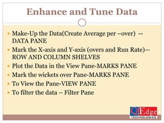
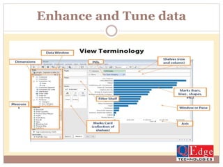
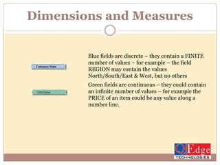
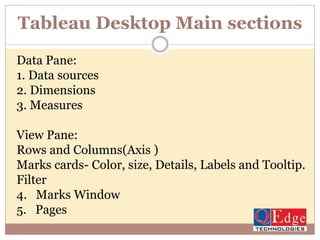
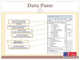
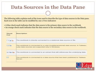
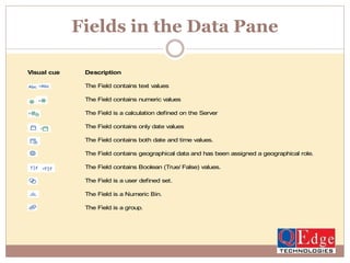
TableauTableau Training Overview
Tableau
Business Intelligence and Analytics
Highlights :
DATA VISUALIZATION
1. What is Data Visualization ?
2. Best Practice for Data Visualization
3. Process Life Cycle of Data Visualization?
4. Basic Chart Creation
Tableau:
1.Tableau Product Family
2.Tableau Desktop
Data Visualization
What it is and Why it is important?
 Data visualization is the presentation of data in a pictorial or
graphical format. For centuries, people have depended on
visual representations such as charts and maps to understand
information more easily and quickly.
 Because of the way the human brain processes information, it
is faster for people to grasp the meaning of many data points
when they are displayed in charts and graphs rather than
poring over piles of spreadsheets or reading pages and pages
of reports.
 Why?
 Visualizations help people see things that were not obvious to
them before.
 Even when data volumes are very large, patterns can be
spotted quickly and easily.
What is Data Visualization ?
Best Practices
Best Practices : ATTENTIVE vs PRE-ATTENTIVE
Process Cycle of Data Visualization
Exercise –Create Run Rate Graph
Tableau Product Family
Acquiring Data
FilteringData
Enhance and Tune Data
 Make-Up the Data(Create Average per –over) --
DATA PANE
 Mark the X-axis and Y-axis (overs and Run Rate)—
ROW AND COLUMN SHELVES
 Plot the Data in the View Pane-MARKS PANE
 Mark the wickets over Pane-MARKS PANE
 To View the Pane-VIEW PANE
 To filter the data – Filter Pane
Enhance and Tune data
Dimensions and Measures
Blue fields are discrete – they contain a FINITE
number of values – for example – the field
REGION may contain the values
North/South/East & West, but no others
Green fields are continuous – they could contain
an infinite number of values – for example the
PRICE of an item could be any value along a
number line.
Tableau Desktop Main sections
Data Pane:
1. Data sources
2. Dimensions
3. Measures
View Pane:
Rows and Columns(Axis )
Marks cards- Color, size, Details, Labels and Tooltip.
Filter
4. Marks Window
5. Pages
Data Pane
Data Sources in the Data Pane
The following table explains each of the icons used to describe the type of data sources in the Data pane.
Each icon in the table can be modified by one o f two indicators
• A blue check mark indicates that the data source is the primary data source in the workbook.
• An orange check mark indicates that the data source is the secondary data source in the workbook.
Visual
Cue
Description
The workbook is directly connected to a relational data source or file.
The workbook is connected to a cube (multidimensional) data source. In Tableau,
cube data sources are supported only in Windows.
The workbook is connected to an extract that still references the underlying data.
The workbook is connected to a data source that has been published to Tableau
Server.
Fields in the Data Pane
Visual cue Description
The Field contains text values
The Field contains numeric values
The Field is a calculation defined on the Server
The Field contains only date values
The Field contains both date and time values.
The Field contains geographical data and has been assigned a geographical role.
The Field contains Boolean (True/ False) values.
The Field is a user defined set.
The Field is a Numeric Bin.
The Field is a group.
Contact for Tableau Training
2nd Floor, Nagasuri Plaza, Opp.
Mythri vihar, Ameerpet, Hyderabad,
Telangana 500082
Toll Free : 1800 300 73343
Mail: info@qedgetech.com
Hands on Practical Tableau Training by Industry Experts
http://www.qedgetech.com/tableau-online-training

Tableau Business Intelligence and Analytics

  • 1.
  • 2.
    Highlights : DATA VISUALIZATION 1.What is Data Visualization ? 2. Best Practice for Data Visualization 3. Process Life Cycle of Data Visualization? 4. Basic Chart Creation Tableau: 1.Tableau Product Family 2.Tableau Desktop
  • 3.
    Data Visualization What itis and Why it is important?  Data visualization is the presentation of data in a pictorial or graphical format. For centuries, people have depended on visual representations such as charts and maps to understand information more easily and quickly.  Because of the way the human brain processes information, it is faster for people to grasp the meaning of many data points when they are displayed in charts and graphs rather than poring over piles of spreadsheets or reading pages and pages of reports.  Why?  Visualizations help people see things that were not obvious to them before.  Even when data volumes are very large, patterns can be spotted quickly and easily.
  • 4.
    What is DataVisualization ?
  • 5.
  • 6.
    Best Practices :ATTENTIVE vs PRE-ATTENTIVE
  • 7.
    Best Practices :ATTENTIVE vs PRE-ATTENTIVE
  • 8.
    Process Cycle ofData Visualization
  • 9.
  • 10.
  • 11.
  • 12.
  • 13.
    Enhance and TuneData  Make-Up the Data(Create Average per –over) -- DATA PANE  Mark the X-axis and Y-axis (overs and Run Rate)— ROW AND COLUMN SHELVES  Plot the Data in the View Pane-MARKS PANE  Mark the wickets over Pane-MARKS PANE  To View the Pane-VIEW PANE  To filter the data – Filter Pane
  • 14.
  • 15.
    Dimensions and Measures Bluefields are discrete – they contain a FINITE number of values – for example – the field REGION may contain the values North/South/East & West, but no others Green fields are continuous – they could contain an infinite number of values – for example the PRICE of an item could be any value along a number line.
  • 16.
    Tableau Desktop Mainsections Data Pane: 1. Data sources 2. Dimensions 3. Measures View Pane: Rows and Columns(Axis ) Marks cards- Color, size, Details, Labels and Tooltip. Filter 4. Marks Window 5. Pages
  • 17.
  • 18.
    Data Sources inthe Data Pane The following table explains each of the icons used to describe the type of data sources in the Data pane. Each icon in the table can be modified by one o f two indicators • A blue check mark indicates that the data source is the primary data source in the workbook. • An orange check mark indicates that the data source is the secondary data source in the workbook. Visual Cue Description The workbook is directly connected to a relational data source or file. The workbook is connected to a cube (multidimensional) data source. In Tableau, cube data sources are supported only in Windows. The workbook is connected to an extract that still references the underlying data. The workbook is connected to a data source that has been published to Tableau Server.
  • 19.
    Fields in theData Pane Visual cue Description The Field contains text values The Field contains numeric values The Field is a calculation defined on the Server The Field contains only date values The Field contains both date and time values. The Field contains geographical data and has been assigned a geographical role. The Field contains Boolean (True/ False) values. The Field is a user defined set. The Field is a Numeric Bin. The Field is a group.
  • 20.
    Contact for TableauTraining 2nd Floor, Nagasuri Plaza, Opp. Mythri vihar, Ameerpet, Hyderabad, Telangana 500082 Toll Free : 1800 300 73343 Mail: info@qedgetech.com Hands on Practical Tableau Training by Industry Experts http://www.qedgetech.com/tableau-online-training