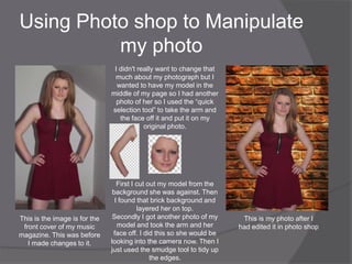
The document discusses planning for a music magazine. It analyzes Billboard magazine as a style model and notes its conventions like simple colors, one main image, and bold fonts. It discusses choosing IPC Media as the distributor due to their music magazine experience. The intended audience is identified as teenage girls. Conventions of music magazine covers are discussed like eye-catching images and logos. A photo shoot is planned to feature the cover model making eye contact with the camera against a plain white background.
The document summarizes what the student learned about technologies from constructing their music magazine. They used Adobe Photoshop and Illustrator to design the magazine pages, learning various editing techniques like cropping images and moving text. They also used online tools like Blogger to upload their work, Picnik to experiment with image editing, and Survey Monkey to get audience feedback through a questionnaire. Overall, the process helped increase their understanding of software like Photoshop and the various techniques for digital design and publication.
For their project, the student created an R&B music magazine individually over ten weeks. They learned new skills like photo editing in Photoshop and layout design in InDesign. Their magazine represents young female artists and fans of R&B music. It uses conventions like cover images, headlines and articles but with its own style. Feedback was generally positive but showed room for improvement in contents design. Overall, the student gained skills and understanding in magazine production through this project.
The document describes the process of creating a music magazine cover and layout. The creator was inspired by a Vogue magazine cover they saw, particularly liking how it was set out like a poster and had bold writing for stories. For their music magazine, they aimed for a sophisticated look with neutral colors and a serious model on the cover. Feedback noted the contents page could be improved, so the creator added more color and spacing to make it look more professional while keeping the overall style. Through this process, the creator learned Photoshop skills that improved their work.
The document discusses the evaluation of a music magazine product. It compares the product to real music magazines like Billboard and Vibe, examining similarities and differences in areas like cover design, layout, images and content. It also addresses questions about the target audience, how the product represents social groups, and what media institution might distribute it.
The document discusses the creator's R&B magazine that targets young males. It summarizes the conventions used for the front cover, content page, and double page spread and how they resemble an existing R&B magazine (VIBE). The front cover features a single artist as the main image. The content page lists information briefly and places it below the image rather than around it. The double page spread includes a large main image and smaller related image, and columns of text rather than lists. Research of VIBE helped with layout decisions. Some conventions were modified slightly for variety.
The document discusses the process of creating a magazine cover and layout. It describes how the author was inspired by a Vogue magazine cover in designing their own music magazine cover. Key aspects they replicated included the bold masthead, sophisticated main image, and column layout of the contents page. The author explains how they aimed to create a sophisticated, neutral design with a black and white color scheme. Feedback noted the contents page could be improved, so the author made changes like adding more color and spacing out the text. Overall, working on this preliminary project helped the author learn Photoshop skills to produce a higher quality final magazine cover.
Rebecca created a magazine called "Indigo" that was inspired by popular mainstream magazines like Vogue and Cosmopolitan. She used conventions like a large masthead and centered cover photo but challenged conventions by omitting coverlines. Rebecca represented her target audience of teenage girls through the cover model's clothing and pose. She believes her magazine would be distributed by IPC Media, a large publisher of music and gossip magazines, to attract her target audience of females aged 15-30 interested in pop and R&B music.
The document discusses how the media product both uses conventions of real music magazines and challenges some of those conventions. It incorporates typical elements like a masthead, additional cover lines, and price, but excludes things like slogans. Images are presented in a more natural way that challenges conventions around looking "picture perfect." Fonts and layouts are also used in some unconventional ways, like a serious expression on the main artist rather than a wide smile. The goal was to balance familiarity with new approaches to better represent the artist.
The document discusses the author's magazine project on the genre of Bhangra music. It evaluates how the magazine challenges and follows conventions of real magazines. Key points include using few strap lines on the cover to show simplicity while still including them, including balanced images and text on the double page spread to follow conventions, and representing the Bhangra music audience and culture through the colors, images, and topics chosen. The author also reflects on learning Photoshop skills like using the sponge tool and the importance of following conventions to make the magazine look professional.
The document provides details about the design and content of a hip-hop magazine called "BEAT" created by the author for a media evaluation assignment. It summarizes the ways in which the magazine's design and conventions follow or challenge those of real hip-hop magazines. Key aspects discussed include the magazine cover, contents page, double-page spread layout and the representation of the target hip-hop audience aged 16-19. Distribution and potential publisher Bauer Media are also discussed.
This document summarizes the results of audience testing and evaluation of a student-created music magazine product. The magazine focused on pop music and included a front cover, contents page, and double-page feature article. Audience testing found that most recognized it as a pop music/gossip magazine based on visual cues. Respondents felt the professional layout, fonts, colors and images made the pages look authentic. The feature article was seen as genuine journalism. Through this process, the student learned about designing for their target audience of 12-17 year old girls and incorporating industry conventions into their magazine.
Media Studies - Magazine Evaluation PowerPointBeckyx1
My magazine targets 16-24 year olds, with a focus on females aged 16-24. It represents this demographic through the models, language, and content used, which focus on music, fashion, and partying. The layout and design conform to typical magazine conventions to appear credible. It would be distributed through both traditional retailers and online to reach its target audience. The intended publisher would be IPC Media due to their large reach and experience with similar music magazines. The magazine aims to attract its audience through exclusive content, competitions, and aligning with the interests of 16-24 year olds.
The document describes how the author's magazine cover, contents page, and double page spread use and develop conventions of real magazines. Key points:
1) The magazine was modeled after Billboard magazine in terms of design elements like font, colors, and inclusion of features such as straplines, issue numbers, and barcodes.
2) The contents page and double page spread continue the color scheme and layout established on the cover to tie the elements together.
3) Conventions like quotes and photos are used prominently and strategically to draw readers in, mirroring techniques seen in researched magazines.
The document describes how the student's media magazine product uses and develops conventions of real magazines. The magazine cover, contents page, and double page spread follow conventions found in researching the Billboard magazine specifically and other magazines more generally. Key conventions included are color schemes, layouts, inclusion of details like issue numbers and websites. The magazine is aimed at representing teenagers and younger adults as a demographic interested in new artists as role models. A music-focused media institution would be suited to distribute the magazine.
The document describes the process of constructing a music magazine media product. It discusses using conventions from real magazines, such as a masthead, cover image, and contents listing. Color scheme and layout are also addressed. Feedback was gathered from reviews by intended audiences aged 13 to 26. The creator learned about using software like Fireworks for image editing and sourcing appropriate pictures and fonts. Reflecting on preliminary work showed a need for fuller pages, higher quality images, and better planning of design elements.
The document discusses how the media product, a music magazine called WITCH, uses conventions from existing magazines like Q Magazine, Kerrang, and MOJO as influences. It aims the magazine at older teenagers aged 16-24 and features both male and female artists from the indie and alternative music genres to represent the target audience. The magazine would be distributed nationally by IPC Media, who distribute similar magazines like NME, to effectively reach the target audience.
The document discusses how the media product, a music magazine called WITCH, uses conventions from existing magazines like Q Magazine, Kerrang, and MOJO as influences. It aims the magazine at older teenagers aged 16-24 and features both male and female artists from the indie and alternative music genres to represent the target audience. The magazine would be distributed nationally in the UK by IPC Media due to their experience with similar music magazines like NME.
The document summarizes the key aspects of an underground magazine created for a media studies assignment. It discusses conventions used and challenged in the magazine's design, such as cover lines, mastheads, images, and barcodes. Social groups represented include young people aged 14-20 interested in indie/rock music. A double page spread on a band called "The Pretty Suicides" uses different text colors and includes photos and a quote. The gender portrayed is strong, dominant teenage girls rather than stereotypical quiet ones. IPC Media is suggested as a suitable distributor since it produces magazines like NME that the underground magazine is similar to. The target audience is described as those who read magazines aimed at people interested in pop culture and
BAKER DONELSON - Attorney Layoffs The SINKING OF A TERRORIST REGIME (FRISIAN)VogelDenise
17 USC § 107 (LIMITATIONS On EXCLUSIVE Rights - FAIR USE) - For Educational and Information Purposes
IEPENBIERE melding: Sis it fierder - - HELP stypje it ynstoarten fan de Feriene Steaten 'Ndebele terroristyske GOVERNMENT regime!
Graach meidwaan yn de Pulling OF kontrakten, him weromlûkende bedriuwen en finânsjes fan terroristyske Wet bedrijven as Baker Algra Bearman Caldwell & Berkowitz. . .
It sinken fan de BAKKER Algra BEARMAN Caldwell & Berkowitz SHIP is LONG efterstallich!
Wurden en te nimmen DOWN Dizze terroristyske Ndebele Government mastermind!
1) On November 19, 2010, Hart held a CNBC town hall meeting where he discussed the eviction of Obama from the White House and called for revolution in Israel.
2) In 2011 and 2012, Baker Donelson expanded into Florida while various individuals were arrested or had actions taken against them by the FBI related to the death of Trayvon Martin.
3) Donelson controls media coverage and portrays events as "premeditated" to turn public opinion against revolution.
This document discusses copyright and how to properly use copyrighted material. It explains that when you create an original work, it is automatically copyrighted. To use copyrighted material, you need permission from the copyright owner. The summary outlines the process of finding out who owns the copyright, writing to request permission, and properly citing the source.
The document discusses tattoos and their history in the Philippines as well as risks associated with permanent tattoos. It notes that tattoos have long been a tradition among certain indigenous tribes in the Philippines like the Igorot and Ifugao peoples. However, it cautions that getting a permanent tattoo can risk one's health and that 50% of people who get tattoos eventually want them removed, suggesting temporary tattoo options may be safer alternatives to consider.
The Union Budget aims to focus on economic recovery in light of a sluggish economy. Key highlights include targeting a fiscal deficit of 3.9% for the current year and 3.5% in 2016-17, implementing GST by 2016, and increasing infrastructure spending by Rs. 70,000 crore. The budget also cuts corporate tax rates gradually to 25% over 4 years and increases individual tax exemptions. Challenges include meeting growth targets, asset sale targets, and potential needs for more public bank recapitalization.
CAN ANYTHING GOOD COME OUT OF UTICA - AzerbaijaniVogelDenise
Amerika Birləşmiş Ştatları OUT danışmaq və rəng insanların həyat şəraitinin nəzarət öz irqçi / ağ SUPREMACIST təcrübələri ifşa AFRICAN-Amerika vətəndaşları zərər çəkmiş haqqında getdi - Dünyanın "lirə-BE LEADER" necə oldu. Yalnız YƏHUDİ CƏMİYYƏTİ BROKERS (- NASDAQ fond bazarının SƏDRİ Bernard Madoff) - biri kimi - Sonra Amerika Birləşmiş Ştatları Aldadıcı məqsədləri üçün FALSE İŞ Hesabatlar söndürmək o SAXTA MALİYYƏ Hesabatlar yaradılan zaman ETDİM və keçirdiyi / Müştərilərdən DOLLAR MILYARDLARI çaldı.
Amerika Jobs Aktı Belə ki, çox! Baker Donelson Bearman Caldwell & Berkowitz İCTİMAİ / DÜNYA FALSE HESABATLAR tərəfindən aldadılaraq ki YouTube, onların cinayət Davranış ifşa SONLANDIRILMASI Voicemail Message aradan qaldırılması üçün cüretini - siz Amerika Birləşmiş Amerikanın prezidenti Barak Obama ABŞ və onun Hüquq Müşaviri bilirdinizmi onlar Amerika Birləşmiş Ştatları İqtisadiyyat İŞ (bu deyil zaman!) yaxşı və çıxaran ki, mö'min daxil Xarici Millətlər aldatmaq yaratmaq? Əslində, onların terrorist və Xalq-Of-Color və XALQLARI-rəngli on irqçi hücumlar salmayın Newsome kimi vətəndaşların iş OĞURLAYIR olunur!
Onlar Ağ Evdə Barak Obama yerləşdirilmiş - Color çox Millətlər Amerika Birləşmiş Ştatlarının ən böyük SEÇKİ Dolandırıcılar biri ALDANMIŞ edilmişdir. Barak Obama kimi DƏRİ COLOR ilə bir şəxs Ağ Ev yerləşdirilmiş olan cəhalət və Dünya liderləri hesab edirəm ki, sərsəmlik haqqında PLAYING Amerika Birləşmiş Ştatları, onun irqçi yolları dəyişib ki, ki, - - - YENƏ edirəm! ABŞ prezidenti Barak Obama PRETTY Oturma və istibdad EMPIRE tikilib yəhudilər və Ku Klux Klan üzvləri ilə laughing olunur!
NO İŞ Amerika Birləşmiş Ştatları ortaya qoyaraq yalan və NÖMRƏLƏRİ saxtalaşdırılması aparılır ki, Hesabatlar. Just Vogel Denise Newsome kimi, çox vətəndaşların hesabat etməyin və həmçinin Amerikanın TERROR / ağ SUPREMACIST imperiyasının Birləşmiş Ştatları zərər çəkmişlər çevrilmişdir - Amerika Birləşmiş Ştatları və onun Müttəfiqlər edirik İQTİSADİ / MALİYYƏ Collapse haqqında gətirmək bilmişdir istibdad rejimi onların gizli saxlamaq üçün ən yaxşı; İCTİMAİ / DÜNYA özləri üçün bilərsiniz ki, lakin, biz həqiqəti təmin axmaq Xarici Nation Liderlər JUST zərər çəkmişlər olmaq və onların pulları və İNVESTİSİYALAR DAVAM EDƏN vasitəsilə mənimsənilir üçün Amerika Birləşmiş Ştatları etibar olmuşdur necə "SWAP Dolandırıcılar:"
http://www.slideshare.net/VogelDenise/barack-obama-termination-voicemail-messina-garretson-resolution-group
http://www.slideshare.net/VogelDenise/despotism-part-1-of-4-41035201
http://www.slideshare.net/VogelDenise/despotism-part-2-of-4
http://www.slideshare.net/VogelDenise/despotism-part-3-of-4
http://www.slideshare.net/VogelDenise/despotism-part-4-of-4
http://www.slideshare.net/VogelDenise/despotism-practices-in-the-united-states-of-america
It appears President Barack Obama and Baker Donelson may have had Breitbart added to their WEEKLY "KILL LIST" - Considering they used Breitbart as a FRONT to go after AFRICAN-American Civil Rights Activist Shirley Sherrod's job
TURKISH YOUTH UNION CONFRONTS UNITED STATES MILITARY TERRORIST REGIME (SPANISH)VogelDenise
PRIMER un grito a la TURCO JUVENTUD Unión por el VALIENTE soporte que tomó en el enfrentamiento de los Estados Unidos de régimen terrorista militar de Estados Unidos.
Me gustó mucho la RISA y continuar a reír cada vez que ver el videoclip en libertad. Disfruté poner esta presentación junto a arrojar luz adicional sobre la cuestión! No sólo eso, parece interesante de cómo el WESTERN Noticias en su cobertura de la etiqueta del soporte como un ataque; Sin embargo, no notificó el PÚBLICA / MUNDO que los Miembros de la Unión de Jóvenes turcos fueron simplemente expresando sus objeciones a los Estados Unidos de América MILITAR TERRORISTA estar en su suelo / en su tierra!
NO MÁS BULLYING: http://www.slideshare.net/VogelDenise/no-more-bullying-standing-up-to-the-united-states-of-america
Es una vergüenza y desgracia cuando uno ve que los gobernantes de las Naciones de color han aprendido nada de los Estados Unidos de la historia de América - - ¿Cómo BLANCOS EUROPEAS entraron y robaron la tierra que los Estados Unidos de América es en la actualidad de los nativos (indios , etc.).
Es una vergüenza y desgracia cuando Líderes de Gobierno de las Naciones de color conspirar con líderes gubernamentales de las Naciones CONTROLADAS-BLANCO PARA MATAR / ASESINATO / destruir a sus ciudadanos a causa del color de su piel, así como su religión (musulmana / Islam). Al parecer, los gobernantes estúpidos e ignorantes que no aprendió nada y como los indios nativos americanos que ahora están enjaulados en RESERVAS las naciones europeas con Occidente han puesto en marcha un plan de esclavitud:
http://www.slideshare.net/VogelDenise/united-states-of-america-immigration-reform-spanish
Es una vergüenza y desgracia cuando Líderes de Gobierno de las Naciones de color también saben / NACIÓN DEL historia de su país y cómo a la vez sus ciudades eran hermosos a la vista; sin embargo, están ahora en ruinas a causa de la TERRORISTA / WHITE supremacista Hechos de los Estados Unidos de América y de JUDIOS Ku Klux Klan! No sólo eso cómo los Estados Unidos de Gobierno BLANCO RACISTA de Estados Unidos ha permitido a Israel de usar su poder militar para comenzar y LUCHAR sus guerras de religión, ya que quiere la supremacía judía en el Medio Oriente y en todo el mundo!
¡Qué estúpido es para las Naciones / Gobiernos para sonreir y hacer tratos con un terrorista Régimen Gobierno como los Estados Unidos de América, Israel y sus aliados - con el respaldo de las Naciones Unidas, la OTAN, la Unión Europea, etc. Todos los que han fracasado para hacer su trabajo y aparecen son una parte de este judío y BLANCO EMPUJE RACISTA bajo su "dE LA ORDEN MUNDIAL!"
Fomentarse QUEDARSE EN LA LUCHA y terminar el curso!
El documento describe los principios de un currículo comprensivo en el mundo y en Ecuador. Un currículo debe ser abierto y flexible, integrar diferentes formas de expresión además del lenguaje verbal, organizar el trabajo de forma cooperativa y permitir el acceso de todos los estudiantes. También debe facilitar el desarrollo de la autonomía y la inclusión, evitando estereotipos e incorporando aspectos de diversidad en todas las materias.
17 USC § 107 (MUGAK ESKLUSIBOAK Eskubideen On - Bidezko erabilera)
Hau albiste eta informazioa dela Sionistek / WHITE SUPREMACIST engainagarri talde hau deitzen Illuminati Vogel Denise Newsome hori eskatu daki zuen hedabide kanpo mantentzeko love litzateke bada. Ez dizugu IN hau CONTROLADA Berriak dira beharrean egia beharrean lanpetuta engainatzen eta engainagarria Pertsonak delako!
Maiatzean, herri zapalduak izan despotismoa Amerikako eta bere aliatuek Batuetako Gobernuak; Vogel Denise Newsome batekin elkartu eta iritzia eman, zabaldu hitza, euskarri lana. . .
BABYLON behera egin du - - Dezagun DRIVE iltzeak hilkutxa!
BAKER DONELSON - Attorney Layoffs The SINKING OF A TERRORIST REGIME (FILIPINO)VogelDenise
17 USC § 107 (LIMITATIONS On EXCLUSIVE Rights - FAIR USE) - For Educational and Information Purposes
PUBLIC NOTIFICATION: Ipagkalat ang WORD - - HELP SUPPORT THE collapse NG ESTADOS UNIDOS 'despotismo TERORISTA GOVERNMENT REHIMENG!
Mangyaring sumali sa batak NG KONTRATA, withdraw NEGOSYO at pananalapi mula TERORISTA Firms Law bilang Baker Donelson Bearman Caldwell & Berkowitz. . .
Ang SINKING ng BAKER Donelson Bearman CALDWELL & Berkowitz SHIP ay LONG overdue!
Uniting TOGETHER Upang TAKE DOWN ito TERORISTA despotismo Government MASTERMIND!
Room 6D is a band that released their second album titled "Bridges Album No. 2". The album was released under their own independent record label. It contains 12 original songs written and performed by the band showcasing their indie rock sound and style of music.
Проект “Экологический транспорт, объединяющий соседей” по Программе LV-LT-BY ...Ira Koleda
Презентация для стартовой конференции
Проекта международной технической помощи Программы трансграничного сотрудничества LV-LT-BY 2007-2013 “Экологический транспорт, объединяющий соседей” LLB-2-173
European Neighbourhood And Partnership Instrument 2007-2013 Cross Border Cooperation Programme Latvia-Lithuania-Belarus
Project LLB-2-173 "Ecological Transport Uniting Neighbours"
Be the Center of everything located in Dian street Makati city
Please contact me for a free tripping and avail our ongoing promo this month at 09062458037/09332178664/7108336
031816 - WORLD NEWS RELEASE (Bulgarian)VogelDenise
17 USC § 107 (ограничения по отношение на изключителните права - честна употреба)
Това е новини и информация, че ционистите / бял превъзходството и илюзорната група наречените Илюминати, че Vogel Денис Нюсъм е попитал дали тя знае, ще се радва да се пази от MEDIA мейнстрийма. Вие няма да получите това в контролирани Новини Форуми, защото те са твърде заети да мамят и подвеждаща Хората вместо да отчита ИСТИНАТА!
Май други нации, които са били потискани от деспотизма правителството на Съединените американски щати и техните съюзници; Обедини с Vogel Денис Нюсъм и осигуряване на обратна връзка, разпространението на думата, подпомага работата. , ,
Падна - - Нека да карам на нокти в ковчега!
My magazine targets females aged 12-16 who enjoy pop and R&B music. I researched conventions of music magazines to design my magazine to appeal to this audience. On the cover, I featured a 16-year old pop/R&B artist as the central image to connect with readers. I challenged conventions by having the model wear minimal makeup to show readers they don't need it. The contents page and double-page article follow conventions but with some unique design choices. IPC Media would be suited to distribute the magazine as it publishes diverse magazines but lacks a magazine for this target age group.
The document summarizes what the student learned about technologies from constructing their music magazine. They used Adobe Photoshop and Illustrator to design the magazine pages, learning various editing techniques like cropping images and moving text. They found Photoshop more advanced but Illustrator easier to edit text. The student also used Blogger to upload their work, Picnik to experiment with image editing, and Survey Monkey to get audience feedback through a questionnaire. Overall, the process helped increase their understanding of design software and online tools.
The document summarizes the development of a student's music magazine project from the preliminary design to the final product. Key changes included adding borders, changing fonts and colors to be more professionally aligned with the genre of music, including more detailed contents information, and rearranging elements like subtitles and photos based on conventions seen in research of other music magazines. The student learned new skills in researching publications, using design software, and developing a more polished final product.
The document is an evaluation of a student's coursework project where they created a music magazine. It discusses the research and influences that informed the magazine's style, which blended music and fashion genres. The evaluation addresses questions about how the magazine represents and targets its intended audience of 15-25 year olds, and the technologies and skills learned in creating the project. Feedback from test audiences was positive and found the magazine to appear genuine and professionally made.
The document discusses how the media product, a magazine, uses and develops conventions of real pop magazines. It examines the magazine's masthead, front cover image, model, audience, fonts and styles, written content, representation of the pop genre, layout, and contents page. The magazine aims to attract a young female audience by following conventions like using a female cover model and bold, colorful design while also innovating in some ways like having a Halloween theme.
The document describes the process of constructing a music magazine media product. It discusses using conventions from real magazines, such as a masthead, cover image, and contents listing. Color scheme and layout are also addressed. Feedback was gathered from reviews by intended audiences aged 13 to 26. The creator learned about using software like Fireworks for image editing and sourcing appropriate pictures and fonts. Reflecting on preliminary work showed a need for fuller pages, higher quality images, and better planning of design elements.
This document summarizes and evaluates the ways in which the author's media product uses, develops, and challenges conventions of real magazines. The author follows typical magazine conventions like templates/layouts but also challenges some conventions, such as tilting the masthead. Props, models, fonts, articles, and layout are chosen to represent the country music genre while still appealing to teenagers. Overall, the author strives to create a magazine that feels both familiar yet unique for its target audience.
The document proposes an indie music magazine called "Rogue" targeting 17-22 year olds. It discusses using black and white photographs with one accessory in color on the double page spread. Additional photos will be edited to look like Instagram or photo booth pictures to appeal to young people. The front cover will feature a main image of indie artists and entice readers with article previews. The contents page will include an editorial and page numbers. The double page spread will use a large bold font and balanced text and images.
The document describes the process of creating a magazine called "blahhh!" for teenage girls. It discusses conventions used from real magazines, such as cover layout, colors, fonts and images. Targeting 14-17 year old girls, the magazine aims to attract its audience using a "girly" theme, minimal text, and a relatable cover star. Through constructing the magazine, the author learned photography and design skills using Photoshop to produce a higher quality product compared to their initial school magazine project.
The document discusses conventions used in magazine design based on research of other music magazines. It summarizes the key conventions used in the layout and design of magazine covers, contents pages, and double page spreads. These include using a large, bold masthead; dominant central image; sidebar information; consistent layouts and fonts. The document also discusses targeting the audience, distributing the magazine, and using technology like design software to create the magazine pages.
The document is an evaluation of a music magazine product created by the author. It discusses various design elements of the magazine including the masthead, cover layout, contents page, double page spread, color palette, and target audience. The author aimed to challenge conventions by using multiple small images on the double page spread and descriptive paragraphs in an article. The target audience is teenage girls aged 14-19. The author learned skills in Photoshop and the importance of taking quality source images during the production process.
The document describes a music magazine product created by the author for evaluation. Key details include:
- The masthead and cover design conventions used to attract readers and represent the genre of music magazine.
- Layout of contents page and use of images, boxes, and questions to entice readers.
- Representation of the target audience of teenage girls through cover images and topics.
- Selection of IPC Media as the ideal distributor due to their existing music magazine portfolio.
The document describes a music magazine product created by the author for evaluation. Key details include using a recognizable masthead positioned at the top of the page, including pricing and issue information in the top right corner, and using a dominant cover image similar to other music magazines. The contents page follows a traditional symmetrical layout with article descriptions. The double page spread uses many small collaged images rather than a single large one for variation. The intended audience is teenage girls aged 14-19 interested in various music genres. IPC Media would be a suitable distributor due to their existing music magazine portfolio.
The document discusses the creation of a magazine cover and contents page. Key details include choosing a confident pose for the cover artist to represent their career, only including one cover image to draw attention, and including popular artists and upcoming events to interest readers. Popular elements from other magazines, like images and page numbers, were incorporated into the contents page for visual appeal and navigation.
Hannah created a music magazine called "Tonic" aimed at students aged 15-20. She based the magazine's design on aspects of existing magazines like NME but made some changes. For example, she used a less busy front cover style than NME and featured unsigned rather than mainstream acts. Hannah learned skills like using Photoshop and InDesign to design the magazine professionally. Through the process, she gained an understanding of challenges in the magazine industry and improving her technical skills.
Hannah created a music magazine called "Tonic" aimed at students aged 15-20. She based the magazine's design on aspects of existing magazines like NME but made some changes. For the cover, she used a style similar to NME but featured an unknown artist. Inside, she combined elements from NME and Q magazine, using three columns and focusing on articles rather than categories. Hannah challenged conventions by arranging images and text differently on a double page spread for better readability. Through her magazine, she aims to represent her target audience of students and introduce them to up-and-coming artists.
The document summarizes the process of creating a music magazine targeted at ages 16-20. Key details include using black and white colors on the cover to catch readers' eyes, including interviews and profiles of new artists, and distributing the magazine online and through popular websites to reach the target audience. Photoshop was used to edit photos and give them desired effects to make the magazine look professional.
- The document discusses the key conventions of music magazines, including an interesting masthead, cover images of bands/artists, and feature articles. Typical contents include interviews, reviews, and advertisements.
- The author created a music magazine focused on club, dubstep, and dance music for their target audience of 15-25 year olds interested in that genre.
- Some conventions like a letter from the editor were omitted based on feedback. Unconventionally, the front cover is dark colored rather than bright to stand out from typical magazines.
The Unbelievable Tale of Dwayne Johnson Kidnapping: A Riveting Sagagreendigital
Introduction
The notion of Dwayne Johnson kidnapping seems straight out of a Hollywood thriller. Dwayne "The Rock" Johnson, known for his larger-than-life persona, immense popularity. and action-packed filmography, is the last person anyone would envision being a victim of kidnapping. Yet, the bizarre and riveting tale of such an incident, filled with twists and turns. has captured the imagination of many. In this article, we delve into the intricate details of this astonishing event. exploring every aspect, from the dramatic rescue operation to the aftermath and the lessons learned.
Follow us on: Pinterest
The Origins of the Dwayne Johnson Kidnapping Saga
Dwayne Johnson: A Brief Background
Before discussing the specifics of the kidnapping. it is crucial to understand who Dwayne Johnson is and why his kidnapping would be so significant. Born May 2, 1972, Dwayne Douglas Johnson is an American actor, producer, businessman. and former professional wrestler. Known by his ring name, "The Rock," he gained fame in the World Wrestling Federation (WWF, now WWE) before transitioning to a successful career in Hollywood.
Johnson's filmography includes blockbuster hits such as "The Fast and the Furious" series, "Jumanji," "Moana," and "San Andreas." His charismatic personality, impressive physique. and action-star status have made him a beloved figure worldwide. Thus, the news of his kidnapping would send shockwaves across the globe.
Setting the Scene: The Day of the Kidnapping
The incident of Dwayne Johnson's kidnapping began on an ordinary day. Johnson was filming his latest high-octane action film set to break box office records. The location was a remote yet scenic area. chosen for its rugged terrain and breathtaking vistas. perfect for the film's climactic scenes.
But, beneath the veneer of normalcy, a sinister plot was unfolding. Unbeknownst to Johnson and his team, a group of criminals had planned his abduction. hoping to leverage his celebrity status for a hefty ransom. The stage was set for an event that would soon dominate worldwide headlines and social media feeds.
The Abduction: Unfolding the Dwayne Johnson Kidnapping
The Moment of Capture
On the day of the kidnapping, everything seemed to be proceeding as usual on set. Johnson and his co-stars and crew were engrossed in shooting a particularly demanding scene. As the day wore on, the production team took a short break. providing the kidnappers with the perfect opportunity to strike.
The abduction was executed with military precision. A group of masked men, armed and organized, infiltrated the set. They created chaos, taking advantage of the confusion to isolate Johnson. Johnson was outnumbered and caught off guard despite his formidable strength and fighting skills. The kidnappers overpowered him, bundled him into a waiting vehicle. and sped away, leaving everyone on set in a state of shock and disbelief.
The Immediate Aftermath
The immediate aftermath of the Dwayne Johnson kidnappin
The Future of Independent Filmmaking Trends and Job OpportunitiesLetsFAME
The landscape of independent filmmaking is evolving at an unprecedented pace. Technological advancements, changing consumer preferences, and new distribution models are reshaping the industry, creating new opportunities and challenges for filmmakers and film industry jobs. This article explores the future of independent filmmaking, highlighting key trends and emerging job opportunities.
Leonardo DiCaprio Super Bowl: Hollywood Meets America’s Favorite Gamegreendigital
Introduction
Leonardo DiCaprio is synonymous with Hollywood stardom and acclaimed performances. has a unique connection with one of America's most beloved sports events—the Super Bowl. The "Leonardo DiCaprio Super Bowl" phenomenon combines the worlds of cinema and sports. drawing attention from fans of both domains. This article delves into the multifaceted relationship between DiCaprio and the Super Bowl. exploring his appearances at the event, His involvement in Super Bowl advertisements. and his cultural impact that bridges the gap between these two massive entertainment industries.
Follow us on: Pinterest
Leonardo DiCaprio: The Hollywood Icon
Early Life and Career Beginnings
Leonardo Wilhelm DiCaprio was born in Los Angeles, California, on November 11, 1974. His journey to stardom began at a young age with roles in television commercials and educational programs. DiCaprio's breakthrough came with his portrayal of Luke Brower in the sitcom "Growing Pains" and later as Tobias Wolff in "This Boy's Life" (1993). where he starred alongside Robert De Niro.
Rise to Stardom
DiCaprio's career skyrocketed with his performance in "What's Eating Gilbert Grape" (1993). earning him his first Academy Award nomination. He continued to gain acclaim with roles in "Romeo + Juliet" (1996) and "Titanic" (1997). the latter of which cemented his status as a global superstar. Over the years, DiCaprio has showcased his versatility in films like "The Aviator" (2004). "Start" (2010), and "The Revenant" (2015), for which he finally won an Academy Award for Best Actor.
Environmental Activism
Beyond his film career, DiCaprio is also renowned for his environmental activism. He established the Leonardo DiCaprio Foundation in 1998, focusing on global conservation efforts. His commitment to ecological issues often intersects with his public appearances. including those related to the Super Bowl.
The Super Bowl: An American Institution
History and Significance
The Super Bowl is the National Football League (NFL) championship game. is one of the most-watched sporting events in the world. First played in 1967, the Super Bowl has evolved into a cultural phenomenon. featuring high-profile halftime shows, memorable advertisements, and significant media coverage. The event attracts a diverse audience, from avid sports fans to casual viewers. making it a prime platform for celebrities to appear.
Entertainment and Advertisements
The Super Bowl is not only about football but also about entertainment. The halftime show features performances by some of the biggest names in the music industry. while the commercials are often as anticipated as the game itself. Companies invest millions in Super Bowl ads. creating iconic and sometimes controversial commercials that capture public attention.
Leonardo DiCaprio's Super Bowl Appearances
A Celebrity Among the Fans
Leonardo DiCaprio's presence at the Super Bowl has noted several times. As a high-profile celebrity. DiCaprio attracts
From Teacher to OnlyFans: Brianna Coppage's Story at 28get joys
At 28, Brianna Coppage left her teaching career to become an OnlyFans content creator. This bold move into digital entrepreneurship allowed her to harness her creativity and build a new identity. Brianna's experience highlights the intersection of technology and personal branding in today's economy.
Odia New Web Series at your fingerprint.mikedanoffice
Stay ahead of the curve with the latest in Odia entertainment! Our Odia new web series promise an exciting blend of fresh narratives, talented performances, and engaging plots. Immerse yourself in the evolving world of Odia storytelling with our curated selection of cutting-edge web content. for more visit: https://aaonxt.com/series
Leonardo DiCaprio House: A Journey Through His Extravagant Real Estate Portfoliogreendigital
Introduction
Leonardo DiCaprio, A name synonymous with Hollywood excellence. is not only known for his stellar acting career but also for his impressive real estate investments. The "Leonardo DiCaprio house" is a topic that piques the interest of many. as the Oscar-winning actor has amassed a diverse portfolio of luxurious properties. DiCaprio's homes reflect his varied tastes and commitment to sustainability. from retreats to historic mansions. This article will delve into the fascinating world of Leonardo DiCaprio's real estate. Exploring the details of his most notable residences. and the unique aspects that make them stand out.
Follow us on: Pinterest
Leonardo DiCaprio House: Malibu Beachfront Retreat
A Prime Location
His Malibu beachfront house is one of the most famous properties in Leonardo DiCaprio's real estate portfolio. Situated in the exclusive Carbon Beach. also known as "Billionaire's Beach," this property boasts stunning ocean views and private beach access. The "Leonardo DiCaprio house" in Malibu is a testament to the actor's love for the sea and his penchant for luxurious living.
Architectural Highlights
The Malibu house features a modern design with clean lines, large windows. and open spaces blending indoor and outdoor living. The expansive deck and patio areas provide ample space for entertaining guests or enjoying a quiet sunset. The house has state-of-the-art amenities. including a gourmet kitchen, a home theatre, and many guest suites.
Sustainable Features
Leonardo DiCaprio is a well-known environmental activist. whose Malibu house reflects his commitment to sustainability. The property incorporates solar panels, energy-efficient appliances, and sustainable building materials. The landscaping around the house is also designed to be water-efficient. featuring drought-resistant plants and intelligent irrigation systems.
Leonardo DiCaprio House: Hollywood Hills Hideaway
Privacy and Seclusion
Another remarkable property in Leonardo DiCaprio's collection is his Hollywood Hills house. This secluded retreat offers privacy and tranquility. making it an ideal escape from the hustle and bustle of Los Angeles. The "Leonardo DiCaprio house" in Hollywood Hills nestled among lush greenery. and offers panoramic views of the city and surrounding landscapes.
Design and Amenities
The Hollywood Hills house is a mid-century modern gem characterized by its sleek design and floor-to-ceiling windows. The open-concept living space is perfect for entertaining. while the cozy bedrooms provide a comfortable retreat. The property also features a swimming pool, and outdoor dining area. and a spacious deck that overlooks the cityscape.
Environmental Initiatives
The Hollywood Hills house incorporates several green features that are in line with DiCaprio's environmental values. The home has solar panels, energy-efficient lighting, and a rainwater harvesting system. Additionally, the landscaping designed to support local wildlife and promote
Sara Saffari: Turning Underweight into Fitness Success at 23get joys
Uncover the remarkable journey of Sara Saffari, whose transformation from underweight struggles to being recognized as a fitness icon at 23 underscores the importance of perseverance, discipline, and embracing a healthy lifestyle.
The Evolution of the Leonardo DiCaprio Haircut: A Journey Through Style and C...greendigital
Leonardo DiCaprio, a name synonymous with Hollywood stardom and acting excellence. has captivated audiences for decades with his talent and charisma. But, the Leonardo DiCaprio haircut is one aspect of his public persona that has garnered attention. From his early days as a teenage heartthrob to his current status as a seasoned actor and environmental activist. DiCaprio's hairstyles have evolved. reflecting both his personal growth and the changing trends in fashion. This article delves into the many phases of the Leonardo DiCaprio haircut. exploring its significance and impact on pop culture.
The Evolution of the Leonardo DiCaprio Haircut: A Journey Through Style and C...
Evaluation presentation
1.
2. magazine
I have decided to use Billboard magazine as
my style model for my front cover. I have also
done some research into Billboard magazine.
I think that this magazine goes with the genre
of the magazine that I am planning on doing.
Billboard is an international
newsweekly magazine devoted to
the music industry, and is one of the
oldest trade magazines in the world.
The first issue was in1894
It maintains several internationally
recognized music charts that track the most
popular songs and albums on weekly basis.
The two most notable charts are
the Billboard Hot 100, which ranks the top
100 songs regardless of genre and is based
on digital sales, radio airplay, and internet
streaming data
Billboard 200 is the corresponding chart
for album sales.
3. IPC media
IPC media only publish 2
different music magazines.
This could be that they
might not be a good
distribution company to
use because they don‟t
have much experience
with music magazines.
Also the genres of the
magazines that they
produce are quite different
from each other. One is
about contemporary music
and the other is about rock
and film both old and new.
Music Magazines – NME
and Uncut
4. Conventions of music magazine
front covers
Simple yet effective
colours
One main image
Bold fonts and different
sized fonts
Puffs
Barcode, price, issue
number and date.
Eye catching images.
Logo/name of
magazine
5. Style Model - Front Cover
I have looked at this front cover and I
have seen some things on it that I
like, that I could incorporate them into
my front cover.
This magazine keeps the same scheme
throughout the whole front cover.
The cover model‟s head covers up the
title of the magazine; this shows me that
he is the most important thing on the
front cover. I think that people don‟t
need to see the entire name because
they know the magazine by the style of
the front cover its self.
This front cover keeps most of the
writing to the sides which goes along
with was is a conventional cover style
this is because that the audience can
see the cover model better.
The pink coloured font actually goes
with the edges of the cover models
blazer and tie. Also the white text goes
with his shirt and the background.
6. In what ways does your media product
challenge forms and conventions of real
magazine products?
I think that my magazine challenges forms and conventions of
real magazine products because real magazine company's will
use top designers for their layouts and real photographers for
their photo shoots. I only had my self when it came to planning
and producing my magazine.
My magazine does follow some conventions of real music
magazines because I have taken inspiration from Billboard
magazine and I have had to look at many different magazines
to find one that I likes the look of and could use that as my
style model. I think I have taken from billboard magazine
inspiration on how to lay out my front cover and to try and use
the same colours through out rather than a muddle of a lot of
colours.
Also I think that real music magazines just stick to the same
things and the same genres, but in feel like my music
magazine tries to produce something for everyone, I have
chart updates for all genres.
My magazine is more targeted at teenaged girls by the colours
and the articles that are going to be inside my magazine.
7. Who would be the audience for your
media product?
I think that the audience for my magazine will be
teenage girls around 15/18
My magazine is mainly aimed at people who like
pop music but I feel like I have included different
things from all genres of music.
This is because I have include chart updates
from all types of genres, articles on different
artists that don't just stick to pop music. I think
that the music that is in the charts does not have
a specific genre so I feel like that is kind of what
my magazine is like.
I think that my magazine shows a new fresher
face to the music magazine scene. When doing
my photo shoot I tried to go for a minimal
makeup look. Rather than when you see adverts
with models who have had every little blemish
taken
off their face because they have to look a certain
way.
8. Analysing contents pages
As you can see from the pictures to
the right there is a definite connection
between the front cover and the
contents page
They have kept the blue from the front
cover and used it on the contents
page. They have only used a bit of
blue but you can still see it.
They have blue for some of the text
and when they underline something‟s.
They have also included the colours
from the mast head in the contents
page in the chard down the right hand
side of the page.
I can see the name of the magazine
on the contents page, it maybe
smaller than it is on the front cover
but it is still easily recognised.
9. Style Model – Contents Page
I have used this contents page
as the style model for mine.
This contents page is not from a
music magazine but from a
fashion magazine. The
magazine is called “Look”.
I have chosen this magazine‟s
contents page because I like the
shapes and the way that each
section is separated from other
parts of the contents page.
One thing that this magazine has
in common with my music
magazine is that they use the
same distribution company as I
am planning on using.
10. What kind of media institution might
distribute your media product and Why?
I am going to use IPC Media
to distribute my music
magazine.
This is because they already
distribute a few music
magazines so they should
know what to do.
They are also quite a well
known publishing company.
Compared to Future PLC who
has quite a few music
magazines.
Future PLC may have a few
music magazines but they all
revolve around guitars and
that is something that won‟t
come in to my magazine very
often
11. Who would be the audience for your
media product?
The audience for my music
magazine will be teenage
girls.
But, I think that my magazine
is mainly aimed at people
who like pop music but I feel
like I have included different
things from all genres of
music.
This is because I have
include chart updates from all
types of genres, articles on
different artists that don't just
stick to pop music. I think that
the music that is in the charts
does not have a specific
genre so I feel like that is kind
of what my magazine is like.
12. How did you attract your audience?
A magazine is there to get you to read it, so if
a magazine front cover does not catch your
attention then it won't sell.
I think that I attracted my audience by the use
of different fonts on my front cover.
I think that having different fronts make the
font cover look more interesting and exciting.
I have about 6 different fonts on my front
cover. All my cover lines are also in different
sizes.
This is there to show more important parts of a
magazine.
13. Planning my magazine
I needed to pick a name for my magazine now that I knew
what genre of music was going to feature in it.
I have decided to call my magazine “shufflin”. I picked this
name because it is a way that you can listen to music on
iPod/mp3 players.
My magazine is going to be sold at £1.99, weekly. This is so
the reader can get the latest chart updates from my magazine.
I think that I am going to sell this magazine in the UK because
I have done a feature on a new artist from the UK. So I think
that will be more appealing to teenager girls in the UK rather
than around the world.
I have made a paper copy of my front cover so that I could get
an idea of how I wanted it to look. I have not stuck to my
original plan because things change when they are being
made because new ideas came to me while I was making the
magazine that I felt I needed to include.
14. Analysing double page spreads
I am going to use this double page spread as my style model for my
own double page spread.
I like that they have split the page into two. They have kept the writing
and the photo separate and I think that that makes the page look
cleaner and more professional.
The model on this double page spread is using a direct mode of
address to the camera. They have used a close up shot of her; this
means that people look to her when they open this page.
The writing is also in a bold, simple font. This looks more professional
compared to if they had a fancy looking font that you could not read.
15. Photo Shoot/Planning
I want my model to be making eye contact
with the camera when I take her photo. This
will draw in the reader if they can see her
eyes.
I think that I will take the photo against a
plain white background because I want the
model to be the main focus rather than
what's behind her.
I will take quite a lot of photos during the
photo shoot. I will also try and take the
photos in different locations, with or without
the flash. I may also have the model in
different outfits to see which one is better.
My model will be wearing minimal to no
Shots – mid shot/ close ups
makeup when I take her photo. Direct mode of address
White background
Simple make up
16. Contents Photo Shoot
For my contents page I decided to have another photo shoot.
I did this because I wanted to have a different type of look for my
cover model. So she is looking more casual in this photo, but I
think that, that it makes her more relatable to the reader.
I also took inspiration from a photo that I had taken a while ago
of a girl writing, so I decided to add that photo onto my contents
page.
I didn't want all the photos to be of my cover model. I think
that, that would make it boring.
I saw from my style
model of my contents
page that they included a
photo of the editor, so I
decided that I would
include one to.
17. Using Photo shop to Manipulate
my photo
I didn't really want to change that
much about my photograph but I
wanted to have my model in the
middle of my page so I had another
photo of her so I used the “quick
selection tool” to take the arm and
the face off it and put it on my
original photo.
First I cut out my model from the
background she was against. Then
I found that brick background and
layered her on top.
This is the image is for the Secondly I got another photo of my This is my photo after I
front cover of my music model and took the arm and her had edited it in photo shop
magazine. This was before face off. I did this so she would be
I made changes to it. looking into the camera now. Then I
just used the smudge tool to tidy up
the edges.
18. Analysis of my final front cover masthead is on a brown
My
I have added in a tag line
for the masthead. It says background that matched my
I have added in the date “Your weekly chart models dress. My magazine is
and issue number to the update”. called “shufflin” and it is in font
top of the page Bauhaus 93, size 125.21 and
it is in italics.
I have added in a bit of
colour to the back of
“official top 10 chart
update”. It matches the
colour of the writing in the
I have added in a puff. This
puff.
is there to grab attention
I did this because I thought
that my front cover needed
some more colour.
My model is making eye
contact with the camera. It
is also quite a strong
image because of she is
standing with her hands on
her hips.
I have 5 cover lines on my
front cover. Then I have
the main cover line which The barcode is in the bottom
says “Hannah, the new corner of the page, I have
rising star, exclusive put the price with it. I put it
interview”. there so that people can still
see it but it does not spoil
the rest of the magazine.
19. Analysis of My Final Contents
Page theatnametop of
I have kept
the magazine the
of
I have another picture of
my cover model. I have added in 3 photos of
the page so that people feature in my magazine. This
will be reminded. makes the contents page look
more interesting.
I have a photo of the
editor. Above the editors
letter. I think that this
makes the magazine more
personal.
In here I have put all the
This is the editors letter. I features and parts of my
have just explained a bit magazine. I have tried to
about the magazine and get lots of information in.
what will be happening in This is so the reader is
this weeks issue. getting lots for their money.
I have some chart
At the bottom I have added
information on the contents in a box. It is there to try and
page. The chart updates are get the reader to subscribe
from all types of music by offering a free gift.
genres.
20. Analysis of My Final Front Cover added “Britain's newts
I have
I have used all lower case star” to the top of the page.
for this part becasue it This gives the reader an
goes with the way the indication into what the article
name of the magazine is. is about.
I have used a
different photo
for this page.
Also I have
added other Here is the
little photos of main article
here to the side
of the photo.
Here tells people to
go to out website to
find out more about
I have added in a QR code. the photo shoot and
I have added in a quote from more about
inside the article. The reader This gives people a free
download of „Hannah‟s ‟ new „Hannah‟.
will see this and want to read
more. song.
21. Audience feedback
I have printed out the whole of my magazine and I asked
10 people from my target market what they thought.
Questionnaire for my
magazine as a whole.
1. What is your favourite
part of my magazine?
2. What don‟t you like
about my magazine?
3. Is there anything that
does not match with the
rest of my magazine?
4. What changes would you
make on each page?
5. Rate out of 10
22. Audience feedback
David said: “I think that my favourite part of this magazine is the contents page because it is well structured, informative and it is easy to read. I think that the double page
spread could be spaced out a bit better. I think that everything hangs together and there is nothing that looks out of place. I would just add in a few more images.
Rate: 8/10
Lesley said: “My favourite part of your magazine would be that everything it well spaced out and it is not too crowded. I think that the whole magazine goes together really
well because you have kept the same colours. I would just add in more things on the contents page.
Rate: 8.5/10
Julie said: “I think that the magazine as a whole is very good, all the pages look really professional. I like everything. I think that all the pages go together and look like
they are from the same magazine.
Rate: 9.5/10
Charlotte said: “I like the colours that you have used in your magazine. I like that you have used lots of photos. I think that you need some more things on the contents
page. I think that all the pages match and go together. I would just add a few more bits to your contents page.
Rate: 8.5/10
Faith said: “The magazine is laid out really well and it is easy to understand what is written on a page. I think that your article is really informative and interesting. I do
think that you need to add in a few more stories or parts to your magazine. I think from looking at it that all the pages go together and it defiantly looks like
something that I would pick up off a shelf in a shop. I would only change the part about adding things to the contents page.
Rate: 9.5/10
Harry said: “I think that all the cover lines and article lines are easy to read especially the ones on the cover which you have changed. I also like the pictures down the
middle of the double page spread. That makes the article more interesting to look at. I just think that those pictures could be a smidge bit bigger. I think that all the
pages go well together and you are always reminded what magazine you are reading because the name is always there and the colours are the same on each
page. I would only change the size of some of the article lines on the contents page.
Rate: 8/10
Millie said: “I like that you have changes the size of the fonts on the cover and I think that the article is very well written and I found it really interesting when I read it, so
that is a good point. I think that having a QR code at the bottom of the double page spread is a really good and different idea. It is keeping up with modern
technology, which I think is a good thing. I don‟t really not like anything of this magazine. I think that because you have used the same colours on each page it
helps tie them together. I think that I would just make sure that all the spelling is correct.
Rate: 9/10
Samantha said: “I think that you have a good magazine so far because you have kept the same colour scheme on all the pages. I don‟t think that you have checked your
spelling so if you did that then it would make it better. That would be the main change that I would do to finish off your magazine.
Rate: 7.5/10
Colin said: “I think that it is good that you listened to the advice we gave about your front cover and you have changed things and I think it has made it look better. The
contents page is really well laid out but there is a bit of a gap so I think that, that needs to be changed. I like all the different pictures on the double page article
and I think that the article is really interesting. I feel like I have learnt a lot about Hannah and what she is planning on doing. I don‟t think that your spelling is
perfect at some points in your magazine but that can be easily resolved. Everything goes together because you have kept the same colours which is a good thing.
I think you just need to do final checks before you can be officially finished.
Rate: 9.5/10
Fi said: “Like I said last time about your front cover I think that it is good that you have kept the same colours and that the cover lines are not in the same font. I am glad
that you have not changed that. I think that it is good that you have made the cover lines bigger. I like the layout of the contents and double page spread. It is
easy to follow and to read. I would just change the size of the pictures in some places
Rate: 7/10
23. What have you learnt about technologies
from the process of constructing this
product?
I have learnt from doing my music magazine is that, there
are many different factors that you must take under
consideration when planning and making the magazine.
I had to use photo shop to bring all the elements of my
magazine together. At first I found photo shop hard to
work and it did get quite annoying when it didn't do the
simple task that I wanted it to.
In the end I have found it easier because I know how to
use the tools and how to get the desired effect that I was
looking for. When working on photo shop, you can't just
click on one button and it will do what you want. I found
that you have to click a few different buttons to get it to do
what you want.
Then when it came to making my music magazine I
decided that I needed to figure out how to use photo shop.
So I got help from my family, teachers and I looked on the
Internet for tutorials. Another technology that I had to work
with was a camera. This was because I had to do a photo
shoot for my double page spread.
From my own photo experience, you can't just go in and
take some photos and it will be done. I had to plan what I
wanted and then I still had to make some changes to
them with the use of photo shop again. From my photo
shoot I got about 50 photos of my model and then I only
used about 7 of them in my magazine, with the exception
on one which I decided to take on another date.