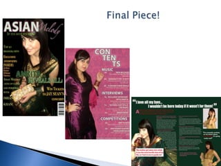
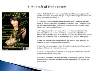
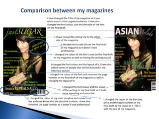
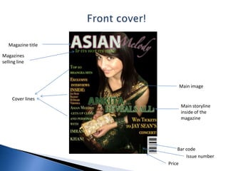
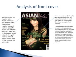
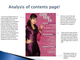
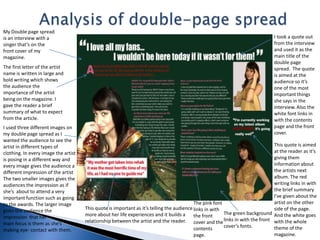
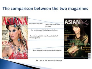
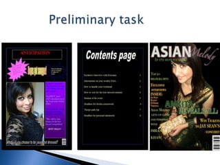
Critical Evaluation
                              Final Piece!
First draft of front cover!This is the first draft of my music magazine based on Bhangra music genre. I have decided to name my magazine ‘Just Sugar’ so anyone that has a general interest in it would feel comfortable reading it.
I have used a colour scheme of green, yellow and beige. I have used one large image for my front cover which clearly shows the genre of music I'm focusing on as the clothing and jewellery the model on the front cover is wearing  makes it quite obvious who my intended audience are.
My magazine consists of several cover lines on my front cover to attract the intended audience such as Imran Khan who is a very popular and well known Bhangra  artist within the Asian music industry. I have included the cover line ‘Top 10 Bhangra hits’ on my front cover to attract Bhangra music lovers to the magazine.
I have also added an issue number, barcode and the price at the bottom of my magazine, to make my magazine look professional.
To develop my music magazine I have decided to change the title of my magazine so it can relate more to the targeted audience.
I will also be moving the main storyline of my magazine ‘Ankita reveals all’ so the audience know who I'm talking about.
In order to improve my magazine I would like to use different colours of fonts as there is too much green and yellow which makes my magazine look a bit dull and uninteresting.        Comparison between my magazinesI have changed the Title of my magazine so it can relate more to the targeted audience. I have also changed the font colour, size and the style of the font on the final draft.I have moved the selling line to the other side of the magazineI  decided not to add this on the final draft  of my magazine as it doesn’t look professionalI changed the colour of the font I used on the first draft on my magazine as well as moving the writing aroundI changed the font colour and the layout of it. I have also added names of people that will be featured in the Interview section I changed the colour of the font and removed the page number on my final draft of my magazine as well as changing the layout of itI changed the font colour and the layout of the writing on my final draft so it looks more appealing and attractiveI changed the colour of my main storyline and moved it so the audience know who the storyline is about. I have also removed the page number as it doesn’t look professional  I changed the layout of the Barcode, price and the issue number on my final draft as the layout of it  fits in with the rest of the magazine.
Front cover!Magazine titleMagazines        selling line Main imageCover linesMain storyline inside of the magazineBar codeIssue numberPrice
          Analysis of front coverFor my front cover I used colours that went with the models outfit and colours that went with my double page spread and contents page, I done this so my magazine looks consistent.I used a black background to make my writing and image stand out .I also used green colour for my models outfit as it’s a unisex colour and it would attract both male and female readers to the magazines. I used colours yellow,green,white and pink on my front cover these colours are again unisex colours and would attract different readers to the magazine.I decided to name my magazine Asian Melody as it links in with the genre of the music that my magazine is about. I used two colours for my title pink and white which both link in with my double page spread and contents page. I used two different types of fonts to make my title stand out and look trendy.
Analysis of contents page!The Font I used for the title of my contents page is the same as I used for the title of my front cover. The pink and white show the consistency throughout the magazine.I used a pink background for my contents page I did not change this on Photoshop this the original background I used when I took this photo and decided to keep this background as it went well with the models outfit and jewellery. This background goes very well with the models outfit as she’s also wearing a very similar colour to the background however it doesn’t make her blend in with the background as the patterns that are on the background make her standout. I have used the colour pink for my background again this goes with the title of my magazine. I have also used white and pink throughout the whole contents page this again links in with my title.My magazine allows my readers to subscribe my magazine on the given website.
    Analysis of double-page spreadMy Double page spread is an interview with a singer that’s on the front cover of my magazine.I took a quote out from the interview and used it as the main title of the double page spread.  The quote  is aimed at the audience so it’s one of the most important things she says in the interview. Also the white font links in with the contents page and the front cover.The first letter of the artist name is written in large and bold writing which shows the audience the importance of the artist being on the magazine. I gave the reader a brief summary of what to expect from the article. I used three different images on my double page spread as I wanted the audience to see the artist in different types of clothing. In every image the artist is posing in a different way and every image gives the audience a different impression of the artist The two smaller images gives the audiences the impression as if she’s  about to attend a very important function such as going to the awards. The larger image gives the audience the impression  that her     main focus is them as she’smaking eye- contact with them.This quote is aimed at the reader as it’s giving them information about the artists next album. The red writing links in with the brief summary I've given about the artist on the other side of the page. And the white goes with the whole theme of the magazine.The pink font links in with the front cover and the contents page.This quote is important as it’s telling the audience more about her life experiences and it builds a relationship between the artist and the reader.The green background links in with the front cover’s fonts.
The comparison between the two magazinesVery similar Title style Selling line at the top of the pageThe consistency of the background colours The main image is the main focus for both of     these magazines Main storyline at the bottom of the magazineBar code at the bottom of the page
The ways in which my magazine develops and challenges forms and conventions of real magazines are:I have used a slogan on my magazine ‘if it’s hot it’s here’ to attract the intended audiences attention as it allows them to think that the information their being fed is exclusive and they won’t need to look elsewhere. The artist on my magazine is the main focal point this is usually what’s expected from a Bhangra music magazine.My magazine has a very similar title style to the one that inspired me to make my magazine in this particular way. The background of my magazine is in one colour which is the same as the ASIANA magazine. This makes my magazine look sophisticated and classy.The main storyline of the magazine is at the bottom of the page which again is the same as the ASIANA magazine. I have used one large image on my front cover rather than adding many images on it this tells the reader what the main storyline’s going to be about. This is usually what’s expected from a typical music magazine.In what ways does your media product use, develop or challenge forms and conventions of real media products?
How does your media product represent particular social groups?The social group I have represented are people from the middle class or higher class  aged 16 onwards who are interested in the Bhangra music genre. My magazine features an Asian girl who is wearing traditional clothing and jewellery this allows the reader to know who the magazine is aimed at and what music genre it is. My magazine mirrors the social group  of Bhangra which is an Asian/Indian type of music the title of my magazine ‘Asian Melody’  allows the reader to know who the targeted audience are.As my magazine is aimed at the younger generation as well as the older generation I decided to balance out the type of language I was using to make sure it wasn’t too formal or too informal.My magazine consists of a large image on the front cover which will attract the audience to the magazine.
What kind of media institution might distribute your product?  The Media institution that will distribute my product is Bhangra Media Group. Bhangra Media Group is the leading specialist PR & Marketing Company to focus solely on the growing Bhangra music scene; which attracts millions of fans worldwide. This will be a very good way to make my magazine well-known as it focuses  mainly on my magazines music  genre.Another Media institution that may distribute my Magazine is Brit Asia TV. This will allow people who haven’t heard of my magazine to find out more about it as Brit Asia TV exclusively focuses on Bhangra music.Networking sites such as Facebook is a very good way of distributing my magazine as it is used by many people all over the world and it will be very easy for my targeted audience to get hold of the information.

EVALUATION

  • 1.
  • 2.
    Final Piece!
  • 3.
    First draft offront cover!This is the first draft of my music magazine based on Bhangra music genre. I have decided to name my magazine ‘Just Sugar’ so anyone that has a general interest in it would feel comfortable reading it.
  • 4.
    I have useda colour scheme of green, yellow and beige. I have used one large image for my front cover which clearly shows the genre of music I'm focusing on as the clothing and jewellery the model on the front cover is wearing makes it quite obvious who my intended audience are.
  • 5.
    My magazine consistsof several cover lines on my front cover to attract the intended audience such as Imran Khan who is a very popular and well known Bhangra artist within the Asian music industry. I have included the cover line ‘Top 10 Bhangra hits’ on my front cover to attract Bhangra music lovers to the magazine.
  • 6.
    I have alsoadded an issue number, barcode and the price at the bottom of my magazine, to make my magazine look professional.
  • 7.
    To develop mymusic magazine I have decided to change the title of my magazine so it can relate more to the targeted audience.
  • 8.
    I will alsobe moving the main storyline of my magazine ‘Ankita reveals all’ so the audience know who I'm talking about.
  • 9.
    In order toimprove my magazine I would like to use different colours of fonts as there is too much green and yellow which makes my magazine look a bit dull and uninteresting. Comparison between my magazinesI have changed the Title of my magazine so it can relate more to the targeted audience. I have also changed the font colour, size and the style of the font on the final draft.I have moved the selling line to the other side of the magazineI decided not to add this on the final draft of my magazine as it doesn’t look professionalI changed the colour of the font I used on the first draft on my magazine as well as moving the writing aroundI changed the font colour and the layout of it. I have also added names of people that will be featured in the Interview section I changed the colour of the font and removed the page number on my final draft of my magazine as well as changing the layout of itI changed the font colour and the layout of the writing on my final draft so it looks more appealing and attractiveI changed the colour of my main storyline and moved it so the audience know who the storyline is about. I have also removed the page number as it doesn’t look professional I changed the layout of the Barcode, price and the issue number on my final draft as the layout of it fits in with the rest of the magazine.
  • 10.
    Front cover!Magazine titleMagazines selling line Main imageCover linesMain storyline inside of the magazineBar codeIssue numberPrice
  • 11.
    Analysis of front coverFor my front cover I used colours that went with the models outfit and colours that went with my double page spread and contents page, I done this so my magazine looks consistent.I used a black background to make my writing and image stand out .I also used green colour for my models outfit as it’s a unisex colour and it would attract both male and female readers to the magazines. I used colours yellow,green,white and pink on my front cover these colours are again unisex colours and would attract different readers to the magazine.I decided to name my magazine Asian Melody as it links in with the genre of the music that my magazine is about. I used two colours for my title pink and white which both link in with my double page spread and contents page. I used two different types of fonts to make my title stand out and look trendy.
  • 12.
    Analysis of contentspage!The Font I used for the title of my contents page is the same as I used for the title of my front cover. The pink and white show the consistency throughout the magazine.I used a pink background for my contents page I did not change this on Photoshop this the original background I used when I took this photo and decided to keep this background as it went well with the models outfit and jewellery. This background goes very well with the models outfit as she’s also wearing a very similar colour to the background however it doesn’t make her blend in with the background as the patterns that are on the background make her standout. I have used the colour pink for my background again this goes with the title of my magazine. I have also used white and pink throughout the whole contents page this again links in with my title.My magazine allows my readers to subscribe my magazine on the given website.
  • 13.
    Analysis of double-page spreadMy Double page spread is an interview with a singer that’s on the front cover of my magazine.I took a quote out from the interview and used it as the main title of the double page spread. The quote is aimed at the audience so it’s one of the most important things she says in the interview. Also the white font links in with the contents page and the front cover.The first letter of the artist name is written in large and bold writing which shows the audience the importance of the artist being on the magazine. I gave the reader a brief summary of what to expect from the article. I used three different images on my double page spread as I wanted the audience to see the artist in different types of clothing. In every image the artist is posing in a different way and every image gives the audience a different impression of the artist The two smaller images gives the audiences the impression as if she’s about to attend a very important function such as going to the awards. The larger image gives the audience the impression that her main focus is them as she’smaking eye- contact with them.This quote is aimed at the reader as it’s giving them information about the artists next album. The red writing links in with the brief summary I've given about the artist on the other side of the page. And the white goes with the whole theme of the magazine.The pink font links in with the front cover and the contents page.This quote is important as it’s telling the audience more about her life experiences and it builds a relationship between the artist and the reader.The green background links in with the front cover’s fonts.
  • 14.
    The comparison betweenthe two magazinesVery similar Title style Selling line at the top of the pageThe consistency of the background colours The main image is the main focus for both of these magazines Main storyline at the bottom of the magazineBar code at the bottom of the page
  • 15.
    The ways inwhich my magazine develops and challenges forms and conventions of real magazines are:I have used a slogan on my magazine ‘if it’s hot it’s here’ to attract the intended audiences attention as it allows them to think that the information their being fed is exclusive and they won’t need to look elsewhere. The artist on my magazine is the main focal point this is usually what’s expected from a Bhangra music magazine.My magazine has a very similar title style to the one that inspired me to make my magazine in this particular way. The background of my magazine is in one colour which is the same as the ASIANA magazine. This makes my magazine look sophisticated and classy.The main storyline of the magazine is at the bottom of the page which again is the same as the ASIANA magazine. I have used one large image on my front cover rather than adding many images on it this tells the reader what the main storyline’s going to be about. This is usually what’s expected from a typical music magazine.In what ways does your media product use, develop or challenge forms and conventions of real media products?
  • 16.
    How does yourmedia product represent particular social groups?The social group I have represented are people from the middle class or higher class aged 16 onwards who are interested in the Bhangra music genre. My magazine features an Asian girl who is wearing traditional clothing and jewellery this allows the reader to know who the magazine is aimed at and what music genre it is. My magazine mirrors the social group of Bhangra which is an Asian/Indian type of music the title of my magazine ‘Asian Melody’ allows the reader to know who the targeted audience are.As my magazine is aimed at the younger generation as well as the older generation I decided to balance out the type of language I was using to make sure it wasn’t too formal or too informal.My magazine consists of a large image on the front cover which will attract the audience to the magazine.
  • 17.
    What kind ofmedia institution might distribute your product? The Media institution that will distribute my product is Bhangra Media Group. Bhangra Media Group is the leading specialist PR & Marketing Company to focus solely on the growing Bhangra music scene; which attracts millions of fans worldwide. This will be a very good way to make my magazine well-known as it focuses mainly on my magazines music genre.Another Media institution that may distribute my Magazine is Brit Asia TV. This will allow people who haven’t heard of my magazine to find out more about it as Brit Asia TV exclusively focuses on Bhangra music.Networking sites such as Facebook is a very good way of distributing my magazine as it is used by many people all over the world and it will be very easy for my targeted audience to get hold of the information.