Download to read offline


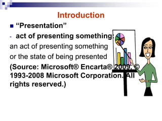
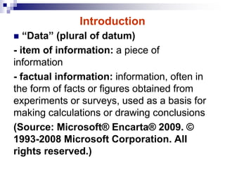

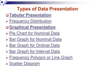
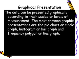

The document discusses methods and principles of data presentation, including definitions of key terms like 'data' and 'presentation'. It categorizes data into primary, secondary, qualitative, and quantitative types, and outlines various levels of measurement such as nominal, ordinal, interval, and ratio. Additionally, it highlights guidelines for effective data presentation and different formats including tabular and graphical methods, with examples demonstrated throughout.


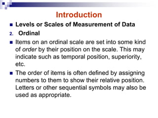
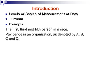
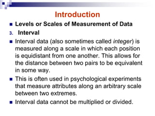
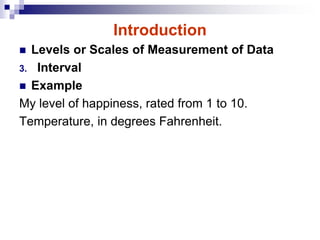
![2. Numerical Descriptive Measures[1].pdf](https://cdn.slidesharecdn.com/ss_thumbnails/2-241121070922-5ee24598-thumbnail.jpg?width=640&height=640&fit=bounds)